The cleanest manicure ideas often have one decision you can describe without explaining the rest. A sharp outline, a deliberate gap, a single reflective shift, or one small accent can give the set its identity. When that decision is clear, the color feels more current because the design has room around it and the eye knows where to land.
That kind of clarity is useful beyond a single appointment or saved reference. It tells you what to preserve when the length changes, which detail can be removed first, and where a stronger contrast would become noise. A manicure does not need more elements to feel finished; it needs a visible reason for every element that remains.
1. Magenta Reflection inside a Silver Almond Outline
The silver outline is the small detail that gives these long almond nails their crisp modern edge. Inside it, a magenta-purple surface shifts through pink and violet highlights, so the center remains colorful while the perimeter stays bright and controlled. The shape is elongated, but the clean border prevents the reflective field from becoming visually loose.
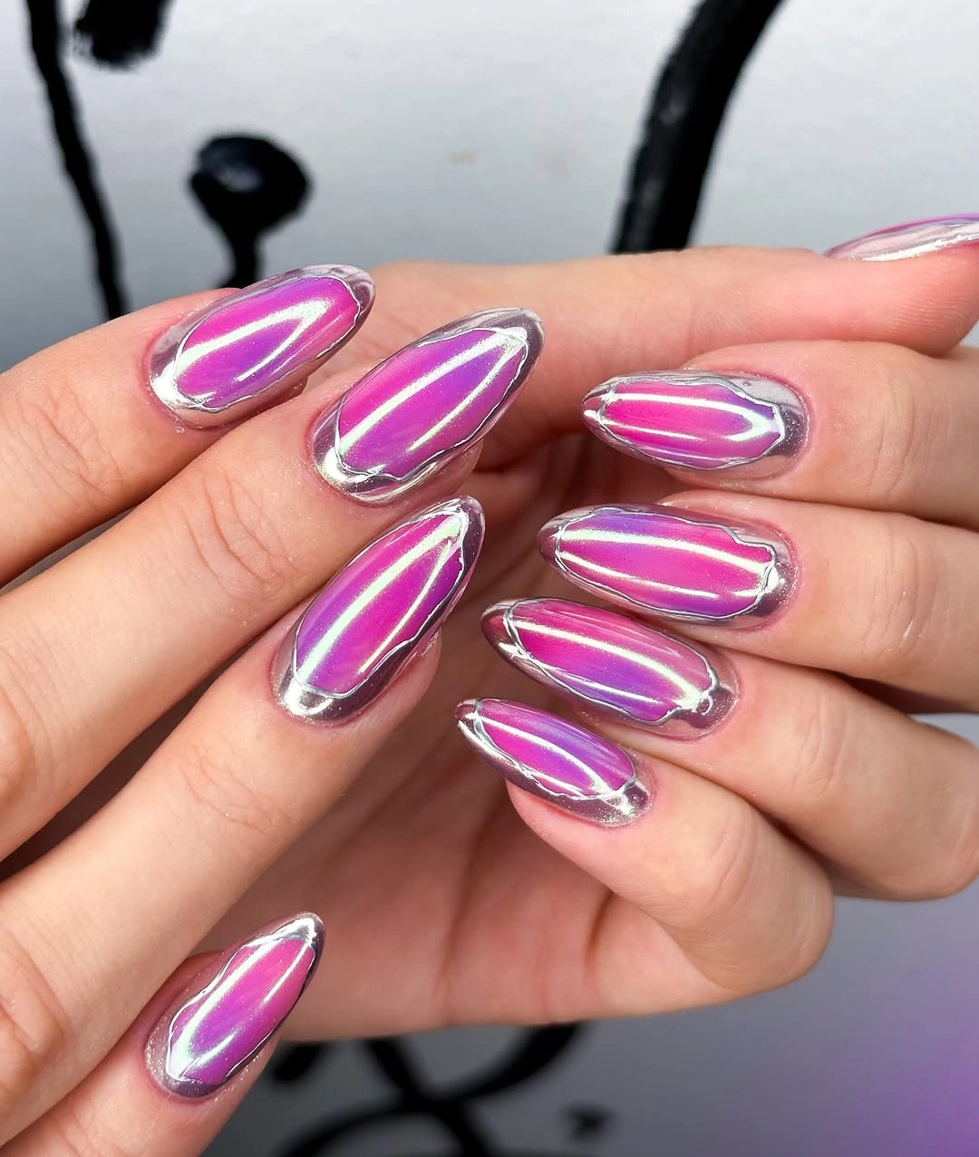
That separation creates visual breathing room. Silver defines the almond contour, and magenta supplies the color-changing focal point, giving each element a clear job instead of mixing all the shine together. The result feels fresh because the border is purposeful: it makes the reflective center look more edited and gives the long points a precise finish.
To make the idea easier to wear, keep the silver line and shorten the almond shape before reducing the magenta area. The border will still explain the design, although it may need to be thinner on a smaller nail. The tradeoff is that reflective finishes show surface changes clearly, so a clean edge matters more than adding another decorative element.
2. Milky Centers Fade into Green Marbled Tips
A pale milky center gives these long almond nails a clean starting point, while translucent green marbling gathers at the tips. Small dark botanical-looking details add texture near the edge, and a yellow ladybug charm beside the hand supplies playful context without belonging to the nail surface. The palette feels fresh because the dark color is concentrated rather than spread everywhere.
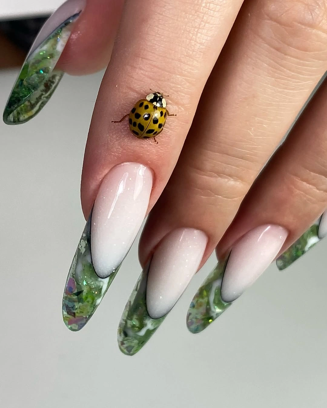
The center-to-tip transition is what keeps the design light. The milky area opens the middle of each nail, then the green arrives as a textured finish that follows the pointed silhouette. That spacing makes the pattern easier to read than an all-over marbled field, and it creates a clear hierarchy between pale base, green edge, and tiny detail.
If you want a shorter version, preserve the pale center and keep the green only at the final third of the nail. You can also omit the small line details when the surface becomes compact. The main limitation is that irregular marbling already carries visual information, so additional charms or extra colors can quickly compete with the clean transition that makes the set work.
3. Glossy Burgundy Lets the Almond Shape Lead
Sometimes the cleanest update is to remove every competing detail. These long almond nails use one glossy burgundy-red color, with a rich depth that appears slightly translucent in the highlights. The curved points supply the structure, while the pale background keeps the dark field easy to read and lets the seasonal tone feel intentional rather than crowded.
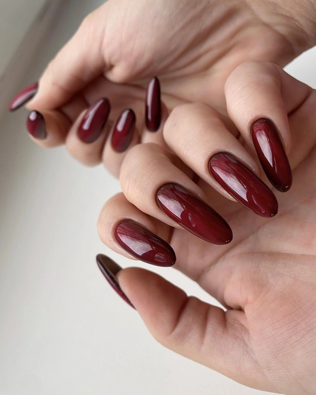
The simplicity gives the silhouette room to speak. Because there are no lines, accents, or color changes, the eye follows the taper from the base to the point and notices the way light travels across the red surface. That makes this a useful reset after more decorated references: one shade, one shape, and a finish that does not need explanation.
For a more compact interpretation, file the points into a medium almond and keep the burgundy uniform. The color will feel slightly denser on a shorter surface, but the core decision remains clear. The tradeoff is that a deep glossy field can show edge wear and uneven contours, so restraint does not remove the need for a tidy finish.
4. Sheer Pink Glitter Keeps Square Tips Airy
Long square tips often create a strong block, but this design uses a translucent blush-pink base to keep the outline light. Fine glitter and small iridescent flecks appear through the surface, while the edges remain more transparent than the center. The result feels current because the finish adds movement without adding a separate motif or a heavy dark shade.
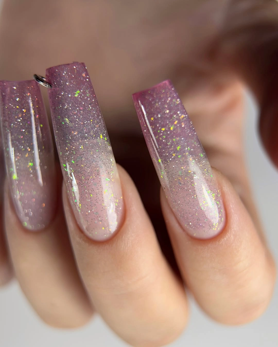
The glitter is spread evenly enough to connect the nails, yet the pale base leaves visible space around each fleck. That balance stops the sparkle from becoming noisy and lets the square shape remain readable. Compared with a fully opaque glitter set, the translucent edge creates more visual breathing room and makes the color feel softer against the hand.
If the length is too much, shorten the square tips while keeping the glitter density consistent through the center. A soft square would preserve the clean geometry with less edge emphasis. The limitation is that a sheer surface can show variation underneath it, so the modern, airy effect depends on keeping the base and the glitter distribution visually even.
5. Pastel Blocks Create a Soft Nail Color Collage
Large pastel blocks in pink, green, and mauve give these long square nails a fresh collage effect. The base stays pale and translucent, while each nail receives a broad patch that may read as textured or botanical. No single color takes over, so the design feels composed through spacing and proportion rather than a single loud focal point.
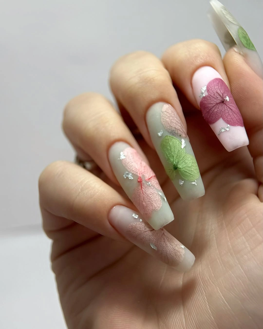
The broad patches work because they are easier to see than tiny scattered marks. Each block has enough room to register, while the pale base separates one color from the next and keeps the hand visually open. The square canvas supports that clarity, giving the colors straight edges and a stable frame instead of asking them to follow a pointed tip.
For a cleaner adaptation, choose one pastel accent nail and let the rest repeat a single milky base. You could also reduce the patch size while keeping the same three-color family. The tradeoff is that large blocks need room to breathe, so crowding every smaller nail with the same amount of color would make the fresh collage feel compressed.
6. Milky White and Pale Blue Use One Small Accent
A cool milky white-to-pale-blue base makes these long square nails feel clear and open. One visible nail carries a small turquoise or blue detail, while the other surfaces stay mostly quiet. That single accent is enough to interrupt the uniform field without changing the overall direction, so the set feels composed rather than unfinished.
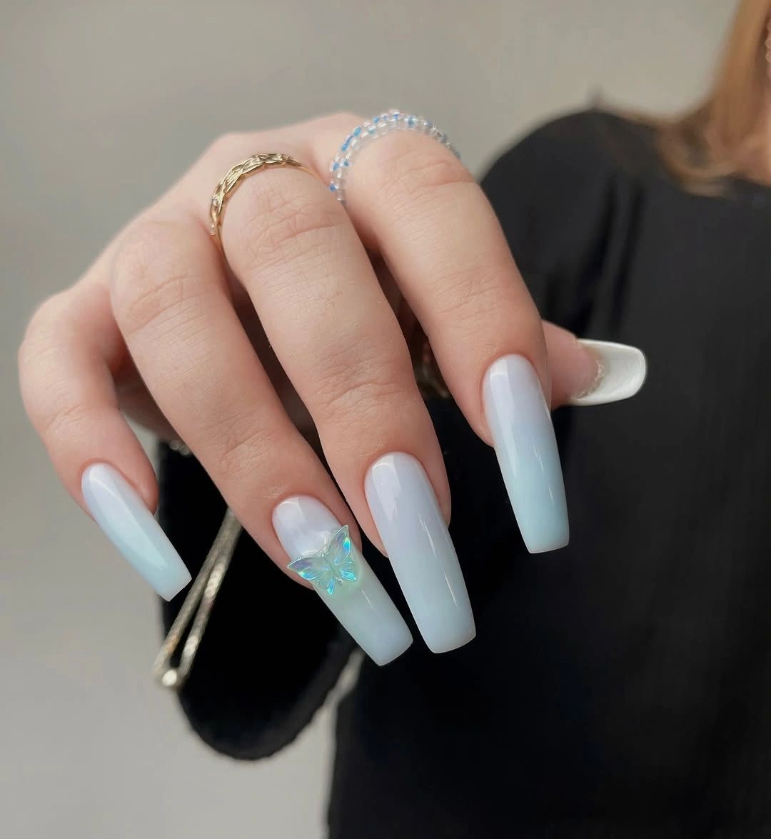
The clean base creates the space that makes the small detail matter. Against a dark top, the pale color reads first, and the blue accent becomes a second point rather than competing for the whole hand. This is a useful example of modern restraint: the manicure has a focal moment, but it does not ask every nail to carry a different story.
If you want the accent to feel more connected, repeat a tiny blue mark on one neighboring nail instead of adding a new color. A shorter square shape would keep the pale palette crisp, though the long edge currently gives the light base more room to breathe. The limitation is simple: a very small detail can disappear from a distance, so its placement should stay clear.
7. Pearly Pink Gives Almond Nails a Soft Reset
Medium-long almond nails use a soft pink base with diffuse pearly shimmer, creating a gentle glow rather than a hard metallic flash. The set is uniform and free of art, so the curved outline and the light-catching surface carry the entire idea. The result feels fresh because it is polished without becoming visually busy.
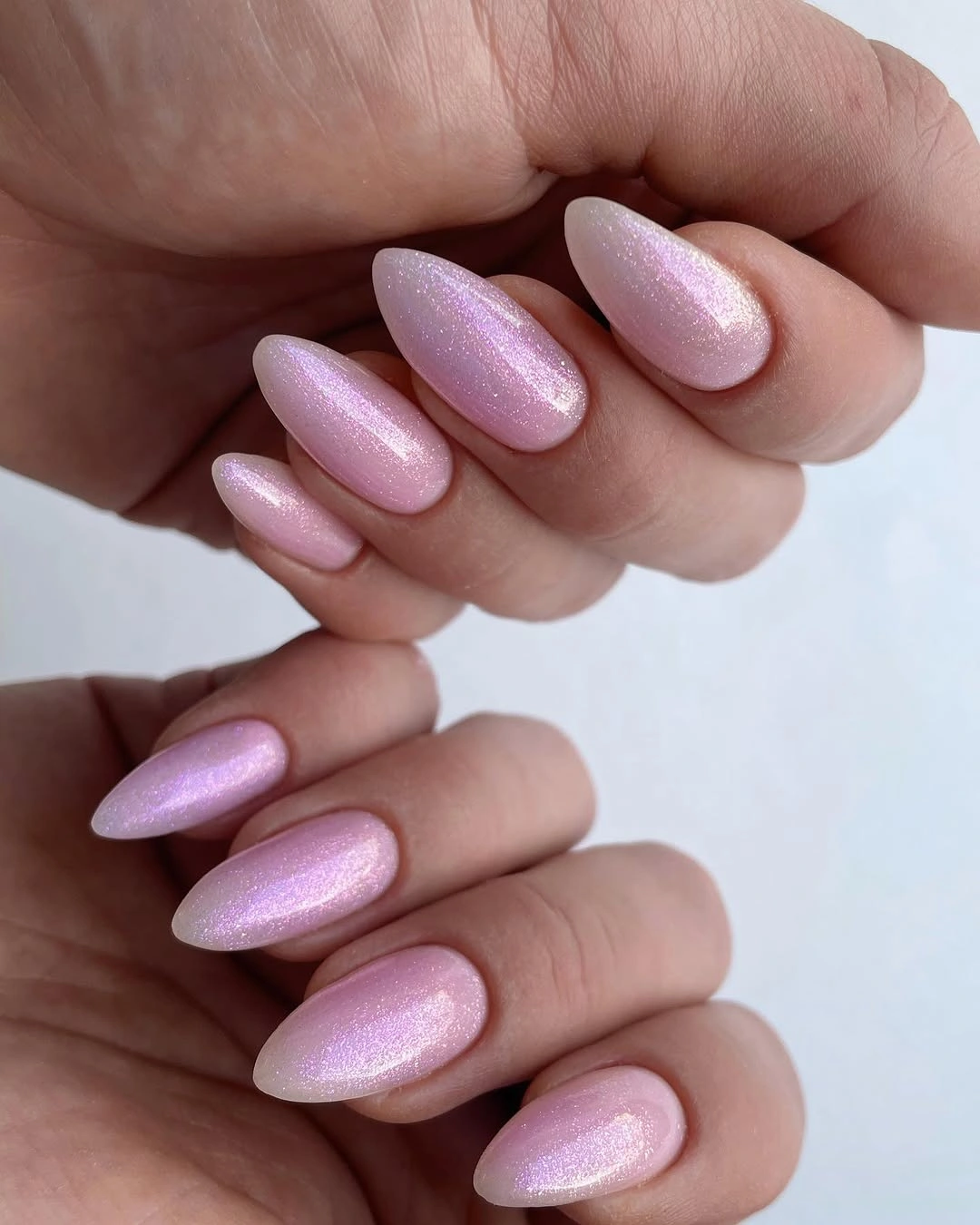
The finish gives the pale color enough depth to avoid looking flat. Light spreads across the almond curves in a satin-like way, and the two-hand composition shows how the shimmer repeats without becoming identical in every reflection. That makes the design a useful middle point between plain pink and reflective chrome: open, soft, and still visibly finished.
To modernize it further, keep the pearly effect on the main nails and use a plain pink on one or two fingers, or shorten the almond slightly while preserving the glow. Diffuse reflection depends on lighting, so the set may look almost creamy indoors. That is the tradeoff for a softer finish: it feels subtle, but its full dimension appears only when light moves across it.
8. Translucent Pink and Gold Use the Pointed Shape
Long pointed nails make the pale pink base feel more dramatic, while small gold flecks and irregular accents keep the surface from becoming empty. One brighter opalescent-looking detail appears near the center, but most of the design remains translucent and open. The contrast between sharp points and delicate color creates the central tension.
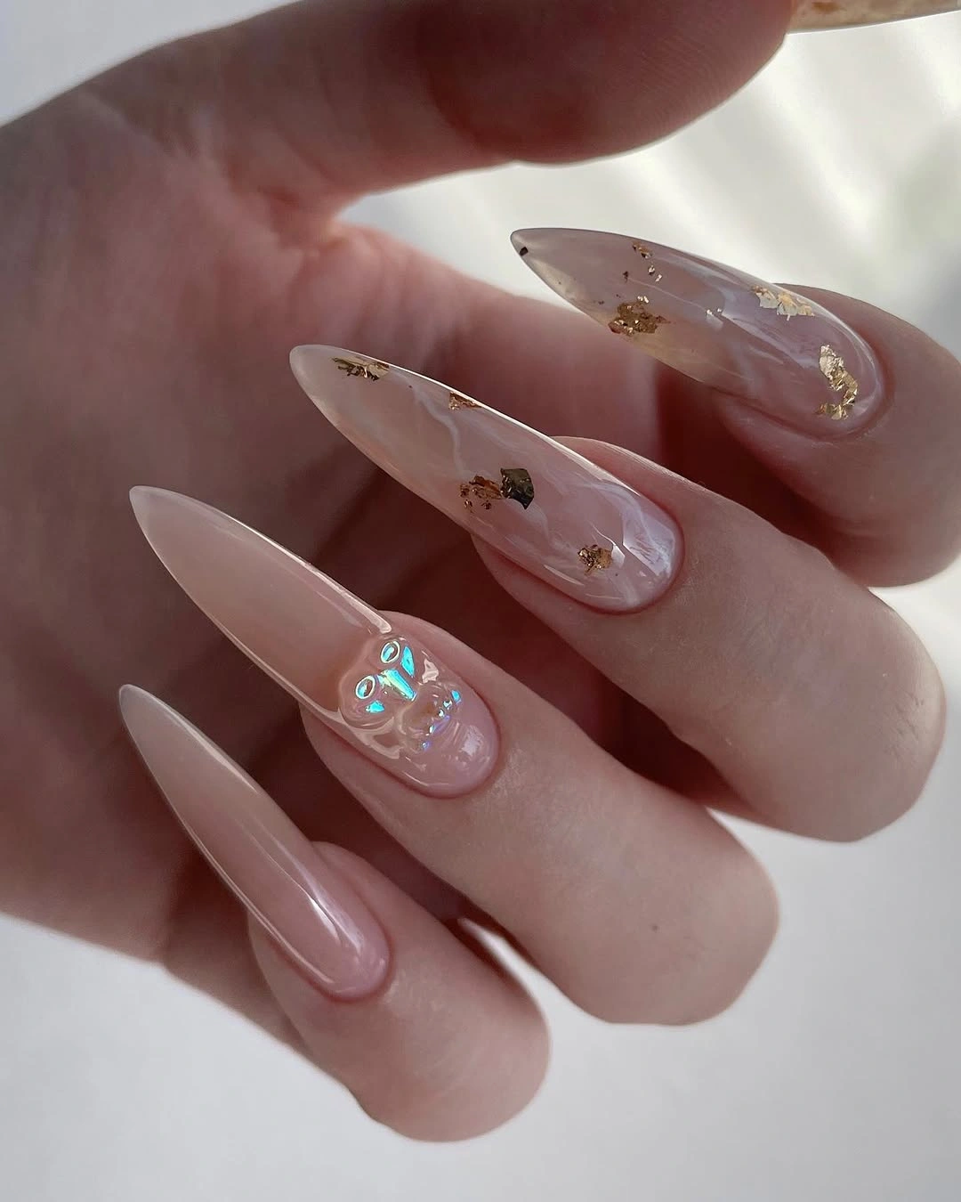
The transparency is important because it prevents the gold from turning into a solid metallic block. Small fragments sit inside the pale field and let the pointed outline remain visible, so the eye reads both the shape and the decoration. That balance feels current when the accents are selective rather than spread so densely that the base disappears.
If the points feel too intense, move the same pale-and-gold idea onto a long almond and keep only a few fragments near the tips. This will reduce the sharpness without losing the airy depth. The tradeoff is that the original design depends on length for its drama, so a shorter version needs more spacing and fewer accents to avoid looking crowded.
9. Olive Patterning Adds Texture without Brightness
Medium almond nails use a muted olive-green base with dark irregular patterning that reads as organic or botanical without needing a fixed label. The surface appears low-shine, so the pattern and shape stay more important than reflection. Compared with the pale glitter and pink finishes earlier, this set creates freshness through texture and clarity rather than brightness.
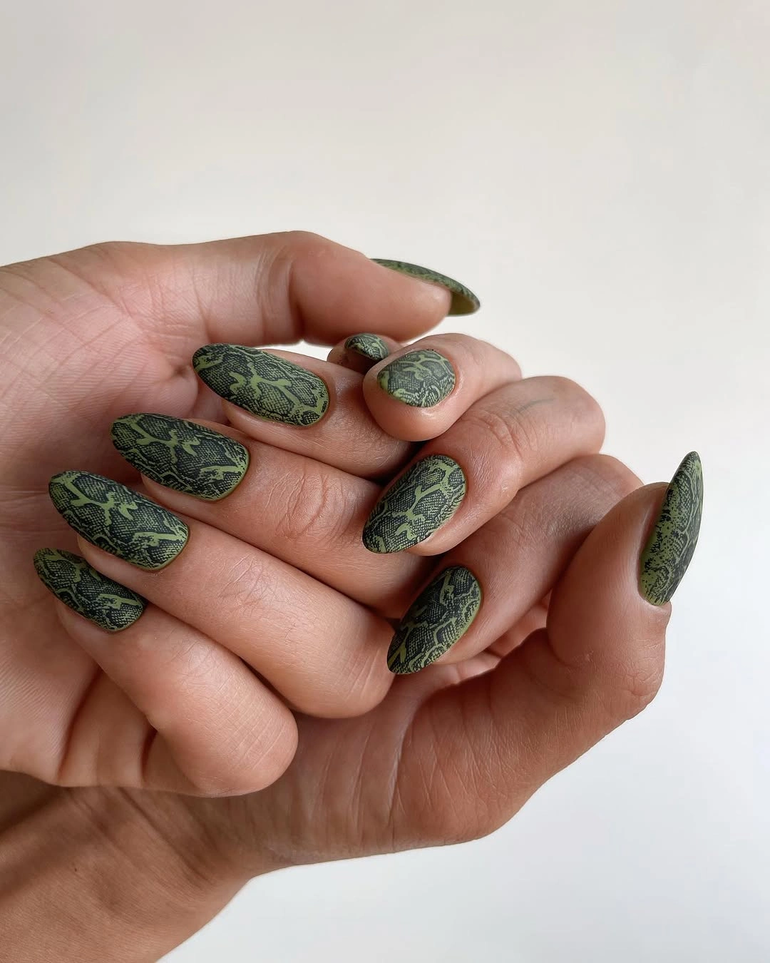
The repeated dark marks give every nail a shared language while allowing the individual contours to remain visible. Olive supplies the field, the pattern adds depth, and the almond outline keeps the result from feeling boxy. Because the colors stay close in value, the design feels grounded and modern instead of relying on a high-contrast black-and-white split.
For a cleaner edit, keep the pattern on two accent nails and use solid olive on the rest. A slightly shorter almond would make the base feel more practical without changing the palette. The honest limitation is that the pattern is deliberately irregular, so it will not look perfectly uniform from finger to finger; that variation is part of the texture rather than a flaw to erase.
10. Red Color Gets a Minimal White Curve
Short rounded-square nails use glossy red as the main color, with thin pale curves interrupting several surfaces. The lines are sparse, so the red remains the first thing noticed and the shape stays compact. Blonde hair and a black sleeve create the surrounding contrast, but the clean color field is what gives this idea its immediate modern clarity.
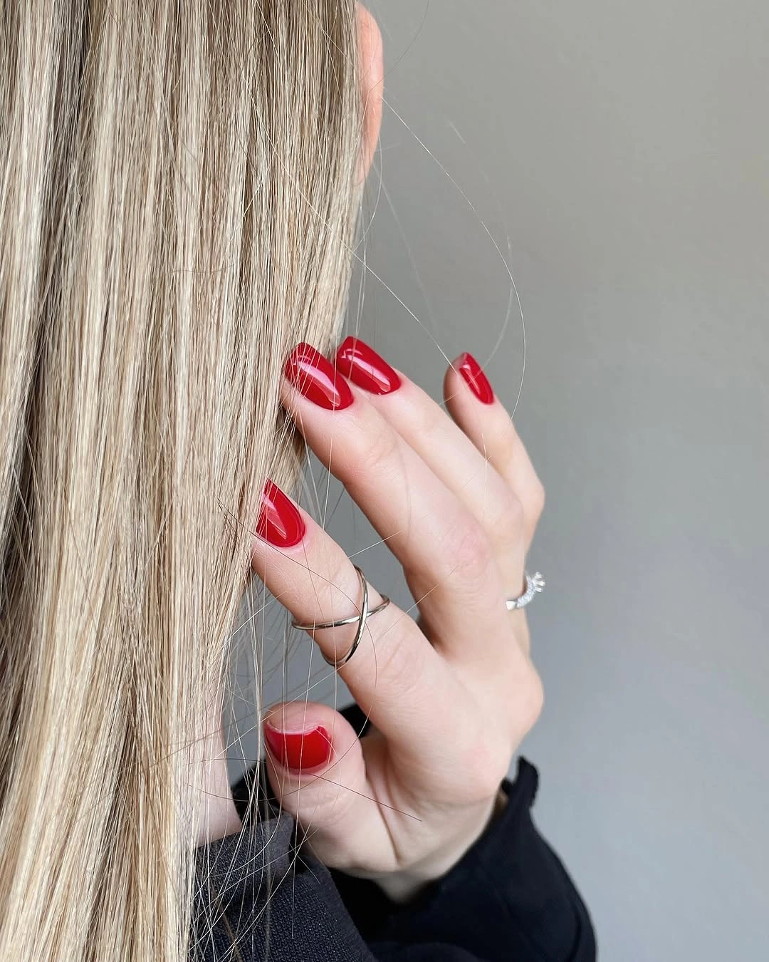
The small curves are effective because they do not compete with the base. They act like a quiet graphic interruption, adding direction while leaving enough red space for the manicure to feel direct. A short outline helps the idea stay readable: there is no long canvas demanding more decoration, and the pale lines can remain deliberately thin.
To simplify it even more, keep one curved accent nail and use plain red on the rest. A deeper wine shade would make the palette feel more grounded, while a brighter red would keep the crisp contrast. The tradeoff is that a glossy solid surface exposes edge accuracy, so the clean modern effect depends on the curves and borders staying controlled.
11. Long Pale Pink Almond Nails Keep the Field Clean
Long almond nails in an even pale pink color make proportion the main design decision. There is no visible art or contrasting accent, so the curved points and uniform surface have room to read clearly. After the line-led red design, this blank field feels like a deliberate reset rather than a lack of ideas.
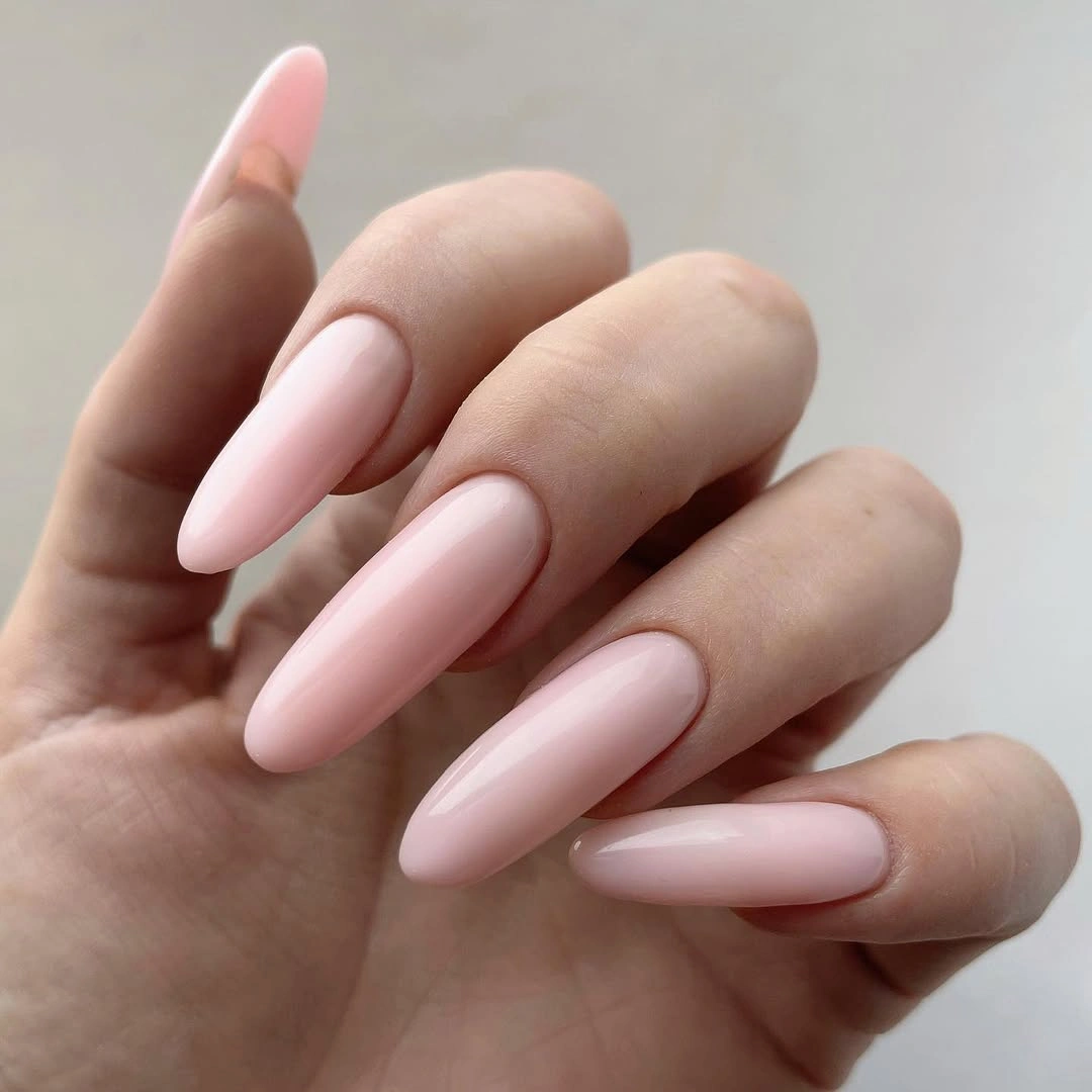
The simplicity works because the shape carries enough length to create a visible outline from every angle. Pale pink keeps that outline soft, while the glossy surface gives the solid color a little light movement. The result is open and composed, especially for someone who wants a fresh seasonal reference without adding motifs, glitter, or multiple shades.
If the length is not practical, move the same color onto a medium almond and let the contour become the smaller focal point. You could also use one accent nail with a slightly deeper pink, but more detail would change the calm hierarchy. The limitation is that a plain surface leaves nowhere for uneven edges to hide, so precision becomes the entire finish.
12. Blue, Spots, and Lines Share One Anchor Color
Cobalt blue connects several different decisions in this medium-long almond set. Some nails are solid blue, others are milky white with black irregular spots, and additional nails carry blue curves, small orange touches, or bright stud-like accents. The variety remains coherent because the same blue returns across the surface and gives the mixed motifs one clear thread.
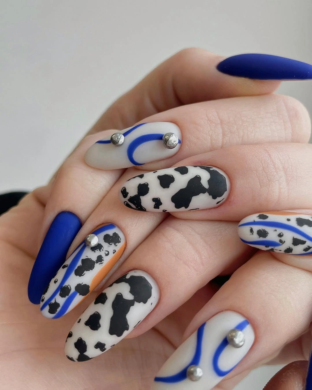
The design feels modern when the motifs are treated as a hierarchy rather than a pile of details. Solid blue provides pauses, spotted white creates contrast, curved lines add movement, and tiny bright accents supply small points of light. The almond length gives each idea enough space, while the repeated palette stops the set from becoming visually disconnected.
For a cleaner adaptation, keep the solid blue and spotted white nails, then remove either the line work or the small accents. A medium length can preserve the composition, but each motif will need more breathing room as the canvas shrinks. The tradeoff is clear: the original set rewards close inspection, while a simplified version reads faster and pairs more easily.
13. Ivory Short Nails with Two Fine Botanical Accents
Short square nails use a pale ivory base, with thin black branching lines on two accent nails. The remaining fingers stay solid, so the small drawings have space to register without turning the manicure into a full pattern. An orange knit sleeve adds seasonal warmth nearby, but the clean ivory field remains the main modern choice.
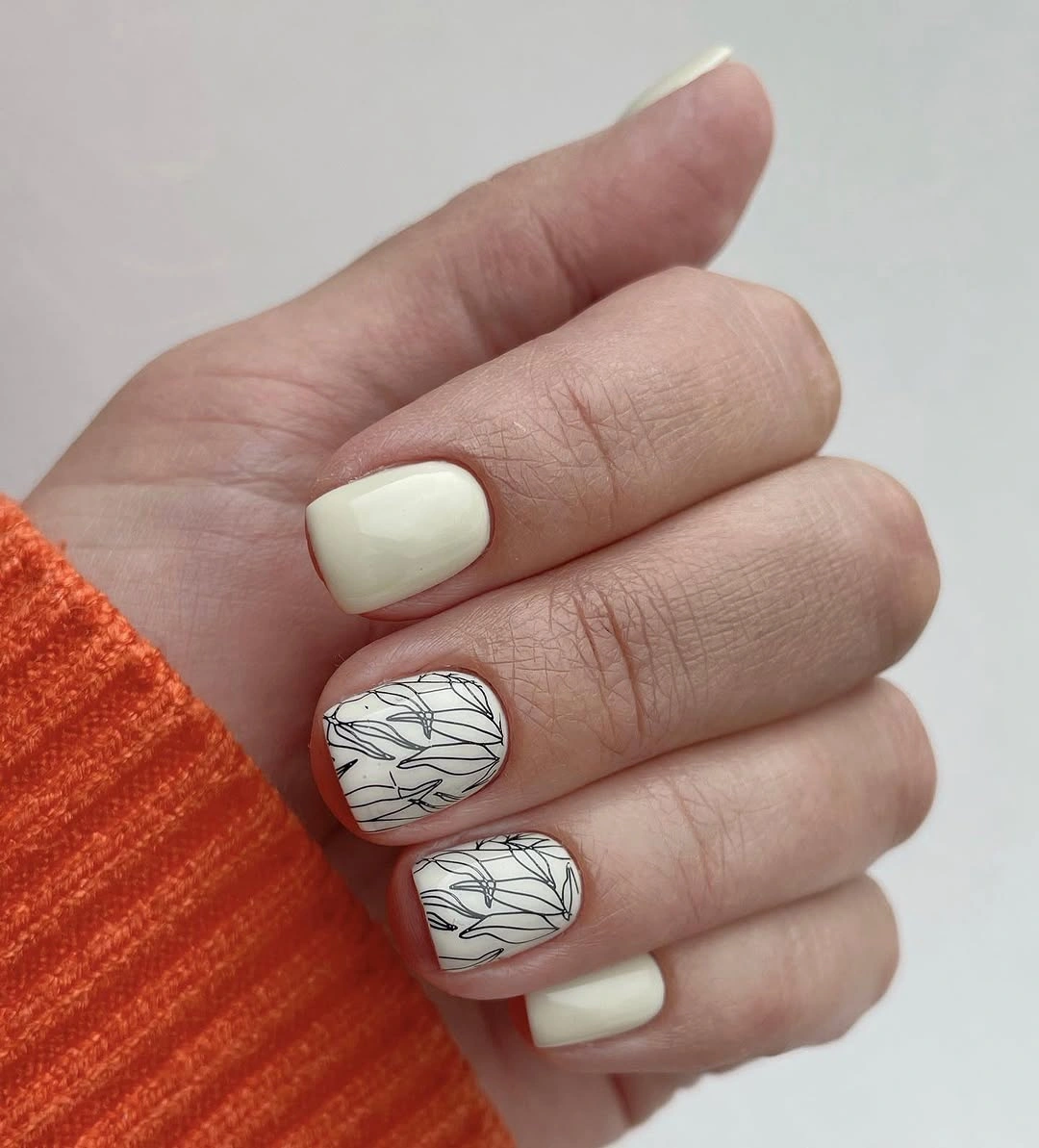
The selective placement is what keeps the design fresh. Black lines provide definition, ivory creates visual breathing room, and the short square outline gives the accents a compact frame. Because only two nails carry the drawing, the hand does not look crowded and the simple base can sit beside a strong sleeve color without competing for attention.
You can adapt the idea by keeping one accent nail and using a warmer cream on the rest, or by making the lines slightly bolder if the nails are viewed from farther away. The limit is scale: delicate branches can disappear on a very small surface. Adding more accents would not necessarily improve clarity, because the open ivory space is doing essential work.
14. Burgundy Curves on a Milky Almond Base
Long almond nails use a milky white base with thin burgundy curves tracing the edges and looping through open spaces. The dark red line gives the pale surface definition without covering it, while the almond contour echoes the direction of each sweep. This is a graphic design that stays light because the negative space is allowed to remain visible.
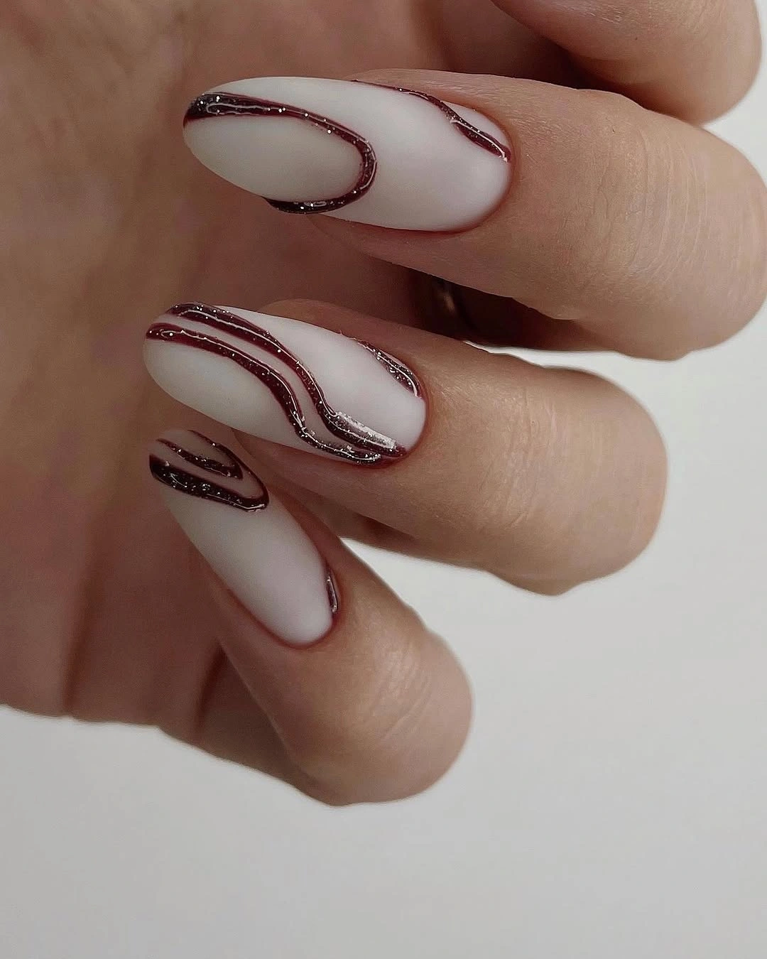
The line system feels coherent because one color repeats across every nail, yet the curves do not all make the same shape. Some appear enclosed, others open toward the edge, and that variation keeps the design from feeling copied. The pale base acts as a clean field, so the viewer sees placement and movement before noticing any extra texture.
For an easier version, keep one burgundy curve near the tip and remove the inner loops, or shift the idea onto a medium almond. The main contrast will survive, although shorter nails may need wider spacing so the lines do not merge. Precision is the tradeoff here: a sparse design has fewer marks, but each mark becomes more visible when it wanders.
15. Bright Green Keeps a Short Rounded Shape Direct
Short rounded-square nails use one vivid green color with a glossy-looking surface, creating a clear visual reset after the burgundy line art. The hand is shown beside a floral tattoo, but that incidental detail does not change the manicure’s simple hierarchy. Green is the whole story, and the compact shape keeps the brightness focused.
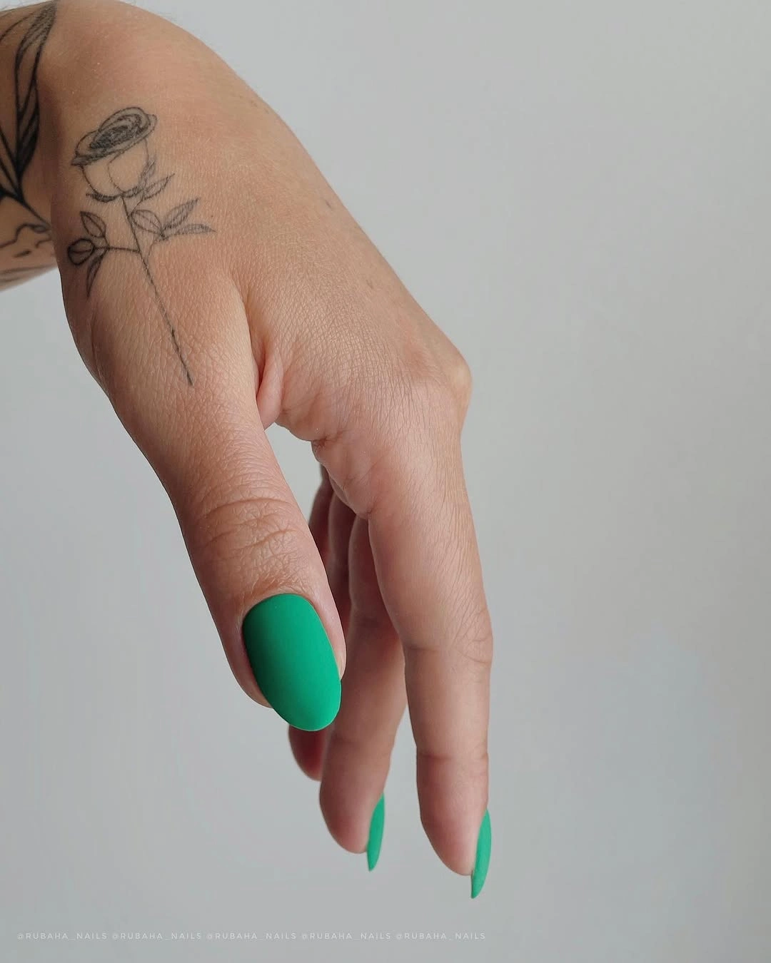
A single saturated color can feel current when the edge is clean and the shape is not overloaded. The rounded square gives the green a stable frame, while the short length prevents the bright tone from stretching into a more dramatic silhouette. This is a useful reference for readers who want a bold color choice but prefer to remove every competing detail.
If you want a softer result, use the green on one or two nails and pair it with a pale cream or muted olive base. Keeping the same rounded contour will preserve the compact clarity. The tradeoff is that a vivid solid shade has nowhere to hide uneven application, so the simpler the design becomes, the more the boundary and surface need to look consistent.
16. Turquoise and Tiny Pink Details Stay Compact
Short rounded-square nails carry a glossy turquoise base with small pink-and-white flower-like accents on selected fingers. The warm details interrupt the cool field without covering it, so the manicure remains bright but not overloaded. A neutral background keeps the turquoise easy to read and lets the small accents function as deliberate points rather than scattered decoration.
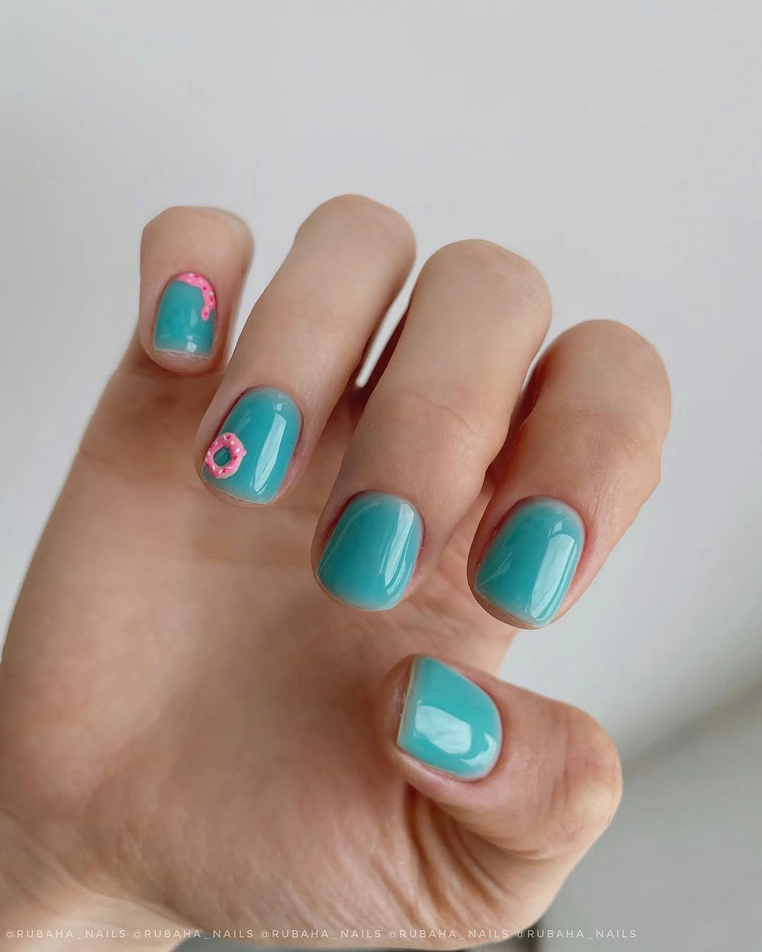
The scale is what makes this combination feel fresh. Turquoise supplies a clean block of color, the tiny pink details create a warm counterpoint, and the short outline limits the amount of information on each nail. Because the motif is concentrated, the eye can understand the palette quickly before moving to the small decorative marks.
For a simpler adaptation, keep the flowers on one nail and repeat the turquoise surface across the rest. If you shorten further, simplify the accent rather than compressing every tiny element into the smaller canvas. The limitation is visibility: small details can lose their shape at a distance, so the design works best when the accent remains clear and sparingly placed.
17. Translucent Pink Leaves Space for Layered Detail
Long pointed and almond-like nails use a translucent pink base with black and magenta lines, scattered glitter, and small bright embellishments. Some shorter nails carry dark red accents, adding a second level of variation. The design is detailed, but the transparent field leaves open areas between the marks so the hand does not become one dense block.
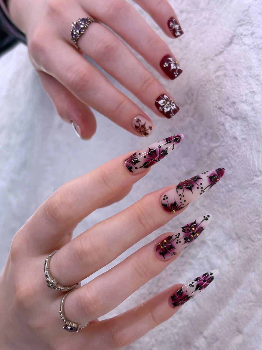
The clear space is the organizing device. Black and magenta create the strongest lines, glitter catches smaller points of light, and the pale base separates those layers enough for each to remain visible. That makes the collection feel editorial without relying on a single motif across every nail, although the varied lengths and details clearly keep it in statement territory.
To reduce the intensity, choose one line color, keep the translucent pink base, and limit glitter to a single accent. A medium almond would also soften the points while preserving the open field. The tradeoff is that removing too much detail can make the design lose its layered identity, so simplify by removing competing marks rather than flattening every nail to plain pink.
18. Black, Red, and White Divide the Pointed Silhouette
Long pointed nails use three strong visual roles: glossy black, warm red shimmer, and milky white. The dark nails carry the strongest weight, red adds a reflective glow through the center, and the white nails create a clean pause across the opposite hand. The palette feels intentional because each color is separated rather than blended into one noisy surface.
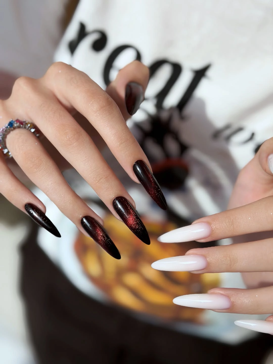
The pointed shape amplifies the contrast by directing every color toward a sharp end. Black anchors the composition, red keeps the dark field from feeling flat, and white opens the arrangement so the hand retains some breathing room. This is a clear example of how a small number of colors can still feel complex when their placement is structured.
If you want a cleaner modern edit, use black and white as the base and keep red shimmer on one or two nails. A shorter almond would reduce the intensity of the points without changing the palette. The limitation is scale: the original look depends on length for its drama, so removing that length means the color blocks must be spaced with more restraint.
19. Burgundy Depth Creates a Single-Color Gradient
Long almond nails stay within one burgundy-red family, but the center appears brighter and more translucent than the darker edges. Glossy oval highlights make the tonal shift easy to see, giving the uniform set more dimension than a flat coat. The design remains uncluttered because no separate motif or accent color is needed.
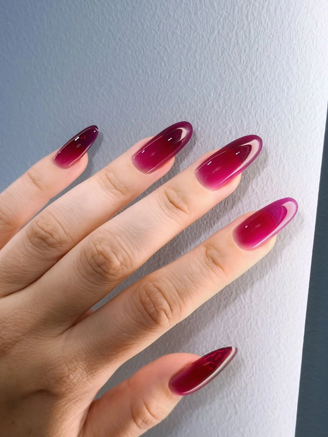
The subtle change in depth is the defining decision. Darker edges reinforce the almond contour, while the brighter center keeps the surface from looking heavy or completely opaque. That creates a fresh way to wear a deep autumn color: the palette is rich, but the finish gives it air and movement instead of asking for additional decoration.
For a more practical version, keep the same burgundy family on a medium almond and let the lighter area stay concentrated toward the center. The silhouette will feel less dramatic, but the color relationship will remain. The tradeoff is that a tonal transition can be difficult to judge under different lighting, so the final effect may look closer to one glossy shade indoors.
20. Cobalt Blue with Just Enough White Movement
Medium square nails use vivid cobalt blue as the base, with thin white curves crossing selected nails. The blue remains dominant, while the pale lines add movement without introducing a full motif system. A cool textile background keeps the contrast crisp and shows how a strong single color can be refreshed by one small graphic decision.
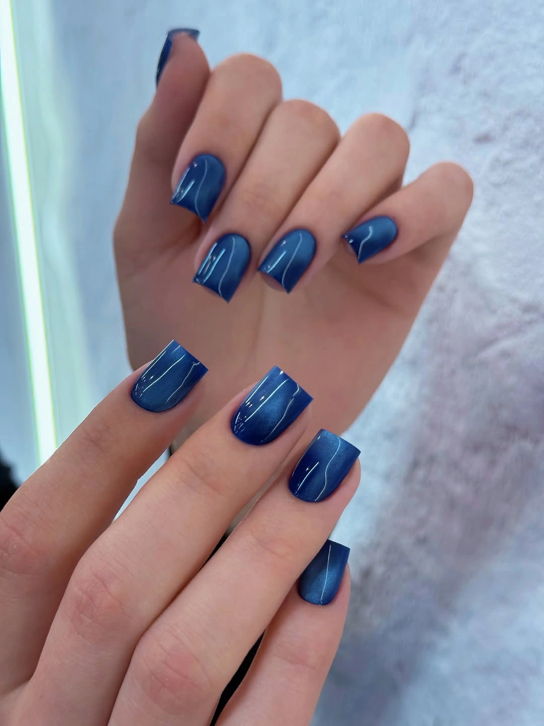
The spacing makes the design feel modern. White appears as a light interruption rather than a second field, so the eye returns quickly to the blue surface and the square outline. That hierarchy keeps the set clearer than a dense pattern and makes the lines useful for breaking repetition without sacrificing the direct character of the cobalt shade.
If you want an even cleaner result, keep the white curves on one accent nail and leave the rest solid blue. A shorter square would preserve the same color block, while a soft square would reduce the hard geometry slightly. The limitation is that sparse line art becomes visible only when the lines stay crisp, so adding more marks would not solve an imprecise edge.
21. Pale Blue Almond Nails with Spaced Bright Accents
Pale blue almond nails close the collection with a glossy base and tiny bright accents placed in a loose vertical rhythm. The decoration is sparse, so the cool color and medium length remain easy to understand before the eye notices each small point. A white textured background reinforces the light palette and leaves the design visually open.
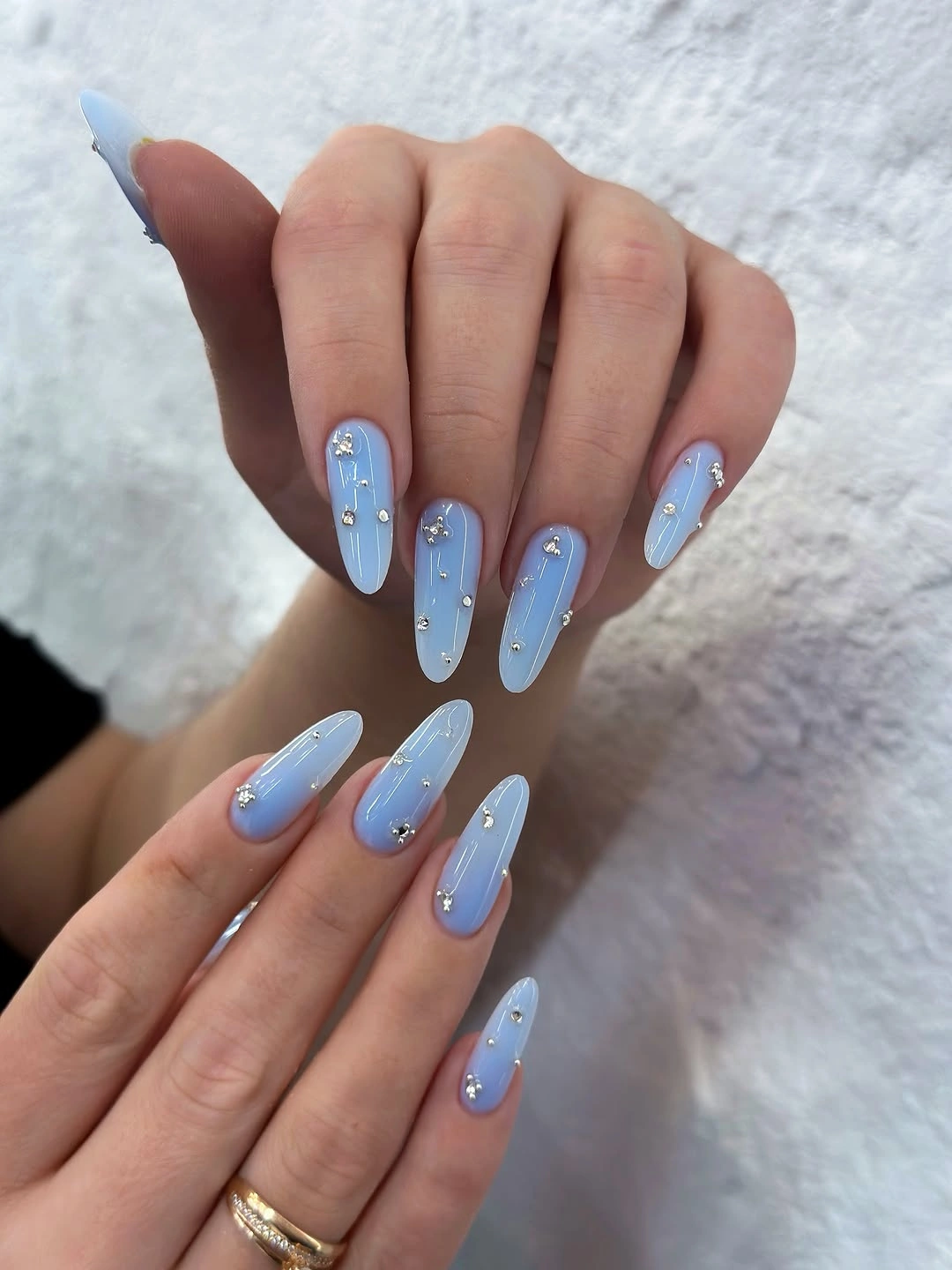
The spacing is the detail that keeps the accents from becoming clutter. Each small point sits inside a clear pale field, and the almond outline gives the eye a long route through the arrangement. Compared with the cobalt curves before it, this set feels softer because the contrast is smaller and the marks are separated rather than connected into a graphic line.
For a simpler version, keep the accents on two nails and repeat the pale blue color across the rest. A shorter almond would still hold the same airy proportion if the dots remain small and well-spaced. The honest limitation is that tiny bright details depend on close viewing, but that subtlety is exactly what lets the finish stay delicate instead of becoming another loud statement.