A playful detail needs something steady beside it. That tension gives cute outfits their character: color can bring the energy while a clean outline holds it together, or a print can take the lead without competing with every other element. You do not need each part to be charming on its own. Sometimes the plainest choice does the most useful work, giving an unexpected detail enough space to feel like an expression of your taste rather than an extra decoration.
What feels slightly off when you like every part of an outfit but not quite the whole? Before replacing anything, check the relationships: how one layer changes another’s proportions, where a contrast draws your attention, or whether texture gives closely related colors enough distinction. Adjusting one of those connections can preserve what you liked while making the combination feel more coherent. That leaves you room to dress with polish, simplicity, or fuller coverage without giving up the small, playful choices that make the result yours.
1. Polka Dots Work Better Through Reversal
The blouse and skirt share polka dots, but they do not copy each other. Small dark spots on cream meet light spots on black, so the connection feels deliberate while each piece keeps its own identity. That kind of reversal is a useful cute outfit idea because the coordination comes from a shared visual language, not from making the top and bottom identical.
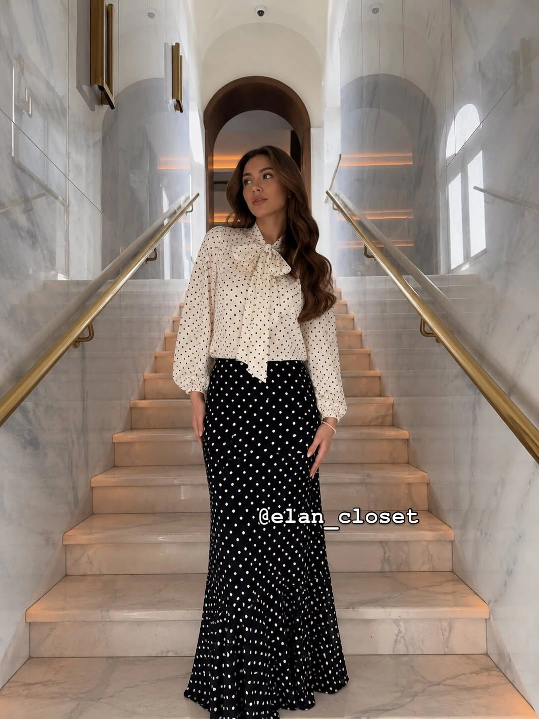
Photo via Instagram
The long skirt changes the mood of the print by giving the lower half a sweeping, composed line. Instead of reading as purely playful, the dots stretch through a fuller silhouette that feels more polished beside the shorter blouse. The result shows how proportion can shift the character of a familiar motif without removing the charm that made it appealing in the first place.
Black and cream repeat from top to bottom, which keeps the mixed dot patterns connected even as their backgrounds switch. The brass rails and pale marble around the outfit also make that two-tone relationship especially easy to see.
2. A Bow Motif Plays With Scale
An oversized pink T-shirt creates a loose, graphic upper half, while the dark pleated mini skirt introduces a much sharper rhythm below it. The contrast is not only about length or color; it is also about surface and structure. That tension gives cute casual outfits more personality than a head-to-toe version of the same soft shape would provide.
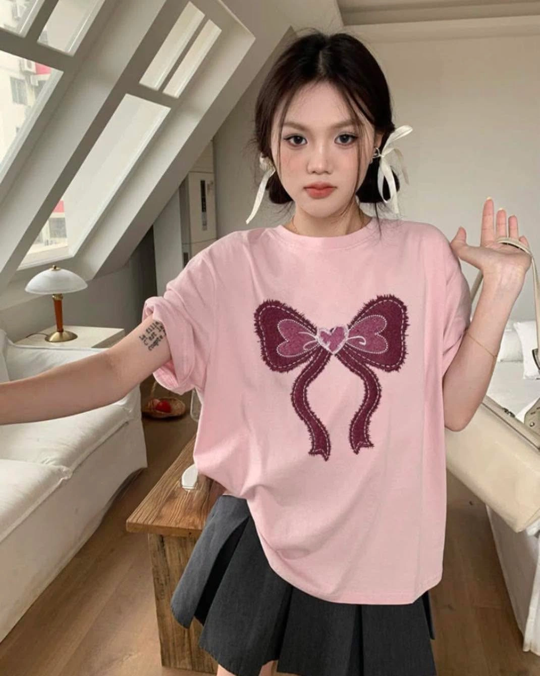
Photo via Instagram
The large burgundy bow on the shirt is echoed by smaller white ribbon bows near the hair, so one idea appears at two very different scales. Because the colors are not copied exactly, the repetition stays playful rather than overly matched. The eye notices the shared bow shape first, which is enough to connect the details without turning them into a set.
Pink carries most of the visual sweetness, but the charcoal skirt keeps the lower half graphic and grounded. The darker pleats also give the oversized tee a clearer edge, so the look stays casual without becoming shapeless.
3. Soft Color Gets Definition From Texture
Pale pink and white sit close together in value, so the cardigan and trousers create a soft, low-contrast base rather than competing for attention. That restrained pairing makes the outfit feel calm at first glance. The interest comes from how the colors leave room for one darker element to change the balance instead of relying on several loud accents at once.
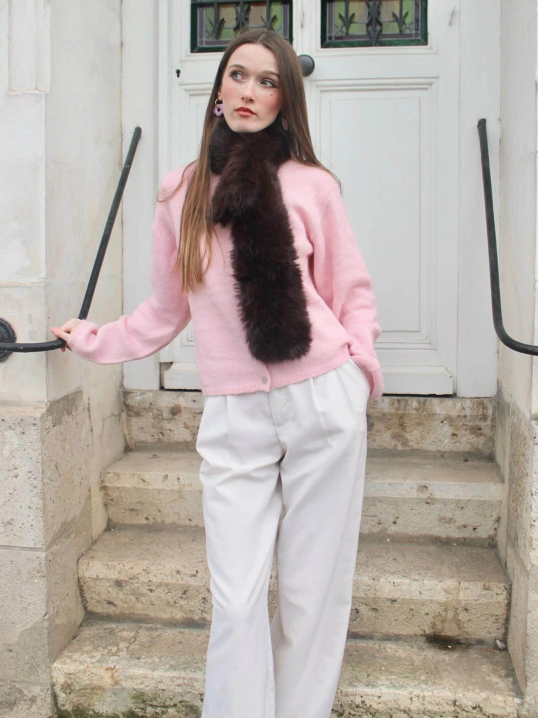
Photo via Instagram
The long dark scarf drops vertically through the center of the outfit and introduces far more visual weight than the surrounding pieces. Its deep tone and textured surface interrupt the pale palette without breaking it into separate blocks. That is what gives the look an aesthetic quality: texture becomes the focal shift, while the underlying colors remain gentle and uncomplicated.
Because the scarf is elongated, it also creates a strong vertical path over the softer cardigan. The loose white trousers continue the light base below, letting the darker texture stay concentrated near the center rather than spreading across the whole outfit.
4. Long Layers Gain Shape Through Asymmetry
A long black outer layer gives the outfit a strong vertical frame, extending from the shoulders toward the ankles while dark loose jeans continue much of that line. The silhouette covers more of the body, but it does not feel visually flat because the layers do not fall in perfectly parallel columns. That makes the modest outfit feel intentional through shape rather than through decorative detail.
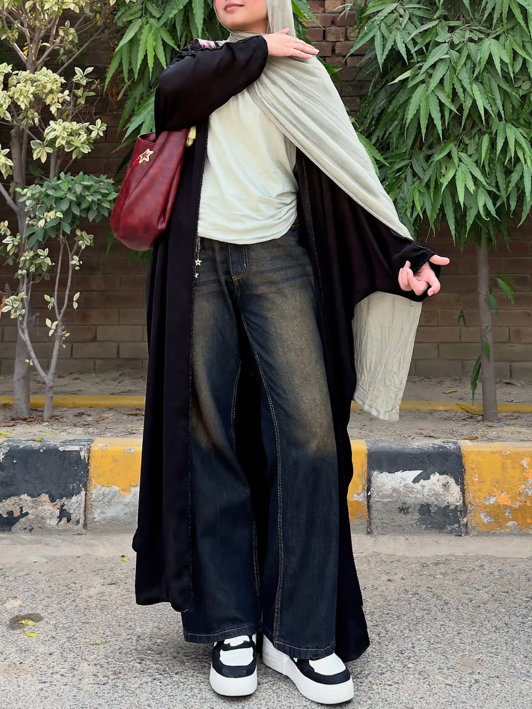
Photo via Instagram
The pale fabric draped across the upper body breaks into the dark base at an angle, creating an irregular contrast instead of a centered stripe or neat panel. Its lighter tone pulls the eye across the torso and changes the direction of the silhouette. The asymmetry matters because it keeps the long black layer from reading as one uninterrupted block.
Loose denim and chunky black-and-white sneakers keep the extended silhouette rooted in casual dressing. The burgundy shoulder bag adds a small separate color note, but the main visual story remains the contrast between the dark vertical frame and the pale drape.
5. Stripes Connect With Small Blue Echoes
The dark jacket stays relatively compact above wide-leg striped trousers, so the outfit shifts quickly from a contained upper half to a longer, more fluid lower silhouette. That proportion change gives the stripes room to do more than decorate the fabric. Their vertical direction reinforces the length of the trousers and makes the lower half feel especially active.
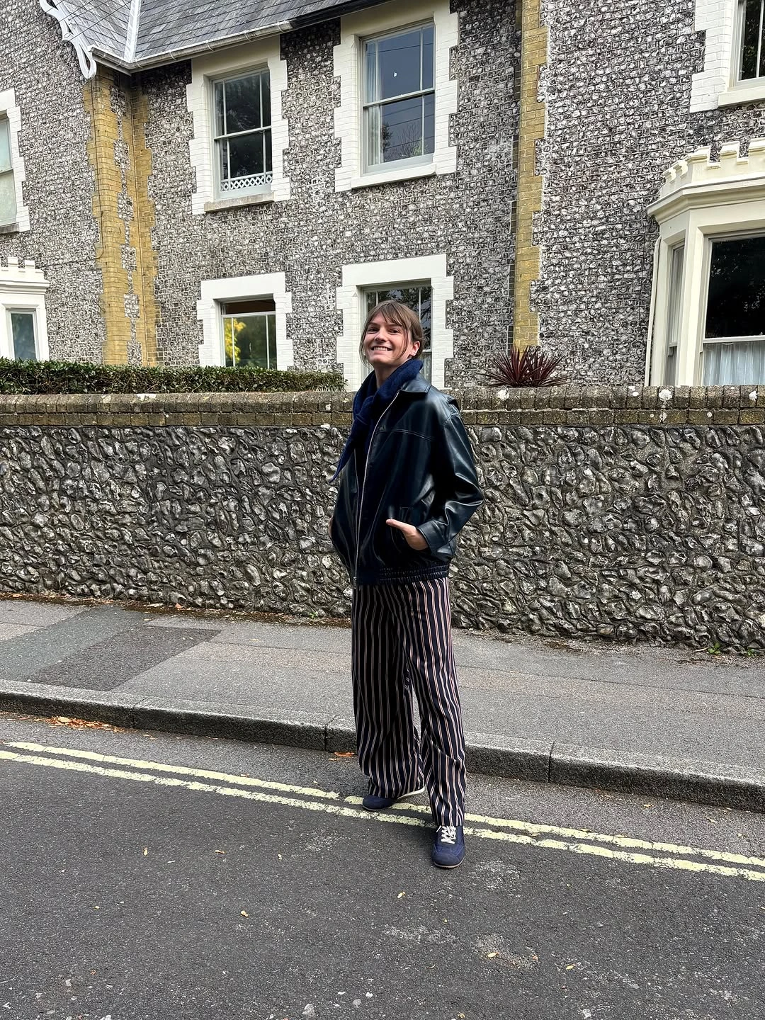
Photo via Instagram
Narrow stripes create repeated movement below the waist without introducing another strong color family. Instead, deep blue appears near the neckline and again at the shoes, producing a quiet echo at opposite ends of the outfit. That small repetition is enough to make the cute casual styling feel connected even though the dominant pieces remain dark.
The blue accents work because they are separated rather than clustered in one place, encouraging the eye to travel through the full look. Meanwhile, the striped trousers carry most of the pattern, so the jacket can stay visually simple without making the outfit feel plain.
6. Minimal Contrast Makes Proportion Do the Work
The oversized white button-down carries most of the visual volume, with its long sleeves and relaxed shape spreading outward above a much darker lower half. Because the shirt is so simple in color, its scale becomes the detail worth noticing. This is where simple outfits can feel intentional without needing print, ornament, or a complicated palette.

Photo via Instagram
Loose black trousers, black footwear, and the rounded black shoulder bag create a continuous visual counterweight beneath and beside the white shirt. Instead of separating into several competing details, those darker elements read almost as one supporting zone. That concentration of black makes the generous shape of the white top appear even more pronounced.
Limiting the look to black and white makes differences in silhouette unusually clear. The sunglasses add another dark point near the face, but the main interest still comes from the contrast between an expansive top and a long, restrained lower line.
7. Pink Feels Different Against Deep Brown
A pink polka-dot blouse brings obvious playfulness, but the long chocolate-brown skirt changes how that print reads. The darker lower half gives the blouse a deeper visual setting instead of continuing with more pastel color. For cute summer outfits, that pairing shows how a cheerful pattern can stay light while the surrounding palette becomes richer.
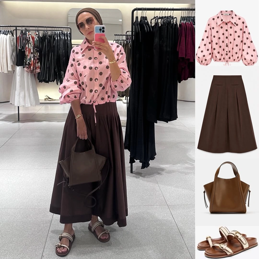
Photo via Instagram
The blouse has a classic collared shape, so the dots provide most of its expressive energy rather than the silhouette itself. Against the broad brown skirt, the pink stands out through hue while the small dark spots connect more quietly to the deeper tones below. The relationship feels coordinated through contrast instead of through exact color repetition.
A brown tote and open strappy sandals extend the lower palette beyond the skirt, making chocolate tones feel like the outfit’s foundation. That continuity lets the pink blouse remain the playful feature without leaving the accessories visually disconnected.
8. Tailoring Loosens Up With Casual Pieces
The burgundy blazer brings a tailored outline, yet the white graphic T-shirt underneath immediately softens that formality. Rather than building a fully polished suit-like combination, the outfit lets a structured outer layer sit beside an easy everyday top. That mix gives cute casual outfits character through contrast in garment type, not just through color.
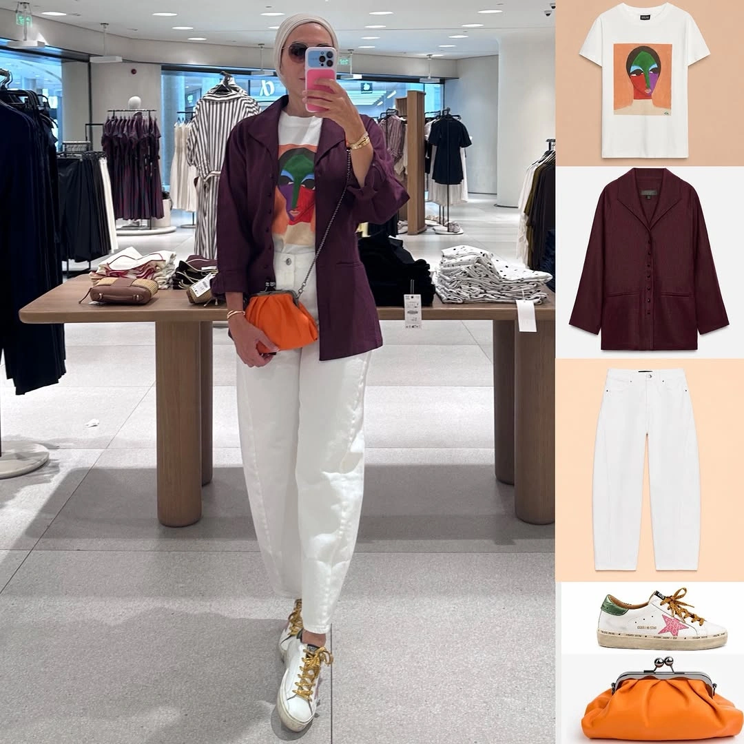
Photo via Instagram
White trousers continue the light tone of the T-shirt, while pale sneakers extend that base all the way to the ground. Because so much of the center and lower half stays light, the burgundy blazer reads as a distinct frame rather than part of a dark block. The clean base also makes the styling feel relaxed despite the sharper outer layer.
The small orange bag introduces a bright accent that does not copy the burgundy exactly. Its warmer, more vivid color sits beside the blazer as an independent note, adding energy without turning the outfit into a rigidly matched set.
9. Cropped Hems Lighten a Long Trench
A long taupe trench coat establishes most of the vertical length, but the cropped black pants stop well above the shoes and interrupt that extension. The exposed lower leg creates breathing room between the heavier outer layer and the dark flats. That shift in proportion gives the aesthetic outfit a lighter finish than full-length trousers would create.
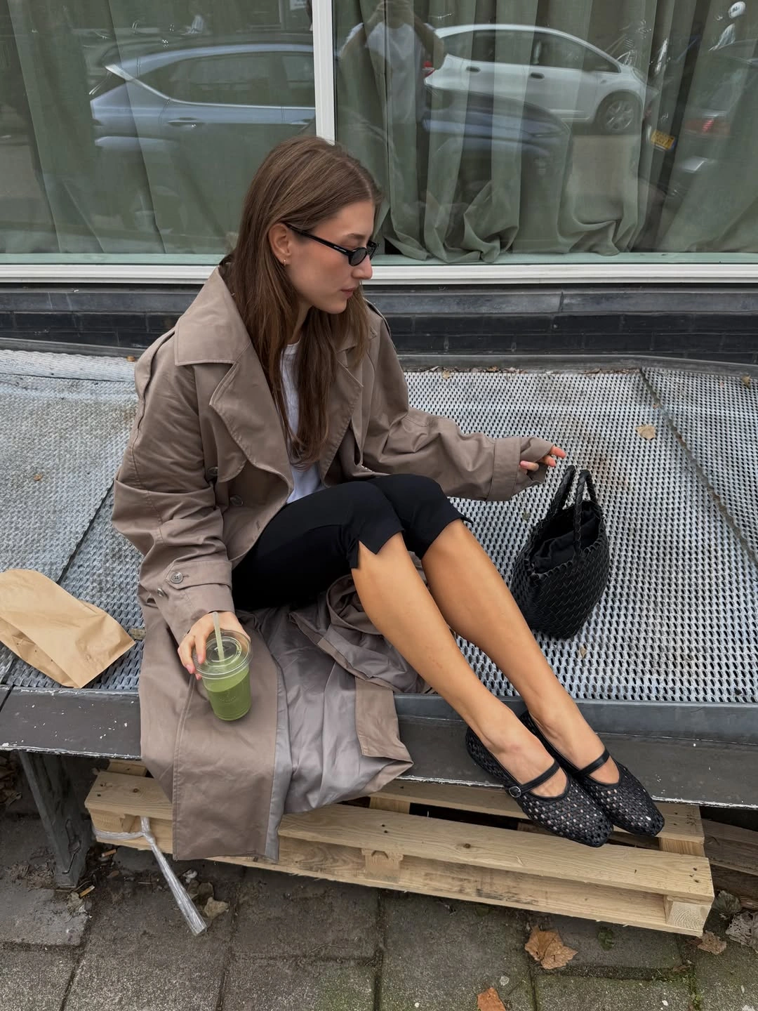
Photo via Instagram
The Mary Jane-style flats stay close to the foot and have visible surface detail, so they add interest without introducing much visual bulk. Paired with the shortened trouser line, their low profile keeps the bottom of the silhouette delicate. This makes the contrast with the longer trench more noticeable and gives the outfit its strongest proportional tension.
Taupe softens the mostly black-and-white foundation without turning into a bright accent. The black woven bag links back to the trousers and shoes, while the trench remains a quieter middle tone between the light top and darker accessories.
10. Chocolate Brown Gains Depth Through Surface Changes
Chocolate brown appears across the wide-leg trousers, collared top, structured bag, and footwear, yet the outfit avoids reading as one uninterrupted block. The pieces change shape significantly from top to bottom, with a narrower striped upper half meeting much broader trousers. That makes the tonal approach feel layered through silhouette as much as through color.
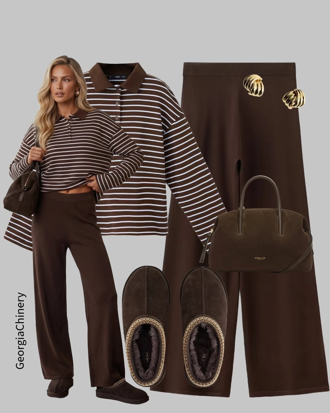
Photo via Instagram
Narrow white stripes cut across the brown top and introduce a regular pattern without abandoning the overall chocolate palette. They give the upper half definition while leaving the trousers solid and visually calmer. In simple outfits, that kind of restrained pattern can create separation between pieces without requiring a new dominant color.
The structured bag has a smoother appearance, the trousers spread into a wide silhouette, and the dark slip-ons add a visibly softer textured finish. Small gold accessories contribute a lighter metallic detail, so the brown palette stays cohesive while the surfaces remain distinct.
11. Relaxed Proportions Keep Soft Neutrals Interesting
The sweatshirt and wide-leg pants both use roomy shapes, so neither piece has to act as the sharp counterpoint to the other. Instead, the silhouette feels deliberately loose from shoulders to hem, with volume distributed across the whole look. That makes the styling read as relaxed through proportion itself rather than through a standout detail.
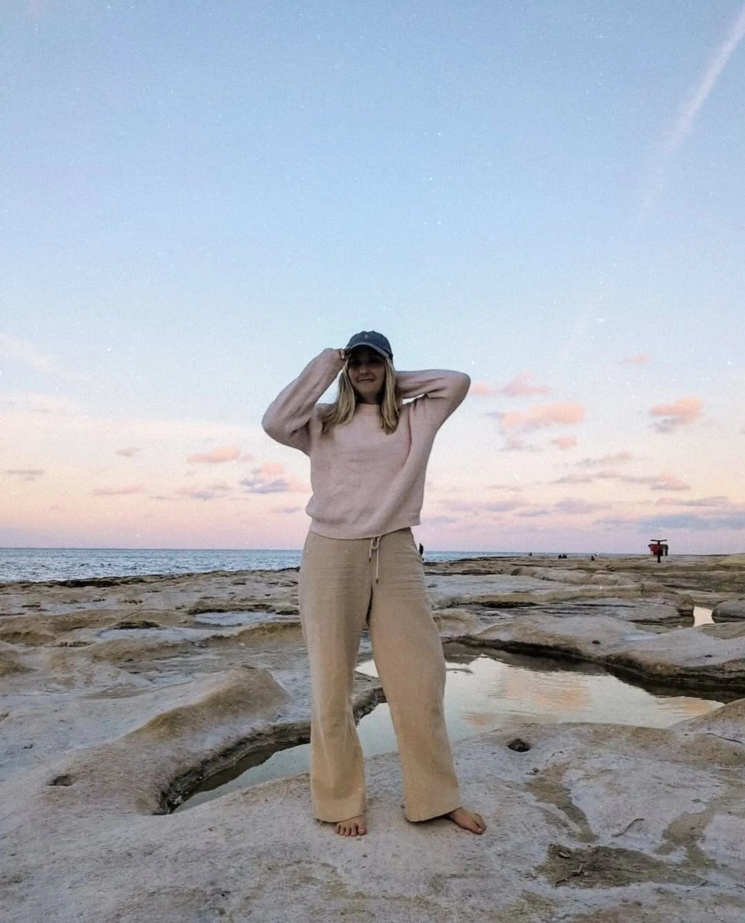
Photo via Instagram
Blush pink and beige sit close together visually, creating a muted palette that lets the overall shape stay in focus. The dark baseball cap provides one compact point of contrast near the top without changing the soft character of the clothing below. It is a useful example of the visual language associated with comfy outfits without making any claim about how the pieces actually feel to wear.
Bare feet leave the bottom of the silhouette visually open rather than adding another dark or substantial element beneath the wide pants. Against the visible rocky shoreline, the pale clothing remains the dominant soft shape while the cap gives the outfit its clearest point of definition.
12. Red Looks Richer Beside Chocolate Brown
Bright red becomes more interesting here because it is paired with deep chocolate brown instead of the more expected black or white. The short-sleeve top supplies a concentrated block of saturated color, while the darker trousers give it a softer, earthier base. The result feels vivid without relying on multiple bright shades at once.
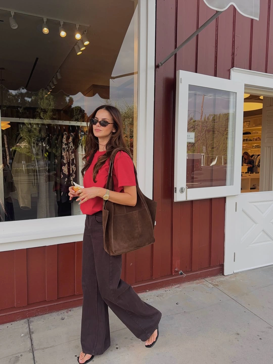
Photo via Instagram
The wide-leg trousers create a relaxed countershape beneath the compact red top, letting the lower half move away from a narrow or sharply tailored line. A large brown tote continues the chocolate family without matching the trousers exactly, so the color relationship feels connected rather than rigid. Dark flat sandals keep the base visually understated.
Sunglasses add another dark detail near the top, giving the red shirt a small visual boundary without competing with it. For cute summer outfits, the combination shows how short sleeves and flat sandals can sit within a deeper brown palette instead of relying on pale seasonal colors.
13. Pastels Meet at the Sock Line
Cream, pale pink, and beige stay within a gentle color range, but the look does not depend on a single uninterrupted pastel block. The long cream graphic top sets the lightest area, while pink appears in smaller doses at the socks and backpack. Beige knee-high boots add a slightly deeper neutral that gives the lower half more definition.
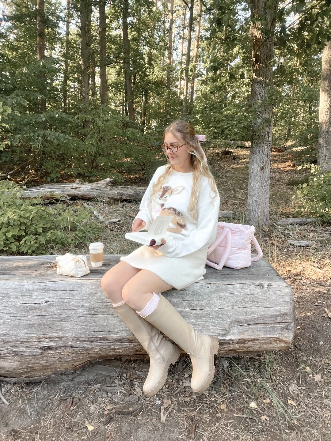
Photo via Instagram
The most distinctive junction is where the pale pink socks remain visible above the beige boots. That narrow band of color creates a deliberate break between the long cream top and the footwear, giving the outfit a small but precise point of interest. The soft pink backpack repeats the blush tone elsewhere without turning every accessory into an exact match.
The graphic on the cream top introduces another point of detail while leaving the soft palette intact. The result fits an aesthetic outfit approach built on small color placements, where the relationship between socks, boots, and backpack carries more of the character than a single dominant statement piece.
14. A Pale Hip Layer Changes the Geometry
A long black coat and dark legwear create an extended vertical silhouette, but the cropped deep-plum top prevents the upper half from becoming completely monochrome. The plum is subdued enough to stay within the dark palette while still separating the torso from the outer layer. That small shift in color makes the silhouette feel more constructed than simply all-black.
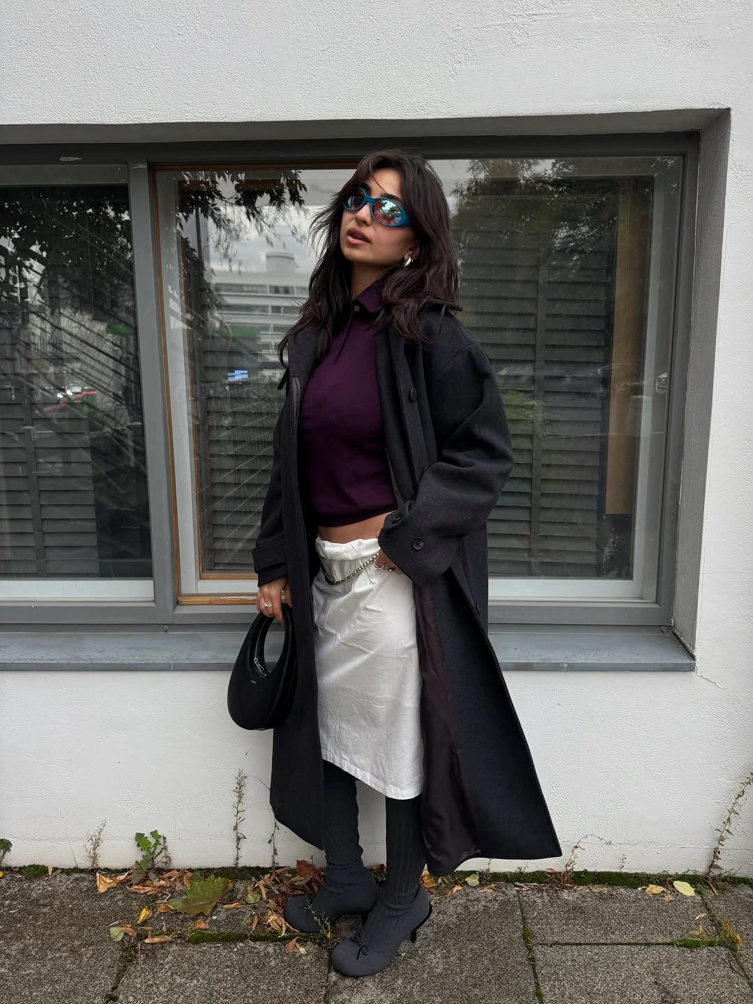
Photo via Instagram
The white wrap-like layer around the hips introduces the most experimental part of the outfit because it sits off-center and cuts across the darker base. Rather than forming a conventional straight hem, the pale panel changes the geometry of the lower torso and creates a strong interruption between coat and legwear. A small black bag keeps the remaining accessories visually contained.
Black footwear continues the dark foundation beneath the pale hip layer, allowing that irregular shape to remain the clearest structural change. Among aesthetic outfits, this one stands apart through placement and layering rather than print, ornament, or a broad range of colors.
15. Exposed Shirt Edges Relax Tailored Layers
The gray herringbone-pattern blazer gives the outfit a tailored outer shape, but the white shirt refuses to disappear neatly underneath it. Visible cuffs and a longer white hem break through the darker layers at several points, which makes the structure feel less strict. The effect comes from deliberate exposure rather than from adding another decorative piece.
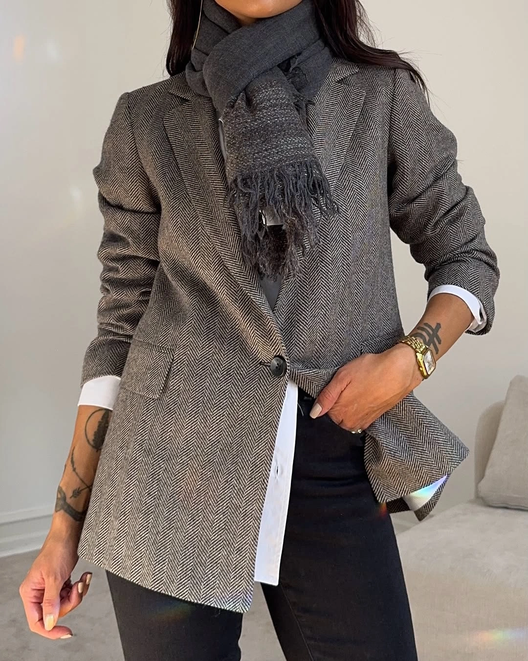
Photo via Instagram
A dark scarf wrapped high at the neck concentrates texture and visual weight close to the face while the blazer stays comparatively clean through the torso. Below, black trousers continue the restrained palette and let the white shirt edges register clearly. For modest outfits, this is a strong example of how layering can create interest without depending on bright color or exposed skin.
The herringbone pattern gives the gray blazer a subtle surface change that rewards a closer look without dominating the outfit. With white showing at both cuffs and hem, the tailored layers feel deliberately loosened rather than perfectly sealed into one formal block.
16. Warm Layers Reshape the Waistline
Rust-orange dominates the upper half through the lightweight jacket, while the shirt tied at the waist introduces a second warm note without becoming another full layer on the torso. Because both colors stay in the red-orange family, the outfit feels connected even before the plaid pattern enters. The pale gray trousers then give those warmer pieces enough visual space to stay distinct.
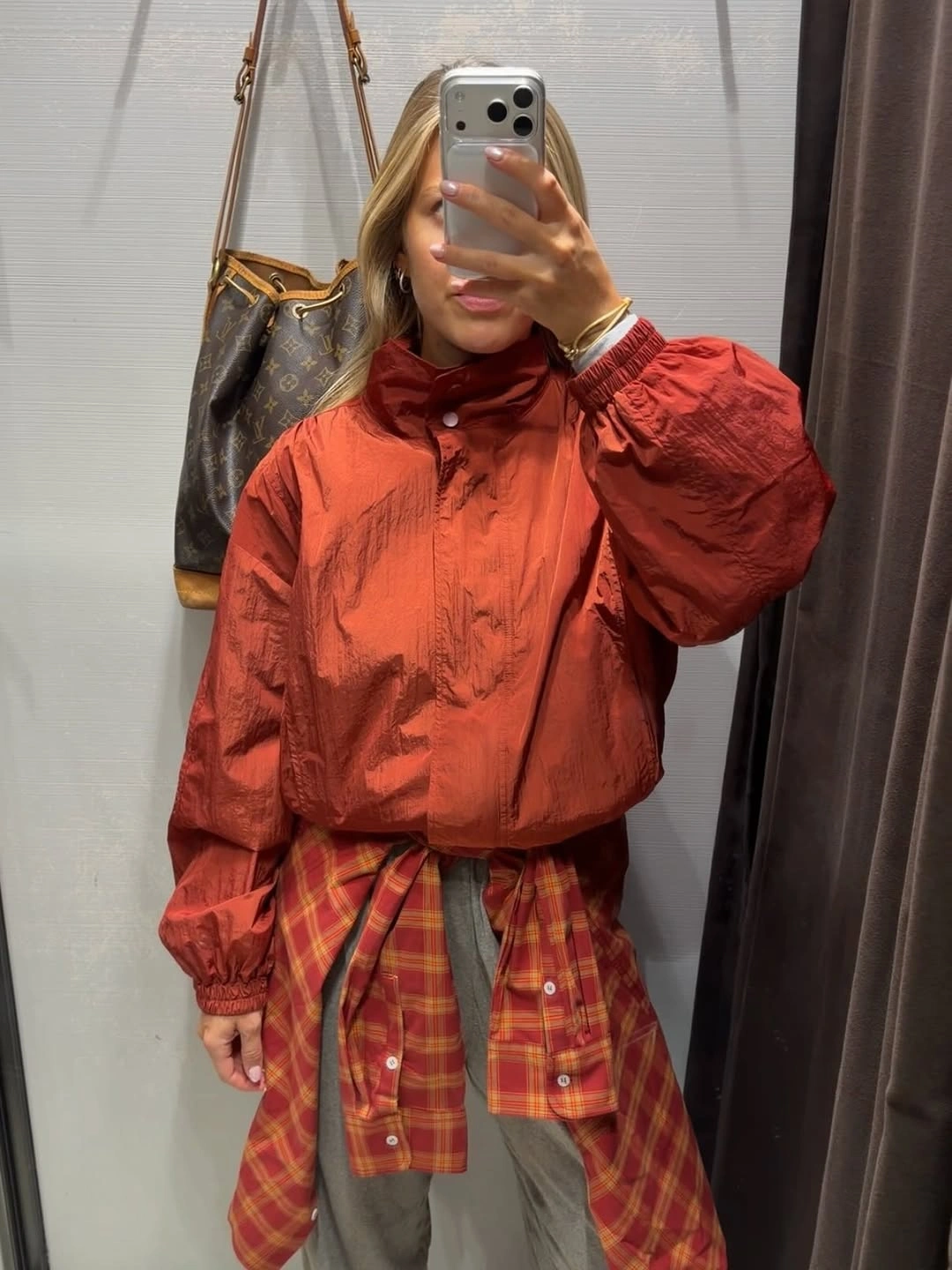
Photo via Instagram
The plaid shirt matters most at the waist, where its checks create a horizontal interruption and slightly reshape the silhouette around the hips. Rather than reading as a spare accessory, it becomes part of the outfit’s structure and adds movement to an otherwise simple combination. That makes the cute casual styling feel built through placement as much as through color.
The pale trousers separate the rust jacket from the red-orange plaid instead of extending the warm palette all the way down. That break lets the tied shirt register as a deliberate middle layer with its own role in the silhouette.
17. Plaid Carries an Everyday Denim Look
A plain white T-shirt and loose light-wash jeans create an uncomplicated base with very little visual competition. The blue-gray plaid overshirt carries almost all of the pattern, so it can add detail without changing the relaxed proportions underneath. This is the kind of simple outfit where one familiar layer does the expressive work while the rest stays deliberately easy to read.
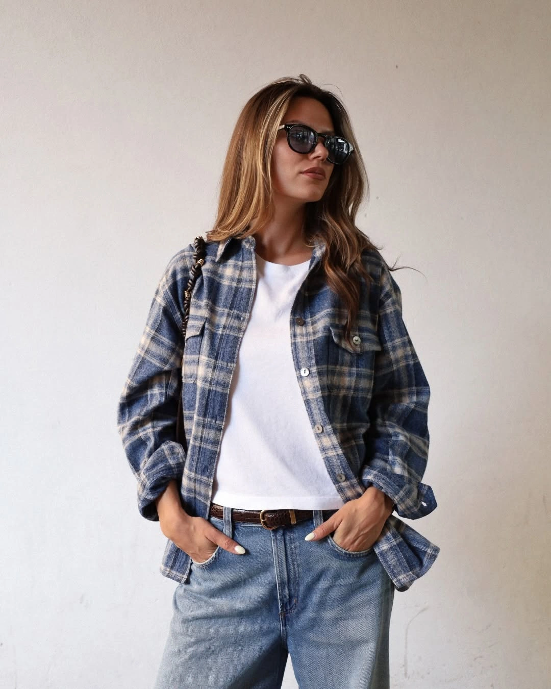
Photo via Instagram
The overshirt hangs open enough for the white center to remain visible, which keeps the plaid from taking over the whole upper half. A brown belt cuts across the cool blues and pale denim with one small warm accent, while dark sunglasses and the shoulder strap add darker punctuation. The result feels casual because the details stay separated rather than crowded together.
The brown belt is especially useful visually because it interrupts the blue-gray range without introducing another large garment. Its narrow placement gives the waist definition while the loose jeans and overshirt preserve the outfit’s easy proportions.
18. Texture Separates a Quiet Neutral Palette
Cream, gray, and taupe sit close together, yet the outfit stays clearly divided because each layer has a different surface and shape. The outer jacket looks heavily textured, the sweater shows a distinct cable pattern, and the wide trousers introduce crisp pleats below. Those changes create separation without needing a sharp jump in color.
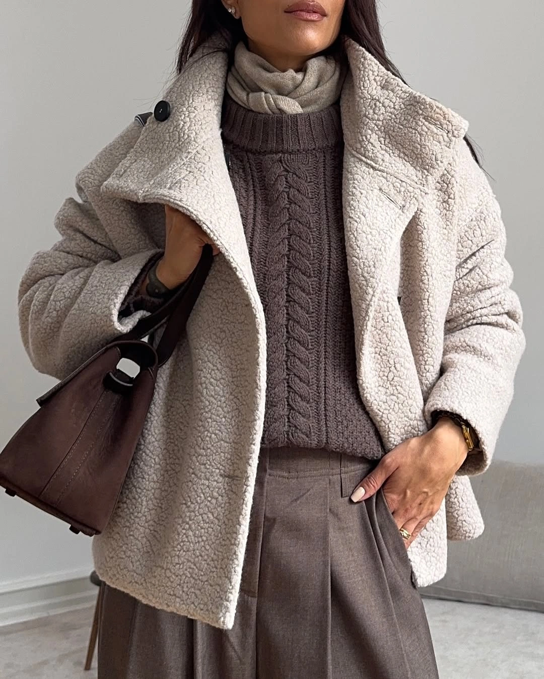
Photo via Instagram
Around the neckline, multiple gray layers build depth before the cream outer piece begins, so the upper half feels deliberately stacked rather than flat. The taupe trousers then shift the focus downward through broad pleats and a generous line, while the dark brown tote adds a firmer edge at the side. For modest outfits, the interest comes from construction and texture rather than exposure or bright contrast.
The pleats give the lower half a different kind of structure from the textured layers above, so the outfit never collapses into one soft neutral mass. Meanwhile, the dark tote introduces a clean boundary at the side without changing the restrained palette.
19. Red Tailoring Frames a Denim Column
The dark denim top and matching jeans form an almost continuous central column, giving the outfit a steady base from torso to ankle. Over that, the bright red jacket acts like a structured frame, defining the shoulders and sides with a much sharper color boundary. That relationship lets the tailoring stand out without requiring extra print or decorative layering.
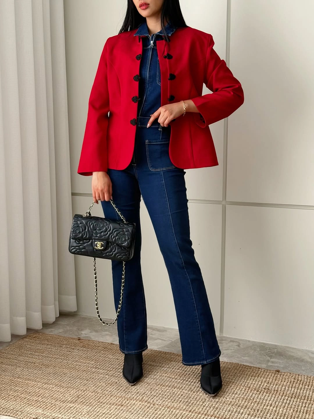
Photo via Instagram
Black pointed boots continue the dark line below the jeans, while the small quilted bag picks up the jacket’s dark fastenings and keeps those accents connected. Because the black details stay close to the denim in value, they support the red rather than competing with it. Among cute outfits for women, this one feels especially polished because color and structure do most of the work.
The jacket’s clean outline makes the denim center look even more continuous, turning a familiar top-and-jeans pairing into a stronger composition. The pointed footwear sharpens the lower edge as well, reinforcing the polished direction without changing the outfit’s limited palette.
20. Cobalt Frames a Relaxed Plaid Base
The white T-shirt keeps the center of the upper body open and visually simple, leaving room for the cobalt-blue sweater to define the shoulders from above. Because the knit is draped rather than worn as the main top, the strongest color works more like a frame than a block. That small styling shift gives the outfit a preppy note without making the layering feel formal.
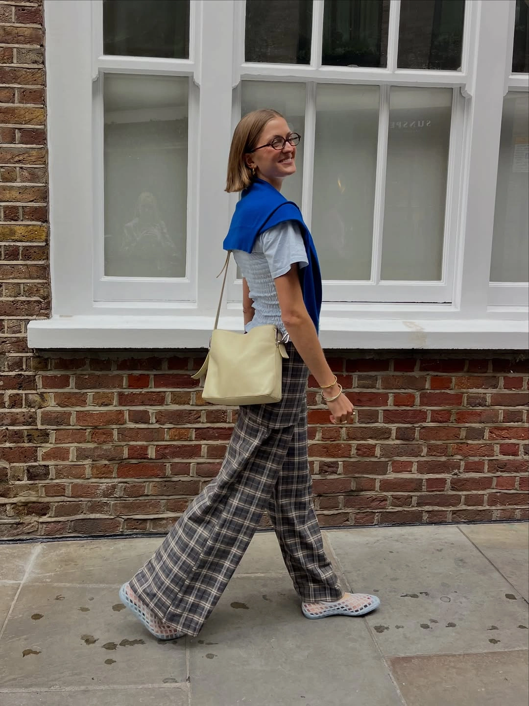
Photo via Instagram
Wide plaid trousers bring most of the pattern and movement, balancing the compact shoulder layer with a fuller line below. The pale bag and light patterned slip-ons keep the lower accessories from becoming heavy, so the trousers remain the dominant patterned element. As a cute outfit idea, the appeal lies in how the blue, white, and plaid occupy clearly different roles instead of competing for the same kind of attention.
Draping the sweater leaves the white T-shirt visible from neckline to waist, which keeps the cobalt from closing off the upper half. Below, the broad plaid trousers add enough visual activity to make the simple shoulder gesture feel purposeful rather than incidental.