Early fall nails 2026 do not need to abandon light color the moment the season changes. The more useful question is what relationship makes a pale manicure feel intentional: cool shimmer against shadow, creamy white beside dark fabric, a soft blush base interrupted by brown, or a saturated jewel tone held in a simple shape. This collection moves through those decisions so you can compare color temperature, value, sparkle, and placement instead of treating autumn as one fixed palette.
Use the references as a way to edit scale before you choose a shade. A long pointed almond can carry reflective detail that would overwhelm a short square, while a tiny accent or a clean edge can make a familiar color feel new without adding a full pattern. The strongest early fall nails ideas here keep one visible choice in charge, then use the rest of the manicure to support it through shape, spacing, or a controlled contrast.
1. Icy Silver Shimmer on a Long Almond
The first manicure makes a cool pale silver-white shimmer the main decision, then lets the long pointed almond silhouette reinforce it. Fine reflective particles run across the softly glossy surface, so the nails look brighter where the light lands and quieter in the shadowed parts of the hand. That change in value keeps the neutral from reading flat, while the dark setting gives the pale finish a distinctly early-fall edge.
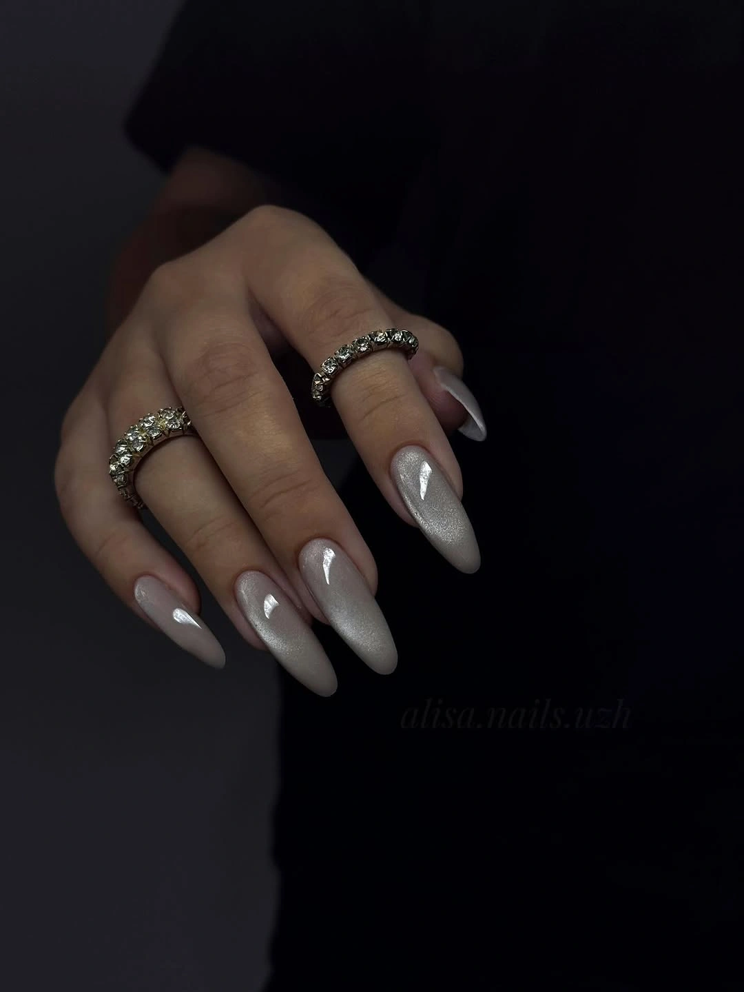
If you want the same color relationship without committing to the full length, shorten the almond until the tip feels comfortable and let the shimmer remain continuous. An oval would soften the point, while a short almond would preserve the forward direction that makes the pale color look elegant. Keep the rings or other accessories quieter if you want the reflective surface to stay the first thing the eye notices.
The tradeoff is clear: the long point creates the most visible shape, but it also makes everyday contact and grow-out more noticeable. I would keep the base pale and the sparkle fine rather than adding another color, because the contrast between cool light and dark surroundings already supplies enough structure. The idea works when the silver stays readable as a soft neutral instead of turning into a collection of competing highlights.
2. Turquoise Centers Framed by Deep Brown
Here, bright turquoise carries the saturation while deep brown-looking framing gives the color a seasonal anchor. The nails are short to medium with rounded-square edges, and the blue appears lighter toward the center of the visible surfaces, which makes the darker border feel intentional rather than accidental. It is a useful example of changing value around a vivid color: the turquoise stays lively, but the surrounding depth stops it from feeling purely summery.
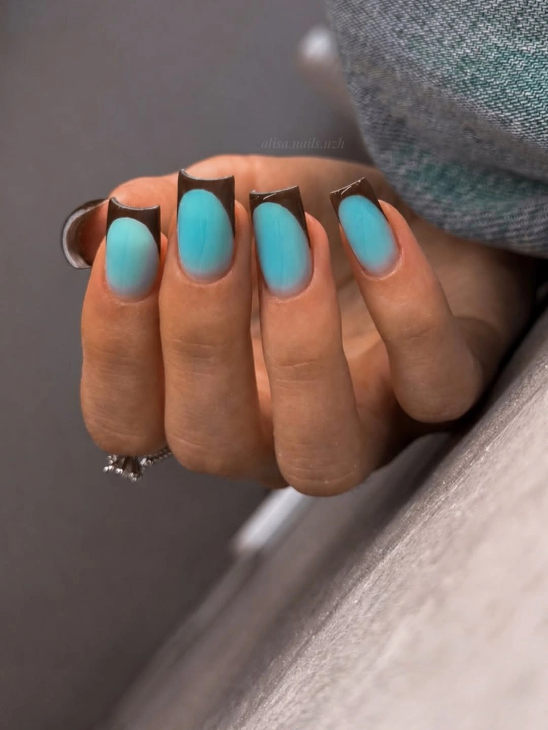
For an easier adaptation, keep the turquoise on every nail and move the brown to two accents, or make the framing thinner so more of the blue remains visible. A shorter squoval would keep the color block neat without changing the contrast, while a muted teal would lower the saturation if the bright center feels too loud. Choose one variable to change at a time so you can see whether the seasonal effect comes from the darker frame or from the blue itself.
The close crop softens the exact edge placement, so the useful takeaway is the color relationship rather than a named technique. The manicure succeeds because the warm dark note gives the cool turquoise a boundary, and the compact shape keeps that boundary from spreading into a large graphic statement. If you repeat the idea, preserve the cool center and the deep support color even when the proportions become simpler.
3. Sheer Silver Tips with Fine Ornament
This long pointed set starts with a pale translucent-looking base, then concentrates silver sparkle and fine curving lines near the tips and across selected nails. The pointed shape creates a narrow visual path, so the ornamental marks feel elongated instead of crowded. A pale base remains visible between the lines, which is why the design can carry several small details without losing the lightness that makes it suitable for the first cool weeks of fall.
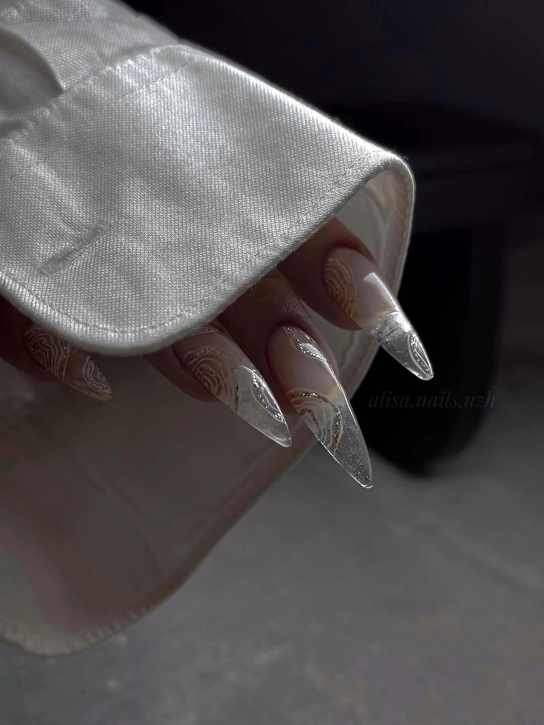
To make the balance more practical, keep the sheer base and place the decorative lines on two nails rather than repeating them across the full hand. A shorter almond can still support a tapered tip, but the motifs should become wider and fewer as the surface gets smaller. That adjustment protects the negative space, which is doing as much work here as the sparkle and keeps the ornament from becoming a solid block.
The most honest limitation is upkeep: long points and fine tip detail ask for a cleaner edge than a plain color does. I would avoid adding another strong shade, because the silver already supplies contrast against the pale base and the dark background. The look stays coherent when the reader can see three layers in order – translucent space, a bright tip, and a small curved accent – rather than all details arriving at the same visual volume.
4. Creamy White on a Clean Short Square
A creamy opaque white surface gives this short square manicure its entire identity. The softly rounded corners keep the geometry approachable, while the glossy reflections show that the color is not a chalky flat block. Against dark fabric, the pale value becomes a clear focal point, so the design does not need glitter, lines, or accent nails to feel finished. It is a useful baseline for comparing how much a simple color can do.
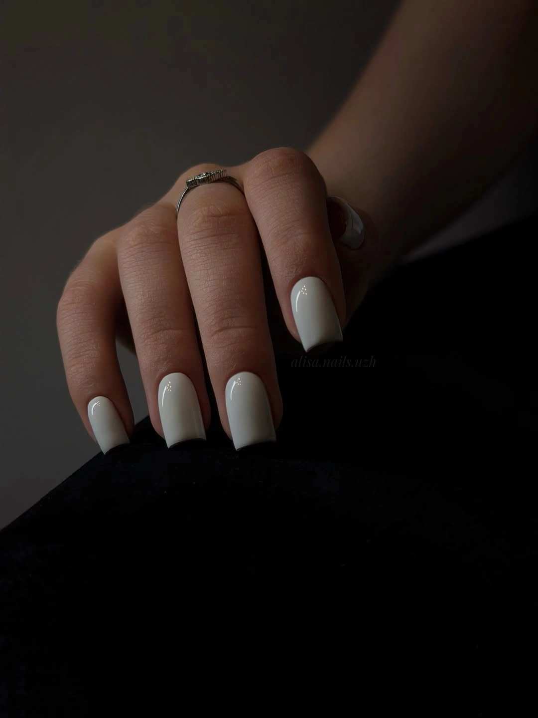
Shorten the corners slightly if you want the same clean shape to feel more relaxed, or keep the square and change only the white toward a warmer cream. That single shift will make the manicure blend more softly with tan, camel, and brown clothing, while a cooler white would sharpen the contrast. The choice is less about adding detail and more about deciding how much separation you want between the nail color and the rest of the look.
Pale opaque color can show edge wear quickly, especially when the shape is squared, so the simplicity should be treated as a reason to keep the outline tidy. I would not add a seasonal motif unless the plain surface feels too quiet; one darker accent would change the value pattern immediately. The strongest version preserves the even length and lets creamy white function as the calm space between more decorated references.
5. Emerald Fine Glitter in a Short Square
Emerald green shifts the collection from cool pale neutrals into a saturated jewel tone, but the short square shape keeps the color from becoming overly theatrical. Dense fine glitter covers the visible surface, creating many tiny points of light rather than a few large pieces, and daylight makes the green move between teal and deeper emerald. That variation gives a one-color manicure more depth without asking a motif to carry the design.
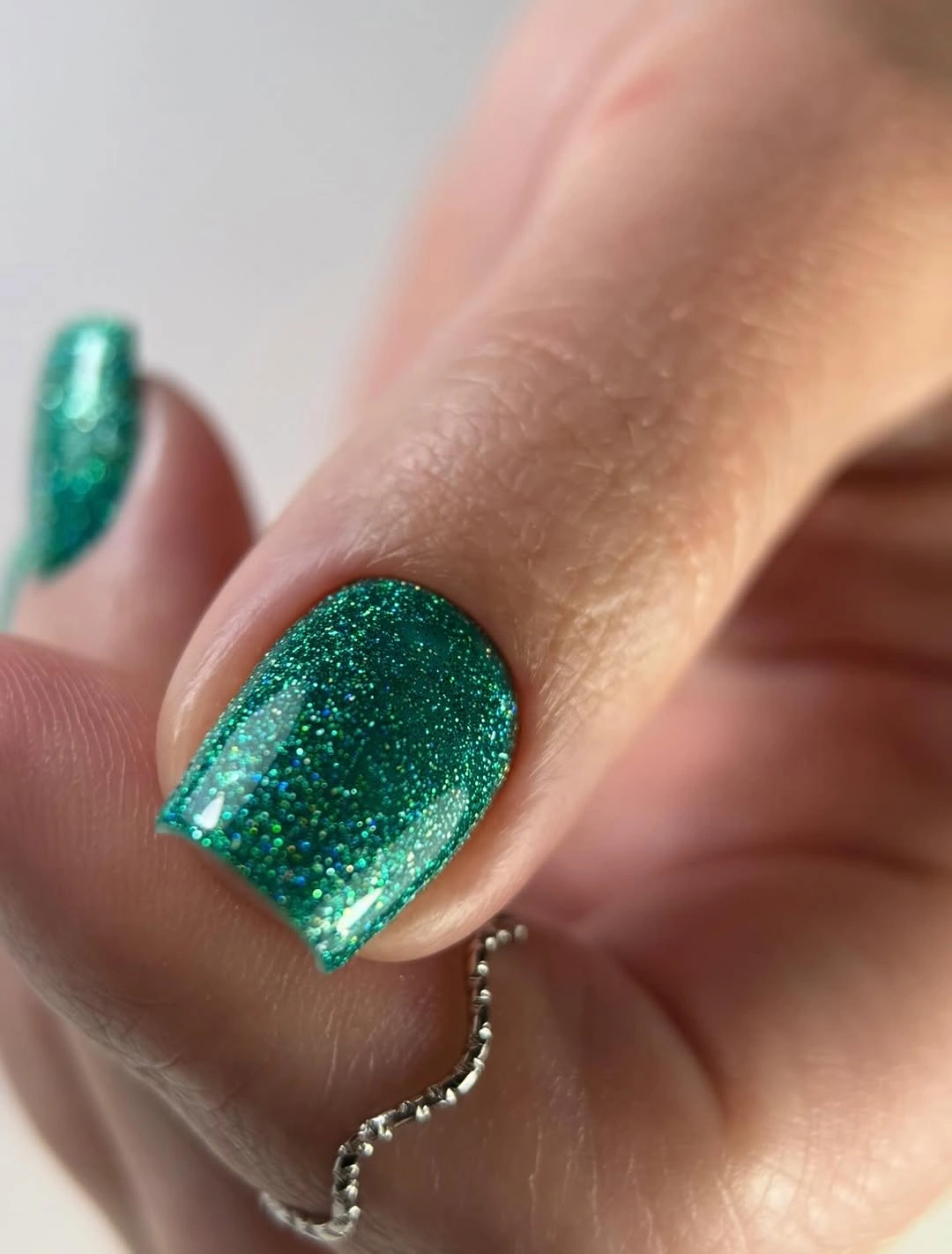
If the full glitter feels too concentrated, use the green on two accent nails and keep the supporting fingers creamy or sheer. You can also keep the short square and choose a softer shimmer, which lowers the sparkle while preserving the jewel-tone contrast. The important variable is particle density: reducing it changes the surface from a statement finish to a quiet glow without changing the green itself.
The macro view makes the glitter the obvious subject, so rings and other styling details should stay secondary when you adapt the idea. A short square is already the more wearable choice here, but the saturated color will still make chips visible against the skin. Keep the edges rounded and the green continuous if you want the manicure to read as a rich fall color rather than a collection of separate sparkles.
6. Pearly Almonds with Inner White Outlines
This pale pearly manicure uses a long almond silhouette and a narrow white outline that follows the center of each nail. The base is light silver-beige and softly reflective, while the repeated inner contour echoes the taper instead of fighting it. Because the line is placed inside the surface, the design feels graphic but not heavy; the eye reads the shape first, then discovers the detail that reinforces it.
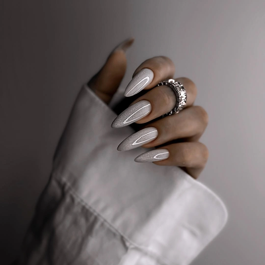
To adapt the idea to a shorter shape, move from long almond to oval and keep the contour on two accent nails. A thinner line will preserve the open base, while a thicker one will make the manicure more graphic and visually shorten the nail. That is a useful adjustment when the reader likes the defined border but does not want every finger to carry the same level of precision.
The pale value and the white outline are close, so the design depends on reflected light and line placement rather than a strong color jump. I would avoid adding glitter or dark accents because they would compete with the shape-following rhythm. The best result keeps the pearly surface quiet enough for the outline to guide the eye from the cuticle toward the tip.
7. Milky Pink, White, and Pale Blue Together
Soft color repetition makes this long almond set feel coordinated even though the visible nails move between milky pink, white, and pale blue. One nail carries a light curved accent, while the remaining surfaces use the three colors as quiet blocks, so the saturation stays low and the shape remains the strongest repeated feature. The cool blue adds contrast to the warmer pink without turning the collection into a loud multicolor mix.
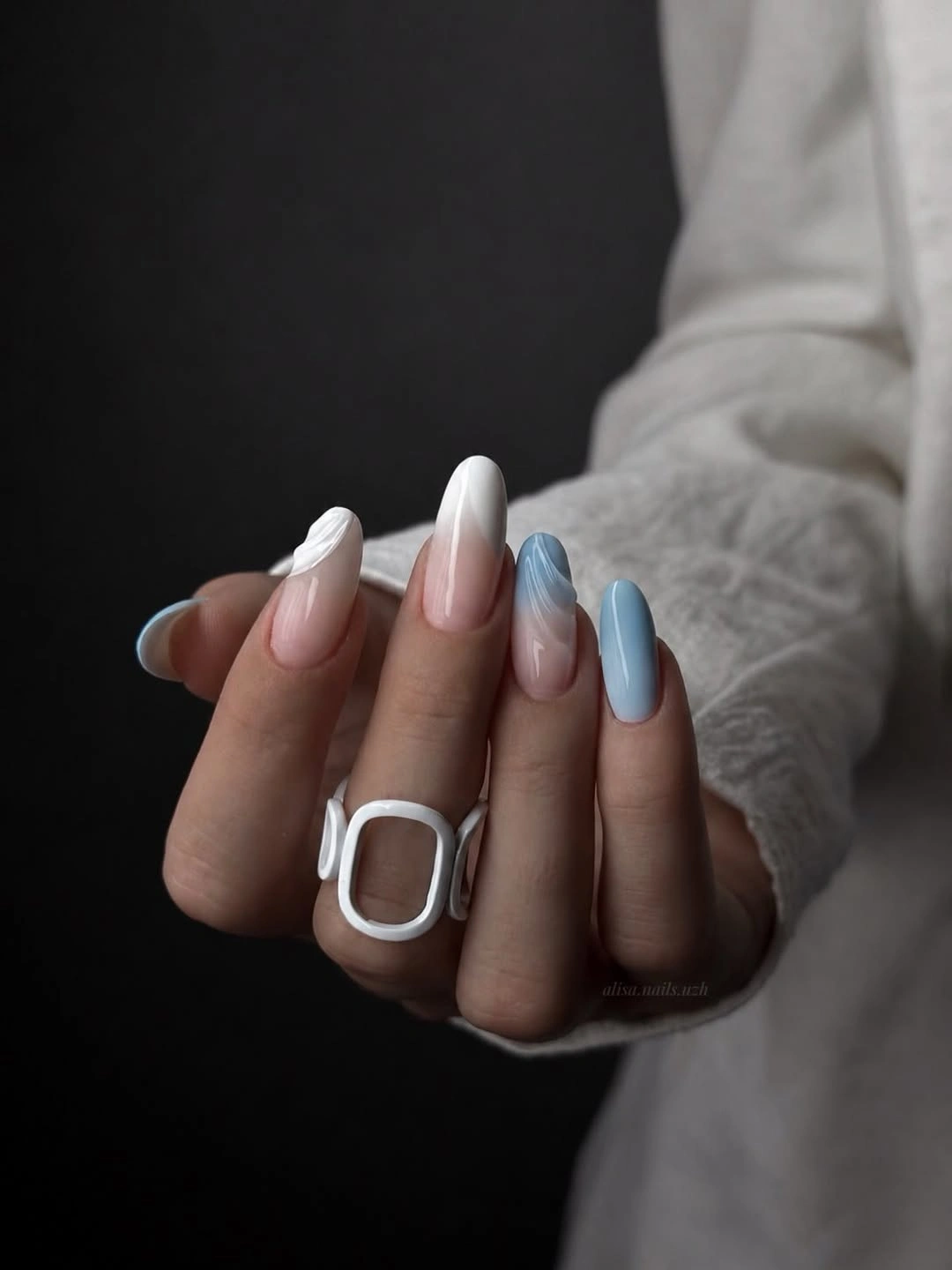
For a more controlled version, keep the milky pink as the base and let pale blue appear on two fingers, then remove the small line detail if the surface starts to feel busy. A shorter almond can preserve the airy direction, while an oval will make the color blocks look rounder and softer. Change either the number of colors or the length, not both, if you want to understand which part of the reference you actually prefer.
The light fabric and oversized white ring echo the palette, but the manicure itself remains balanced because no single color becomes too saturated. I would keep the supporting shades close in value when adapting it for early fall nails ideas; a much darker blue would change the mood and make the pink look more decorative. The quiet success here comes from repetition with small differences, not from exact matching on every nail.
8. Blush and Chocolate in Alternating Blocks
Pale blush and deep chocolate create a simple value pattern on short square nails. Several fingers carry the light glossy color, while two visible accents turn dark, giving the hand an easy rhythm that can be understood from a distance. There is no need for a painted motif because the alternation itself supplies emphasis, and the compact shape keeps the contrast from taking over the whole hand.
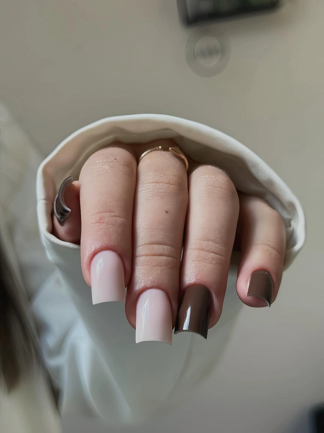
Keep the two dark accents if you want the strongest contrast, or use a deep green in the same positions for a cooler early-fall variation. A shorter square will make the color blocks more compact, while a rounded-square edge will soften the transition between the two values. The useful rule is to preserve the ratio of light to dark even if the exact shades change.
Dark polish can reveal uneven grow-out more clearly than pale polish, so placing it on only a couple of nails makes the maintenance story easier. I would avoid adding glitter to the brown because the reference is strongest when the eye reads a clean alternating sequence. The manicure succeeds through controlled repetition: blush gives relief, chocolate provides weight, and the square shape keeps both colors orderly.
9. Dark Brown Glitter with a Soft Rounded Edge
This short-to-medium manicure uses a dark brown-black base with fine glitter that appears only when the curved surface catches the light. The softly rounded nails make the dense color look less severe than it would on a long square, while the low-key sparkle adds a change in texture without introducing a second shade. It is a good example of using finish to create movement inside a nearly monochrome palette.
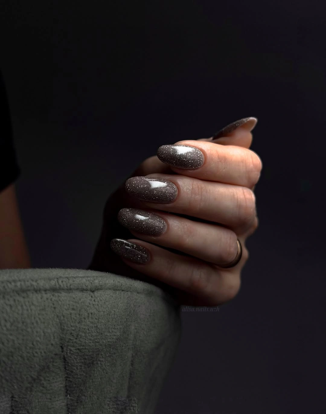
If you want the glitter to sit farther in the background, use the same dark brown on most nails and place the sparkle on two fingers. A short oval would make the surface look even softer, while a squoval would add a little more structure without creating a hard corner. These changes adjust the silhouette first, so the reader can keep the low-light sparkle that made the reference appealing.
The dark setting shows how much the finish depends on reflection, so the manicure may read closer to brown or black in different surroundings. I would keep the base deep and the glitter fine rather than searching for a brighter sparkle that could erase the quiet contrast. The practical takeaway is to let movement reveal the finish; the design does not need a visible motif to stay interesting.
10. Graphic Black Framing on a Sheer Nude
A translucent blush-nude center keeps this medium-long square manicure open, while dark framing at the edges and slim white oval lines create a graphic boundary. The strong perimeter gives the nail a defined silhouette, but the sheer middle prevents the look from becoming a full black block. Value contrast is doing the organizing work: dark outside, pale inside, then a narrow light line that repeats the central path.
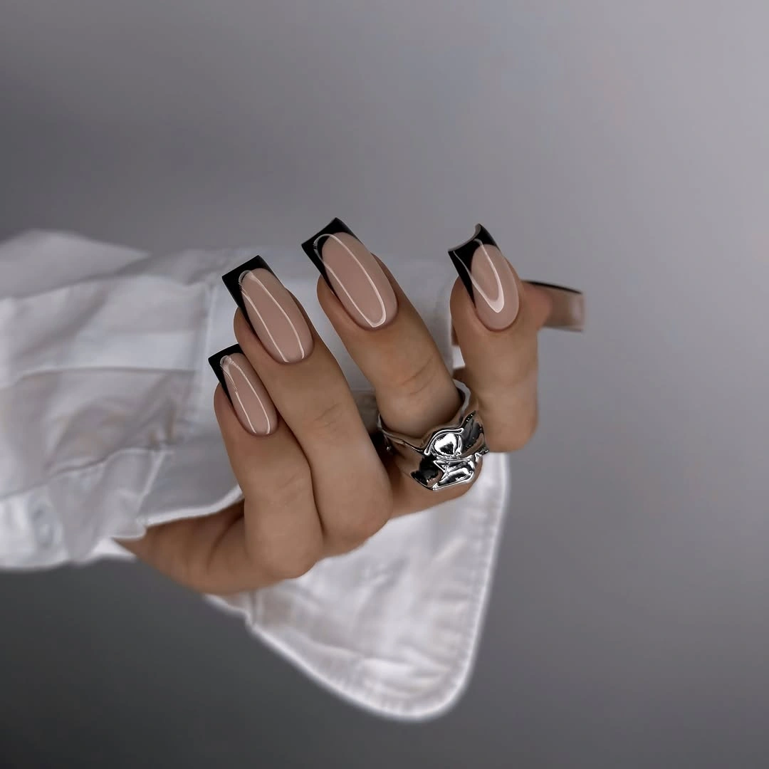
For a shorter adaptation, keep the dark edge only at the tip or reduce the inner oval to two accent nails. Deep brown can replace black if you want a softer transition against the blush center, while a slightly wider square will make the frame easier to keep even. Preserve the open middle, because filling it with another color would change the balance that makes the design feel light.
Precise borders can show grow-out and small unevenness, which is the realistic cost of a graphic outline. I would pair the design with simple rings and clothing so the manicure has room to read, then let one contrast remain dominant. The look is strongest when the dark perimeter feels like a frame around sheer space rather than a separate decoration laid over it.
11. Deep Navy on Medium Square Nails
Deep navy brings a saturated cool value to a medium square shape, and the uniform glossy surface keeps the color visually focused. It sits close to black in the low light, but the blue reflection becomes clearer where the white fabric catches the hand, which gives the monochrome a subtle shift. The result is a jewel-tone alternative to the brown, black, and pale neutrals without needing a pattern.
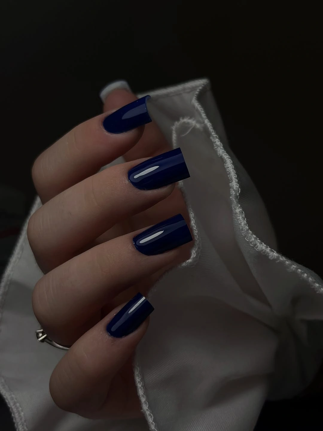
Shorten the square if you want the navy to feel more casual, or keep the length and use the color on four nails with one pale accent. A muted ink blue would lower saturation, while a brighter cobalt would make the same shape more energetic. The base decision is the depth of the blue, so change that variable before adding any extra decoration.
Because the color is nearly monochrome, edge quality matters more than motif placement. I would keep the rings and clothing in the background when styling it, since the white fabric already supplies enough value contrast to make the blue legible. The manicure works when the reader can see navy as its own color rather than treating it as black with a random blue reflection.
12. Sheer Blush with Sparse Confetti Accents
Short rounded-square nails carry a translucent blush base with small white, yellow, and pastel reflective pieces scattered across the surface. The accents do not form a dense pattern; instead, the pink space between them remains visible and gives the manicure a light, almost floating rhythm. This is a softer way to introduce decoration into early fall nails without making the nail bed look covered from edge to edge.
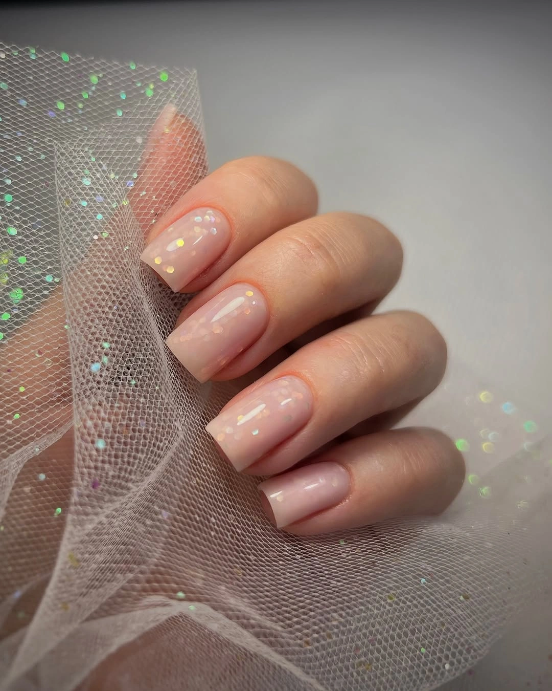
Use fewer pieces if you want the design to feel more grown-up, or place the scattered accents on two nails and keep the rest sheer blush. A short oval would make the arrangement gentler, while a square with a straighter edge would give the little shapes a more graphic setting. The key is spacing: the base should still be the first color the eye recognizes.
Tiny accents can become less readable on a very short surface, and a sheer base makes uneven edge work easier to notice. I would choose warm cream, muted yellow, or soft green pieces if you want a clearer seasonal connection, but I would not add a large motif on top. The collection works because the decoration behaves like texture and light, not like a second competing illustration.
13. Sky-Blue Tips on a Nude Square
A sheer neutral center makes the vivid sky-blue edge look crisp on these short square nails. The color is concentrated at the free edge, so the manicure feels fresh without giving up the clean shape that works well for everyday wear. This is a lesson in placement rather than saturation alone: a bright color can stay controlled when it occupies a narrow, repeated band.
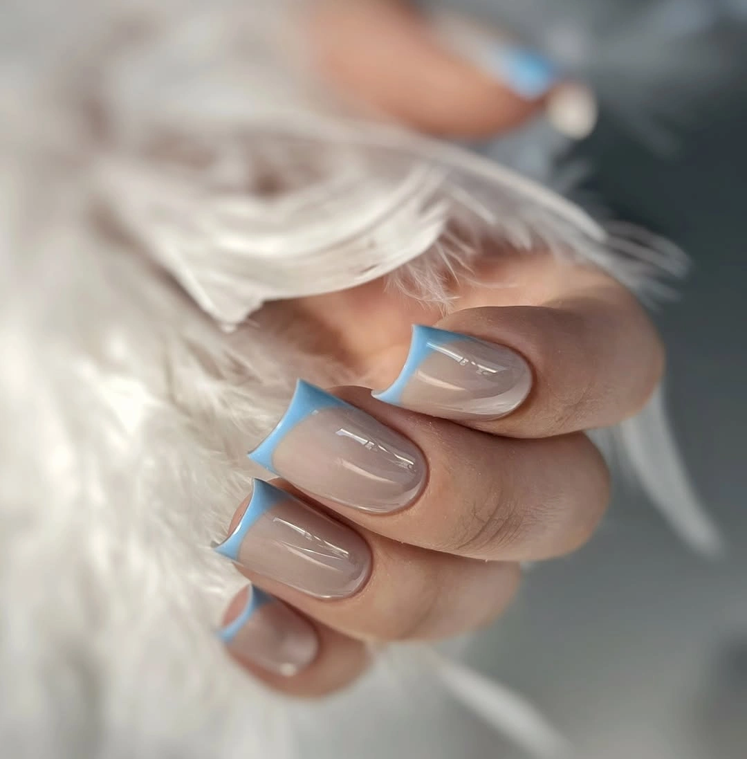
If bright blue feels too strong for every finger, keep it on two tips and leave the others sheer, or shift the color toward muted denim. A squoval will soften the line while a sharper square will make it look more graphic, so choose the edge shape based on how much definition you want. Avoid adding a second pattern because the blue boundary already supplies a clear visual stop.
The pale center and saturated edge create enough contrast to make the design visible even in a small crop, but that also means any uneven tip will show. I would preserve the transparent-looking center when adapting the manicure, since painting the whole nail blue would remove the negative space that makes the idea feel light. A clean tip and compact length are the quiet structure holding the color together.
14. Bright Cobalt in a Short Rounded Shape
Cobalt blue fills the entire short-to-medium oval shape here, so the manicure depends on saturation, shine, and proportion rather than decoration. The rounded edges prevent the intense color from becoming too rigid, while the glossy reflections make the blue look almost luminous against the blurred dark background. It is a useful comparison with deep navy: the shape is similar, but the higher saturation changes the amount of attention the color demands.
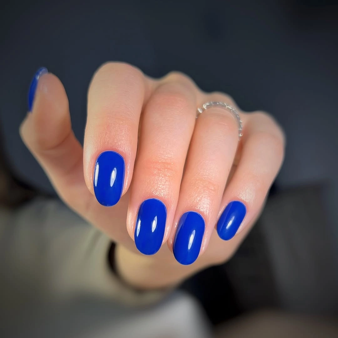
Use a shorter squoval if you like the color but want more structure at the free edge, or place cobalt on two accent nails beside a pale neutral. A darker ink blue would move the look toward a quieter fall mood, while a lighter blue would make it feel more open. Change the saturation before changing the motif, because the solid color is the point of the reference.
Strong blue will show chips against the skin, especially when the finish is glossy and the color is fully opaque-looking. I would keep accessories delicate and avoid matching every other element to the nails, since one cobalt block already gives the hand enough emphasis. The design feels current when the shape stays simple and the color is allowed to be the only loud decision.
15. Peach Nude with Multicolor Brush Strokes
Most nails use a glossy peach-nude almond, while two accents introduce a creamy base crossed by diagonal strokes in pink, orange, blue, purple, and black. The contrast works because the neutral fingers give the brighter accents visual rest, and the strokes are concentrated near the tips instead of filling every surface. Color variation is high, but placement is selective, so the manicure remains readable as one idea.
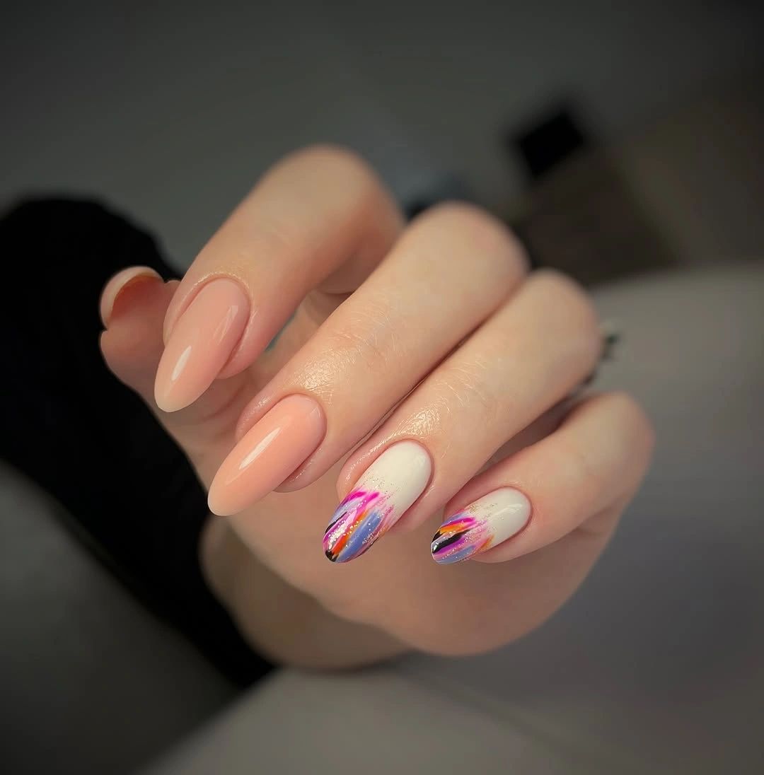
Keep the peach-nude base and limit the accents to two fingers if you want the reference to feel wearable in a quieter routine. You can also replace the full range of colors with two related shades, such as warm coral and berry, while preserving the diagonal direction. A shorter almond will make the strokes look more compact, so use broader marks and leave clear nude space around them.
The multicolor detail is more demanding than the solid nails around it, and fine strokes can look uneven as the tip grows. I would not add glitter to the nude fingers because their job is to give the eye a pause between the active accents. The collection stays balanced when the warm base remains visible and the colorful movement feels like a deliberate interruption rather than the default surface.
16. Cream with Tiny Orange and Green Flecks
Short square nails use a warm creamy-white base and tiny orange and muted green flecks scattered across several fingers. The marks are irregular and spaced apart, so the cream still occupies most of the visible area and the season is suggested through small color decisions rather than a literal motif. This is a good example of lowering saturation while keeping a palette clearly connected to early fall.
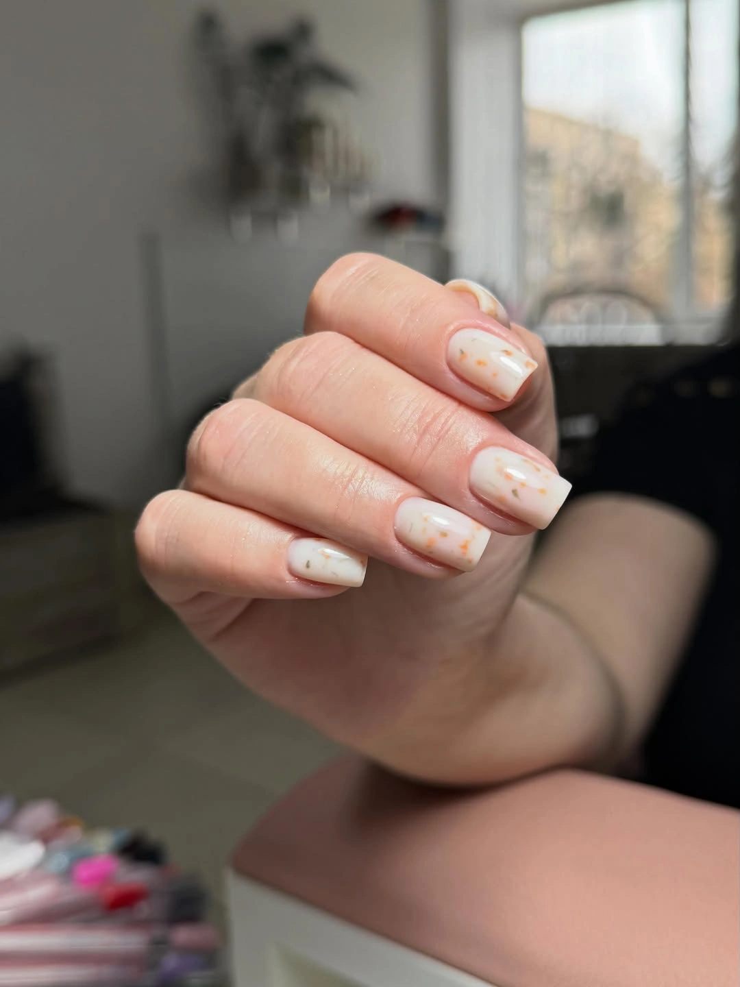
If fine flecks feel difficult to control, enlarge them into a few spaced dots or keep the detail on one accent nail. A warmer cream will make the orange feel softer, while a cooler white will sharpen the green and increase contrast. Preserve the short square shape if you want the marks to read as small punctuation rather than a field of scattered texture.
The design is quiet enough for everyday styling, but the pale base can make tiny edge imperfections visible, so the clean outline matters. I would avoid turning the flecks into leaves or another specific symbol because the strength here is their ambiguity and scale. Keep the warm white dominant, then let orange and green act as small seasonal signals that do not overpower the hand.
17. Milky White Tips on a Long Square
Long square nails carry a pale milky body with bright white tips, creating a subtle boundary through value rather than a strong color contrast. The softly rounded corners keep the shape from looking severe, while the tip line gives the hand a more finished outline than a single cream color would. It is a quiet design, but the length makes the silhouette impossible to miss.
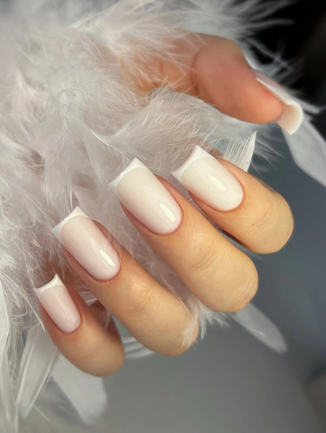
A shorter squoval can preserve the milky center and white edge with less daily commitment, and a thinner tip will make the result more delicate. If you want a warmer early-fall version, shift the body toward a soft beige while keeping the tip light. Avoid adding glitter unless the pale separation is no longer visible, because the restrained value change is what gives the manicure its calm structure.
Long square edges show wear quickly, especially when the tip is bright, so the reference is best treated as a shape-and-boundary idea rather than a demand to copy the length. I would keep the background and accessories light when styling it, allowing the small change between milky and white to remain visible. The manicure works when the tip reads as a clean finish, not as a separate decorative stripe.
18. Pale Pink with White Cuticle Crescents
This short square manicure places white crescent shapes near the cuticle over a glossy pale pink-white base. Because the accent sits at the bottom rather than the free edge, it changes the visual weight of the nail without shortening the tip with a dark band. The repeated curves frame the nail bed and create a tidy rhythm, making placement more important than color variety.
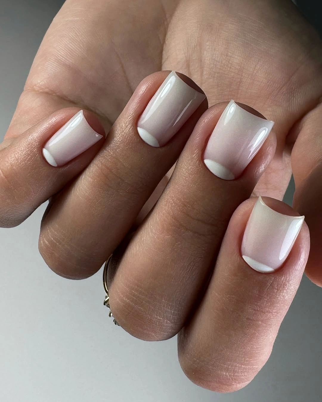
Keep the crescents on two accent nails if you want a lower-maintenance version, or make the arcs thinner so the pale base remains dominant. A rounded-square edge will echo the curves, while a sharper square will make the contrast feel more graphic. The best adaptation preserves the location of the white detail; moving it to the tip would produce a different balance even if the colors stayed identical.
Cuticle-area lines can reveal grow-out and uneven spacing sooner than a plain color, so a neat outline is part of the design’s value. I would not add a third shade because the pale pink and white already create a clean two-value relationship. The manicure feels early-fall ready through its quiet precision, leaving darker colors and heavier textures to the references that need them.
19. Soft White Waves with Small Gold Notes
Short rounded nails combine a blush-beige base with repeated white waves and small gold-looking marks. The lines travel organically across the nail rather than forming rigid geometry, while the light base keeps the pattern gentle even when several fingers carry it. The result shows how rhythm can add personality to a neutral palette without requiring high saturation or a large focal motif.
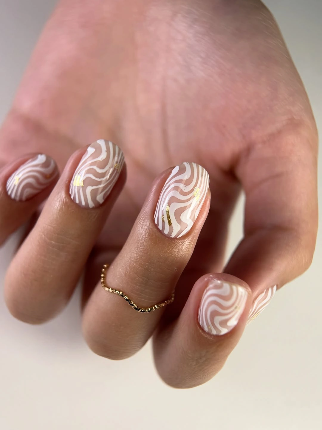
For a simpler version, draw two broader waves on only two nails and keep the others in the blush base. You can also replace the small gold notes with warm beige if you prefer less shine, or use a shorter round shape to make the pattern feel more compact. Preserve the uneven organic movement rather than forcing every line to match exactly, because variation is part of the visible rhythm.
The fine pattern asks for more upkeep than the plain cream or blue sets, but the short length keeps the overall commitment reasonable. I would keep the base soft and the metallic-looking marks sparse so the waves remain the main detail. The design holds together when the reader sees one continuous movement across the hand, supported by a quiet color field underneath.
20. Sheer Pink with Tiny Floral-Like Fragments
A translucent pale pink base lets small pink, purple, and white floral-like fragments appear across these short rounded-square nails. The pieces are irregular and individually spaced, while the white flowers around the hand echo the softness without becoming part of the manicure itself. The visual relationship is delicate: low-value color, small accents, and plenty of open surface keep the design from feeling heavy.
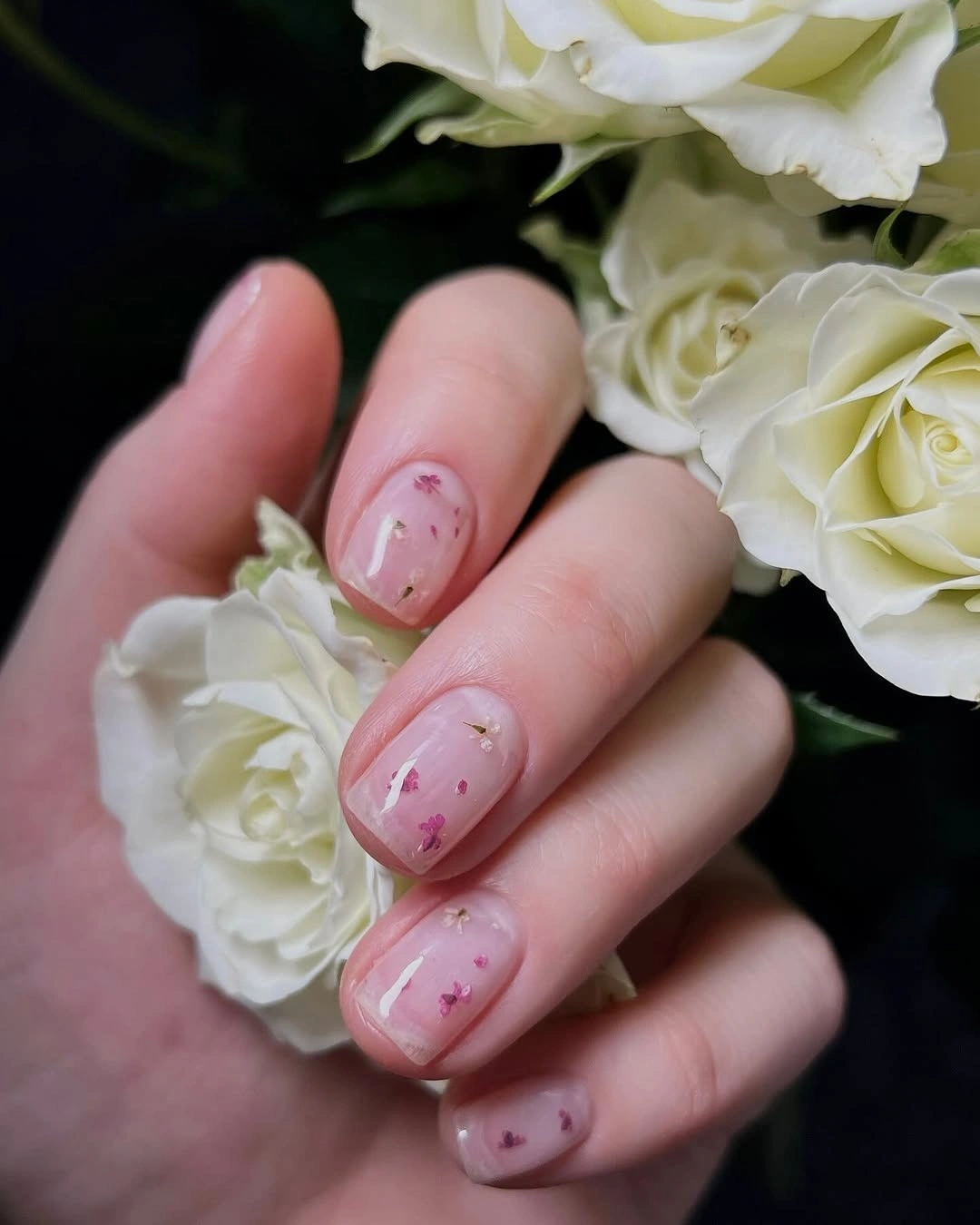
Use only a few fragments on one accent nail if you want the idea to be easier to maintain, or replace the small shapes with simple dots while keeping the translucent base. A slightly shorter square will make the accents feel more concentrated, whereas a rounded edge will soften the floral suggestion. Do not fill the whole nail with decoration; the open pink area is what makes the little marks legible.
Small pieces can catch at the edge or lose definition on very short nails, so spacing is more useful than adding more color. I would keep the surrounding styling neutral and let the pale base remain visible from a distance. The manicure succeeds as an early-fall transition because it carries the last trace of summer delicacy into a compact shape without depending on a literal seasonal icon.
21. Pale Lemon Yellow on a Short Square
Pale lemon yellow closes the collection with a glossy short square that is bright but not neon. The rounded corners keep the saturated light color approachable, while the neutral background lets the yellow read as a deliberate block instead of blending into the hand. This is a reminder that an early-fall palette can stay sunny when the shape is compact and the tone is softened.
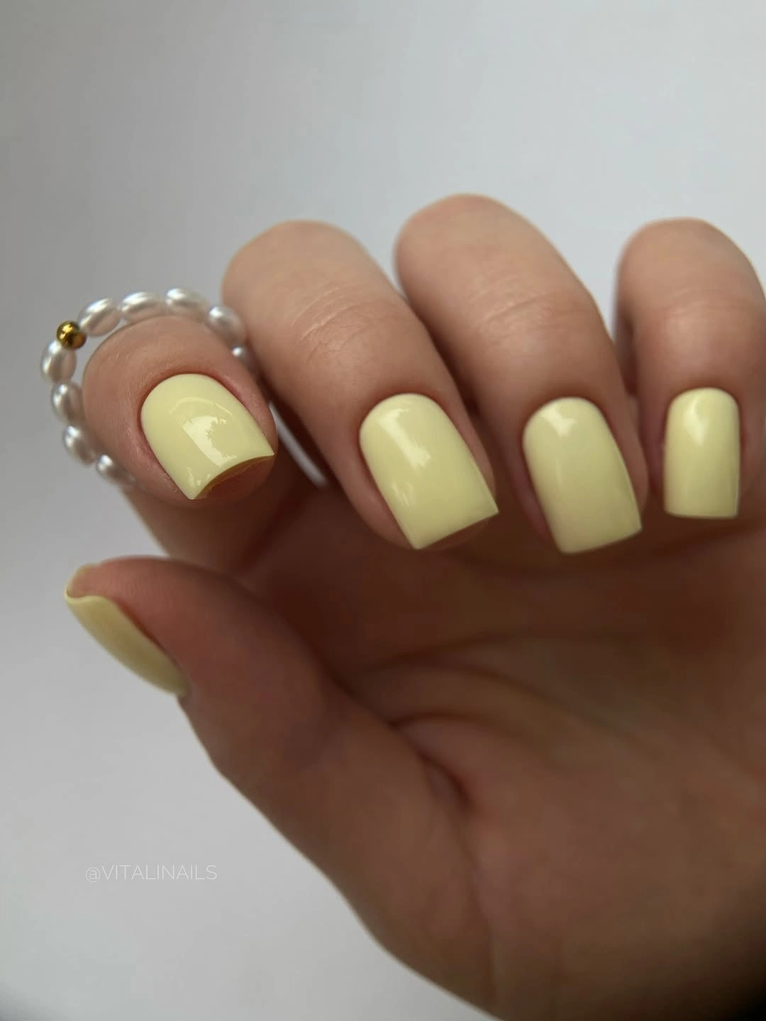
If you want more autumn weight, shift the yellow toward butter or muted ocher, or use the pale shade on two nails beside creamy white. A shorter squoval will make the color feel even more casual, while a straighter square will emphasize its graphic edge. Change the tone before adding art, because the manicure already has enough identity through its light saturation and clean silhouette.
The single color keeps upkeep visually simple, but a pale yellow edge can show wear against the skin, so even length matters. I would avoid matching the ring or background too closely; a small neutral contrast helps the yellow stay visible. The collection ends on this controlled brightness because the relationship to preserve is simple: one softened color, one practical shape, and no detail strong enough to steal its place.