Burgundy changes its character dramatically when the silhouette changes around it. A long almond tip makes the color travel forward, a short square contains it, a pale accent interrupts it, and a narrow stripe can redirect the eye without taking over the manicure. This collection looks at fall burgundy nails with design through proportion first, then through contrast, placement, surface detail, and the practical limits that come with different lengths.
The strongest sets do not all add more decoration; many make one structural choice and let it carry the mood. Some rely on a clean wine surface, some use cream, pink, teal, or silver as a controlled break, and one lets a pointed tip become the focal detail. Use the ideas as comparisons: keep the burgundy, adjust the width, shorten the tip, move the accent, or remove the detail that asks more from your routine than it gives back.
1. Long Burgundy Almonds with Directional Gloss
The first manicure makes the almond silhouette do the work. Deep burgundy runs across medium-length tapered tips, and the glossy surface sends a clean highlight along the length of each nail, reinforcing the forward direction created by the shape. With no visible motif to interrupt the color, the relationship between width at the base and narrowing at the tip becomes the central design decision.
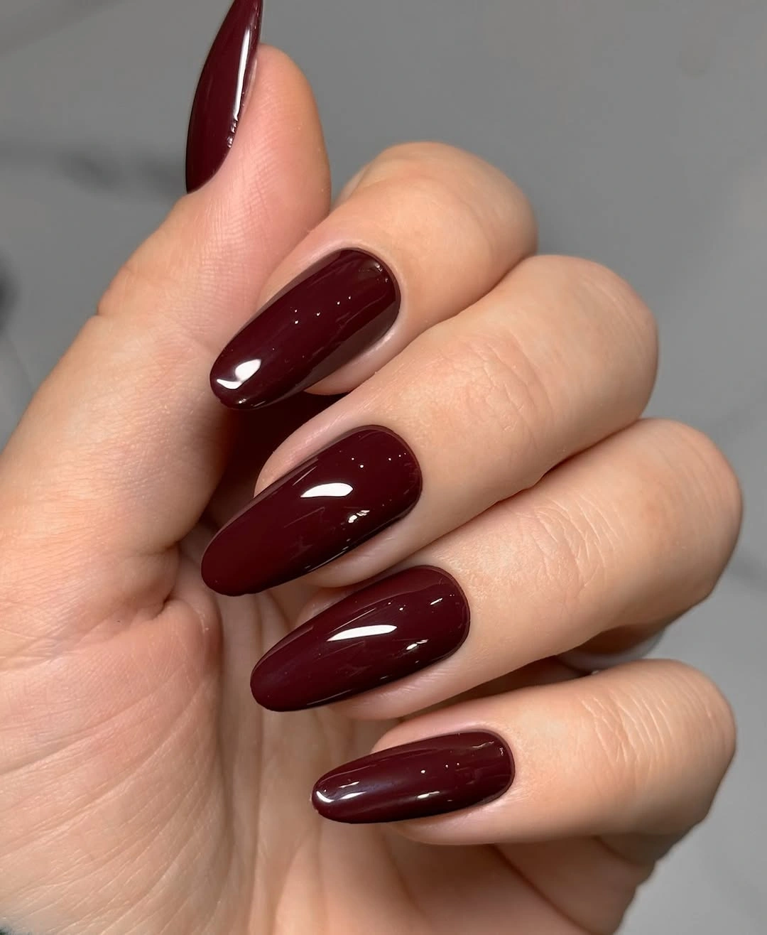
This proportion gives the dark color a sleek, elongated reading, but it does not require the exact length shown to be useful. A shorter almond would keep the same directional line with less practical commitment, while a rounded tip would soften the wine shade and make the set feel less pointed. Preserve the taper if you want the burgundy to remain visually stretched rather than compact.
Long almond tips bring a realistic tradeoff because the pointed silhouette can affect how the hand moves around sleeves, hair, and small objects. The solid surface also makes edge wear easy to spot, especially at the narrow tip. If your routine demands a shorter shape, reduce the length first and keep the smooth burgundy field intact; the proportion will change, but the color will still have a clear role.
2. Rounded Burgundy with a Softer Profile
Here the same deep wine family is placed on softly rounded oval tips, which changes the balance before any additional color is considered. The curved outline removes the sharper directional emphasis of an almond and gives the glossy burgundy a calmer, more continuous shape. A pale sweater behind the hand reinforces that softness by contrasting warm fabric texture with the smooth dark surface.
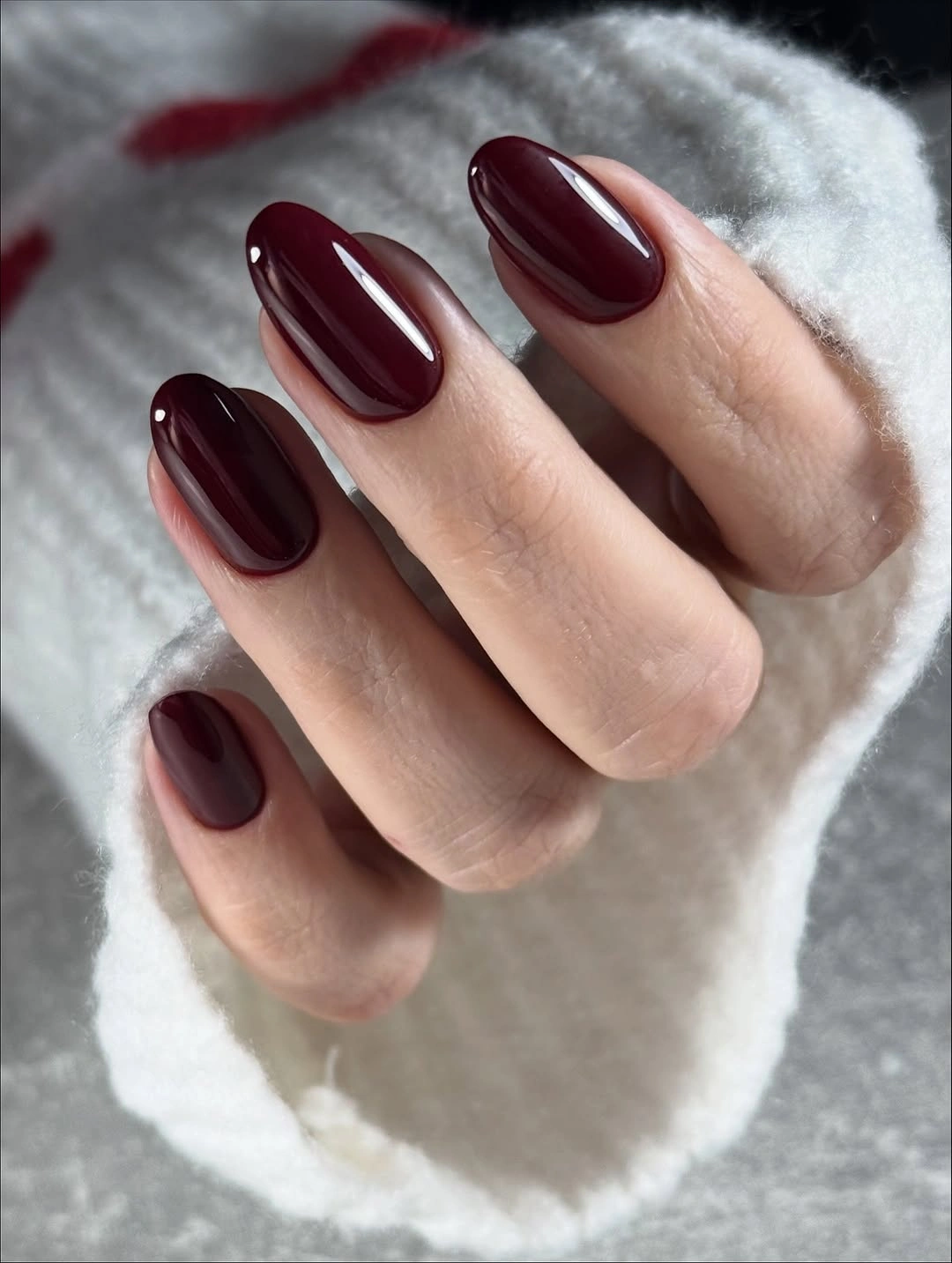
Choose this structure when you like the depth of burgundy but want the manicure to feel less pointed. A medium oval keeps the color visible while reducing the visual length, and a rounded-square version would move it closer to a practical everyday shape. The important comparison is not simply long versus short; it is how curved edges change the way a saturated color occupies the hand.
Rounded tips can make a dark manicure feel easier to wear, although the solid finish still benefits from precise side edges. Because the design is plain, a chip will be visible as a break in the continuous wine shape. If maintenance is the priority, keep the oval outline and shorten the free edge rather than adding decorative lines intended to disguise changes in proportion.
3. Angular Burgundy with a Pale Diagonal Accent
A pale section and a thin white diagonal line interrupt the burgundy field in this close-up, introducing direction without changing the dominant color. Most of the visible nails remain dark, so the accent reads as a deliberate cut through the surface rather than a competing palette. The angle echoes the tapered feeling of the tips and gives the manicure a sharper graphic structure.
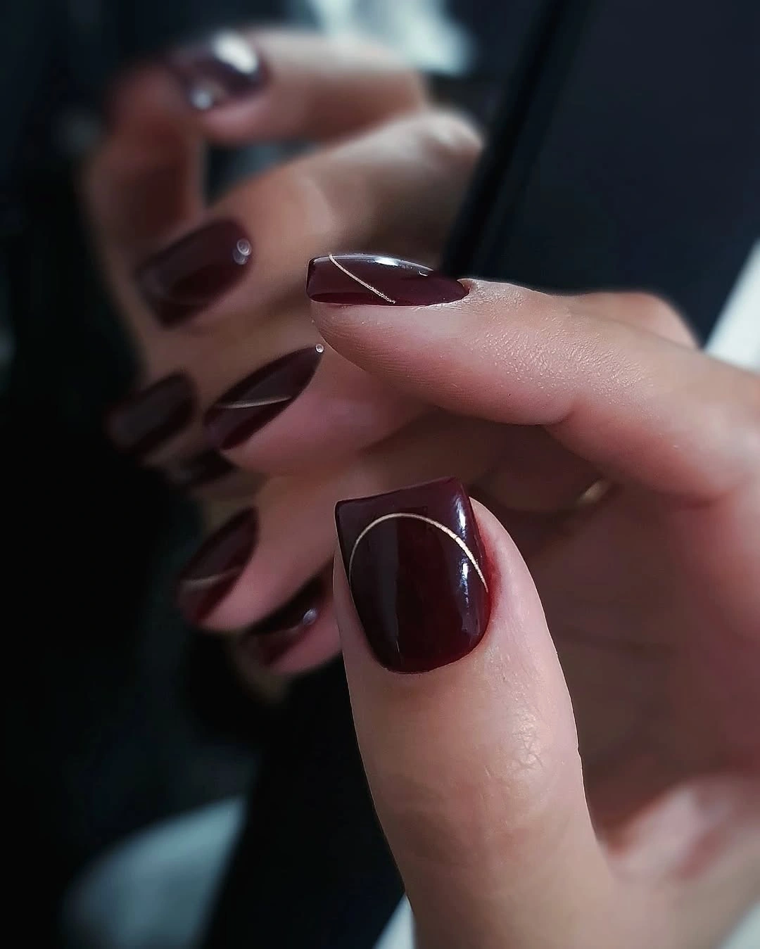
The accent is effective because it is narrow and isolated. You could place the same line on one shorter square nail, reduce the pale area, or switch the white line to a muted cream while keeping the contrast between deep color and open space. Avoid spreading the diagonal across every finger; repeated angles would turn a precise interruption into a busy pattern and reduce the focal effect.
Negative space brings a grow-out consideration because the boundary remains visible as the nail changes. A clean line matters more than adding a second accent, especially when the base is dark enough to carry the rest of the manicure. If the angle becomes difficult to maintain, shorten it into a small corner detail and preserve the burgundy field as the stable proportion.
4. Short Rounded Squares for Everyday Burgundy
This compact rounded-square set shows how much a shorter outline can change the reading of deep burgundy. The color remains glossy and uninterrupted, but the reduced length makes the manicure feel contained rather than elongated, and the softly curved corners take some severity away from the dark tone. A nearby bottle does not define the design; the short proportion does.
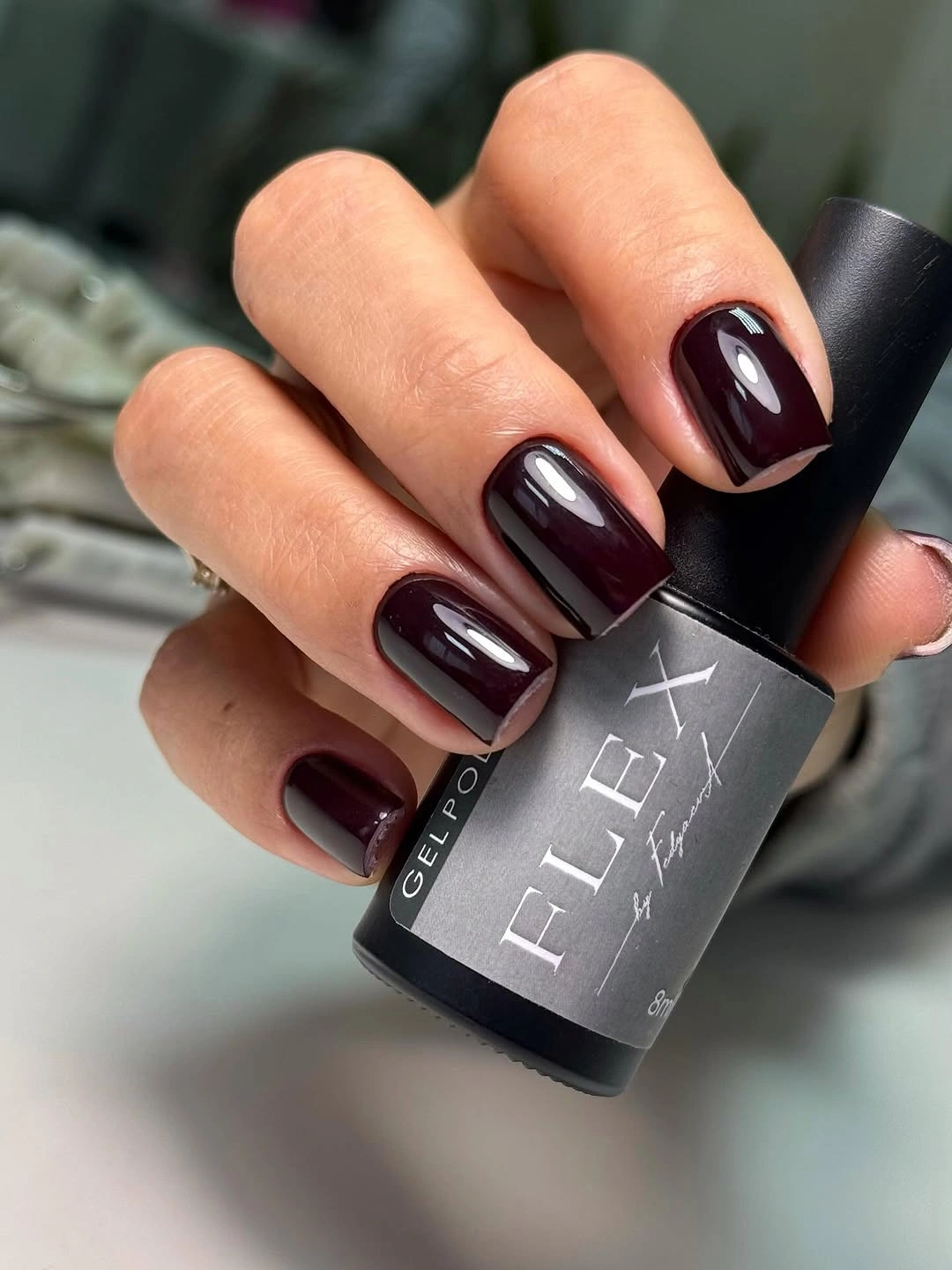
Readers who like long wine manicures but need a more practical shape can use this as the structural adjustment. Keep the burgundy solid, shorten the free edge, and let the rounded corners preserve a smooth visual path. If you still want design, add one pale line or small accent on a single finger rather than extending the length to create visual interest.
Short nails reduce the amount of surface that needs attention, but a dark color still makes uneven corners clear. The rounded-square outline should remain consistent from finger to finger so the manicure looks intentional rather than simply trimmed down. This is a good place to prioritize proportion over decoration, because the compact frame already solves much of the practical problem.
5. Elongated Almond Burgundy in a Clean Frame
Long almond tips return here with a more elongated, uninterrupted burgundy surface. The light background makes the dark wine color appear saturated, while the narrow points create a directional silhouette that extends beyond the finger rather than sitting close to it. Without any accent color, the set depends on the relationship between length, taper, and the clean reflection running along each nail.
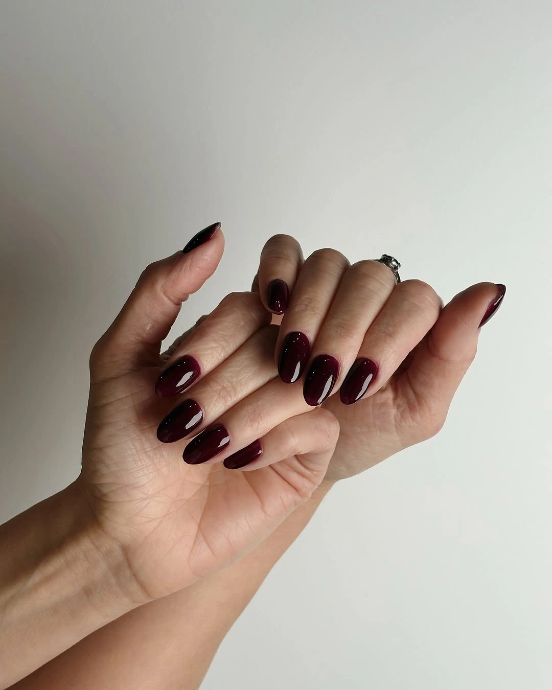
This proportion is useful for comparing shape changes within one palette. A medium almond would retain the tapered line while lowering the visual weight, and a coffin tip would make the sides feel straighter and more architectural. If you prefer the drama of length but need more width at the tip, keep the burgundy and shift only the silhouette instead of introducing a new motif.
Long almond shapes can be striking but less forgiving in daily movement, particularly when the tip catches against fabric or the hand works in a confined space. The dark color also makes the narrow free edge part of the composition, so small chips can break the line. Shorten the tip before changing the color if the look needs to become more functional.
6. Square Burgundy Balanced by Blue Denim
A short square burgundy manicure looks more graphic against blue denim because the warm dark color and cool background create a clear contrast. The straight tips keep the wine shade contained, and the glossy surface gives each nail a narrow bright reflection that reinforces the clean geometry. No painted design is needed; the interaction between color, edge, and clothing supplies the visual structure.
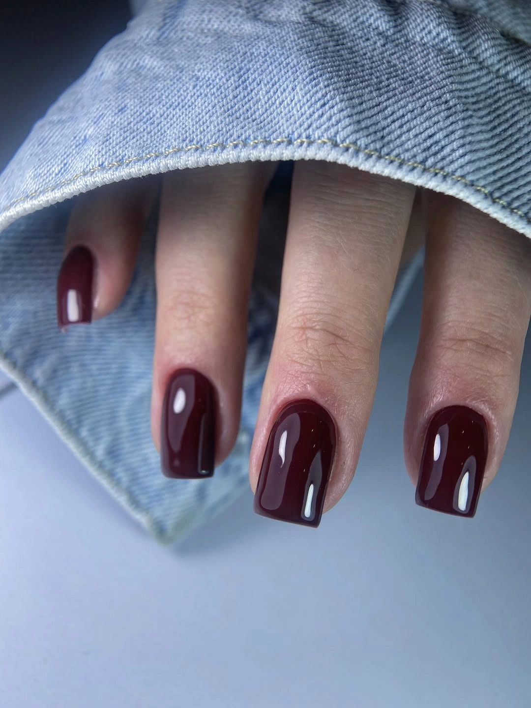
This is a practical reference for readers who want a dark color that can move through casual styling. Keep the square length compact, or soften the corners slightly if the straight edge feels too rigid. A muted berry shade would reduce the contrast with denim, while a deeper brown-burgundy would make the same proportions feel more grounded.
Short square tips are easier to manage than long extensions, but their straight edge still needs even shaping. The solid color makes small differences visible, especially when the hand is photographed near a light fabric or blue background. If the free edge becomes difficult to maintain, shorten it evenly and keep the rest of the design unchanged rather than hiding the problem with extra art.
7. Middle-Length Rounded Squares with Visual Weight
This manicure sits between compact and elongated proportions, using rounded-square tips to give the deep burgundy enough surface for a clear glossy reflection. The curved corners prevent the medium length from feeling too rigid, while the uninterrupted color keeps the eye focused on how much visual weight the shape carries. It is a structural middle ground rather than a decoration-led design.
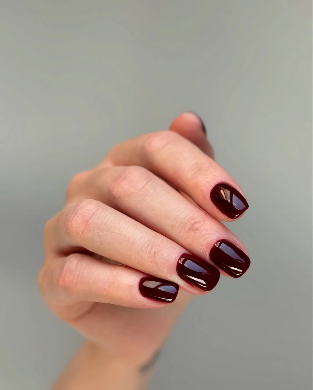
Use this balance when a short manicure feels too restrained but a long almond feels too demanding. The middle length can be shortened while preserving the rounded corners, or it can be made slightly straighter for a sharper reading. Because the color remains solid, changing one proportional variable at a time will give you a clearer result than adding a new motif immediately.
The main maintenance question is whether the corners stay consistent as the nails grow. Dark burgundy will reveal a chipped edge, but the rounded outline gives a little visual softness around small changes. Keep the length moderate, watch the free edge, and let the shape carry the sense of structure rather than asking every nail to hold additional detail.
8. Cream Waves Against Long Burgundy Squares
Long square burgundy nails gain movement from a pale cream wave placed on selected accents. The straight sides and flat tips create a strong architectural frame, while the curved line pushes against that structure and prevents the dark surface from feeling static. Because the wave is limited to a few nails, it creates a focal path without competing with the solid burgundy majority.
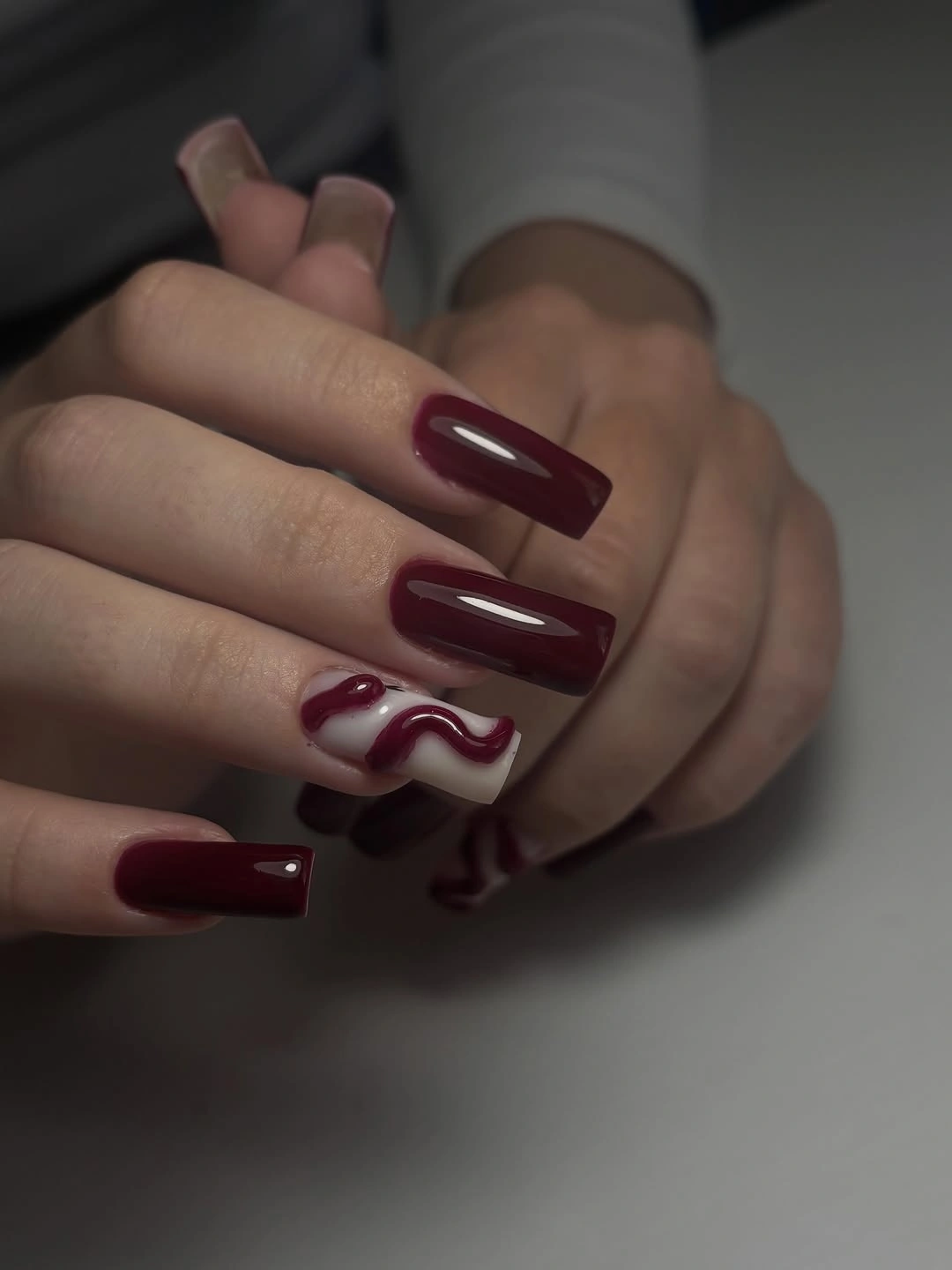
The contrast between straight silhouette and curved accent is the part worth adapting. Use a shorter square tip with one cream wave, or keep the long shape and reduce the line to a single broad curve. A warm beige would make the contrast gentler, while a brighter white would sharpen it; in both cases, leave most nails burgundy so the wave remains a controlled interruption.
Long square nails ask more of a routine than the compact examples, and a curved accent can draw attention to any change in the underlying shape. Keep the wave broad enough to remain readable and avoid adding smaller marks around it. If the length becomes inconvenient, shorten the tips while preserving the straight sides and one curve; the proportion will become calmer without losing the idea.
9. Micro-Accents on a Short Burgundy Base
Small pale marks appear on selected short rounded-square burgundy nails, creating detail without breaking the dark base into separate blocks. The accents are sparse and intermittent, so the manicure reads as a quiet shift in placement rather than a full pattern. That restraint allows the compact outline to remain visible and gives the eye only a few points to investigate.
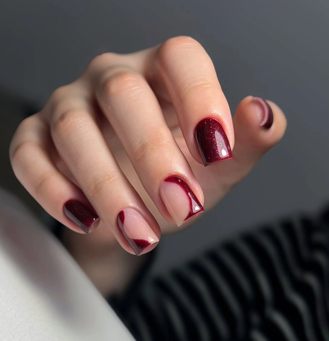
This approach suits readers who want a design but do not want a contrast nail or a large motif. Keep the marks on one or two fingers, enlarge one of them slightly for a clearer focal point, or replace the pale tone with muted copper for more warmth. The design will remain coherent as long as the burgundy occupies most of the surface and the accents stay subordinate.
Micro-details can disappear at normal viewing distance, so their value is in the close rhythm they create rather than in instant readability from across a room. As the manicure grows, small marks may also become visually misplaced. If upkeep becomes tedious, remove the smallest accents first; the dark base and short shape will still provide a complete result.
10. One Bow-Like Detail on Burgundy Squares
A small dark bow-like detail gives this burgundy square manicure a clear focal nail while the remaining surfaces stay glossy and uniform. The object-like accent changes the mood more than its size suggests because it introduces a decorative shape into an otherwise uninterrupted color field. The medium square proportion gives the detail enough space to register without making the entire set feel crowded.
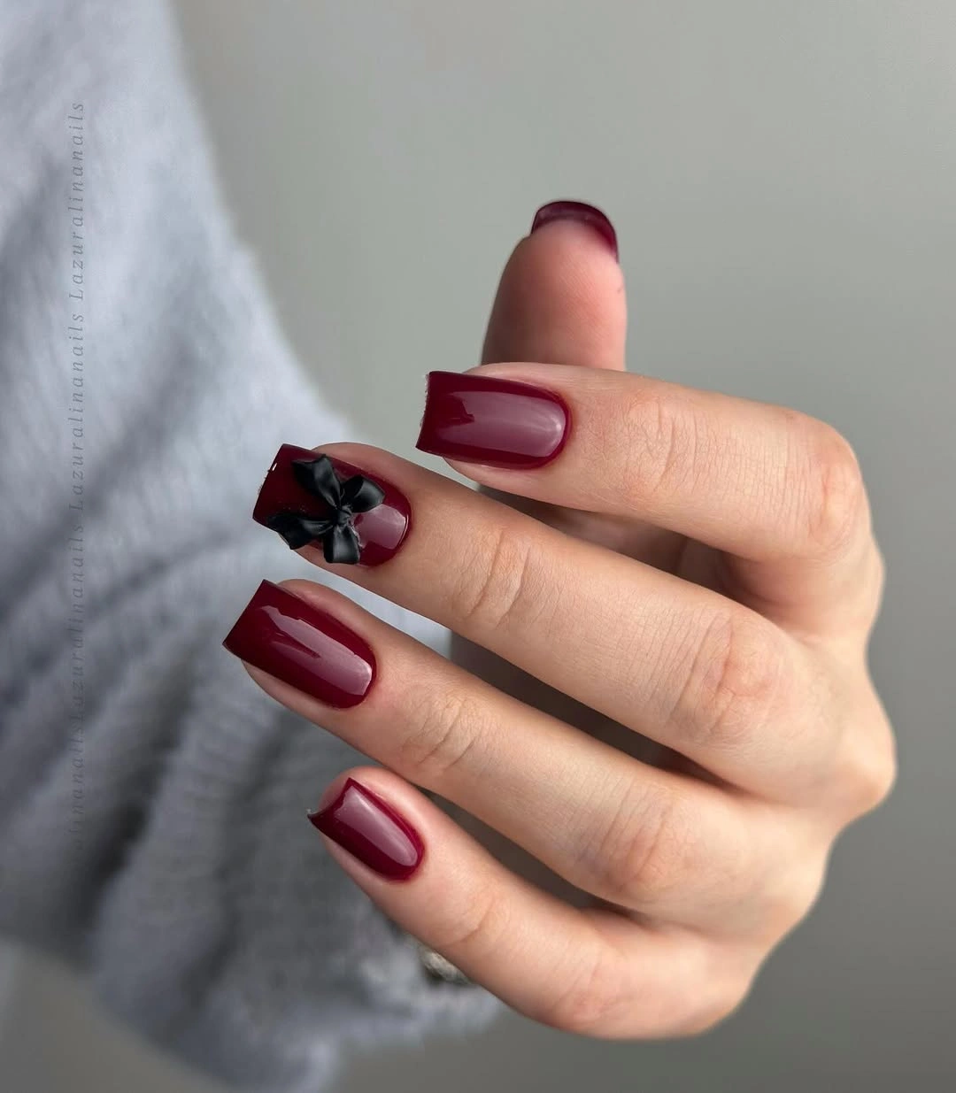
To keep the idea practical, use one accent only and let the other nails remain plain. A pale pink or cream detail would increase contrast, while a tone-on-tone dark accent would keep the result quieter and more structural. The main choice is placement: a small object near the base or center can personalize the set, but repeating it on every nail would change the visual weight completely.
A raised-looking detail may interact differently with sleeves, hair, or small objects than a smooth surface, so its convenience deserves consideration. The compact square shape helps, but it cannot remove that tactile tradeoff. If the accent becomes difficult to keep neat, replace it with a flat outlined bow or remove it entirely while preserving the burgundy base.
11. Plain Burgundy in a Casual Car Setting
Short square burgundy nails look especially straightforward in this everyday setting because the manicure does not try to compete with the steering wheel, cuff, or surrounding controls. The dark wine color gives the hand a clear accent, while the compact straight tips keep the design practical in appearance. The absence of art makes the relationship between color and routine feel more believable.
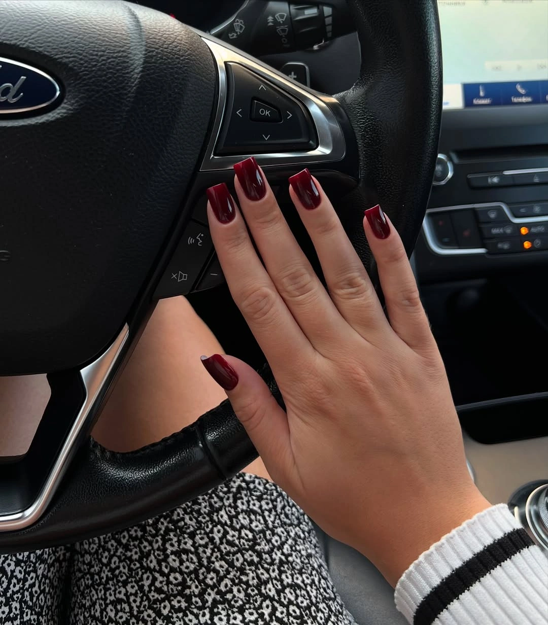
This proportion works when you want a dark fall color that can move through ordinary moments without requiring a special styling story. Keep the tips short and the surface glossy, or switch to a rounded square if you want less visual rigidity. A subtle brown undertone would soften the wine shade, but adding graphic lines would no longer be necessary for the manicure to feel complete.
Short square nails are not automatically maintenance-free, and dark polish still shows wear along a straight free edge. The practical advantage comes from the controlled length, not from ignoring the outline. Keep the corners even and refresh the color before chips spread, because a clean solid manicure will look more coherent than a decorated set with a neglected edge.
12. Long Burgundy Squares with Denim Contrast
Long square burgundy nails become more graphic when placed against blue denim and a white shirt. The straight tips create a broad, directional silhouette, while the glossy wine surface picks up bright reflections that emphasize the length. The outfit supplies casual contrast, allowing the manicure to feel strong without becoming formal or overly ornate.
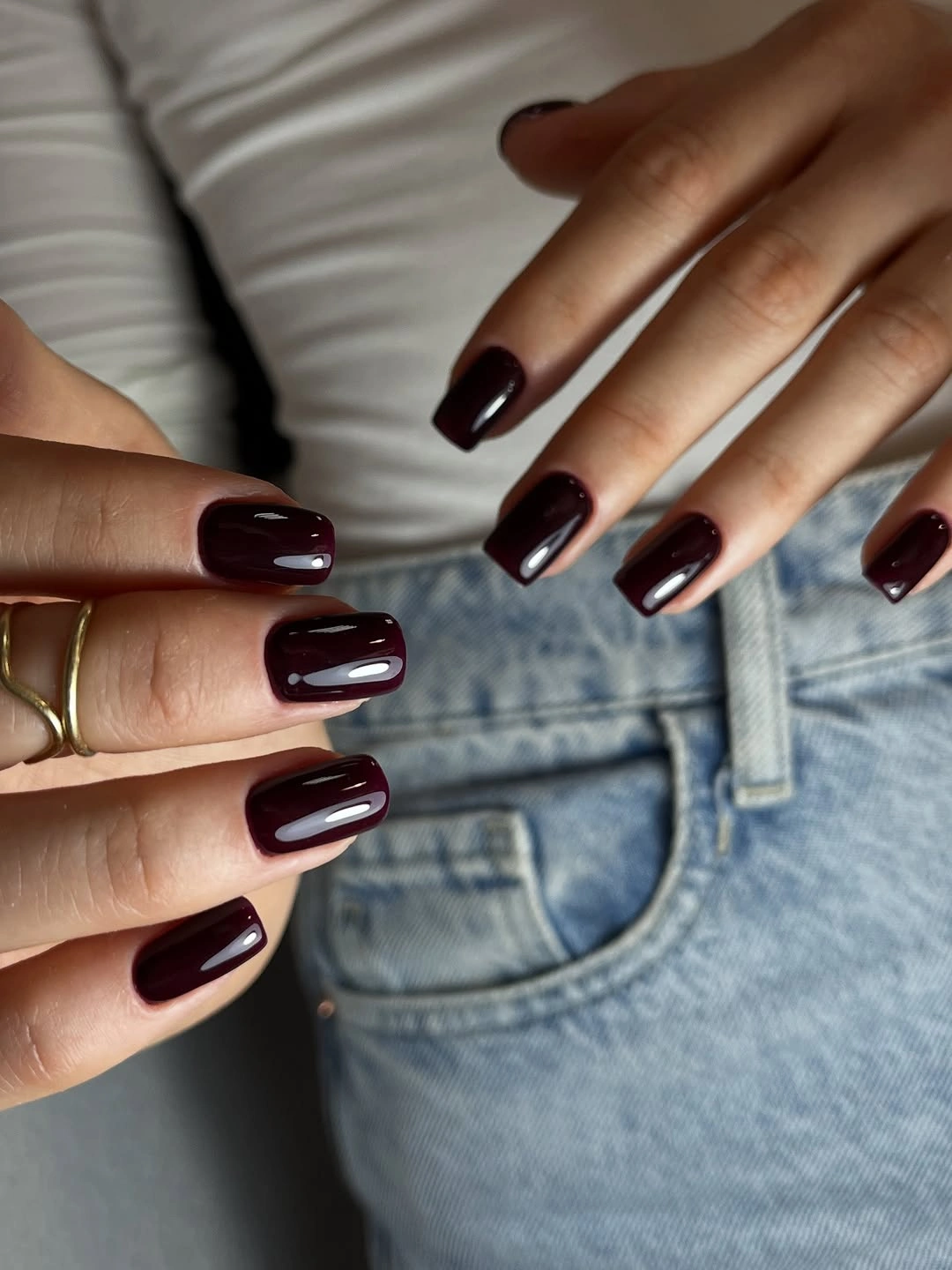
If you like the color but not the length, shorten the tips while keeping the square outline and the denim pairing. A rounded corner would make the result softer, while a deeper brown-burgundy would reduce the contrast with white clothing. The adjustment should begin with proportion because the solid color is already doing enough visual work.
Long straight tips can be less forgiving around daily tasks, and the broad surface makes any uneven sidewall more visible. The glossy finish also highlights chips at the free edge, especially against a pale shirt. A practical adaptation keeps the burgundy and the square idea but trims the length to the point where the outline stays comfortable rather than merely dramatic.
13. Tapered Coffin Tips in Solid Deep Wine
Here the burgundy surface remains plain, but the tapered coffin outline changes the distribution of visual weight from the base toward the tip. The sides narrow gradually, creating a directional profile that is sharper than a rounded square and more structured than an oval. Because the color is uninterrupted, the tip shape becomes the design element readers notice first.
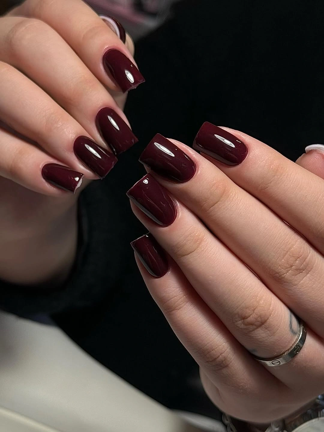
This silhouette is useful when you want a long manicure to feel organized rather than broad. A shorter coffin would keep the taper while lowering the commitment, and a softer wine shade would make the outline less intense. If you add an accent, keep it small and near the center so it does not compete with the tapered edges that define the set.
The coffin profile can create a clean line, but it also makes the relationship between length and width important. If the tip becomes too narrow for your routine, reducing the length will usually improve the balance more effectively than changing the color. Keep the burgundy solid and let the taper remain legible; the manicure already has a clear structural point of view.
14. Tonal Burgundy on Long Almond Tips
Long almond tips show subtle shifts within the burgundy family, moving from brighter wine areas to darker edges rather than adding an unrelated accent color. The tonal change creates movement along the elongated silhouette, while rings around the fingers add small points of cool shine outside the manicure. The result feels dimensional because the color changes with the surface instead of remaining one flat block.
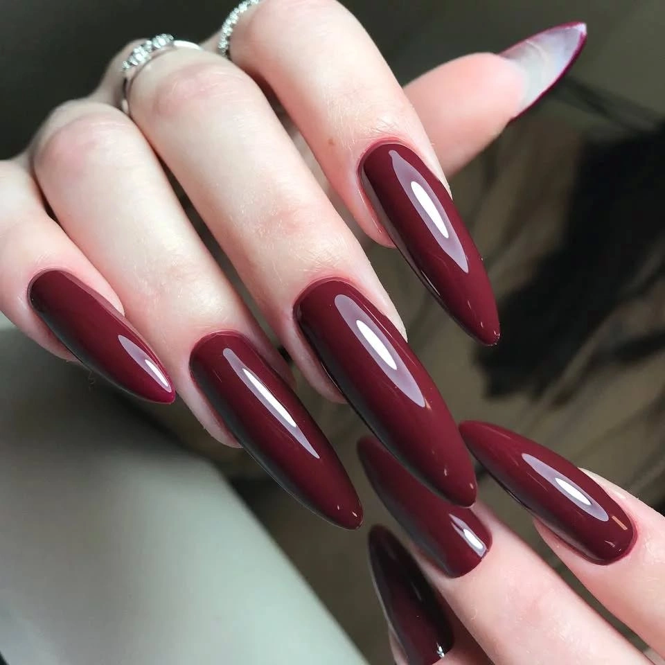
Keep the almond silhouette if you want to preserve the fluid reading, or move the same tonal idea onto a medium oval for a softer proportion. A single darker accent nail could create a similar depth with less color variation, while a warm brown transition would make the set feel closer to earth tones. The key is to vary tone without losing the burgundy family that holds the collection together.
Long almond tips bring both visual length and practical demand, so the tonal surface should not be treated as a substitute for manageable proportions. A shorter tip can still show a shift from wine to deep burgundy if the contrast is concentrated near the edge or center. Preserve the transition, but edit the length whenever the pointed outline begins to control the routine too much.
15. Teal Edges Framing Short Burgundy
Short rounded-square burgundy nails gain a cool teal-green edge on selected fingers, creating a warm-versus-cool contrast at the perimeter. The burgundy remains the main field, while the teal acts like a narrow outline that sharpens the shape without filling the center. This placement makes the color relationship more important than the amount of decoration.
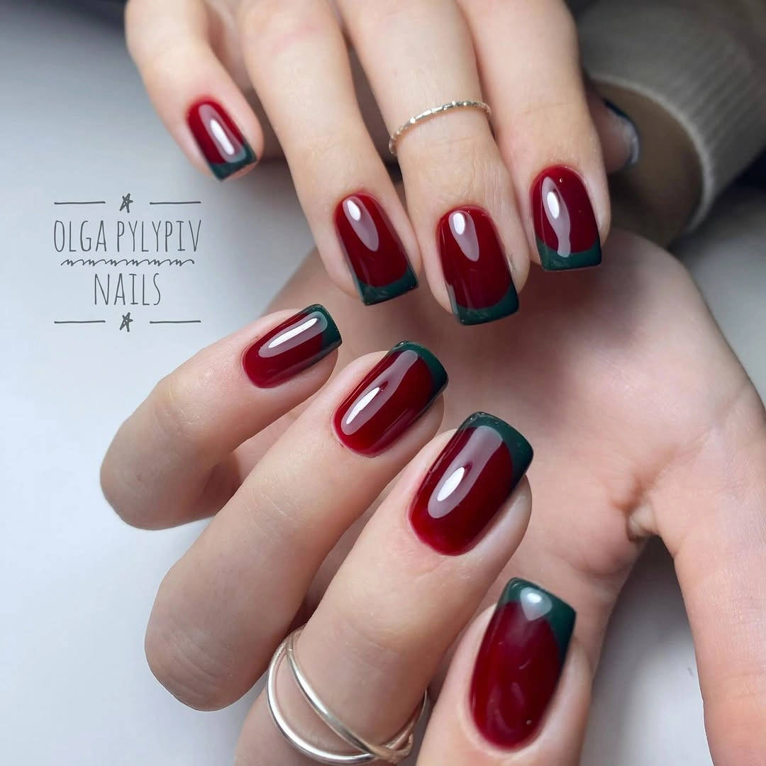
To adapt the idea, keep the teal on one or two accent edges and leave the remaining nails fully burgundy. A muted blue-green would lower the contrast, while a brighter teal would make the border more immediate. The design remains readable when the edge is narrow enough to frame the burgundy rather than split the nail into two equal color blocks.
Perimeter accents need consistent placement because an uneven line changes the apparent width of a short tip. The compact rounded-square shape makes the edge manageable, but it also leaves little room for a border that drifts inward. If the contrast becomes hard to maintain, use teal on one complete accent nail instead of forcing a thin outline across every finger.
16. Pale Pink Accent in a Long Burgundy Set
Long square burgundy nails are interrupted by one pale pink accent, creating a strong light break within an otherwise dark structure. The square tips make the contrast feel graphic, while the light nail gives the eye a clear focal point without adding a full pattern. Most of the surface remains burgundy, so the accent changes the proportion of attention rather than the identity of the manicure.
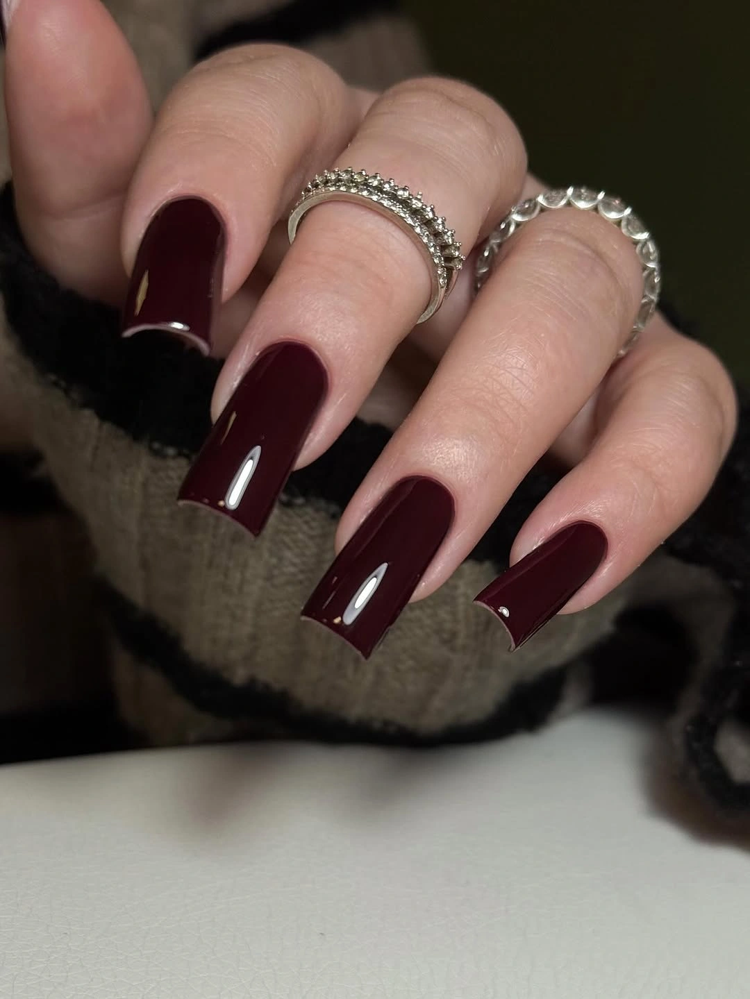
This is an efficient way to brighten a dark set. Keep the pale accent on one finger, move it to the thumb if you want a different viewing rhythm, or use a warm cream for a softer result. A shorter square shape would make the contrast more practical, but keeping the dark majority is the decision that preserves the original balance.
Long square corners can require more attention than a compact shape, especially when the pale accent makes the rest of the set look even darker by comparison. Watch the free edge and keep the light nail smooth so it remains a deliberate focal point. If the length becomes impractical, shorten every nail evenly rather than removing the accent first; the proportion can change while the contrast remains useful.
17. Tiny Symbol on a Pale Accent Nail
This set repeats the dark burgundy square structure but gives one pale pink nail a small heart-like symbol. The symbol is tiny, yet its position on a light field makes it more noticeable than the surrounding color, creating a personal-looking focal point without requiring a full character or large illustration. The other nails remain deep and glossy, so the composition has a clear dark majority and one lighter interruption.
For a simpler version, use the pale accent on a shorter square nail and keep the symbol as a small mark near the center. A cream base would make the contrast softer, while a deeper pink would keep the accent closer to the burgundy family. The useful idea is the scale relationship: one small symbol can change the set when the surrounding nails are quiet.
Small symbols can lose clarity if the nail is viewed from a distance, and a long square tip may make the mark look more isolated than intended. Keep its placement centered and give it enough empty space rather than surrounding it with additional lines. If the design grows out unevenly, preserve the pale accent and remove the tiny symbol before allowing the rest of the manicure to become crowded.
18. Pointed Burgundy with One Dark Flower
The pointed stiletto silhouette supplies immediate drama, and a small dark flower-like accent near the base adds a second focal decision without changing the burgundy palette. The sharp tips create a directional rhythm across the hand, while the dark accent remains close in value to the base so it reads as texture and placement rather than a bright contrast. Shape and detail are working together here.
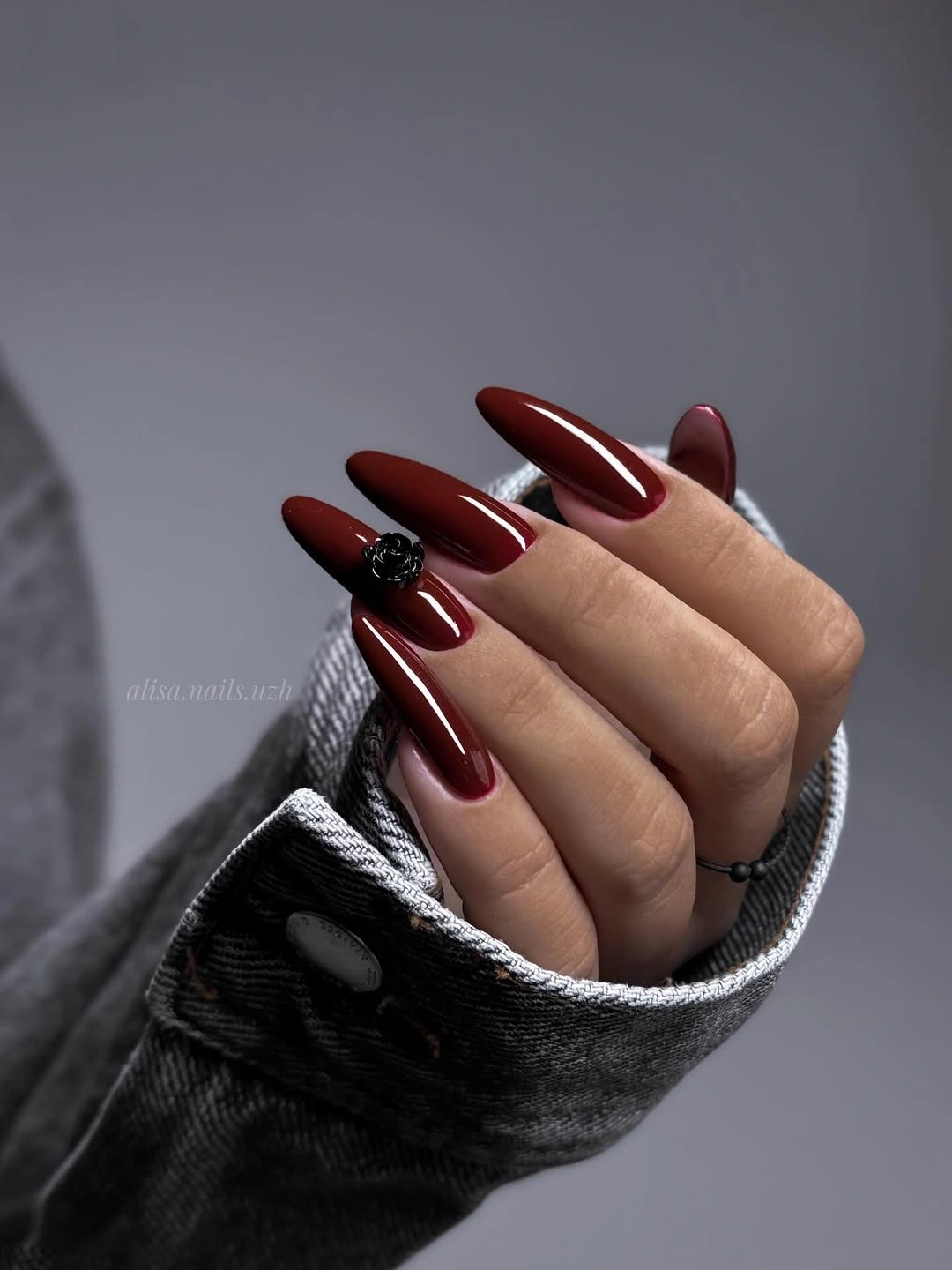
This is the look to study when you want the manicure to feel theatrical through structure. A shorter almond would keep the taper with less intensity, and a flat outlined flower would reduce the tactile impression while preserving the focal placement. Do not copy the length automatically; decide whether the point itself or the small flower is the feature you can realistically keep.
Pointed tips and raised-looking accents can catch on sleeves and hair, so the practical tradeoff is stronger than with the short square examples. The dark palette may disguise small color changes, but it cannot remove the inconvenience of a sharp outline. If you need a routine-friendly adaptation, shorten the tip and flatten the accent before changing the burgundy base.
19. Silver Stripe Across Deep Burgundy
A narrow silver-gray stripe cuts through the burgundy field on this long square set, adding a cool linear highlight without turning the accent into a full glitter nail. The warm dark base remains visually dominant, while the stripe introduces a directional mark that echoes the straight tip. Because the detail is thin and concentrated, the design feels controlled rather than heavily embellished.
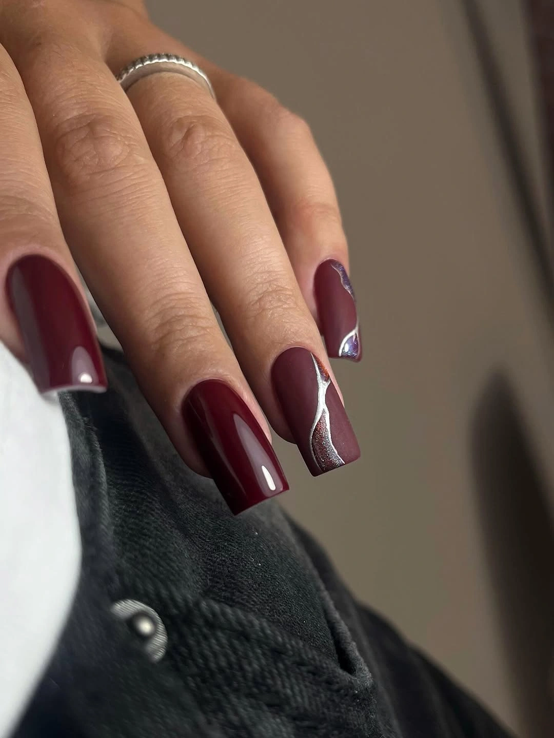
Use one stripe on a shorter square nail if you want the same contrast with less length. A soft pewter line would make the design quieter, while a brighter reflective line would sharpen the difference between warm burgundy and cool silver. Keep the stripe narrow and place it consistently; if it becomes too broad, the accent starts competing with the base instead of guiding the eye.
Long square tips already carry strong visual weight, so the linear accent should not be asked to solve a proportion problem. Check whether the length feels practical first, then decide if the stripe adds enough value to justify its upkeep. A clean burgundy set with one precise line will usually look more coherent than several uneven stripes scattered across the hand.
20. Short Burgundy Squares Against White
Short square burgundy nails return in a plain format, and the white background makes the color and outline unusually easy to assess. The dark wine surface looks saturated, the compact tips keep the shape contained, and the lack of decoration provides a visual pause after the pointed and striped examples. This is a proportion-led idea in its simplest form.
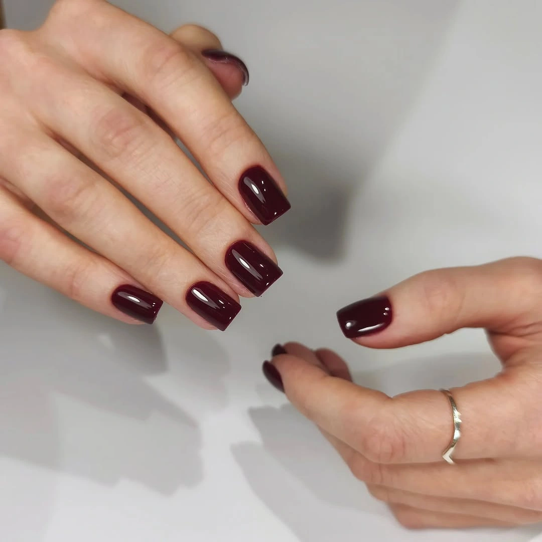
Choose this version when the color itself is the part you want to save. A rounded corner would soften the result, a deeper brown undertone would make it quieter, and a single accent could be added later if the solid set begins to feel too familiar. Start with the short square frame because it gives the burgundy a practical scale before any decoration is considered.
White surroundings make edge wear and uneven corners easy to notice, but they also show why a clean short tip can be enough. The manicure does not need a motif to look finished; it needs a consistent outline and a surface that reflects evenly. If your routine is demanding, preserve the color and shorten the free edge rather than replacing the design with something more difficult to maintain.
21. Pale Curves Softening Rounded Burgundy Tips
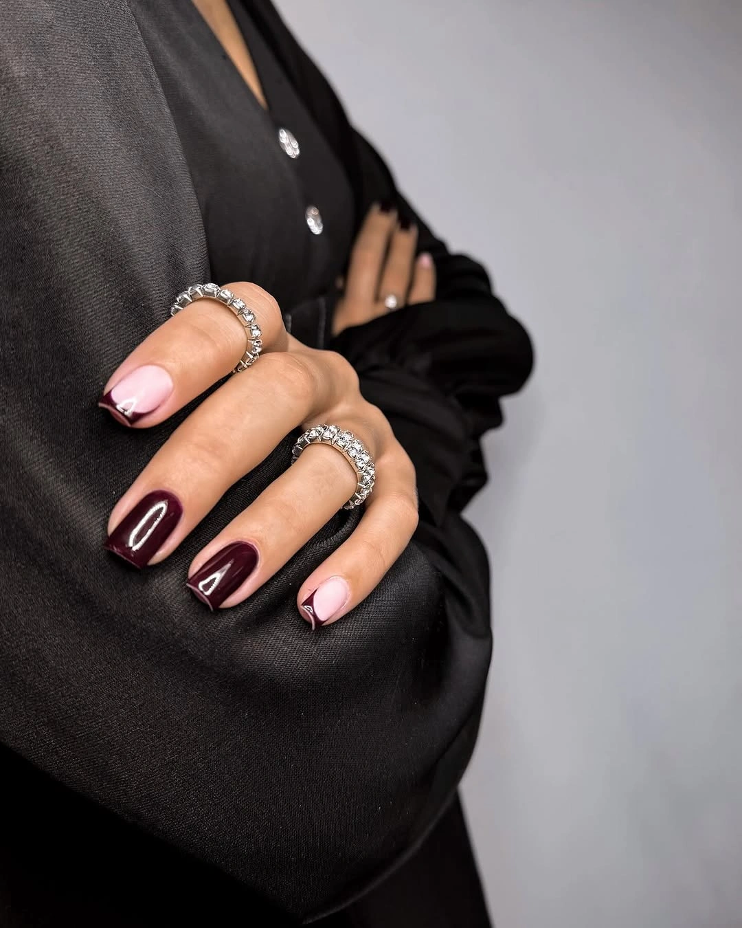
The final set uses compact rounded burgundy tips with a pale curved accent near selected edges. The dark base keeps the manicure grounded, while the light curve softens the transition and adds a small graphic movement without filling the nail with a large motif. Gray denim behind the hand supports the neutral contrast and lets the edge detail remain visible.
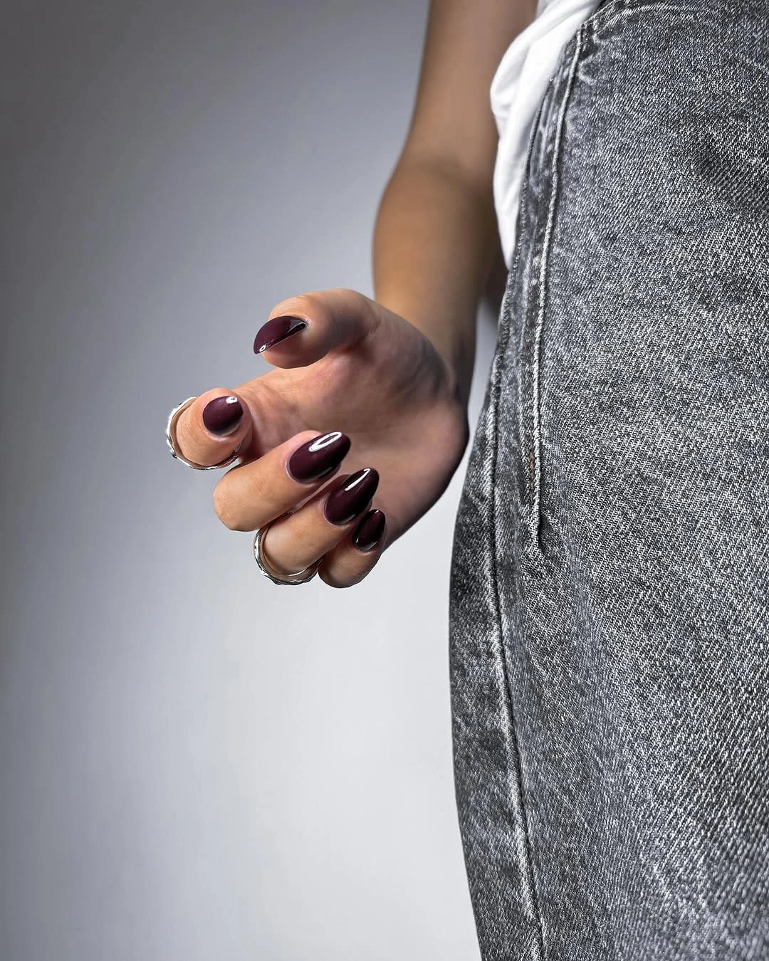
This is a practical way to combine a deep fall color with a lighter design decision. Keep the curve on two nails, make it cream instead of white, or shorten it into a small corner mark if the nail bed is very compact. The rounded shape and pale edge work together, so adding sharp lines would change the gentle proportion that makes the set feel easy to wear.
A pale tip accent needs a clean boundary, but its small scale makes it easier to reduce than a full floral or geometric pattern. Watch the free edge as the manicure grows and simplify the curve before adding more color. The final proportion is controlled by three jobs: burgundy supplies depth, the rounded tip keeps the length grounded, and the pale curve provides just enough movement.