Fall gel nails ideas 2026 become easier to use when you look for the small decision that changes the whole hand. It might be a peach curve on an otherwise milky nail, a dark edge around a smoky center, one patterned finger beside a solid color, or a fine line that points toward the tip. This collection keeps the manicure central while moving through edges, placement, texture, repetition, and contrast, so each reference offers a different way to edit the scale.
Start with the detail you would actually keep if the design had to become simpler. Long almond nails can carry a soft gradient or a single central motif, while short squares often benefit from broader marks and clearer negative space. The goal is not to copy every visible element blindly; it is to identify the feature that gives the manicure its rhythm, then preserve that feature while adjusting length, color density, or the number of accent nails.
1. Peach Curves on a Milky White Base
Thin peach or coral curves sit near the edges of short square milky-white nails, and that small warm detail changes the entire pale surface. The base remains glossy and dominant, but the lines create a direction that the eye can follow across the nail instead of stopping at the white field. Because the marks are limited, they feel like a precise interruption rather than a full pattern.
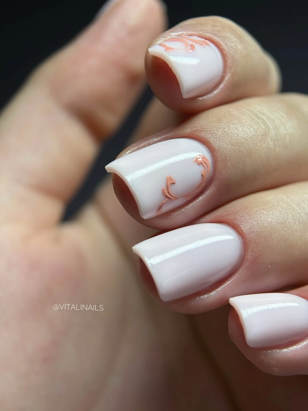
Keep the lines on two accent nails if you want the pale set to feel quieter, or make each curve broader when working on a smaller surface. A warm terracotta line would increase the fall connection, while a softer beige would make the detail almost disappear into the base. Preserve the light center and change only the edge color if you want to understand how much the small mark is doing.
Fine curves need a clean border to stay intentional, especially on a short square where the available surface is limited. I would not add glitter or a second motif, because the pale base needs open space around the line to keep the detail legible. The manicure works through scale: one warm edge note is enough to make a simple white shape feel considered.
2. Periwinkle Blue with No Extra Motif
A short square periwinkle manicure shows how a single color can become the detail when the surface is completely uninterrupted. The cool blue is pale but not washed out, and glossy reflections run along the compact edges, giving the uniform set a little movement. There is no art competing for attention, so the eye notices the exact balance between the rounded corners and the calm color first.
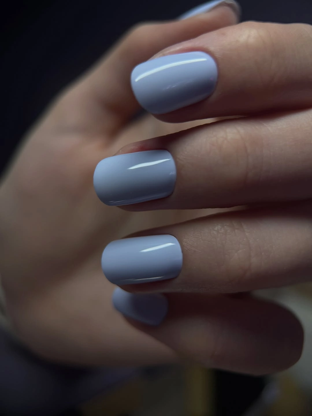
If you want a stronger fall connection, keep the periwinkle on most nails and add one deep brown or ink-blue accent, rather than decorating every surface. A shorter squoval will soften the corners, while a straighter square will make the blue feel more graphic. The useful adjustment is controlled: one darker note can change the seasonality without erasing the pale color that defines the set.
A cool light shade can look more summery when surrounded by other pale tones, so styling has a practical role in how the manicure reads. I would pair it with charcoal, denim, or a dark knit if you want the blue to feel grounded. The small lesson is that restraint is also a detail; leaving the surface plain lets shape, reflection, and color do the work.
3. Lavender Tips with Tiny Colored Fragments
Short rounded-square nails use a translucent lavender center, brighter lilac tips, and tiny blue, purple, and pale fragments beneath the glossy surface. The tips frame the open middle, while the scattered pieces reward a closer look without filling the nail from edge to edge. This layered arrangement depends on negative space: the pale center keeps the color fragments from turning into a dense block.
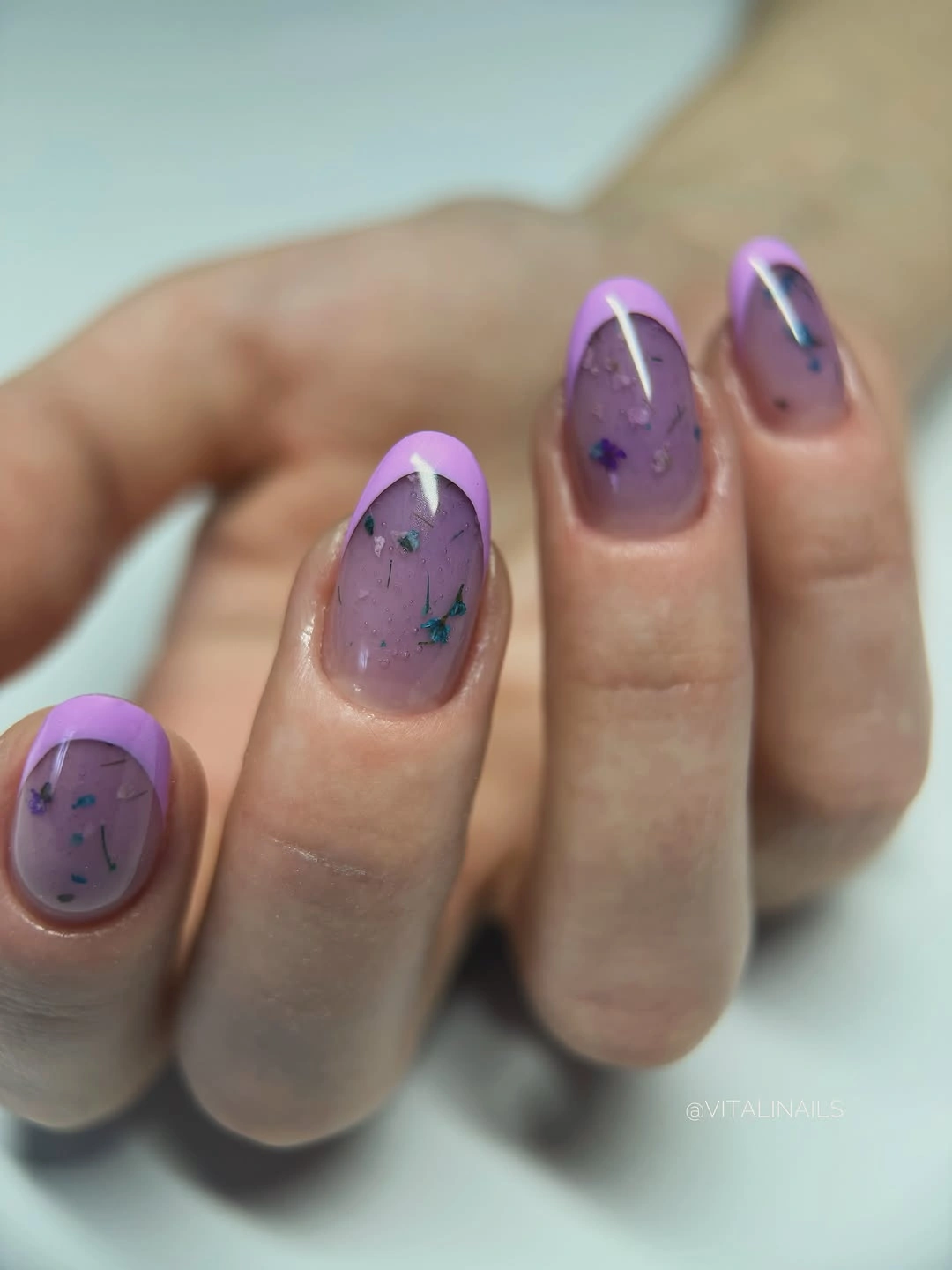
Keep the fragments on one or two accent nails if you want a simpler version, and use plain lavender on the supporting fingers. A shorter square can carry the same idea if the pieces become fewer and slightly larger, while a rounded edge will echo the soft tip curve. Preserve the translucent center before changing the exact colors, because that open field is what makes the details visible.
Small fragments are visually sensitive to spacing, and a glossy surface can make them appear more active in direct light than in shade. I would not describe the pieces as a particular material or claim a hidden construction. The design succeeds through a clear order of attention: brighter tip first, sheer lavender second, then small color points inside the quiet middle.
4. Bright Orange on a Compact Square
Bright orange covers these short square nails with a glossy, uninterrupted surface, so the most consequential detail is the clean corner and free edge. The color is saturated enough to carry the whole hand, while the compact length keeps it from becoming a long theatrical block. Nothing else competes with the orange, which makes the silhouette easy to evaluate and the seasonal association immediate.
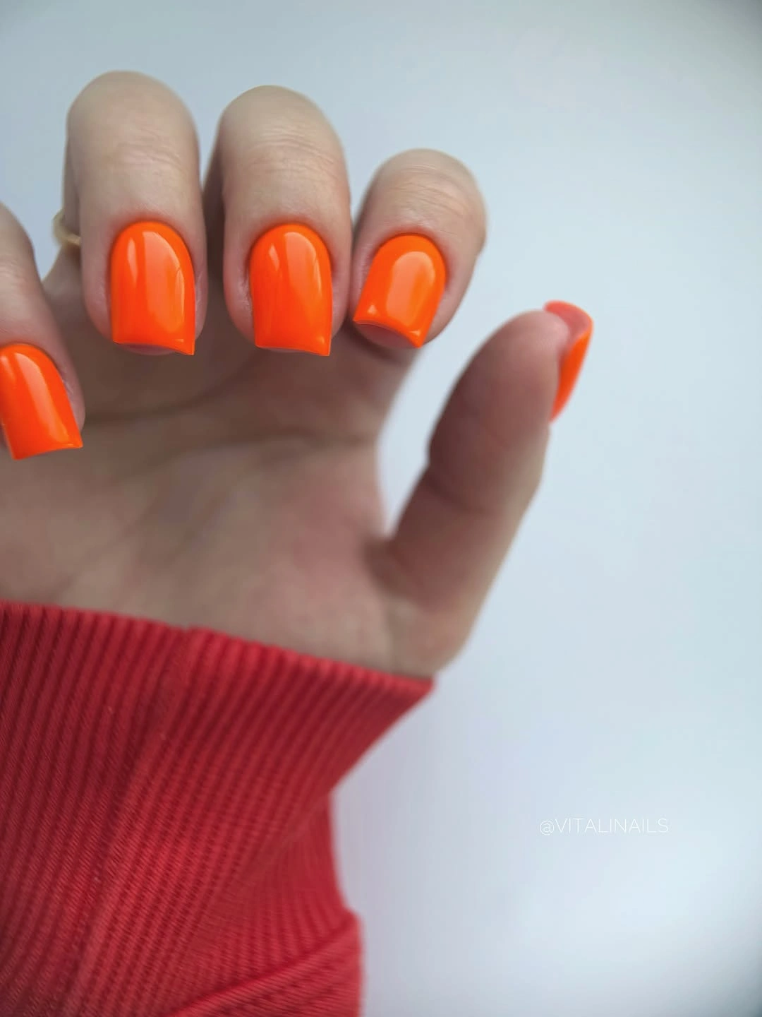
If the saturated shade feels too loud, move toward pumpkin, terracotta, or muted rust without adding a pattern. A squoval will make the orange more relaxed, while a straighter square will sharpen the graphic quality. Change one variable at a time and keep the solid surface intact, because the reference depends on the color being seen as one uninterrupted decision.
Vivid color makes edge wear obvious, especially when the nail is short enough for every tip to sit in view. I would keep the surrounding styling simple and let the orange be the single warm focal point. The design is useful precisely because it has so little to hide behind: even length, a clear edge, and one confident color are the details that matter.
5. Deep Blue with a Small Metallic Accent
Glossy deep blue squares form the main manicure, and one small reflective accent near the hand adds just enough interruption to keep the solid set from looking flat. The blue is saturated but dark, while the short-to-medium length gives the color a firm shape without relying on long tips. The surrounding jewelry is separate from the nail design, yet it shows how a small bright point can frame a quiet jewel tone.
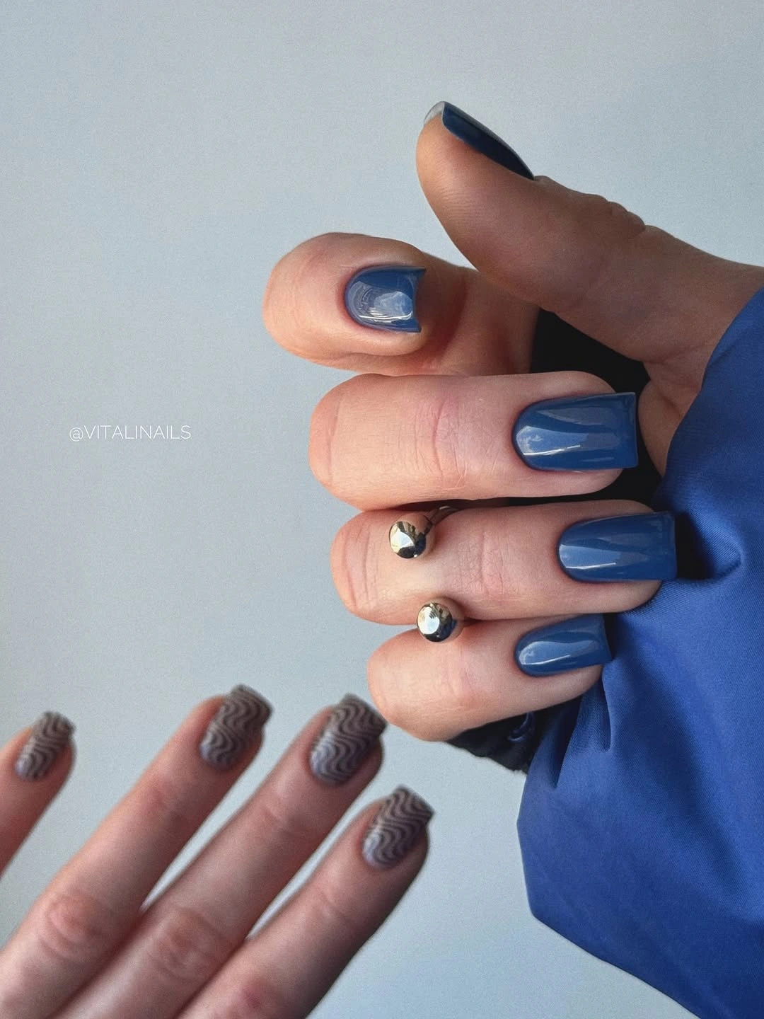
Keep the blue on four nails and use the accent on one or two if you want the same balance with less visual weight. A shorter square will make the dark color feel more casual, while a muted navy will lower the saturation without changing the placement. Preserve the solid blue field; adding a large pattern would take away the controlled contrast that makes the little accent useful.
Because the accessory appears close to the fingers, it is important not to treat it as evidence of nail decoration. I would use a simple ring or bare hand when adapting the manicure so the nail color stays central. The useful detail is the proportion: a deep uninterrupted field can carry the design, and one small glint can supply relief without becoming a second focal point.
6. Red Solids with Two Contrasting Accents
Short square nails combine glossy red solids with two accent decisions: one pale nail has a dark and reflective-looking edge, and another white nail carries irregular black outlined marks. The red repeats across most of the hand, which makes the unusual accents feel deliberate rather than random. Placement is doing the editing here; the set has contrast because the exceptions are limited.
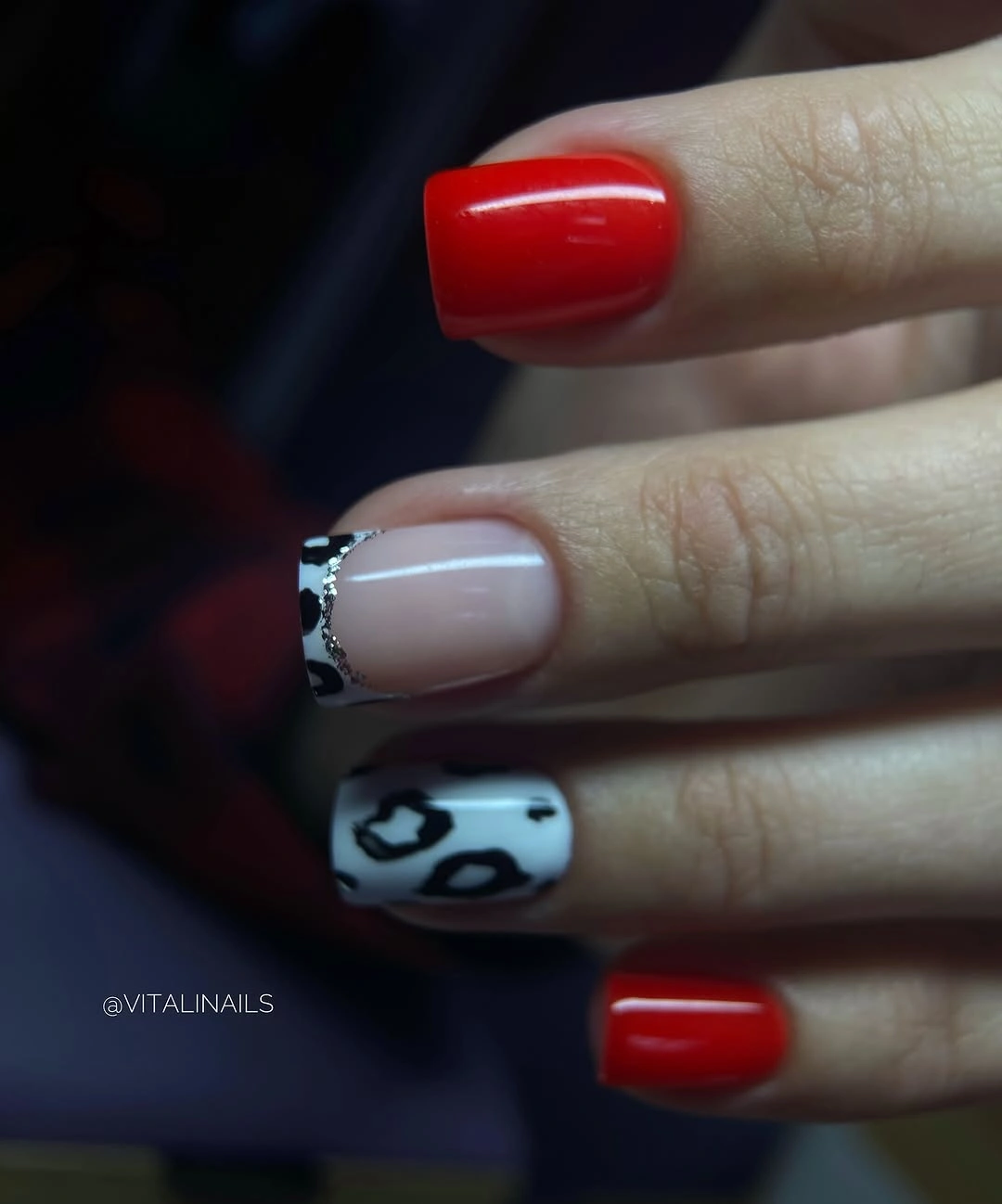
Keep one patterned accent and let the rest remain red if you want the design to feel more compact. The pale edged nail can become a soft beige tip, while the irregular black marks can be made larger and fewer on a short surface. Preserve the red as the dominant color, because the accents are effective only when they interrupt an established field.
The close crop does not prove a named technique or exact material, so the safe takeaway is the contrast between a warm solid, a pale edge, and a dark graphic mark. I would avoid making all three surfaces equally busy. The manicure works when the eye returns to the red after noticing the accents, creating a rhythm of repetition, pause, and return.
7. Brown Patches on a Soft Oval
Medium oval nails use warm brown as a base, then add irregular darker patches and a cool translucent-looking edge that gives the surface a layered appearance. The patches vary by finger, so the set feels organic rather than mechanically repeated, while the rounded silhouette keeps the dark marks from looking too sharp. The smallest consequential detail is the pale border, which prevents the brown from becoming a flat block.
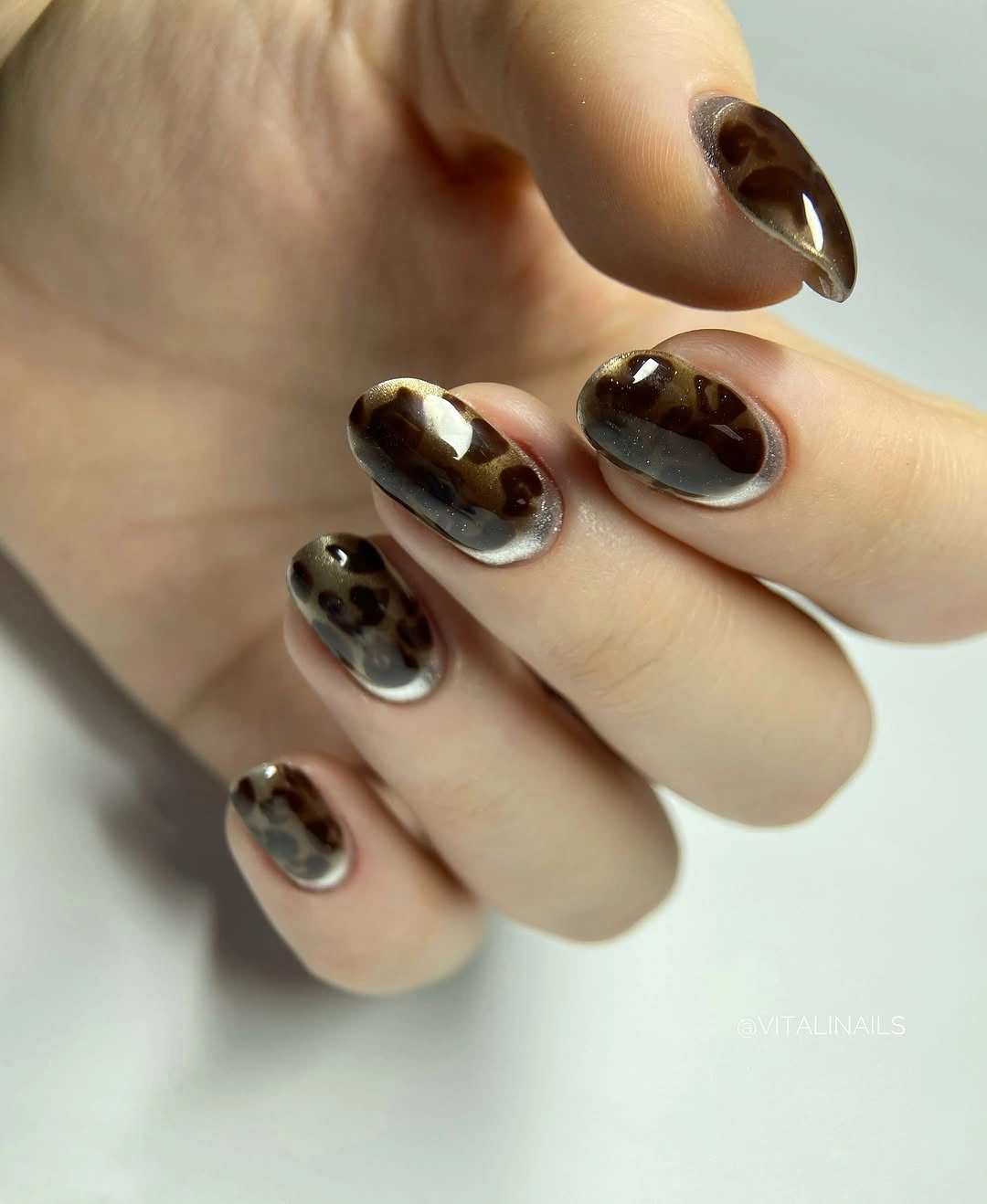
Use the patchwork on two accent nails and keep the rest warm brown or nude if you want more negative space. A shorter oval will preserve the soft direction, while a squoval will make the edges more graphic. If the cooler border feels too contrasting, shift it toward beige instead of removing the patches; the border is what separates the layered colors.
Irregular marks should remain broad enough to read on a medium nail, and too many small spots could make the design look crowded. I would describe the pattern as abstract rather than naming a specific print, because the visible shapes support mood more clearly than identity. The reference succeeds through a warm base, a darker interruption, and one lighter edge that keeps the balance open.
8. Silver Fracture over Glossy Black
A short square black manicure stays mostly glossy and solid, but one visible accent carries a dense silver-white fractured texture. The accent is small enough to create relief without taking over the hand, and the surrounding black makes every light mark appear sharper. The detail-first lesson is simple: a single active surface can change how an otherwise plain set is read.
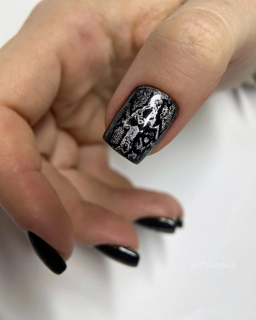
Keep the silver texture on one or two nails and leave the rest black if you want the contrast to remain controlled. On a shorter edge, broad light fragments will read more clearly than many thin marks, while a rounded-square corner will soften the graphic effect. Do not add another color unless the black and silver relationship feels too stark; the two values already provide enough structure.
The surface looks fractured or lace-like, but the visible detail does not prove a specific application method, so it is better to focus on density and contrast. I would keep the accent close to the center of the design and let the black remain a quiet frame. The manicure works because the active nail is a deliberate exception, not because every finger carries equal complexity.
9. Caramel Lines with Gold-Edged Accents
Medium oval nails move through nude, amber, caramel, and warm brown, with curved accents and narrow gold-looking borders appearing on selected fingers. One warm solid nail gives the eye a place to rest, while the more detailed nails use translucent space and layered lines. The palette is narrow, but the small changes in finish and placement keep the hand from feeling repetitive.
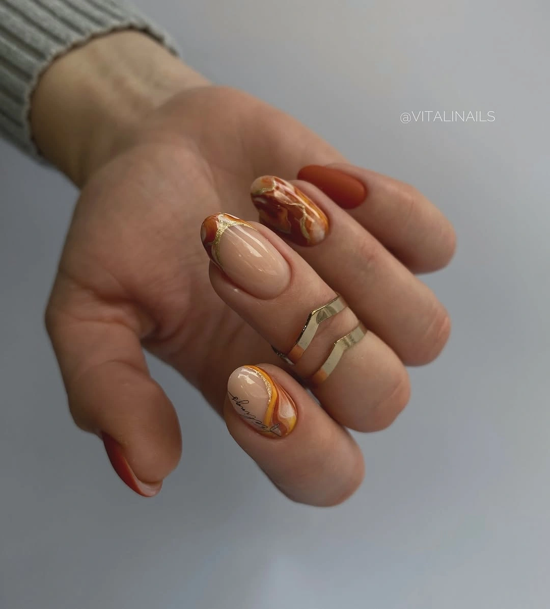
Keep one amber accent and one warm solid beside plain nude nails if you want a quieter version. A shorter oval can hold the same curved movement, but the line work should become broader and less numerous as the surface shrinks. If the metallic edge feels too bright, change it to beige or caramel rather than adding more detail; the warm family already provides cohesion.
The rings and background reinforce the styling, but the manicure itself is defined by how the lines sit inside the warm palette. I would not claim that the borders are made of real metal or assign a specific technique. The useful structure is visible: nude gives space, caramel supplies movement, and a small bright edge tells the eye where the accent ends.
10. Burgundy with Botanical Line Work
Medium oval nails use a deep burgundy base, then place white flower-like and leaf-like outlines on selected surfaces. The pale marks vary in scale, leaving enough burgundy exposed for the dark color to remain the primary field. That proportion is the important detail: the line art adds a second reading without turning the manicure into an all-over illustration.
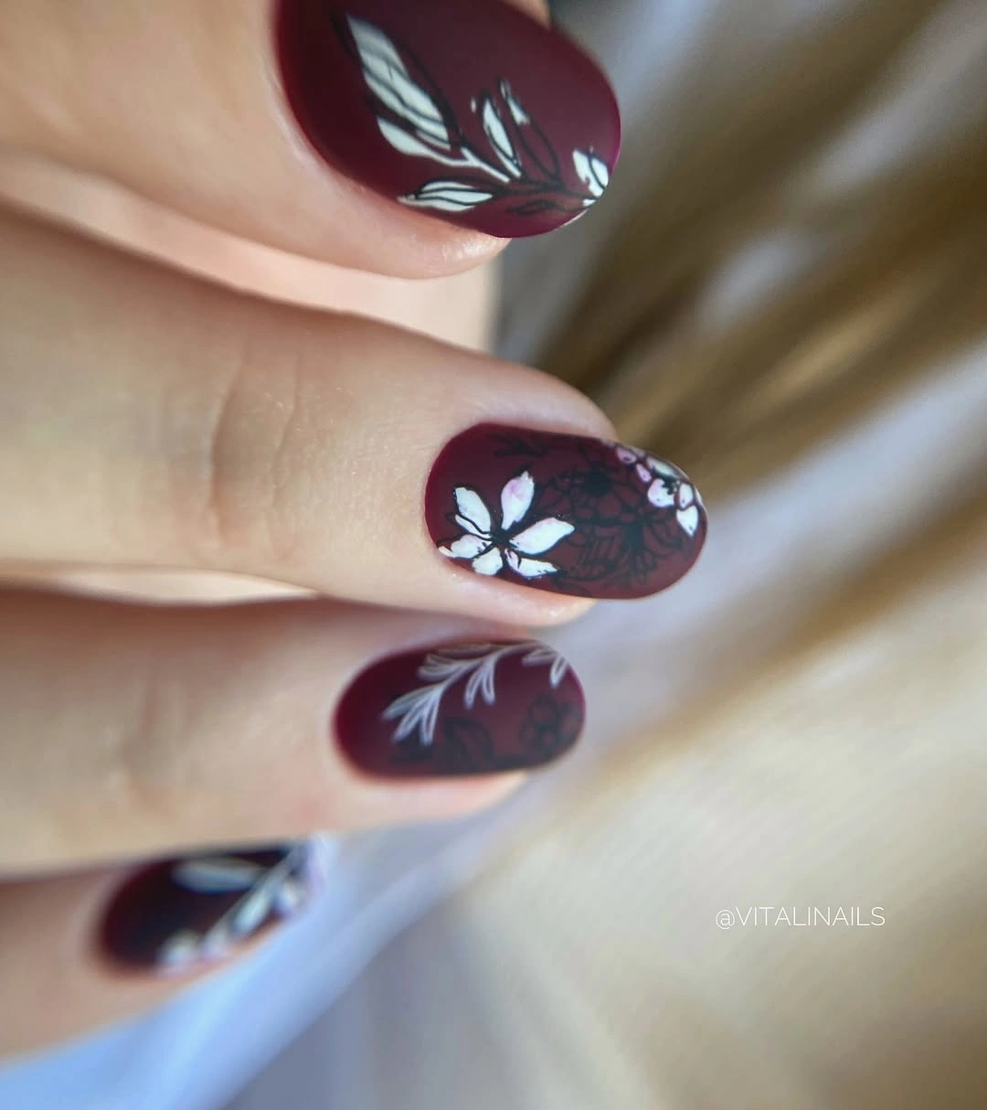
Use the botanical outlines on two accent nails and keep the rest solid burgundy for a clearer hierarchy. A shorter oval will make the motifs more compact, while a slightly wider shape can give the pale lines more room to breathe. Preserve the dark base and change only the number of decorated nails if you want the reference to feel more wearable.
Fine organic lines need careful spacing, but the medium oval shape helps them feel softer than they would on a long square. I would avoid naming a specific flower species because the visible motifs are stylized and partly cropped. The set works when the white lines behave like a quiet drawing inside the burgundy, leaving the base readable from a distance.
11. Orange Glitter with Black Curved Accents
Several short square nails carry dense orange sparkle, while two pale nails use black looping lines with warm orange color inside the curves. Repeating orange across the solids and the accents ties the design together, even though the surfaces are not identical. The key detail is the anchor color: without the orange repeating, the black line work would feel disconnected from the glittered fingers.
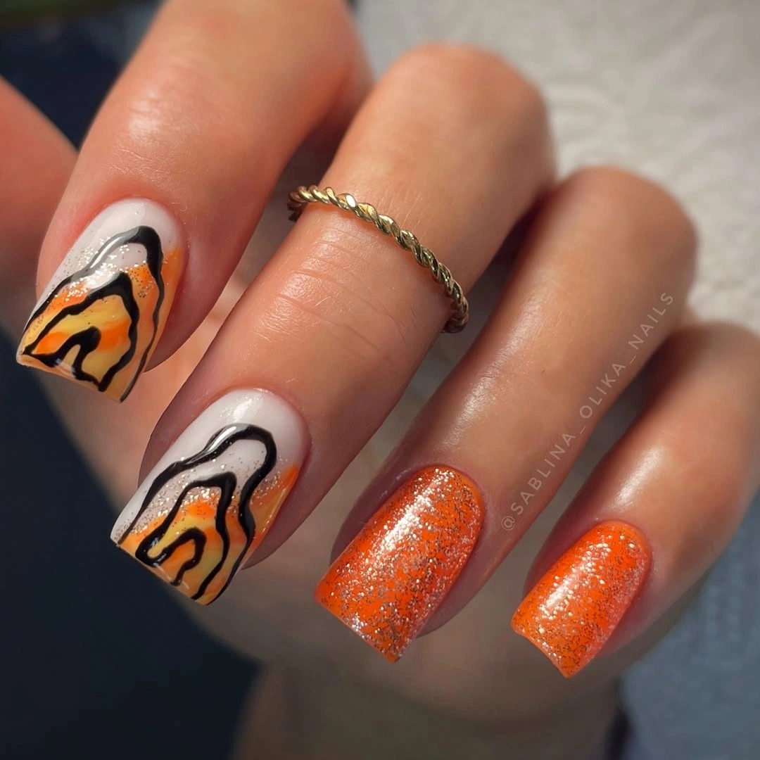
Use glitter on two nails and simplify the curved accents into broader marks on one finger if you want less density. A shorter square will make the lines feel more concentrated, so leave extra pale space around each curve. Keep the orange family consistent while changing the amount of sparkle, because color repetition is the bridge between the quiet and active surfaces.
The curved marks are abstract and do not need to be labeled as a seasonal object. I would avoid adding another bright shade, since the warm orange already supplies enough energy and the black lines already create definition. The manicure holds together through repetition with variation: orange returns in different textures, while the pale nails provide the pause between glitter and line work.
12. Pale Pink with Dark Spotted Accents
Short square nails mix a soft pale pink, glossy dark brown solids, and two light nails covered with irregular dark spots. The pattern is concentrated rather than spread across every finger, so the hand keeps a simple base even while one pair supplies contrast. The small detail that changes the balance is the placement of the spots beside a dark solid, which makes the palette feel intentional.
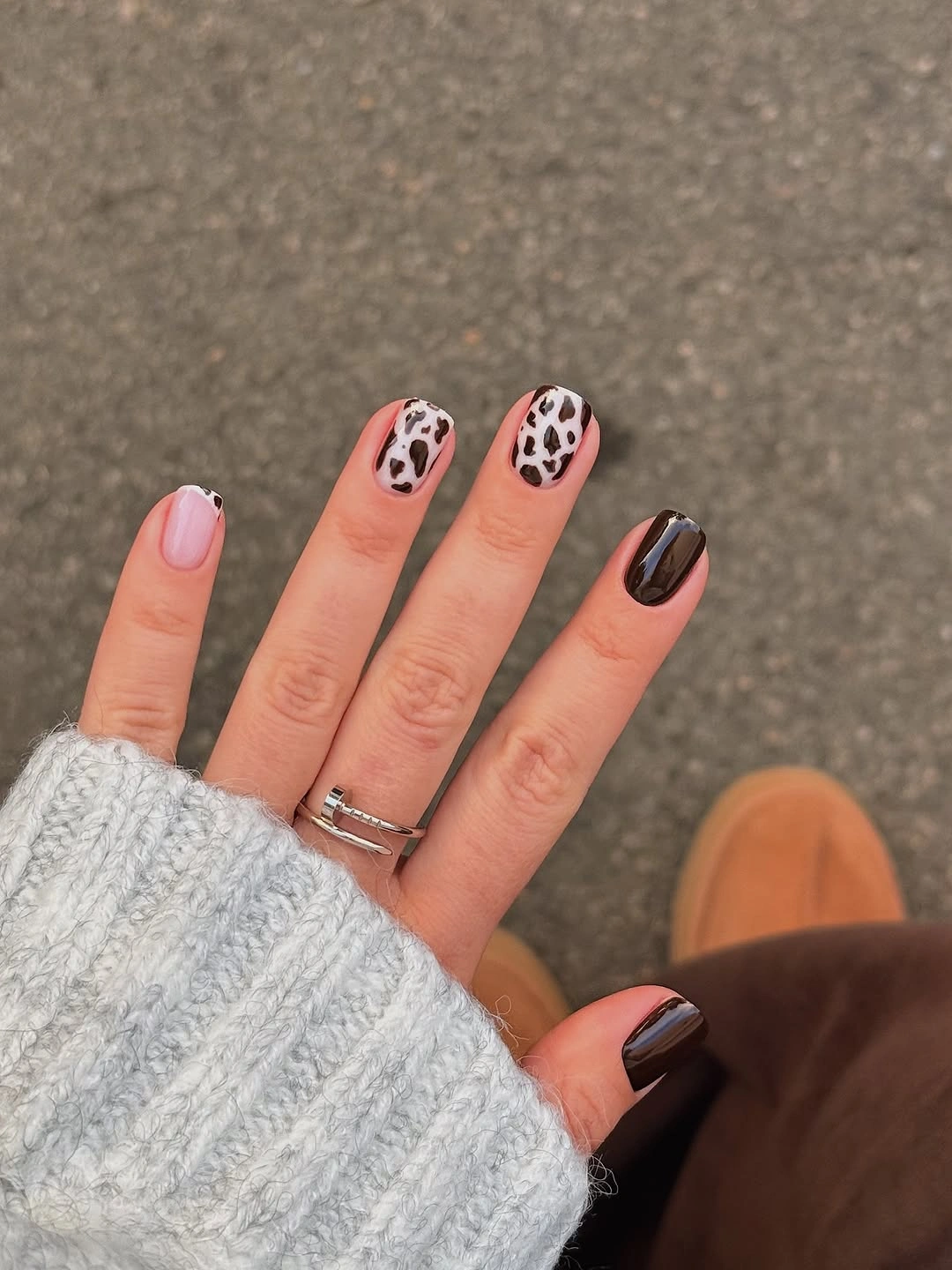
Keep the spots on two nails and use pale pink on the rest if you want a lighter composition, or keep one dark brown solid as an anchor. On a shorter surface, choose fewer larger marks so they remain readable. Preserve the warm relationship between pink and brown before changing the exact pattern, because the color connection is what makes the accents belong together.
The irregular shapes are better described as spotted than assigned a precise print name, and the outdoor setting is not evidence for a nail technique. I would keep the supporting nails glossy and simple so the eye can identify the patterned pair. This design is practical inspiration because it shows how a small amount of visual noise can add personality without demanding a full decorated hand.
13. Deep Red with One Glittering Heart
A long pointed nail carries a deep red glossy surface with fine red sparkle and a brighter heart-like shape traced across the center. The motif is small compared with the length, so the eye sees the elongated red field first and the central detail second. That order keeps the design from becoming childish or overly crowded; the heart is an accent inside the color rather than the entire story.
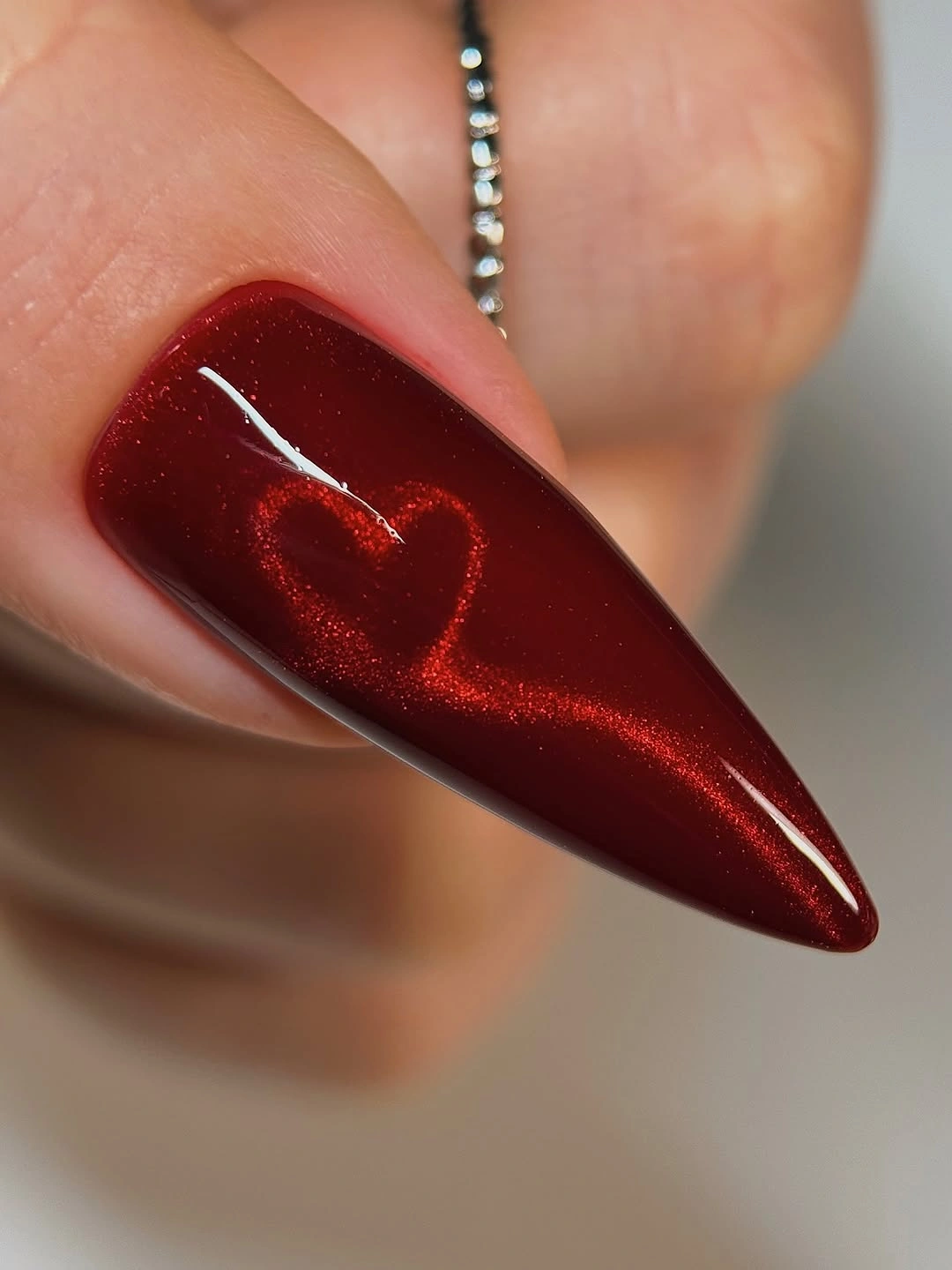
Use the heart-like detail on one shorter almond if you want a more practical version, and keep the remaining nails plain deep red or red sparkle. A broader outline will survive better on a small surface, while a thinner line will feel more delicate. Preserve the central placement, because moving the motif to the tip would change the visual weight and make the nail appear shorter.
The close view supports the red, shimmer, and central shape, but not a claim about how the accent was made. I would avoid adding extra charms or another motif around it. The look works when the sparkle stays fine, the pointed silhouette remains visible, and the heart-like detail appears as a quiet focal point discovered after the color has already established the mood.
14. Rounded Droplets on a Dark Blue Base
Medium square nails use a dark blue-black base covered with many rounded droplet-like forms that catch light at different sizes. Some areas look metallic while others recede into shadow, so the surface changes as the hand moves instead of presenting one flat texture. The individual circles are the consequential detail: together they create relief, but their uneven scale keeps the result from looking mechanically stamped.
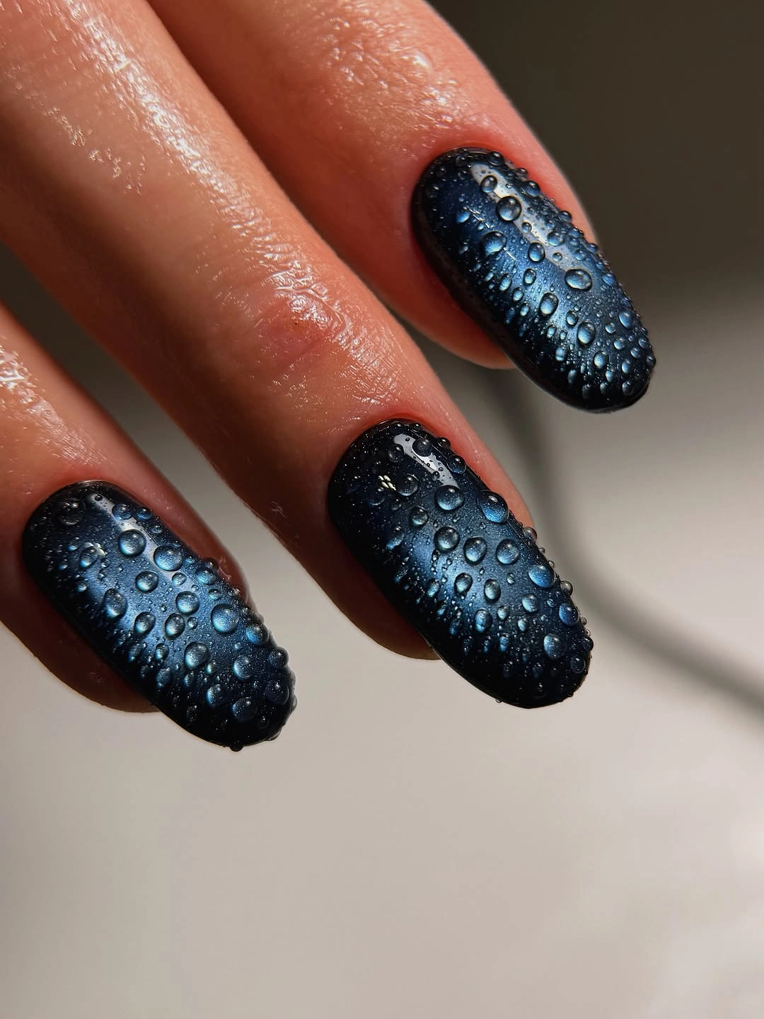
Keep the textured surface on two accent nails and use plain dark blue on the rest if you want the effect to stay wearable. A shorter square can carry larger, fewer rounded marks, while a softer edge will reduce the visual severity. Preserve the difference in droplet size; making every circle identical would remove the natural rhythm that gives the surface its depth.
The visible relief should be described cautiously, without claiming water, a 3D product, or a specific method. I would keep the palette dark and avoid adding glitter, because the rounded highlights already supply movement. This is a strong example of how texture can replace color contrast: one deep base becomes expressive through small changes in surface and reflection.
15. Sheer Nude with Tiny Pale Flecks
Short-to-medium almond nails use a sheer nude-pink base with glossy highlights and only a few tiny pale flecks. The shape is tapered but not extreme, and the transparent-looking surface leaves the manicure close to the hand, making the smallest details easier to notice. Nothing is concentrated at the tip or cuticle, so the design feels quiet because the decoration is sparse and evenly restrained.
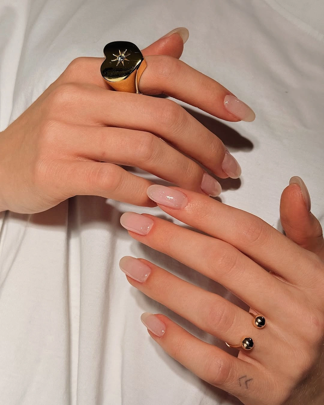
Keep the almond slightly shorter if you want the same softness with less maintenance, and place the flecks on one or two nails rather than distributing them everywhere. A warmer blush would make the hand feel cozier, while a cooler pink would keep the look cleaner. Preserve the open base before changing the tiny accents, because the negative space is the design’s main visual feature.
A sheer surface can reveal uneven edge work more easily than an opaque color, so the minimal look still benefits from careful shaping. I would not add a large motif or dark contrast here; the value is in the restraint and the way the almond silhouette remains visible. This reference is useful when the reader wants a fall manicure that feels finished but does not announce itself from across the room.
16. Soft White Fade on Long Almonds
Long almond nails use a translucent blush center that fades softly into milky white tips. The edge is the detail that changes the balance: a plain pale nail would feel flatter, but the gentle transition gives the eye a destination and makes the long shape appear even more elongated. Warm light colors the hand, yet the manicure stays defined by the pale tip and the clean direction of the almond.
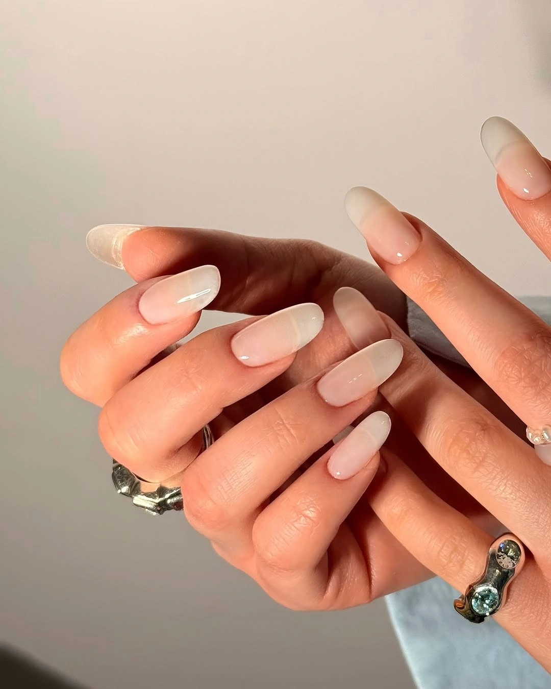
Use a medium almond if you want the length to be easier to manage, and make the white transition slightly broader so it remains visible on the shorter surface. A warmer beige base will move the look toward fall, while a cooler pink will keep it airy. Change the gradient width before adding art, because the tip transition is already the feature carrying the design.
Long almond nails create a clear silhouette but require more attention as the edge grows, especially when the colors are pale and the blend is subtle. I would keep rings and clothing from becoming too visually busy, allowing the small change between blush and white to remain visible. The manicure works through a quiet progression from translucent center to light tip, not through a dramatic color break.
17. Pastel Organic Shapes across Two Hands
Short square nails across two hands repeat soft pink, lavender, mint, and yellow fields with abstract organic shapes layered over them. The colors vary from finger to finger, but their similar softness creates continuity, while the shape language gives the manicure a repeated visual cue. The small detail to watch is not one isolated mark; it is the way the organic forms keep different pastel colors connected.
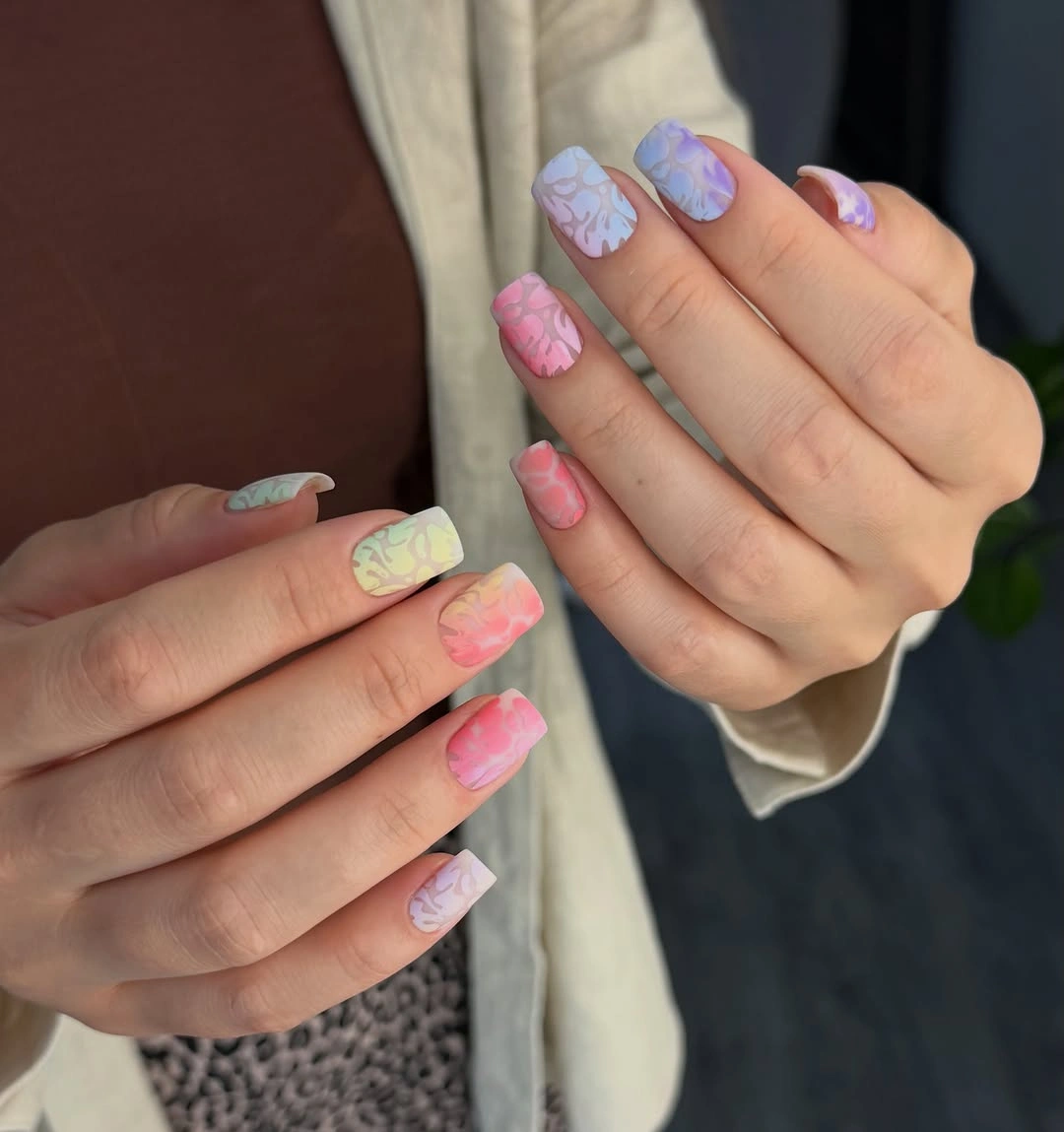
Choose two pastels over a neutral base if the full range feels too busy, and keep the organic shapes on accent nails. A shorter square can support broader marks more clearly than many tiny ones, while a rounded corner will echo the soft curves. Preserve the shared pastel intensity before changing individual colors, because the low contrast between shades is what keeps the two hands coherent.
The background clothing helps explain the color mood but does not prove a named technique or raised finish. I would describe the marks as abstract shapes and leave room for the reader to simplify them. The set succeeds through repetition at collection scale: each nail can differ, yet the same soft color density and curved language keep the manicure from becoming a random assortment.
18. Black, Brown Pattern, and a Gold Bead Line
Long square nails combine glossy black solids, translucent brown nails with darker abstract patches, and one nude nail finished with a small line of gold-looking beads near the base. The black provides dense relief, the brown introduces pattern, and the nude accent opens the hand so the details do not merge into one dark field. The bead line is small, but it changes the focal path by drawing the eye toward the cuticle.
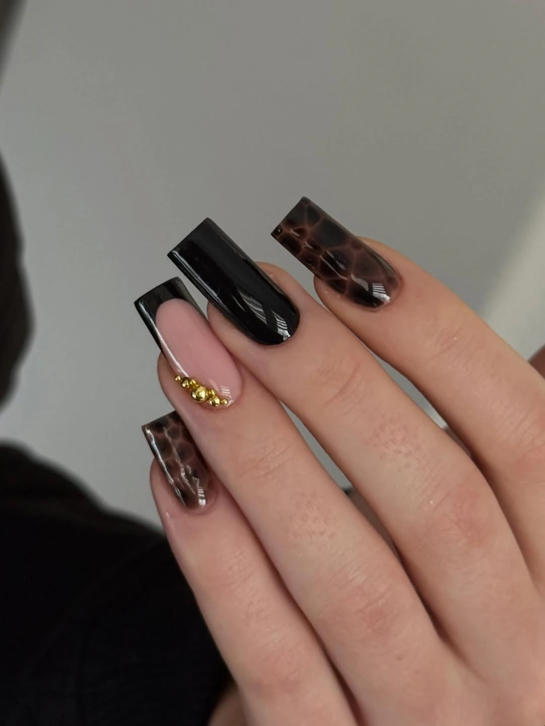
Keep the black solids and one brown accent if you want a more practical version, then remove the bead line or use a thin warm-colored border. A shorter square will reduce the commitment of the long tips, while broader brown patches will stay clearer as the surface shrinks. Preserve the order of contrast – black, translucent brown, then nude – because the palette is doing the organizing work.
The visible beads look metallic, but their exact material and application are not established, so the safe advice is about scale and placement. I would avoid adding another focal detail near the tip; the small line at the base already provides a deliberate interruption. This is a mixed-finish manicure that stays coherent because each surface has a job and the dark colors do not receive equal visual weight.
19. Glossy Red on a Medium Square
Medium square nails in vivid glossy red show how a clean edge can be more consequential than a decorative motif. The color is uniform across the visible fingers, and the salon-like surroundings remain soft enough that the red becomes the first clear shape in the scene. A medium length gives the saturated surface presence without making the hand depend on a long point or a dense pattern.
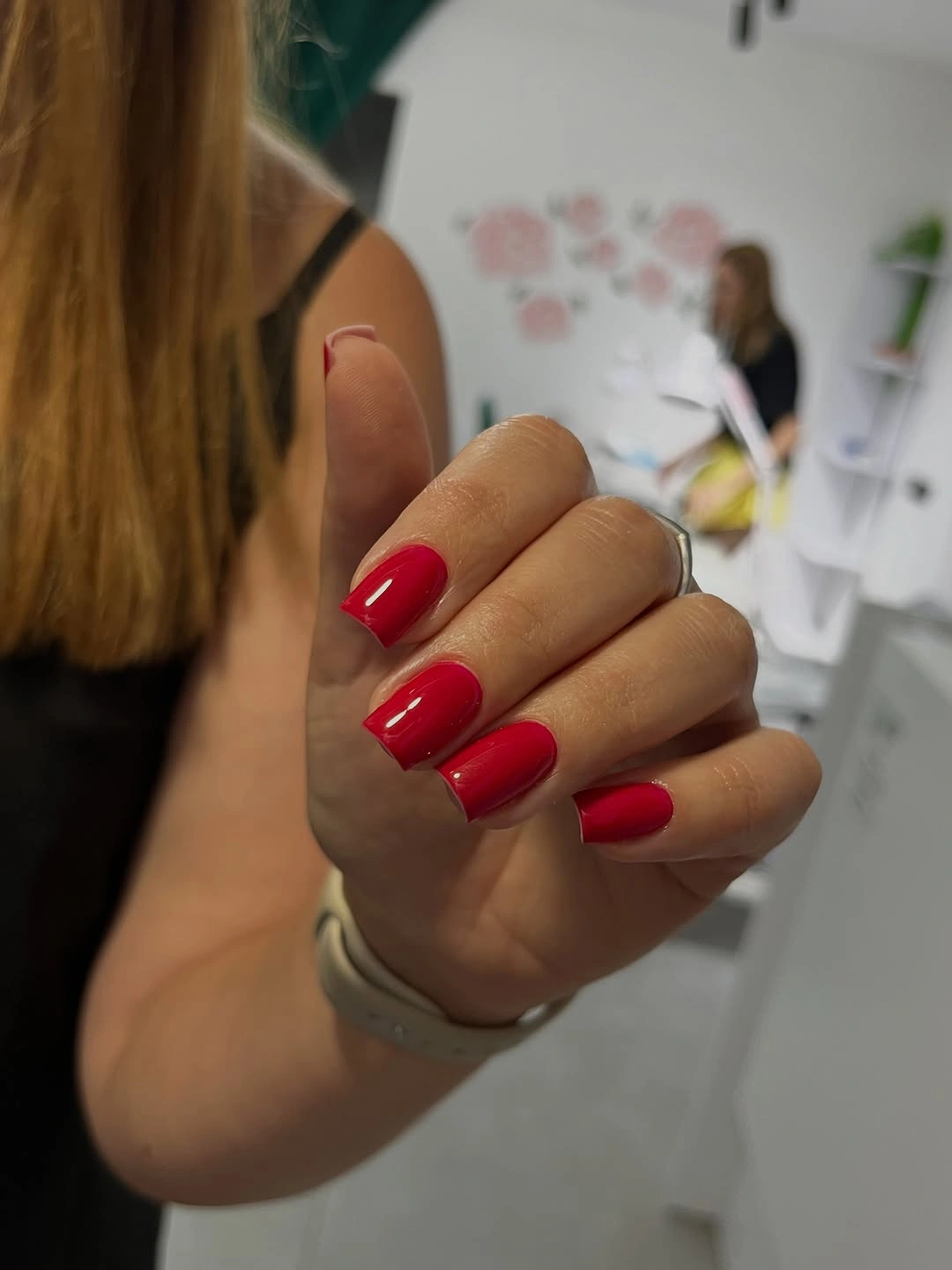
Shorten the square slightly if you want the red to feel more everyday, or shift it toward berry, brick, or deep red while preserving the one-color surface. A softer squoval will reduce the graphic edge, but a crisp square will make the color look more deliberate. Change tone or shape before adding art, because the reference is valuable precisely for its uninterrupted red.
Bright red will show chips quickly, so a clean outline matters more than extra decoration. I would keep rings and clothing neutral enough to let the glossy reflection remain visible, then use the color as the whole focal point. The design gives fall gel nails a direct answer: one strong shade, a balanced square, and enough shine to make the edge readable.
20. Pastel Streaks Following a Long Almond
Long almond nails carry soft pink, yellow, blue, and lavender streaks that travel lengthwise over a pale base. The marks are blurred into flowing bands rather than placed as separate dots, so they emphasize the direction of the almond and make each nail look longer. The smallest design decision is the angle of the movement: the color follows the shape instead of cutting across it.
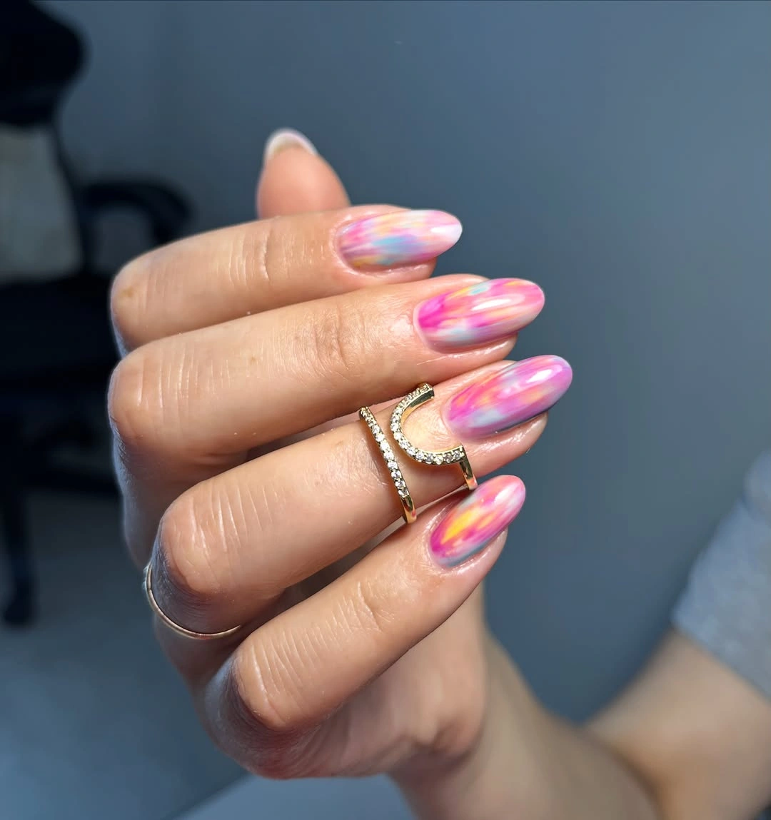
Use two related colors if the full pastel range feels too active, or keep the streaks on two accent nails over a sheer base. A medium almond will still show the direction, but the bands should be broader and fewer so they do not collapse into noise. Preserve the lengthwise movement before adjusting the palette, because that is what gives the manicure its visual rhythm.
Long almond length and many soft colors create an expressive look that may need editing for daily wear, especially when the hand already has reflective jewelry. I would keep the base pale and let the streaks vary slightly rather than forcing identical repeats. The result works through controlled flow: the colors move, the almond points forward, and the open base keeps the surface from feeling crowded.
21. Forest Green beside Midnight Blue
Short square nails alternate deep forest green and midnight blue, using close dark values rather than a loud contrast. Glossy highlights separate the colors just enough for the eye to recognize the two-tone pattern, while the compact shape keeps the jewel tones from becoming heavy. The small detail carrying the balance is the color order: green and blue sit beside each other as related depth, not as unrelated blocks.
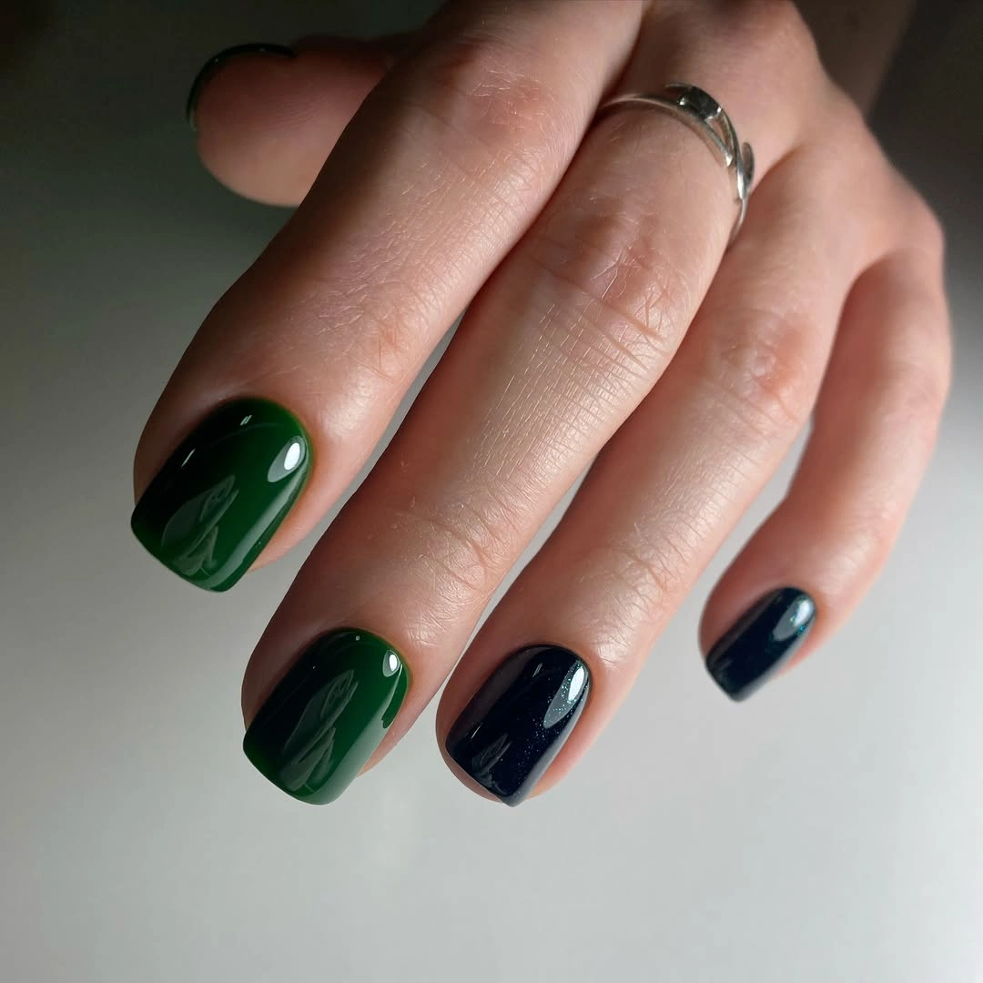
Use one shade on most nails and place the other on two accents if you want more negative space. A shorter squoval will soften the transition, while a crisper square will make the tonal alternation clearer. If the colors look too close, brighten the green slightly before adding any art; a small value change can make the existing placement easier to read.
Deep colors reveal edge wear against the skin, but the short shape keeps the maintenance more manageable than the long editorial examples. I would avoid a third accent because the quiet tension between green and blue is the point of the set. This ending leaves the collection on a controlled contrast: two dark colors, one glossy surface, and enough difference for the eye to keep moving.