The surprising thing about fall matte nails 2026 is how quickly a quiet surface can make a bold choice feel more deliberate. Without a glossy reflection to smooth over every decision, spacing, shape, and the amount of open room around an accent start doing the talking. That is useful when you want personality in your manicure without asking every nail to perform at the same volume.
Choose the detail you want remembered, then remove anything that competes with it. A practical test is to hold the silhouette and finish steady while you judge whether the design still feels balanced from a normal distance, not only in a close-up. If you are comparing options with broader early fall nail ideas, let that simple test guide the final decision.
1. Milky Ivory Nails With a Dark Side Outline
The pale ivory base is the main decision here, with a thin dark contour following one side of the long tapered nails. Because the line does not become a full tip, most of the surface stays open and the almond silhouette remains soft. That restrained placement gives the manicure structure without making the dark detail compete with the light field.
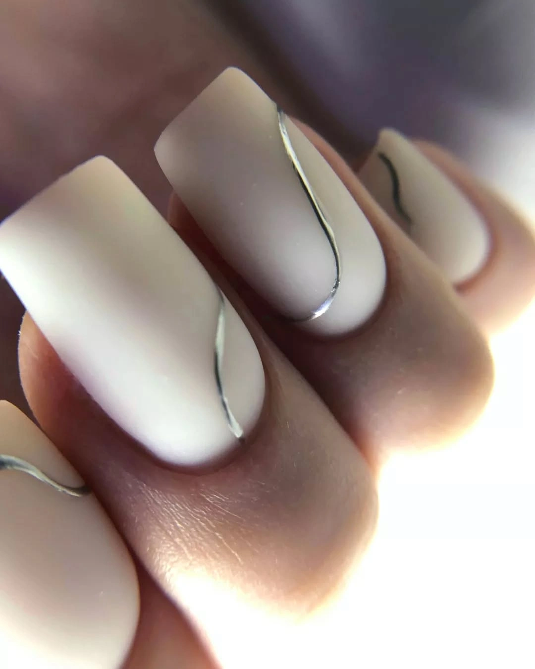
This idea is especially useful when you want contrast but dislike a complete black edge. The dark curve creates a visual boundary that the eye can follow from the base toward the tip, so the nail feels longer without needing a busy pattern. On a shorter shape, keep the contour on only one or two nails and leave the rest as plain ivory so the line retains its role as an accent.
Maintenance is easiest when the outline stays narrow and the base remains simple. Any small grow-out at the cuticle will be less distracting than it would be with a dense motif, although the long tapered shape still asks for more care than a short square. The look also pairs naturally with charcoal, silver, or soft gray clothing because those tones echo the line without changing the manicure’s calm center.
2. Deep Cocoa Brown On A Short Rounded Square
Here the manicure depends on a uniform deep cocoa-brown color across a short rounded-square shape. There is no printed motif to interrupt the surface, so the softened corners and even coverage do the visual work. That combination keeps a dense fall shade from feeling severe, especially when the hand is photographed against a blurred and neutral background.
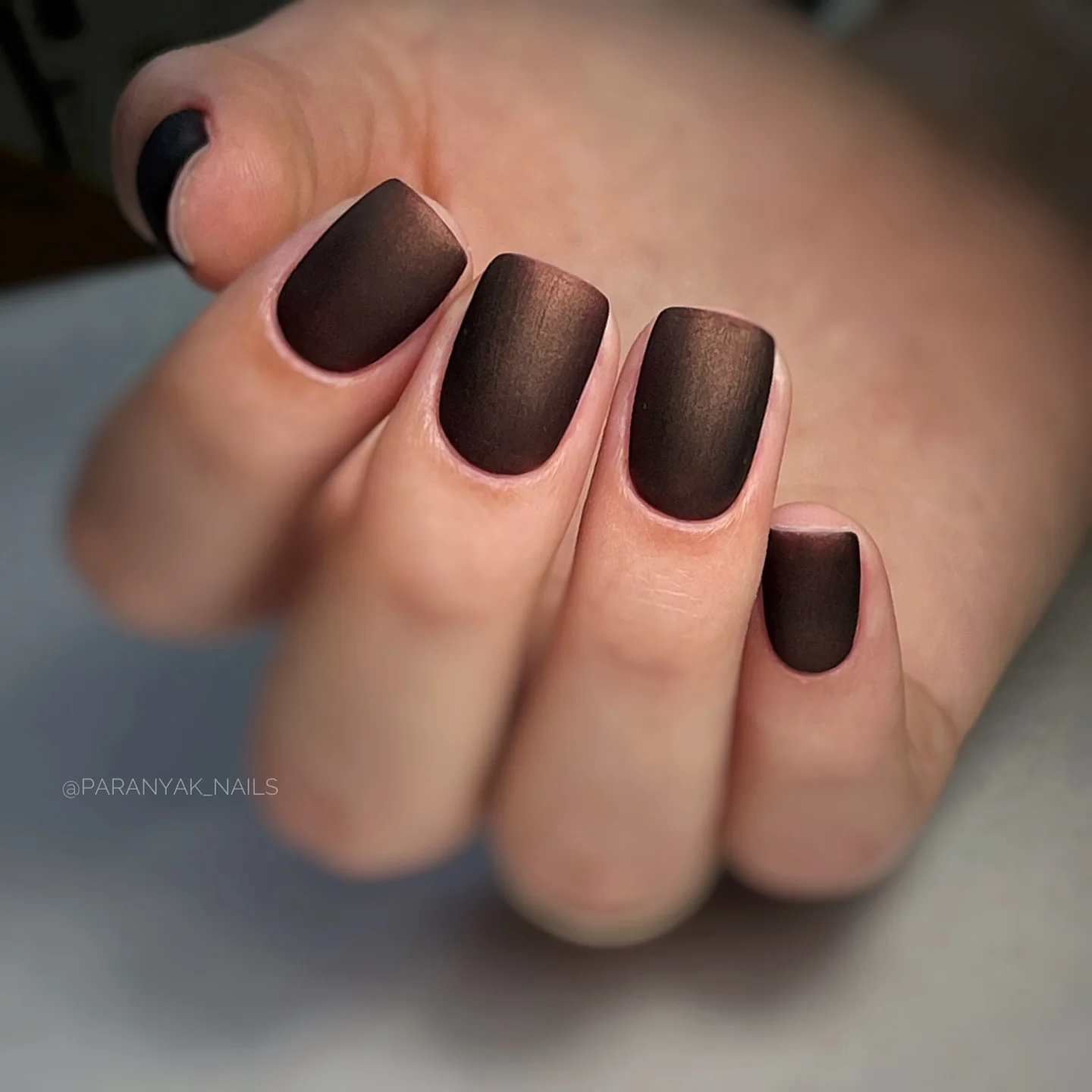
A dark solid color can look more deliberate on a compact nail because the eye reads the full shape at once. The rounded corners add a small amount of softness, while the matte-looking surface removes the extra flash that might make the brown feel dressier than intended. If you prefer a little contrast, use the same color on most nails and reserve one glossy-looking finger rather than adding a new motif.
The practical advantage is a short design with very little visual upkeep. There is no fine line to keep crisp and no small detail that can disappear as the nail grows, but an even dark surface will show chips clearly. Readers who want a wider fall palette can compare this grounded brown with the richer shades in these fall nail color ideas before deciding whether to stay completely matte.
3. Creamy Squares With Curved Green Cuticle Accents
Long square nails carry creamy pale bases while curved green sections sit near the cuticle on several fingers. The green does not cover the entire nail, which leaves the light base visible and makes the placement feel intentional rather than random. Repeating the curve in slightly different positions creates rhythm without turning every nail into an identical drawing.
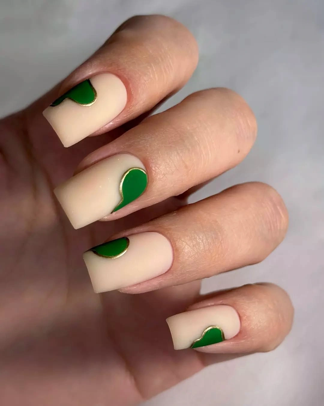
The balance works because the green is saturated but limited in area. A reader could keep the same relationship on a medium square by using one green curve near the base and a plain cream nail beside it, allowing the negative space to remain part of the design. This is a useful way to borrow a seasonal green without committing to a fully dark or fully colorful hand.
Length changes the effect more than the color does. On a long square, the open cream area gives the curve room to read as graphic; on a short nail, a smaller arc will be easier to keep clean and less likely to crowd the sidewalls. Pairing the set with warm brown, olive, or faded denim clothing can support the fall feeling while leaving the manicure itself uncluttered.
4. Muted Pastels Softened By Cool Styling
The hand shows a compact mix of pale blue, blush pink, and light neutral nails rather than one dominant pattern. The colors stay muted, and the rounded shape keeps the set gentle even though more than one shade is present. Cool clothing and a relaxed lifestyle setting matter here because they make the pastel palette feel quieter and less sugary.
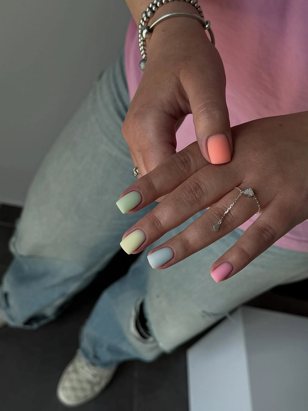
This is a good reminder that the surrounding palette can change how a manicure reads without altering the polish itself. A pale blue can look crisp beside gray denim, while blush becomes softer when the neighboring nails stay neutral. To adapt the idea for fall, keep one pastel as the lead, repeat the neutral twice, and use the second color only where you want the hand to turn.
The tradeoff is that muted pastels may lose definition in low light or against very pale clothing. A compact length helps, but a reader who wants stronger separation can choose one deeper accent such as cocoa or dusty rose instead of adding more colors. The result remains easy to wear because the design has variety without fine art that needs constant attention.
5. Pale Neutral Nails Framed By Deep Shadow
This portrait uses pale cream or nude nails on a short-to-medium rounded-square silhouette, with deep shadow around the hand creating the contrast. There is no obvious decoration to carry the composition, so the clean shape and light surface become the focal point. The dark background makes a very simple neutral feel more editorial than it might in a bright studio view.
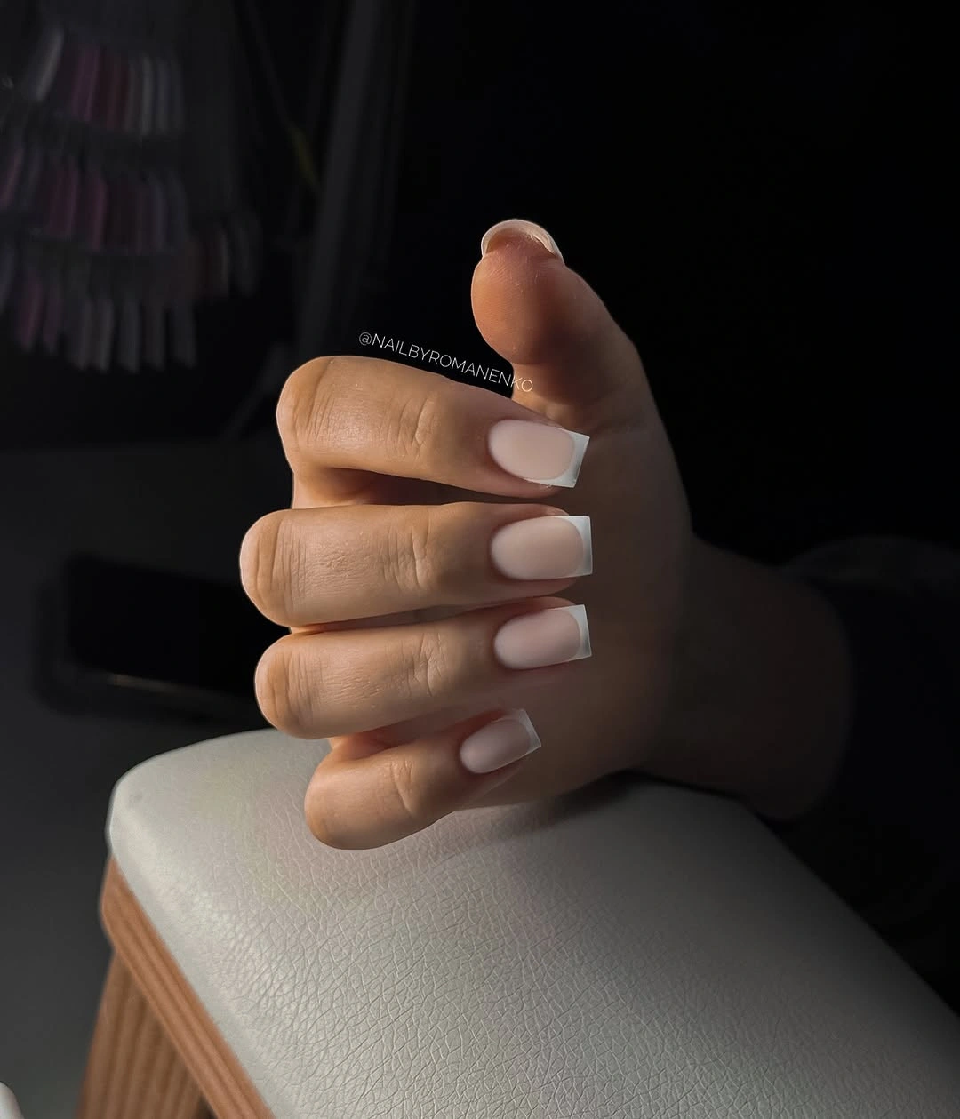
A light manicure like this is useful when you want the hand to look polished without choosing a seasonal motif. The value difference between the nails and the background gives enough visual tension, while the quiet base can sit beside nearly any clothing color. If your own styling is lighter, introduce contrast through a dark sleeve or a single metal ring rather than changing the manicure.
The limitation is that a plain neutral depends on even application and a tidy outline because there is nowhere for the eye to hide. The shorter silhouette helps with daily wear, but the pale color may show staining or small edge marks sooner than a deep brown would. It is a strong base for readers who want a calm starting point before exploring more specific fall manicure ideas.
6. Milky Almond Nails With Sparse Silver Curves
Long almond nails are covered in a milky pale base, then interrupted by thin reflective-looking silver arcs that sweep diagonally across individual nails. The curves are sparse rather than layered, so the light background still carries most of the design. Their direction follows the length of the nail, which gives the manicure movement without adding another strong color.
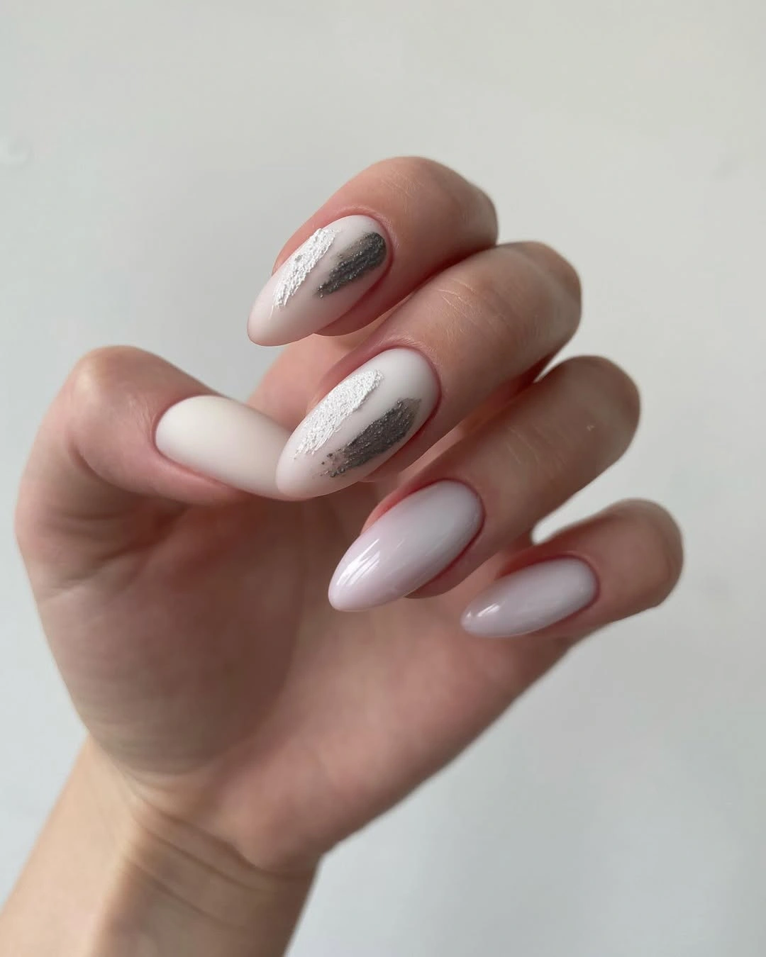
The diagonal placement is what keeps this neutral set from feeling flat. A narrow curve can draw attention from the base toward the tip, while the open spaces prevent the silver from becoming a full graphic panel. On a shorter nail, use one arc rather than two and keep it away from the side edge so the design remains readable after ordinary wear.
Silver is also a practical bridge between warm and cool clothing, but the reflective detail may catch more attention than a matte base. That makes the idea suitable for a reader who wants a quiet manicure with one polished detail rather than a completely plain set. Keep the rest of the accessories simple if you want the linework to remain the first thing noticed.
7. Neutral Prints Held Together By Small Warm Accents
This lifestyle manicure combines pale nude nails with dark spotted print, black-and-white contrast, and small warm yellow or metallic-looking details. The nails do not use one identical design, yet the limited palette keeps the mixed set from becoming disconnected. Denim and rings repeat some of the surrounding colors, but the manicure remains the central source of pattern.
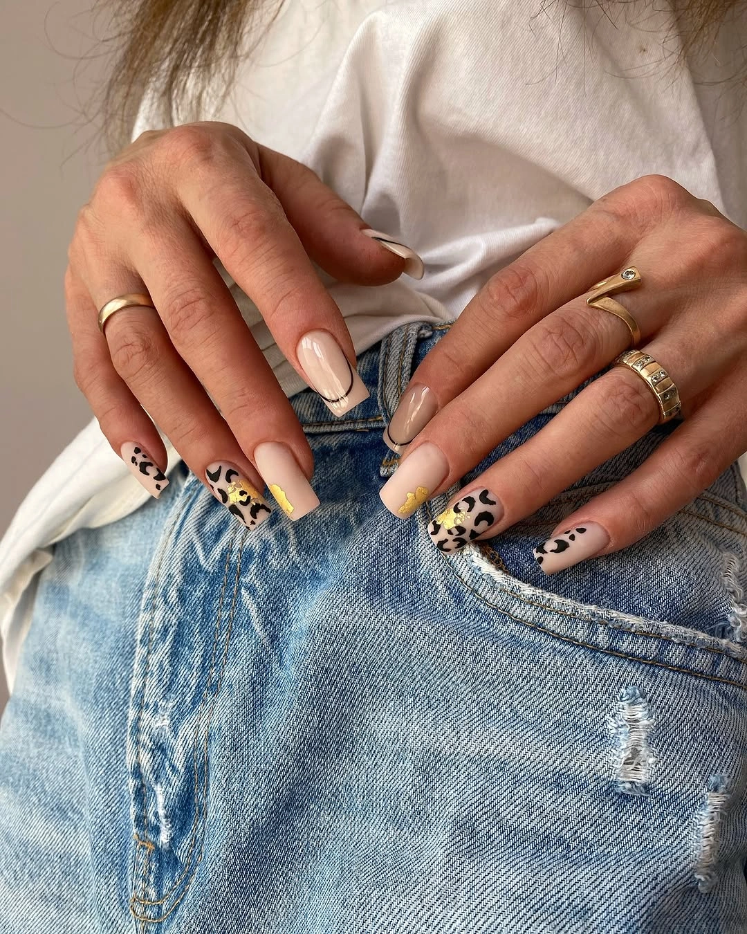
The useful lesson is to let a neutral base carry several small decisions while repeating one or two accent colors across the hand. A reader could keep the spotted print on one finger, use black on another, and leave the rest nude for a lower-density version. That edit preserves the contrast and makes the set easier to pair with clothing that already has texture.
Mixed designs demand more attention during grow-out because different details can make an uneven edge noticeable. The long almond shape also gives the prints room to show, but it asks for more length management than the short solid options. If the full hand feels too busy, keep the warm accent and remove one pattern first; the palette will still read as considered rather than plain.
8. Taupe Almond Nails With Delicate Botanical Lines
The muted taupe or mushroom-nude base keeps these long almond nails grounded, while pale botanical lines add detail across selected surfaces. The linework looks delicate and repeated, but it does not erase the soft base underneath. That contrast makes the manicure seasonal without relying on a loud orange, red, or leaf-shaped statement.
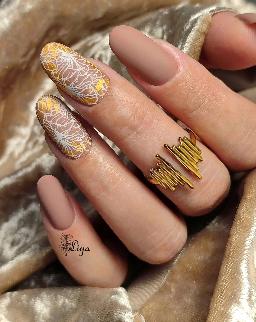
Fine lines work here because the almond silhouette already supplies a long, gentle direction. The motif can be simplified for a shorter nail by keeping one pale branch-like trace near the center and leaving the neighboring nails solid. That approach protects the negative space and keeps the botanical idea from becoming a dense all-over print.
The honest limitation is that delicate linework benefits from a tidy surface and can lose clarity if too many details are layered together. A warm taupe base is forgiving beside brown, cream, or muted rose clothing, so the reader can change the surrounding palette without rebuilding the whole idea. For a broader seasonal comparison, this mood sits closer to a soft neutral than to a dramatic fall nail design for October.
9. Nude Squares With Offset Black And Gray Arcs
Long square nails use a pale nude field with thin black and cool-gray arcs placed at different angles. The lines do not mirror each other exactly, which makes the set feel designed but not rigid. Most of each nail remains open, so the contrast comes from placement and direction rather than from heavy coverage.
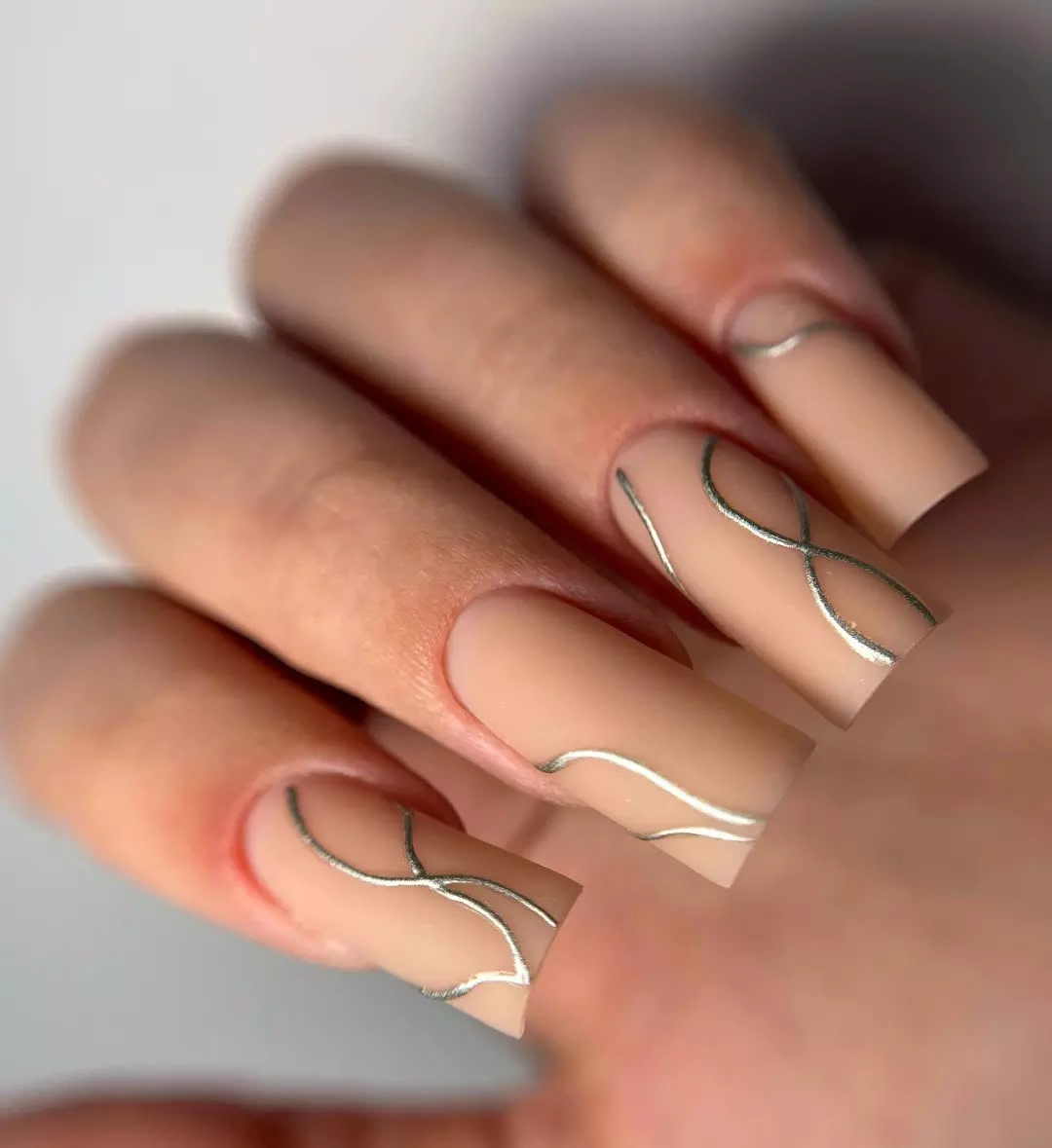
Offset repetition is useful when you like graphic nails but do not want a strict matching pattern. One dark line can sit closer to the side on a square nail, while another can cross nearer the tip, creating a visual conversation across the hand. For a shorter version, reduce the number of arcs and keep the line weight consistent so the base still reads first.
The neutral palette makes the design adaptable, but the black marks will show any smudging more readily than a soft solid color. A reader who wants lower upkeep can keep the arcs on two accent nails and use the same nude everywhere else. That edit also makes the manicure work with prints, because the dark detail is present without competing with every pattern in the outfit.
10. Short Saturated Red With A Soft Matte Surface
Short square nails carry a saturated red color with a flat, matte-looking surface and no visible pattern. The compact shape is important because it keeps the strong shade from becoming oversized, while the softened corners prevent the red from reading too severe. When the color is this clear, adding another motif would only weaken the directness of the idea.
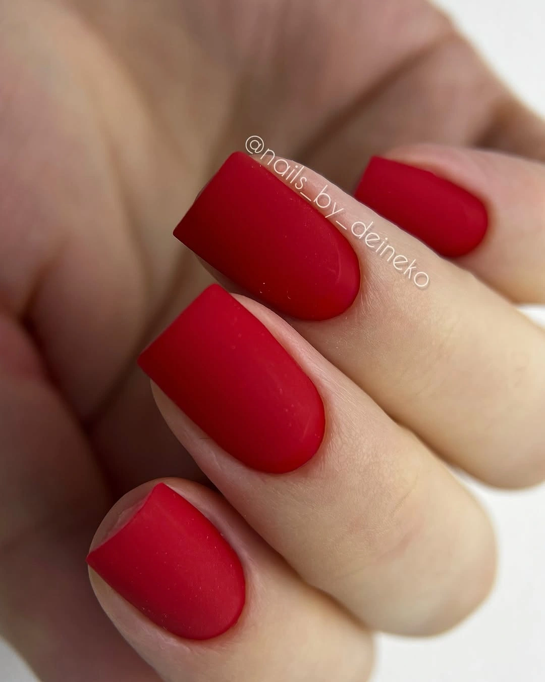
This is a strong choice for readers who want a statement color but not a complicated appointment. The short length makes the red easier to live with, and the simple surface means the design remains legible even in a quick close-up. If the matte effect feels too quiet, switch only one nail to a reflective-looking finish rather than adding glitter or a second color.
The tradeoff is that a bold solid red can reveal chips quickly because every edge is visible against the saturated field. Keeping the corners softly squared gives a little practical balance, but an even outline still matters more here than in a spotted or layered design. It also works well as a base for a single dark line if you later want to connect it with the more decorative ideas above.
11. Pastel Lilac And Blue With Tiny Dots
Medium square nails alternate pale lilac, soft blue, and a light neutral, with a few tiny marks adding rhythm. The color blocks remain the main decision, while the dots stay secondary and do not cover the surface. That hierarchy keeps the set soft and organized instead of turning a pastel palette into a collection of unrelated accents.
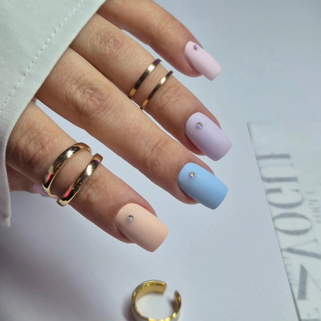
Small marks are useful when a reader wants evidence of design but dislikes dense art. Place them on one or two nails, keep the dots close in scale, and allow the neighboring colors to stay plain. This preserves the airy quality of the palette and gives the eye a pause between lilac and blue rather than making every nail ask for equal attention.
Pastels can be less forgiving against pale clothing, so a reader may prefer a deeper dusty rose or muted green as the neutral anchor. The medium square length gives enough surface for the colors to separate, but it does not require the upkeep of a long shape. The overall direction is playful without relying on a novelty motif, which makes it easier to repeat in another season.
12. Vivid Blue Squares With Tonal Wavy Lines
These medium-to-long square nails stay within one blue family, using a vivid base and lighter blue wavy lines that repeat across the surface. The tonal contrast creates movement without introducing several unrelated colors. Because the waves follow the length of the nails, the design feels energetic while the square edge keeps the composition orderly.
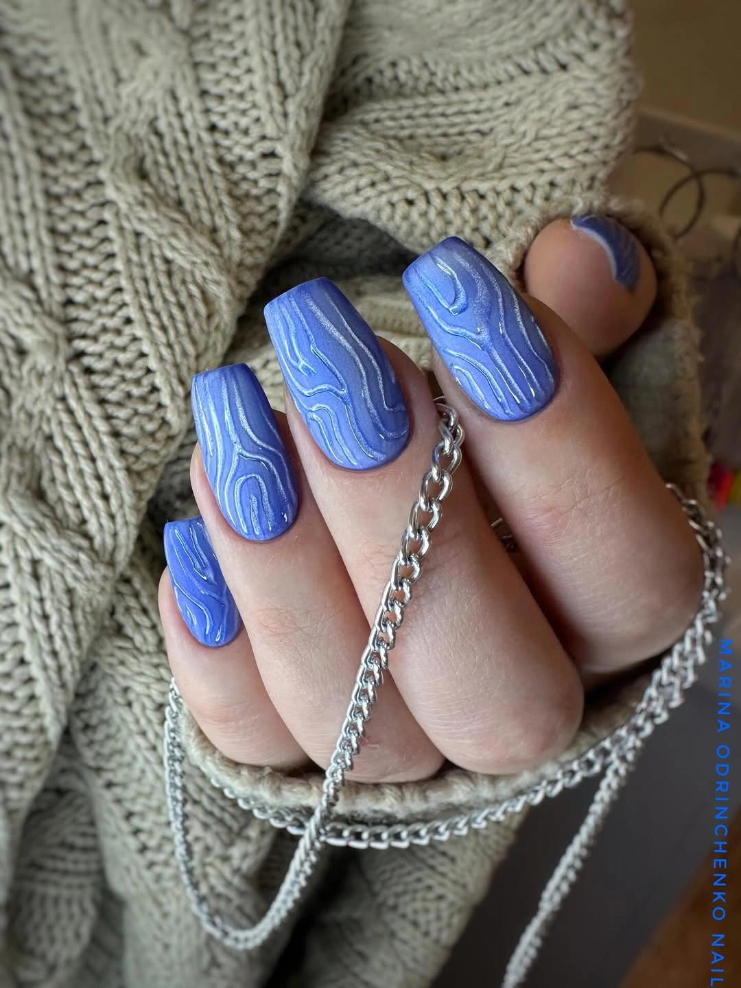
A single-color family is a practical way to make graphic nails feel coherent. The reader can keep the base deep blue and use a softer version of the same hue for the lines, then reduce the number of waves on a shorter shape. That preserves the visual texture while making the details less likely to crowd the tip or side edge.
The brighter the blue, the more the line spacing matters because tight waves can become visually noisy. A medium length is a good compromise: it gives the pattern room to travel but keeps the hand easier to manage than a very long style. Readers who enjoy this direction may also compare it with the richer seasonal palette in November fall nail designs before choosing the final color depth.
13. Lime And Pink Curves On A Medium Almond
Medium almond nails alternate bright lime green and soft pink, with curved sections placed near the edges and parts of the base left open. The two colors are playful, but their repetition across the hand keeps the set from becoming chaotic. The almond shape softens the strong contrast and gives the curved placement a natural direction.
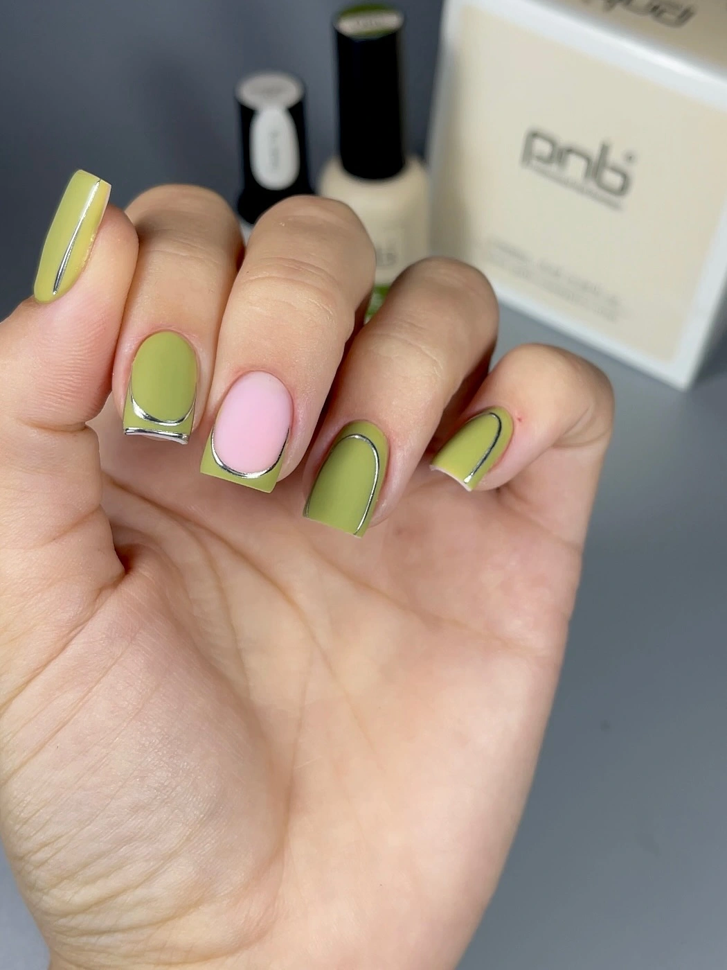
The easiest adaptation is to choose one bright color and use the second only as a small supporting curve. That edit keeps the negative space visible and makes the design less dependent on perfect symmetry. A neutral base can also replace one of the pink nails if the reader wants the lime to feel more autumnal without losing the graphic placement.
Bright lime and pink are more demanding beside patterned clothing than beside plain denim, cream, or brown. The medium length helps, but the contrast will still lead the look, so the rest of the outfit may need a quieter palette. This is a good option when the manicure is meant to be the playful element rather than a background detail.
14. Silver And Lilac Swirls Need Room To Breathe
Long tapered nails combine pale bases with silver and lilac bands that overlap in flowing arcs. The lines are more layered than the earlier sparse curves, so the manicure reads as decorative and fluid rather than minimal. Length matters because the swirls need open space between turns to stay visible instead of collapsing into one dense block.
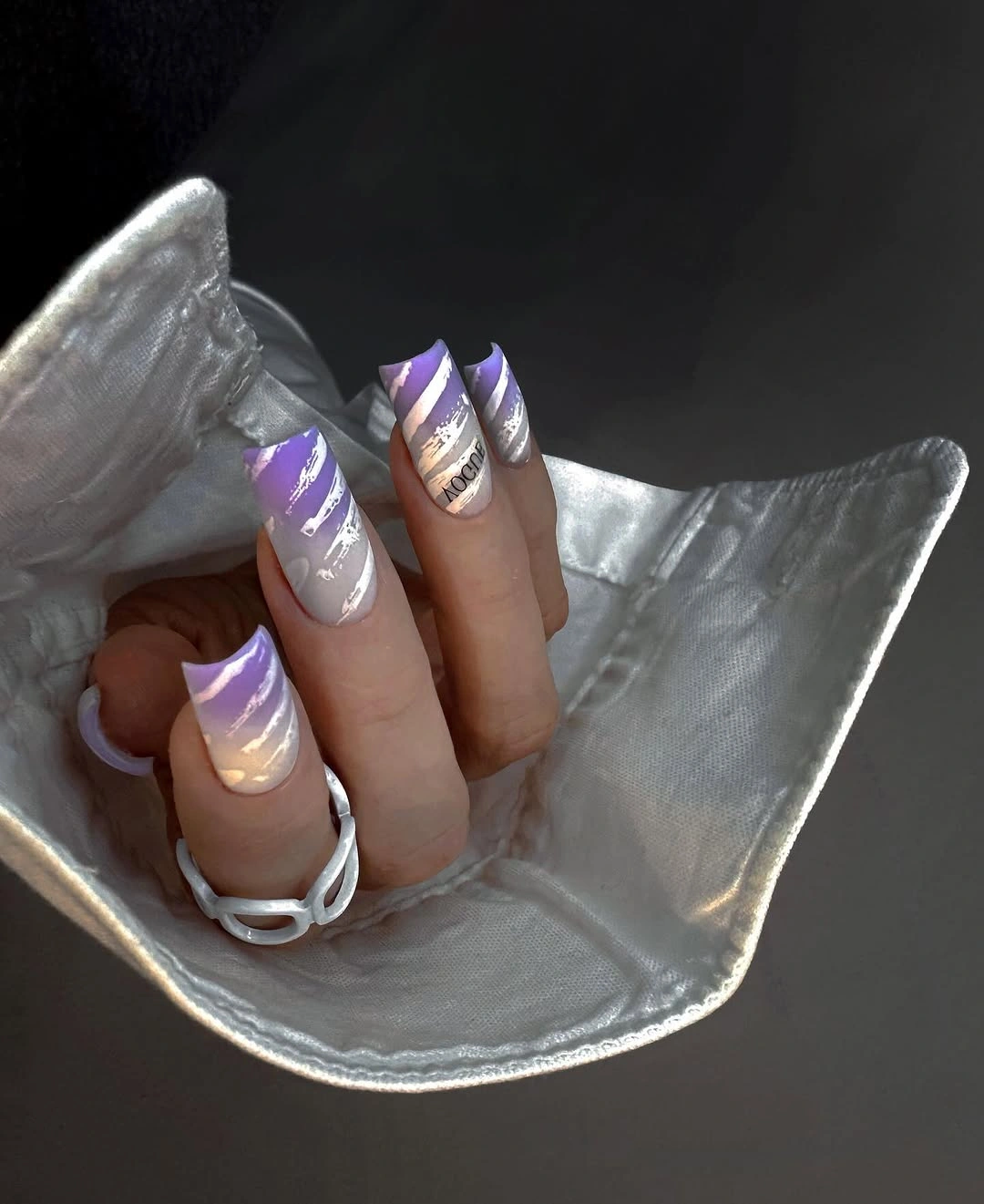
For a shorter version, keep one dominant sweep per nail and remove the secondary curve. That preserves the movement while reducing the amount of detail that must remain crisp. A reader can also place the full swirl on two accent nails and keep the others pale, which shifts the design from statement set to a controlled focal treatment.
The tradeoff is clear: the longer silhouette supports the idea beautifully, but it also brings more length management and more visual activity. Silver and lilac are easy to pair with cool neutrals, yet they can look disconnected beside very warm prints unless one warm accessory bridges the palette. If the goal is daily wear, simplifying the line count is more useful than changing the colors.
15. Fluorescent Pink Squares As The Whole Statement
Long square nails are covered in a uniform hot pink that appears highly saturated and matte-looking. There is no secondary motif, so the color and the straight silhouette become the complete statement. The dark jewelry and background increase the contrast, but the manicure would still read boldly because the long square gives the bright pink a large, uninterrupted field.
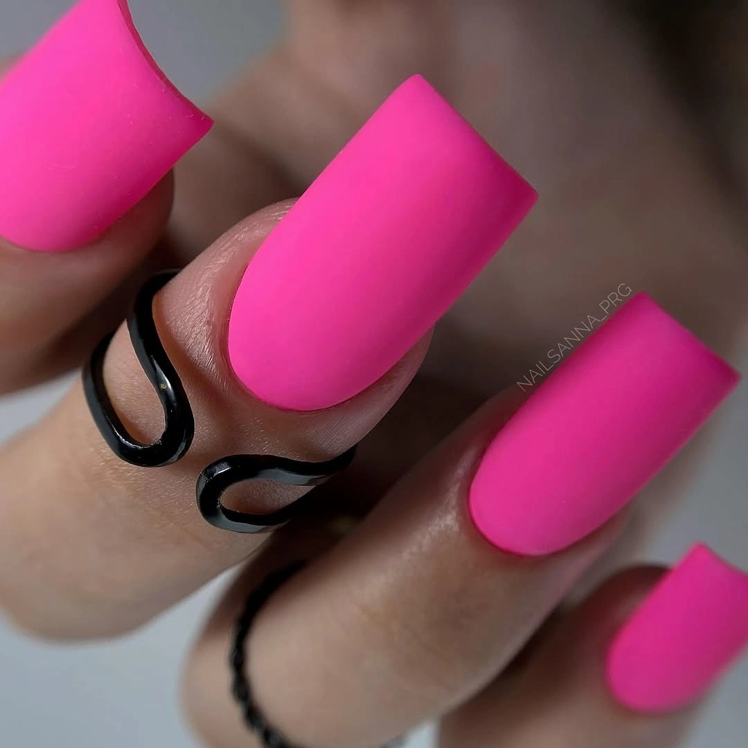
If the color feels too intense for everyday styling, the simplest adjustment is to shorten the nails rather than introduce another shade. A medium square will contain the brightness, while one hot-pink accent on a neutral set will keep the same energy at a lower volume. The clean base also makes it easy to compare the result with other October fall nail ideas without adding a competing motif.
High saturation asks for a little restraint elsewhere because the hand naturally becomes the focal point. The matte-looking surface reduces reflection, but it does not reduce color intensity, so clothing in black, cream, gray, or faded denim will usually support the manicure better than another neon. The practical benefit is that there is no small art to maintain, only the visible condition of the solid edge; an October comparison can wait until the base is settled.
16. Cool Gray Blue With Bright Floral Linework
A cool gray-blue base supports vivid blue floral or leafy lines on a tapered nail, and the decorative motif fills much of the visible surface. The base stays subdued enough for the blue detail to remain readable, while the elongated shape gives the lines room to curve. This is a focal design rather than a quiet all-over set, so the motif should be treated as the main choice.
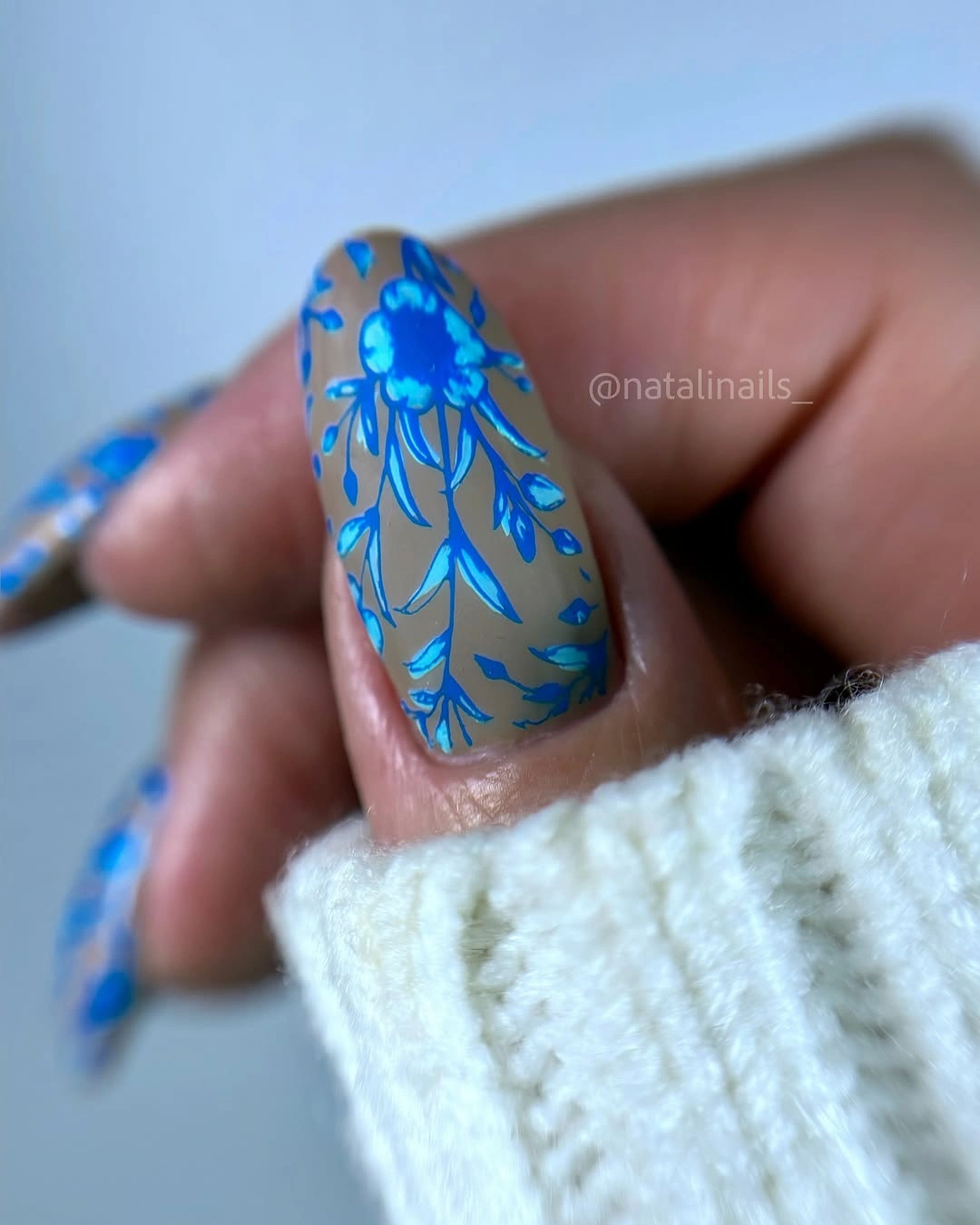
The design can be borrowed without copying the full density. Put the bright blue lines on one or two nails and use the gray-blue base on the rest, or reduce the motif to one larger leaf-like sweep. That keeps the contrast visible and makes the manicure less dependent on a long canvas, especially if the reader prefers a shorter almond shape.
Large linework is easier to notice as it grows out because the design changes position relative to the cuticle. The cool palette is straightforward beside silver, denim, and soft gray, but it may look sharper than expected with warm orange or yellow clothing. A single bright accent is enough here; adding more colors would blur the clear relationship between the calm base and the blue motif.
17. Dusty Rose Squares With Contained Leaf Motifs
Medium square nails use a dusty rose base with pale botanical or leaf-like linework contained inside several individual nails. The pattern is detailed but the color contrast stays gentle, so the manicure feels warmer and quieter than the bright blue floral close-up. A thin light band on another nail adds a small change in scale without taking over the composition.
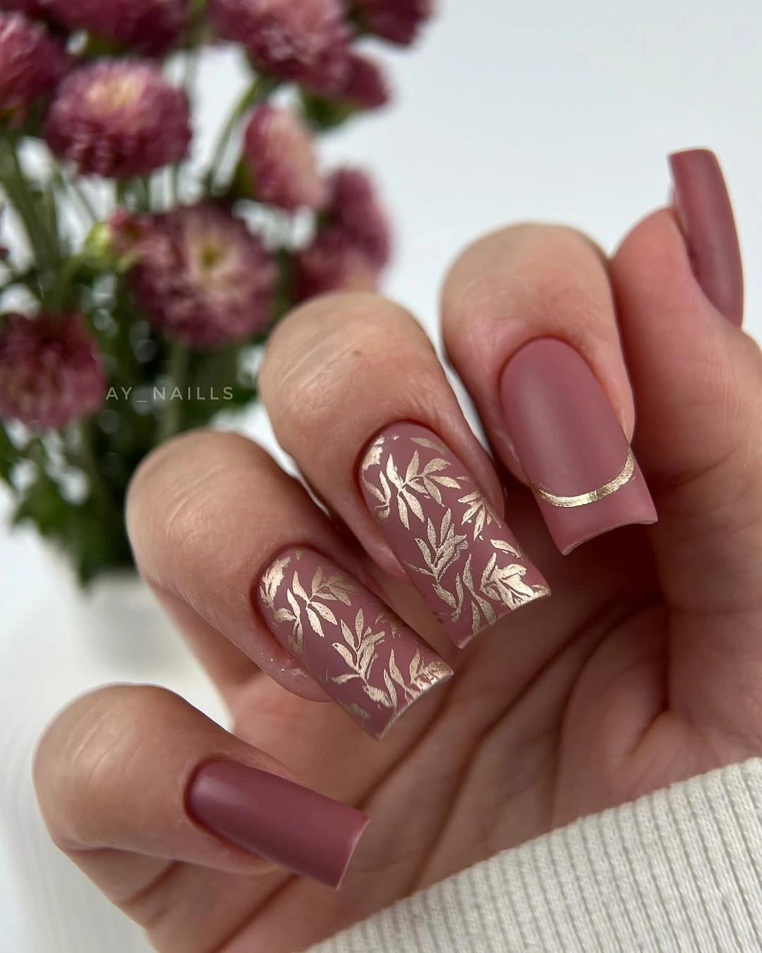
Containing the motif is the useful decision. Instead of carrying a pattern across every nail, keep two illustrated panels and let the dusty rose show on the remaining fingers. That gives the reader a practical way to wear botanical detail with a medium length, while the pale lines still provide enough interest when the hand is viewed from a distance.
The muted palette is forgiving beside cream, brown, and soft denim, but the pale linework may disappear if the base and surrounding clothing are too close in value. If more contrast is needed, deepen the base slightly rather than adding several new accents. This keeps the manicure in the same thoughtful direction as the broader classy fall manicure ideas that rely on shape and spacing.
18. Nude Squares With Spotted Tips
Short-to-medium square nails use a pale nude base, with brown and dark spots concentrated toward the tips on the visible fingers. Leaving the lower portion open is what keeps the print from becoming heavy. The shape is compact, so the spotted edge reads as a playful border rather than a full animal-inspired statement across the whole hand.
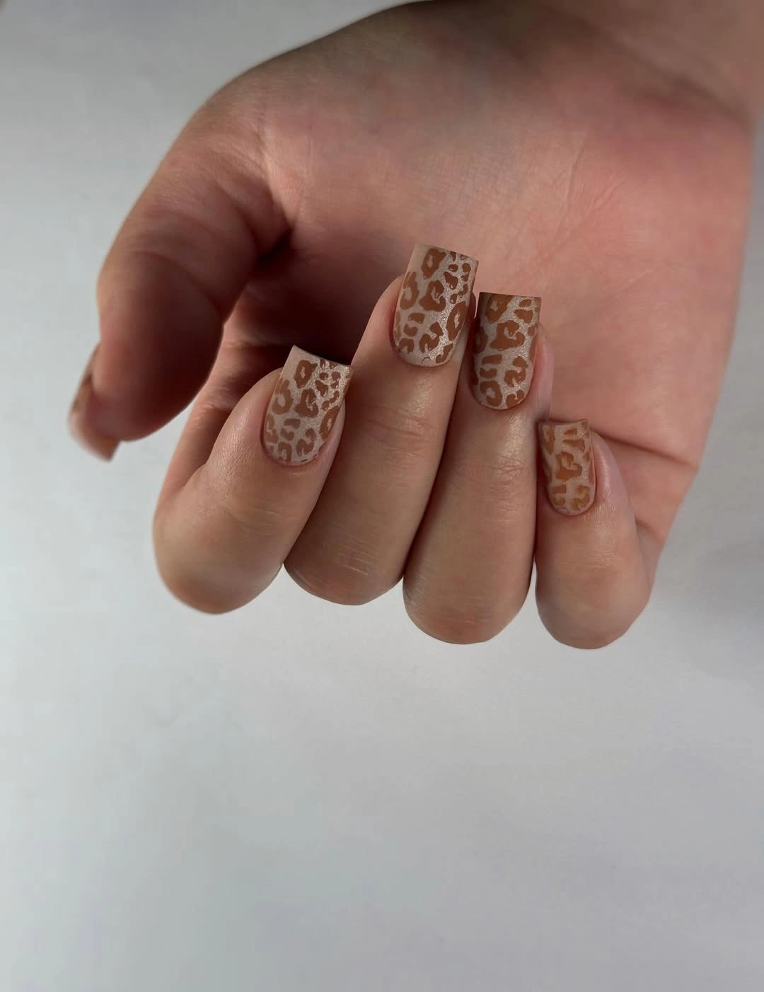
Tip concentration also gives the design a practical grow-out advantage. As the nail changes, the pattern stays visually connected to the edge instead of shifting a large central motif away from the cuticle. Readers who want an even quieter version can keep the spots on one accent finger and use the same nude base on the rest, preserving the contrast without extra density.
The main limitation is that dark spots can look more scattered on a very short nail, where there is less open space between them. A softened square helps, and choosing two spot colors rather than several keeps the border legible. The result works best with plain or lightly textured clothing because the manicure already supplies a small print that does not need another pattern beside it.
19. Offset Dark Blocks On Pale Almond Nails
Long almond nails carry a pale nude base with thin black lines and small cool-gray or charcoal blocks placed away from the center. The details are asymmetrical, so the manicure feels architectural without becoming a repeated grid. Most of the surface remains light, which keeps the dark elements from changing the entire mood of the set.
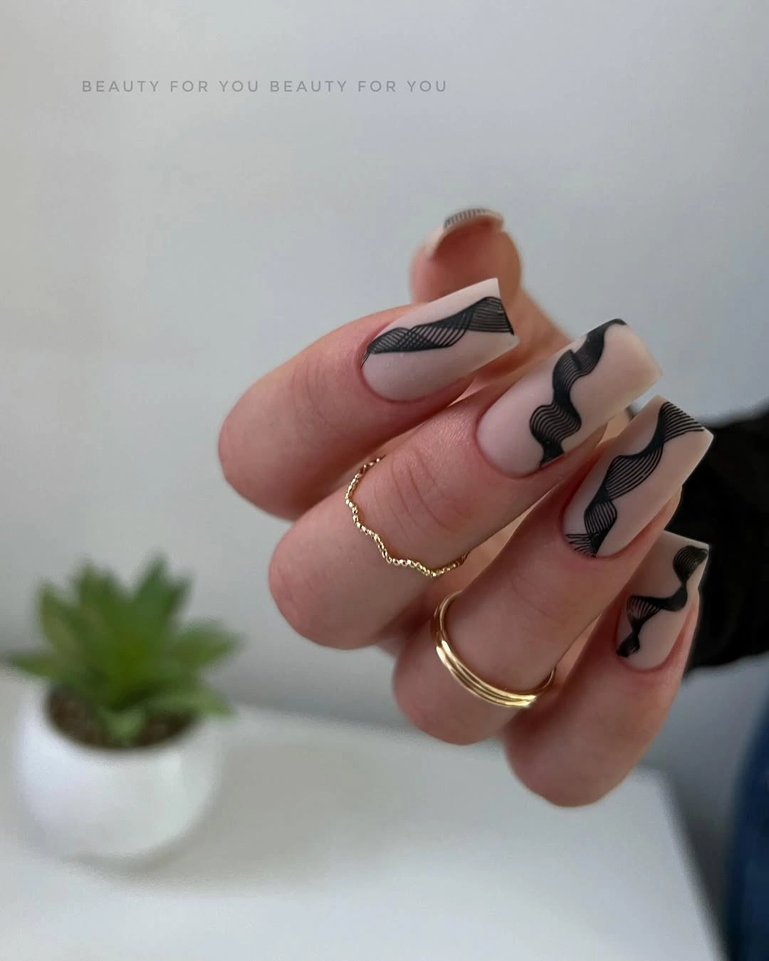
Asymmetry is helpful when each nail needs to look related but not copied. A reader can place one dark block near the side on an accent nail, then echo only a thin line on a second finger. That approach keeps the pale base dominant and makes the design easier to adapt to a shorter almond or a compact square.
The black details create a sharper contrast than the taupe botanical designs, so the manicure will usually feel more modern and graphic. Grow-out is still relatively manageable because the blocks are small, but any smudge may show against the pale field. Keep jewelry simple if you want the negative space to remain visible, or use one dark ring to echo the geometry without adding more nail art.
20. Muted Taupe Brown On A Compact Shape
Short-to-medium rounded-square nails are a uniform muted taupe-brown, framed by a cool blue-green sleeve and small gold rings. The surrounding styling shows how the same neutral can lean warmer or cooler depending on what sits beside it. With no motif competing for attention, the hand looks composed through color balance, length, and the soft surface.
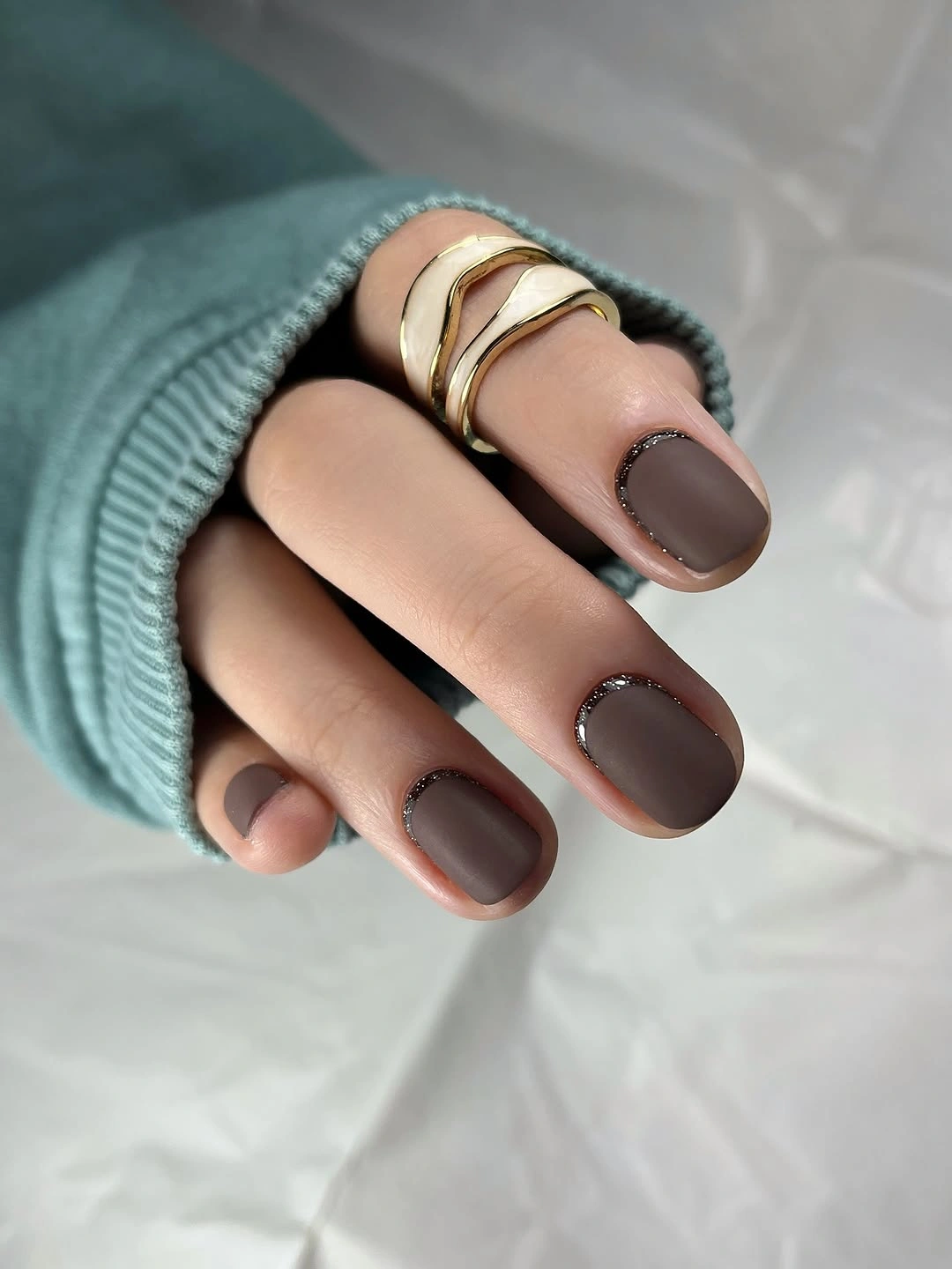
This is a useful neutral when deep brown feels too heavy but pale nude feels too quiet. The compact shape contains the warm color, while the cool sleeve creates enough contrast to keep the manicure from blending into the hand. A reader can shift the mood with cream clothing for softness, denim for contrast, or gold jewelry for a warmer fall finish.
The design is simple, but a uniform brown surface makes edge care important because chips will read as gaps in one uninterrupted color. That is also the main advantage: there are no tiny lines, spots, or panels to maintain. The look can sit behind a patterned outfit more easily than the graphic options, making it a practical choice for a week when the clothing should lead.
21. Cool Gray Matte With Scattered Pink Flecks
Short-to-medium square nails use a cool gray base with irregular hot-pink flecks scattered across the surface. The flecks vary in size and spacing, so the design feels casual rather than geometric or perfectly repeated. Gray keeps most of the hand quiet, while the pink provides enough energy to stop the neutral from looking blank.
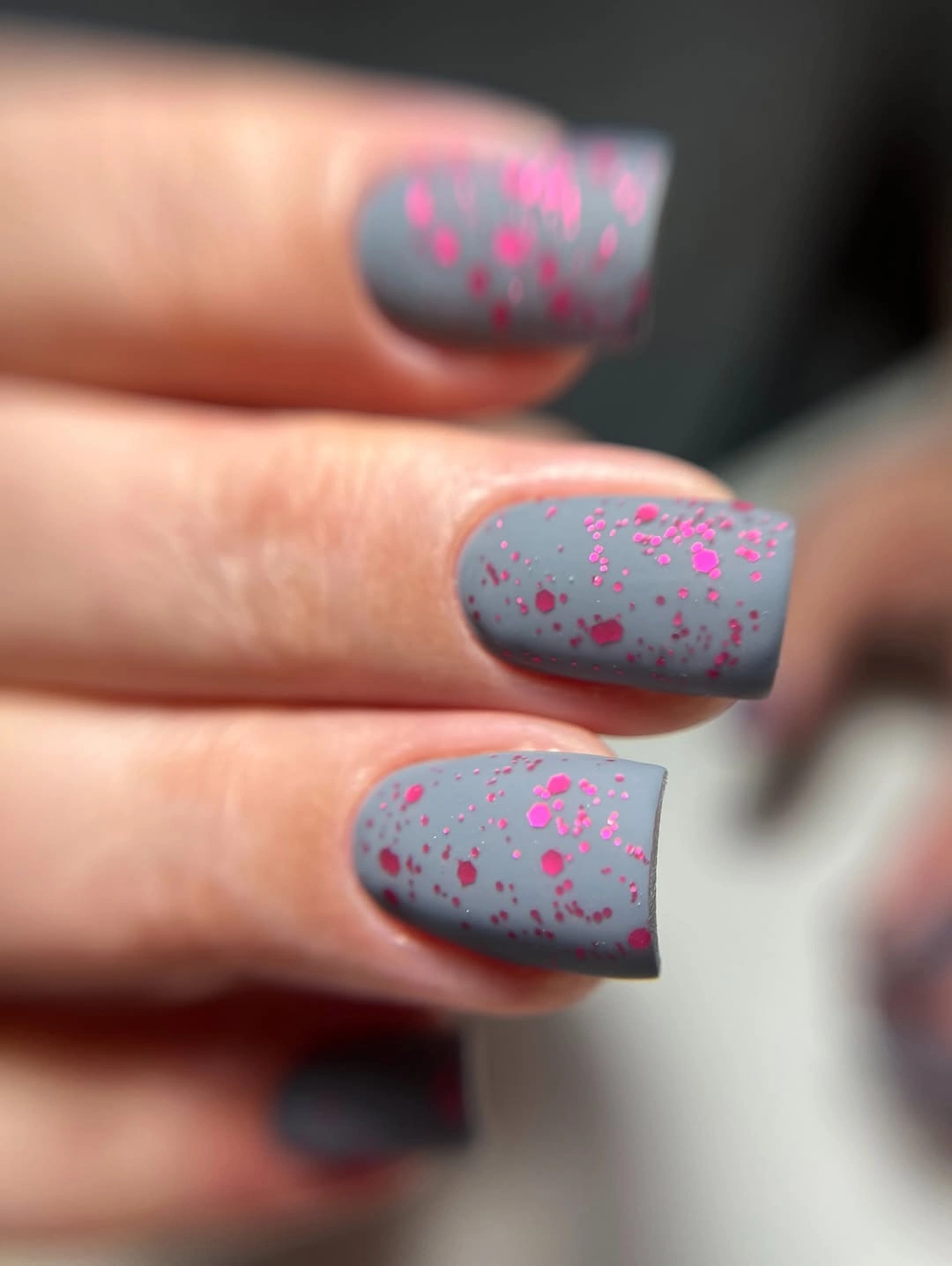
The accent color works because it appears in small pieces instead of full blocks. Readers can make the idea more restrained by placing the pink flecks on one or two nails and leaving the remaining gray, or they can change the accent to burgundy for a softer fall relationship. Either edit keeps the surface readable and does not require a complex motif to explain the color contrast.
Irregular flecks are forgiving in one way because they do not need to match exactly, but they can look uneven if placed too densely near the edge. A short square gives the neutral enough room for the pink to show without demanding much length upkeep. It is a useful final direction for someone who wants matte color, a little surprise, and a design that remains easy to adapt.