Office nails do not have to be invisible to look polished. A deep red, a soft lavender, or even a bright blue tip can work well when the shape is tidy and the design knows when to stop. For fall, I like the balance between a color that feels personal and a finish that still looks comfortable beside a blazer, a keyboard, or a busy calendar.
The looks below range from short squares that stay out of the way to medium almond and stiletto shapes with a little more attitude. Think of them as starting points, not rules. Keep the color and shorten the nails, copy a single accent, or turn a decorated set into a simple solid shade when your office calls for less. The best office manicure is the one you do not have to second-guess all day.
1. Burgundy And Black With A Small Accent
A medium almond shape gives burgundy, black, and deep red enough space to feel intentional without turning the manicure into a costume. The small pale accent breaks the dark field, while the glossy surfaces keep the color story clear. For fall nail designs for office settings, controlled contrast matters more than adding many separate motifs.
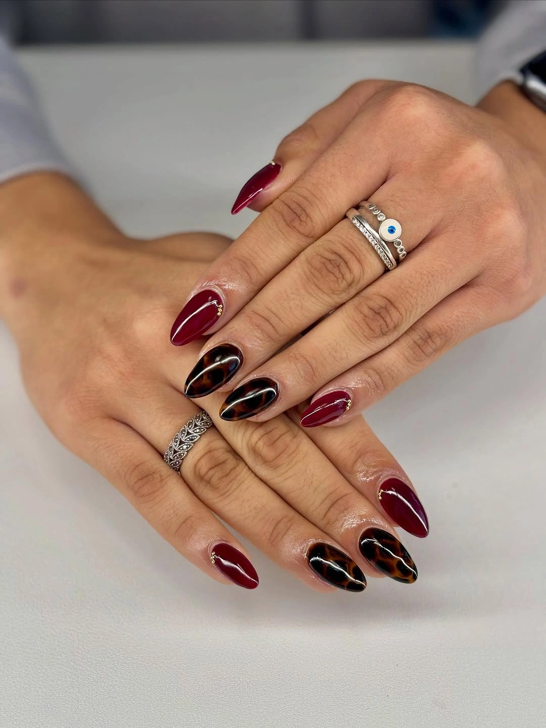
If your workplace allows a richer palette, keep the darkest shade on alternating nails and use the pale accent only on the ring finger. A shorter almond will preserve the proportion, and replacing black with deep brown will make the set easier to pair with tan, charcoal, or navy clothing. The pale accent can echo a blouse or light knit, which makes the dark set feel coordinated rather than simply intense.
The rings in the setting add visual noise, so the manicure is strongest when the nail design stays simple around them. Limit the accent detail rather than the color itself if you want a practical edit; the dark palette already supplies enough depth for the office. That edit keeps the hand readable in an office setting and avoids asking the nail art to compete with every accessory.
2. Plain Wine On A Short Square
One saturated wine-red color makes these short rounded-square nails look deliberate without relying on art. The compact outline contains the depth of the shade, and the glossy surface gives the manicure a clean finish that can sit comfortably beside tailored clothing or everyday basics. Simplicity is the design choice here.
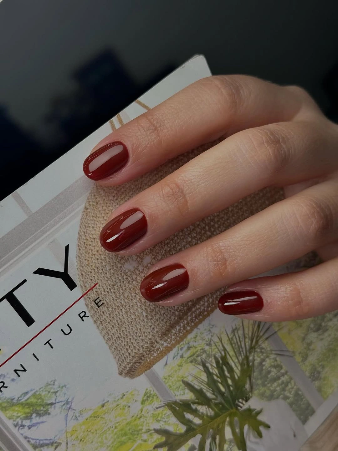
This is a useful answer to fall office nail ideas when you need something quick to compare with patterned options. Keep the free edge short and even, then consider brick red or muted berry if a cooler wine tone feels too formal. The same solid approach works when accessories or sleeves already provide the visual interest.
A dark solid color shows chips at the edge more clearly than a pale neutral, so the shape needs regular attention. If your week includes a lot of hands-on work, choose a slightly shorter outline and keep the color uniform. The manicure will look more composed when the length and surface agree. A slightly deeper shade will also soften the contrast while keeping the manicure visibly red rather than turning it into a beige neutral.
3. Forest Green With Delicate Accents
Forest green alternates with nude pink on a short square shape, while a few lighter and metallic-looking marks appear on the pale nails. The color division gives the set rhythm without making every nail carry an illustration. That is why the design feels expressive but still capable of working in a professional setting.
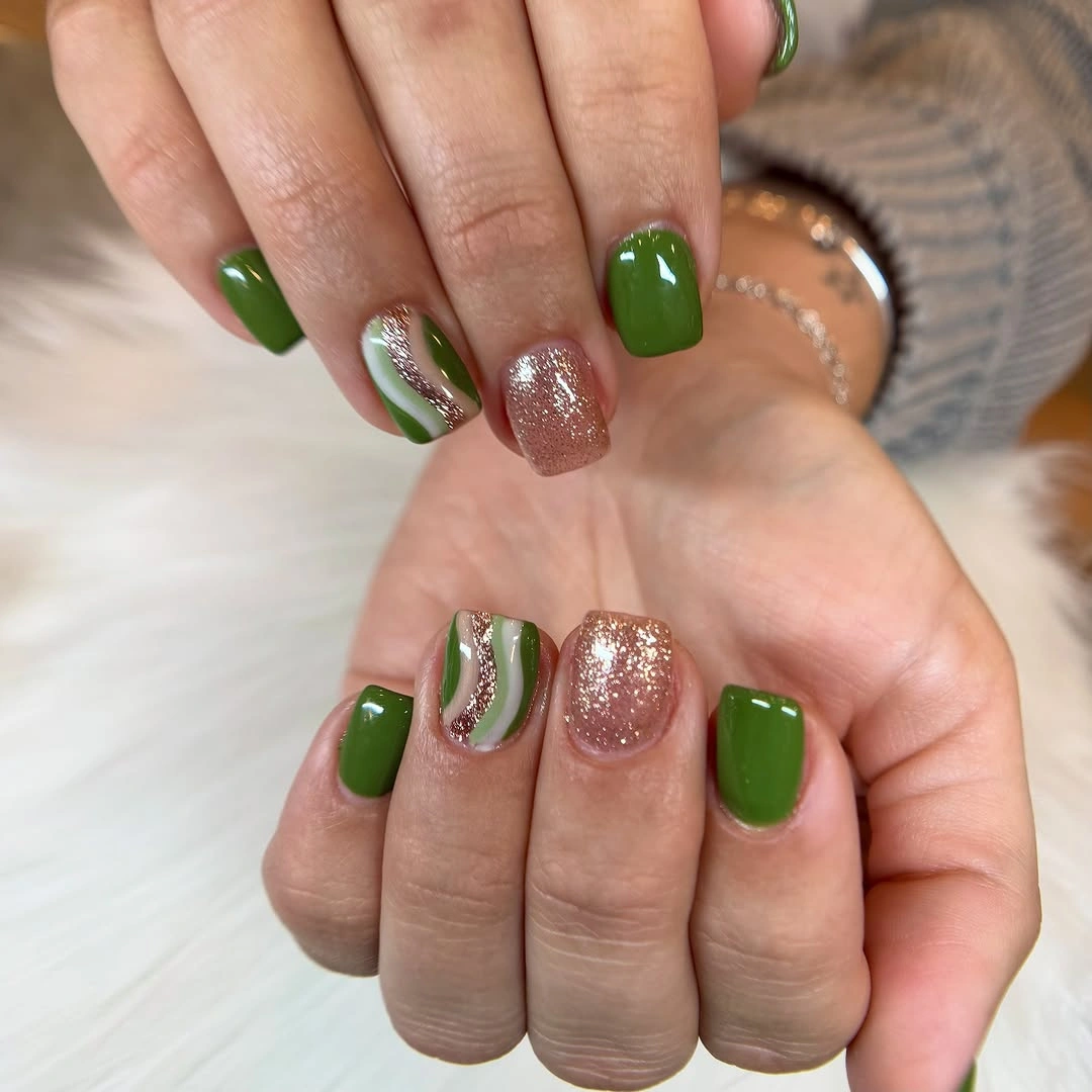
For office-friendly nail designs, use forest green on two or three fingers and keep the pale accents small. If the green feels strong against your wardrobe, switch the nude base to a soft beige and let the dark shade remain the only saturated color. A shorter square outline will keep the result neat as the nails grow.
Tiny accents can disappear when they are too close in color to the base, so leave enough contrast for them to remain visible at normal conversation distance. If the manicure feels busy under office lighting, remove one accent before changing the palette. The alternating structure will still do the organizing work.
4. Black French With Gold Dots
The sheer pink base keeps this medium almond design light, while black French tips provide a clear border. Tiny gold dots and fine dark lines soften the hard edge without hiding it, so the manicure reads graphic rather than ornate. The moderate length helps the contrast stay focused on the tip. The pale pink area supplies enough breathing room for the dark edge to stay sharp instead of swallowing the almond outline.
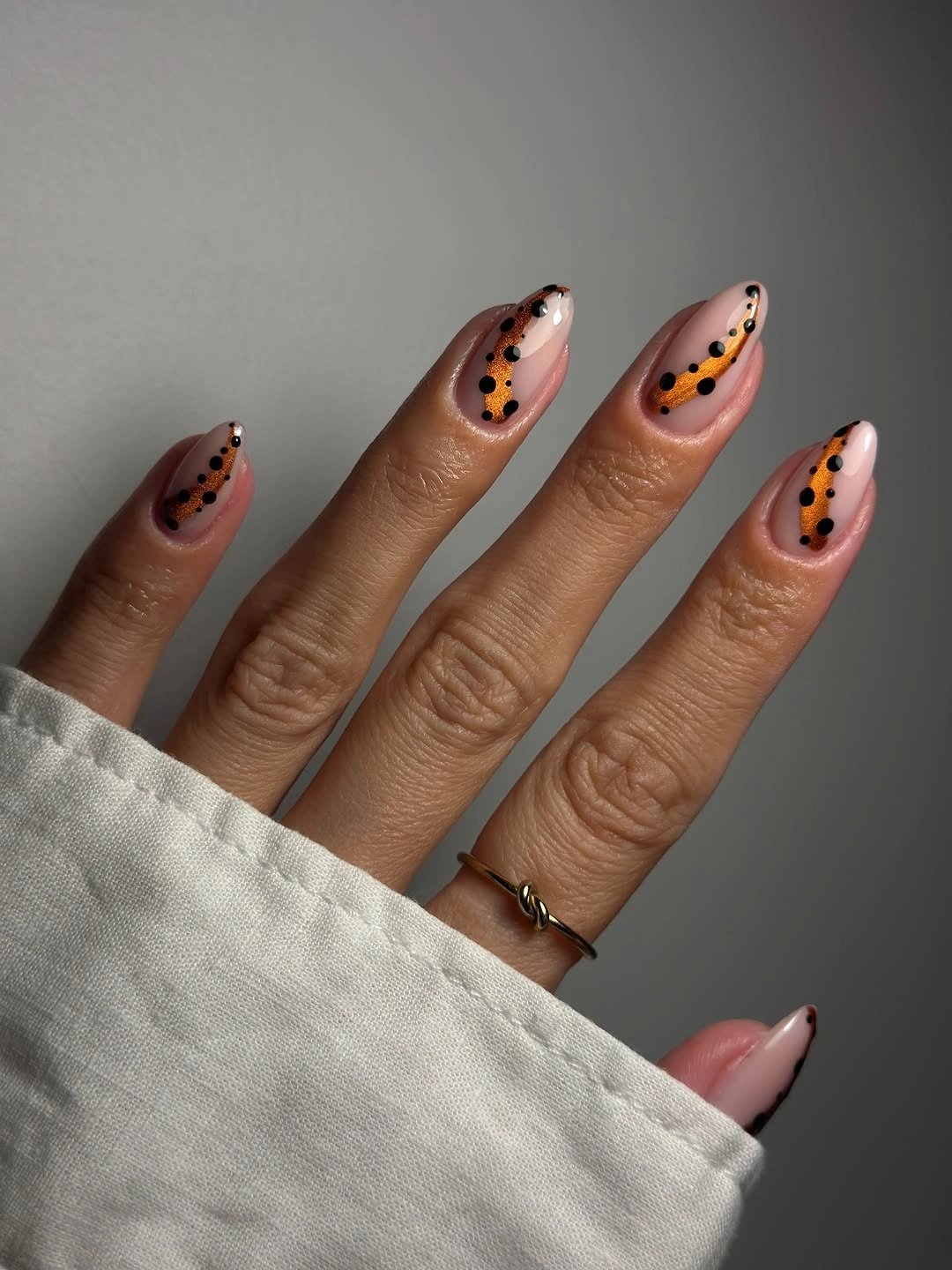
To adapt this look for fall nail designs for office wear, keep the black narrow and use gold on only two nails. A brown-red edge can replace black when the rest of your wardrobe is warm, while the almond taper keeps the design from feeling boxy. The spacing between the dots matters more than their number.
Small details need clean placement because the pale base makes every mark easy to see. If you do not want to maintain several dots, use one small point near the tip and leave the rest of the line plain. The design will remain recognizable as long as the dark border stays even. Spacing the tiny marks also helps the manicure keep its clean character as the edge begins to move forward.
5. Blue French On Long Almond
Vivid blue tips give this long almond set its entire personality, while the sheer pink base leaves a visible buffer around the color. A few slim blue inner lines repeat the edge without filling the nail, so the design stays graphic and organized. The long taper makes the blue feel directional rather than blocky.
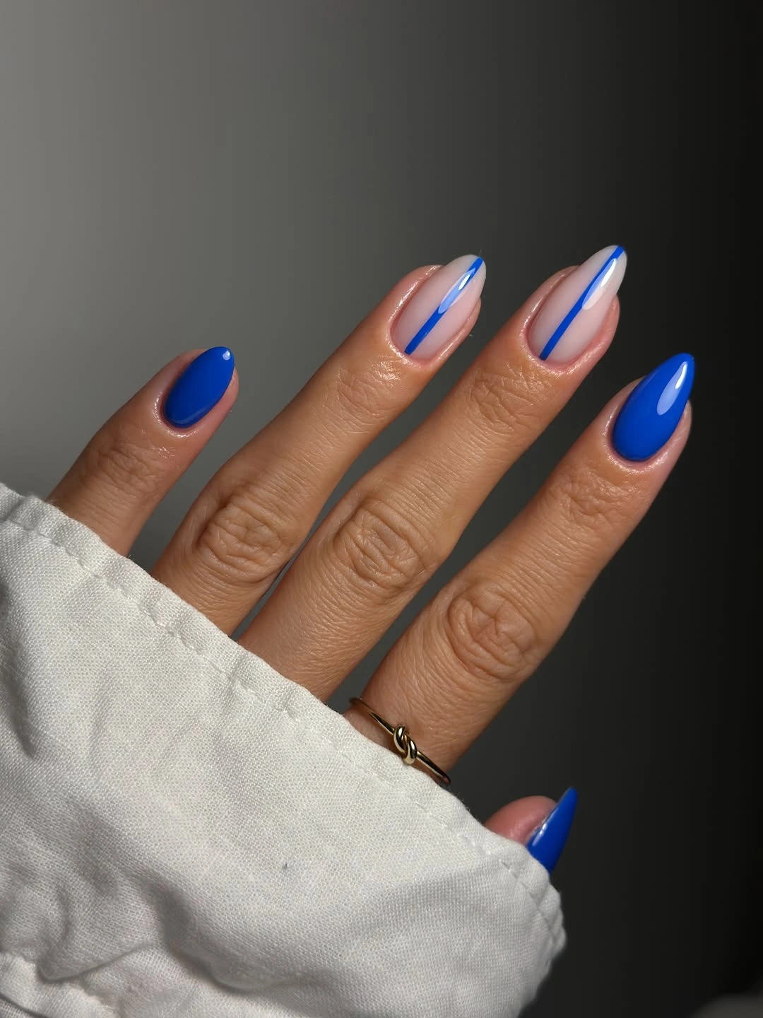
For a more restrained office manicure, move the blue to two accent nails and use navy or dusty denim on the others. A medium almond length will still show the curved tip clearly, and a thinner line will make the bright color easier to wear with neutral jackets and knitwear. The pale base also prevents the blue from looking like a full solid color, which keeps the result closer to a tip-focused manicure.
The long shape is part of the visual impact but also the main practical limitation. If you type or handle small objects throughout the day, reduce the free edge before choosing the bright color. The design will keep its contrast because the pale base gives the tip enough separation. That change preserves the color story while reducing the amount of free edge exposed to daily knocks.
6. Periwinkle On A Short Round
Pastel periwinkle creates a cool, quiet color statement on short rounded-square nails. The glossy surface reflects a simple highlight across each nail, and the absence of decoration lets the softened blue feel intentional rather than unfinished. This is a useful example of how color alone can carry an office manicure.
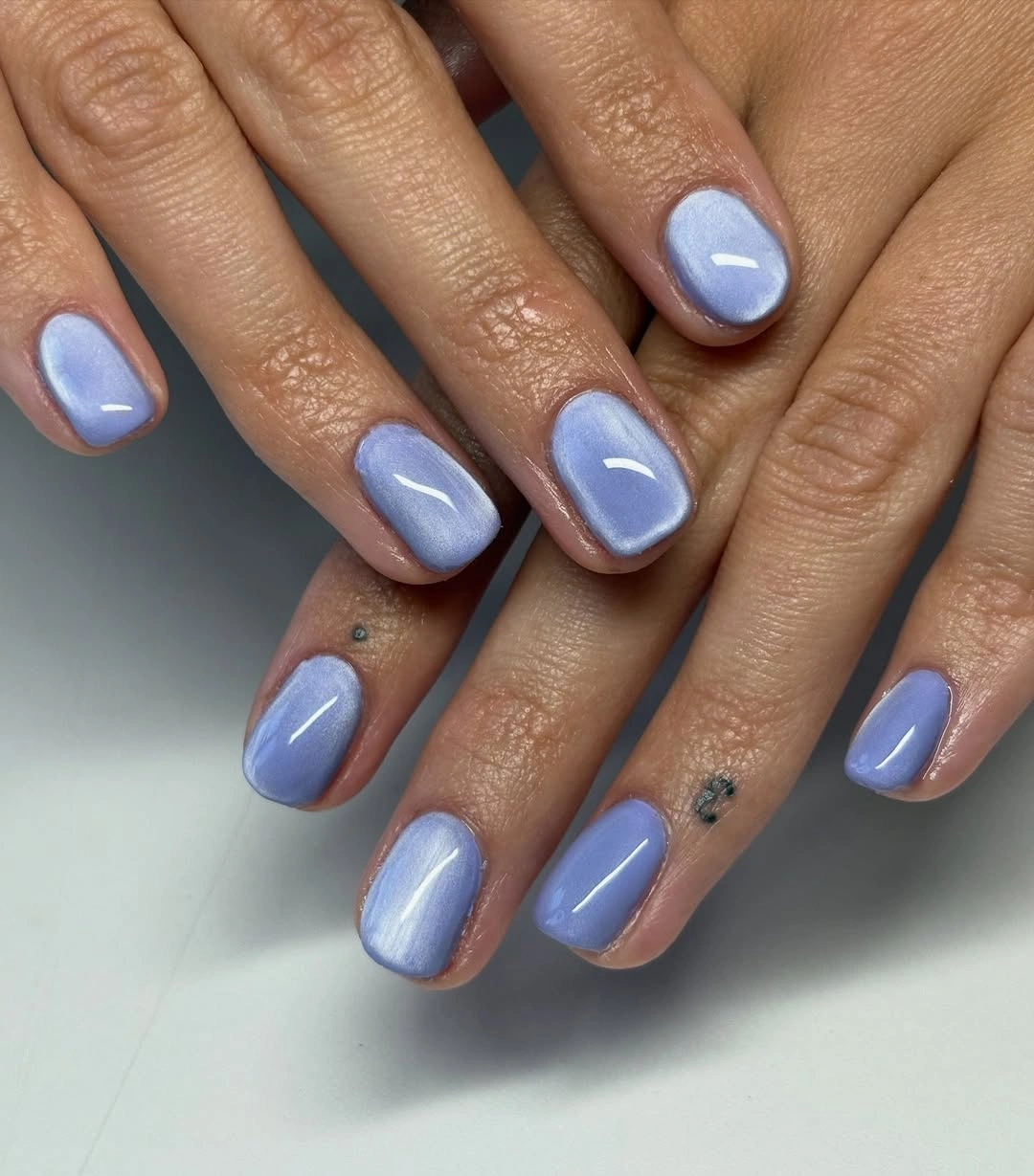
If you are searching for simple nail designs office ideas, use periwinkle when a nude feels too predictable but a deep shade feels too strong. Dusty lavender or softened cornflower blue can create a similar effect. Keep the corners rounded enough that the short shape remains practical and not visually rigid.
Pale blue can look flatter under dim office lighting, so a smooth surface and even coverage matter. If your hands are often near cool-toned screens or gray clothing, warm the palette with a nude accent on one nail. That small shift can keep the manicure from looking washed out. A smooth, even surface will make the pastel look more deliberate and less like a color chosen at random.
7. Pink Swirls On Short Rounds
The translucent pink base keeps these short rounded nails open, while glossy pink swirls add movement to selected fingers. Because the lines curve over a light surface, the design feels playful without needing extra length. The office question is handled through scale: the color is lively, but the nail outline remains compact.
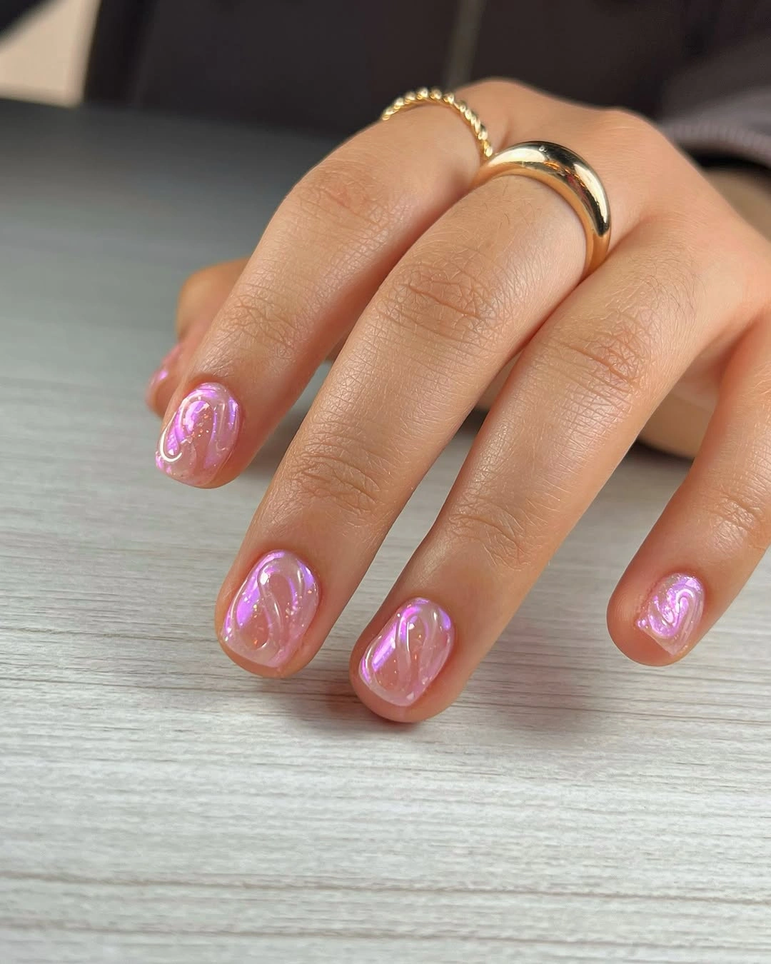
A practical office version can use one swirl on the ring finger and leave the other nails translucent pink. If the bright tone feels too youthful for your wardrobe, use mauve or rose and keep the line slightly thinner. The rounded shape will continue to soften the overall effect. That version will read as a small personal detail instead of a full novelty manicure when the rest of the hand remains plain.
Swirls need enough spacing to stay readable and can look crowded if too many curves are placed on a short nail. Keep the accents away from the sidewalls, where growth and movement are more noticeable. A single clean curve will look more controlled than several compressed ones. Leaving the base translucent is especially helpful because it keeps the bright line from taking over the short shape.
8. Bare Nude With A Fine Edge
This medium almond manicure uses a translucent nude pink base and an almost invisible light edge, so the shape becomes the main visual decision. The surface is glossy but unadorned, which lets it work beside formal clothing, casual denim, or a statement watch without competing. The restrained contrast is its office strength.
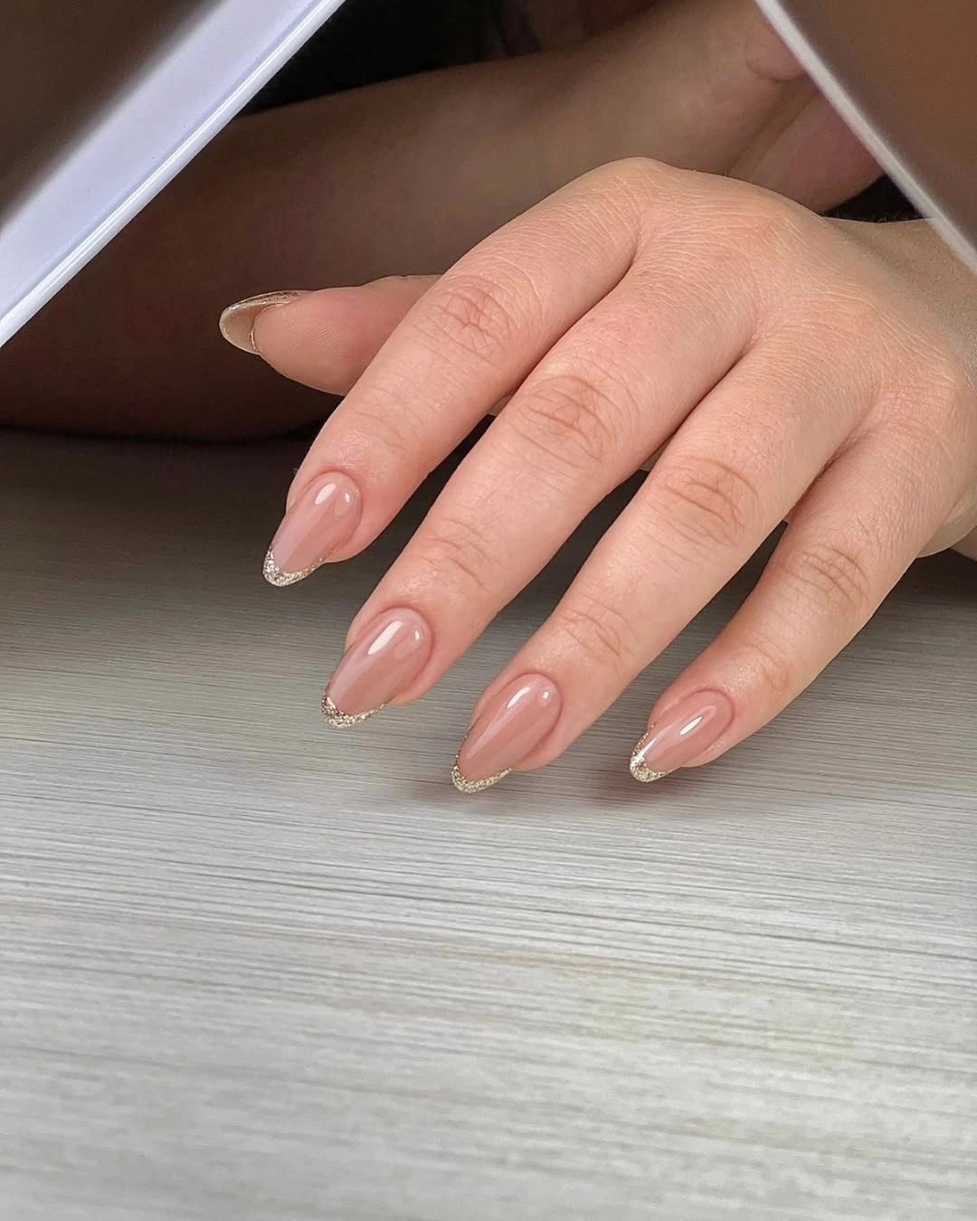
For elegant office nail designs, keep the tip close to the natural curve and choose a cream that is only slightly lighter than the base. A shorter almond will make the set even more practical, while one muted accent nail can be added later if the neutral result feels too quiet. The low-contrast base also makes this an easy option when the office wardrobe contains prints, strong tailoring, or visible jewelry.
Low-contrast designs reward careful proportion because there is nowhere for uneven lines to hide. Check the nails together rather than one at a time and keep the length consistent across the hand. If the edge disappears completely, a small increase in contrast is more useful than adding decoration. That is enough structure for a workday manicure without making the detail feel formal.
9. Cream Gloss On A Long Almond
A glossy cream-white surface gives the long almond shape a clean, luminous frame without any visible pattern. The warm pale color feels softer than stark white, while the elongated silhouette keeps the solid shade from reading flat. This is a strong neutral option when the rest of an office outfit contains texture or print.
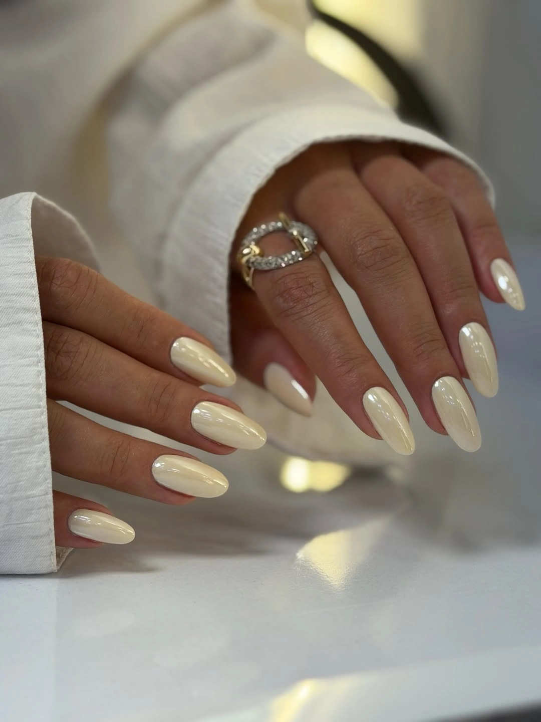
To make the look more practical for daily work, shorten the almond and keep the cream coverage even. A pale beige or soft ivory can work in the same role if white feels too bright. The design stays polished because the single color and shape are allowed to remain uninterrupted. The warm cream surface can also sit comfortably beside brown leather, denim, or black tailoring without creating a sharp color clash.
The long outline has a clear maintenance cost, especially when hands move around keyboards, bags, or paperwork. The cream shade will not disguise an uneven edge, so choose a moderate length if you prefer a manicure that can grow out quietly. The surface is simple enough to support that adjustment. That compromise keeps the neutral idea intact while making the outline more suitable for a busy workday.
10. Quiet Pink With A Soft Edge
Sheer pink bases and pale tips create a quiet medium almond manicure that relies on even curves instead of decoration. The low-contrast palette brings a little polish to the hand without asking the nails to become the focal point. A few rings in the setting reinforce how easily this kind of design can sit beside accessories.
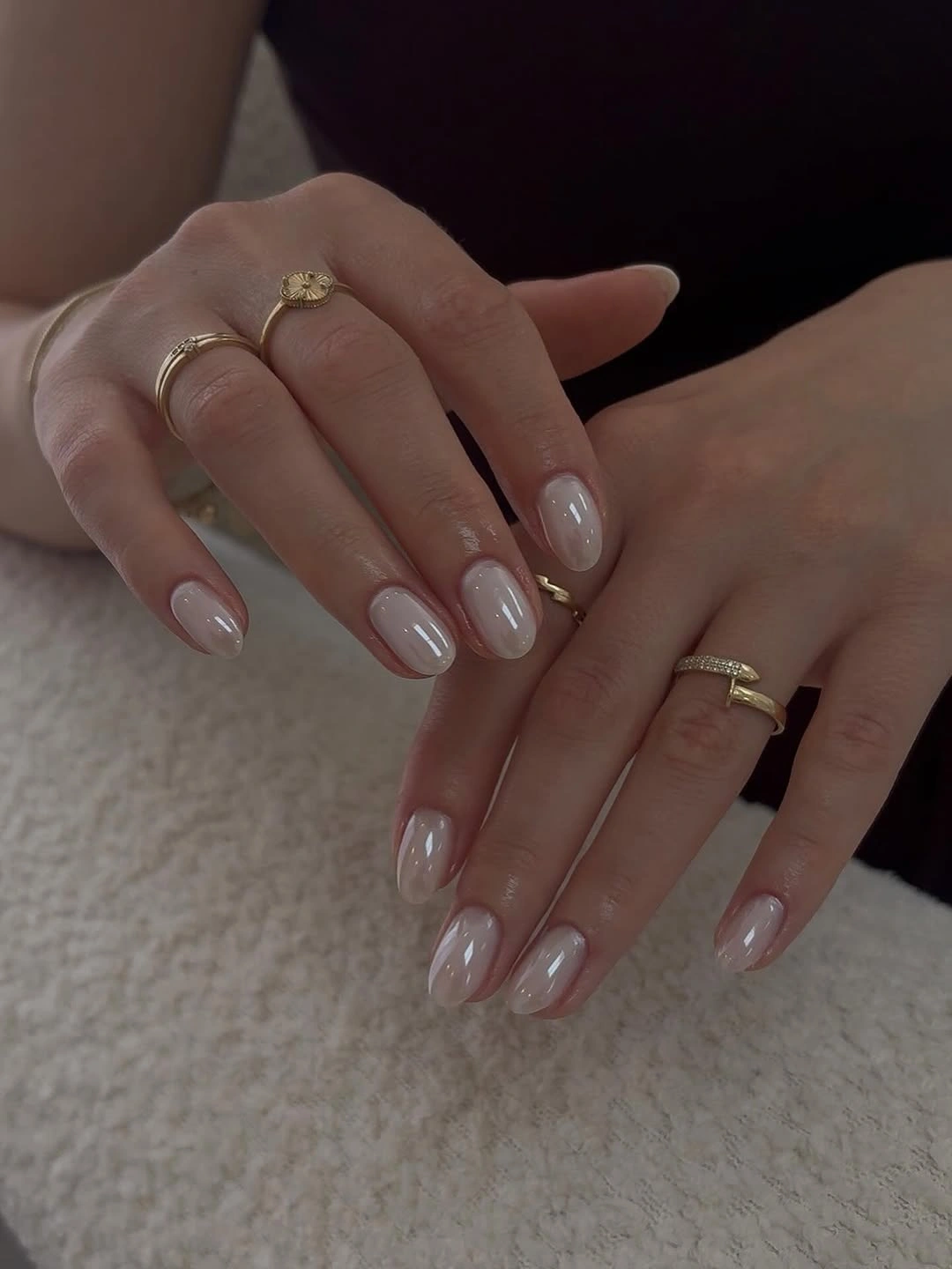
For nail art designs for office work, use this as a neutral foundation and add a small brown or mauve edge to one finger if needed. The almond shape can be shortened without losing its tapered quality, and a warm cream tip will keep the look connected to fall clothing. The result can stay understated even when the rest of the outfit includes a noticeable collar, scarf, or watch.
The subdued contrast means the set may look almost plain from far away, which is either the benefit or the limitation depending on your taste. If you want more definition, deepen only the tip line and leave the base sheer. That keeps the manicure professional while giving the eye a clear boundary. A small contrast change will therefore be more useful than a decorative addition that increases upkeep.
11. Milky White On Short Square
Solid milky white turns a short rounded-square manicure into a clean block of color with no extra visual noise. The softly opaque surface feels lighter than a stark white and gives the compact shape a tidy frame. For a workday manicure, the absence of art can be more useful than another accent because it pairs with every outfit.
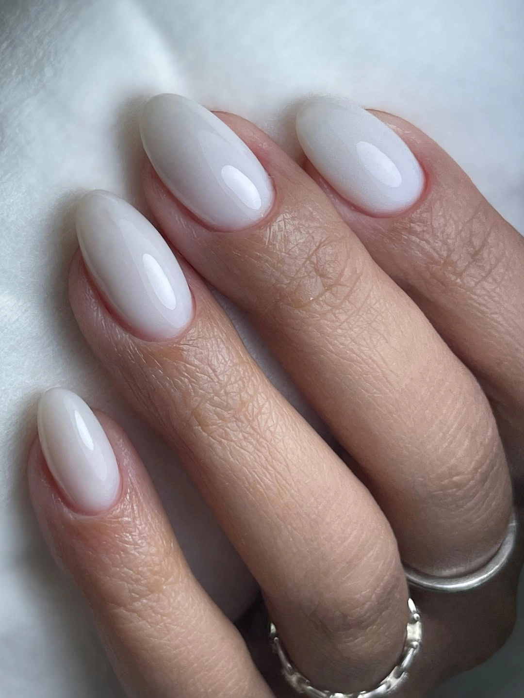
This option belongs in the simple nail designs office category when color rules are strict or meetings fill the week. Keep the free edge short, or use the milky white on four nails and a sheer nude on one finger if you want a little contrast without creating a motif. Its short rounded edge also keeps the pale block from feeling too formal or too large on the hand.
The pale surface shows uneven application and dry edges clearly, so preparation matters. If the nails differ in length, match the set to the shortest finger rather than stretching the shape. A uniform outline will make the plain color look intentional and easier to maintain. That simple adjustment protects both the appearance and the practicality of the finished set.
12. Tiny Warm Marks On Nude
Small pink, coral, and green marks sit over a pale nude base, leaving most of each medium almond nail open. The marks read as floral-like decoration without needing to be identified as a specific motif, and the neutral background keeps the color mix from becoming loud. Placement and scale keep the idea suitable for work.
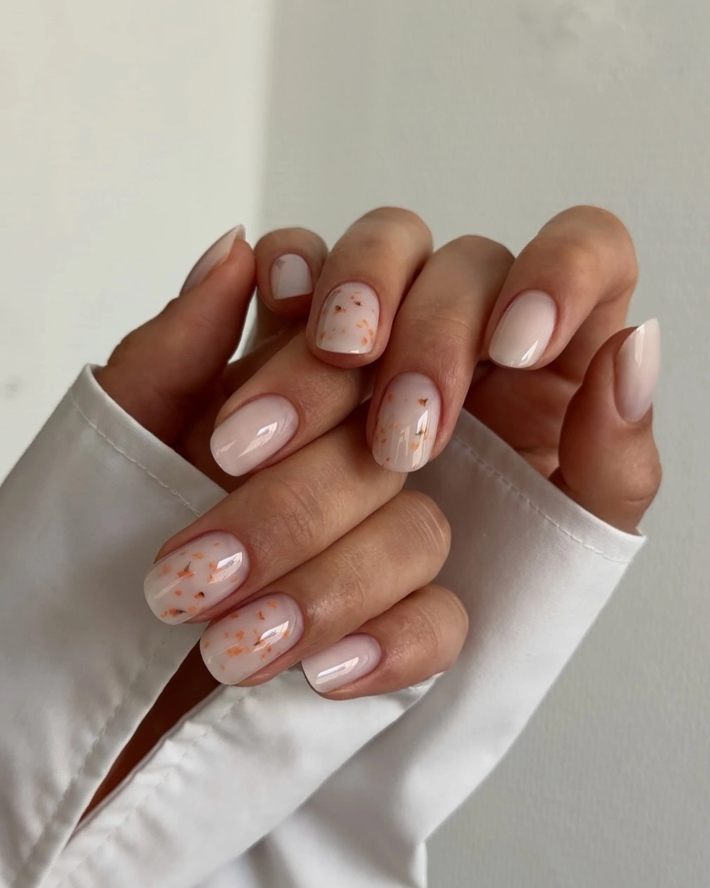
For nude nail designs for office, reduce the marks to two accent nails and use muted rose with a single olive point. The medium almond shape supplies a soft frame, while a shorter version will make the tiny details feel more proportional. Keep the rest of the nails plain so the small marks have room to breathe.
The accents are delicate enough to disappear if they are too pale, but adding more color can make the set harder to pair with formal clothing. Choose clear contrast in a small dose and accept that the detailed fingers may need more careful touch-up than the plain ones. The plain nails are important because they prevent the small marks from turning into an all-over pattern.
13. Coral And Purple Tip Mix
Coral and purple French tips alternate over a translucent pink base, creating a stronger color mix while the almond silhouette keeps the set elegant in outline. Each nail has a clear tip area, so the contrasting shades feel organized rather than random. The look is more expressive, but it still has a repeatable structure suitable for a creative workplace.
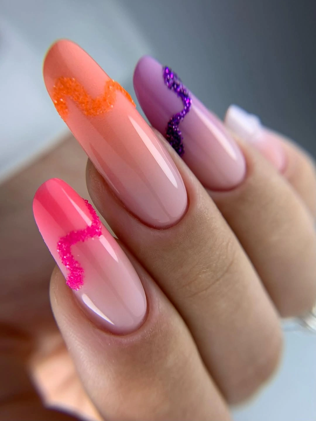
To make it easier to wear in a traditional office, choose coral on two nails, purple on one, and keep the rest in a pale tip. Muted plum and terracotta will bring the palette closer to fall, while a medium almond length will reduce the visual volume of the colors. The translucent center is the quiet element that keeps the contrasting colors from filling the entire visual field.
Multiple bright tips can make the manicure feel less neutral than expected, particularly under bright office lighting. If that is a concern, keep the base sheer and make the color bands narrower. The design will retain its identity through the alternating placement alone. That proportion lets the manicure show personality while still giving neutral office clothing a calm background.
14. Emerald Solid On A Medium Square
Glossy emerald green fills the medium square shape with a saturated color that looks deliberate because the edges are straight and the surface is plain. There is no competing art, so the shade becomes the focal point while the moderate length keeps the manicure organized. It is a direct choice for someone who wants color without decoration.
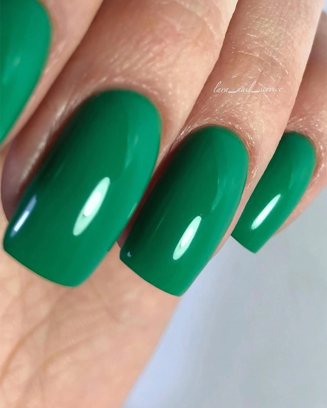
For office nail designs, a deep green can feel more restrained than a bright primary color, especially with a short square outline. If the full set feels too bold, use emerald on alternating fingers and add a nude base to the rest. A soft cream outfit will let the color stand out without making the look busy.
Saturated green can reveal chips around the sidewalls, so the evenness of the outline matters. Keep the free edge moderate and avoid adding glitter unless the work setting permits a more reflective finish. The solid color already supplies enough visual information for the hand. A clean edge will also make the dark green look more considered than a brighter shade with uneven coverage.
15. Soft Yellow-Green Square
A pale yellow-green cream shade gives the long square silhouette a softer alternative to neon. The color is unusual but not patterned, and the glossy surface keeps the design simple enough to compare with classic nude or red options. The squared free edge adds structure to a shade that might otherwise feel overly sweet.
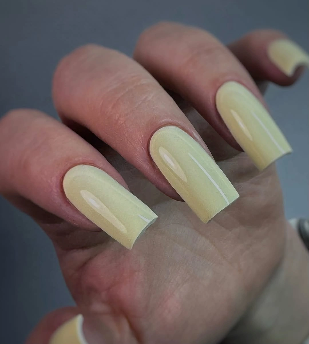
To bring this fall nail designs for office idea closer to everyday wear, shorten the square outline and keep the color on two accent nails. A muted pistachio or softened chartreuse can play the same role with less brightness. Pairing the tone with brown or charcoal clothing will make it feel more grounded.
Long square nails and a light color can together create a large visual block, so proportion deserves attention. Reduce the length before changing the shade if the manicure feels overwhelming. A smaller, even shape will keep the unusual color readable without letting it dominate every gesture. The color is easier to integrate when the supporting accessories stay simple and the nail length does not add another strong shape.
16. Outlined Red Stiletto
Glossy red covers a medium stiletto silhouette, while a narrow pale outline separates the color from the hand and sharpens the point. The design is dramatic because of shape and color, not because it uses multiple motifs. It can work in a creative office when the rest of the styling stays simple and the length remains controlled.
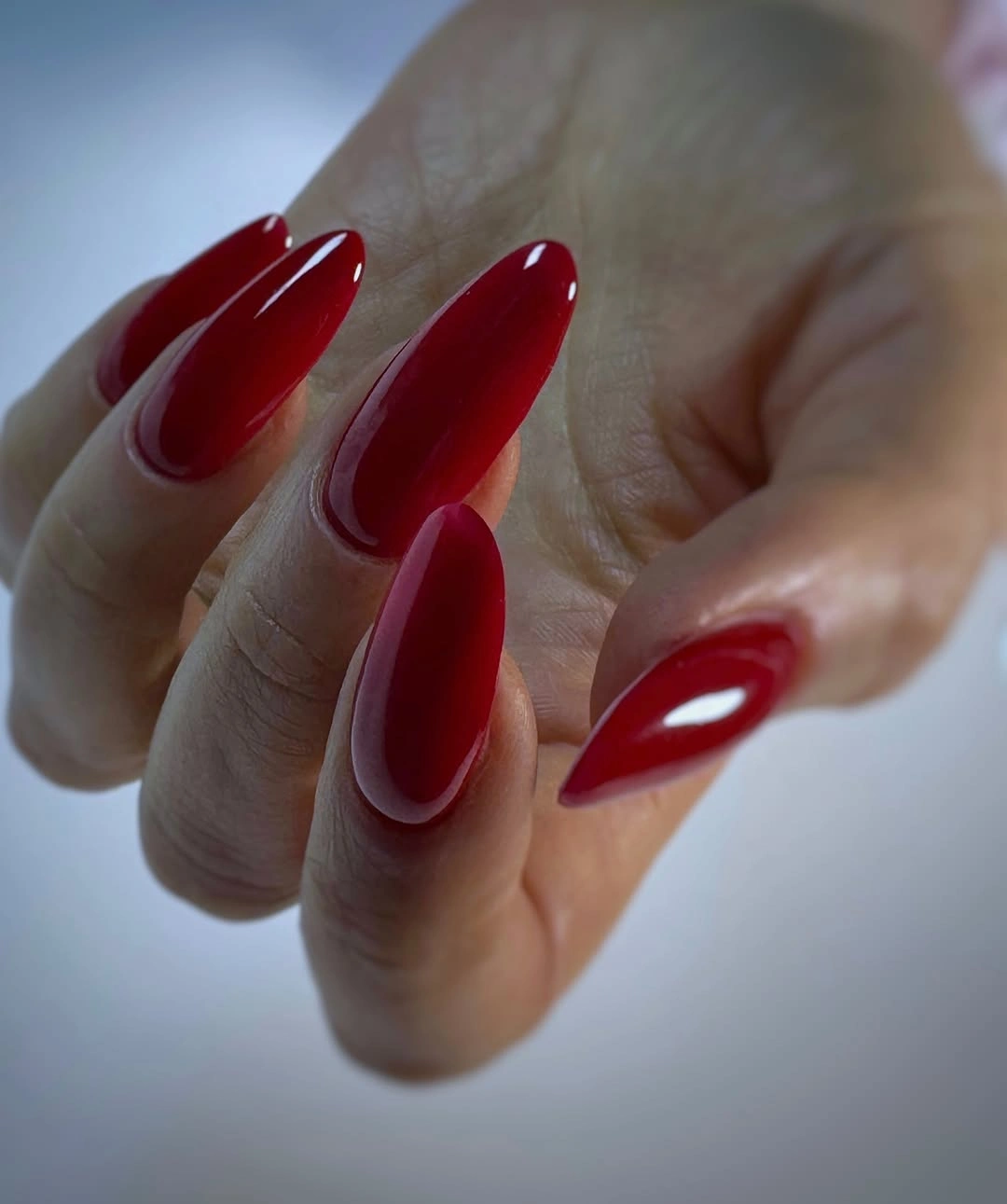
For a more conservative version, transfer the red-and-outline relationship to a medium almond or reduce the point further. A wine or brick red can soften the effect, while keeping the outline light will preserve the visual definition around the tip. That outline is a useful way to keep the red vivid without letting it blend into the skin around the tip.
The pointed shape carries the main tradeoff: it catches attention, but it can also catch on fabric and feel less comfortable during repetitive tasks. If your work requires constant hand movement, change the silhouette before adding more decoration. The red will remain strong on a shorter almond. A controlled length will make the design easier to wear without weakening the clear red focal point.
17. Sparkling White French
A translucent white base and pale French edges keep the medium square shape light, while fine silver sparkle gathers near the tips. The shimmer is visible but not spread into a full glitter field, so the design stays closer to a polished neutral than a party manicure. The square outline gives the sparkle a crisp boundary.
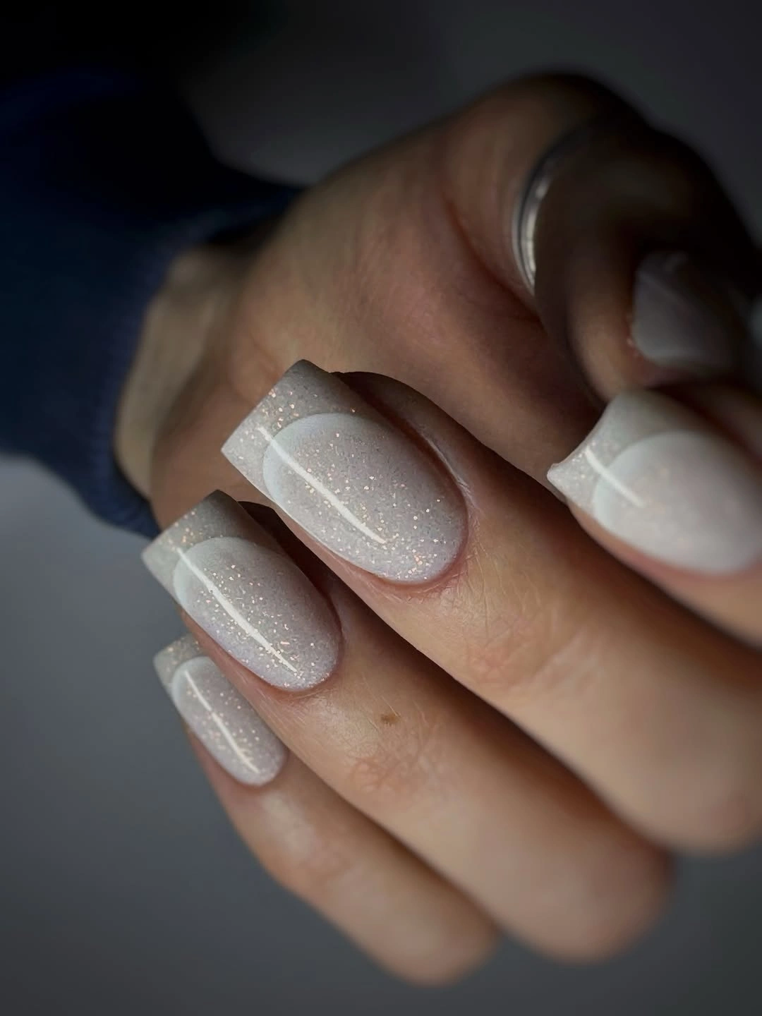
For fall nail art designs for office, keep the shimmer on the ring fingers and make the other tips plain cream. This edit works with a shorter square and will be easier to pair with matte fabrics, neutral suits, or understated jewelry. The sparkle should follow the tip rather than migrate into the center.
Small reflective particles can appear stronger under overhead light, so consider the setting where you work. If the finish catches too much attention, choose a satin pale edge instead of removing the entire French structure. That preserves the shape and contrast while lowering the shine. A smaller amount of sparkle can still catch light when the hand moves, even if it is not visible from across the room.
18. Bright Pink On A Medium Square
A solid bright pink surface gives the medium square outline a clear, graphic presence. The color is energetic, but the lack of art keeps the manicure visually simple, and the moderate length prevents the set from becoming oversized. This is a useful work option for a bold color preference that does not want a complicated design.
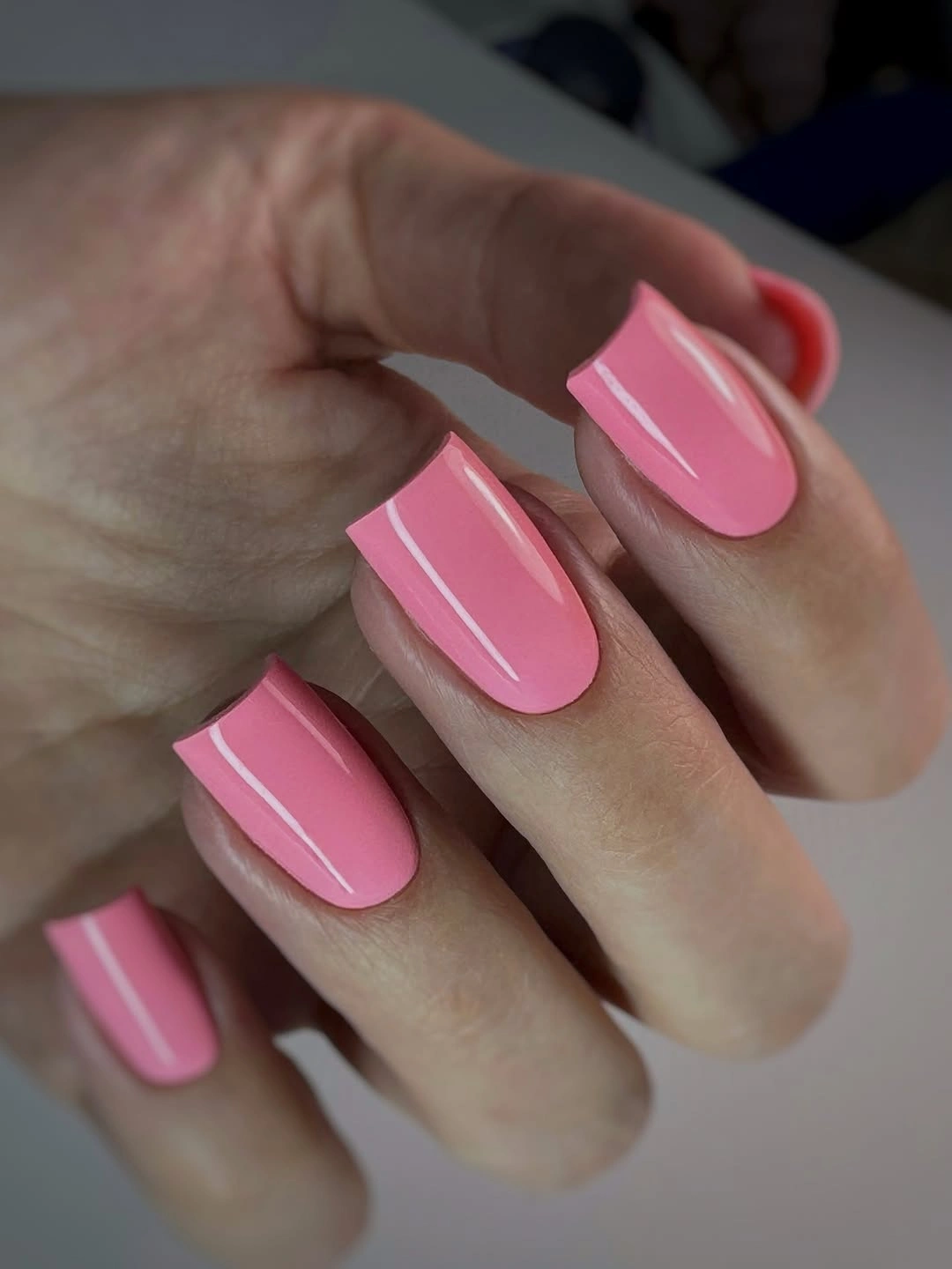
To soften the look, move from bright pink toward rose, berry, or dusty fuchsia and keep the corners lightly rounded. If your office is conservative, use the color on two accent nails over a sheer pink base. The square shape will still show the color clearly without covering every finger. The solid surface also gives you a clear choice between a confident bright set and a muted rose version without changing the structure.
Bright colors make edge wear more obvious, particularly on a plain set where nothing distracts from the tip. Keep the free edge smooth and choose a length that matches your daily routine. The simpler the design, the more useful it is to make maintenance realistic rather than aspirational. That practical limit matters because color impact is easier to adjust than a complicated design that cannot be simplified later.
19. Fine Diagonals On Short Almond
Short almond nails stay light through a sheer nude pink base, while thin white and silver diagonals appear only on selected fingers. The lines add direction without occupying the whole surface, and the compact outline keeps the result approachable for work. This is an example of using a small graphic detail instead of a full pattern.
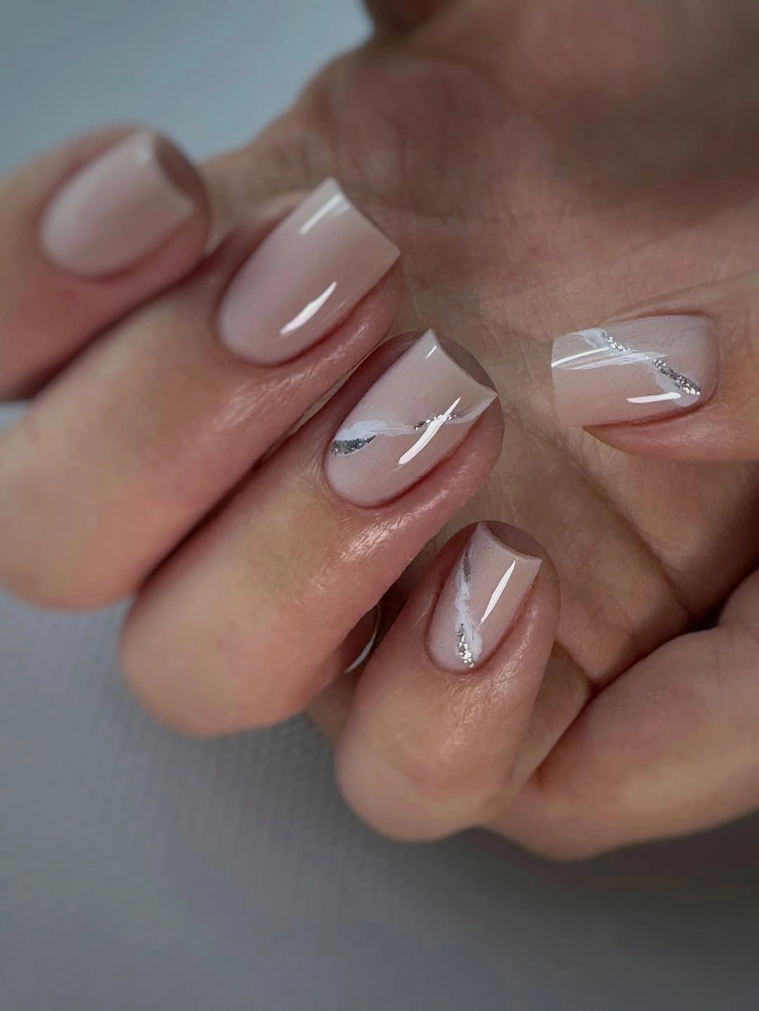
For office nail designs, place one diagonal on each accent nail and leave the remaining fingers plain nude. A soft gold can replace silver if your jewelry is warm, while a rounded almond edge will keep the design gentle and practical during the day. The open nude surface lets the diagonal read as a small design decision rather than a full nail pattern.
Diagonal accents need enough distance from each other to avoid looking like accidental scratches. Keep them close to the free edge and make sure the base remains visible. If the nails are even shorter, use one short line rather than forcing a longer stripe to follow the taper. That spacing keeps the fingers looking clean and makes the set easier to coordinate with office accessories.
20. Mauve Edge On Pale Nude
Thin dark mauve tips give the pale nude base a soft boundary, adding definition without the high contrast of black. The medium almond shape keeps the line curved and the palette balanced, so the set can read as an autumn update without becoming obviously themed. A small darker detail near the edge repeats the color quietly.
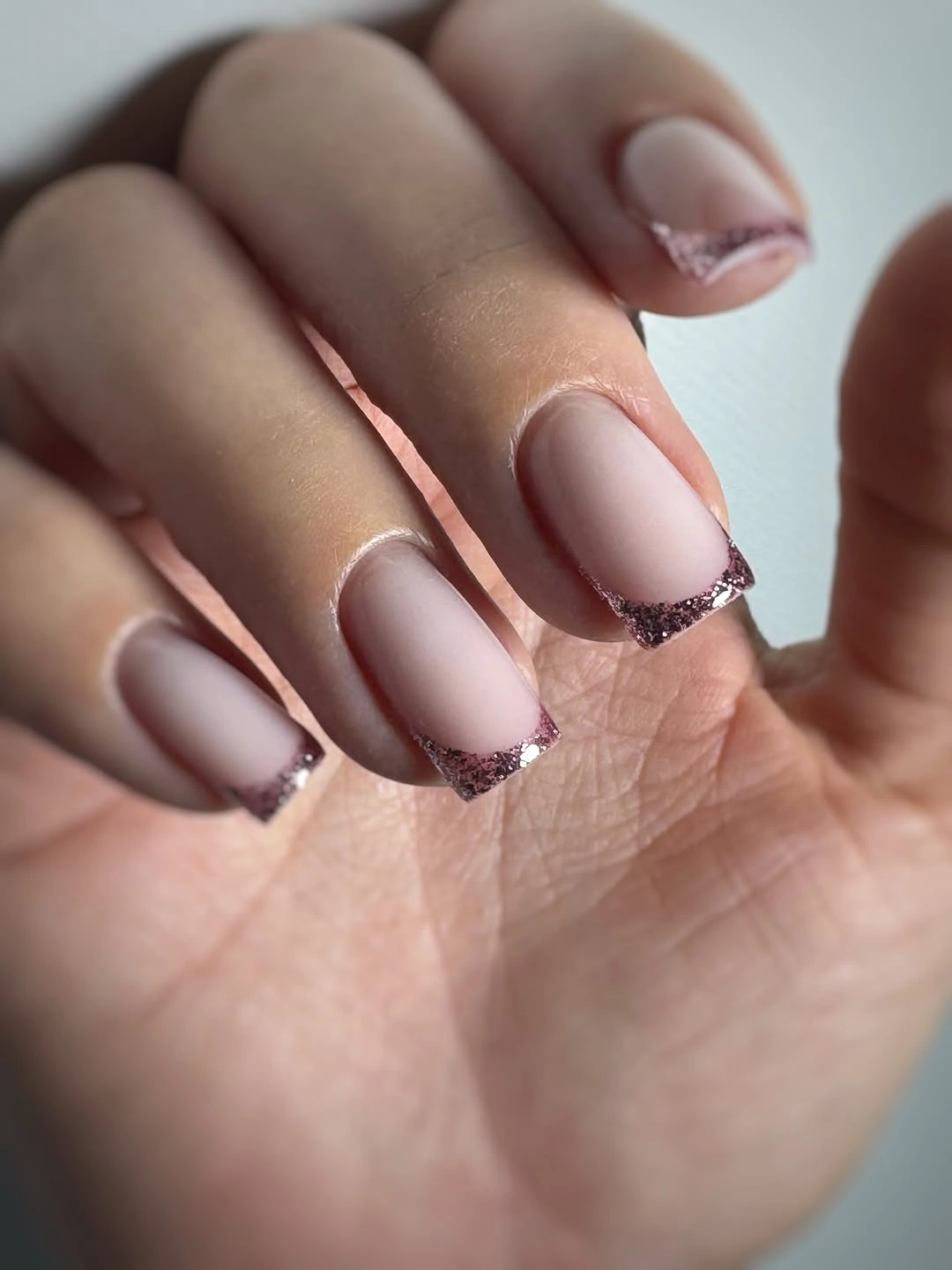
For elegant office nail designs, replace mauve with cocoa or softened burgundy and keep the base close to your natural-looking nude range. A shorter almond will hold the line neatly, and limiting the darker edge to two fingers will make the set even more discreet. The warm dark edge will also pair naturally with brown, cream, denim, and muted berry clothing through the season.
Low-contrast dark tips can blur if the line is too thin or the surface is uneven, so the border needs enough weight to remain visible. If you prefer minimal upkeep, make it slightly wider and accept the stronger definition. That small change is more forgiving than trying to preserve a nearly invisible edge.
21. Brown Red With Gold Detail
Brown red, near-black, gold, and one glittered nail create a deep office palette with a clear focal point. The medium square outline keeps the colors organized, while the tiny gold detail supplies interest without spreading decoration across every finger. The composition is rich because the accent is concentrated.
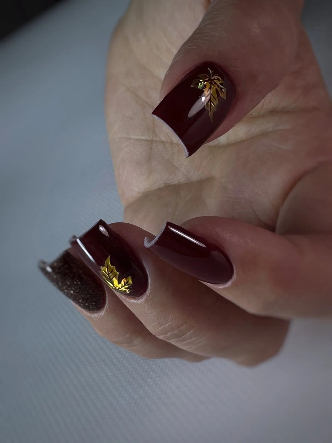
For a work-friendly version, keep the brown-red color on most nails and reserve the dark glitter for one finger. Simplify the gold detail to a small point if your office favors restraint, or use a warm cream accent instead. The square shape will still frame the darker palette neatly. The medium square outline keeps the concentrated accents from feeling too delicate or too dramatic for the setting.
The dark colors will make grow-out and edge wear more visible, and the glittered nail may need a little more care than the solid ones. Keep the accent away from the busiest finger if possible. One deliberate focal nail is easier to live with than several competing details. That approach makes the manicure easier to repeat because the main color can remain unchanged between appointments.
22. Classic Red On Short Square
Vivid red on a medium square outline is direct, clean, and easier to style than a red manicure with several extra elements. The straight free edge gives the color a firm frame, while the glossy surface keeps the set looking fresh and readable. This is a strong answer when the office manicure needs color but not visible decoration.
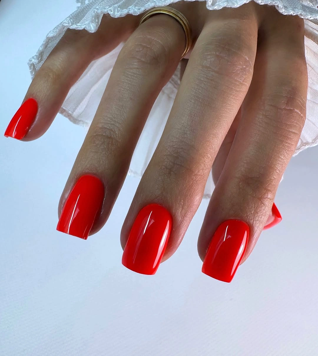
If a classic red feels too bright for your workplace, move toward brick, cranberry, or deep berry without changing the shape. A shorter square length will also make the color feel more contained. The point is to let one shade carry the look and avoid adding art simply because the surface is plain. A berry or brick substitute can therefore keep the same visual clarity while feeling a little more seasonal.
The plain finish leaves no place to hide chips, so choose a length that matches how often your hands meet desks, bags, or tools. Keep the sidewalls tidy and the edge even. A well-proportioned solid red will stay more convincing than a detailed set that does not fit the workday. Keeping the design plain makes that upkeep visible, but it also makes the repair straightforward when one edge needs attention.