When I pull on a charcoal sweater and notice my hands disappearing into the sleeves, I want one small detail to wake them up without making the outfit feel busy. A pale nail with a soft glow does that quietly; a glossy blue accent has the opposite energy, like a tiny flash of cold daylight. I keep coming back to that choice when autumn mornings make everything else feel muted.
If your appointment is coming up, start by deciding where you want the eye to land. A clean tip or a reflective surface can carry the look on its own, while a single decorated nail gives you room to be playful without committing to a full pattern. That is how I use fall nail trends 2026 – as a prompt to choose a mood, not a rule to copy. Pick the level of attention you can live with through the week, then let the rest stay easy.
1. Quiet pearly almond nails
The long almond shape here is softened by a creamy ivory base and a restrained pearly glow. The color stays close to white, but the reflective surface keeps it from looking flat against the dark background and nearby rings. Because the manicure is otherwise solid, the eye follows the tapered outline and the narrow light on each curve rather than searching for a motif.
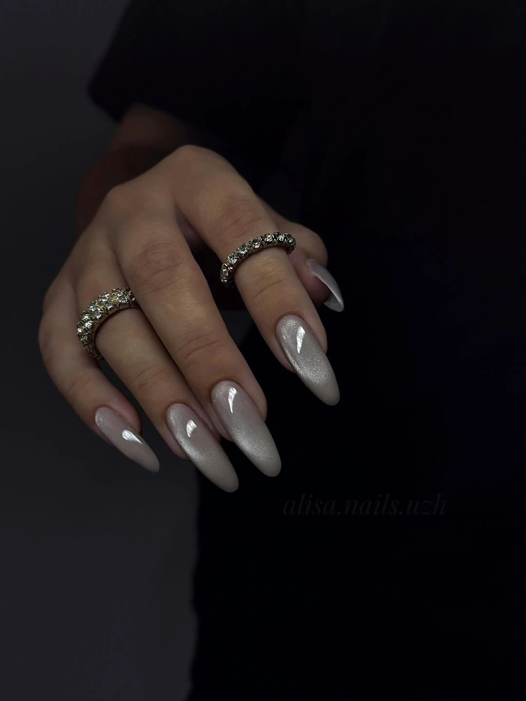
This is a good example of using finish as decoration. A pale reflective layer gives a simple manicure evening energy without adding glitter, lines, or contrasting tips, while the almond silhouette keeps the hand visually long. The darker setting makes that difference especially clear, but the same effect can stay wearable with a sweater, a neutral coat, or a low-key appointment.
For daily comfort, I would keep the pearly color and reduce the length to a medium almond before changing anything else. The pointed shape is the most noticeable practical choice, especially around typing and pockets, while the ivory tone is easy to repeat. If full shine feels too formal, a milky cream with only a faint pearl shift preserves the softness.
2. Aqua-tipped translucent pink
A sheer pink base gives these tapered nails a light center, while aqua and warmer colored edges bring the contrast to the perimeter. The effect is less about covering the nail and more about letting a small band of color outline the shape. That placement leaves the hand feeling airy, even though the bright tips make the manicure clearly more playful than a neutral French.
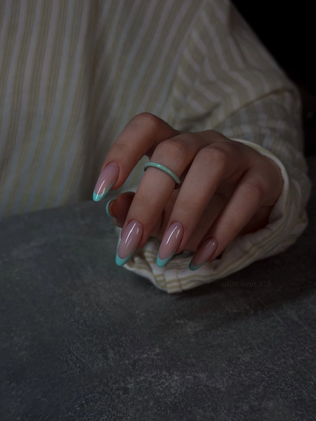
The colored edge works because the translucent center creates a pause between the skin and the brighter shades. You can read the shape first, then notice the tip variation, so the manicure has energy without becoming a solid block of neon. It also gives a useful way to bring fall nail trends into a lighter wardrobe when deep brown or burgundy feels too heavy.
I would adapt this idea by choosing one tip color for shorter nails, especially if the free edge is compact. Two vivid shades need enough room to stay distinct and evenly spaced, while a single aqua or coral line remains easier to balance. Echoing that color in a scarf or small accessory can make the manicure feel intentional without turning the outfit into a matching set.
3. Pale sage square minimalism
Short square nails in a pale sage-cream range show how a quiet color can still look deliberate. The compact tips keep the manicure neat, and the close tonal relationship between the base and the small pale accent prevents the design from feeling busy. There is no strong graphic contrast here; the appeal comes from clean placement, a softly muted palette, and an even glossy surface.
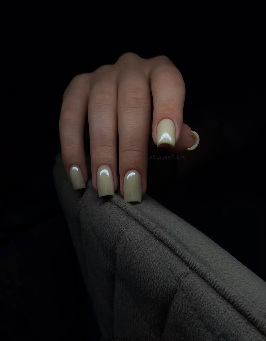
The low contrast makes this look especially useful when you want color but not a focal point that announces itself across the room. The square outline supplies the structure, while the softened green note adds a little seasonal direction without relying on orange or dark red. In dim light the accent may nearly disappear, which is part of the manicure’s understated character rather than a flaw.
For a clearer version, deepen the sage slightly or move the light accent onto one ring finger instead of repeating it. I would keep the short square length because it supports the tidy mood and lets the pale color feel practical. If your wardrobe is mostly gray, cream, or denim, the muted green can act as a small change that still sits comfortably beside familiar basics.
4. Black web lines over blush
Soft blush almond nails become graphic through irregular black web-like lines placed across selected surfaces. The base remains pale and glossy, so the dark marks read as a deliberate drawing instead of a full dark manicure. Their loose, uneven movement also follows the almond shape, giving the set a little tension without covering every nail in the same dense pattern.
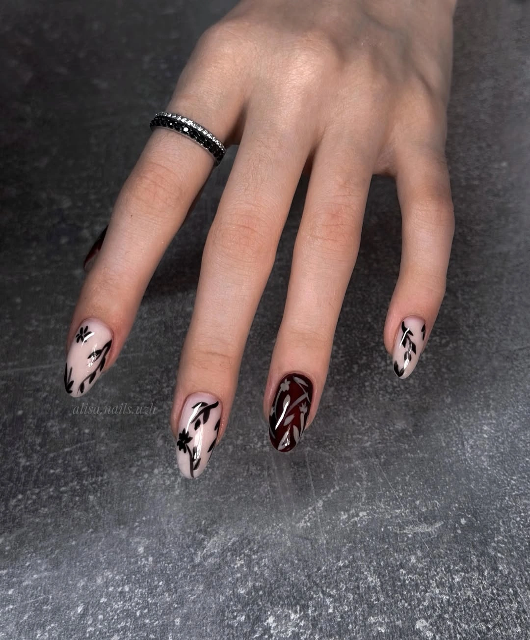
The contrast works because the blush base leaves visible space around each line. A black mark can feel sharp, but the open pale background keeps it from taking over the hand, and the rounded almond outline softens the graphic quality. This is a useful direction when a plain nude feels too quiet but a detailed seasonal motif would feel out of character.
Keep the linework on two accent nails if you want a version that grows out more calmly. The dark marks make spacing and placement easier to notice than on a tone-on-tone design, so a simpler arrangement can look more polished over time. A warmer pink, mushroom nude, or muted mauve would preserve the same idea while changing the emotional temperature.
5. Glossy dark chocolate coffin
Long coffin nails in an almost-black chocolate brown make the finish the main event. Narrow white reflections run across the curved surface, showing how much depth the gloss adds to a single dark color, while the straight sides and flat tips give the manicure a strong outline. The gray knit around the hand reinforces the cozy, deep-toned mood without becoming part of the design.
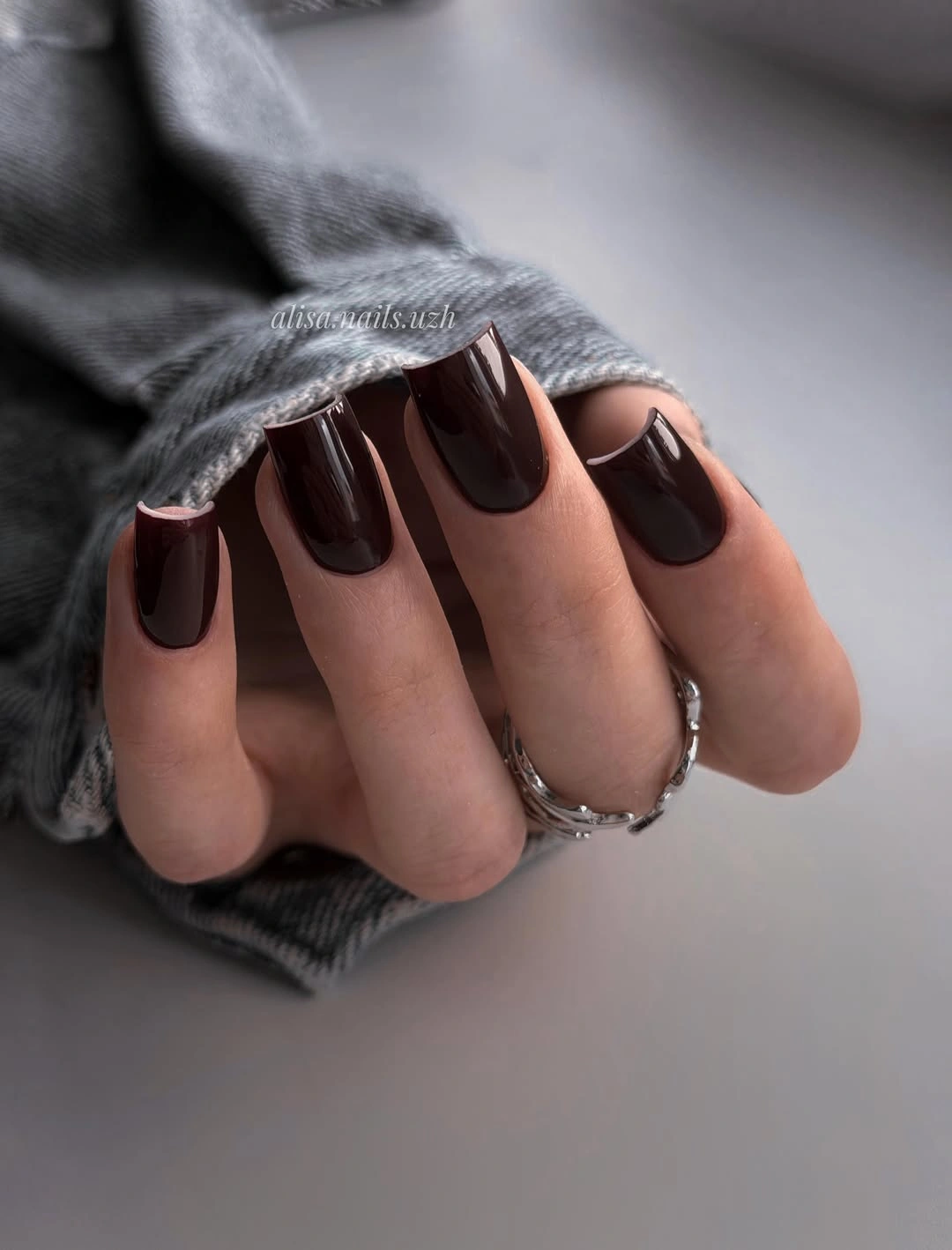
This kind of brown is effective when you want the richness of black with a slightly warmer impression. There is no accent to interrupt the surface, so the eye notices the color’s brown undertone only where the light moves across it. The result suits simple clothes especially well, because the nails supply a concentrated point of depth rather than another competing pattern.
The practical tradeoff is the combination of dark gloss and length. Tip wear will stand out, and coffin corners can feel less forgiving around fabric or a keyboard, so I would borrow the shade on a shorter square if comfort matters more than drama. A chestnut or espresso variation can also soften the near-black effect while keeping the same polished fall direction.
6. Cobalt blue almond shine
Saturated cobalt blue turns a long almond silhouette into a clear visual statement. The nails are solid and glossy, with no extra motif to dilute the color, so the bright blue reads almost like a clean ribbon of pigment along each fingertip. Set against a white cushion, the contrast becomes even more direct, giving the manicure a crisp quality that feels intentionally modern.
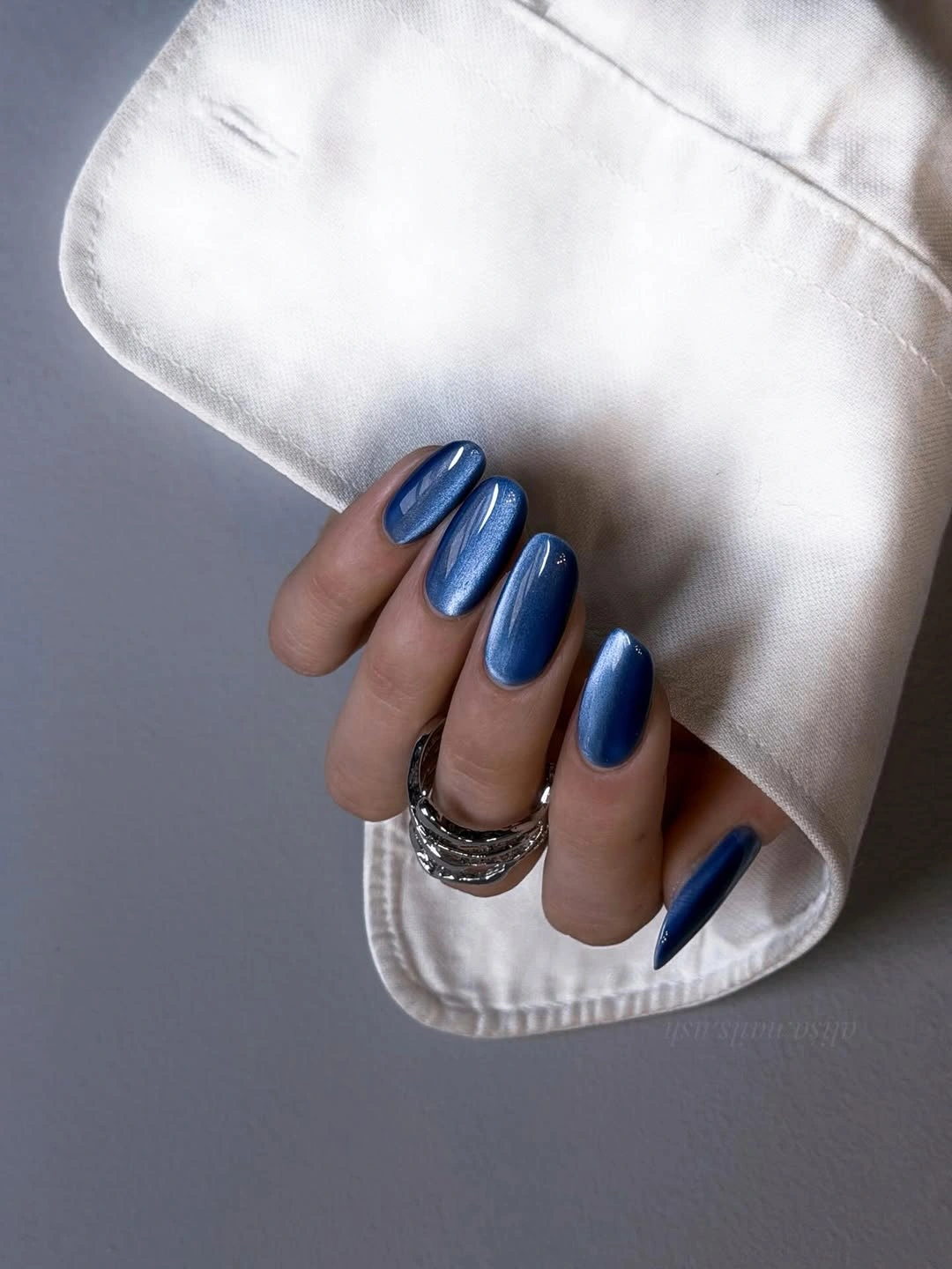
The simplicity is what keeps such a vivid shade from looking overworked. The almond curve adds softness to the strong color, while the uninterrupted surface lets the eye understand the shape immediately. This is a helpful option for readers who save fall nail trends but do not want every seasonal idea to stay inside brown, berry, or cream territory.
If cobalt feels too loud for all ten nails, use it on two fingers and pair it with a muted blue-gray or sheer nude. Medium length will make the color easier to wear with coats and denim, though the saturated surface will still show edge wear quickly. I would let the blue stand alone rather than adding art, because its strength is already visible in the color block.
7. Smoky swirl almond detail
A cloudy taupe base gives these long almond nails a soft, smoky foundation, then pale looping swirls add movement across the surface. The lines are light enough to blend into the neutral base instead of creating a hard graphic pattern, while a small metallic-looking detail near one cuticle supplies a restrained point of contrast. The overall effect stays dimensional without becoming glitter-heavy.
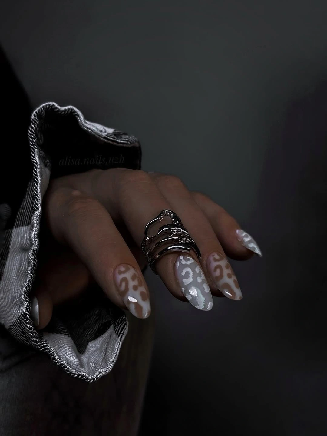
The design feels balanced because the swirling marks follow the natural length of the almond rather than fighting it with blocky shapes. Taupe, gray, and pale accents create a low-contrast rhythm, so you can notice the detail up close while the set still reads as a neutral from farther away. It is a good compromise between a plain polish and a fully illustrated manicure.
For a shorter appointment, keep the swirl on one or two nails and let the rest stay taupe. The finer lines need enough room to remain legible, and a crowded pattern can lose its calm quality when compressed onto a small surface. A mushroom base with warm cream lines would make the idea feel cozier, while cooler gray keeps the original smoky balance.
8. Berry pink painted accents
Deep berry polish anchors this long almond set, while pink-and-white curved details bring a lighter, more decorative layer to selected nails. One solid wine nail keeps the composition from becoming a collection of unrelated marks, giving the eye a place to rest between the painted accents. The palette feels romantic, but the dark base keeps it grounded enough for fall styling.
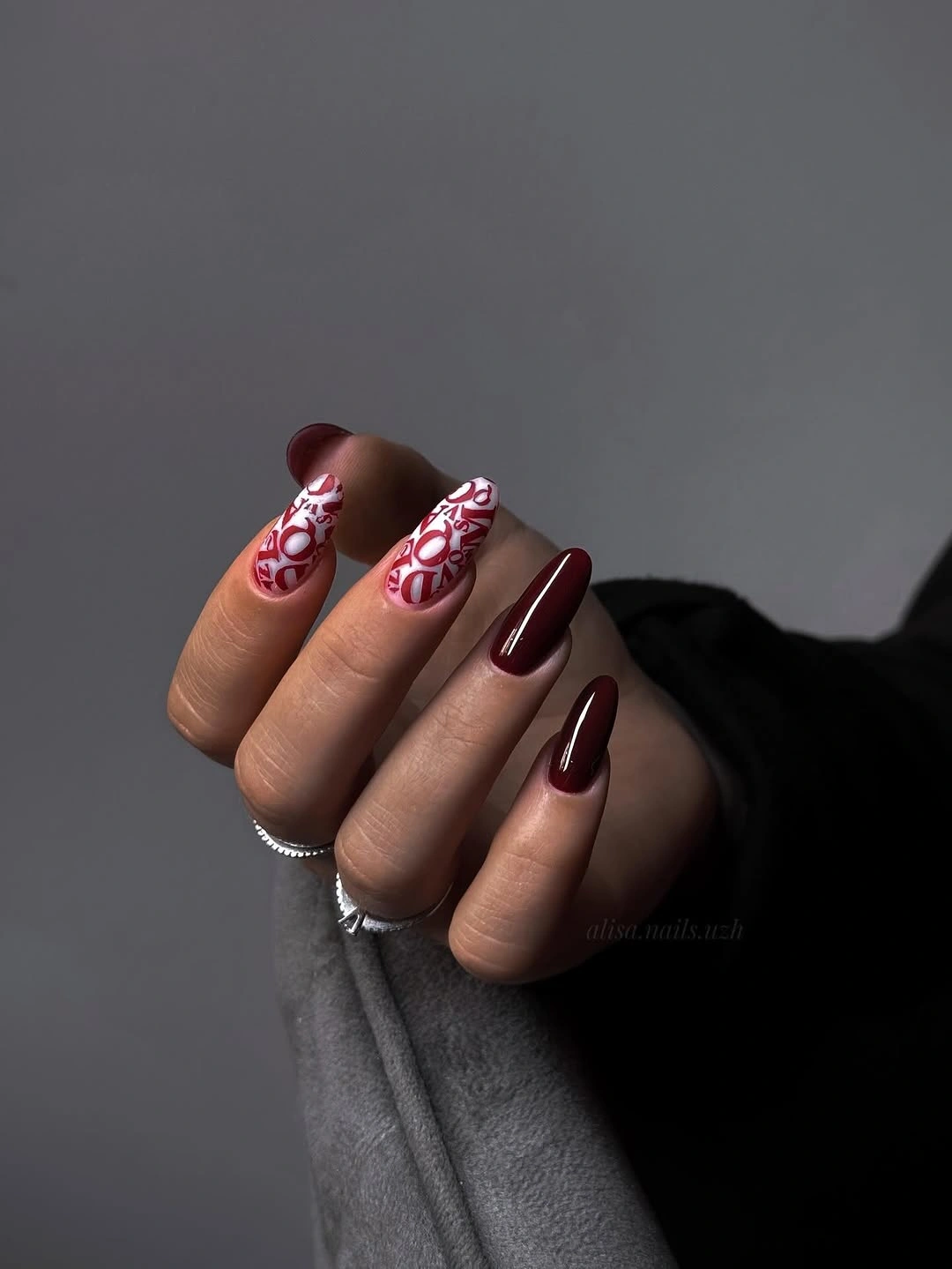
The repeated relationship between berry, pink, and white is what makes the mixed set readable. The lighter curves do not have to match perfectly to feel connected because they share the same family of color and sit on similarly elongated shapes. This makes the idea useful for readers who want visible art but still prefer a limited palette that can sit beside denim, cream, or black.
Concentrate the painted curves on two nails if you want the manicure to feel less occasion-led. A plain berry on the remaining fingers provides the same seasonal depth and makes grow-out less visually complicated than a full set of details. If you shorten the shape, keep the curves larger and simpler so they do not turn into tiny marks competing for the same small space.
9. Liquid gold almond finish
Warm metallic gold covers the long almond nails in one uninterrupted reflective layer. Narrow vertical highlights move down the surface, making the pointed tips look almost liquid, while the surrounding background stays quiet enough for the chrome-like finish to lead. There is no painted motif to explain; the color, reflection, and length provide the full visual story.
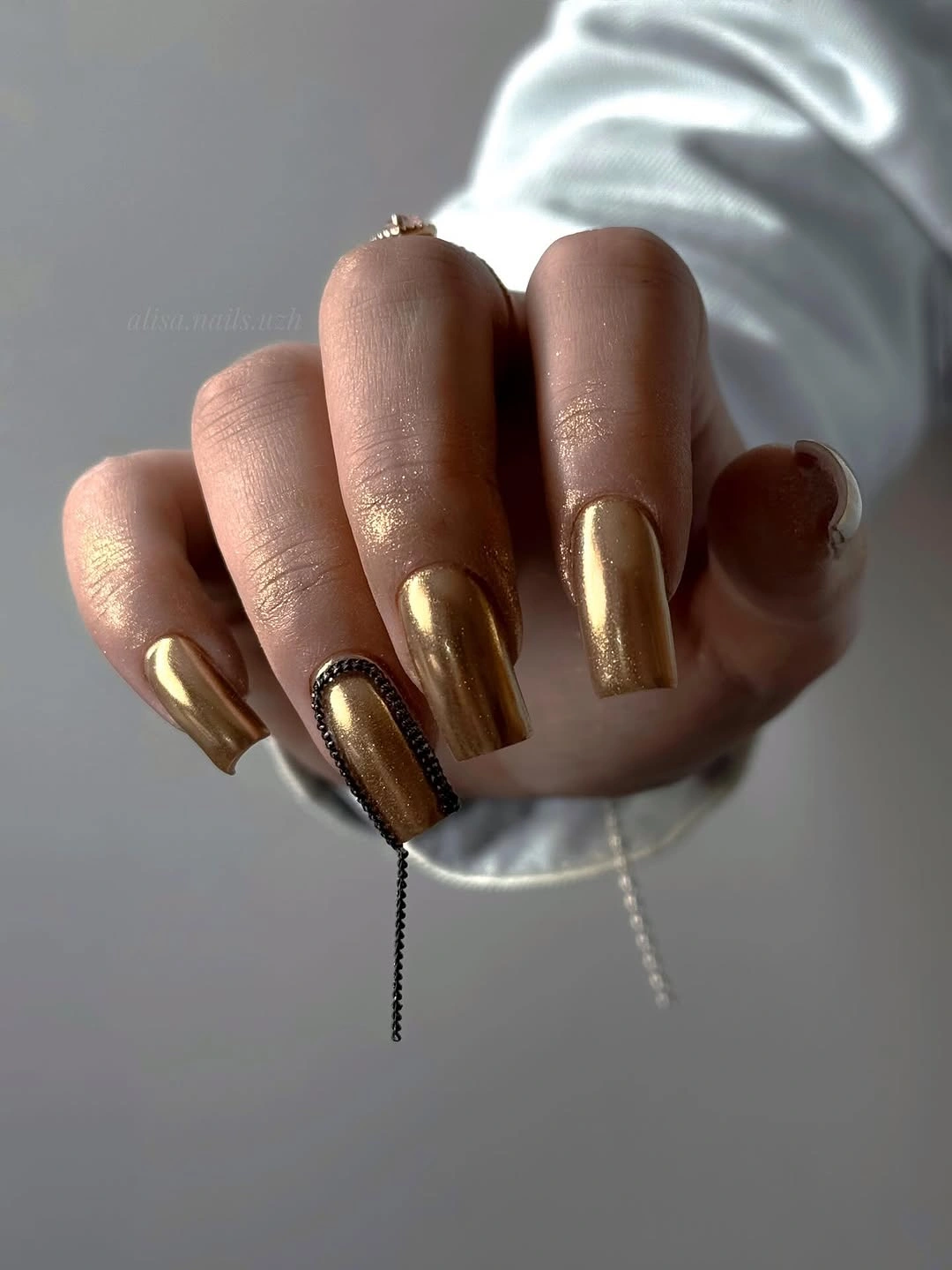
A full metallic finish can replace jewelry when the rest of the outfit is simple. The almond shape gives the gold a graceful direction, and the continuous surface keeps the look cleaner than a set built from several glitter or foil accents. It is still a statement, but the statement comes from one repeated decision rather than a busy arrangement of details.
I would switch to a soft champagne or use gold on two accent nails if a complete chrome effect feels too formal. Reflective surfaces reveal uneven texture and edge wear, so the manicure benefits from a shape that is kept visually clean. With a plain knit, black coat, or cream top, the gold can act as the one deliberate point of shine without needing additional sparkle.
10. Cool taupe almond polish
Cool taupe-gray beige gives these long almond nails a composed neutral quality, while the glossy surface keeps the color from disappearing beside charcoal denim. The manicure is completely solid, so the tapered outline and the subtle difference between the gray undertone and the warmer hand carry the visual interest. It feels quiet, but not unfinished or bare.
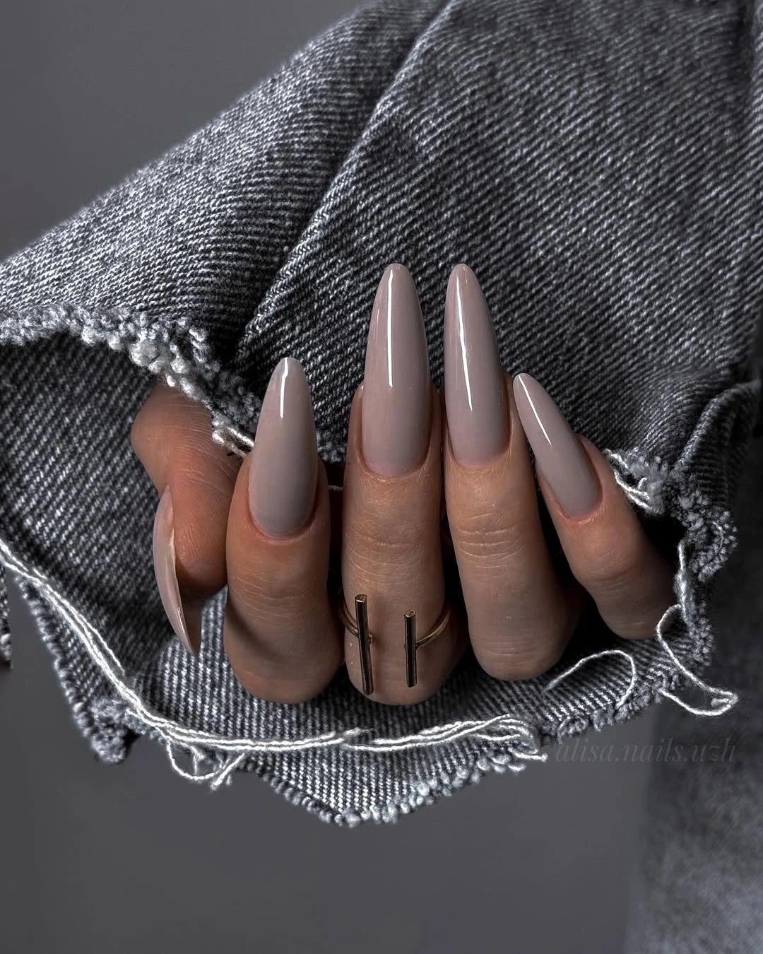
This shade is useful when you want a neutral that feels more directional than a familiar pink nude. The cool undertone echoes gray clothing and dark layers, and the gloss adds enough dimension for the color to remain visible in softer light. Because there is no art to coordinate, the manicure can move between outfits without asking the rest of the look to become equally minimal.
The long pointed shape remains the main practical decision. I would keep the taupe and reduce the length to a medium almond if daily tasks make the silhouette feel too delicate, or warm the shade toward mushroom for a softer autumn balance. A short rounded shape would change the mood more than a color change, making the same polish feel less editorial and more casual.
11. Deep mauve almond polish
Deep muted mauve gives this long almond manicure a wine-like richness without turning fully red or black. The nails are solid and glossy, and the clean reflections show that the shape is doing much of the styling work. With no decorative marks competing for attention, the color reads as a considered dark neutral that can shift depending on the light and nearby fabrics.
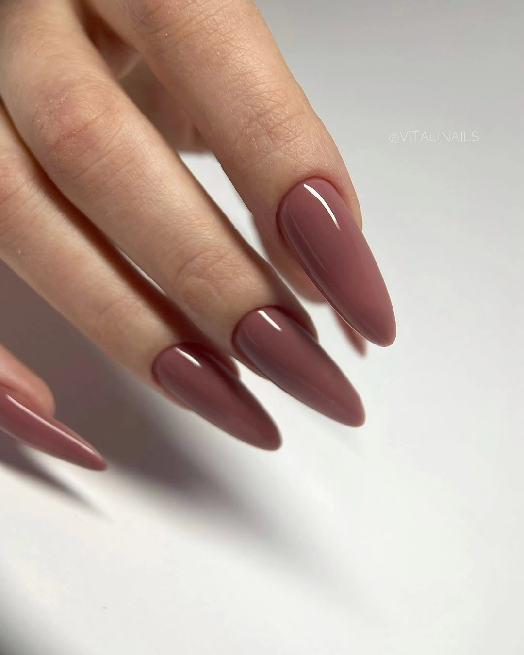
The appeal is in the middle ground: mauve has more personality than beige, but its softened undertone keeps the result from feeling as sharp as a bright red. The almond taper adds elegance, while the uninterrupted surface gives the manicure a calm rhythm from finger to finger. It is a useful option for readers who want color but do not want visible nail art before an appointment or event.
For a more relaxed version, shorten the almond or move toward a browner mauve that sits easily with cream and denim. The dark gloss still makes chips noticeable, so a compact shape can improve the practical side without changing the core mood. I would avoid adding glitter here; the muted color already has enough depth when the surface stays clean.
12. Olive mosaic square accents
These medium square nails use olive and olive-black as the foundation, then layer in yellow, cream, rust, and thin black lines. The result looks like a small abstract collage: color blocks and fine marks share the squared canvas without becoming a literal seasonal picture. The variety is clear, but the repeated olive family keeps the set from feeling scattered.
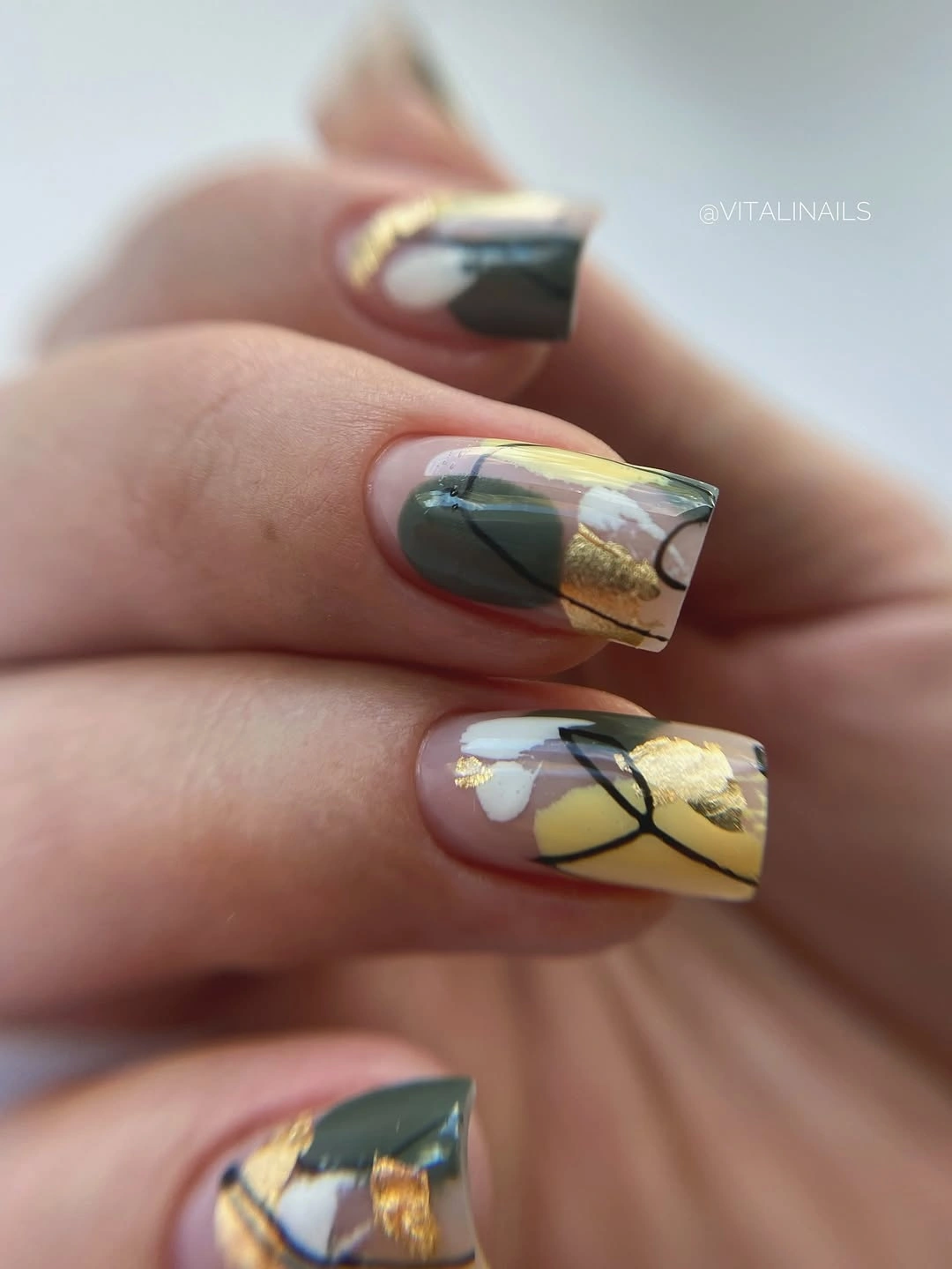
The design works through color control rather than one repeated motif. Olive carries the visual weight, while yellow and cream create light and the black lines sharpen the edges between sections. That makes the manicure interesting up close but still compatible with simple clothing, provided the outfit gives the hands enough breathing room instead of competing with every accent at once.
To adapt it for everyday wear, keep olive across most fingers and choose only yellow or cream for one accent nail. The square shape gives the artwork a useful flat area, yet too many small blocks can feel crowded if the tips are shortened. A warm khaki or muted moss base would preserve the same idea for readers who prefer less contrast than the brighter yellow provides.
13. Olive nails with tiny florals
Long almond nails in muted olive green carry small pink and coral flower-like details, with a yellow-tinted tip adding a brighter note on one finger. The green base is the visual anchor, so the floral marks feel like accents within one palette rather than a separate theme. The pointed silhouette gives the little details room to follow the length without looking compressed.
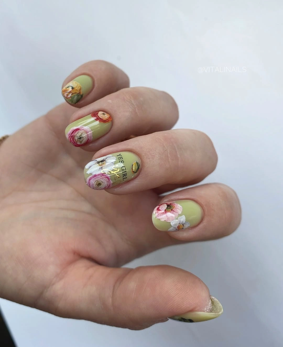
Olive is a smart foundation for this kind of art because it lowers the intensity of the pink and yellow. The brighter details become noticeable in small doses, and the almond curve keeps the composition fluid rather than blocky. It offers a botanical feeling without asking for literal leaves or a full pattern on every nail, which helps the set stay wearable beyond one outfit.
If the design needs to be simplified, place the floral details on two nails and leave the others olive. Shortening the shape calls for larger, fewer marks so the flowers do not blur into texture, while a khaki base can warm the whole set. I would keep the yellow tip as the single high-energy accent or replace it with a muted cream for more flexibility.
14. White and tortoiseshell contrast
Short square nails alternate milky white with a brown-and-black tortoiseshell-like accent, creating contrast through placement rather than length. The plain white nails act as visual pauses, while the patterned finger supplies warmth and movement beside the striped clothing in the background. The compact shape keeps the mix practical and prevents the brown accent from becoming too dominant.
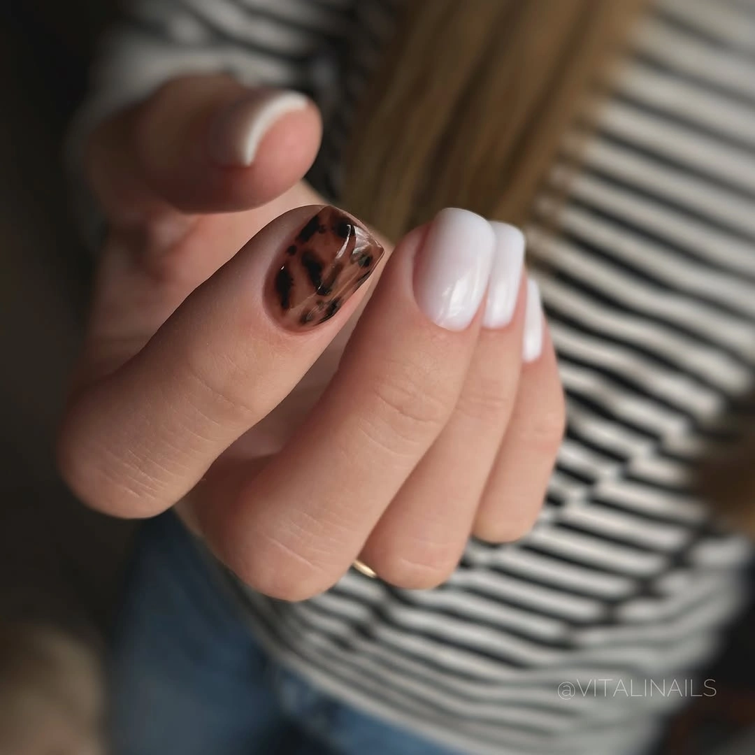
This pairing feels balanced because the busy accent has a clear, quiet neighbor. Tortoiseshell can carry several brown notes at once, but the white resets the palette and lets the pattern be read as one detail instead of a full hand of texture. It is a useful way to add autumn character when a uniform dark manicure would feel too strong.
Use the tortoiseshell on one nail per hand if you want an even calmer result, and shift the white toward warm cream to soften the contrast. The short square length is already the most wearable part of the idea, so I would preserve it rather than adding more decoration. A small brown ring or leather accessory can echo the accent without requiring exact color matching.
15. Icy blue short squares
Even pale icy blue makes these short square nails feel crisp without relying on a pattern. The color is glossy and evenly placed, and the gray textile around the hand gives the pastel a cooler setting that keeps it from reading sugary. Because the shape is compact and the surface is solid, the manicure looks tidy first and expressive second.
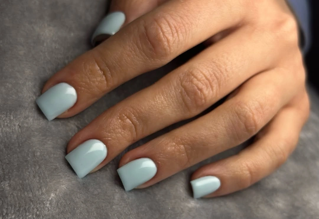
The contrast is subtle but useful: a cool pastel can brighten a dark-season wardrobe without becoming as intense as cobalt or as expected as burgundy. The square tips sharpen the soft color, giving it a little structure, while the lack of art keeps the hands visually clean. It is a good choice when the outfit already has texture and the nails need to stay simple.
Pairing the blue with gray, denim, or silver-toned accessories will make the cool undertone feel deliberate, though a warmer coat can change its impression. The light surface may show marks, so a short length is a practical advantage. If you want more depth, move toward slate blue or add a single white accent rather than covering the set in extra detail.
16. Blush nails with a dotted accent
Medium almond nails begin with a blush base and soft white curved tips, then interrupt that pale rhythm with one black-and-white dotted accent. The main color stays gentle, and the accent is concentrated enough to read as a small moment of play instead of a full pattern. The almond outline keeps the overall look graceful even with the stronger contrast.
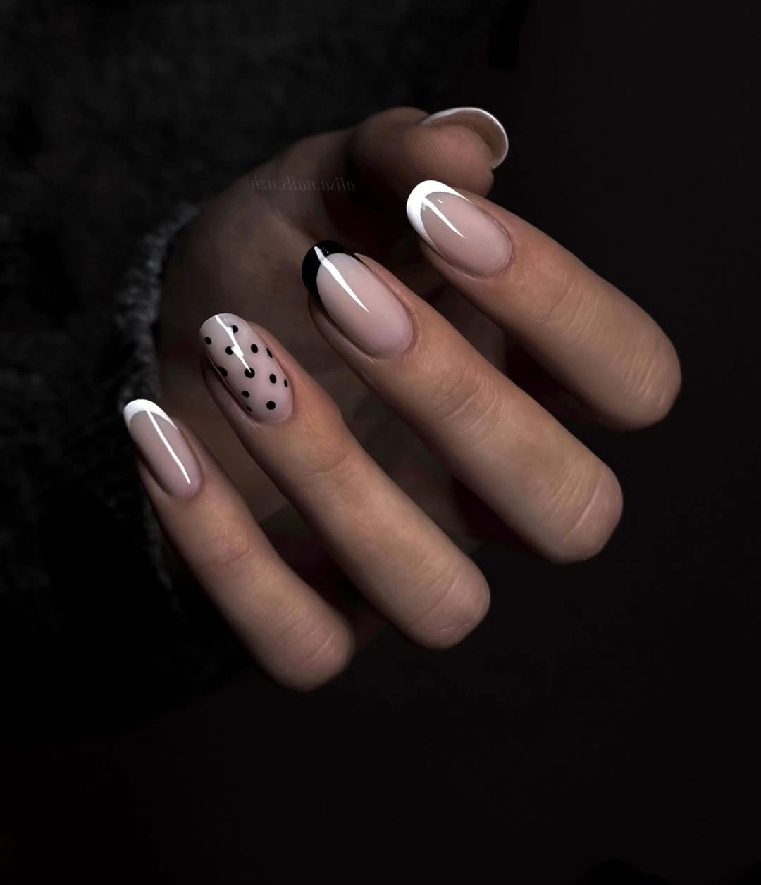
The single patterned nail works because the rest of the hand remains quiet. Black dots have a clear place to land against the pale base, while the white details echo the light tip on the other fingers. This is a useful approach for readers who want a little personality in their fall nail trends without committing every nail to seasonal art or a complicated color story.
Keep the dots on the ring finger or thumb and vary their size slightly if you want the accent to feel hand-drawn rather than rigid. The almond length gives the pattern room, but a shorter version needs fewer, larger dots to stay readable. I would keep the blush base glossy and let the accent do the talking instead of adding another motif.
17. Glossy cherry red almonds
Long almond nails in saturated cherry red create a direct, confident line from cuticle to tip. The color is solid and highly glossy, and the pale fluffy background makes the red look even more concentrated. Without art or contrasting edges, every bit of the visual effect comes from the relationship between the pointed shape, the rich surface, and the clear reflective highlights.
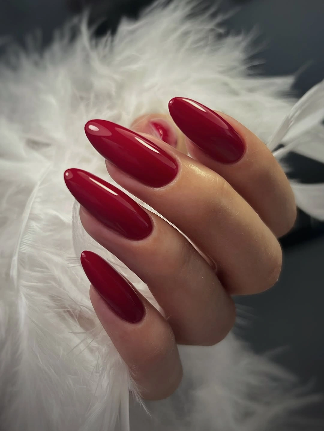
A bright red manicure can feel seasonal without being tied to a narrow motif. It works beside black, cream, denim, or a simple gray layer, and the almond curve keeps the strong color from looking too blunt. The set is especially useful when you want the hands to feel finished quickly, because one decisive shade supplies more direction than several small accents.
The color is high-visibility, so edge wear will show and the long length will remain part of the statement. I would keep the red but shorten the shape to a medium almond or softly rounded tip for a more everyday option. If you love the impact but want less contrast, a deeper cherry or berry red can keep the same focus with a quieter temperature.
18. Cobalt outline on milky squares
Medium square nails use a milky base as an open center, then trace the tips and sides with vivid cobalt blue. The outline follows the perimeter instead of filling the whole surface, so the pale middle remains light and the squared geometry becomes part of the design. It reads like a colored frame: clear, graphic, and more directional than a standard white French.
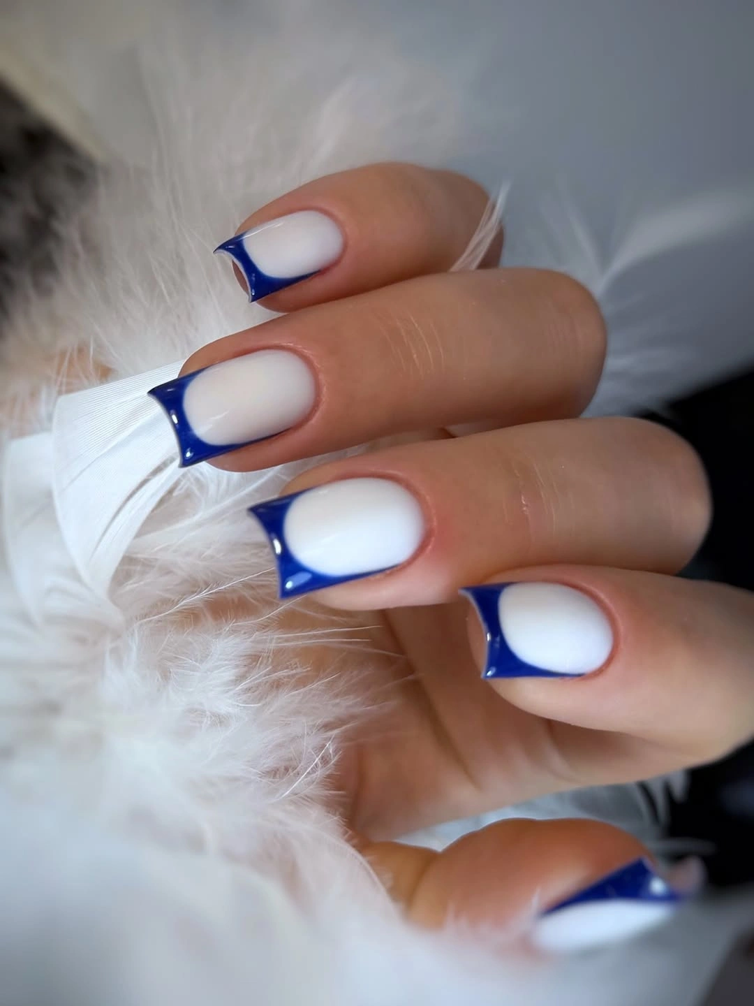
The placement is what makes the color feel fresh. Cobalt appears at the edge where it can emphasize the straight tip and sidewall, while the milky base keeps the hand from becoming a solid block of blue. This is a helpful compromise if you want a strong hue but still need the manicure to sit beside neutral clothes or a layered fall outfit.
Thin the outline for a softer version, or swap cobalt for navy when the contrast feels too bright. Because graphic borders reveal uneven width, a clean square edge matters more than adding more detail, and medium length gives the line enough room to stay legible. I would keep the center plain so the outline remains the clear visual decision.
19. Bright pink square polish
Bright pink-coral gloss fills the long square nails in one confident color block. The straight tips give the shade a clean, almost architectural presence, while the dark background makes the brightness look even more concentrated. There is no pattern to soften or complicate the choice, so the manicure feels cheerful because of color alone and stays easy to understand at a glance.
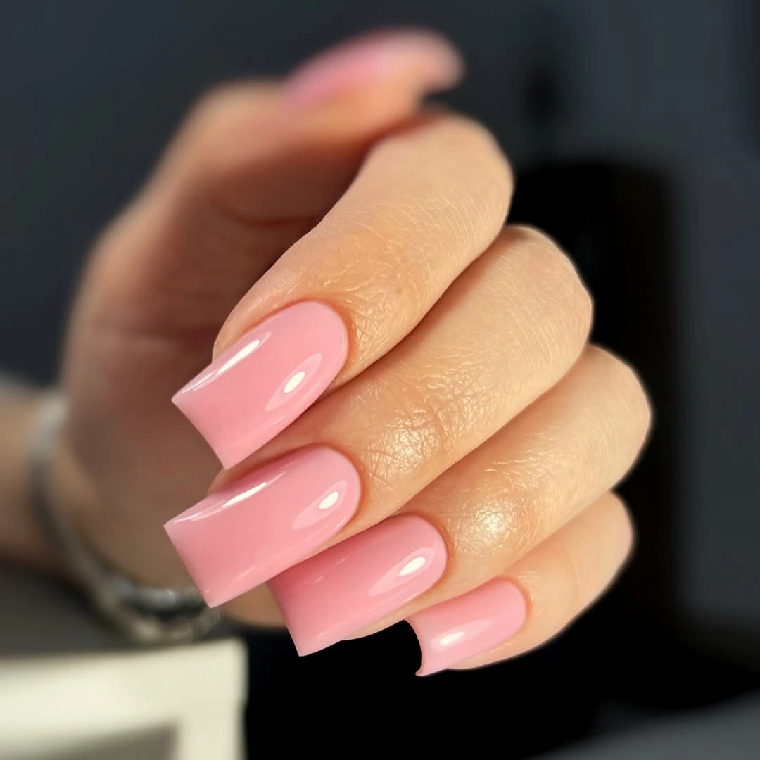
This is a useful reminder that seasonal nail inspiration does not have to become dark to feel considered. The vivid pink brings energy to gray, denim, cream, or black clothing, and the long square outline makes it feel more deliberate than a casual swipe of color. When the wardrobe is simple, a single bright surface can act like a small styling accessory.
The tradeoff is that the shade becomes the strongest color in the outfit and the squared corners may catch on fabric. Keep the pink but reduce the length if you want a less formal statement, or use it on two accent nails over a soft nude. I would avoid adding art unless the pink is muted first, because the solid color already has plenty of visual weight.
20. Burgundy with metallic leaf
Medium square nails alternate deep burgundy with black accents carrying fine silver-white leaf or flame-like marks. The dark solids establish a rich base, while the cooler linework supplies a slim decorative contrast rather than a full field of sparkle. The squared canvas gives the fine details enough structure to feel intentional without making every nail equally ornate.
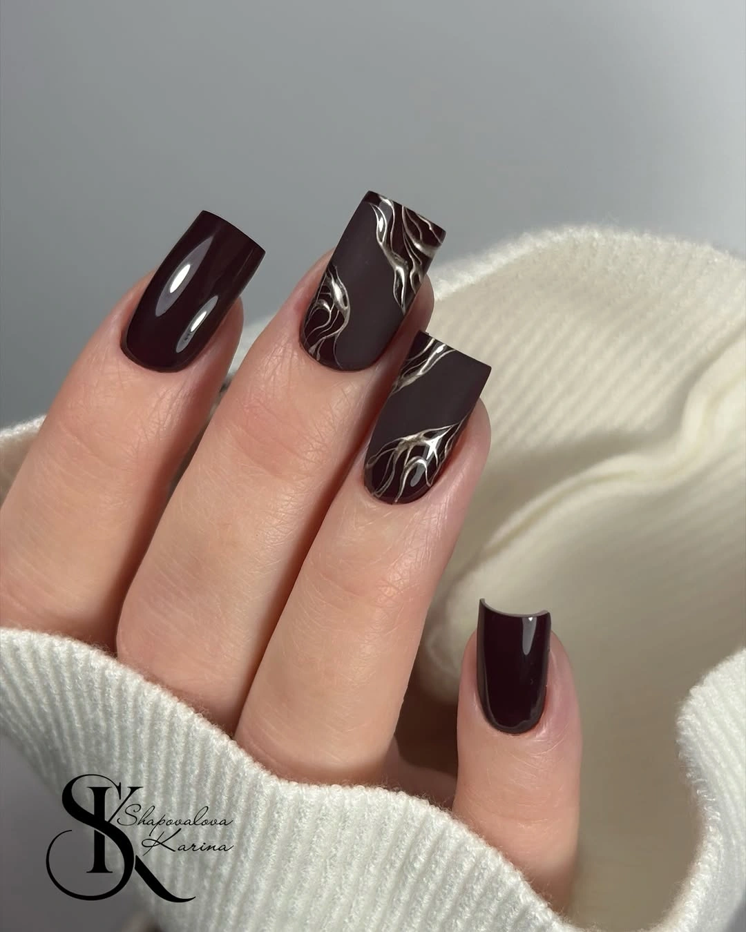
The set succeeds because the metallic-looking detail is concentrated. Burgundy keeps the manicure warm and familiar, black deepens the contrast, and the pale lines guide the eye through the accent nail without changing the whole palette. It is a good choice for readers who want fall nail trends with art but prefer a dark foundation that can still work with simple clothing.
Keep the detailed mark on one ring finger if a full accent pair feels too rich, and let the other nails stay burgundy. Medium square length supports the composition, but a shorter nail may need fewer lines so the design does not look crowded. A bronze or warm cream detail would soften the contrast, while silver-white keeps the original graphic edge.
21. Spotted French with a gold charm
Long almond nails combine pale pink and white French sections with black spotted tips, then place a clustered gold embellishment on one nail. The French base keeps the center light, the spots add a playful graphic edge, and the gold detail creates one concentrated focal point instead of repeating ornament across the entire hand. The contrast is expressive but still organized.
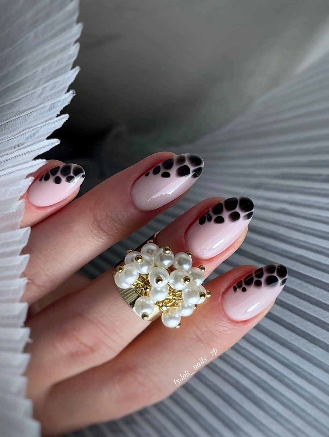
The composition works through hierarchy. You notice the pale almond outline first, then the black marks at the edge, and finally the gold accent when you look closer. That order keeps the manicure from becoming a flat collection of decorations, and it also offers a useful styling lesson: a statement set can feel balanced when one detail clearly leads and the others support it.
For a more practical appointment, keep the spotted French on two nails and leave the gold off or move it to a shorter accent. The long almond shape and raised-looking detail are more likely to catch on knits, so comfort may matter more than copying every element. A simple black spot pattern over pale pink will preserve the personality with less maintenance.
22. Red linework on milky squares
Medium square nails start with a milky pale base, then use thin red lines, white spaces, and curved crosshatched marks to create an airy abstract design. The pattern has more movement than a solid shade, but the light background keeps it from becoming visually heavy. Straight tips give the fine marks a stable frame, so the artwork feels controlled rather than random.
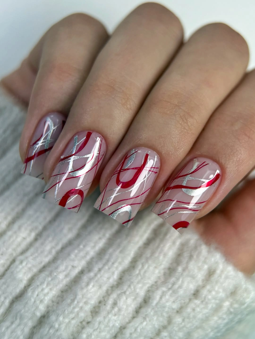
The appeal is the contrast between delicate lines and a clear shape. Red supplies the seasonal energy, while the pale base leaves enough empty space for the manicure to breathe; the result feels more graphic than floral and lighter than a full burgundy set. It is a strong choice when you want nail art that can sit beside textured knits without repeating the same visual density.
Keep the line motif on two accent nails if you want easier grow-out and less pressure on spacing. Fine red marks can show smudges or uneven intervals, so a shorter square should use fewer, broader curves rather than more tiny details. A muted wine line would make the idea quieter, while bright red keeps the contrast crisp and playful.