A nail color starts working before anyone names it. The same red can feel warm, sharp, softened, or deep depending on its finish, the amount of skin left visible, and the shape carrying it. That is why choosing a fall manicure by shade name alone is unreliable: the surface and proportion can change the entire impression.
A better test is to ask what kind of presence you want at your fingertips. Should the color sit quietly beside jewelry and clothing, or should it create the only vivid point in the look? The answer helps decide whether to keep the base open, concentrate detail at the tip, or let one accent do the work instead of crowding every nail.
1. Copper Reflection on an Almond Fall Shape
Copper-red metallic color gives this almond manicure its entire point of view. The nails are medium-long with a curved, tapered outline, and every surface catches a bright reflective highlight that shifts as the hand moves. Against the rich skin contrast and green berry background, the warm tone feels grounded without needing any painted motif.
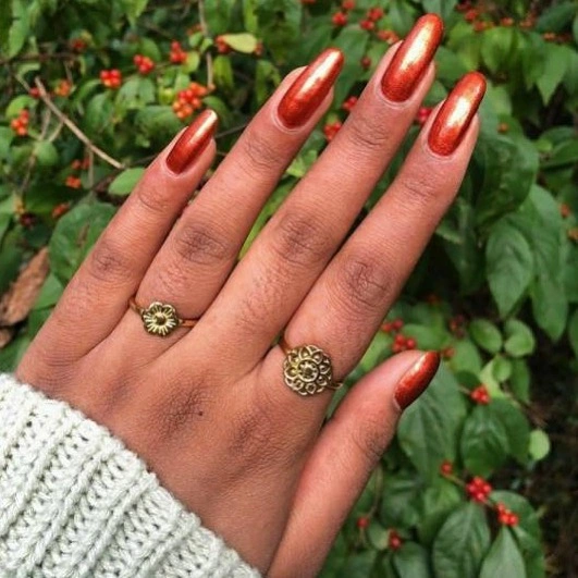
The finish is doing more work than the color name alone suggests. A flat red would read as a solid block, but the reflective surface creates lighter paths across the curved nails and makes the almond shape look longer. The repeated copper field also keeps the set calm, so rings and a pale knit sleeve remain supporting details rather than competing accents.
For a lower-maintenance version, the same copper tone would work on a shorter almond or softly rounded shape, although the reflective field would look more compact. Metallic surfaces reveal uneven edges and small marks more readily than a forgiving cream finish. Keeping the color even matters here because the design has no secondary detail to distract from the surface.
2. Orange Tips Keep a Nude Almond Base Open
A translucent nude-pink base leaves most of these long almond nails visually open, while vivid orange-red tips supply the fall direction. Thin pale lines sit within some of the colored edges, so the manicure has more than a simple block tip but still keeps the center of each nail quiet. The result is warm, bright, and clearly shaped by the tip placement.
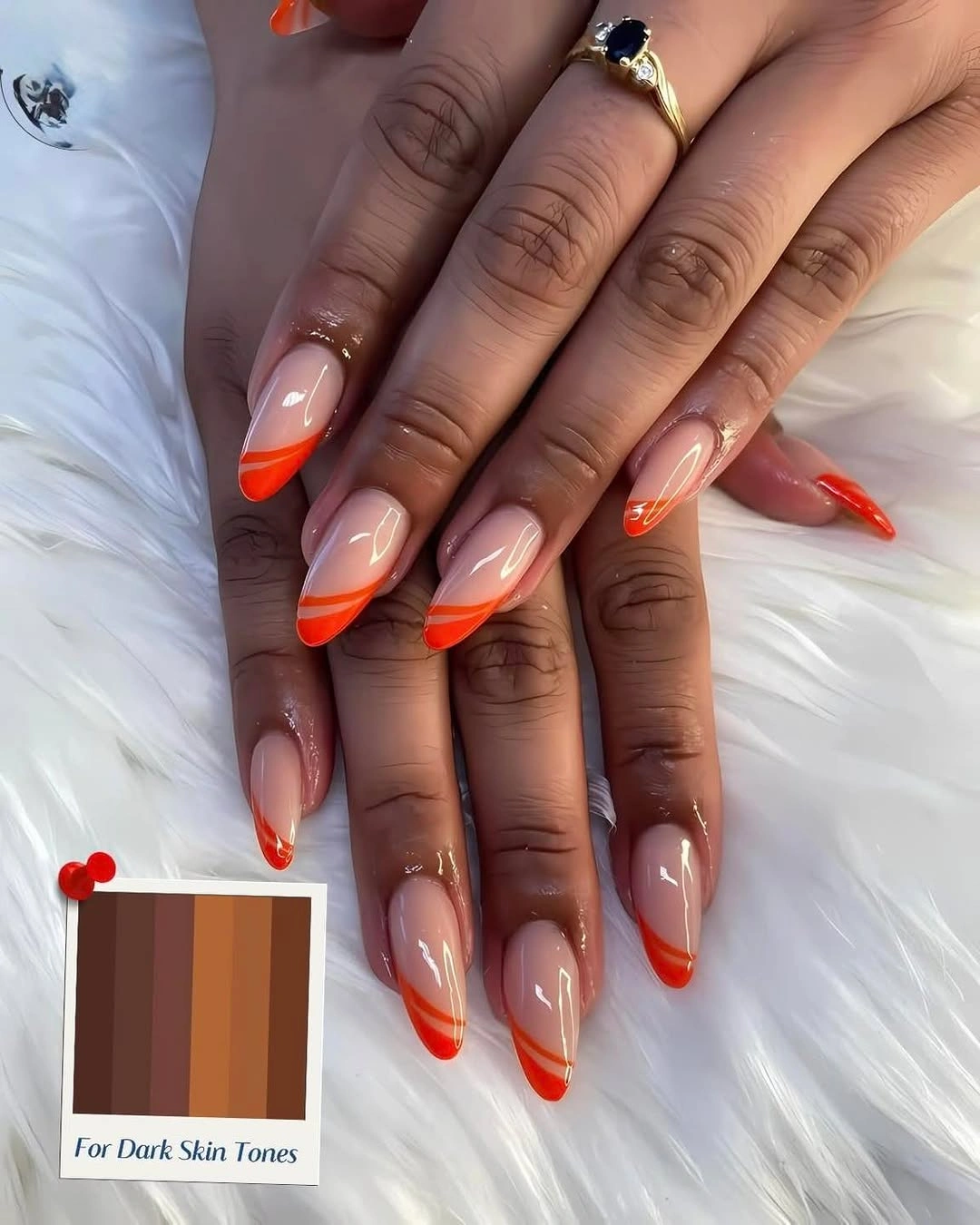
The orange concentrates attention at the perimeter, which lets the almond points stay visible without burying them under full coverage. That placement also gives the deeper skin contrast a clean frame around the nude center. Because the base remains pale, the design can feel lighter than a full orange set while still carrying the energy of a saturated seasonal accent.
If the long point feels impractical, shorten the nails gradually and keep the orange band narrow enough to preserve the same proportion. The exact line spacing will matter more on a compact tip, so a simpler single edge may be easier to keep tidy. The color story survives the change, but the almond silhouette will no longer stretch the accent as far.
3. Pink Florals and Gold on a Long Square Canvas
Long square nails give this pink set enough room for several different decisions at once. Bright pink panels sit beside softer pink areas, white flowers add clear focal points, and gold curves introduce a warm glint across selected nails. The design is not trying to be quiet; it uses the squared edges as a broad canvas for decorative contrast.
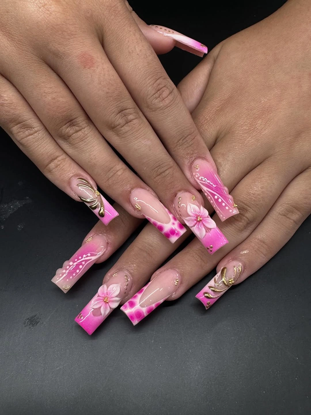
The most successful detail is the distribution of emphasis. A floral nail draws the eye first, while gold lines and pink transitions connect it to the neighboring fingers so the set does not feel like unrelated samples. The dark background makes the colors easy to separate, but the long length remains part of the visual statement and cannot be treated as a neutral base.
To make this idea calmer, keep the strongest flower and gold work on one or two nails, then use a single pink shade across the rest. That preserves the cheerful palette while reducing the amount of detail competing for attention. The tradeoff is straightforward: shorter square nails will feel easier to wear, but large floral shapes may need to become simpler as their canvas shrinks.
4. Emerald Curves Leave the Nude Center Breathing
Emerald-green tips and curved lines give these long almond nails a richer seasonal direction without covering the entire surface. The base stays translucent and nude, while green gathers at the edge and curls inward through thin line work. White details keep the curves readable, so the design feels open rather than dense.
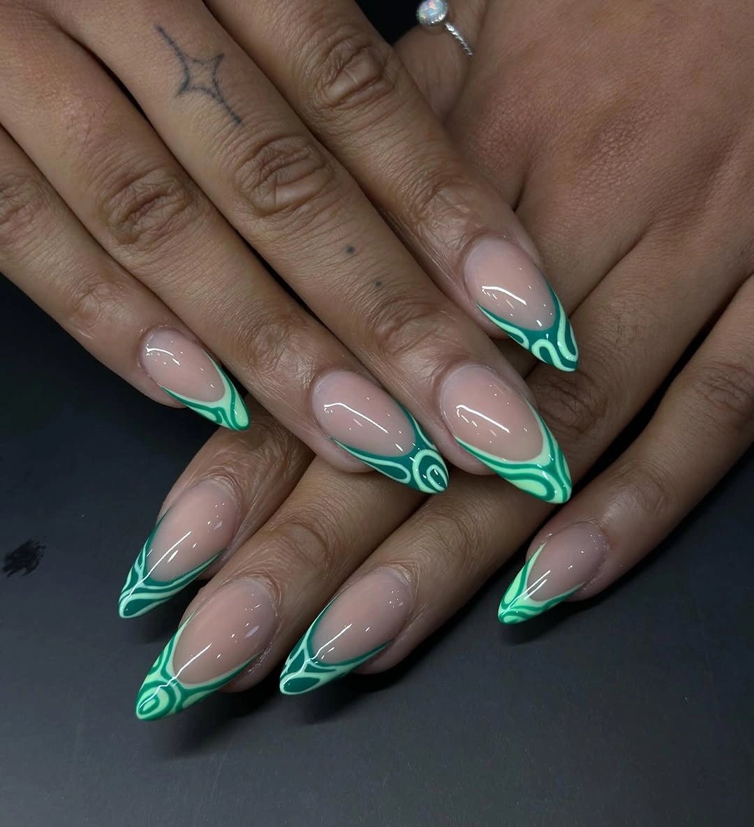
The placement creates a useful visual rhythm. The eye follows the green perimeter, then returns to the clear center before moving to the next nail, which keeps the longer points from looking crowded. That balance is especially effective against the deeper skin contrast because the green has enough depth to stand out while the nude area prevents the set from becoming a single heavy block.
A shorter almond version could keep the green edge and remove some of the inner curl, making the design easier to reproduce while protecting its main idea. Thin lines need consistent spacing to look intentional, and the long surface makes any uneven curve noticeable. If you prefer less precision, use the emerald only as a clean tip on a few nails and leave the rest plain.
5. Brown Pattern and Gold Framing Warm a Nude Set
A sheer beige base gives this almond manicure room for warm brown patches, irregular tortoiseshell-like color, and gold framing lines. Some nails use curved gold stripes while others carry the darker pattern, so the set feels collected rather than uniform. The palette stays close to brown, beige, and metallic warmth, which makes it easy to read as grounded fall color.
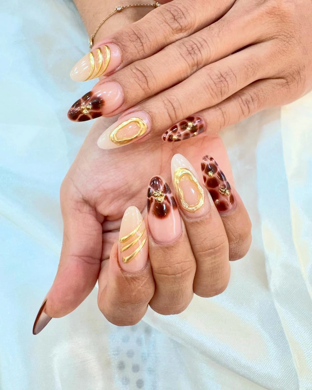
The contrast works because the base remains visible between the accents. Brown adds depth without covering every nail, and gold outlines pull the separate details into one visual family. The almond shape supports that direction by giving the stripes a long route to travel, while the pale background keeps the warm pattern from becoming too dark or visually compressed.
For a more restrained version, place the patterned patch on one or two nails and repeat only the nude base elsewhere. Gold can remain as a small line if you want the set to keep its warm sparkle. The long almond point is part of the mood, though, so shortening will make the pattern feel broader and may call for fewer patches to preserve open space.
6. Bright Pink Tips Give Square Nails a Clear Edge
A soft pink base and vivid hot-pink tips create a simple color decision on these medium-long square nails. The horizontal tip line is crisp, and the rest of the surface stays glossy and free of extra art. That restraint lets the squared edge become part of the design, giving the bright pink a graphic finish without adding more colors.
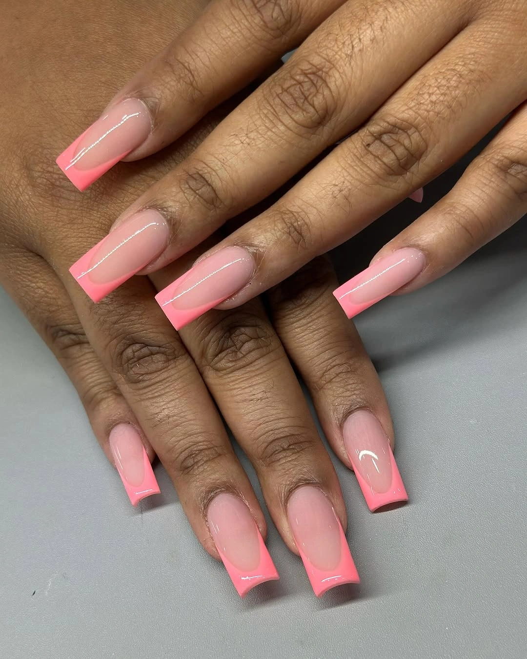
The color block sits exactly where the shape changes direction. The straight tip echoes the square outline, while the pale base keeps the saturated pink from taking over the whole hand. Against the deep skin contrast and gray surface, the set feels cheerful but controlled, making it a useful example of how a single bright accent can carry an entire manicure.
This idea adapts well to a shorter square or soft square because the tip remains recognizable after the length changes. You may want to reduce the width of the colored band so the base does not disappear on a smaller nail. The limitation is visual simplicity: if you want more texture or depth, you will need to add it deliberately because the plain surface leaves little distraction.
7. Rose-Metallic Edges on a Nude Almond Base
Long almond nails stay mostly nude here, with a narrow rose-metallic edge following the curved tips. The border flashes when it catches light, but the translucent base remains the larger visual field. That makes the manicure feel delicate rather than fully metallic, and the deeper skin contrast gives the fine outline enough separation to remain visible.
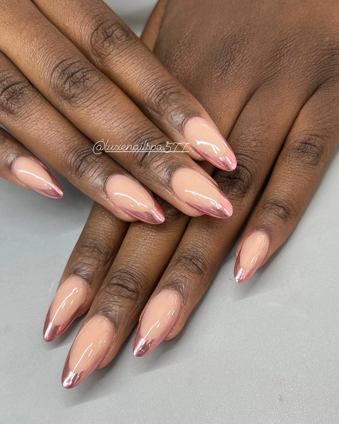
The design depends on proportion more than decoration. A thin reflective line lengthens the almond contour and creates a small warm shift at the edge, while the open center keeps the hand from looking overloaded. Compared with a full copper or chrome-like set, this version uses metal as punctuation, so the overall impression stays softer and more flexible.
If you prefer less length, keep the outline close to the tip and avoid widening it as the nail is filed down. A fine edge can be hard to keep even, especially when the curved almond shape changes from finger to finger. The payoff is a controlled metallic accent that can sit beside jewelry without turning the manicure into the loudest part of the look.
8. Burgundy Blocks Meet Nude Wavy Accents
Deep burgundy gives this long squared set its fall weight, but the manicure avoids a flat all-over block by leaving several nails nude. Curving burgundy and pale lines move across those lighter sections, creating an abstract wave that breaks up the solid wine panels. The contrast is strong, yet the repeated color keeps the separate nails connected.
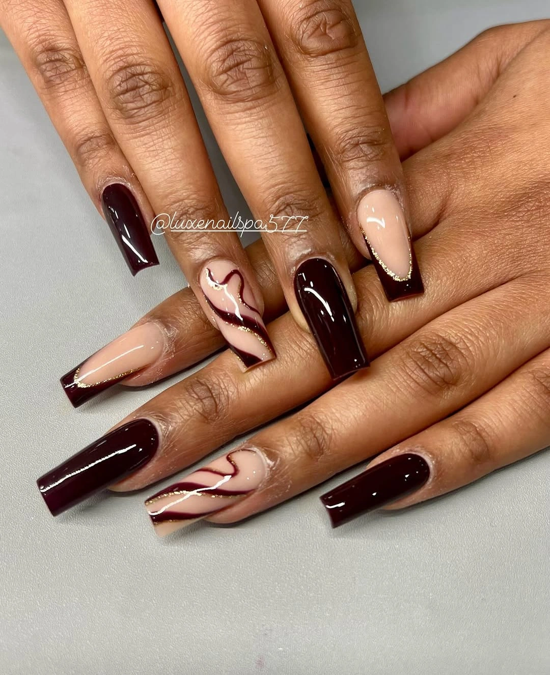
The balance comes from assigning each part a clear job. Burgundy supplies depth and a visual anchor, while the nude sections create relief and let the curved lines show their direction. The long square shape makes the dark panels feel graphic, so the lighter accents are important because they stop the set from becoming one uninterrupted rectangle across the hand.
To soften the design, use burgundy on fewer nails and keep the wavy line on one accent finger, or move the same palette onto a medium length. That reduces the statement effect without losing the rich color. A shorter square may make the curves look larger relative to the nail, so the line work should become simpler rather than merely squeezed into the smaller space.
9. Cobalt Blue Metallic Color on a Short Shape
Cobalt blue carries this short-to-medium squared manicure without any extra motif. Each nail shows a vivid metallic-looking surface, and the softened square corners keep the color compact instead of stretching it into a long point. The deep skin contrast and dark background make the blue feel even more saturated, while the knit sleeve adds a quiet seasonal texture nearby.
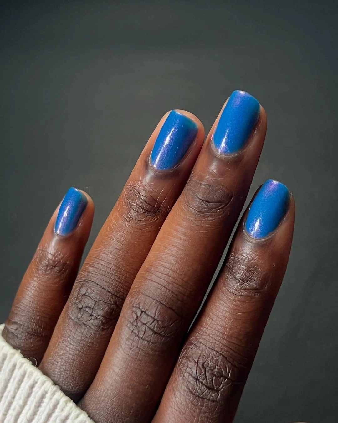
The shorter shape changes how a bold color behaves. Because there is less length, the blue reads as a clear pigment decision rather than a dramatic silhouette, and the reflective surface supplies enough movement to keep the set from looking flat. That makes the manicure a useful alternative to long art when you want color to be the first thing noticed.
A simple short square is also easier to adapt than the long almond and coffin ideas earlier in the collection. Keep the blue uniform if you like a clean statement, or use it on two accent nails beside a neutral base for less intensity. Metallic surfaces still show edge inconsistencies, so the compact shape rewards careful contour even when the design itself remains minimal.
10. Neon Green and Hot Pink Break the Muted Palette
Short square nails alternate vivid neon green and hot pink, creating the brightest color contrast in the collection. Each finger carries one clear shade, and the glossy surface keeps the two colors separate instead of blending them together. Outdoor greenery echoes the green in the background, but the manicure remains intentionally loud and playful against the deeper skin tone.
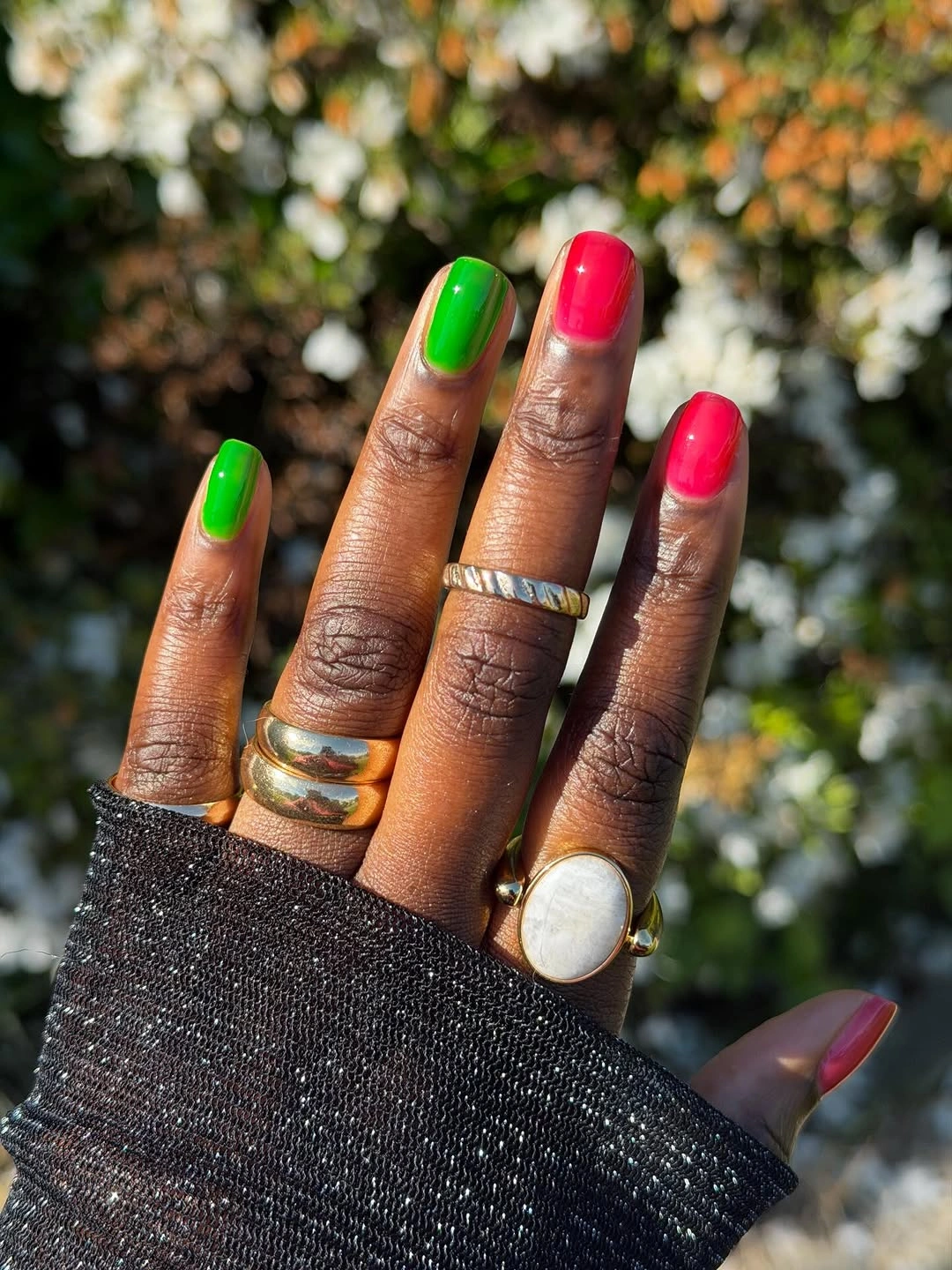
The alternating rhythm is what makes the set feel designed rather than random. Green gives one side of the palette a sharp cool energy, pink supplies the warmer counterpoint, and the short shape prevents the combination from becoming overly elaborate. This is not a muted interpretation of fall; it is a deliberate choice to let bright color replace the usual brown or wine association.
If you want the same idea with more seasonal restraint, keep the pink on one accent nail and replace the green with a deeper olive or moss tone. The short square contour can stay exactly as it is. The honest limitation is that the original contrast reads loudly in any setting, so the palette may suit a playful styling moment better than an understated manicure plan.
11. Muted Mauve on Short Rounded-Square Nails
A single muted mauve-pink color brings the collection into a quieter register. The nails are short with softly rounded square edges, and the glossy surface is even from finger to finger without visible art. Rings add a little warmth, but the manicure itself relies on the relationship between a calm shade and a compact outline.
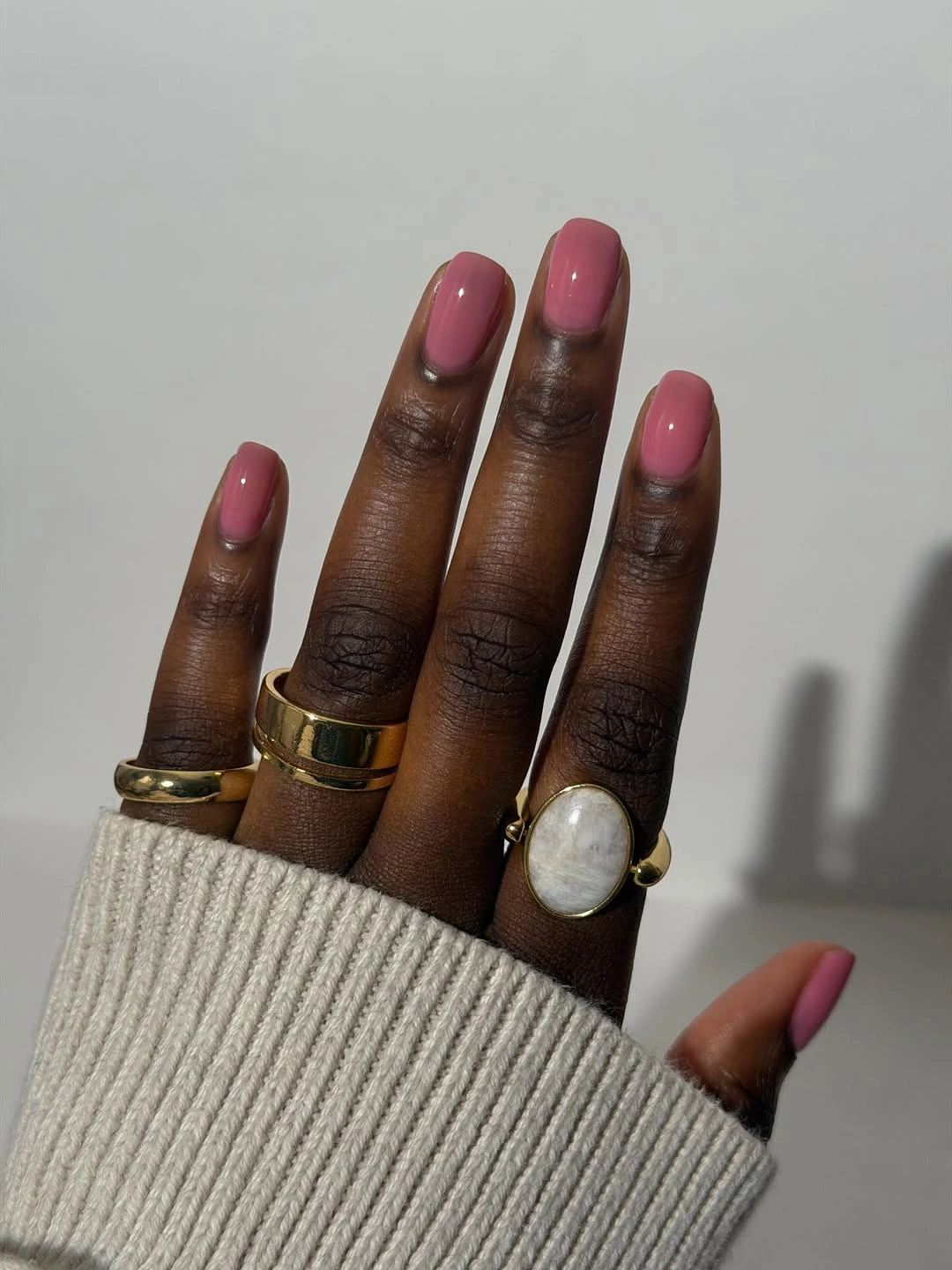
The restraint works because the color has enough depth to remain visible against the skin without asking for high contrast. The rounded corners soften the square shape, so the overall effect feels less graphic than the hot-pink tips and less reflective than the cobalt set. It is a useful reset when the eye needs a plain field after several louder designs.
This kind of color is easy to pair because it does not compete with rings, sleeves, or a patterned outfit. You can keep the short length and change only the undertone if you want a warmer or cooler result. The tradeoff is that the manicure offers little texture, so even coverage and a clean contour matter more than they would in a dense art design.
12. Deep Olive Reflection Adds Quiet Seasonal Depth
Short rounded nails take on a deep olive-green color with a bright diagonal reflection crossing the surface. The set has no visible motifs, so the interest comes from the way the finish shifts between a dark green field and a warmer highlight. Against black fabric and rings, the tone feels grounded without becoming plain.
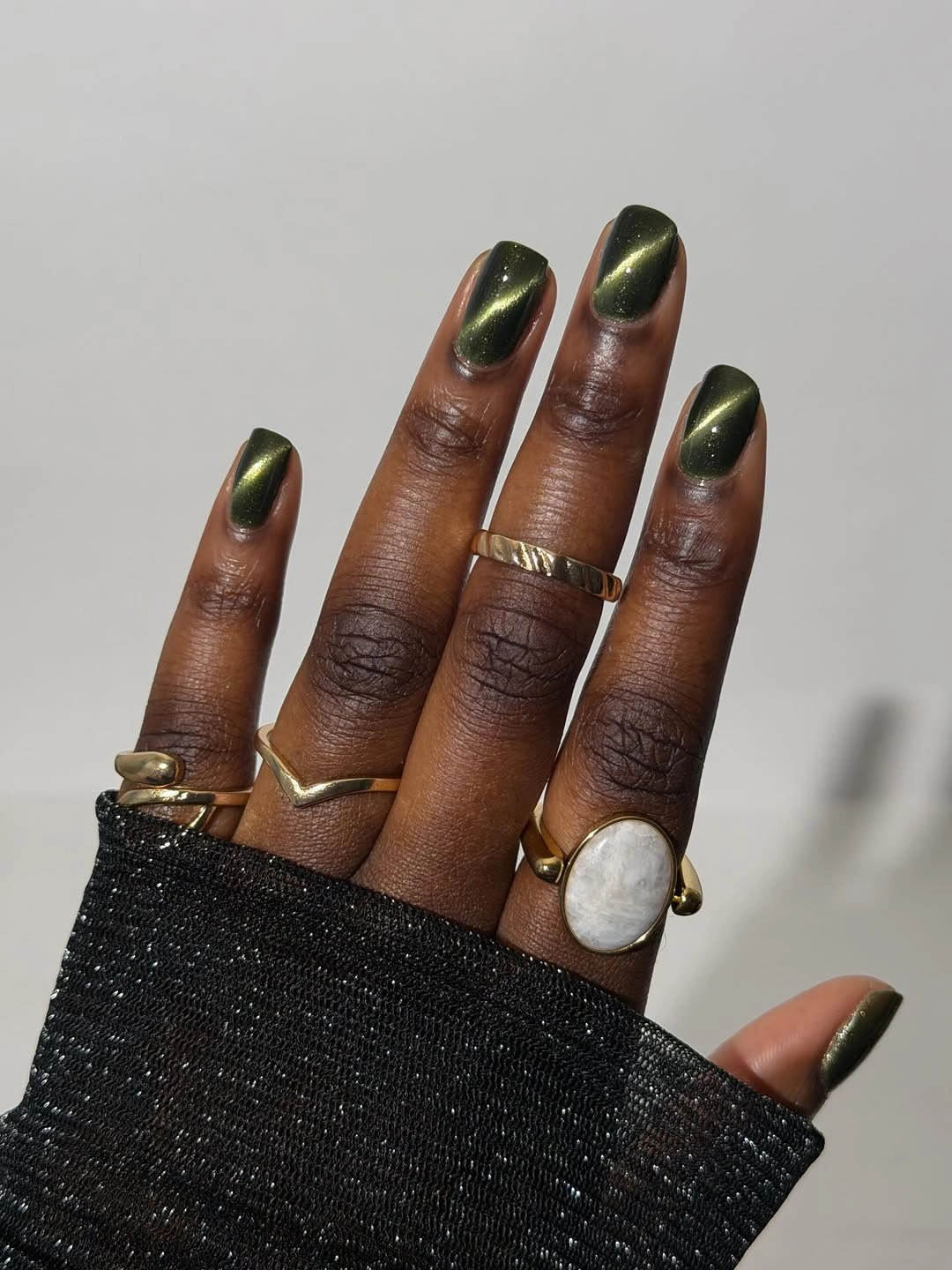
The moving-looking highlight keeps the color from reading as a flat dark coat. It also makes lighting part of the visual story: one angle can show more green, while another may emphasize the warmer glint. The short shape keeps that depth controlled, which is helpful if you want a moody color without the length or decoration of the earlier statement sets.
For an easier color substitution, keep the same reflective idea in a softer olive or brown-green tone. A plain dark surface can look heavier when the light is low, so the visible shift is valuable rather than incidental. The limitation is that reflection is less predictable indoors, meaning the manicure may look more subdued when the light does not catch the diagonal highlight.
13. Silver Metallic Color Keeps the Shape Compact
Short rounded-square nails coated in bright silver make finish the central decision. The color reflects across every nail, while the compact length keeps the metallic effect from becoming overly dramatic. Dark fabric and rings provide contrast, but there is no extra art to interrupt the clean silver field or compete with the shape.
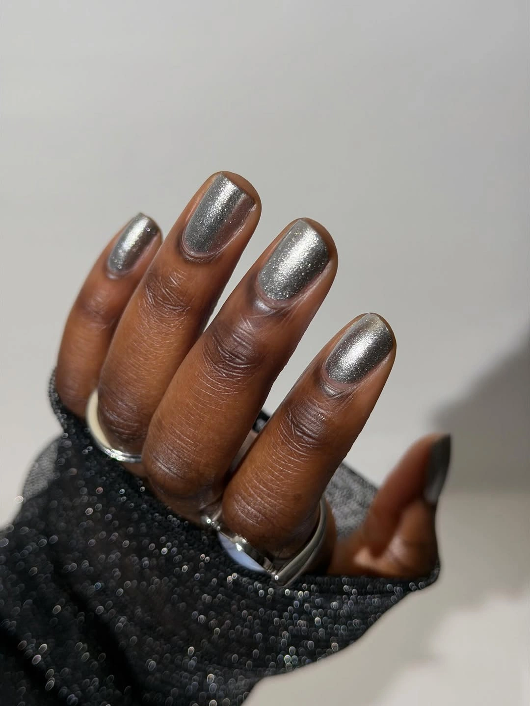
A cool metal creates a different kind of seasonal mood from copper and burgundy. Instead of warmth, the surface brings crisp light and a clean neutral contrast that can sit beside many colors. The short outline is important because it lets the silver feel intentional and direct, rather than turning the hand into a long reflective statement.
Keep the contour soft if you want the finish to look less severe, or move the same silver onto one or two accent nails beside a muted base. Reflective surfaces reveal uneven edges and small texture changes, so the simple design still needs a tidy outline. Its strength is also its limitation: without motifs, the finish must remain consistent across the set.
14. Purple Reflection Gives Short Nails Jewel Depth
Short rounded-square nails shift through saturated purple with a cooler blue-green highlight near the surface. The set remains uniform and free of painted art, but the reflective color gives each nail a slightly different moment as the hand turns. A navy sleeve and gold rings underline the contrast between the cool jewel tone and the warm accessories.
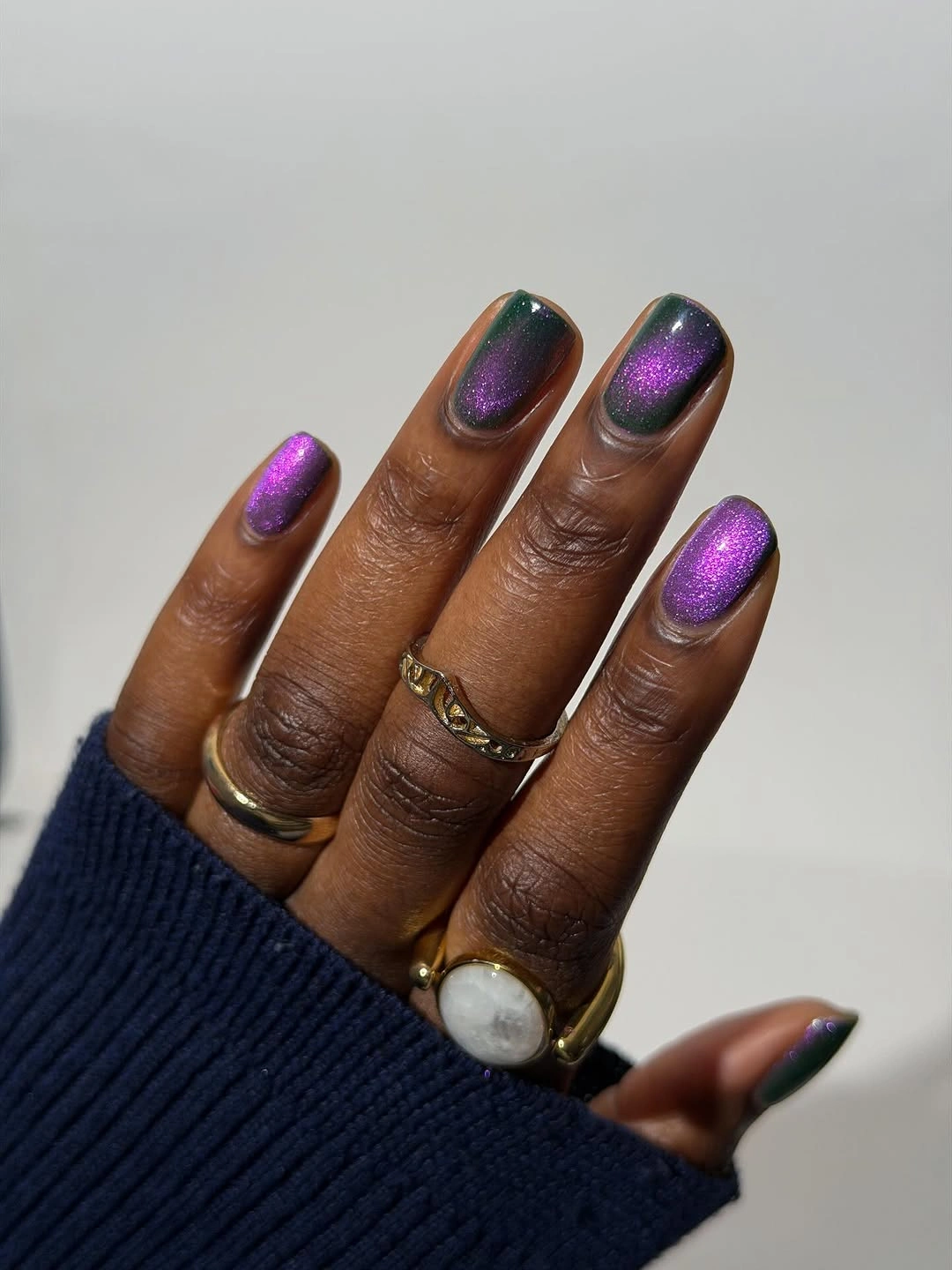
The color change keeps a single shade from feeling static. Purple remains the anchor, while the cooler highlight adds depth along the curves and gives the compact nails more visual movement than a flat cream or mauve would provide. That makes the manicure feel richer without requiring extra line work, stones, or a long canvas.
If you want the set to look calmer, keep the reflective purple on the main hand and use a plain deep plum on one or two nails. The effect will still feel jewel-toned but less dependent on every surface catching the light. Because reflective color changes under different bulbs, the final impression can be softer indoors than it is in the close-up setting.
15. Deep Blue Shimmer Rather than a Flat Navy
These short rounded-square nails use deep cobalt blue with fine reflective sparkle scattered through the surface. The color is darkest toward the edges and brighter in the center highlights, creating a gentle glow rather than a hard mirror effect. A black sleeve keeps the palette grounded, while the shimmer provides the only visible variation.
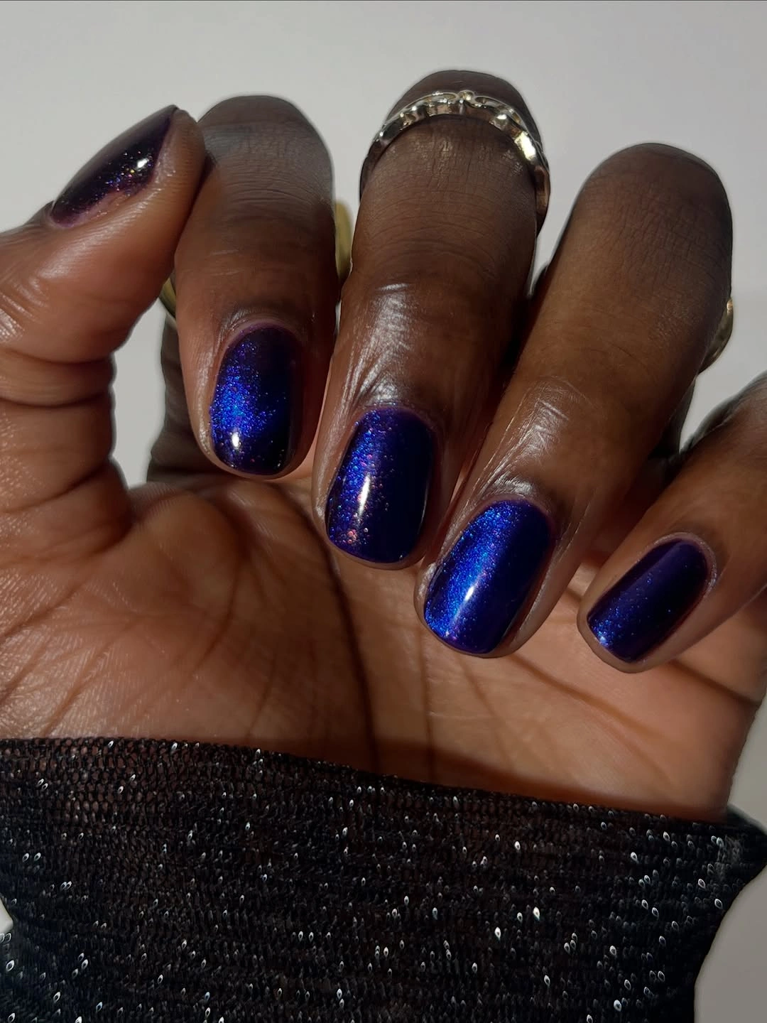
Fine sparkle changes the mood of a dark blue shade without adding a second color or motif. It catches light in small points, so the manicure feels softer than a solid navy block and less graphic than the silver or purple reflective references. The short length lets the shimmer stay concentrated, making the set statement-like but still visually compact.
A shorter rounded shape can preserve the same color story, while a single shimmer accent beside a cream or nude base would reduce the overall depth. The finish may need more careful removal or touch-up than a plain color, but that is a practical consideration rather than a hidden technical claim. Its appeal comes from small flashes that reward close viewing.
16. Sheer Blush Pink Makes Short Nails Feel Light
Short rounded nails carry a translucent blush-pink color that lets the surface beneath remain part of the visual impression. The finish is glossy and uniform, with no visible art, so the manicure feels softer than the saturated pink and blue sets nearby. A cream knit sleeve and green outdoor background reinforce the gentle, low-contrast palette.
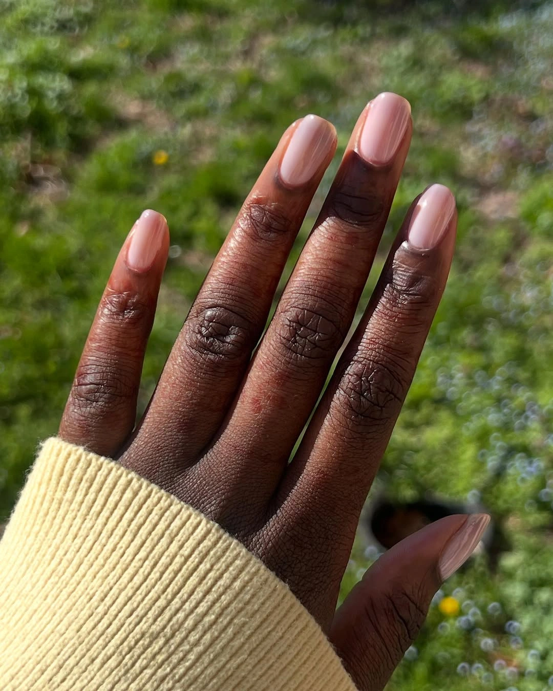
The sheer quality changes how the color sits against deeper skin contrast. Instead of forming a hard opaque block, it creates a light veil that follows the short contour and keeps the hand visually open. That makes the shape and evenness of the surface more important than pigment strength, because there are no motifs or metallic highlights to carry attention.
If you want more coverage, build the same blush tone or move it onto a rounded square with slightly more length. A translucent base can also show unevenness beneath it more readily, so the clean result depends on a smooth-looking surface. This is the quietest option in the color run, useful when the manicure should support clothing rather than become the focal point.
17. Hot Pink Shimmer Keeps a Short Shape Lively
Bright hot pink covers these short rounded-square nails, but fine shimmer keeps the color from looking flat. The set is uniform and glossy-looking, with the small reflective particles appearing more strongly where the outdoor light reaches the surface. A pale knit sleeve and green background provide contrast without changing the manicure’s direct, energetic character.
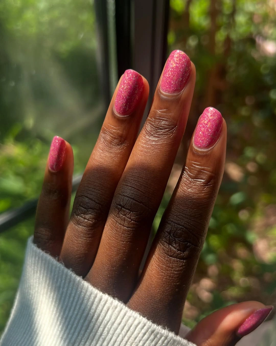
The design works through a simple sequence: saturated color first, small flashes second, and compact shape throughout. That keeps the manicure brighter than sheer blush while avoiding the extra visual weight of long art. The shimmer also gives the eye something to notice across the smooth pink field, so the single shade feels active rather than unfinished.
For a softer seasonal edit, keep the hot pink on one or two nails and replace the rest with a muted rose or warm nude. The short rounded-square shape can remain unchanged. Lighting will affect how much sparkle appears, so the same manicure may look closer to a glossy pink indoors and more textured when daylight catches the surface.
18. Turquoise Color Brings a Cool Break to Fall
Medium square nails use a bright turquoise color with an even glossy surface, and a matching bottle-shaped prop repeats the same palette nearby. The nails themselves remain mostly uniform, so the color and squared length provide the structure. Against the deep skin contrast, the aqua shade feels clear and energetic rather than muted or traditionally warm.
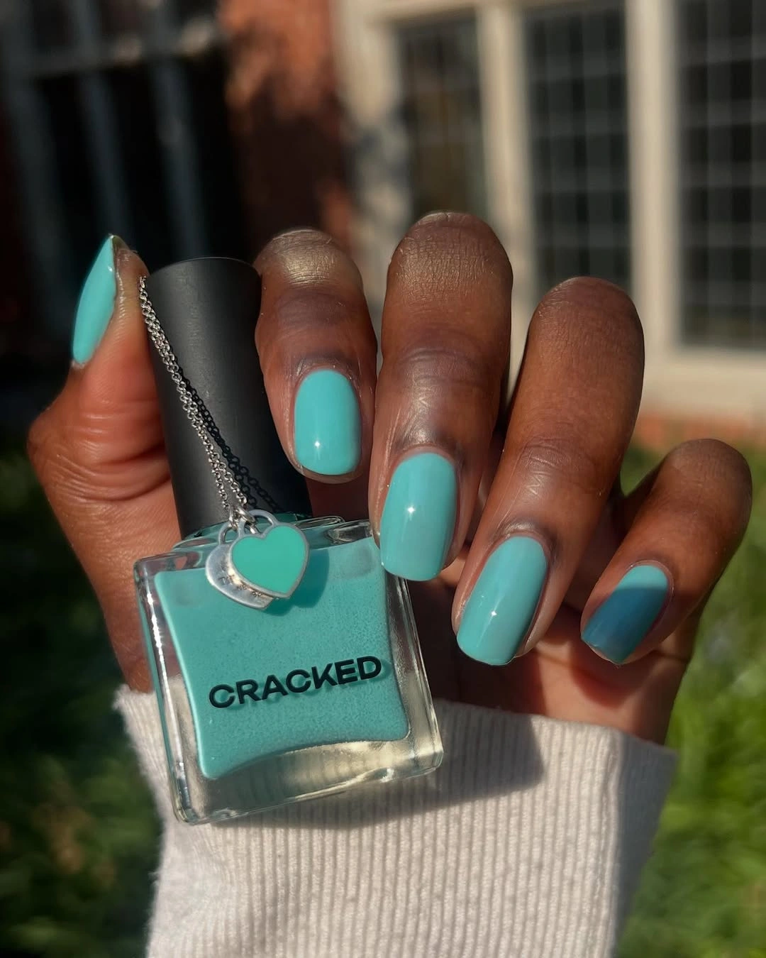
The cool hue creates a useful break from copper, burgundy, mauve, and olive. A medium square canvas keeps the color block crisp without the extra drama of a long point, while the matching prop makes the palette feel intentional rather than accidental. The accessory is supporting context only; the nail design stays strong even when that repeated object is removed.
If you want the turquoise to feel more grounded, use it as an accent on two nails and pair it with a warm nude or brown base. That keeps the same cool spark without making every finger equally bright. The medium length is already a practical compromise, but a shorter square would make the color feel more graphic and less elongated across the hand.
19. One Gold Accent Changes a Soft Blush Set
Most of these short square nails are glossy pale blush, while one visible accent nail carries dense gold glitter. That single change gives the quiet base a small focal point without adding a second pattern to every finger. The overlapping hands and pale background keep the composition soft, so the gold reads as a contained flash rather than a full statement.
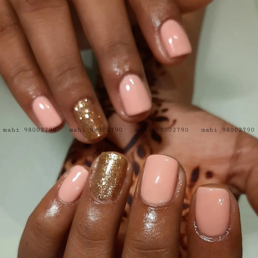
The accent works because the base stays consistent around it. Pale blush supplies continuity, the square outline keeps the gold block graphic, and the one glitter surface gives the eye somewhere to pause. Compared with an all-over metallic set, this approach lets sparkle sit beside a calm color and can pair more easily with rings or layered clothing.
To adapt the idea, move the gold to one chosen nail and keep the rest of the set plain, or replace it with a warm bronze if you want less contrast. The short length supports the restrained balance, although glitter can draw attention to surface texture and edge changes. The design is simple, but its success depends on the accent remaining deliberate rather than scattered.
20. Nude-Pink Almond Nails beside Layered Jewelry
Medium almond nails in glossy nude pink create a quiet finish that sits comfortably beside rings, bangles, and a watch. Both hands are visible in a mirror composition, and the manicure remains uniform without painted art. The moderate length matters because it gives the almond outline enough presence while leaving the accessories free to carry their own layered detail.
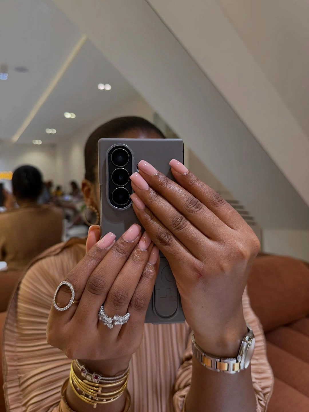
The neutral color balances the styling context instead of competing with it. A deeper skin contrast gives the pale pink definition, while the curved shape echoes the softness of the pleated clothing without becoming another loud pattern. This makes the set a useful final reference for readers who want fall color that can support jewelry, texture, and a dressed-up outfit.
For more contrast, keep the almond length and shift the base toward warm caramel, muted berry, or a deeper rose, but preserve the single-color surface. A shorter almond would still keep the proportion idea, while a square edge would make the look more graphic beside the jewelry. The quiet palette is its strength because it leaves room for everything around it.