A simple manicure can still have a loud point of view when the color is chosen with care. This collection moves from bright red and lemon yellow to pale blue, mint, reflective silver, deep wine, navy, and tiny playful drawings, showing how short tips can carry very different moods without needing a complicated structure. The most interesting choices come from the relationship between one strong color and the amount of open space left around it.
Some of these sets stay completely solid, while others place a tiny illustration, a French edge, a botanical line, or a small heart where it will be noticed. That difference makes the ideas easy to adapt: keep the color, reduce the palette, move the detail to one finger, or let the finish do the work instead. Think of the collection as a set of color decisions for simple fall short nails, not a demand to copy every accent exactly.
1. Glossy Red with No Extra Decoration
Bright red covers these compact rounded-square nails from base to tip, and that single decision gives the manicure its immediate energy. The finish reflects cleanly across the surface, so the set looks lively without a second color or painted motif. Because the design is so open, the short shape becomes part of the style: the softened corners keep the red feeling neat rather than overly severe.
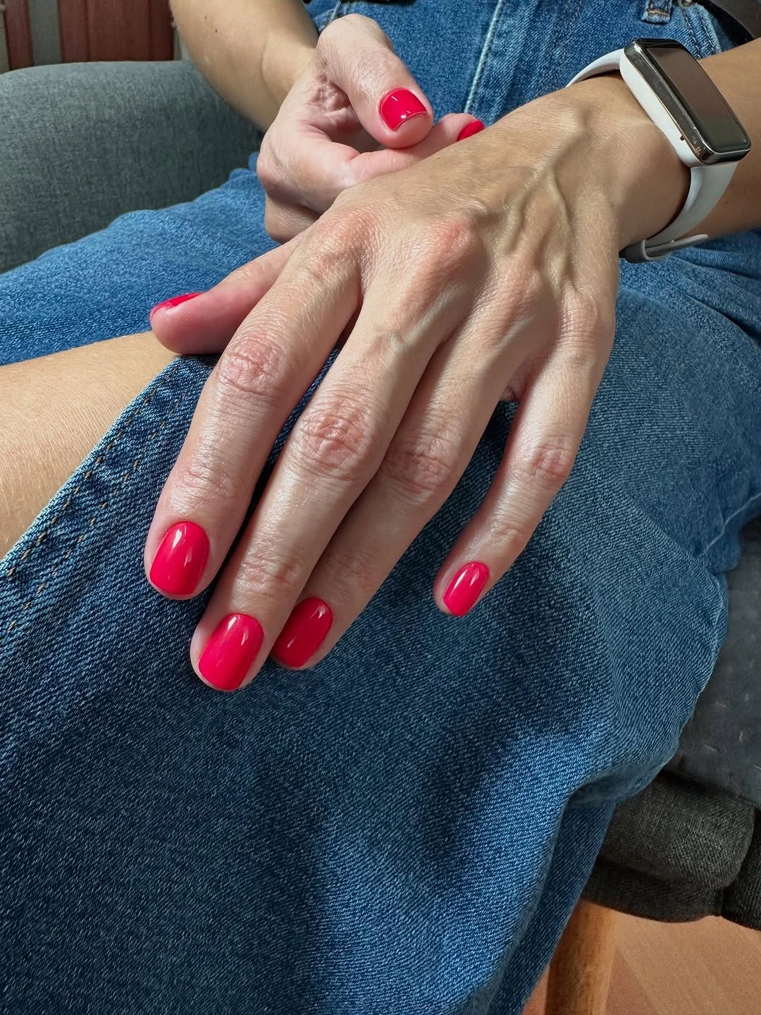
This is the easiest idea to use when you want a manicure that can sit beside denim, a smartwatch, or a casual wardrobe without fading into the background. A slightly deeper cherry red would move the same set toward autumn, while a muted brick tone would make it quieter without changing the solid-color logic. The useful part is the confidence of one color, not a particular red label.
With no art to distract the eye, the surface needs a tidy edge and an even curve across the short tips. Bright red can reveal a small chip quickly, especially at the free edge, but the compact shape makes a refresh straightforward. If you are tempted to add dots or glitter, try keeping one hand plain first; the clean block may already provide the visual finish you were looking for.
2. Yellow Tips with Tiny Citrus-Like Drawings
Yellow turns these short square nails into a cheerful little canvas, while small dark-outlined drawings add personality without taking over every surface. The base color is strong enough to hold the idea together, so the tiny rounded and citrus-like details read as accents rather than unrelated pictures. Keeping the illustrations small also lets the square shape remain visible instead of disappearing under decoration.
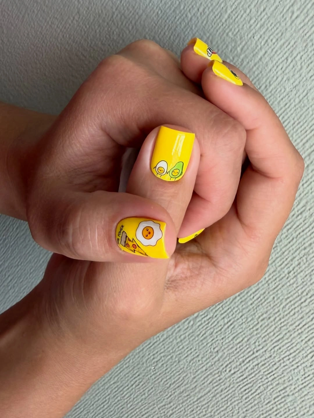
If a full yellow set feels too bright for your everyday clothes, keep the color on two or three nails and repeat one small drawing on a single accent. That change keeps the lively relationship between yellow and dark lines while giving the eye more neutral space. You could also shift the yellow toward a warmer ochre for fall, but avoid adding several new colors because the base already supplies most of the personality.
Small drawings need contrast and breathing room to stay legible on short tips, so the simplest repair is usually to remove a detail rather than crowd it with another outline. The compact shape is helpful because it gives the motifs a clear boundary, but it also limits how much can be seen at once. Keep the illustrations near the center and let the yellow remain the first thing people notice.
3. Pink Spots and One Larger Heart Accent
Pale pink links the spotted nails, small outlined figures, and one larger heart-like mark in this playful set. The repeated pink base creates continuity, while the black spots supply a pattern that can travel across several fingers without requiring identical drawings everywhere. The larger heart acts as a visual stop, which keeps the smaller details from competing at the same volume.
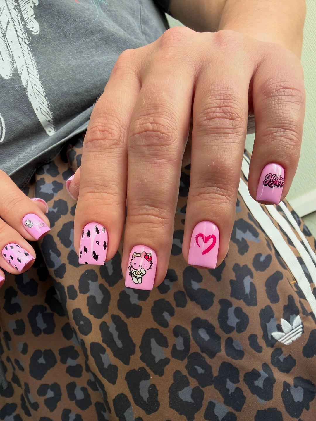
This is a good example of how simple fall short nails can include several ideas without looking disconnected. Keep the spots on two nails, choose one symbol for the accent, and leave the remaining fingers calmer if you want a lighter version. A softer rose base would make the set more autumnal, while a brighter bubblegum pink would push the same structure toward a more energetic mood.
When a manicure contains both repetition and a focal symbol, scale matters more than the number of motifs. The spots should remain smaller than the heart or main accent, otherwise the eye loses the hierarchy that makes the set easy to read. On very short tips, preserve the repeated pattern and remove the smallest drawings first; the pink base and one clear symbol will still carry the idea.
4. Pale Blue in a Quiet Denim Palette
Soft pale blue gives this manicure a calm, uniform surface, and the short rounded-square tips keep the color compact. The denim behind the hand sits close to the blue family, creating a gentle tonal relationship instead of a dramatic contrast. That setting makes the plain finish feel intentional: there is no art to explain, only a cool shade chosen to harmonize with a casual texture.
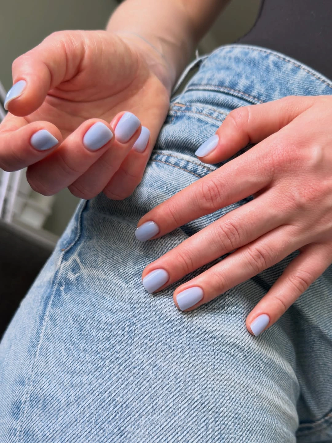
For a fall version, pair the same blue with beige, oatmeal, gray, or brown clothing so the manicure becomes the cool note in a warmer outfit. If you want more definition, replace the pale shade with a dusty blue rather than adding an unrelated motif. The open surface is doing useful work here, because it allows the color relationship with denim to stay visible.
Light blue can make uneven side edges noticeable, especially when the background is also cool and low contrast. A short rounded-square shape helps keep the idea practical, but the finish still benefits from clean corners and a consistent base. If the color feels too quiet after a few days, one tiny darker-blue edge on an accent nail will change the rhythm without turning the entire set into nail art.
5. Pastel Mint with a Smooth Gloss
Pastel mint covers these compact rounded-square nails with no visible pattern, so the manicure depends on the freshness of the color and the evenness of the surface. The pale green has enough presence to feel intentional, yet it stays softer than a saturated emerald or bright lime. Against the light background, the shape reads as tidy and approachable rather than dramatic.
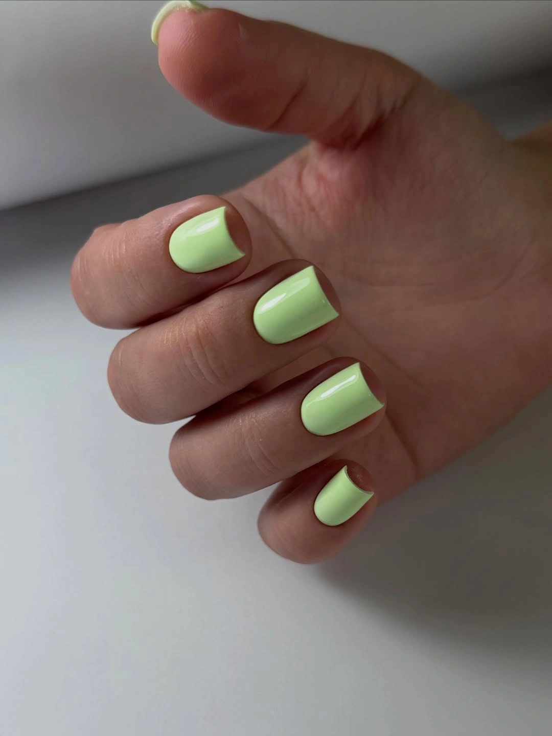
Mint can move into a fall wardrobe when it is surrounded by cream, gray, brown, or soft denim. Keep the color plain if you want the manicure to feel airy, or place a single deeper green line on one finger to give it a seasonal anchor. The strongest adjustment is usually an undertone change, not more decoration: a slightly grayer mint will feel calmer while a greener version will look livelier.
Pastel surfaces can show uneven coverage and small marks more readily than deep colors, so a clean edge matters before any extra detail is considered. Short tips make the shade easier to manage, but the pale field still benefits from consistent shaping across the fingers. If you add an accent, use it sparingly and keep most of the mint visible, because the open color is the reason this set feels simple.
6. Deep Wine Red with a High-Shine Surface
Deep wine red changes the energy of the collection without adding any pattern. The short-to-medium tips keep the saturated color concentrated, while a glossy reflection gives the dark surface depth and prevents it from looking flat. A few rings add a cool metallic counterpoint, but the manicure remains centered on one warm, grounded color.
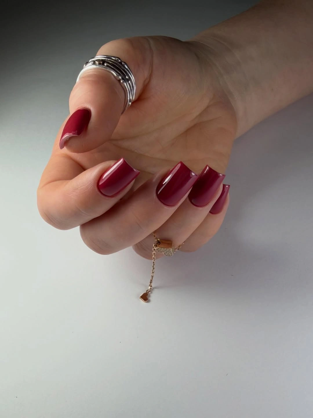
This is a useful step down from bright red when you want simple fall short nails to feel richer and more muted. Keep the shape compact, or change the undertone toward burgundy if you prefer a darker finish; neither adjustment requires extra art. The color can also sit comfortably beside denim, cream knitwear, or silver jewelry because its strength comes from depth rather than novelty.
Solid wine polish is straightforward to maintain, although dark tips can show chips at the corners and along the free edge. The short length helps with daily movement, but an even square outline still matters because there is no pattern to soften a crooked edge. Let the shine remain the feature and resist adding multiple accents unless the simple color stops feeling like enough.
7. Charcoal Matte with Small Reflective Shifts
Charcoal-black gives these short square nails a graphic base, but the finish keeps the set from becoming a flat block. Most of the surface reads matte, while small reflective areas catch the light and create a quiet change from nail to nail. That finish contrast is the entire design language, so the compact silhouette stays visible and the color feels controlled rather than heavy.
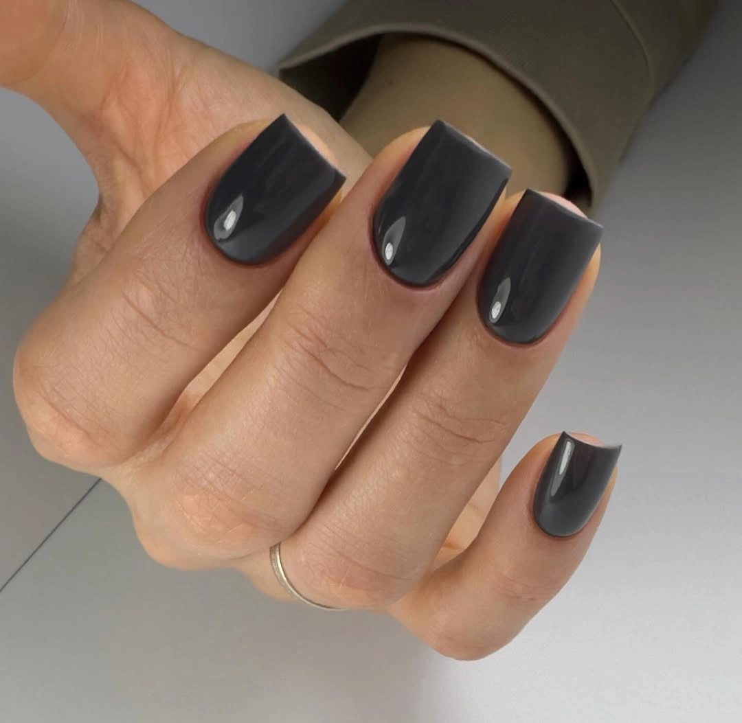
If you like dark nails but want something less expected than glossy black, this surface-led idea is easy to adapt. Keep the charcoal matte on most fingers and add one small glossy accent, or reverse the balance so the shine is limited to a thin edge. A deep forest green would soften the black impression, while a warm gray would make the finish contrast more subtle.
Matte surfaces can reveal smudges and changes in texture more clearly than full gloss, so the practical question is how much finish contrast you can keep looking even. The short square shape limits the amount of surface that needs attention, but the dark color still makes the free edge important. Avoid piling on art; the shift between quiet and reflective areas already supplies enough detail.
8. Blush Pink with a Barely There Mood
Blush pink keeps this rounded-square manicure soft and almost completely undecorated. The finish is smooth, the tips are compact, and a small moon tattoo near the finger remains a separate personal detail rather than part of the nail design. That separation matters because the manicure feels complete through its own proportions, not because the surrounding styling supplies a story.
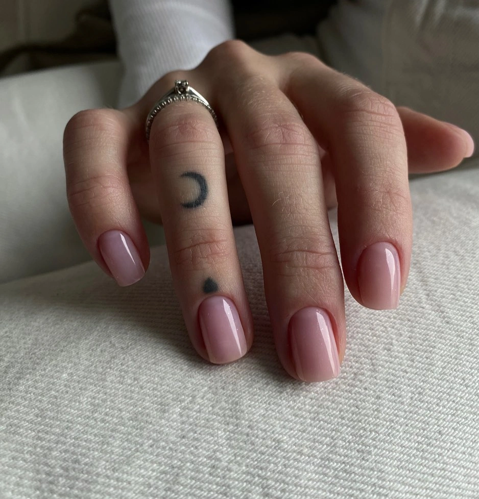
This is a gentle option when you want simple short nails to sit quietly beside rings, tattoos, textured fabric, or a busy outfit. A slightly warmer nude-pink would make the result more neutral, while a transparent milky base would keep the same low-detail feeling with even less color. Do not add an accent just because the set is plain; the restraint is precisely what lets the shade feel personal without being loud.
Subtle pink demands tidy preparation because small gaps and uneven edges are easier to notice when the base has little contrast. The short shape is forgiving in terms of length, but it still needs a consistent corner and a smooth surface. If you want a tiny change, add one micro-heart or a thin blush line on a single nail and keep the other fingers untouched.
9. Green French Edges on a Nude Center
A sheer nude center leaves most of these short rounded-square nails open, while vivid green is concentrated at the tip. The bright edge creates the manicure’s identity without covering the entire surface, and the compact shape keeps the curve clear rather than stretched. It is a simple color idea with a placement decision built into it: green belongs at the border, not everywhere.
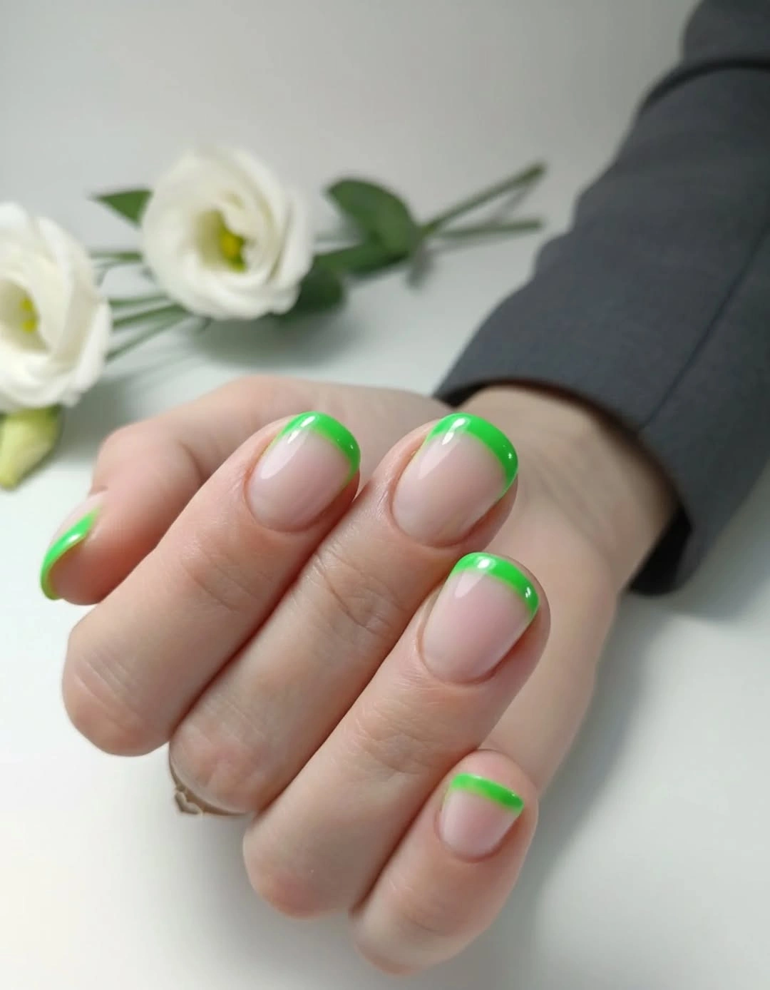
That placement makes the design easy to calm down or intensify. Use a thinner edge for a quieter result, repeat the green on only two fingers for more negative space, or swap in olive if you want the color to feel closer to fall. A full green base would be a different manicure, so preserving the nude center is the best way to keep this idea simple.
French edges depend on a consistent curve, especially on short tips where a small shift changes the whole proportion. The open nail bed can also make regrowth visible, so a clean boundary will matter as the manicure wears. If the line starts to feel too demanding, shorten it into a small side accent rather than adding another motif across the center.
10. Silver Sparkle on Compact Square Tips
Fine silver sparkle covers these short square nails from base to edge, making finish rather than color variation the main source of interest. The surface reflects many small points of light instead of one smooth highlight, so the neutral gray-silver shade feels more decorative than a flat gray. Because the tips remain compact and the color stays within one family, the manicure does not lose its simple structure.
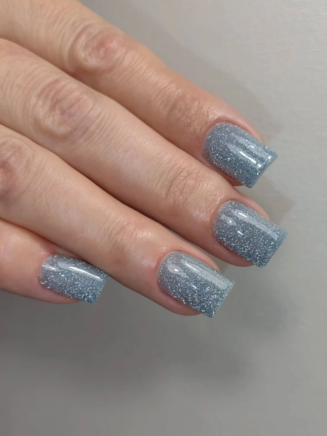
This is a smart way to add brightness without introducing a second hue. Keep the glitter on one or two accent nails if a full sparkle set feels too festive, or choose a softer pewter direction for a more muted fall reading. The design works because the base color remains controlled while the surface supplies the movement, so extra motifs would probably make it less clear.
Dense sparkle can disguise tiny changes across the nail, but it can also make the edge feel more textured and may require more patience when the manicure is refreshed. A short square shape keeps the visual field manageable, yet a clean free edge still helps the glitter read as intentional. If the surface begins to feel busy, reduce the number of sparkled nails before changing the color itself.
11. Warm Copper Brown with Reflective Depth
Copper-brown gives these short square nails a warm neutral base, then uses reflection to make the single shade shift between bronze, rose-brown, and deeper copper. There is no visible motif, but the surface changes as the light moves across the fingers, so the manicure feels more dimensional than a flat brown. The compact tips keep the warmth focused and easy to pair with fall textures.
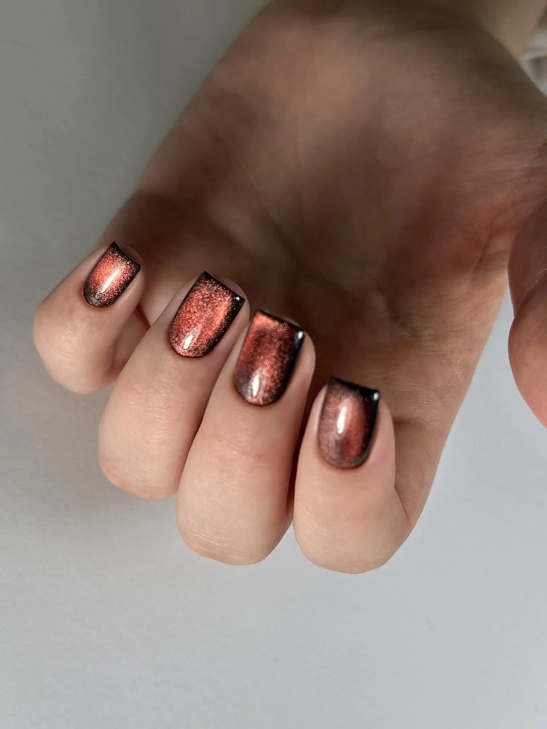
Use this idea when you want something deeper than nude but less familiar than red or burgundy. A muted bronze would soften the color, while a richer chocolate brown would make the set moodier without changing its solid structure. Pairing it with cream, denim, olive, or black lets the reflective finish stay visible without forcing the rest of the outfit to match it exactly.
Reflective surfaces draw attention to shaping, so the side edges and straight tips need to look deliberate. The short length keeps the color practical, but the warm shine may still show small chips against pale clothing. If you add design, choose one thin line or one accent nail and leave the remaining copper-brown surfaces open so the tonal depth remains the point.
12. Deep Purple with Ink-Like Shine
Deep purple creates a cool alternative to the wine and red shades in this collection, especially because the glossy surface reflects light in a way that can make the color look nearly navy at the edge. The short rounded-square tips keep the saturated shade contained, while strong highlights give the plain manicure a sense of movement. Nothing is painted on top, yet the color does not feel static.
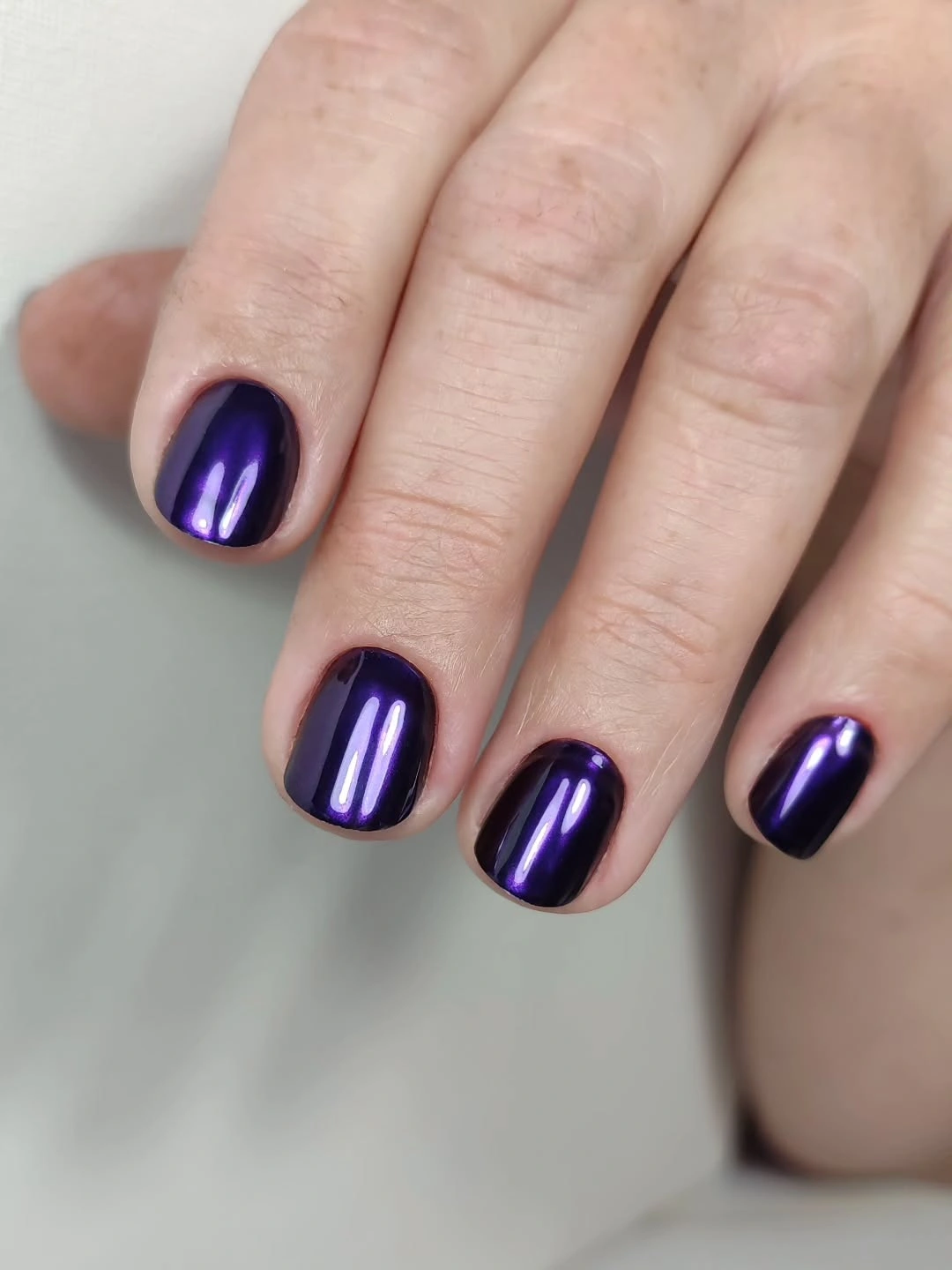
If you want a softer version, move the purple toward plum or dusty violet and keep the same reflective finish. A shorter tip would make the dark color more everyday, while a single pale lavender accent could connect the set to a lighter wardrobe without changing its cool identity. The important choice is the undertone; adding several unrelated colors would weaken the clean purple statement.
Dark glossy polish is direct about maintenance because every corner and free edge contributes to the silhouette. The compact shape makes the length easier to live with, but the reflection can still expose an uneven surface or small chip. Keep the finish smooth and let the purple carry the mood instead of trying to compensate with extra glitter or linework.
13. Berry-Wine Between Pink and Burgundy
This berry-wine manicure sits between bright pink and deep burgundy, which gives the short rounded-square tips a colorful but grounded character. The surface is glossy and uniform, so the undertone does all the expressive work: it looks warmer than purple, brighter than brown, and softer than near-black wine. The absence of art keeps the color relationship easy to read.
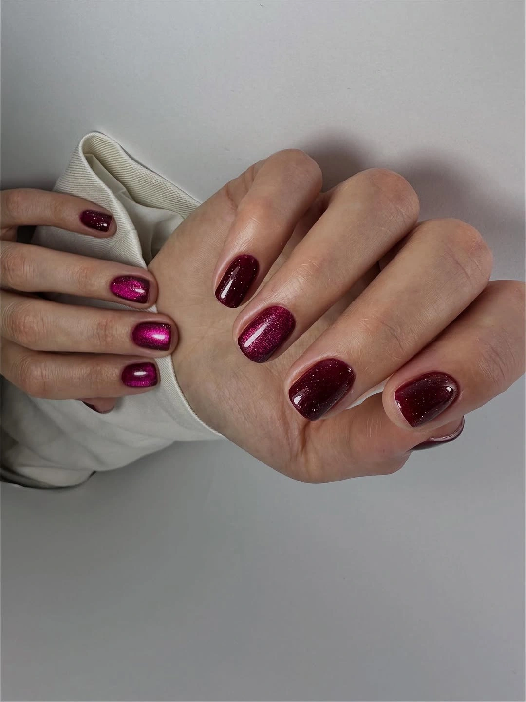
For a simpler fall wardrobe, keep the berry tone and pair it with cream, gray, denim, or dark brown so the nails act as the colorful point. A muted raspberry would make the set lighter, while a deeper plum would pull it toward the burgundy family. The manicure does not need a motif to feel special because its value is in finding that middle ground between familiar shades.
Saturated berry colors show small changes at the edge, so even corners and clean side lines will protect the polished effect. The short shape helps the shade remain practical, but the glossy surface still makes chips visible when the hands move. If you add an accent, use a transparent or pale pink detail on one finger and keep the berry color dominant.
14. Dark Burgundy with a Clean Square Outline
Deep burgundy covers these short-to-medium square tips and uses a smooth reflection to keep the dark color dimensional. The hand is photographed against a pale background, which makes the wine-brown tone appear especially rich and gives the straight edges a clear outline. No motif is needed because the manicure already has a strong relationship between dark color, clean shape, and surrounding light.
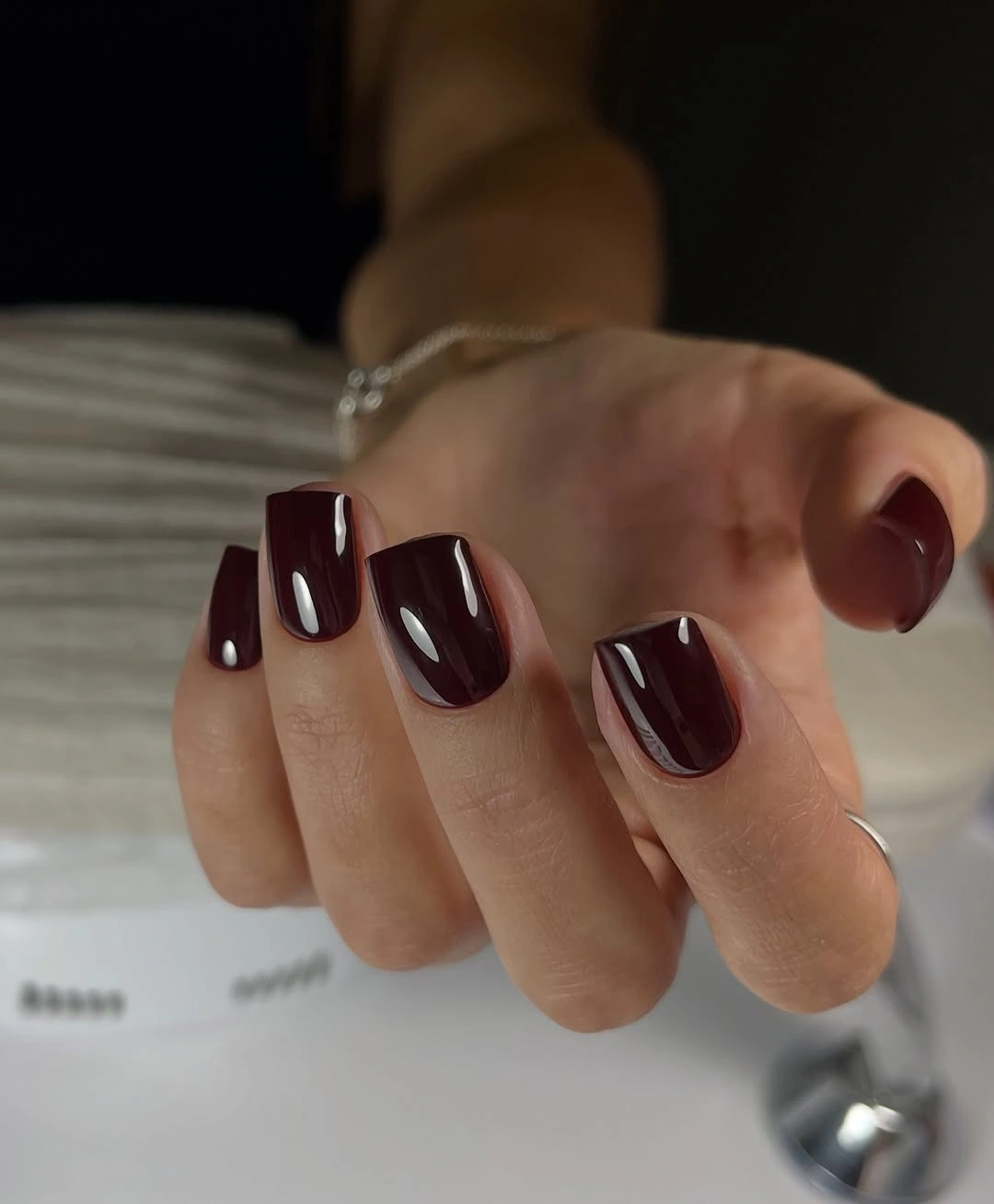
This is a dependable option when you want a simple dark manicure that feels warmer than black. Keep the square tips compact for a more practical result, or round the corners slightly if the straight outline feels too formal. A single bronze line could add a small seasonal note, but a full pattern would take attention away from the precise color and shape relationship.
Dark burgundy rewards an even free edge because contrast makes every corner visible. The shorter length keeps the design manageable, but it does not hide chips or uneven surface texture. If you need a low-effort refresh, preserve the color and shorten the tips rather than introducing a new finish that would compete with the clean square outline.
15. Bright Red Styled with Blue Plaid
Bright red returns here in a compact rounded-square shape, but the blue-and-white plaid background changes how the color reads. The manicure remains completely solid, while the patterned sleeve supplies the visual complexity around it, so the red becomes a clear accessory rather than another print competing for attention. The glossy surface keeps the color crisp against the textured fabric.
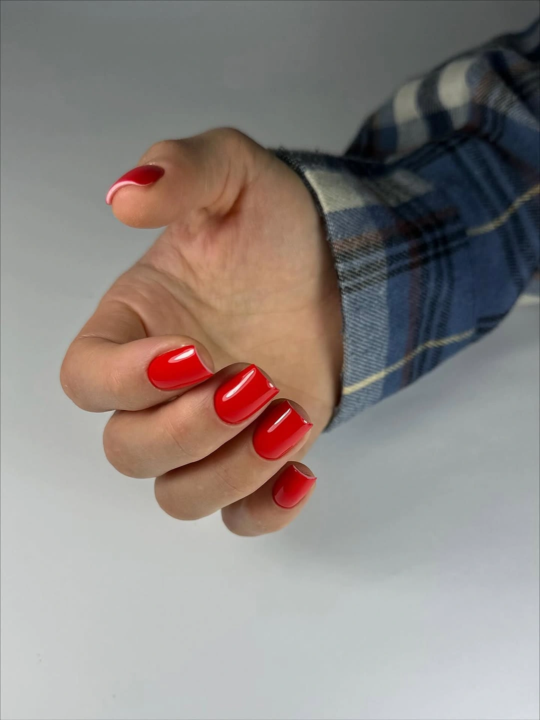
This styling relationship is useful when your outfit already carries pattern and your nails need a straightforward counterpoint. Keep the red, or shift it toward tomato or brick if you want less contrast with blue; there is no need to add checks to the nails because the clothing already provides that rhythm. A simple fall manicure can feel considered when the color is allowed to play a supporting role.
Solid red still benefits from a tidy free edge, especially beside a high-contrast plaid where small imperfections can become visible. The short shape keeps the manicure practical, and the absence of art means a small refresh will not require rebuilding a pattern. If the red feels too loud, lower the saturation rather than adding a neutral accent that breaks the clean relationship.
16. Near-Black Burgundy on Soft Cream
This manicure uses a very dark burgundy shade on short rounded-square tips, and the soft cream background makes the depth of the color immediately apparent. Narrow white reflections prevent the surface from disappearing into black, while the compact shape keeps the look controlled. The result is moody but not complicated because every nail follows the same color and finish decision.
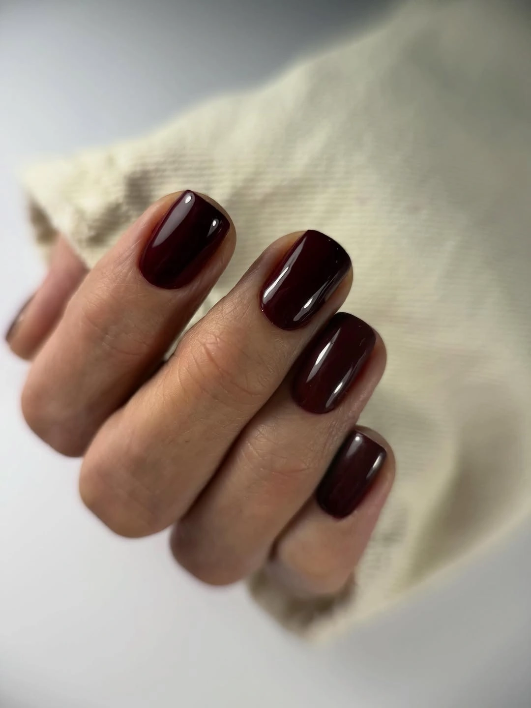
Choose this direction when classic red feels too bright and true black feels too hard. A softened wine tone would keep the same mood with a little more visible warmth, while a shorter tip would make the dark shade easier to manage during hands-on routines. The surrounding cream shows how useful contrast can be: the manicure does not need matching dark clothing to feel intentional.
Near-black colors reveal edge wear clearly against pale clothing, so the free edge deserves attention before any extra decoration is considered. The short shape is a practical advantage, but the glossy surface can still show small dents or uneven corners. Keep the set plain if you want its strength to remain in the depth of the burgundy rather than in added detail.
17. Cool Navy with a Strong Reflective Line
A close view of deep navy shows how much personality can come from undertone alone. The surface is smooth and glossy, with a bright reflection running across the compact square tip, while the darkest edge approaches black without losing its cool blue center. There is no art to interpret, so the color shift and shape are the entire story.
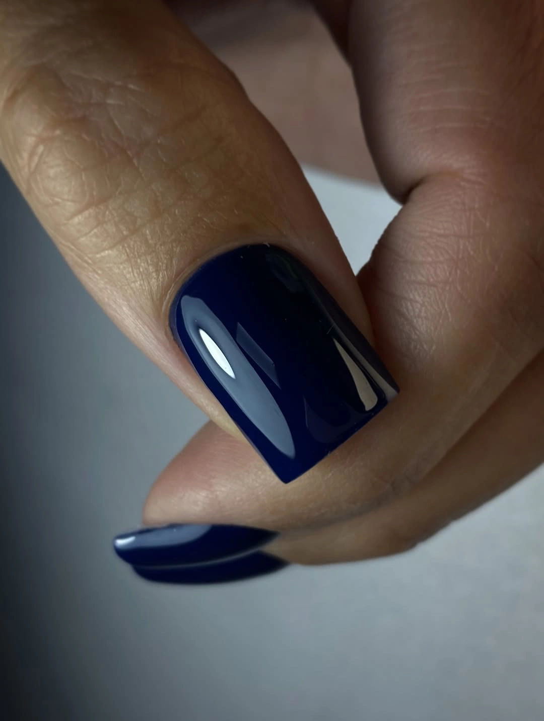
Navy is useful when you want a dark manicure that does not repeat the warmth of burgundy, brown, or red. Keep it short and square for a clean everyday version, or soften the shape into a rounded square if the straight edge feels too severe. A pale blue accent could echo the undertone, but the simplest result will usually come from staying within the navy family.
Strong reflections emphasize the surface condition and make a clean outline important. Because the nail is short, the dark shade remains practical, yet the free edge can still show a chip quickly against the cool background. If maintenance is the concern, choose a slightly lighter ink-blue tone rather than adding a busy accent meant to hide wear.
18. Muted Bases with Tiny Colorful Illustrations
Pale blue-gray bases create calm space for tiny colorful drawings in this macro set. Yellow, purple, and pink details appear in small concentrated areas, so the manicure feels playful without becoming a wall of bright color. The short rounded-square tips give the miniature illustrations a boundary, and the muted background makes each small accent more readable.
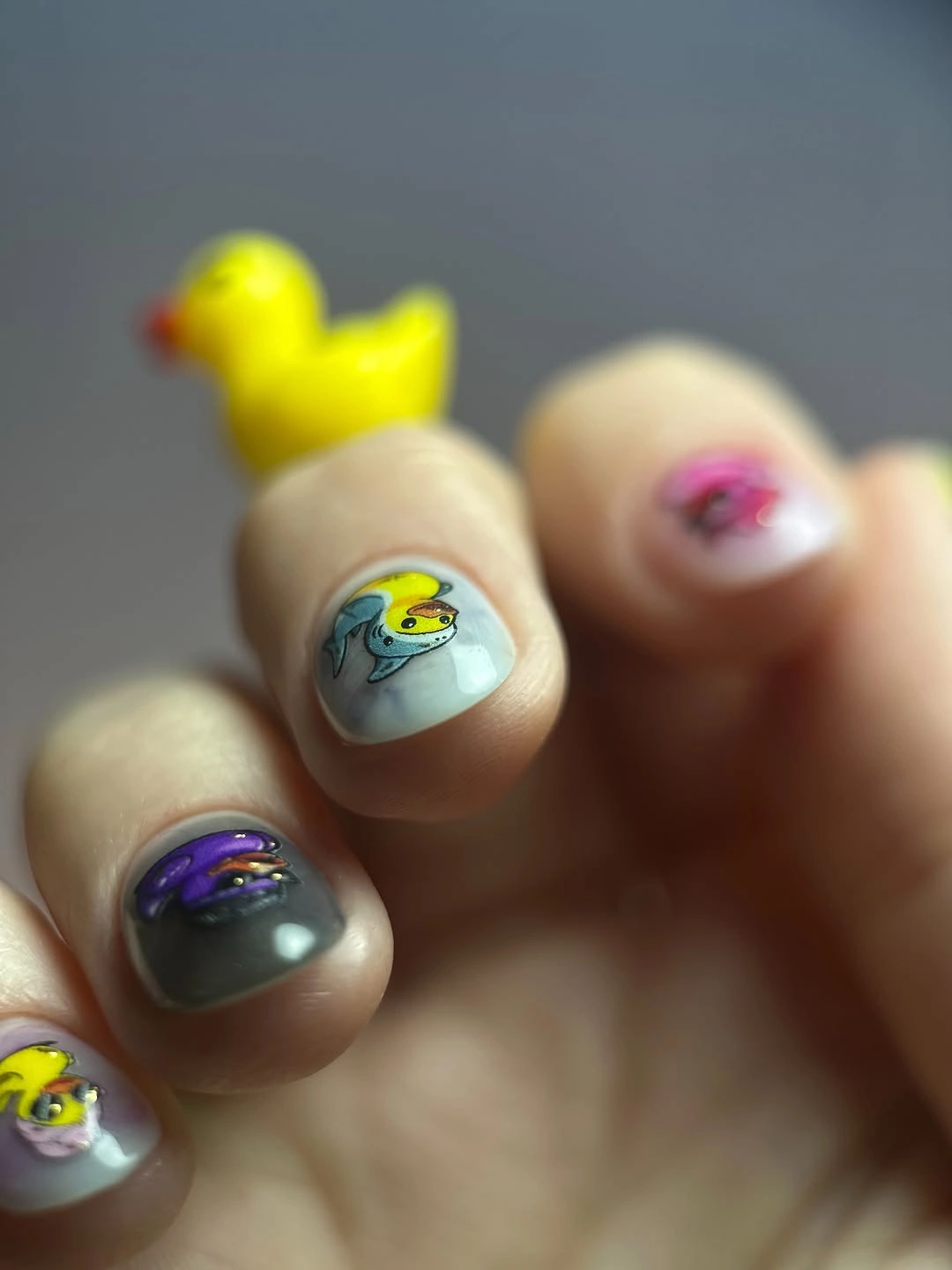
To keep the idea simple outside a close-up, choose one illustration and repeat it on two nails while leaving the other fingers in the pale base. That adjustment preserves the contrast between quiet color and tiny bright detail, but it makes the design easier to read at normal distance. You can also shift the base toward milky blue or soft gray if the original palette feels too cool.
Small artwork needs enough empty space to remain a detail rather than becoming visual texture. On a short tip, one clear shape will usually read better than several tiny marks squeezed together, especially as the manicure grows. If a motif loses clarity, simplify its outline and keep the base calm; adding more color will not solve a scale problem.
19. Fresh Mint Beside a Charcoal Knit
Pale mint returns in a plain rounded-square manicure, but the charcoal-gray sleeve gives it a different role from the brighter mint set earlier. The cool pastel becomes a light focal point against a darker knit texture, while the smooth finish keeps the nail design quiet. It is a useful reminder that the same color can feel new when the surrounding contrast changes.
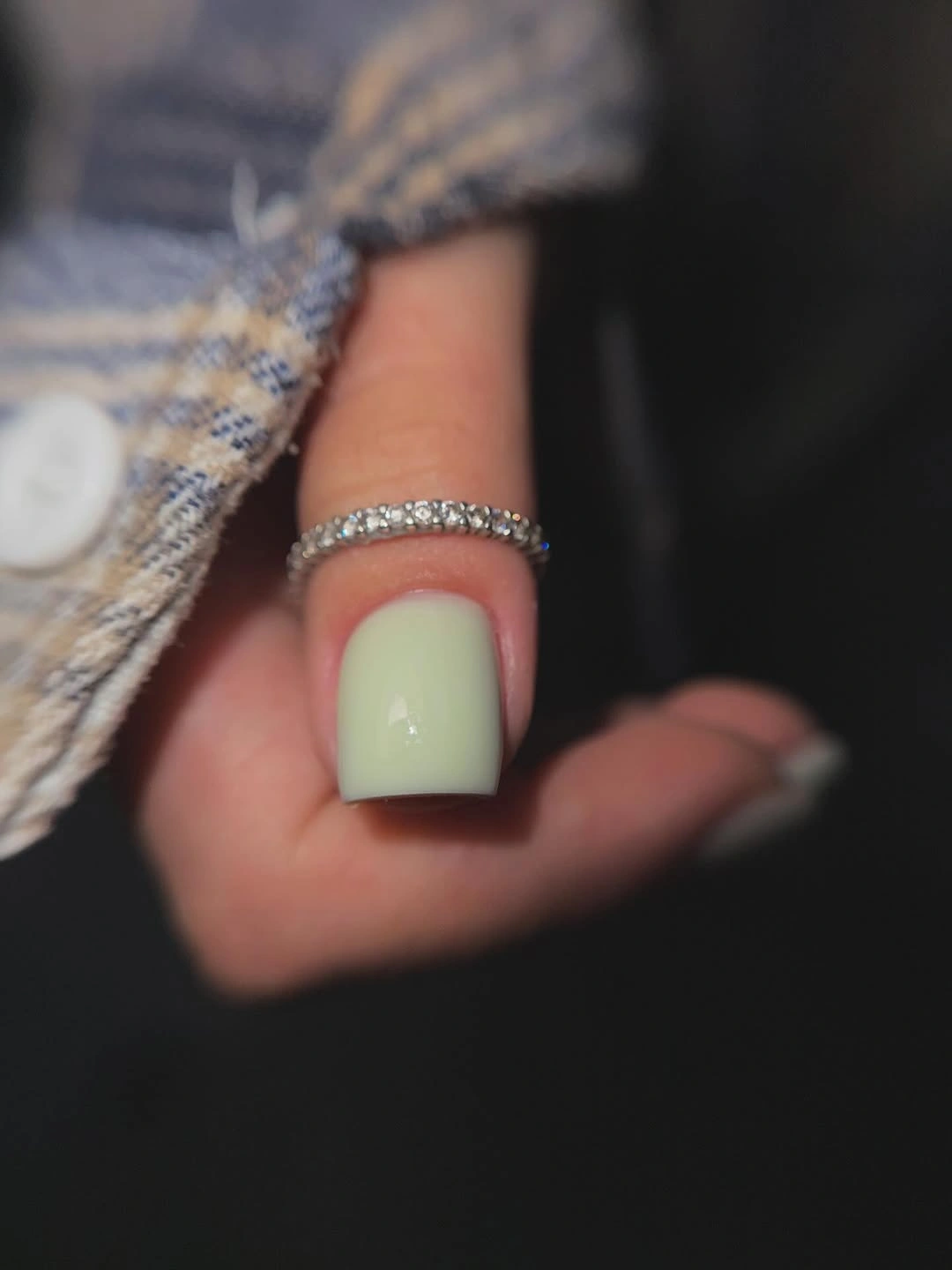
For a stronger fall connection, pair this mint with charcoal, chocolate, olive, or denim instead of matching it with more pale colors. A deeper sage would make the idea moodier, while a single darker green accent could add structure without changing the soft center of the palette. The best adaptation preserves the contrast between fresh mint and grounded clothing.
Light green can reveal small surface marks and uneven edges, so the simple color benefits from clean shaping. The short length makes the set easier to live with, and the absence of art means a refresh can stay quick. If you add a detail, keep it on one nail and use a darker tone that supports the mint rather than turning the manicure into a multicolor set.
20. Milky Nails with Black and Yellow Botanicals
A pale milky base gives these short rounded-square nails open space for black leaf-like linework and small yellow botanical accents. The dark lines provide structure, while yellow adds warm points that keep the design from feeling stark. Because the detailed marks are concentrated on selected nails, the light base remains a major part of the manicure rather than disappearing underneath the art.
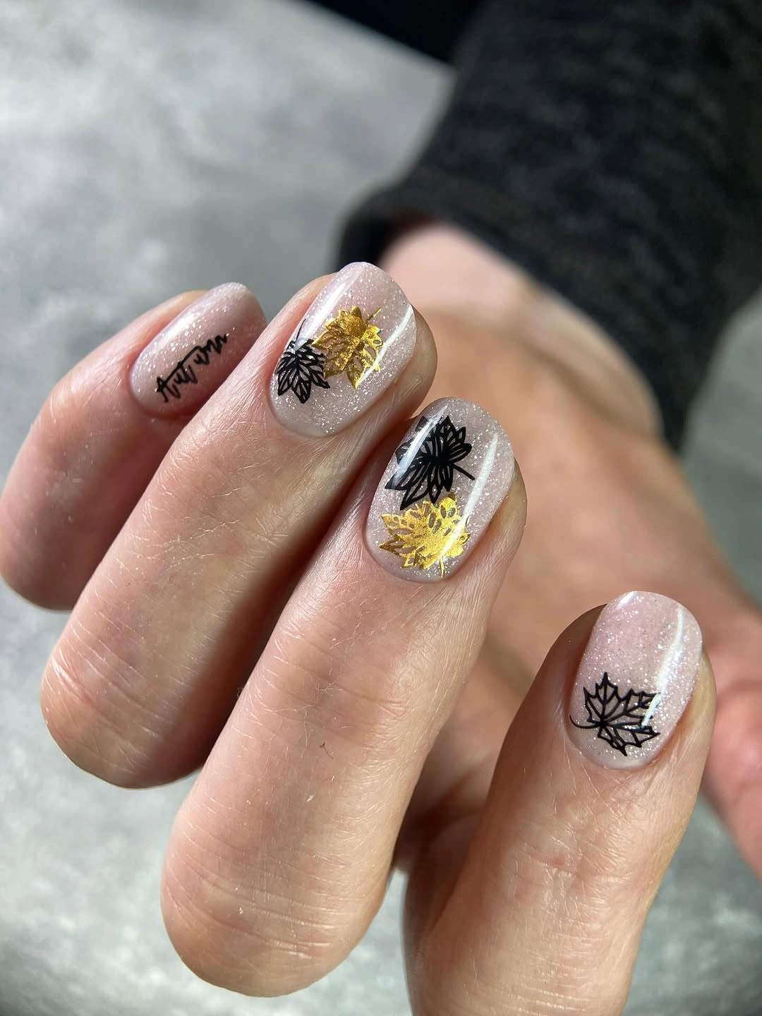
If you want a simpler version, keep the botanical drawing on one accent nail and let the other fingers remain milky or softly pink. A muted gold-yellow would make the palette feel more autumnal, while brown linework would soften the contrast without changing the placement strategy. The open base is the key to the idea, so preserve it even when you reduce the number of colors.
Fine botanical lines can lose clarity as the nail grows or the surface picks up small marks, which makes spacing important. Do not add extra leaves simply because a nail has room; the existing black line and yellow point already create a focal path. If the design needs repair, remove a small detail before repainting the whole base, keeping the light background as visual relief.
21. Milky Pink with Tiny White Hearts
Milky pink gives these short square nails a pale, soft base, while tiny white heart-like marks add a personal touch without creating strong contrast. The surrounding flowers echo the gentle palette, but the nail design remains separate and easy to understand: light base, compact shape, and a small repeated symbol. Because the hearts are subtle, the manicure feels delicate rather than decorated from edge to edge.
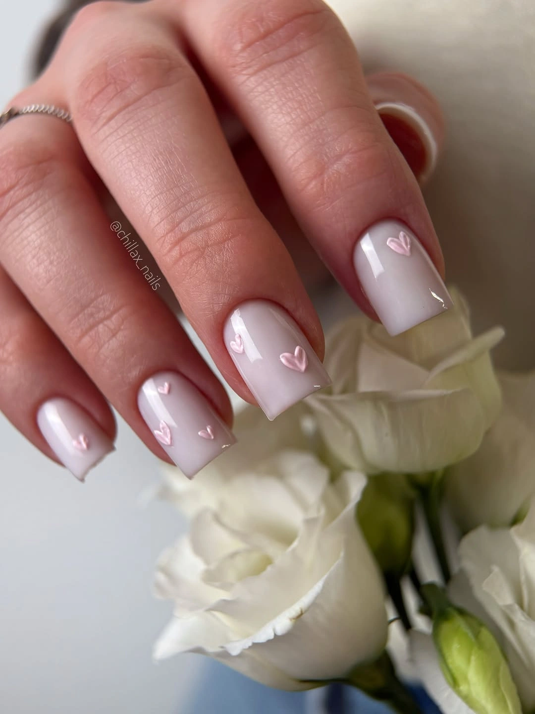
This is an easy idea to scale down because the motif can appear on one or two nails while the rest stay plain. A slightly deeper blush would make the hearts more visible, while a warm cream base would give the same structure a softer fall direction. Keep the symbols small and spaced so they remain accents, not a pattern that competes with the pale surface.
Low-contrast white details may disappear in bright light, but that quietness is also what makes the manicure easy to wear beside floral styling or jewelry. The short square tip provides enough room for one clear heart without forcing extra decoration. If upkeep becomes difficult, remove the smallest marks first and preserve the milky base, because the calm color relationship is what holds the set together.