Your closet already has opinions: the pieces you reach for, the lines you skip, and the shifts that feel right before anyone else weighs in. Trendy outfits for women over 40 work best when that self-knowledge leads the decision, so newness becomes a choice you edit, not a rule you obey. The goal is to notice which change earns space in your real routine.
You do not need to surrender your taste to make an outfit feel current. A good style decision starts with where you want the attention to land, then asks what should support it, soften it, or sharpen it. That kind of editing keeps clothes from feeling like a costume, because the final message still sounds like you.
1. Asymmetry Gives a Loose Top Direction
The olive-gray top takes its interest from shape before decoration. Its loose body, long sleeves and uneven hem make the line feel off-center in a deliberate way, so the eye follows the slant rather than searching for print or bright color. That makes the outfit feel relaxed, but not unfinished or vague.
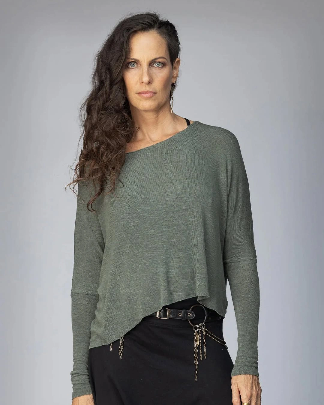
Photo via Instagram
The darker lower piece changes the mood because the belt gives the waist a firmer interruption. The dangling chains make that break more noticeable, adding a small industrial edge beside the top’s easy shape. Instead of making the relaxed piece disappear, the hardware gives it a sharper point to answer.
This is the kind of contrast that helps a simple top keep its personality without needing a printed surface. The strongest idea sits in the meeting point between slouch and control, which is why the belt line matters as much as the neckline.
2. Bright Green Tailoring Meets a Graphic Tee
The green blazer claims attention quickly because the color sits in a tailored shape, not a loose accent. Its clean front and strong outline make the shade feel intentional, while the white graphic T-shirt underneath keeps the center from becoming too formal. The result has energy before it has complication.
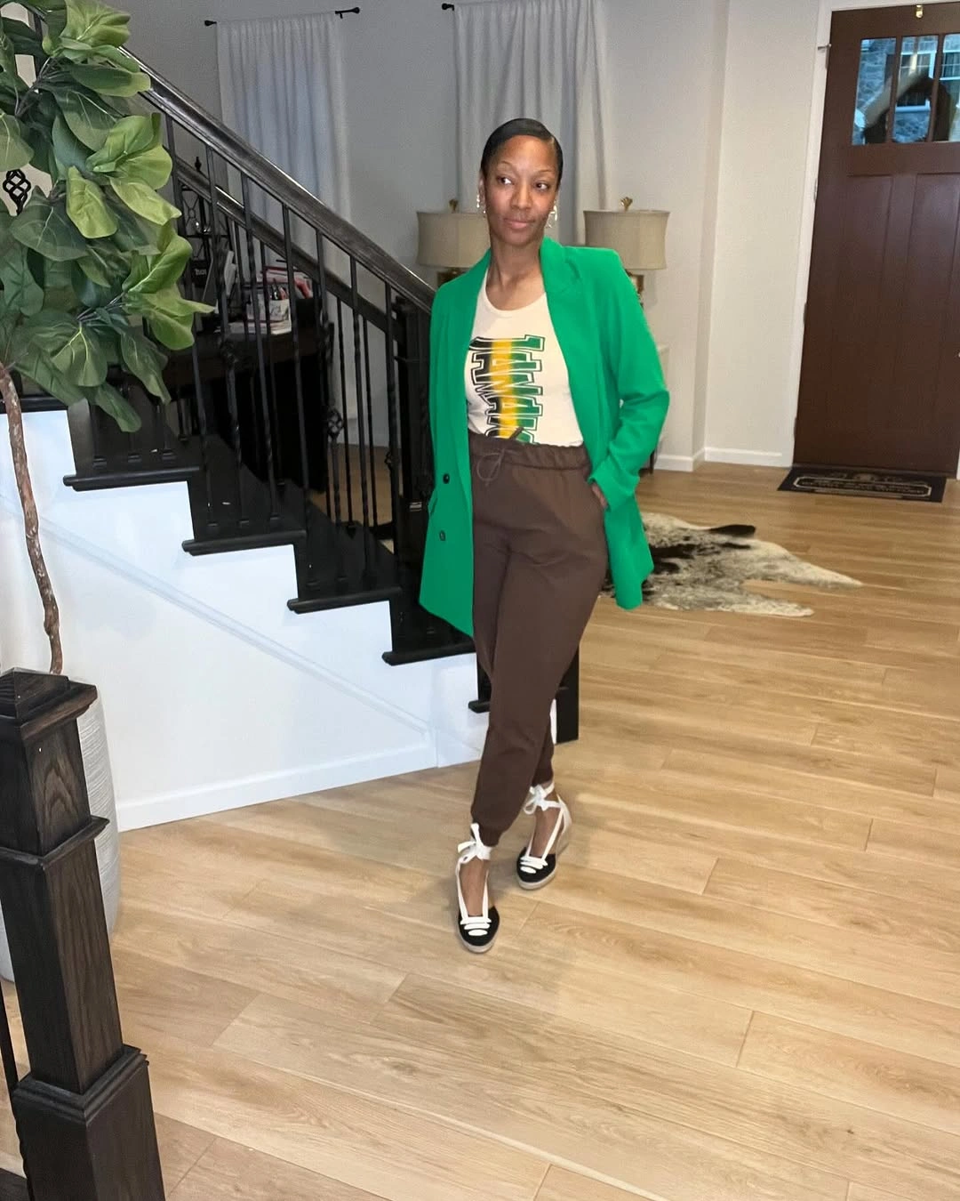
Photo via Instagram
The brown trousers matter because they pull the outfit away from a simple bright-over-neutral formula. Their earthy tone sits between the vivid jacket and the black-and-white shoes, making the outfit feel connected across very different pieces. For trendy casual outfits for women over 40, that bridge is often more useful than a perfect match.
The lace-up shoes add a graphic finish at the floor without copying the T-shirt exactly. That small visual echo helps the outfit feel assembled, while the trousers keep the brighter green from being the only note.
3. High-Contrast Print With Plain White Sneakers
The black-and-white printed garment carries the attention through repetition, scale and contrast. Because the pattern spreads across the visible piece, the outfit does not need a second major color story to feel deliberate. The seated pose leaves the exact garment category partly open, but the print’s role is clear.
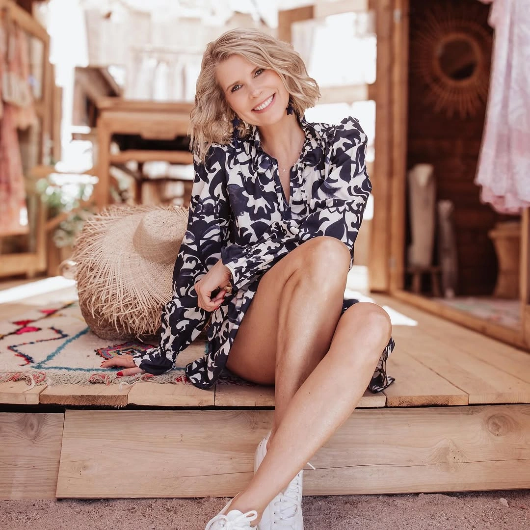
Photo via Instagram
The white sneakers change the reading because they give the high-contrast pattern a cleaner and easier finish. They do not erase the drama of the print; they make the lower edge feel more direct and less dressed up. That difference is specific to this pairing, where the shoes are plain enough to let the pattern keep speaking.
The strongest choice here is not the footwear alone, but the distance between an active surface and a simple finish. It is a reminder that print can feel relaxed when the supporting pieces stay visually clear.
4. Pattern Near the Face, Solid Contrast Below
The sleeveless cream-and-black patterned top places the most active detail close to the face and shoulders. Its dense contrast draws attention upward, while the clean arm line keeps the shape direct. Beside the desk and laptop, the outfit reads polished without needing the top to become plain or the silhouette to feel stiff.
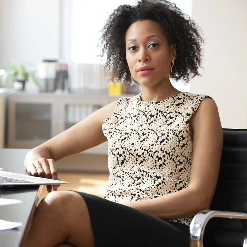
Photo via Instagram
The solid black lower piece gives the patterned top a clear visual landing place. It does not compete with the small light-and-dark movement above, so the contrast feels organized rather than scattered. Because the lower half stays simple in color, the top can keep its busy surface without making the seated outfit feel crowded.
This section works because polish is not treated as the absence of detail. The patterned top brings movement, and the solid lower half gives that movement a steady edge.
5. A Long White Layer Changes Denim
The loose white tunic or long shirt changes the light ripped jeans by placing a long, open layer over them. The jeans still show their distressed areas and pale wash, but the white layer gives the outfit a larger shape before the eye reaches the denim. That makes the pairing feel styled rather than simply casual.
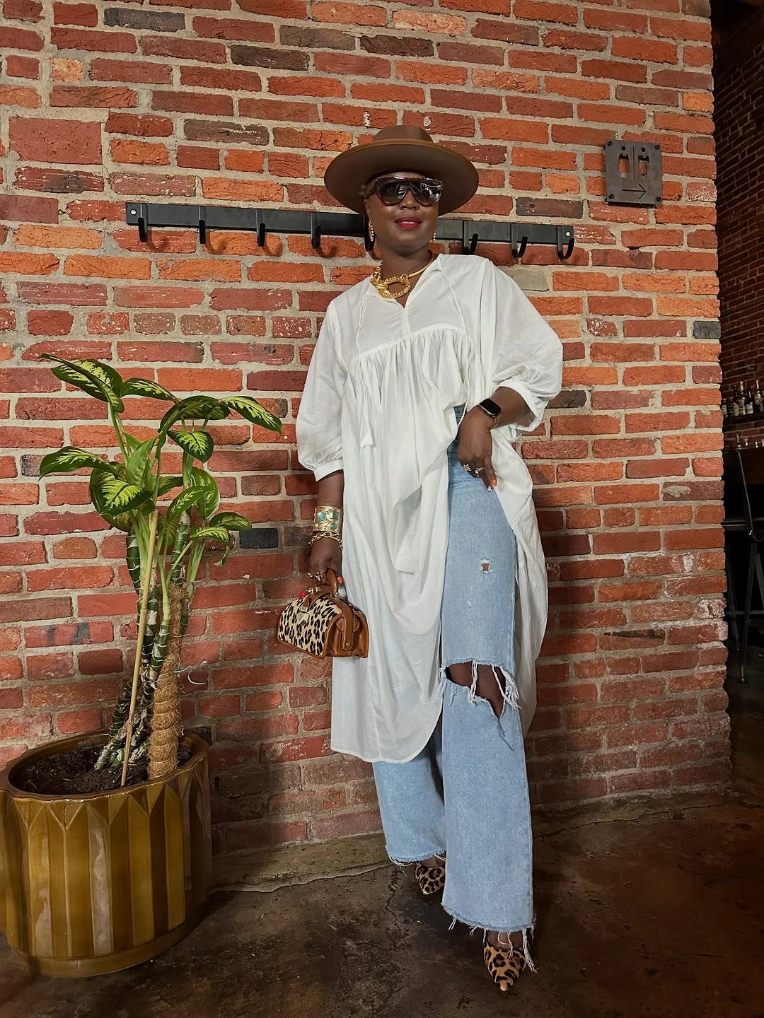
Photo via Instagram
The accessories distribute attention across the whole outfit instead of leaving all the interest at the top. The brown wide-brim hat, sunglasses, jewelry and small bag add visible points around the face, hands and neckline, while the leopard-print pointed shoes move pattern down to the feet. The brick wall behind the outfit makes those light and animal-print details stand out more clearly.
The animal print works here because it appears low in the outfit and meets the ripped denim at the hem. Together with the long white layer, it turns a casual jeans base into a more layered style choice.
6. Plaid Sharpens a Graphic Hoodie
The red-and-black plaid blazer gives the outfit its frame before anything else registers. Its checked pattern and straight front line sit over a gray hoodie, so the upper half reads as layered rather than simply casual. The blazer does not erase the relaxed base; it makes the hoodie look intentionally included.
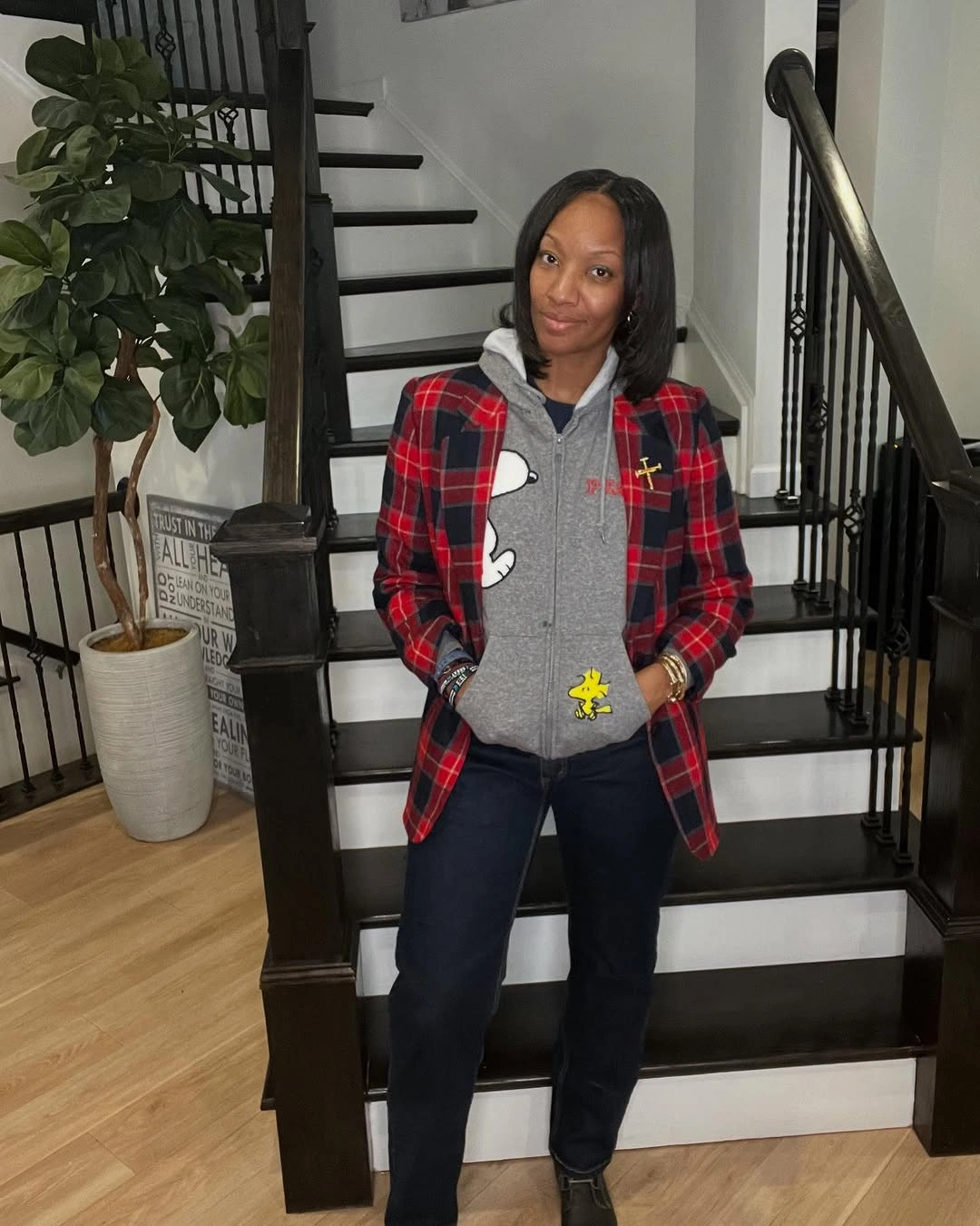
Photo via Instagram
The character graphic on the hoodie keeps the outfit from turning into standard blazer-and-jeans dressing. Dark jeans help the plaid, gray and black shoes sit in one connected palette, which matters because several casual-polished signals are working at once. For trendy casual outfits for women over 40, the useful lesson is how visible play can stay inside a clean structure.
I like that the hoodie is not hidden as a secret layer. Its drawstring, graphic and soft shape are part of the message, while the plaid blazer gives that message a clearer edge.
7. A Pale Vest Breaks a Dark Column
The cream cable-pattern vest changes the black base by placing texture directly across the torso. Because the shirt, lower visible outfit and neck detail stay dark, the pale layer becomes a clear interruption rather than just another neutral. Its cropped shape also gives the outfit a shorter visual block over the longer dark line underneath.
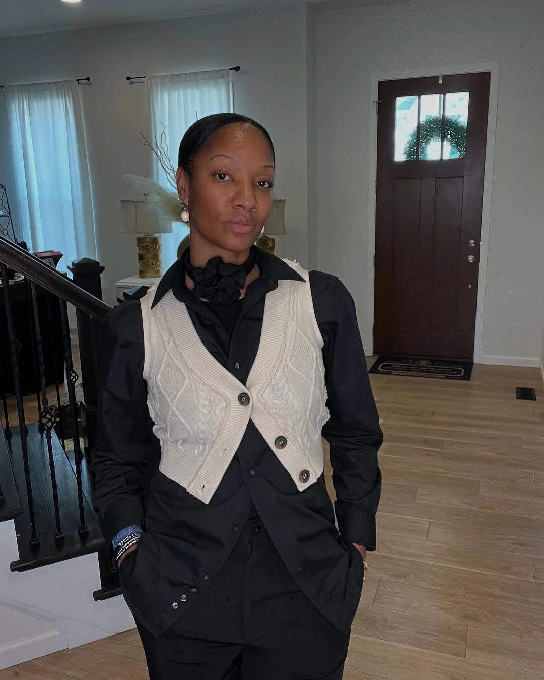
Photo via Instagram
The black neck detail creates a close focal point that feels deliberate beside the vest’s pale texture. It draws attention upward without competing with the cable pattern, while the pearl-like earrings add a small bright echo near the face. The strongest choice is the relationship between surface and proportion, not a large color shift.
This outfit shows how a dark column can be changed by one textured layer placed with precision. The vest gives structure and relief, while the black base keeps the overall mood composed.
8. Embroidery Shapes a Soft White Blouse
The white blouse is shaped by its neckline as much as by its embroidery. The open shoulder line gives the upper half a soft, relaxed curve, while the red floral stitching runs down the front and appears again on the sleeves. Those details make the blouse feel decorative without needing a separate printed layer.
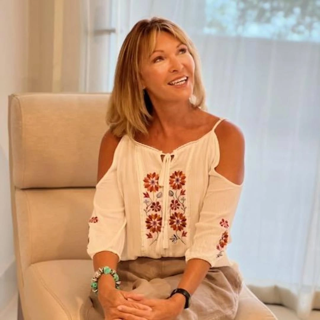
Photo via Instagram
The neutral bottom lets the blouse remain the clearest subject, especially because the lower piece is partly hidden in the seated view. The bracelets repeat the sense of ornament near the wrist, close enough to relate to the embroidered sleeves but not so large that they pull attention away. That balance keeps the outfit gentle rather than overloaded.
The point here is not that embroidery has to be treated delicately. It works because the placement is easy to read: neckline, front panel, sleeves and wrist details all speak in related areas.
9. Diagonal Stripes Move Across a Dark Base
The long cream layer changes the outfit through direction. Its bold black diagonal stripes cut across the body instead of falling straight down, so the eye moves from side to side before it reads the all-black base underneath. That motion gives the outer layer a graphic role without depending on bright color.
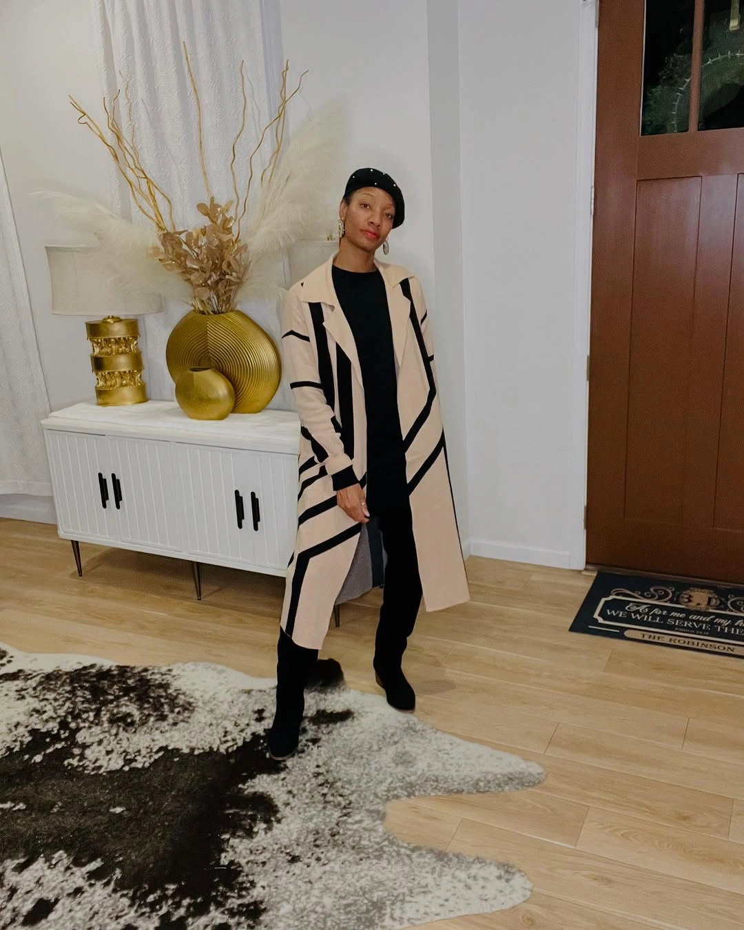
Photo via Instagram
The black base, boots and headwear make the cream layer’s pattern look more continuous because the dark elements repeat from top to bottom. The boots add weight at the floor, while the headwear brings the dark color back near the face. That vertical repetition helps the diagonal stripes feel designed into the whole outfit, not just placed on top of it.
This is a strong example of movement created by line rather than by extra pieces. The outer layer leads, but the dark base decides how sharply those lines read.
10. Tall Boots Ground a Mixed Print Dress
The patterned dress brings several kinds of movement at once: black spots, white areas, orange sections and a fitted long-sleeve shape. Because the print changes scale and direction across the dress, the outfit feels active even before the footwear enters. The orange notes add warmth without becoming the only thing the eye sees.
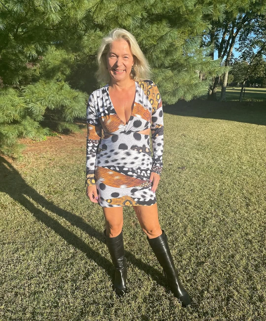
Photo via Instagram
The black knee-high boots change the lower outline by adding a strong vertical finish below the short hem. They give the patterned dress a more grounded stance, especially against the open grass setting where lighter footwear might have disappeared visually. The boots also repeat the black in the print, creating a firm connection between upper and lower halves.
The dress-and-boot pairing works because both parts have presence. The print brings motion across the body, while the boots make the bottom edge feel intentional and strong.
11. Hearts Meet Stripes Under a Black Hat
The pink sweater starts with a playful motif, but the heart pattern is spaced widely enough to read as graphic rather than tiny decoration. The black hearts sit clearly against the soft pink, giving the upper half a repeated rhythm. That repetition feels lighthearted, yet the larger scale keeps it from becoming overly delicate.
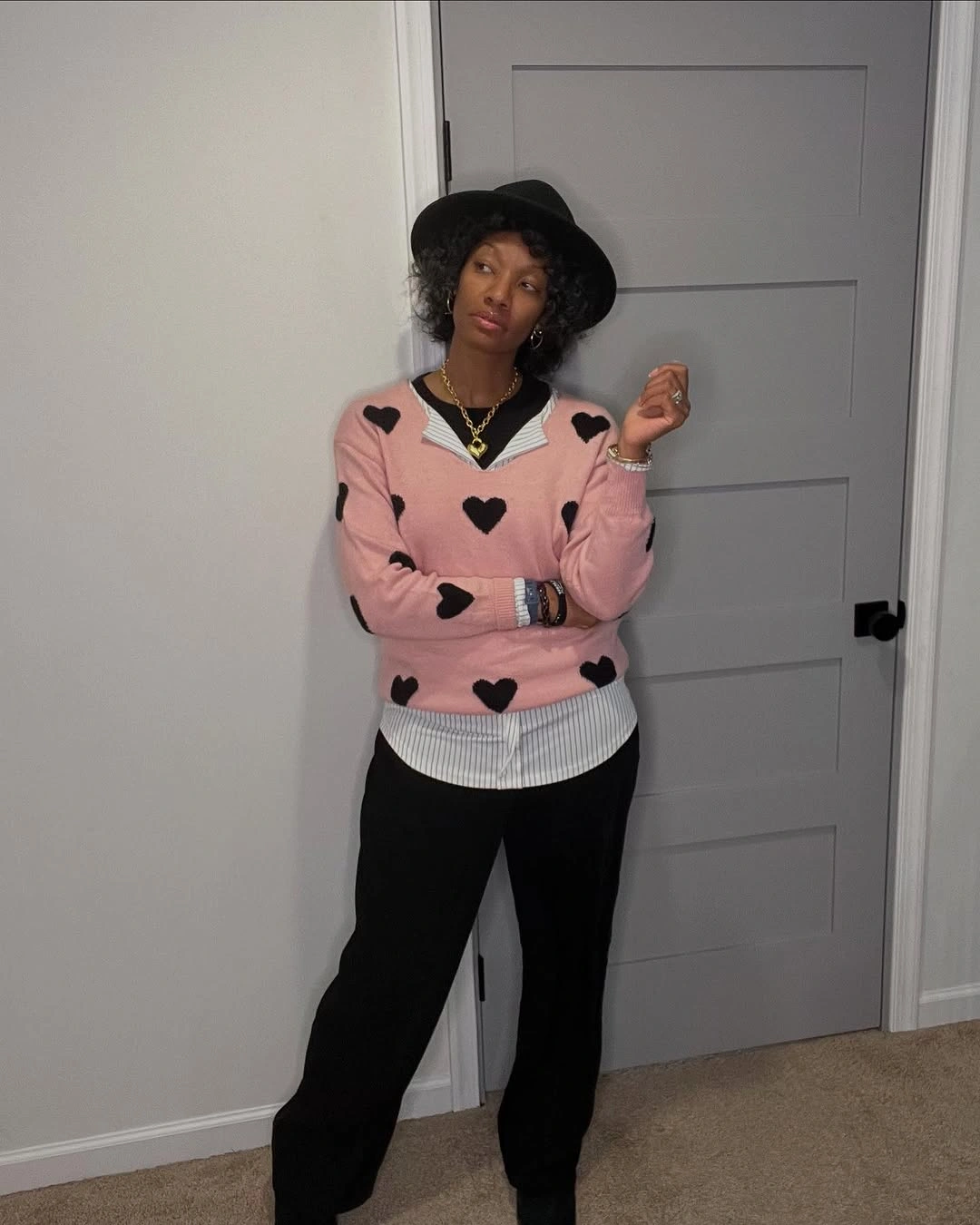
Photo via Instagram
The blue-and-white striped shirt changes the sweater’s edges at the cuffs and hem. Instead of letting the pink knit stop cleanly, the stripes add a second pattern exactly where the layers separate. The black base and black hat then shift the mood, giving the sweet motif a more grounded outline without making the outfit lose its charm.
I like the slight surprise of the stripes under the hearts because it makes the layering feel intentional. The outfit does not depend on one playful idea; it lets two patterns meet in controlled, visible places.
12. Pale Blue Tailoring Frames a Dark Center
The pale blue double-breasted blazer gives the outfit a clear upper structure through its crossed front and visible rows of buttons. Its color is soft, but the construction is not vague, so the jacket keeps a defined shape. That mix of gentle color and precise front closure is the main reason the upper half feels composed.
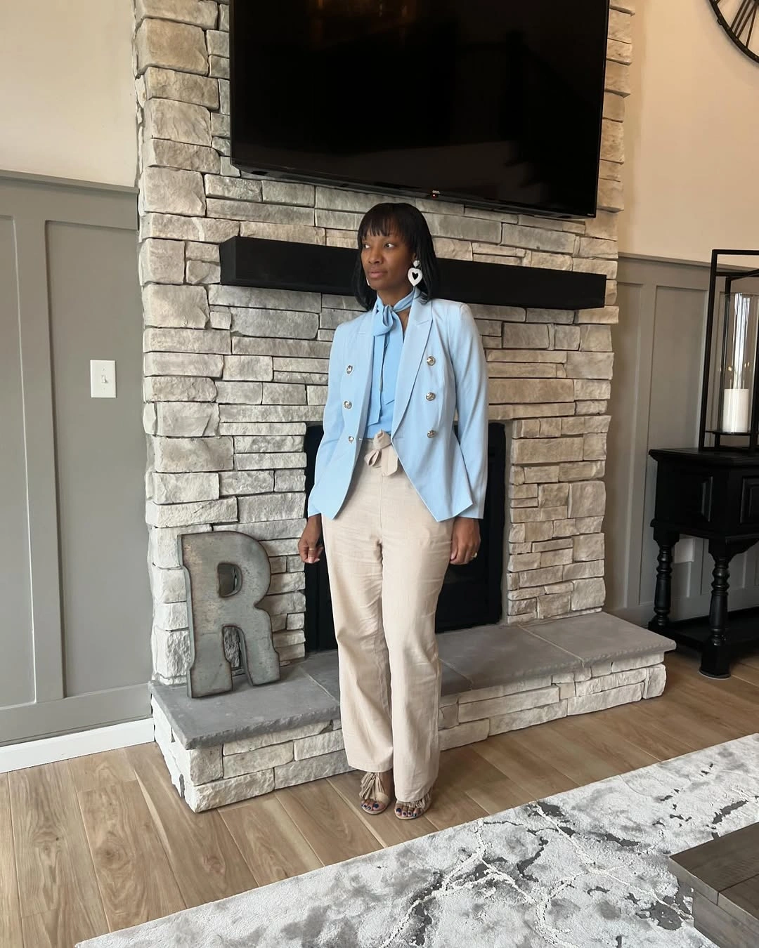
Photo via Instagram
The black top creates a strong center line where it meets the pale blue jacket. Below that, the light beige trousers keep the outfit from becoming only a blue-and-black contrast, adding a warmer neutral block to the lower half. The white statement earrings bring brightness back near the face, where they can echo the clean lightness of the blazer.
The best detail is how the pale jacket and dark center meet without either one flattening the other. The outfit feels polished through placement and proportion, not through a generic idea of tailoring alone.
13. Hot Pink Holds the Outer Line
The hot pink blazer carries the strongest color because it covers the shoulders, sleeves and outer edge of the outfit. Against the white top and white pants, the saturated layer reads as a clear frame rather than a scattered accent. The shape stays open at the front, so the white center remains visible inside the color.
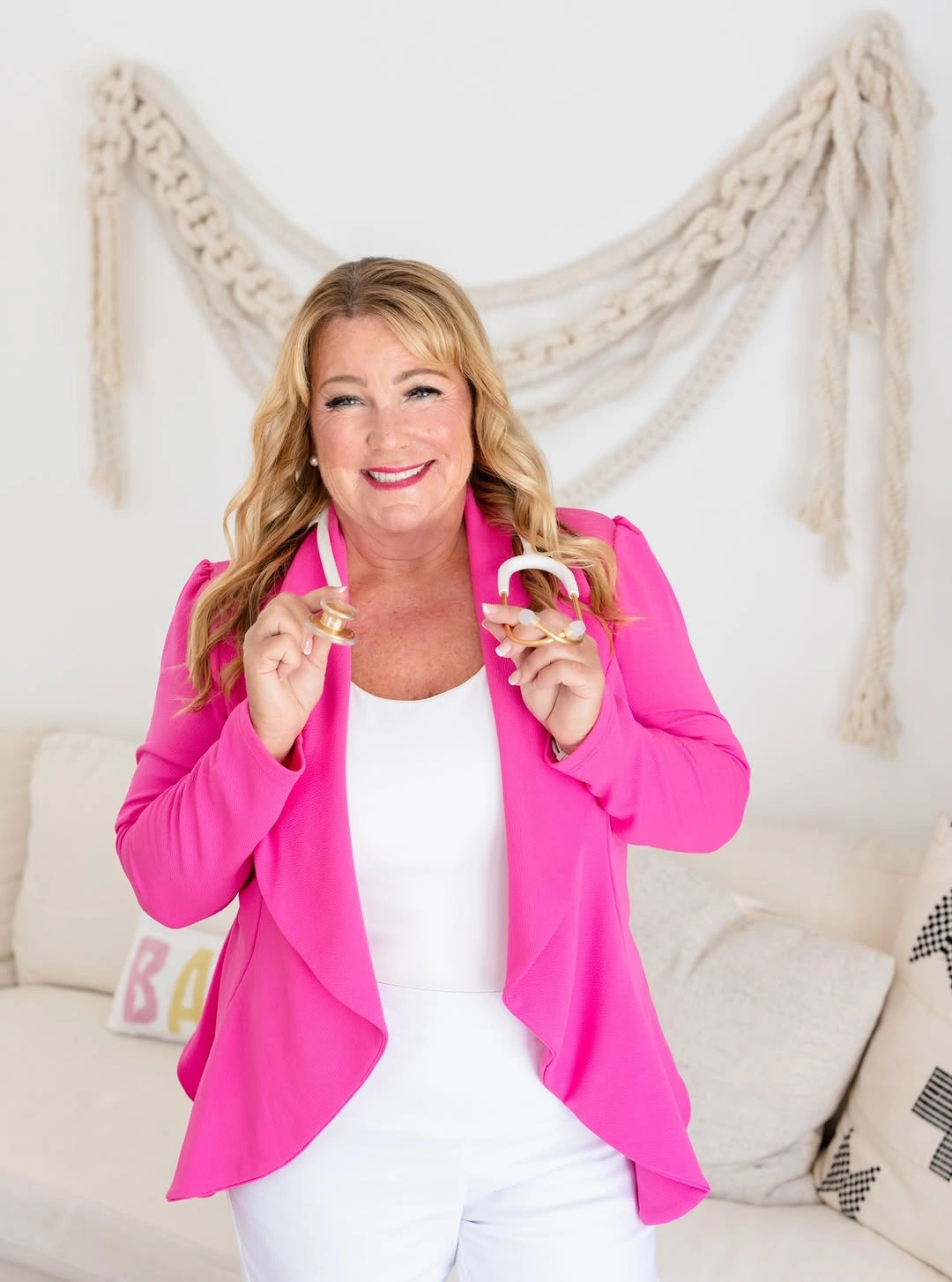
Photo via Instagram
The all-white base gives the pink a crisp boundary from neckline to lower half. That matters because the color is bright enough to dominate if there were too many other competing notes. The glasses are held in the hands rather than worn, so they register as a visible prop-like detail, not as part of the face styling.
This is a direct color decision, but it is not just brightness for brightness’s sake. The outfit’s control comes from how completely the white base defines where the pink begins and ends.
14. A Dark Upper Line Meets Brushstroke Movement
The dark sleeveless layer gives the outfit a clean upper zone before the patterned skirt begins. Its deep color and simple shape make a firm edge at the torso, while the arms and neckline keep the top half visually open. That creates a strong starting point for a lower half with much more movement.
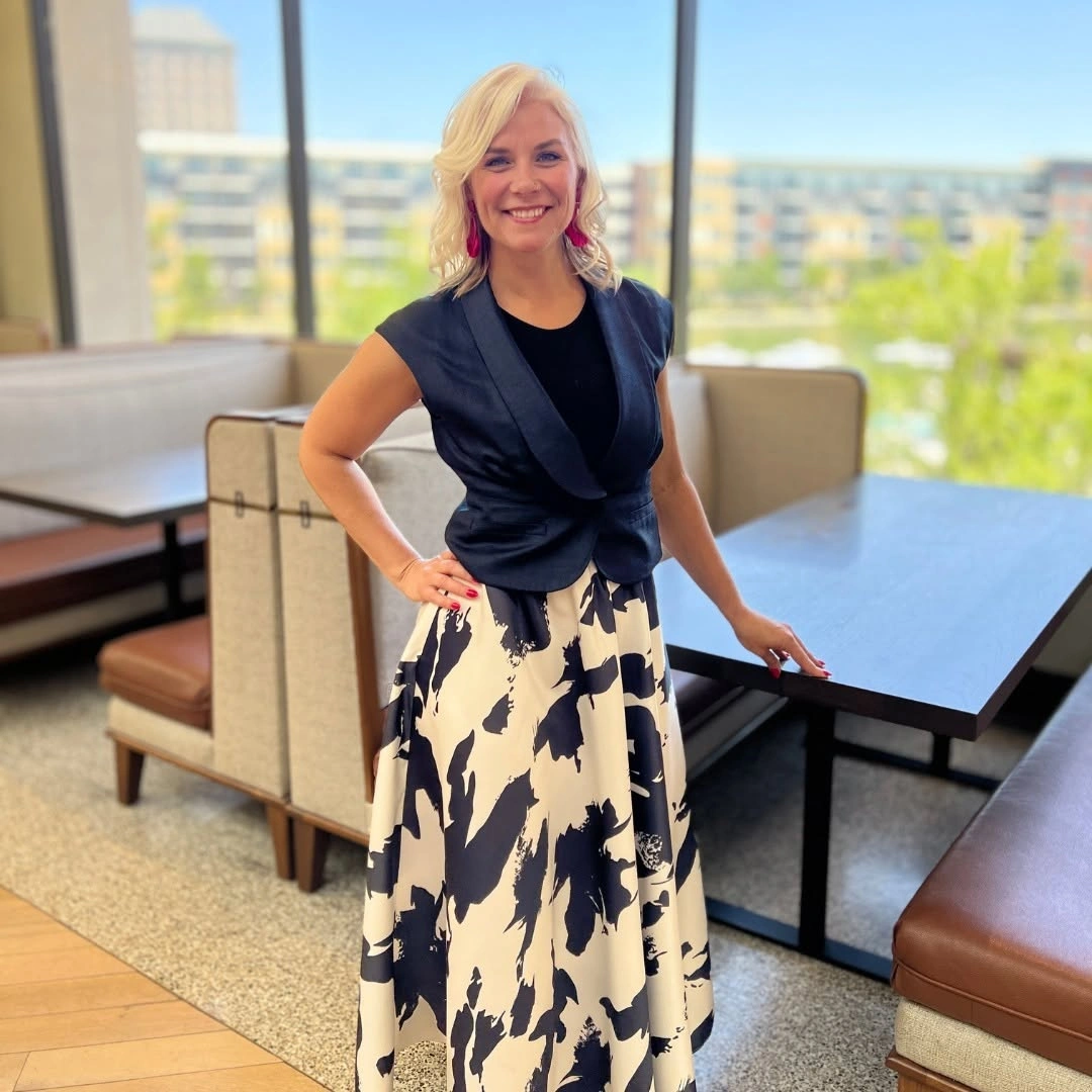
Photo via Instagram
The cream skirt carries a large dark abstract pattern that looks brush-like rather than regular or tiny. Because the marks spread across the lower half with uneven spacing, the skirt feels expressive without needing extra color. The contrast between the steady upper shape and the active lower pattern gives the outfit its clearest tension.
The interesting part is the split between control and motion. The dark sleeveless layer sets the frame, while the skirt lets the outfit loosen into graphic movement.
15. Red-Orange Trousers Answer a Graphic Top
The short-sleeve top has a busy graphic pattern with red, yellow, black and white shapes arranged in a bold floral-like repeat. The scale is large enough to make each color visible, so the print feels lively instead of blending into one surface. The top’s simple cut also lets the color and pattern carry most of the attention.
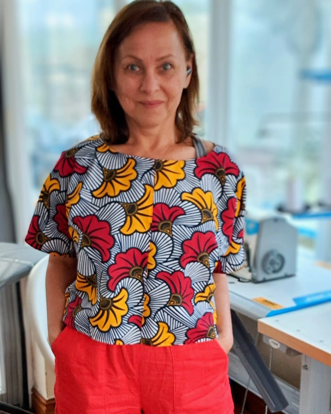
Photo via Instagram
The red-orange trousers relate to the red family in the top without pretending to be an exact match. That is what makes the color repetition feel useful: it connects the upper and lower halves while still allowing the print to stay varied. The trousers create a solid block below the graphic surface, giving the outfit a clear color answer.
The outfit shows how repetition can be looser than matching. A shared color family is enough to make the pieces speak to each other while keeping the overall look energetic.
16. Lavender Layering Frames a Small Print
The lavender blazer gives the patterned dress a softer outer frame without hiding the print. Its open front leaves the small repeated pattern visible from neckline to hem, so the dress still carries the center of the outfit. The jacket changes the read by adding a smooth, pale layer around a busier surface.
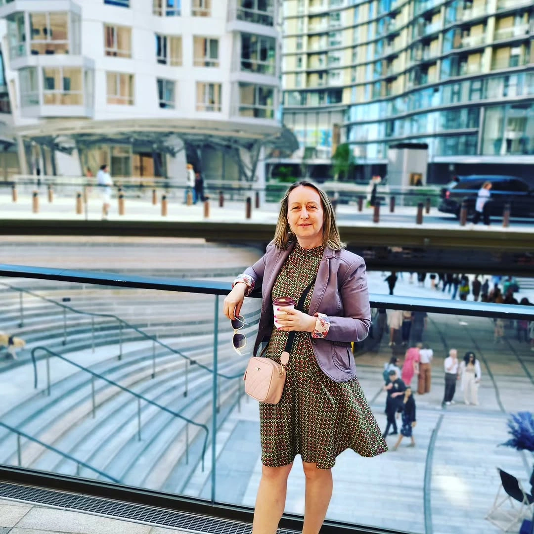
Photo via Instagram
The pale pink crossbody bag adds a second gentle color note, and its compact size keeps it close to the body rather than turning into a separate focal point. The cup is held, not worn, so it reads as part of the visible moment instead of part of the styling. Against the urban balcony setting, the outfit feels composed but not overly formal.
The strongest choice is the soft frame around a patterned center. I like how the blazer and bag make the print feel city-ready without making the dress disappear.
17. Cropped Denim Resets a Black-White Base
The pale cropped denim jacket interrupts the black-and-white base at a very specific height. Its frayed edge stops above the white pants, so the outfit gets a casual break right where the dark top would otherwise meet the lighter lower half. That short jacket length makes the proportions feel more deliberate than a full-length denim layer would.
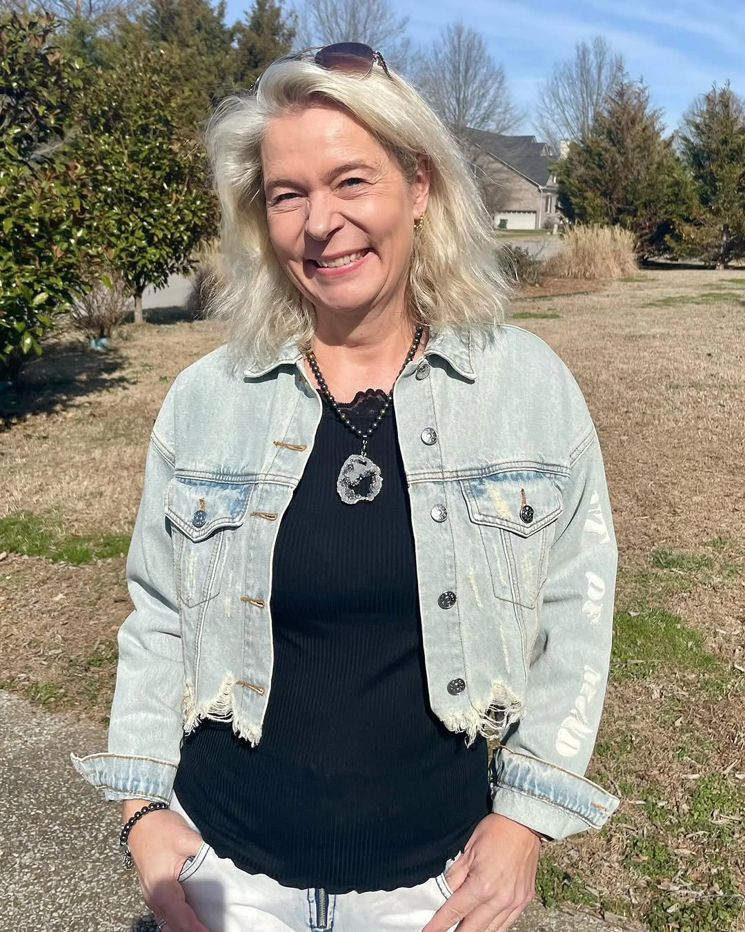
Photo via Instagram
The black top and white pants create a clean division, while the jacket softens that division with faded color and worn-looking edges. The large pendant necklace brings attention back toward the center of the chest, and the sunglasses resting on the head add another visible detail near the face. Those pieces make the casual layer feel personally styled rather than thrown over the base.
This outfit has an easy openness because the denim does not cover the whole structure underneath. The cropped jacket, pendant and sunglasses each sit in visible zones, giving the simple color split more character.
18. Tonal Blue Gains Dark Endpoints
The outfit builds its main statement through related blues rather than through a single matching set. The light blue long coat and upper layer sit above brighter blue wide-leg pants, creating a tonal shift from pale to saturated. That difference keeps the color story active while still feeling connected from shoulder to hem.
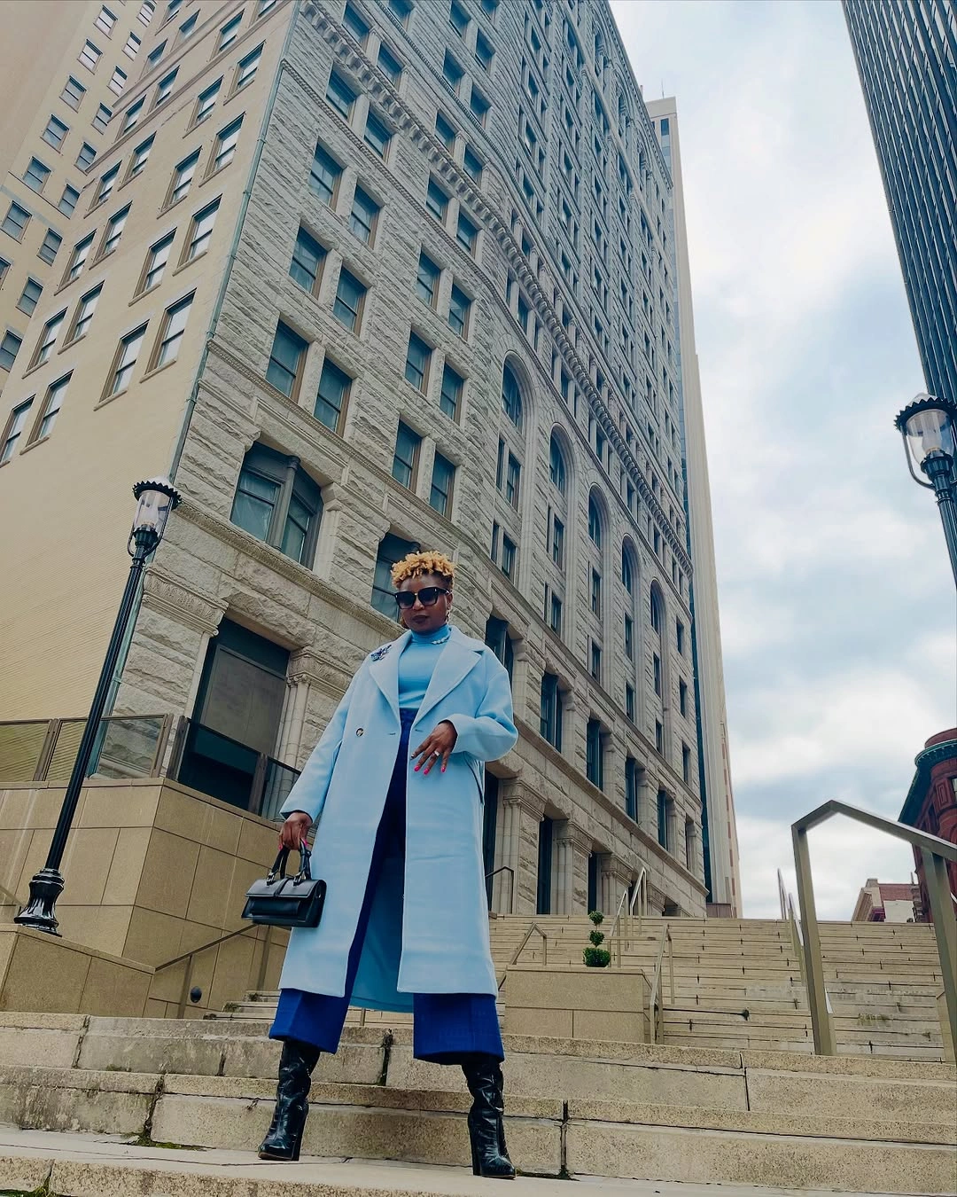
Photo via Instagram
The long coat and wide trousers create a strong vertical silhouette on the city steps, with the coat drawing a pale line down the outside and the pants adding a deeper block below. The black handbag and black boots act like endpoints, one held at the side and one grounding the outfit at the bottom. They sharpen the blue without turning the look into a black-and-blue contrast only.
The appeal here is the control of color temperature and placement. Blue carries the outfit, but the dark accessories decide where the eye starts and finishes.
19. A Printed Midi Dress Stays Relaxed
The gray printed midi dress carries its pattern through a long, uninterrupted line. The sleeves, bodice and skirt all share the same surface, so the outfit feels continuous before any accessory enters. Its length gives the print more room to register, which makes the dress itself the clearest style decision.
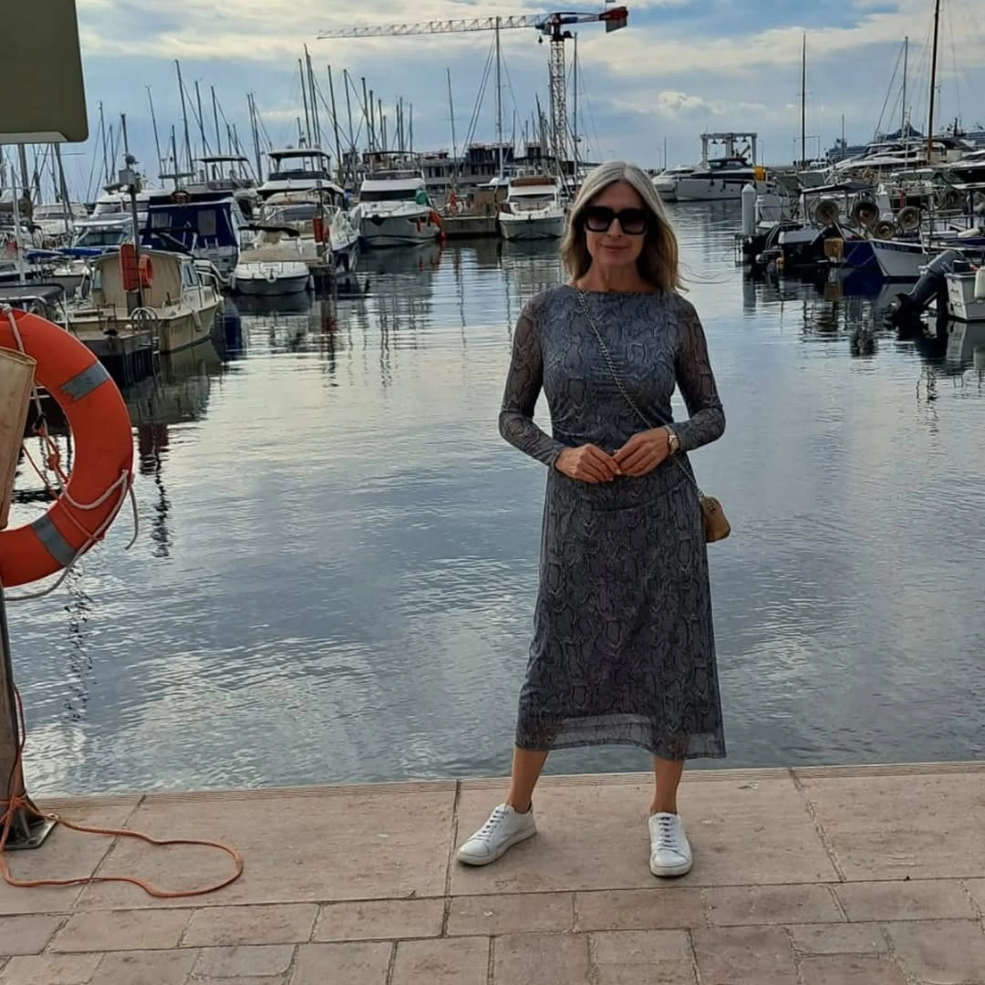
Photo via Instagram
The white sneakers interrupt that long patterned line in a practical, low-key way. They do not need to announce a trend; they simply change the finish from more dressed-up to more relaxed at the ground. The sunglasses and small tan bag add limited color and shape, enough to complete the outfit without pulling attention away from the dress.
The marina background gives the styling an easy visual setting, but the clothes do not depend on a story about being there. The useful idea is the balance between a long printed piece and simple shoes that let it stay wearable.
20. Everyday Graphics Meet Bright Blue Pants
The gray long-sleeve top starts the outfit with a large graphic across the front, giving the upper half a casual visual subject. Its muted base color keeps the drawing readable without adding another strong background shade. That makes the graphic feel like the outfit’s first point of personality rather than a small logo or hidden detail.
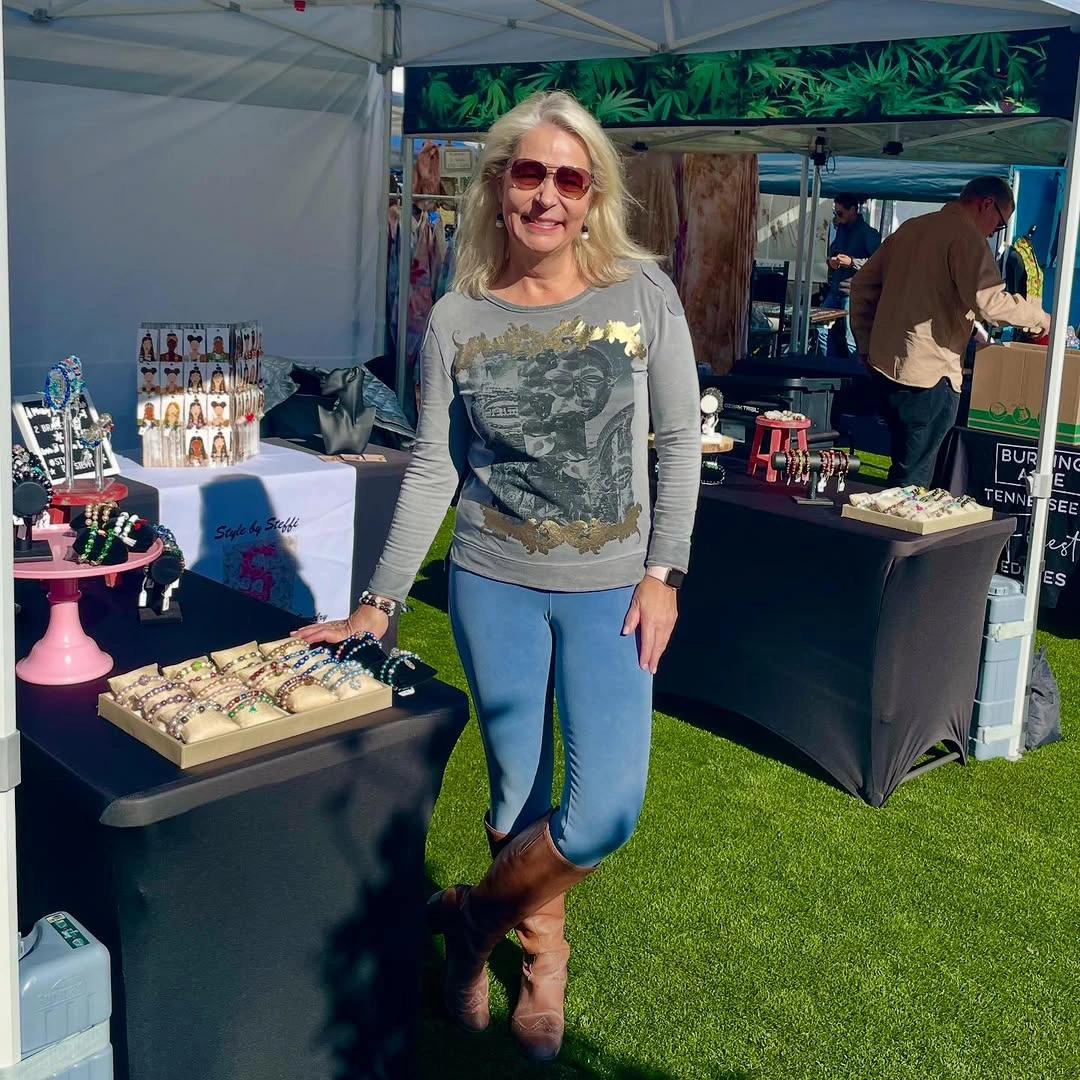
Photo via Instagram
The bright blue pants create the clearest color block, shifting the outfit from neutral graphic dressing into something more noticeable. Brown ankle boots add warmth at the bottom, while the red sunglasses introduce a separate color note near the face. The market booth setting is visible around the outfit, but the styling reads from the clothing relationships rather than any invented activity.
I like the way the colors do not try to match each other exactly. The blue pants, brown boots and red sunglasses each hold their own place, which makes the casual graphic top feel more intentional.