The detail people overlook often decides whether a manicure feels deliberate. A tiny shift at the edge, a clean pause between accents, or a finish that catches only in motion can change the entire balance of the hand. Looking closely is more useful than chasing a label, because the right detail should support the nail’s proportion instead of asking the rest of the look to explain it.
Choose the feature that deserves first attention, then remove anything that competes with it. Shorter nails usually need a restrained scale and a clear outline; longer shapes can carry more distance between elements, but they still need a quiet area. That simple test keeps a manicure readable in real life, where light, movement, and daily wear reveal whether the design has structure or only decoration.
1. A Tiny White Heart on Sheer Short Nails
The quietest design here depends on one very small decision: a short, softly rounded nail with a translucent blush-nude base and a tiny white heart. Because the other nails stay nearly bare, the heart reads as a point of punctuation rather than a repeated pattern. The warm gold ring nearby adds context, but the manicure remains centered on the clean curve, the small scale of the mark, and the amount of open space surrounding it.
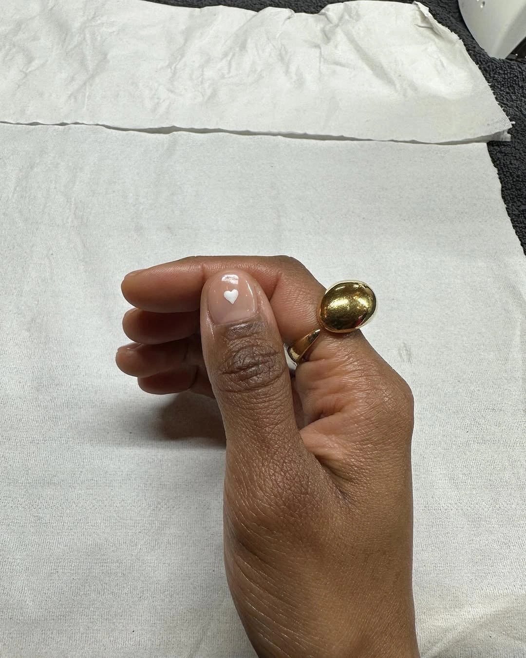
That restraint is useful when a short nail bed cannot spare much room for decoration. A large motif would compete with the compact shape, while a single small heart gives the eye somewhere to land without making the whole set look busy. Keep the base close to the visible pink-beige family and let the accent sit on one central nail; changing the heart to a tiny dot would preserve the same balance if a graphic shape feels too specific.
The tradeoff is precision. A tiny mark shows its scale immediately, so uneven placement will be more noticeable than it would be inside a dense design. The short rounded outline is forgiving for daily movement, but the clean effect depends on keeping the edge and surrounding skin neat. If the heart begins to feel overly sweet, retain the sheer base and replace it with one narrow white crescent for a quieter finish.
2. Glossy Cobalt Gives Almonds Clear Weight
Vivid cobalt blue takes over the second look without help from art, glitter, or contrasting tips. The nails are long and almond-shaped, and the saturated glossy color follows each curve evenly, giving the set a strong silhouette against denim and jewelry. That simplicity is exactly why the shade works: the eye reads the blue as one confident shape, while the almond outline keeps the color from becoming a flat block.
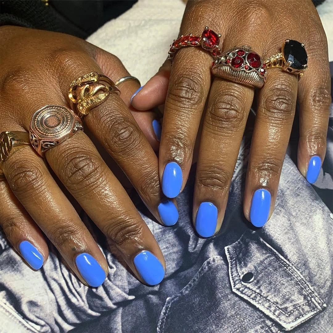
On brown skin, the cool blue creates a deliberate contrast that does not need to be softened with beige or brown. The finish also matters because the curved highlights keep a solid color moving as the hands change position. If you want the same idea at a more practical length, stop at a medium almond and keep the coverage uninterrupted; the color will still be the focal point, but the outline will interfere less with typing and small tasks.
A single saturated shade asks for a little discipline around the edge. Any gap at the cuticle or chip at the tip will interrupt the clean block more than it would on a mottled design, so the shape should be kept consistent from finger to finger. The result is strongest when the rest of the styling stays simple and lets the blue hold its own, which makes this a useful contrast to the layered ideas in brown fall nails.
3. Acid Olive Keeps a Compact Shape Fresh
This bright yellow-green olive manicure gains its character from the tension between an energetic color and a compact squared edge. The nails are medium length with rounded corners, and the glossy surface makes the olive shift toward yellow in direct light. There is no motif to explain or repeat, so the shape becomes a quiet control mechanism: it keeps an unusual color focused instead of allowing it to spread into a louder, more theatrical silhouette.
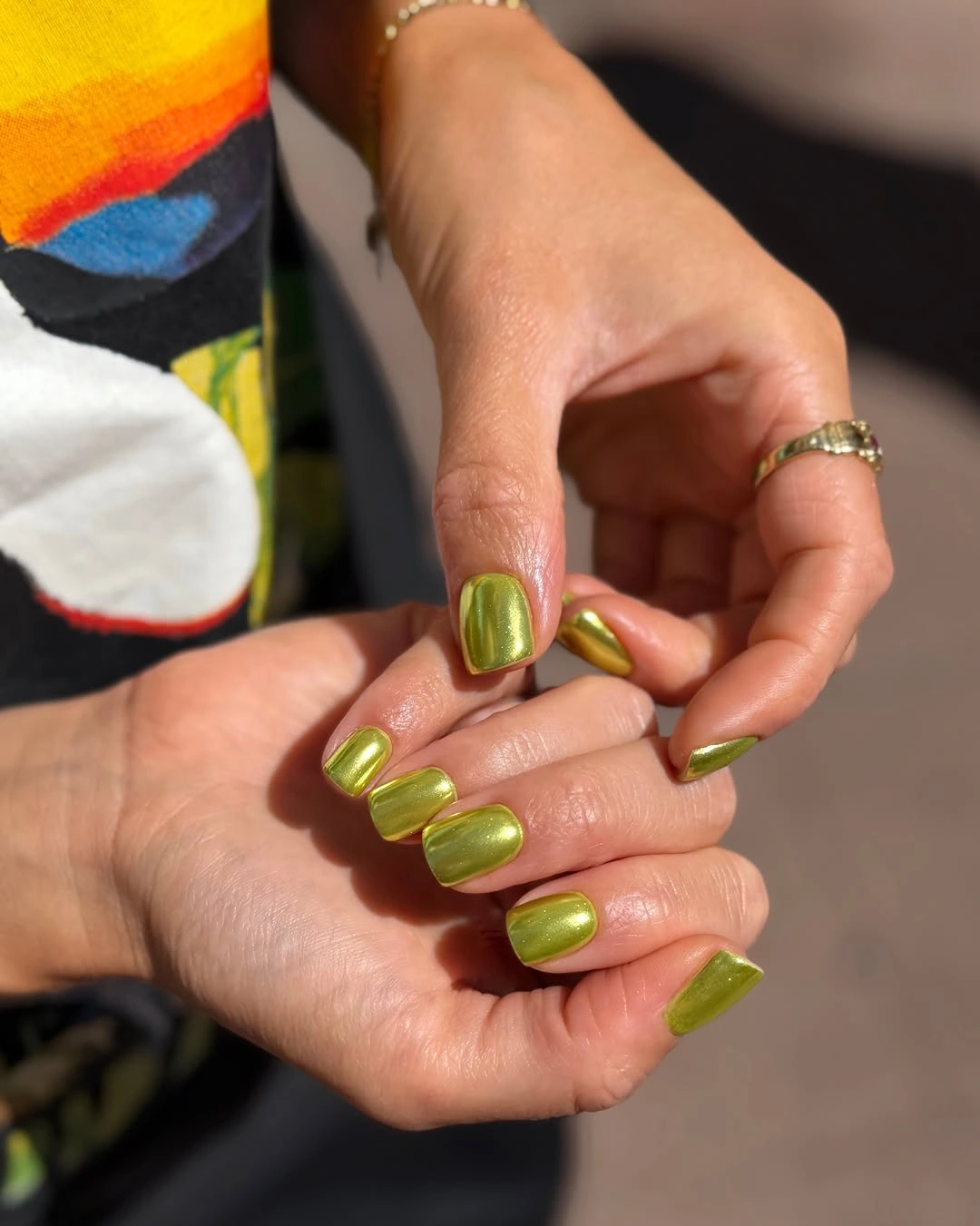
The color is easiest to wear when the nail length does not compete with it. A longer outline would make the acid quality feel even more graphic, while the medium square gives the shade a clear boundary and leaves the hand looking purposeful. If your wardrobe already contains strong prints, keep the nails at this compact proportion and let the olive act as the single bright note; if the color feels too sharp, a softer muted olive can follow the same placement logic.
Clean edges matter here because yellow-green makes small inconsistencies visible. The glossy surface reflects the surrounding light, so uneven corners or a crowded cuticle area will interrupt the simple color block. A practical version keeps the same squared outline but shortens it slightly, then treats the color as the complete statement. That is a different kind of fall choice from the earthy palettes in fall nail designs for all skin tones: the interest comes from contrast, not depth.
4. Fine Shimmer Makes Orange Feel More Layered
Warm orange-red is already expressive, but the fine reflective shimmer across these medium oval nails changes how the color behaves. Instead of reading as a single flat pumpkin block, the surface breaks into small points of light that appear and disappear with movement. The oval outline stays soft, so the finish becomes the defining decision. Nothing else competes with the shade, and the close view makes the difference between a flat solid and a lightly textured one easy to notice.
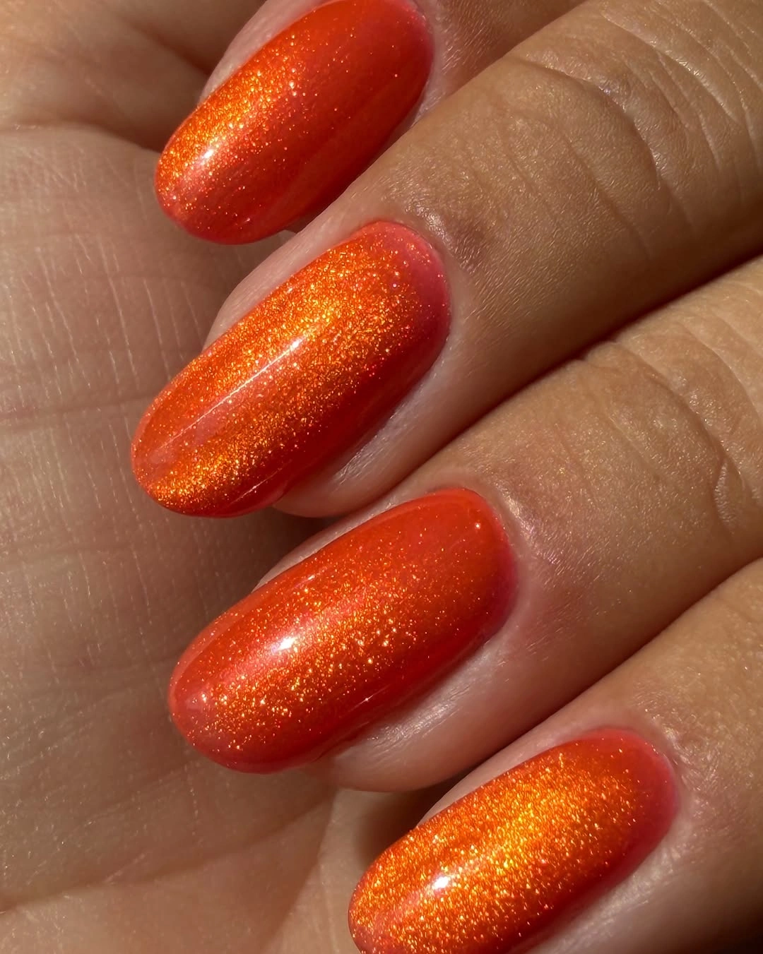
That fine shimmer is a useful way to keep a warm color dimensional without adding a separate accent nail. It supports an autumn palette while avoiding the heavier look of large glitter pieces, and the medium oval length gives the glow enough area to travel across each nail. For a shorter version, keep the color on every nail but use a softer rounded edge; the visual idea survives because the reflection, not the length, is doing the decorative work.
There is still an upkeep consideration. A rounded edge can show growth and small chips clearly when the color is saturated, even if the shimmer disguises minor brush variation in the center. Keep the surface smooth-looking and the outline consistent, especially if the hands move between bright and dim light. The honest appeal is its simplicity: one warm shade, one quiet finish change, and no claim that the manicure needs a special technique to feel considered.
5. Creamy Butter Yellow Brightens a Long Almond
Pale creamy yellow can look too light when the shape has no definition, yet the long almond outline gives this manicure enough structure to hold the color. The nails are evenly covered in an opaque butter-cream family with a glossy surface, and the green stone ring creates a small counterpoint without becoming part of the design. The result is a light seasonal option that feels warm rather than stark because the color sits closer to cream than to pure white.
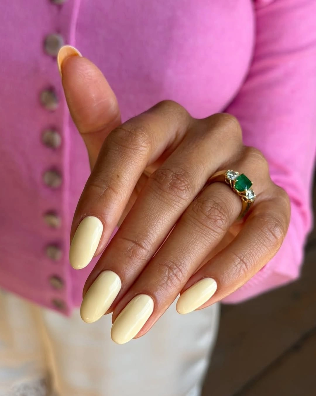
The shape is doing practical visual work. A long almond adds a tapered line that lets a pale color read as intentional, while a shorter almond would make the same shade feel softer and more neutral for everyday use. If you prefer less length, keep the polish opaque and shorten the point gradually rather than switching immediately to a square; that preserves the elegant outline and prevents the light color from becoming visually boxy.
Because the base is pale, edge wear may show quickly against the surrounding skin. A clean cuticle boundary and consistent almond tips will matter more than adding a design element, and a simple color like this benefits from being checked in both warm and cool light before committing. For readers who usually reach for deeper shades, this is a useful reminder that fall can be expressed through warmth and proportion, not only through burgundy or brown.
6. Soft Pink Lets a Short Square Stay Playful
Short square nails in glossy light pink become more lively through their setting, not through added nail art. The compact edges and rounded corners are clear against the green textured background, while the color stays an even soft pink across the hand. That contrast matters because the manicure itself is intentionally plain: the bright surroundings make the restrained shade feel fresh, yet the short proportion keeps the look grounded and easy to repeat.
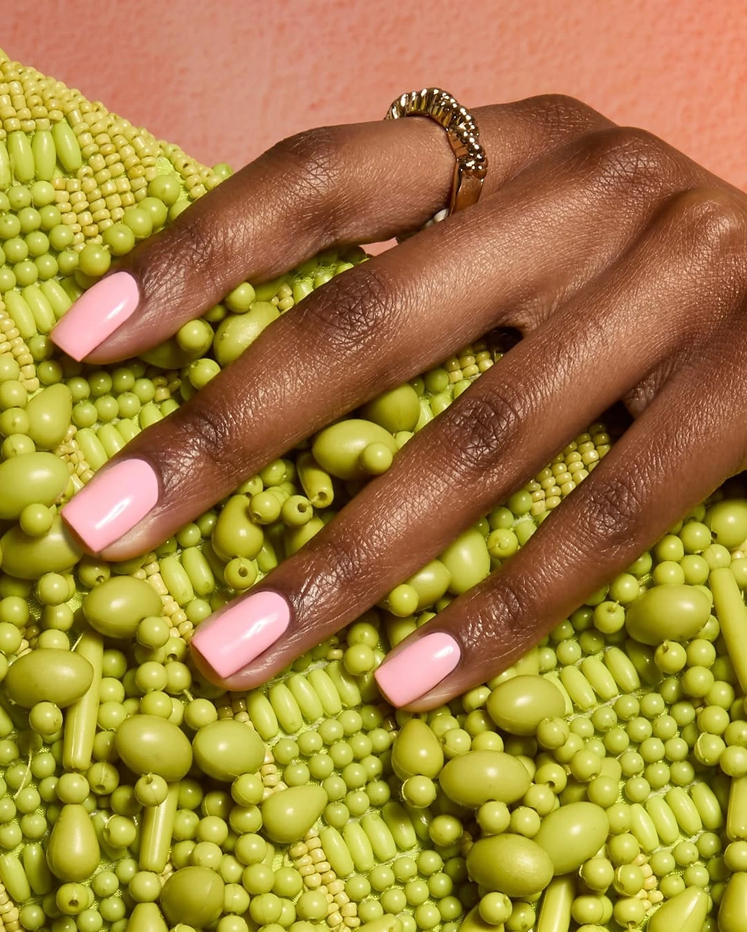
This is a good example of letting context sharpen a simple choice without mistaking context for the manicure. The pink has enough shine to look finished, but it does not need dots, lines, or a second color to become interesting. Keep the corners compact if you want a practical shape, or soften them into a rounded squoval when straight edges tend to catch. The design remains recognizable as long as the color stays the calm center.
The limitation is that a plain light shade depends on clean preparation more than a dense pattern would. Any unevenness near the edge can pull attention away from the color, and a very bright outfit may compete with the softness. If that happens, deepen the pink slightly rather than adding more decoration. The short outline, smooth gloss, and controlled color are already enough to make a wearable fall base.
7. Burgundy Stripes Lengthen the Visual Rhythm
Deep burgundy lines over a pale base give these compact squared nails a vertical rhythm that changes how the length is perceived. The stripes run along the nails with slight variation in spacing, so the design feels drawn and graphic rather than mechanically repeated. That placement is the key detail: the color is not simply sitting on top of the nail, it is guiding the eye from the base toward the edge and giving a medium square a little extra visual lift.
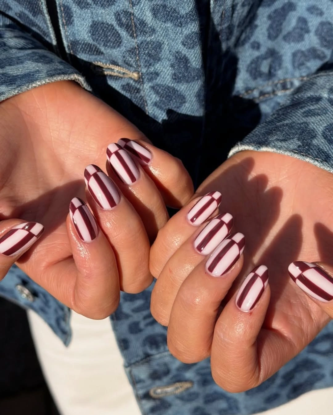
The wine-and-cream contrast works because the surrounding space is allowed to remain pale. If every section were filled with burgundy, the short shape would feel heavier and the line work would lose its purpose. For a reduced version, place the stripes on two accent nails and keep the others in one of the quiet base colors. That keeps the seasonal reference clear while making spacing easier to control on a smaller surface.
Graphic lines also create a realistic precision tradeoff. They do not need to be perfectly identical to look intentional, but they should share a direction and avoid bunching near the center of the nail. A medium square is a good compromise because it provides enough room for the rhythm without requiring a long extension-like outline. The look sits naturally between a simple solid and the more expressive options in fall nail inspiration.
8. Translucent Rosy Nude Uses Depth Instead of Art
The long coffin shape is not the only point of interest in this neutral manicure. The rosy nude base appears translucent, so the color has depth rather than a flat opaque wall, and the tapered squared ends make that depth easy to see. Rings and dark clothing frame the nails, but the design itself stays quiet: its visual character comes from the relationship between a barely-there warm tone and a clearly extended outline.
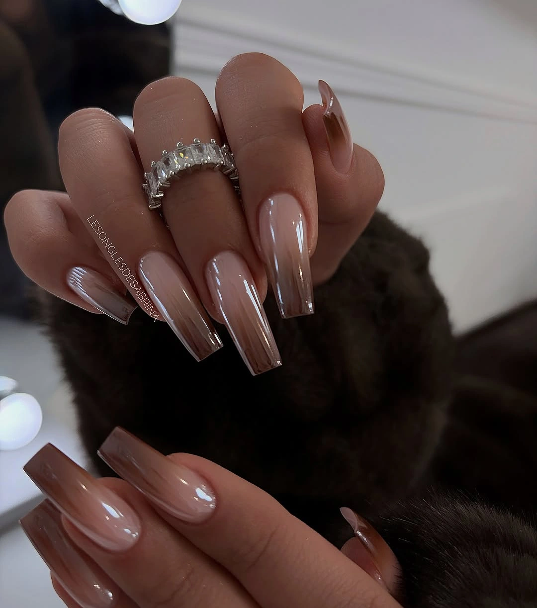
A translucent-looking neutral is useful when you want the hand to feel polished without adding contrast. The color lets the shape carry more responsibility, which is why the long coffin outline feels deliberate instead of unfinished. If daily movement makes the length inconvenient, shorten the edge while preserving the tapered square, or shift to a medium almond for a softer line. The base can remain quiet because its depth already supplies interest.
Long length is the honest limitation. A sheer neutral may be forgiving in color, but it cannot hide snagging, grow-out, or an uneven outline when the silhouette is this visible. Keep the finish smooth-looking and resist adding a motif merely to make the manicure feel more complete. A restrained base can be the strongest choice when the surrounding shape is doing enough visual work.
9. Lavender Tips Add a Small Graphic Surprise
Pale lavender nails with white tips already have a soft, airy direction, but the small dark dots at selected edges shift the mood toward something more playful. The long almond shape keeps the pastel base elegant, while the tip detail gives the eye a clear place to pause. Because the dots are limited to the edge, they do not erase the lavender field or turn the manicure into a full print.
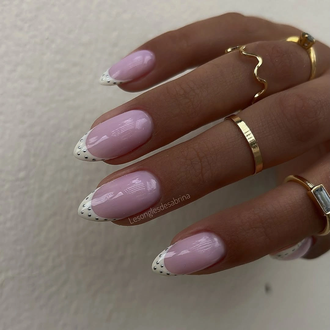
The balance comes from scale and placement. A dark mark near the tip has more influence than its size suggests, so it can create contrast without demanding a second accent color across the hand. If the full set feels too detailed, keep the white tips on every nail and place the dotted treatment on one or two only. A medium almond would also preserve the same soft-to-graphic progression while making the edge easier to maintain.
Pastel designs can lose definition when the tip line becomes too thick or the dots spread into the base. Keep the lavender visible and let the small marks support the edge rather than compete with it. The result is especially useful when you want a lighter alternative to dark fall colors but still need one detail to keep the set from feeling unfinished. Quiet color benefits from a deliberate boundary.
10. Peach Nude Finds Warmth Against Deep Green
A pale peach-beige nude can look almost neutral until it is placed against a deep green sleeve, and that contrast reveals the warmth in the color. These nails are long and almond-shaped with an even glossy surface, so the design is carried by a single warm block and a tapered outline. There is no accent nail to interrupt the rhythm, which makes the surrounding styling important without taking attention away from the manicure.
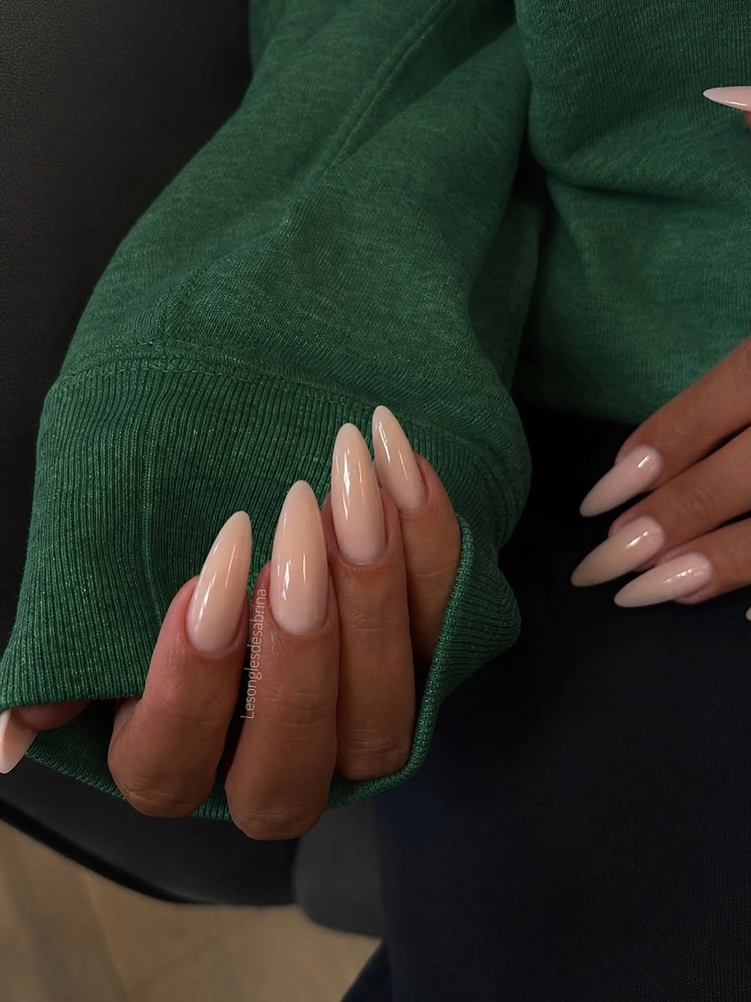
The length gives the light shade presence. On a shorter nail, the same peach would read more quietly, while the long almond turns it into a visible color decision that can balance deeper clothing. If you type often or prefer less interference, use a medium almond and keep the base opaque-looking; the warmth will remain, but the proportion will feel more relaxed. A plain nude works best when the edge is clean and the tone is allowed to show.
This design also shows why a seasonal manicure does not need to be dark. The warm peach can sit beside green, brown, denim, or cream without forcing a matching outfit, and the glossy surface gives enough finish to avoid a washed-out effect. The limitation is length rather than color: shorten the outline first if you want practicality, then decide whether the shade needs any additional detail at all, using the proportion logic in fall almond nails as a useful shape check.
11. Deep Red Lets Gold Stay Selective
Deep burgundy-red carries most of this long coffin manicure, while gold-looking accents appear only on selected nails. That distribution keeps the metallic points from flattening the whole set into one bright surface. The squared ends make the color feel substantial, and the white fabric around the hands gives the wine base a clean stage. The defining decision is not simply red plus gold; it is the amount of gold allowed to interrupt the red.
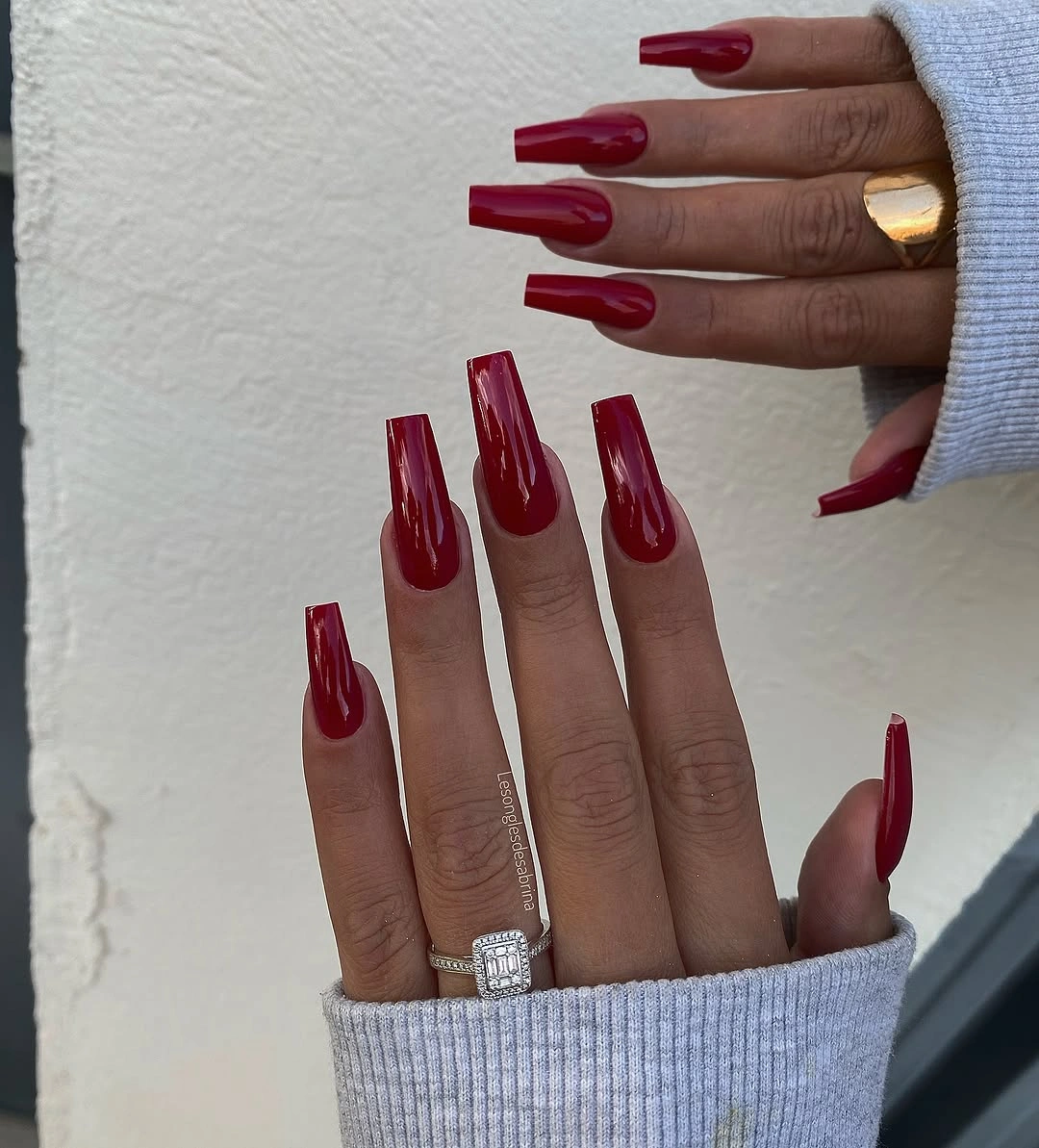
Selective placement gives the eye a rhythm. A few metallic-looking sections create focal points, while the remaining burgundy nails provide relief and keep the palette coherent. If you want a more wearable version, reduce the gold to one or two fingers before changing the red; that preserves the strongest idea and avoids placing high-maintenance detail across every edge. A medium coffin or soft square can also lower the daily commitment.
The tradeoff is upkeep in two directions. Long squared tips need consistent filing, and bright accents can show lifting or surface wear sooner than a plain dark color. Keep the dark base neat, let the metallic pieces stay visually separated, and treat the design as a contrast study rather than a promise of any particular material. When the gold is restrained, the manicure keeps its depth and avoids becoming noisy.
12. Cool Edge Detail Sharpens a Milky Base
Long pointed nails in a milky pale base can disappear against light fabric, so cool blue-silver edge accents provide the needed outline. The color stays soft through the center, while the reflective-looking lines trace or sharpen selected edges and make the pointed silhouette easier to read. That is a small placement decision with a disproportionate effect: the border gives definition without replacing the calm base.
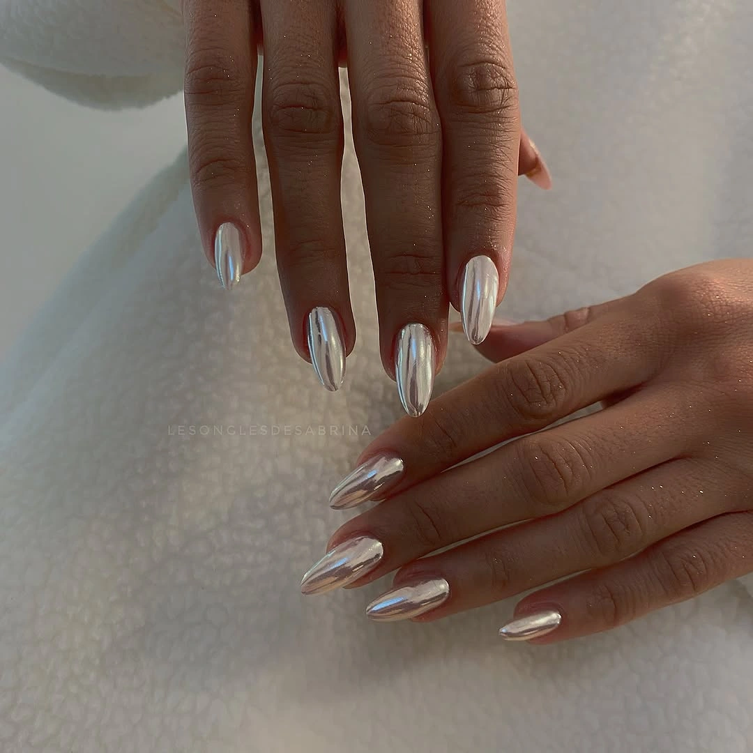
Edge detail works differently from a centered motif. It leaves the middle open, which makes the nail appear longer and keeps the manicure visually light even at an extended length. If the point feels impractical, move the same cool outline to a medium almond and use it on two accent nails. The design will lose some drama but retain the principle of using a perimeter to give a pale shade structure.
Fabric catches and pointed tips are the honest concerns here. The longer edge can interfere with sleeves or soft materials, while any break in a pale outline is immediately visible. Keep the border fine and avoid crowding it with additional art. The manicure is strongest when its cool detail remains a frame, allowing the milky base and the hand’s natural movement to provide the rest of the rhythm.
13. Earthy Mismatched Shades Need One Shared Thread
This medium almond set uses several individual color decisions: pale nude, warm brown, black, and a metallic-looking gold accent. The nails do not repeat one single motif, yet they feel related because the palette stays close to an earthy range and the almond tips keep the silhouettes consistent. The small detail to watch is the shared warmth; without it, mismatched nails can look like unrelated samples rather than one planned manicure.
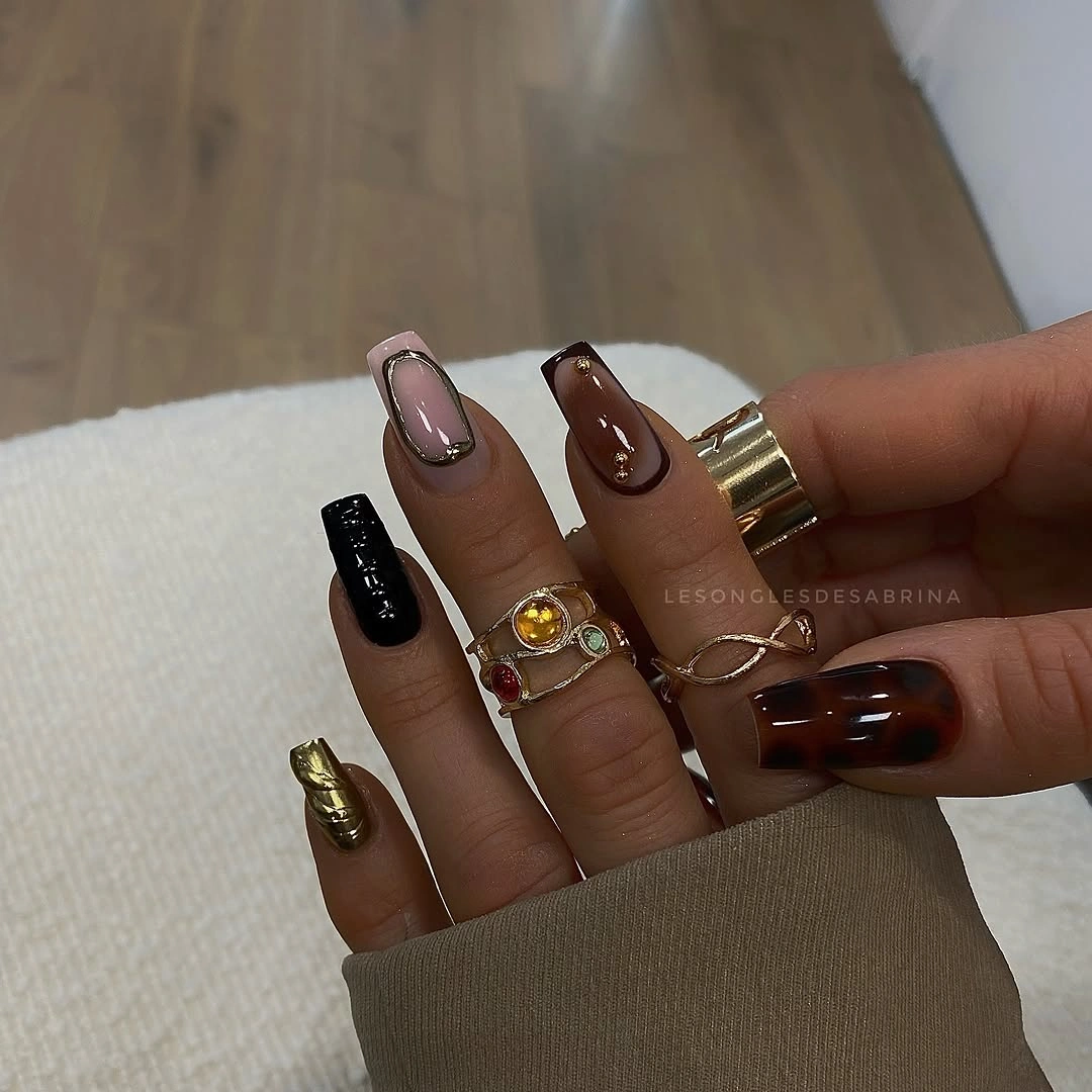
Color distribution is more important than exact repetition. A quiet nude can provide breathing room, brown can carry the seasonal weight, black can sharpen the contrast, and one reflective-looking accent can catch light. If four tones feel excessive, remove one before changing the shape. A three-color version using nude, brown, and black will keep the visual logic, while the almond outline still gives the hand a cohesive finish.
The practical advantage of this approach is flexibility: you can substitute nearby shades without rebuilding a motif, as long as the values and undertones remain balanced. The limitation is decision fatigue, because every nail becomes part of the palette plan. Check the colors together in the same light and keep one shade clearly dominant. The result should look curated, not crowded, and the final contrast should remain easy to read.
14. Pale Yellow Holds a Clean Seasonal Line
Long almond nails in pale yellow make a strong point through consistency. The color is smooth and glossy from nail to nail, the tips keep the same tapered curve, and no motif competes with the light block. Against white texture and jewelry, the manicure looks almost graphic, which shows why pale color does not have to mean barely visible. The outline and the even coverage give the shade enough visual authority.
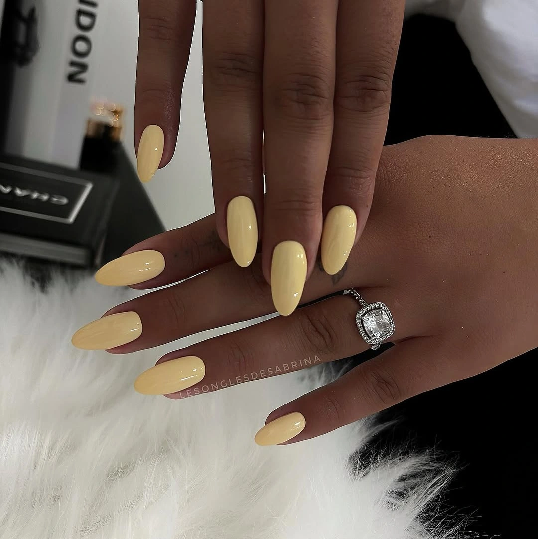
A light yellow can work as a fall choice when it is treated as a deliberate palette decision rather than a background neutral. The warm cream quality sits comfortably beside brown, denim, olive, or burgundy, while the almond shape keeps the hand from looking overly square. For a shorter adaptation, keep the color on every nail and preserve the gloss; changing the silhouette is enough to make the result more practical.
Because the manicure is so clean, the edges become the measure of success. Pale color can reveal small gaps, while long tips make any mismatch between fingers more visible. There is no need to add glitter simply to increase interest; the value comes from letting one unusual light shade remain uninterrupted. If the color feels too bright, soften the length or choose a slightly warmer cream, not a busier design.
15. Lavender and Warm Tips Create Controlled Tension
A pale lavender base paired with vivid yellow-orange tip sections creates a warm-cool tension that is easy to see from a distance. The long almond shape gives the two-tone edge enough room to remain legible, and the gray clothing around the hands acts as a quiet bridge between the colors. The manicure is not relying on multiple motifs; it is using the boundary between soft purple and warm light to create the focal point.
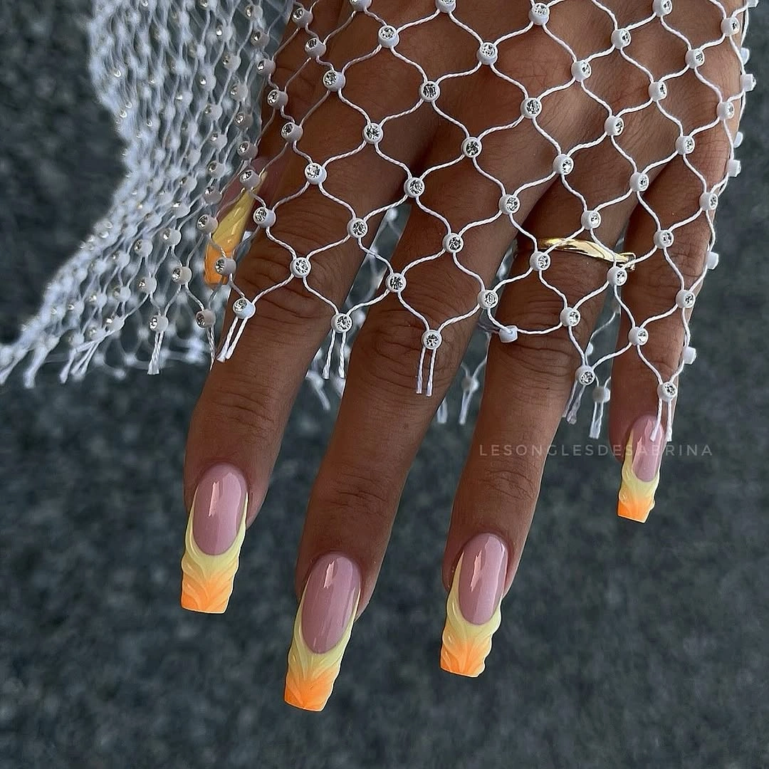
The color split is strongest when the warm tip remains concentrated. If it spreads too far into the base, the lavender loses its role and the set can start to look like a collection of unrelated bright sections. On a shorter almond, keep the warm edge on two accent nails or use a narrower tip. That preserves the contrast while respecting the smaller surface and reducing the amount of precision required.
This kind of design is expressive but still adaptable because the shape stays consistent. You can trade yellow for a muted ochre or orange for a softer terracotta without changing the placement logic, as long as the base remains visibly cooler. The main limitation is visual crowding: keep the center clear and let the tip transition do the work. Controlled contrast is more wearable than unlimited color.
16. Blush and White Use Alternating Negative Space
The long coffin manicure alternates translucent pink-looking sections, solid white accents, and pale outlined edges. That mix creates negative space because not every nail is filled with the same visual weight, and the squared tips give the variety a shared frame. White fabric echoes the opaque areas, but the blush sections remain visible enough to stop the set from becoming a simple white block.
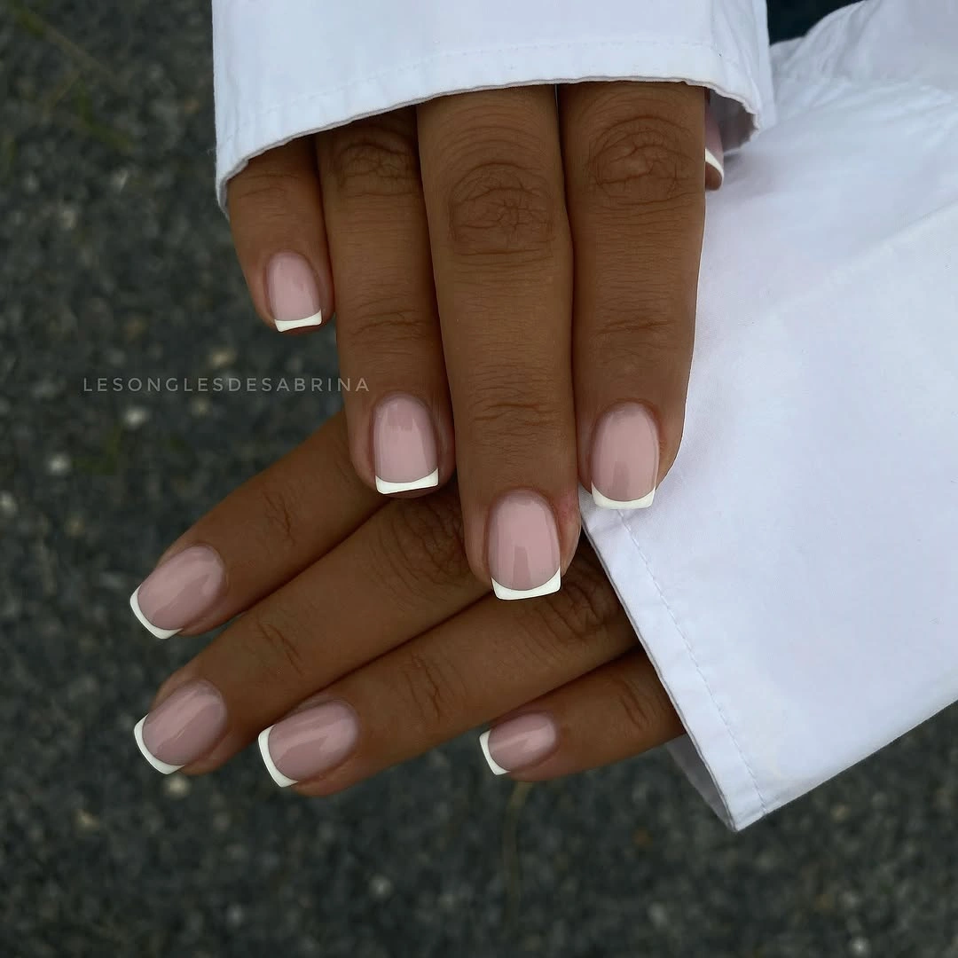
Alternation keeps the eye moving without requiring a repeated pattern. A solid white nail can act as a pause, while a sheer pink section brings back openness and makes the next accent feel lighter. If you want less length or less contrast, keep the outline on two nails and the white block on one, then use the blush tone elsewhere. The manicure will still read as a conversation between transparency and opacity.
The long coffin edge is the practical cost. It gives the design room to breathe, but it also creates more surface to protect and more corner to maintain. Avoid adding another motif simply because the set already mixes finishes; the strength is in the existing difference between pale solid and sheer space. A shorter soft square can carry the same idea with a clearer everyday limit.
17. Moody Dark Gloss Gets One Reflective Interruption
Deep brown-black almond nails can become visually heavy when every surface reflects the same way, so the single metallic-looking accent in this set changes the rhythm. Most nails remain dark and glossy, while one reflective detail catches light differently and gives the eye a stopping point. Denim and jewelry keep the mood casual, but the manicure itself stays controlled because the contrast is concentrated rather than repeated.
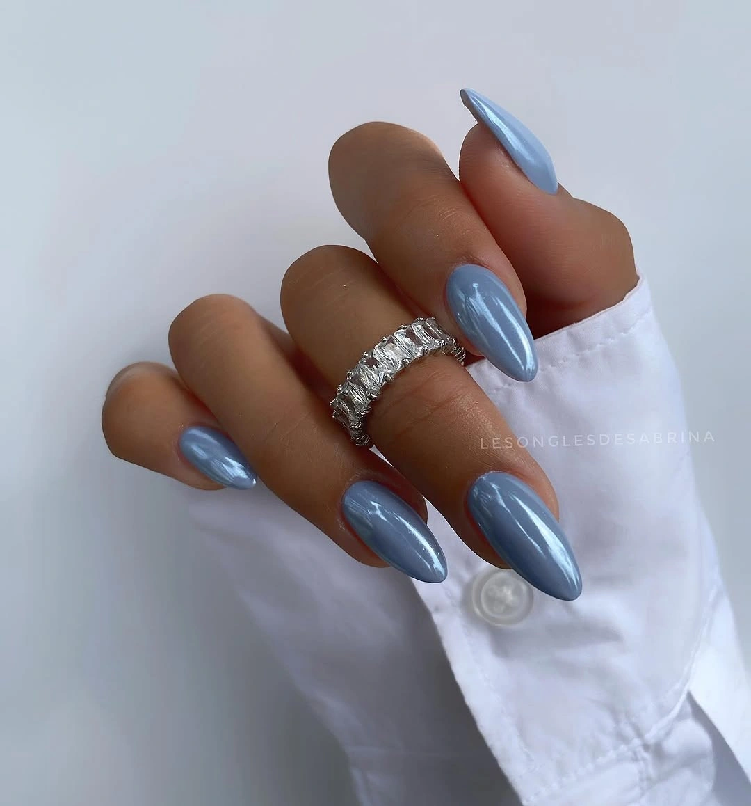
The useful lesson is not that a dark set needs sparkle; it is that one interruption can be more effective than several competing accents. Keep the near-black brown as the dominant color and use the reflective detail where the hand naturally bends or catches light. For a shorter adaptation, preserve the same one-accent rule and choose a soft almond or rounded square so the dark block remains manageable.
Dark gloss is honest about maintenance. Small chips and cuticle gaps show clearly, and the reflective accent may draw attention to surface changes around it. A neat outline and limited detail will help more than extra decoration. If the dark brown begins to feel too severe, shift it slightly warmer rather than adding another color; the broader shade comparison in fall nail colors for dark skin can help keep that change deliberate.
18. Chocolate Depth Works Through Subtle Contrast
Deep chocolate brown carries this long almond manicure, but one darker oval or reflective-looking detail changes the surface without breaking the monochrome mood. The color remains close to the dark family across the hand, so the design depends on a small value shift rather than a bright accent. Pale fur and gold rings provide the surrounding contrast, leaving the nails to explore how much variation a restrained palette can hold.
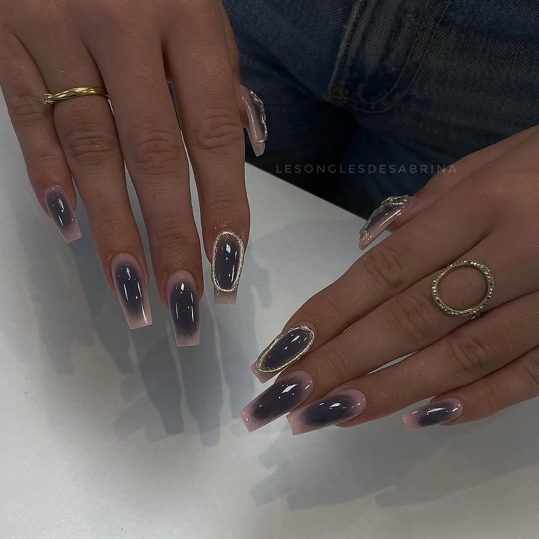
Subtle contrast is useful when a reader wants interest but does not want a decorated manicure. The almond outline makes the dark shade feel elongated, while the internal oval gives one nail a slightly different reflection. If the detail is difficult to reproduce, keep the entire set in chocolate and vary only the finish on one nail. The visual idea stays intact because the difference remains quiet and close to the base.
The practical limit again comes from length, not from the palette. A long almond can interfere with small tasks, and a deep color benefits from clean edges because any gap will read as a break in the dark field. Keep the shape medium if you want the mood without the commitment. The design is most convincing when its restraint is visible and the subtle accent does not ask to become a new theme.
19. Purple Reflection Brings Motion to a Solid Set
Long almond nails in reflective purple-magenta do not need a separate motif because the surface changes as the hand moves. The color remains solid, but curved highlights shift between violet and pink, giving the manicure a sense of motion against gray clothing and a watch. The key detail is the finish behavior: the set looks different from one angle to the next while keeping one clear color identity.
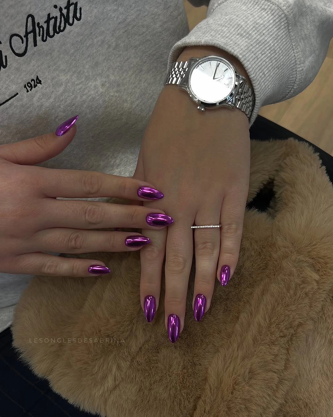
This is a strong choice when you want impact through light rather than pattern. The long almond outline gives the reflection more space, yet a medium almond would keep the same saturated color and make daily movement easier. Avoid adding lines or stones unless the reflection truly feels insufficient; extra detail could interrupt the clean surface that makes the purple interesting in the first place.
Reflective surfaces can reveal marks and edge wear, especially when the color is dark enough to show every interruption. Keep the silhouette even and let the surrounding clothing stay neutral if you want the purple shift to remain readable. A softer plum or berry version can preserve the same movement for a more muted fall palette. The finish supplies the variation, so the design can stay quiet.
20. Milky Pink and White Turn Contrast into Structure
Alternating sheer pink, solid white, and pale outlined tips gives the final manicure a clear structure without relying on a busy pattern. The nails are long with squared coffin ends, and the difference between translucent-looking blush and opaque white makes each finger feel intentional. The white fabric around the hand repeats the light accents, but the pink sections keep the set from becoming visually flat.
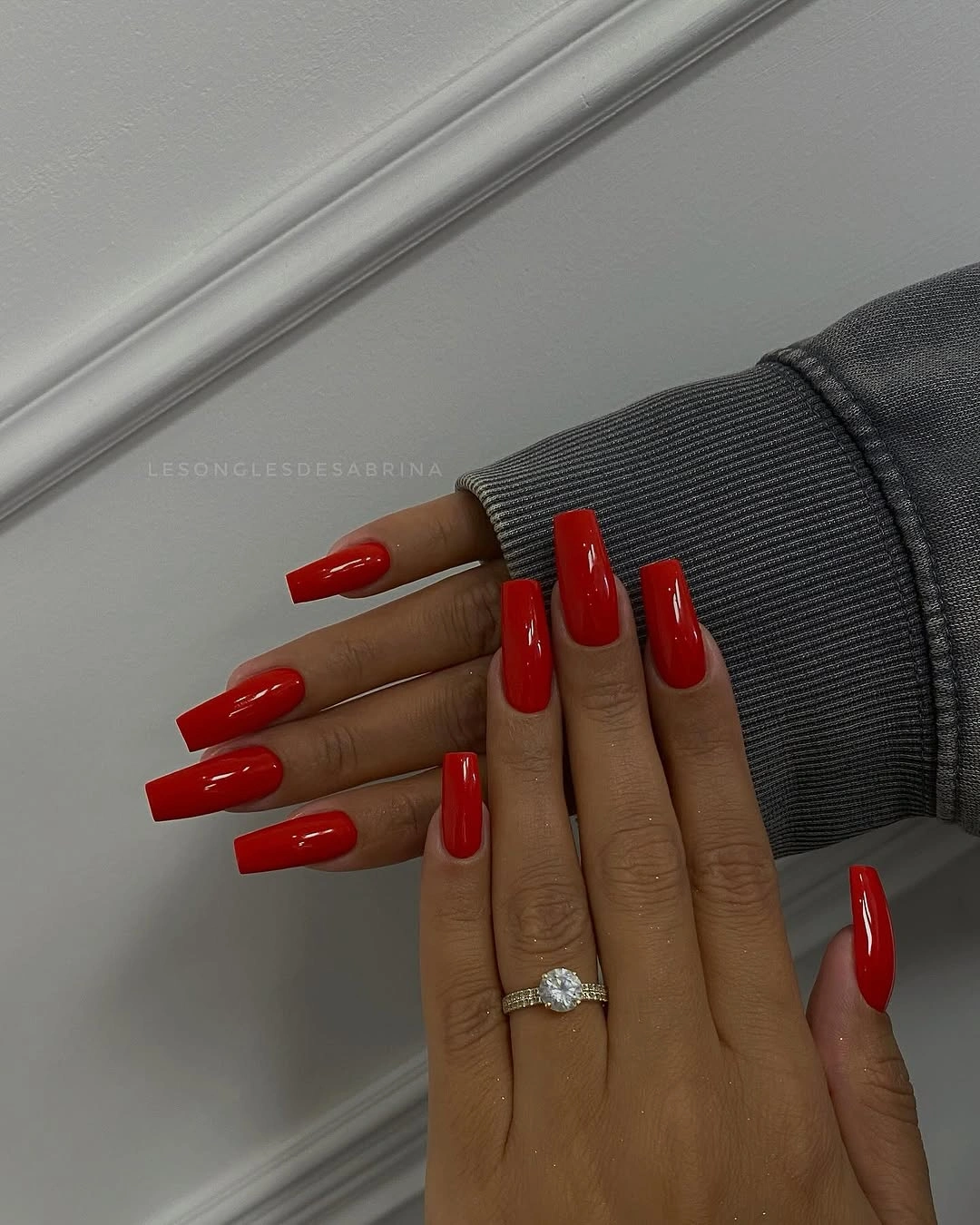
The contrast works because it is distributed. A white nail can act as a strong pause, while the outlined blush nail allows more of the pale base to remain open. If the full alternation feels too demanding, use white on one accent nail and keep the outlined treatment on two others. A shorter coffin or rounded square will reduce the maintenance without removing the relationship between solid and sheer.
Keep the shapes consistent even if the colors change from nail to nail. Mixed coverage can look accidental when the outline varies, and pale edges show wear quickly against the skin. There is no need to add more color; the existing pink-white conversation is enough. The quiet conclusion is practical: let contrast organize the manicure, then stop before the structure becomes clutter.
21. Silver Edges Keep a Pink Base Open
A soft pink base with white opaque accents and outlined edges creates a more open design than a full-coverage manicure, especially on a long coffin silhouette. Some nails read as milky white, while others keep translucent blush space inside a pale border. That difference gives the hand a measured rhythm: solid, open, solid again. The design feels complete because the contrast is organized, not because every nail carries the same amount of color.
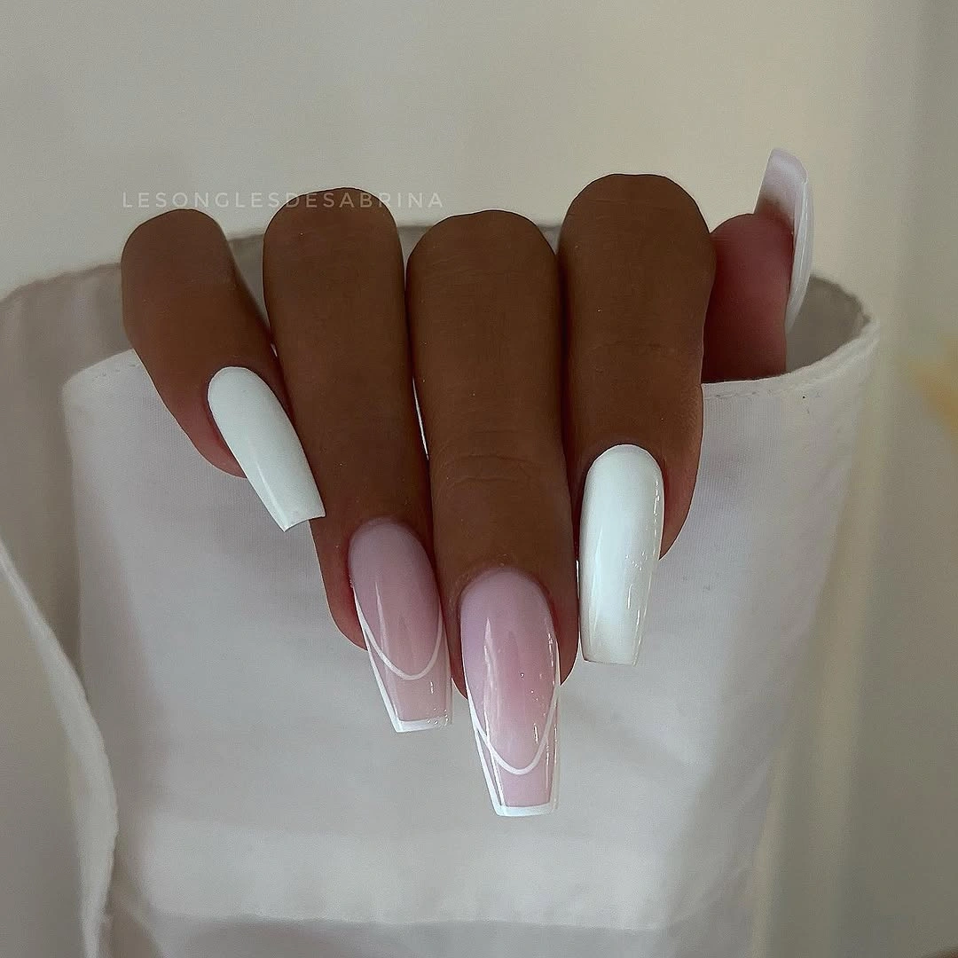
Negative space is useful when you want length to remain visible. The sheer sections preserve the lightness of the hand, while the white accents anchor the look and stop the outline from disappearing. To make the idea more wearable, keep the border on two nails and use the solid white only once, then move to a medium soft square. The visual principle survives as long as the open-and-opaque rhythm remains clear.
The final tradeoff is detail density around the edge. Long coffin tips give the design a polished frame, but they also make corner wear and uneven lines more noticeable. Keep the palette limited to blush and white, let the hand’s movement provide the change in light, and resist adding an unrelated motif. A well-placed border can say enough when the surrounding space is left deliberately quiet.