Fresh nail art is not the same as adding more color or more detail. It is the moment when one deliberate mark makes the hand feel clearer without asking the eye to decode a crowded surface. A design earns attention when its open space is doing as much work as its decoration, because clarity is what keeps a creative manicure from becoming visual noise.
When testing a fall nail art idea, cover the busiest detail with your thumb. If the manicure still has a clear direction, the balance is strong; if everything disappears, the design is leaning on clutter. Keep the first decision obvious and let the rest support it, so the result feels intentional even when the viewer notices it only for a second.
1. Short Abstract Tips on a Pale Base
Short rounded-square nails keep their pale base open while burgundy and brown curves gather around the tips and side edges. The marks vary slightly from nail to nail, which gives the set a lively hand-drawn quality instead of a rigid repeated stripe. That small variation is exactly what makes the design feel fresh: the base stays clear, but the eye keeps finding a new angle in each dark curve.
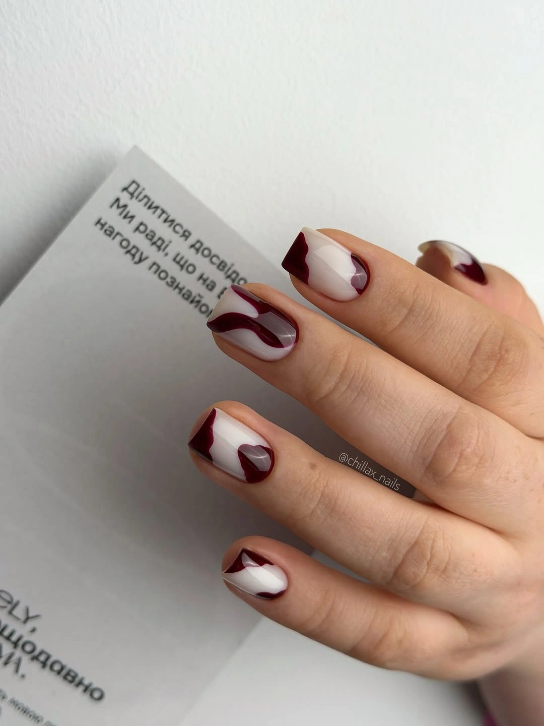
For a simpler version, repeat one burgundy curve and allow the placement to shift by a few millimeters rather than inventing a new motif on every finger. A soft square edge keeps the short length practical, while a milky beige base would make the contrast warmer. The design does not need a perfect symbol; its strength comes from leaving space around a line that feels deliberate.
Short nails make this abstract idea easy to use for everyday styling, although dark tips will show wear sooner than the pale base. Refresh the edge rather than repainting the whole set when a line begins to fade. Keep the curves near the tip for a crisp result, or move one toward the sidewall if you want the manicure to feel more editorial without adding another color.
2. Pink Short Nails With Quiet Texture
Soft pink short square nails stay visually calm because the small pale accents are close to the base color. Instead of relying on contrast, the design lets texture and tiny raised-looking details create interest near the center of selected nails. The neutral wall and gray clothing leave the pastel surface uncluttered, which makes the manicure feel light without becoming blank or overly sweet.
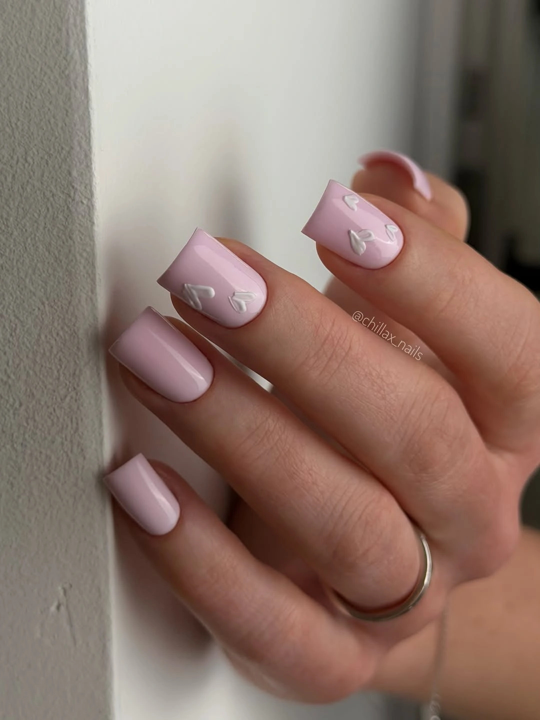
Keep the low-contrast relationship if you adapt it: a white dot, translucent curve, or tiny pearl-like mark can replace a more tactile detail. A rounded square would soften the edges, while a pale mauve base would make the same accents slightly cooler. The clean reset comes from reducing competition, so adding dark lines or several bright colors would change the design’s central appeal.
Small raised-looking details may catch on knitwear, and pale surfaces can show unevenness more readily than a darker polish. That is a practical reason to place the texture on only two nails and keep the rest smooth. For a longer wear window, choose flat marks with the same tone-on-tone relationship and let the short square shape remain the main frame.
3. Yellow Stiletto Nails With Magenta Edges
Long stiletto nails turn pale yellow and vivid magenta into a single graphic decision because the pink follows the pointed edge. The colors are bold, but the division is clear: yellow occupies the body while magenta sharpens the tip and side direction. Against a white knit sleeve, the manicure looks especially crisp, proving that a strong silhouette can make bright color feel organized rather than chaotic.
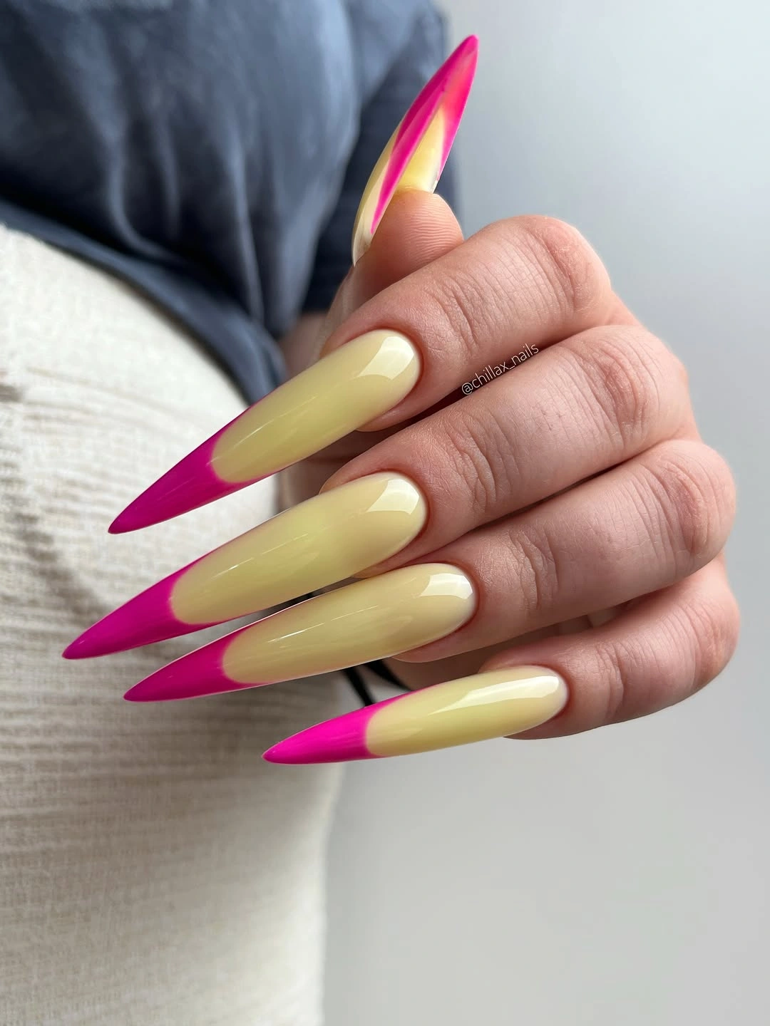
Keep the two-color split if you want to make the design more wearable, but trade the stiletto for a medium almond or tapered square. A softer pink can replace the vivid magenta, while cream can stand in for yellow when the original palette feels too loud. The important part is the edge following the shape; a random pink accent would lose the visual logic.
Long pointed nails bring a clear practical limitation to an otherwise simple color idea. They can look striking for an event or editorial outfit, but the same colors become easier for daily use when the length is reduced. Because the surface is mostly clean, chips at the magenta edge will be obvious, so the design benefits from careful tip checks rather than additional decoration.
4. Pale Pink Squares With a Navy Micro Edge
Medium square nails use a pale pink base and a thin dark blue edge, creating structure without closing in the whole nail. The line is narrow enough to preserve the soft center, while the blue gives the shape a cool outline that echoes the denim behind the hand. This is a fresh balance because the manicure is neither fully neutral nor fully graphic; one crisp border does the work.
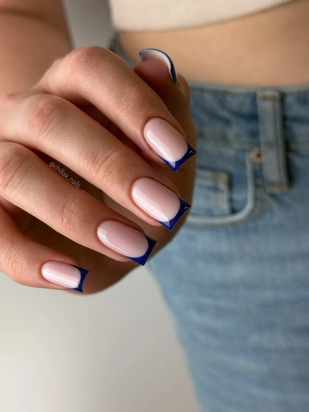
Keep the line narrow when adapting the idea, and move it slightly toward the tip if you want more open space. A shorter square will make the edge feel practical, while a soft blue or charcoal line can lower the contrast. If the border becomes thick, it will read as a full dark tip and the lightness of the base will disappear.
Thin dark lines require a steady shape, and the edge can show wear quickly because it sits at the most exposed part of the nail. That maintenance is manageable when only a few nails carry the strongest line or when the color is close to the wardrobe. Pairing it with denim is intuitive, but cream, gray, and black will keep the cool edge just as clear.
5. Pastel Tips in Three Clean Colors
Pastel yellow, pink, and lime tips give these medium square nails a playful lift while the pale base keeps the palette from competing with itself. Each edge carries a different color, yet the design remains coherent because the placement is consistent and the center stays open. The two-hand view makes the rhythm visible: color changes from finger to finger, but the overall structure never becomes crowded.
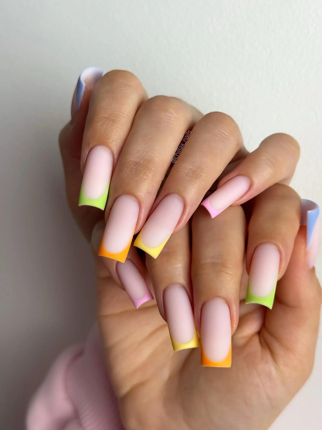
Choose three colors that share a similar softness rather than matching the exact shades, then repeat them loosely across both hands. A short square or rounded square will make the tips feel more compact, while one color can be removed if the set seems too playful. The pale base is the visual reset, so keep it visible enough to separate each tip from the next.
Mixed tips are easier to coordinate than full multicolor nails because the color stays near the edge, but the bright tones still ask for a little wardrobe awareness. A cream sweater or denim layer gives them space, while a busy print may make the hands feel louder. Touch up the tips individually when needed; repainting the entire set would erase the useful flexibility of the design.
6. Milky Gradient on a Medium Coffin Shape
The medium coffin shape is softened by a pale pink-to-white transition that moves quietly across each nail. There is no separate motif, so the freshness comes from the clean change in tone and the squared silhouette beneath it. White flowers nearby repeat the light palette, but the manicure would still read as composed without that background, which keeps the gradient itself in focus.
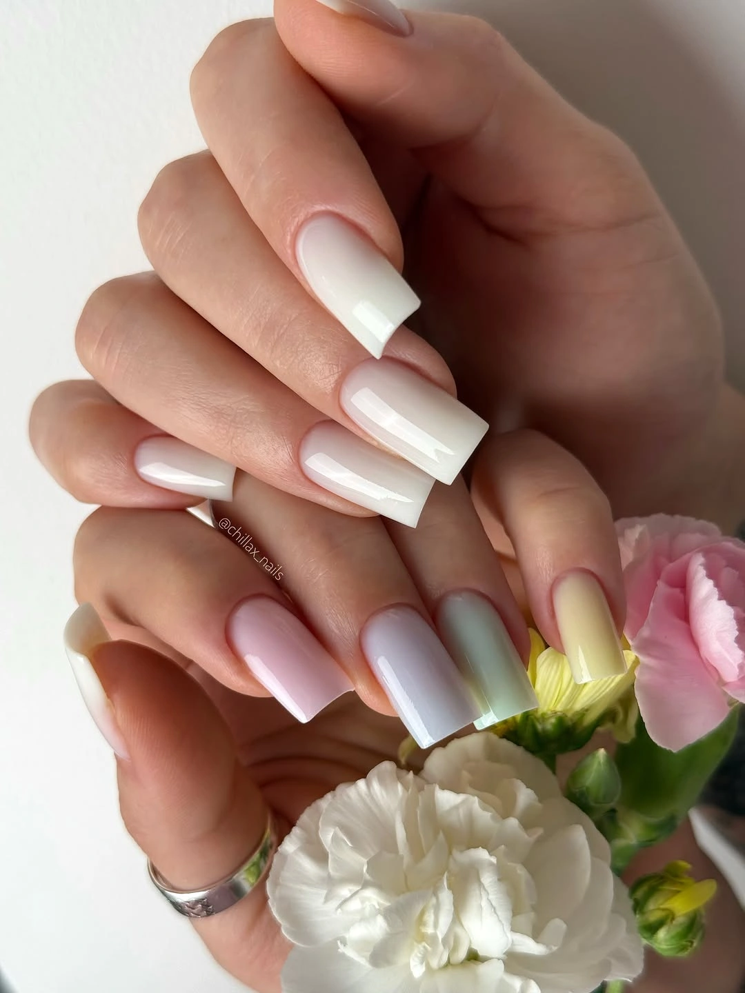
Use a warmer cream at the light end if pure white feels stark, or move the pink slightly toward mauve for a cooler version. A shorter soft square can preserve the gradient while making the hand more practical, and the low contrast will keep the transition gentle as the nails grow. Avoid adding glitter unless the pale fade truly needs more direction; the open surface is part of the appeal.
A soft gradient can hide the visual line of regrowth better than a solid dark shade, although pale colors show surface unevenness and staining more easily. Keep the shape clean and the transition smooth rather than relying on a decorative accent to disguise flaws. This is a useful pause before stronger designs, especially for someone who wants the feeling of art with very little visual weight.
7. Creamy Ivory Coffin Nails Without Extra Motifs
Long coffin nails in creamy ivory make the silhouette the central design decision. The color stays uniform and warm, so the manicure feels fresh through clarity rather than contrast or decoration. White clothing around the hand makes the ivory slightly warmer, a small contextual shift that prevents the pale shade from reading as flat or unfinished.
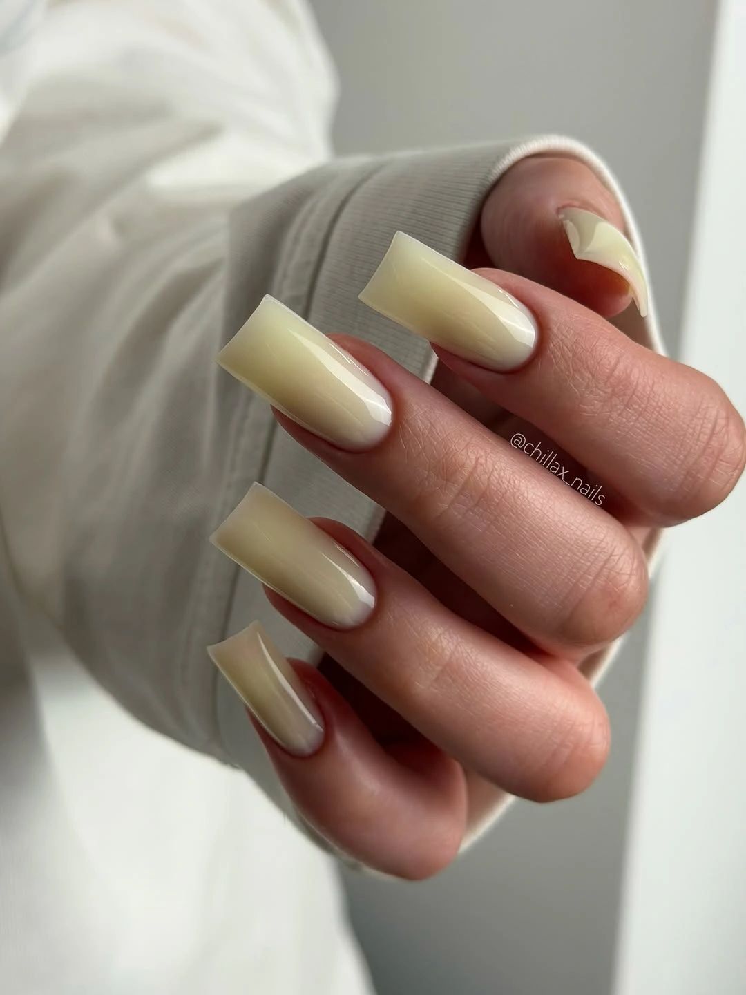
If the length feels too demanding, move to a medium coffin or short square while keeping the same creamy tone. A milky pink base would make the result softer, and a single ivory accent on a darker set would turn the idea into a different, more contrast-led manicure. For this version, resist the urge to add art: the clean reset depends on letting one neutral and one shape stay in charge.
Long coffin tips are the honest tradeoff here, because they look clear and sculptural but may not suit every routine. The solid color coordinates easily with gray, denim, black, and pale knits, so styling is simpler than maintenance. Keep the edges even and the surface smooth; any unevenness will be more visible precisely because there are no motifs to distract the eye.
8. Blue and Silver Curves Around a Dark Center
Long almond nails frame deep blue areas with silver-white contours that bend irregularly across the surface. The dark centers remain easy to identify, while the reflective borders create the impression of small panels rather than isolated dots. Because each nail has its own contour, the design feels expressive without relying on a repeated template, and the cool palette stays visually clean.
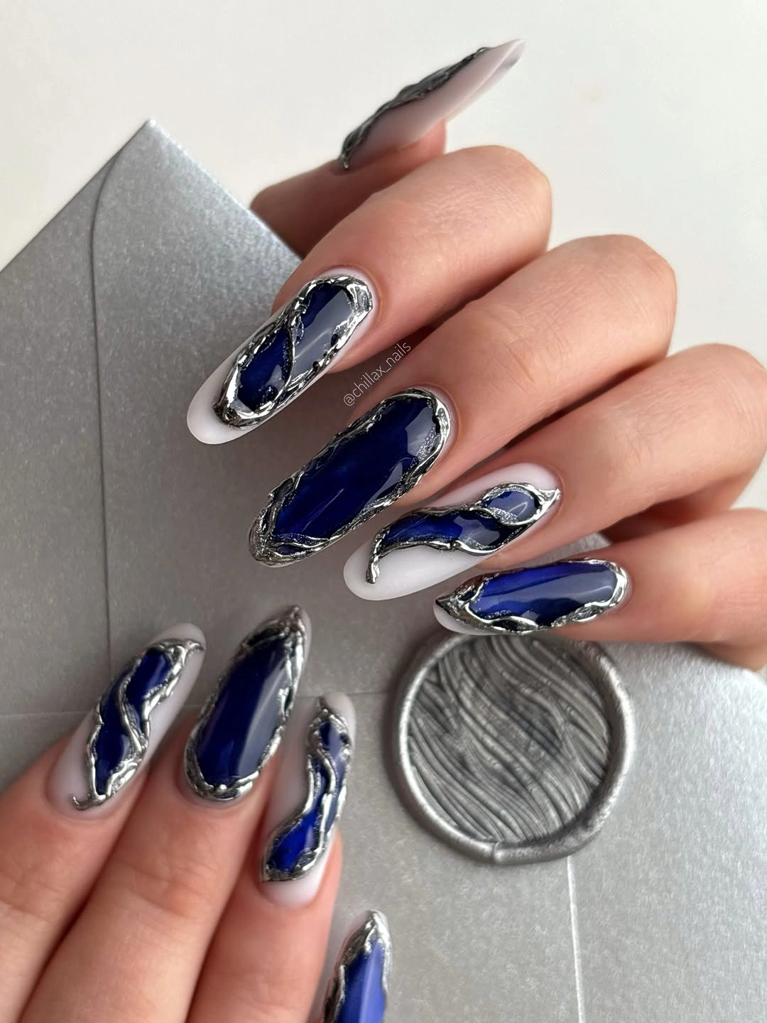
Keep the border idea but move it to one or two accent nails if the detailed version feels too difficult to maintain. A medium almond shape will give the dark center enough room, while pale gray can replace the bright silver for a quieter result. The design works best when the contours are allowed to vary; forcing identical curves would make the surface feel less natural.
Irregular silver detail can catch light beautifully, but it also asks for precision and may need attention around raised-looking edges. The long almond profile adds impact and limits everyday ease, so a shorter version is a sensible adaptation rather than a compromise. Pair the cool colors with simple gray, white, or denim when you want the manicure to read as a fresh visual reset.
9. Lime Green Shimmer With Nothing to Distract It
Long almond nails in saturated lime green use fine shimmer instead of a painted motif, so the color stays completely legible. The reflective texture prevents the bright shade from appearing flat, while the pointed shape gives it a controlled, elongated outline. Green leaves behind the hand reinforce the palette, but the manicure does not need them to make its visual decision clear.
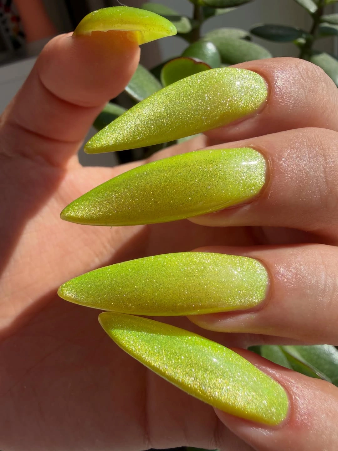
For a softer update, choose a muted chartreuse or pale olive and keep the same almond profile. A medium almond will lower the intensity, while a short square will make the color feel more graphic and less elongated. Keep the finish fine rather than chunky; the point is to give the lime dimension without adding another competing surface.
Bright lime asks for more styling intention than the pale pink and ivory options, especially when clothing already carries strong color. Cream, gray, and denim give it room, while a patterned outfit may make the hands feel busier. Fine shimmer can catch dust or texture in close light, so a smooth base matters as much as the final color.
10. Dark Stiletto Color With One Floral Accent
Most of the long stiletto set uses deep red-black color, but one pale nail carries small floral-like details and tiny bright points. That single light accent interrupts the sharp darkness without changing the overall silhouette, giving the eye a clear focal point and the manicure a gentler note. The neutral background makes the contrast easy to read, especially at the pointed tips.
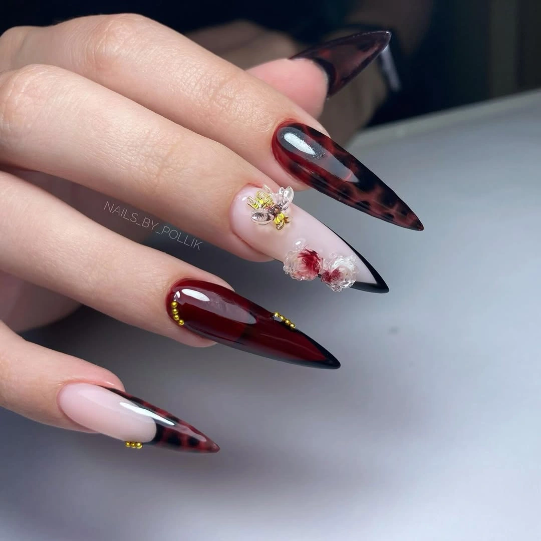
Keep the pale accent on one nail and move the shape toward a medium almond if you want the design to feel less formal. A simple dot or curved petal mark can replace the finer details, while a muted rose base will soften the contrast. The cleanest adaptation preserves the dark majority; adding flowers to every nail would remove the breathing room that makes the accent work.
Long stiletto length and small light details both require more upkeep than the color alone, so this idea sits closer to an occasion manicure. The dark base can hide minor surface changes, but a pale accent will show any wear quickly. If you need a daily version, keep the same color relationship and place one small mark on a shorter almond or square nail.
11. Milky White and Navy Glitter in Alternation
Medium oval nails alternate milky white with deep navy glitter, giving the set a clear rhythm that the eye understands immediately. The pale nails create breathing room for the textured blue ones, and the repeated order prevents the glitter from becoming too dominant. A cool gray background supports both colors, making the contrast feel composed rather than seasonal in a literal way.
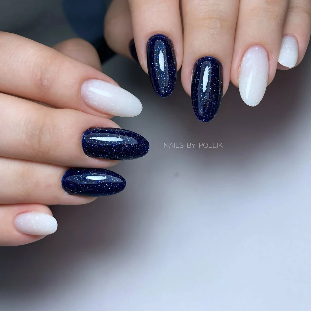
Preserve the alternation even if you change the colors: a soft cream paired with forest-green shimmer would keep the same structure, while a shorter oval would make the contrast more practical. If glitter on every second nail still feels strong, keep it on two fingers and use a glossy navy on the others. The key is to give the statement finish clear space around it.
Glitter is more forgiving in changing light than a flat dark polish, but it can take longer to remove and may emphasize a rough edge. Keep the oval profile smooth so the alternating pattern remains clean. This approach pairs naturally with the structure of fall nail trends, yet it stays useful beyond the season because the rhythm comes from finish and color rather than a dated motif.
12. Chocolate Color Meets Cool Silver Shine
Medium square nails compare two different temperatures: a glossy chocolate-burgundy depth on one hand and cool silver reflective accents on another. The contrast is strongest because each surface is allowed to stay legible instead of being mixed into every nail. Pale surroundings give the warm and cool finishes a clean boundary, making the manicure feel more like an organized edit than a random pairing.
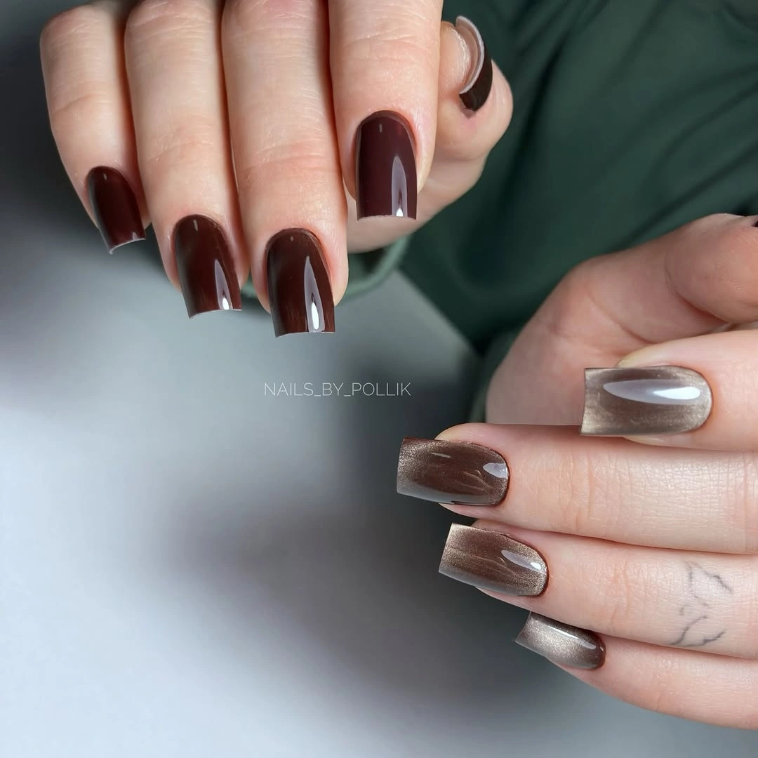
Use the warm brown-red on most nails and keep the silver to two accent fingers if you want a more coherent everyday version. A shorter square will make the metallic surface less dominant, and pewter can replace bright silver for a softer contrast. The separation between finishes is important; placing both across every nail could make the set harder to read.
Mixed finishes ask for slightly more coordination than a single color, but the palette remains easy to style with cream, gray, black, and denim. Silver accents may reveal scratches under direct light, while the chocolate base can hide small changes more gracefully. Choose this layout when you want color contrast without adding painted images, and let the temperature shift provide the design.
13. Warm Bronze on Every Square Nail
Short-to-medium square nails are fully covered in reflective bronze, so the warm metallic finish supplies all the decoration the hand needs. The surface shows soft vertical highlights rather than large glitter pieces, which keeps the manicure polished and clear. Against a pale gray setting, the color reads as copper-brown warmth rather than orange brightness, giving it an easy fall direction.
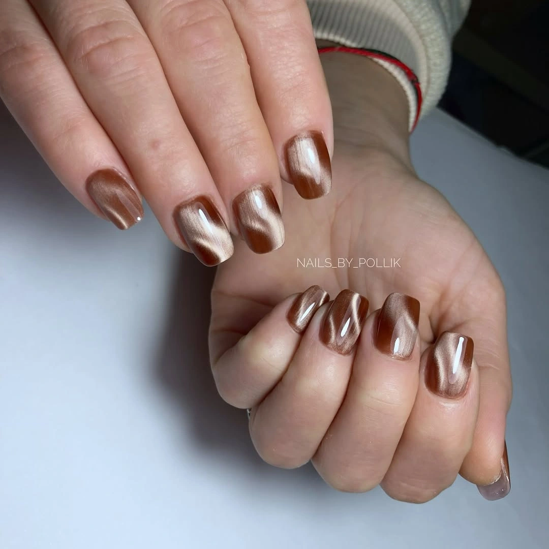
Keep the bronze uniform if you want the cleanest version, or use it on two nails as a concentrated accent beside a matte brown. A soft square would reduce the geometry, while a deeper copper tone would make the finish more dramatic. Avoid adding a second metallic unless the original bronze needs support; its strength is that one surface already carries the whole idea.
Metallic surfaces show fingerprints and uneven texture, so the base needs to be smooth before the color goes on. The square length is manageable, but the reflective finish makes chipped tips easy to notice. Wear it with charcoal, cream, or denim when you want the bronze to read as a warm punctuation mark rather than the only bright element in an outfit.
14. Glossy Cherry Red With a Clean Outline
Medium square nails in saturated cherry red are completely free of visible motifs, yet they look like nail art because the color and shine are so precise. The dark burgundy background deepens the red and makes the reflected highlights look almost graphic. This is a clear example of a fresh reset: one confident shade, one controlled shape, and no extra detail competing for attention.
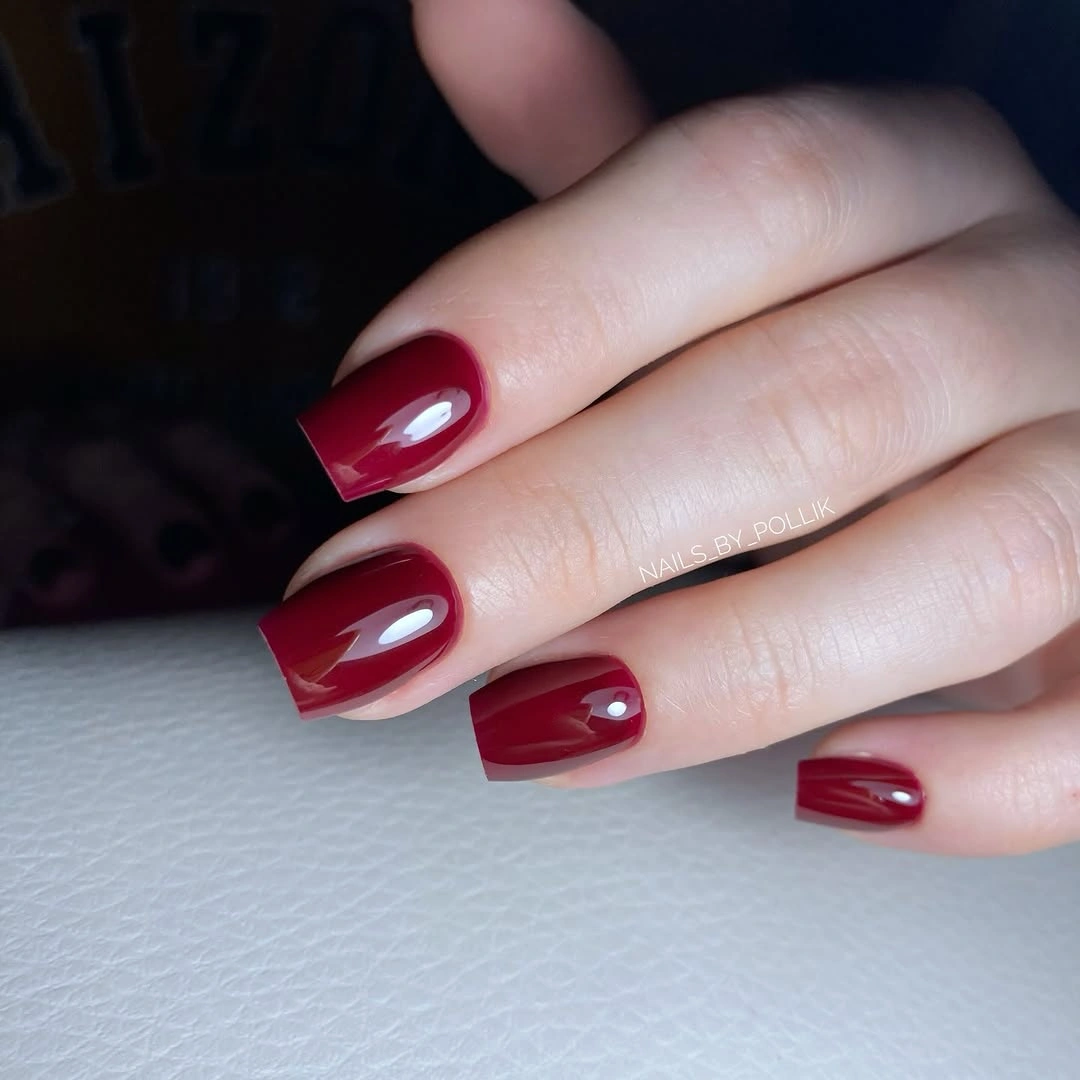
If you want less intensity, shorten the square shape or move the color toward a muted brick red. A single pale or metallic accent would be enough to change the set, but begin with the solid version so the red remains the main decision. Keep the corners crisp; a rounded edge would make the manicure softer, while a sharp square would reinforce its graphic quality.
Glossy red coordinates with black, gray, cream, and denim, but it can dominate a patterned outfit more quickly than burgundy or bronze. Tip wear will be visible, so a clean outline matters. For readers who want a dependable idea between simple polish and detailed art, the uniform color is not a shortcut; it is the reason the manicure looks composed.
15. Milky Almond Nails With Tiny Black Bows
Medium almond nails keep a milky base open while selected fingers carry small black bow-like motifs and red graphic marks. The accents are tiny compared with the pale surface, so the manicure feels playful without becoming crowded. The design’s freshness comes from the spacing: the eye notices the symbols, then returns to the quiet base instead of meeting a new pattern on every nail.
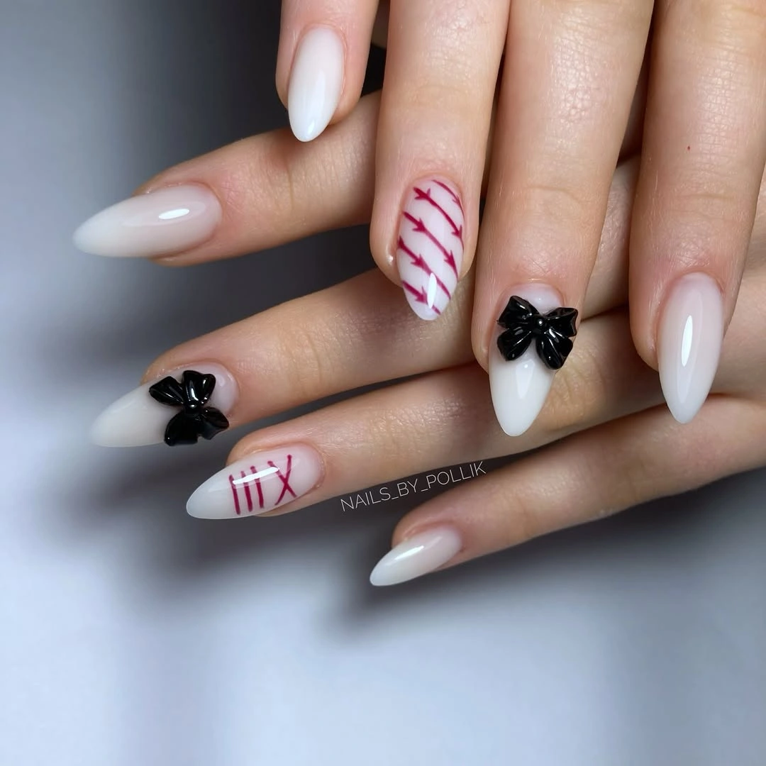
Use one black motif and one red mark if the full placement feels too detailed, or replace the symbols with simple dots and short curves. The almond shape can stay medium, while a shorter oval will make the look even softer. Keep the base milky and let the accents remain small; enlarging them would remove the airy quality that supports the design.
Small graphic marks may wear first at the tips and are less forgiving than a solid color, but they are also easy to refresh individually. A pale base shows unevenness, so the cleanest result depends on smooth edges. This is a good choice when you want a little personality with a neutral wardrobe, especially if you prefer the lighter tone of September nail art ideas for short nails over a darker fall palette.
16. Orange Nails With Glitter and Small Warm Details
Vivid orange carries most of this medium almond manicure, while a few nails shift into orange glitter or small warm illustrated details. The palette stays unified because every variation belongs to the same color family, so the set feels lively without losing clarity. A pale background makes the orange brighter and helps the eye distinguish gloss from sparkle before it notices the tiny accents.
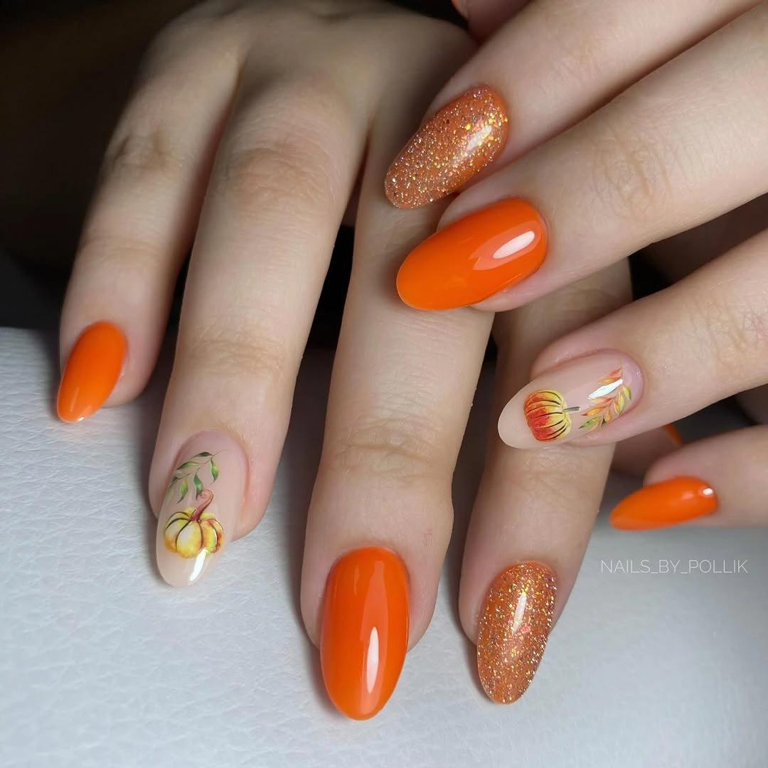
Keep one orange shade constant and vary only the finish if you want a simpler version. A single small motif on a pale accent nail can replace the finer illustrations, and a shorter almond will make the color easier to wear. The design works because gloss, glitter, and detail support one another; adding unrelated blue or purple would change its clean warm focus.
Orange is an assertive choice, but the repeated color makes styling less complicated than a truly mixed palette. Fine accents need touch-ups, while glitter may take longer to remove, so choose where you want the maintenance before covering every nail. Cream, brown, black, and denim give the manicure enough space to look seasonal without turning it costume-like.
17. Full Silver Glitter on Long Square Tips
Long square nails covered in bright silver glitter turn a single finish into a complete visual statement. Because the color and texture repeat across every nail, the set feels graphic rather than scattered, and the squared ends give the sparkle a firm frame. The pale background lets the surface reflect openly, which is why the manicure looks more like a deliberate metallic block than a delicate shimmer.
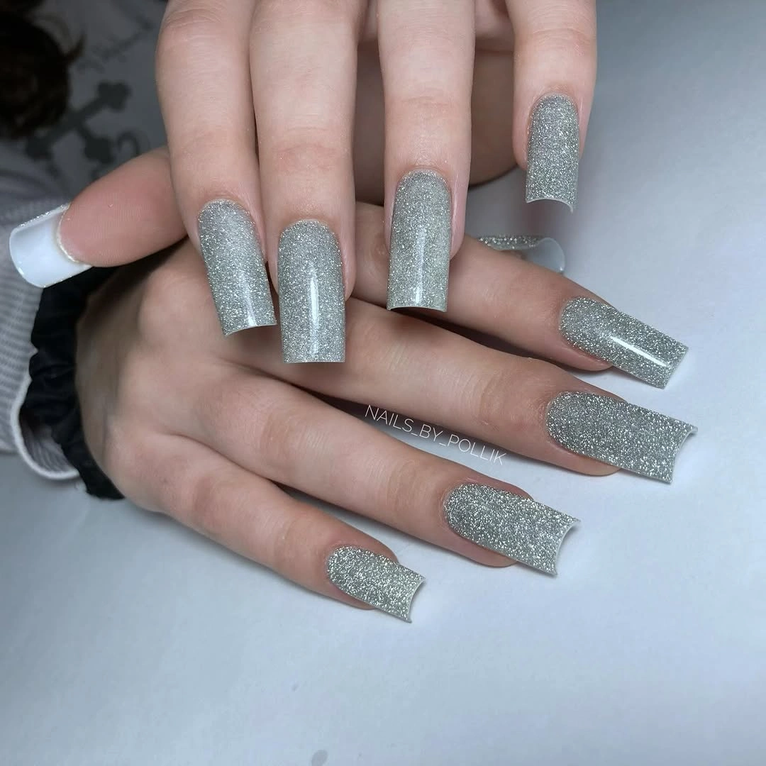
Shorten the shape to a medium square if the full length would interfere with your routine, or keep silver glitter on two accent nails beside a pale neutral. A softer gray-silver can lower the brightness without losing the finish. Do not add several other colors unless the goal changes; the clarity comes from giving one metallic surface uninterrupted space.
Dense glitter can be visually forgiving when light moves across it, but removal and edge care take more time than a plain polish. The long square profile also makes the design more occasion-led. For a practical adaptation inspired by fall gel nails ideas, keep the square outline and use a fine silver shimmer instead of dense sparkle so the hand remains lighter.
18. Silver Texture With a Brighter Edge
Long square nails use one silver family in two densities: a pale textured body and a more concentrated sparkling edge. That small difference creates a border without introducing a new hue, so the manicure feels clean and current instead of overly decorated. The light background keeps the cool surface easy to inspect, and the structured edge gives the shape a clear finish.
Use the brighter edge on two nails if a full set feels too detailed, or move to a medium square for a softer proportion. A pale gray body can replace bright silver while keeping the density contrast, and a single line at the tip will be easier to maintain than a broad textured border. The design depends on difference within one color family, so keep that relationship visible.
Textured surfaces can reveal uneven preparation, especially under direct light, and the long tips ask for more care. That makes the look better suited to a planned event than to a low-maintenance week. If you want the same clean update for daily wear, keep the pale metallic base and add one brighter edge on each hand rather than repeating it everywhere.
19. Muted Green and Orange With Tiny Autumn Lines
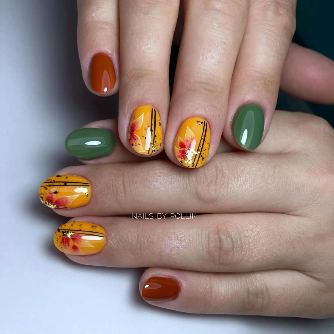
Short rounded nails combine muted green and burnt orange solids with pale accent nails carrying tiny yellow-brown line illustrations. The solid colors do useful framing work: they make the delicate accents easier to see while keeping the overall set rooted in a clear autumn palette. Because the nails are short, the design feels approachable rather than dependent on a long canvas.
Keep the illustrations on two nails and let the green and orange repeat around them. A shorter round or soft square will preserve the practicality, while olive and rust can shift the palette warmer without losing its clarity. Fine line art needs enough breathing room, so avoid filling the accent nails with additional dots, leaves, or unrelated symbols.
Short length limits the amount of detail that can stay legible, which is why the selected accent placement matters more than adding complexity. The warm colors are easy to coordinate with cream, brown, black, and denim, but the mix can compete with a very busy print. Refresh the pale accents first when they wear; the solid green and orange will usually remain visually stable longer.
20. Black Glitter on a Long Almond Shape
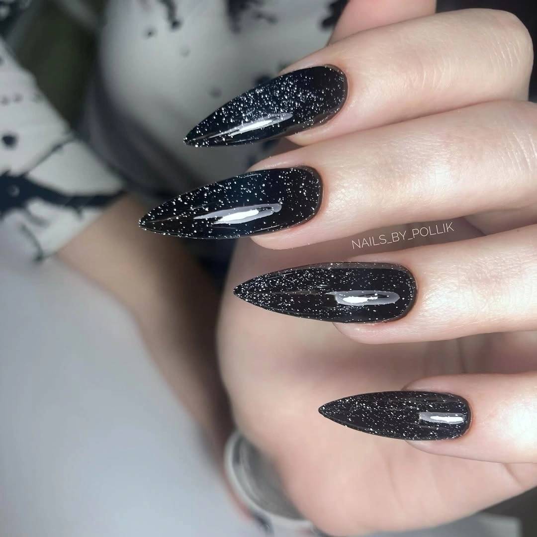
Long almond nails use a black base and dense silver sparkle to create a dark finish that still catches light. The pointed outline keeps the set sleek, while the glitter prevents the black from becoming a flat block. Gray clothing nearby echoes the silver without adding another nail color, so the manicure stays focused on the relationship between depth and reflection.
Choose a medium almond for a more practical version, or keep the length and move the glitter to two accent nails beside glossy black. A softer silver dusting will reduce the visual intensity while preserving the light-catching surface. The black base should remain visible; if the sparkle becomes too dense, the design will read more like silver glitter than dark nail art.
Long almond shape and dense glitter both increase maintenance, especially around the pointed edge and removal time. That tradeoff is worthwhile for an event, but a shorter profile will carry the same mood through an ordinary week. Pair the look with simple gray, black, or cream layers so the hand feels intentional rather than overloaded with competing shine.
21. Orange Gloss With Two Pale Accent Nails
Most nails here are short square and glossy orange, while two pale accent nails carry only small warm marks. The bright color remains the first impression, but the pale breaks prevent the hand from becoming one uninterrupted block. That ratio is the useful idea: art appears where it can be seen clearly, while the dominant shade stays simple enough for everyday styling.
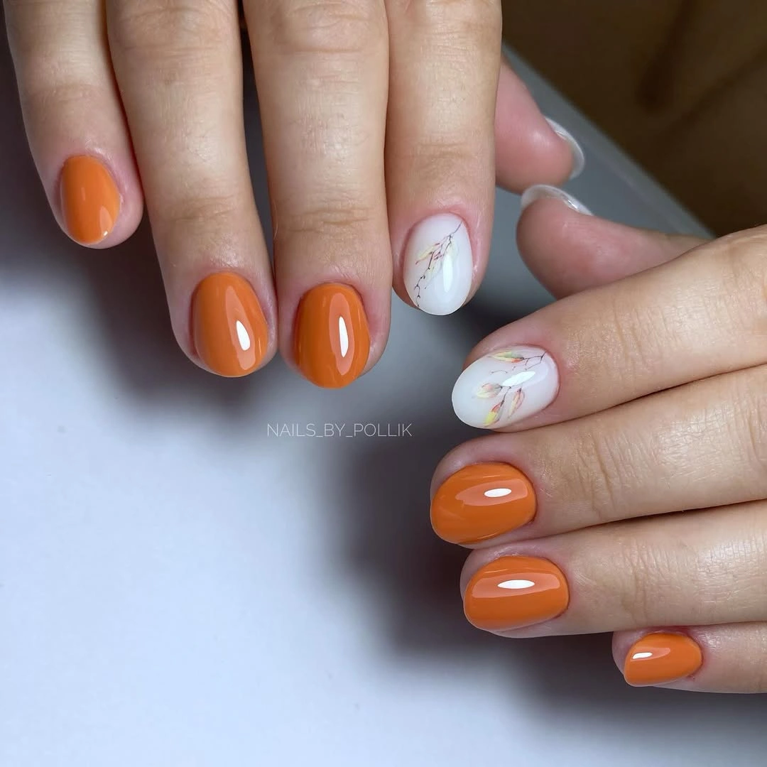
Keep the orange on most nails and change the accent color to milky cream, soft pink, or pale beige according to your wardrobe. A rounded square will soften the bright shade, while a short square will make the color look more graphic. Keep the marks small and warm; a large dark motif would pull attention away from the clean orange center.
Short length makes the set easy to wear, and individual accent nails can be refreshed without disturbing the orange majority. The glossy surface will still show tip wear, especially because the color is vivid, so a neat edge matters. This is a useful starting point for readers who want to explore fall manicure ideas without committing to glitter, long extensions, or a full illustrated set.
22. Champagne Glitter With Pale Overlay Lines
Medium square nails use a warm champagne-gold glitter field with lighter line details layered across selected surfaces. The marks are close in tone to the sparkle, so they create structure without the hard contrast of black or red. A dark background makes the gold brighter, but the design still depends on the relationship between a textured base and restrained pale lines.
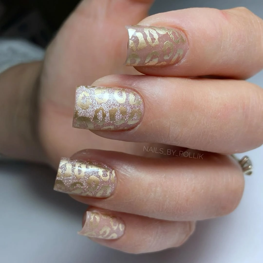
Use the pale lines on one or two accent nails if the full set feels too intricate, and choose a soft gold shimmer when dense glitter is not practical. A shorter square will keep the warm metallic idea crisp, while cream or ivory can replace the brighter overlay. The strongest adaptation preserves the same-color contrast rather than adding another unrelated shade.
Fine marks over sparkle need careful placement and may be the first details to blur, so treat them as accents rather than a maintenance-free pattern. The warm gold suits cream, brown, black, and evening fabrics, but it can compete with heavy jewelry. Keep accessories simple if you want the line work to remain visible, and let the square shape provide the final sense of order.