A matte manicure changes the way color sits on the hand: it absorbs glare and brings undertone, edge, and spacing forward. That can be a relief when gloss feels too polished, but it also leaves nowhere for an uneven shape or a crowded detail to hide. A strong matte fall nails design 2026 choice begins with the visual mood you want to hold at arm’s length, then lets the finish do its quiet work.
Choose the surface after looking at the silhouette, not before. A compact rounded nail can carry a deeper tone with ease, while a longer tip usually benefits from a little open space or one controlled focal point. If a shade starts to feel too stern once the shine is gone, soften its undertone or reduce the amount of decoration rather than adding more competing detail.
1. Cobalt and Coral Florals With Matte Energy
Cobalt blue and coral solids are broken up by ivory accents painted with blue and coral flowers, so the palette has a clear rhythm instead of reading like a random bright mix. The medium almond shape keeps the color blocks rounded at the tip, while the floral nails provide the softer visual pause. It is a lively combination, but the repeating flower colors make the contrast feel planned.
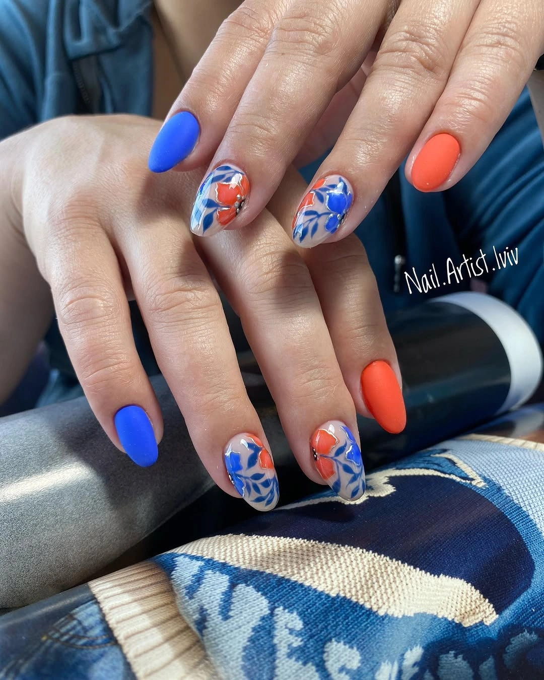
The strongest part of this manicure is the decision to repeat the blue and coral inside the accent art rather than introduce a third unrelated tone. That connection lets the ivory work as a background, not a separate idea. Anyone who likes color but finds full-hand pattern overwhelming could keep just two floral accents and still retain the same balanced effect.
On a shorter almond or oval shape, enlarging the petals slightly would keep the motif readable without needing more detail. The tradeoff is that bright opposites show chips and uneven edges more readily than a muted solid, especially near the tips. A tidy file shape matters here because the clean almond outline is doing as much work as the painted flowers.
2. Dusty Mauve Leaves on Long Matte Squares
Dusty mauve matte nails sit beside beige accents traced with pale leaf shapes and slim metallic-looking lines, creating a design that feels quieter than its length suggests. The long square silhouette gives the botanical work a straight canvas, so the delicate leaves do not disappear into the base color. It is a useful reminder that a dark fall nails designs matte look can still feel light when the artwork stays narrow.
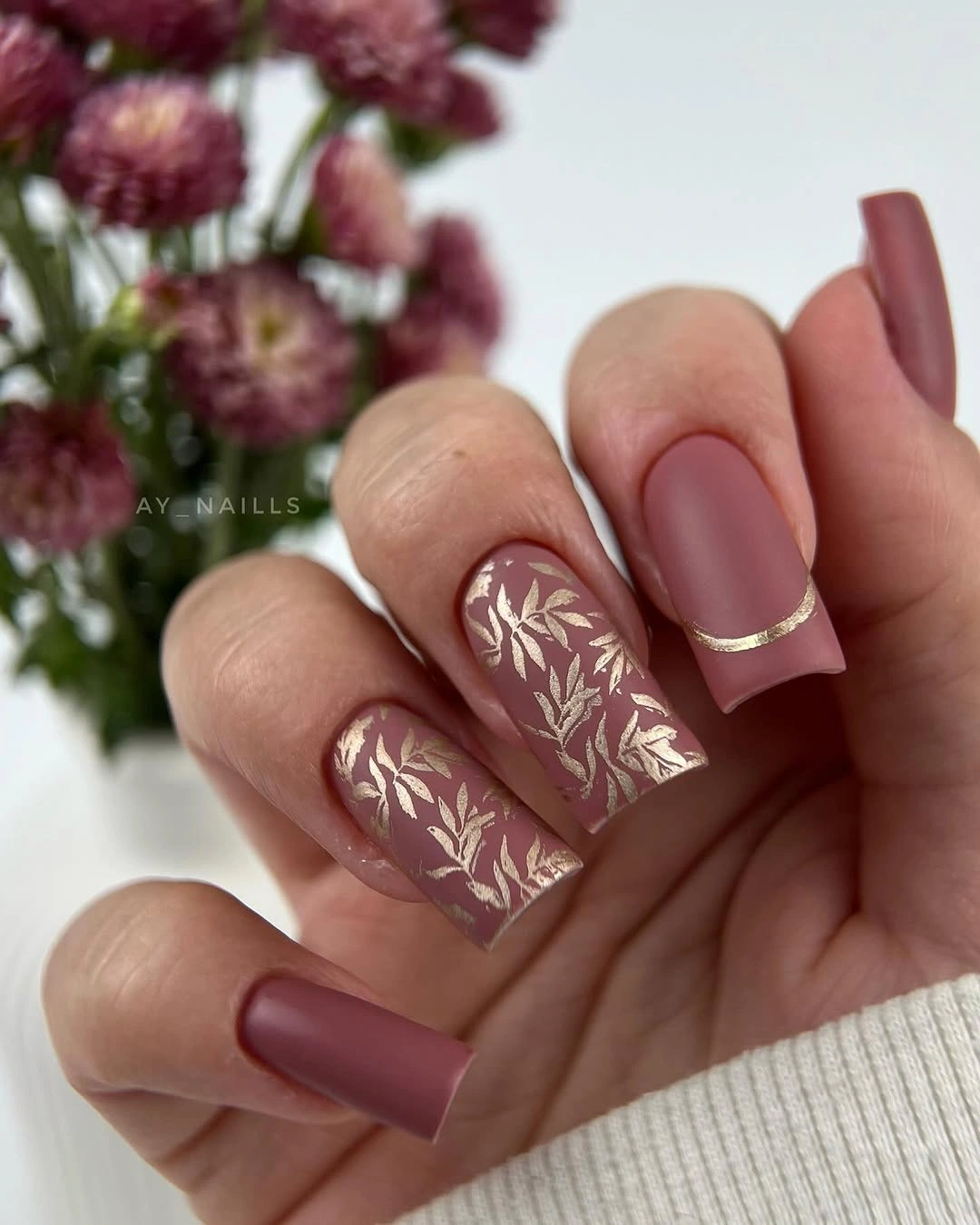
The leaf pattern works because the surrounding mauve nails are plain and slightly muted, allowing the linework to remain the focal point without covering every surface. A similar depth-and-detail balance appears in these matte fall nail ideas, where finish matters as much as color. If metallic lines feel too dressy, a tone-on-tone leaf outline would make the same composition more relaxed.
Long squares can make even a soft color look structured, so this version suits someone who likes an orderly shape but does not want a severe black or wine shade. Fine art near the tip has less room to blur visually than a dense all-over print, though it will need careful touch-ups if growth becomes visible. The restrained accent placement is what keeps the set warm rather than overly formal.
3. Pastel Blocks Anchored by Tiny Studs
Pink, mint, yellow, blue, and nude appear one per nail, yet the non-reflective finish turns the pastel mix into one cohesive surface instead of a candy-colored scramble. A few small studs add a point of light, but they do not compete with the color changes because they are used sparingly. The squared medium length also gives every shade a similarly sized area, which makes the alternation easier to read.
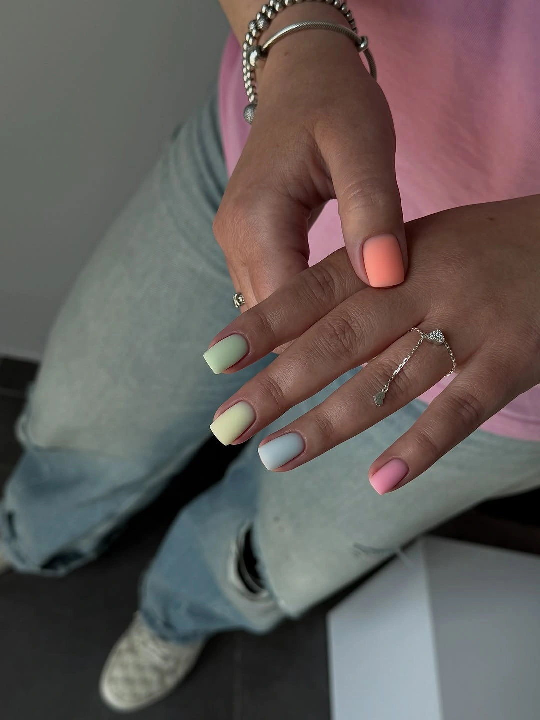
This is the kind of mixed-color manicure that benefits from a shared texture more than a complicated pattern. Without the matte surface, the separate shades could look more disconnected under different reflections. For a subtler version, choose three neighboring colors such as muted green, cream, and blush, then reserve the tiny studs for one or two nails only.
Stud details sit above the surface, so they are the first element to consider if you use your hands heavily or prefer a very smooth feel. The colors themselves can be rearranged freely, but keeping the palest tone away from every adjacent nail avoids a washed-out patch. It feels cheerful, although its strongest feature is the disciplined use of one small embellishment rather than the number of shades.
4. Pink Solids With Crisp Speckled White Accents
Glossy pink nails alternate with white accents scattered in tiny black speckles, giving a familiar two-color manicure a graphic, lightly textured interruption. The medium square shape keeps the white panels broad enough for the dots to look intentional rather than crowded. Because the pink remains plain, the contrast lands as a pattern decision rather than a full theme.
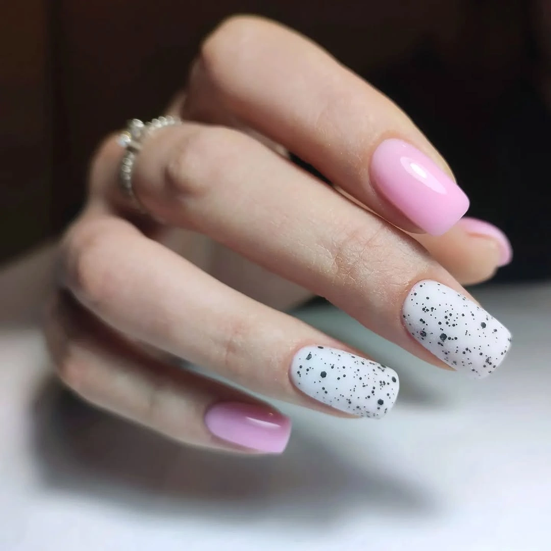
Small dark speckles work best when they are not arranged too perfectly, since a little variation keeps the white nails from resembling a printed fabric swatch. The clean pink nails around them also act as visual rest, which is useful if you want a design that looks polished from a distance and more playful up close. A muted rose or pale gray could replace the pink without disturbing the basic balance.
This pairing is more forgiving than a detailed floral design because the dots do not require matching outlines from nail to nail. Still, white surfaces can make discoloration and grown-out edges noticeable sooner than deeper shades. Choosing two speckled accents instead of every nail would preserve the same visual idea with less upkeep at the base of the nail.
5. Ocher Botanical Accents Against Taupe Matte Nails
Matte taupe nails frame ocher-and-ivory accents covered in fine white botanical outlines, creating a warm palette with one clearly decorative center. The long almond shape softens the leaf drawings because the tip narrows gradually instead of ending in a hard corner. Each element has space: taupe establishes depth, ocher adds warmth, and the linework supplies movement.
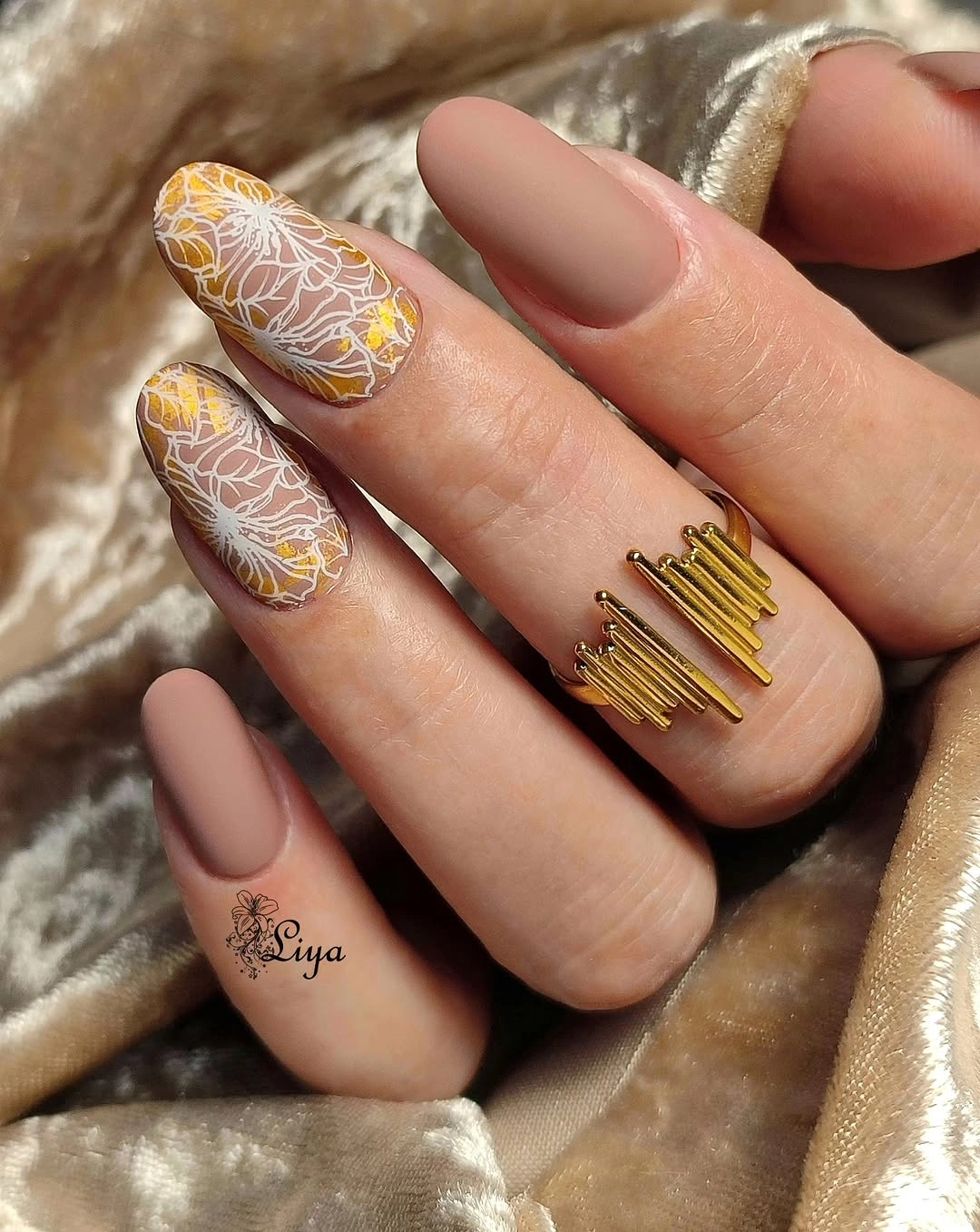
The finest detail is concentrated on only two nails, which makes this a strong reference for anyone exploring fall accent nail designs without committing to full-hand artwork. White outlines stand out clearly over the warm accent base, but the organic leaf shapes keep them from feeling rigid. A brown base with one cream botanical nail would retain the same idea in a lower-contrast version.
Fine white lines may lose their crispness sooner than the matte solids, particularly on a long tip that meets keys and screens often. That practical limitation is balanced by the fact that the taupe nails would still look complete if the accent art needed a refresh. The palette has a cozy, muted feeling without leaning on a literal seasonal symbol.
6. Lavender Swirls With Brighter Violet Layers
Lavender almond nails carry translucent purple swirls and brighter magenta patches, so the design changes from one nail to the next without losing its color family. The longer tapered shape gives the marks room to curve instead of stopping abruptly at the edge. Even with several layered forms, the pale base keeps enough negative space visible to make the pattern feel airy.
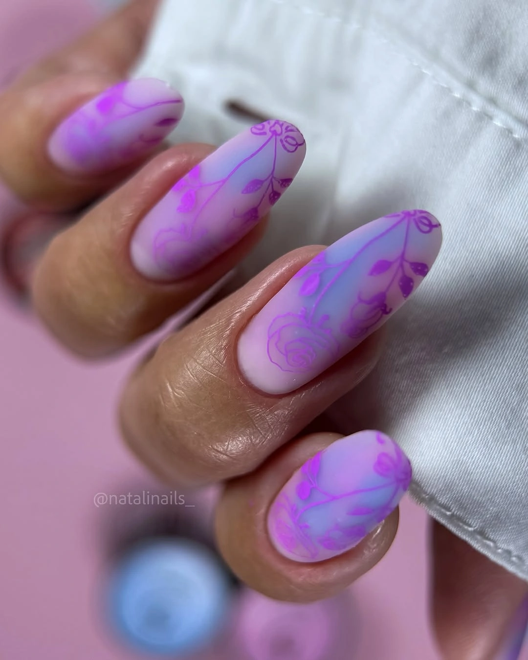
Here, the pattern does not depend on exact symmetry; the repeated violet range is what makes the individual swirls belong together. A person who prefers less contrast could switch the magenta marks for a slightly deeper lavender and keep the translucent layering. That adjustment would preserve the motion while making the manicure easier to pair with neutral clothing.
Abstract lines can be a good choice for a regrowth period because a little irregularity already belongs to the visual language. The downside is that too many opaque patches would quickly flatten the design, so the pale areas are important. This set feels most successful where the thin outlines and soft color clouds remain visibly separate rather than blending into one dark mass.
7. Pale Blue Waves Across Soft Ivory Tips
Off-white almond nails have uneven pale-blue wave tips, with one accent outlined more fully in blue, turning a French-inspired idea into something looser and more modern. The matte finish keeps the blue soft against the ivory and avoids the sharp contrast a glossy edge might create. It is a calm design, but the wavy placement stops it from becoming overly traditional.
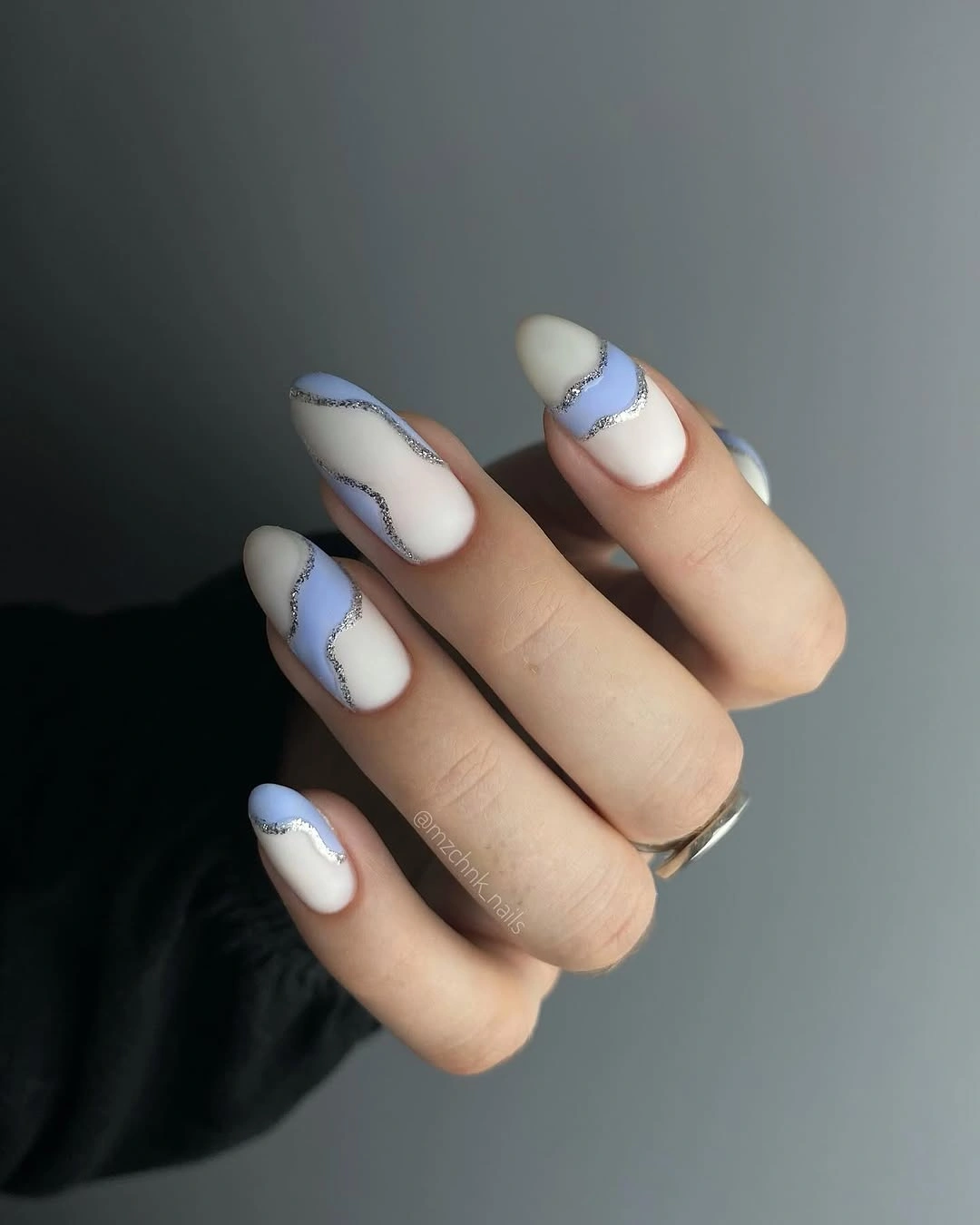
The irregular tip line works because it repeats the same gentle curve across several nails without trying to make every wave identical. That is a helpful approach for shorter lengths too: a shallower wave can give the impression of detail without sacrificing much visible nail space. Ivory and dusty blue also offer a quieter alternative when rich brown or burgundy feels too heavy.
A pale tip will show wear at the free edge more clearly than a deeper color, especially if the base is matte and uniform. Keeping the wave narrow helps the manicure remain readable as it grows out, since the main contrast stays at the tip. The soft blue has a cool, almost porcelain-like effect, but the curved outline keeps it from feeling delicate in a precious way.
8. Soft Pastels and Small Metallic-Looking Points
Lilac, sky blue, blush, and nude squares alternate in a fully matte finish, while a few tiny studs give the surface a controlled flash. The colors are gentle enough that the small metal details register as punctuation, not the theme itself. Their placement also draws attention to the center of selected nails, which breaks up the block-color arrangement.
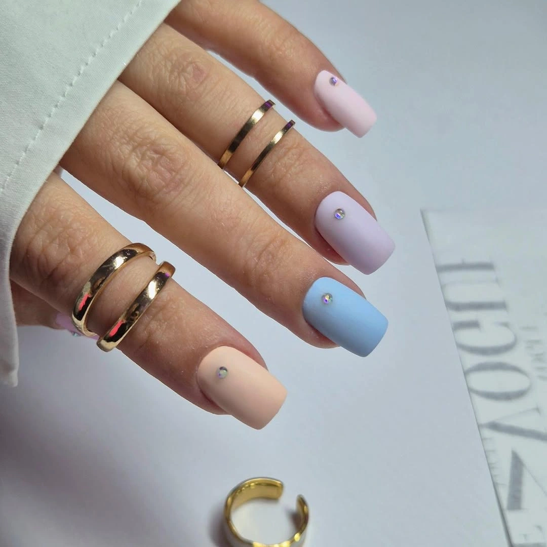
Mixed pastels can easily become visually busy when every nail carries a separate embellishment, so the limited number of studs is the most useful decision here. Try repeating only one shade twice and keeping the other colors singular if you want a less even, more editorial layout. The matte surface will still make the palette feel connected even when the sequence is not perfectly symmetrical.
For an everyday version, leaving off the studs would not weaken the manicure because the color spacing already creates interest. If you keep them, smooth placement matters more than size; a slightly raised point becomes obvious against a velvety non-reflective base. The overall result is soft but not timid, thanks to the square outline and deliberately varied color order.
9. Blush Nails Framed by Deep Green Leaves
A blush base is topped with dark green leaf shapes positioned near the tips and sides, using the empty pink areas to make the motif look more sculptural. The long almond silhouette lets each leaf angle follow the taper rather than sit flat across the nail. Green becomes the visual weight here, while blush keeps the design from looking too dense.
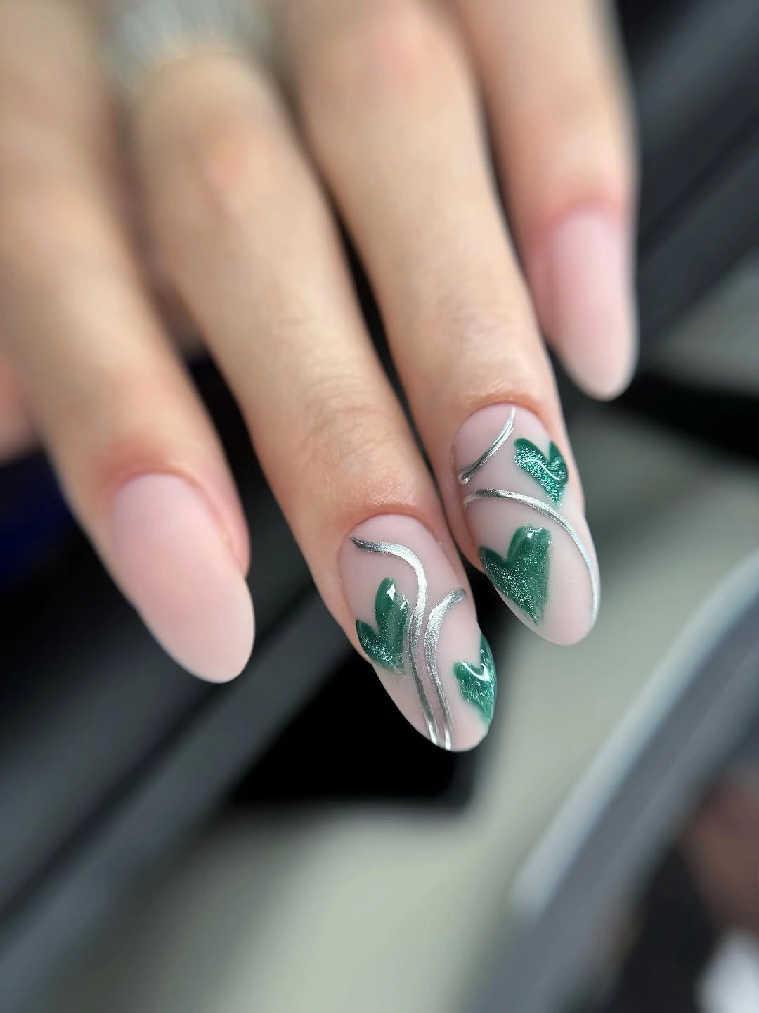
The leaf placement is more effective than an all-over print because the eye can still follow the curve of the almond shape. Dark green offers enough contrast to look seasonal against a pale neutral, but it does not need a black outline to stay visible. Someone wanting a simpler version could put the leaves on just the ring fingers and keep the remaining nails blush.
Botanical shapes with filled centers may show small imperfections more than a fine outline, so they benefit from clean edges and a careful top surface. Their advantage is that they remain recognizable from a distance, unlike very delicate line art. The composition feels grounded by color rather than by a literal leaf-per-nail formula, which gives it more flexibility across the season.
10. Ivory Almond Nails With Miniature Floral Illustrations
Ivory almond nails feature different small flowers in red, orange, green, purple, and yellow, but the common neutral base prevents the individual drawings from competing. Each nail has a distinct illustration, creating the sense of a hand-painted sketchbook rather than one repeated decal. The long shape offers enough length for the motifs to sit away from the cuticle and tip.
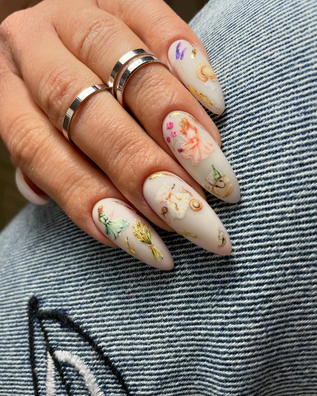
Varied flowers are most convincing when their scale stays similar, and that consistency is what holds the multi-color details together here. For more reference on mixing small motifs without losing focus, these fall nail art ideas offer useful ways to let one neutral base lead. Switching ivory for a light beige would warm the set while preserving its illustrated quality.
This amount of small detail deserves a little practical caution: intricate marks near the tip can look less clear as the nail grows or wears. A shorter version could use one flower per accent nail rather than a different design on every finger. The strength of the concept is its gentle variety, so simplifying the number of illustrations would still make visual sense.
11. Minimal Blush Matte on Soft Short Squares
Short rounded-square nails in an even pale blush matte finish show how a restrained color can carry a manicure without help from pattern or contrast. The surface looks quiet, while the softened corners stop the compact length from feeling too strict. This is the clearest example of finish changing the mood: a glossy blush would feel brighter, but matte gives it a hushed, powdery quality.
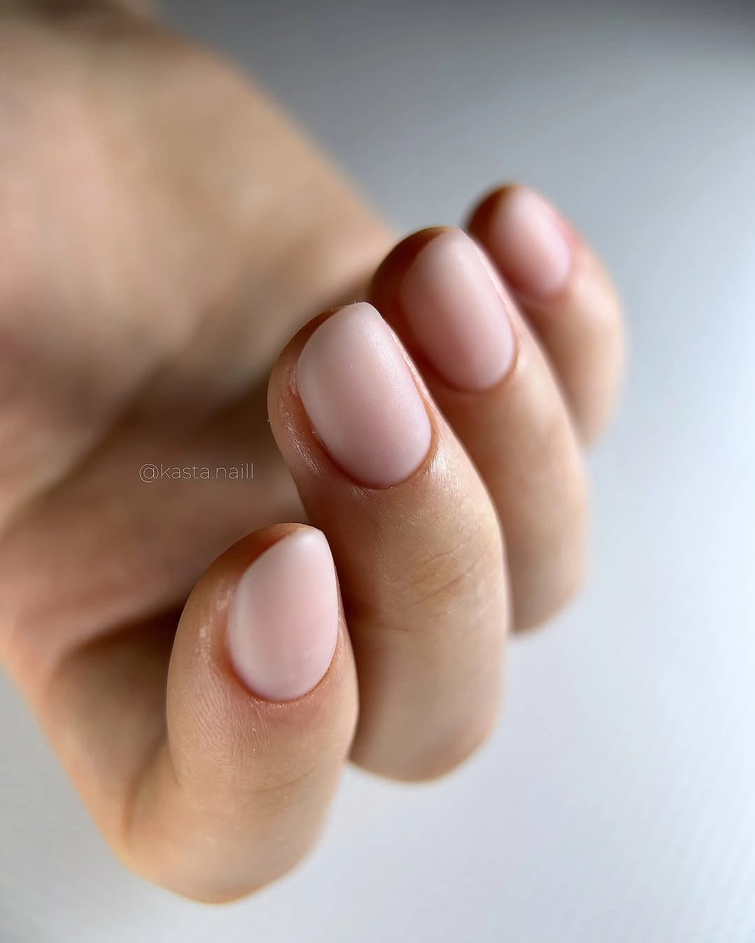
The appeal lies in undertone and shape rather than decoration, which makes this a practical choice when you want a polished hand without a focal accent. Pale blush can flatter a wide range of outfits because it does not demand a matching color nearby. If the exact shade feels too close to the skin tone, moving one step rosier or cooler will keep the same understated effect.
Matte finishes on short nails need a smooth application because there is no reflected light to disguise unevenness. On the other hand, the low-detail design is simple to refresh when the surface starts to look less even. It is neither a statement manicure nor an afterthought; the soft square outline gives the quiet color a deliberate frame.
12. Black Curves Floating Over Pale Pink
Pale pink square nails are crossed by black flowing lines that change direction from finger to finger, creating movement without hiding the base color. The contrast is strong, yet the thin marks leave wide areas of pink visible between them. That negative space is why the design stays graphic rather than becoming a dense black-and-pink pattern.
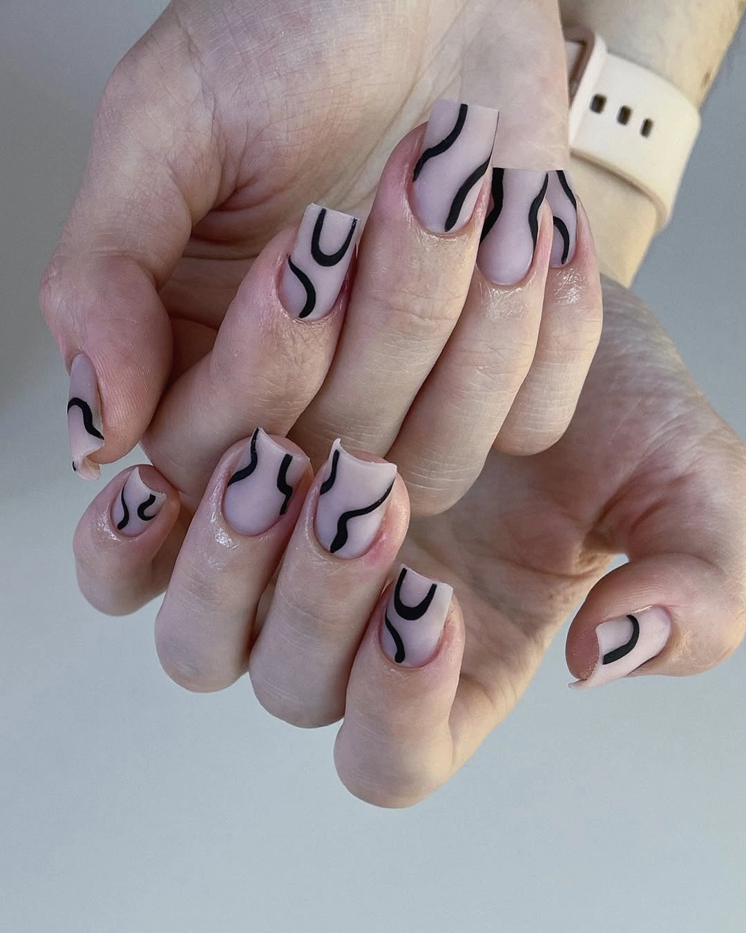
Curved linework is useful when you want a bolder result but do not want to commit to a full dark nail. The black follows no rigid grid, so the set feels more like an abstract drawing than a strict geometric layout. For a softer interpretation, use dark brown or deep green lines and keep the pink base slightly muted.
The lines should remain slim enough to retain their separation, because thick strokes would quickly overpower a medium square shape. A benefit of the abstract approach is that minor variations between nails support the concept instead of looking like a mismatch. The cleanest contrast appears where the curve stops before the sidewall and lets the pink edge remain visible.
13. Deep Cocoa Matte for a Compact Shape
Short rounded-square nails are finished in a uniform deep cocoa brown matte shade, proving that a dark solid can look composed without metallic detail or high shine. The warm brown has enough softness to avoid the severity of black, while the compact length keeps the color from feeling too heavy. It is a very direct take on matte brown nails design fall inspiration.
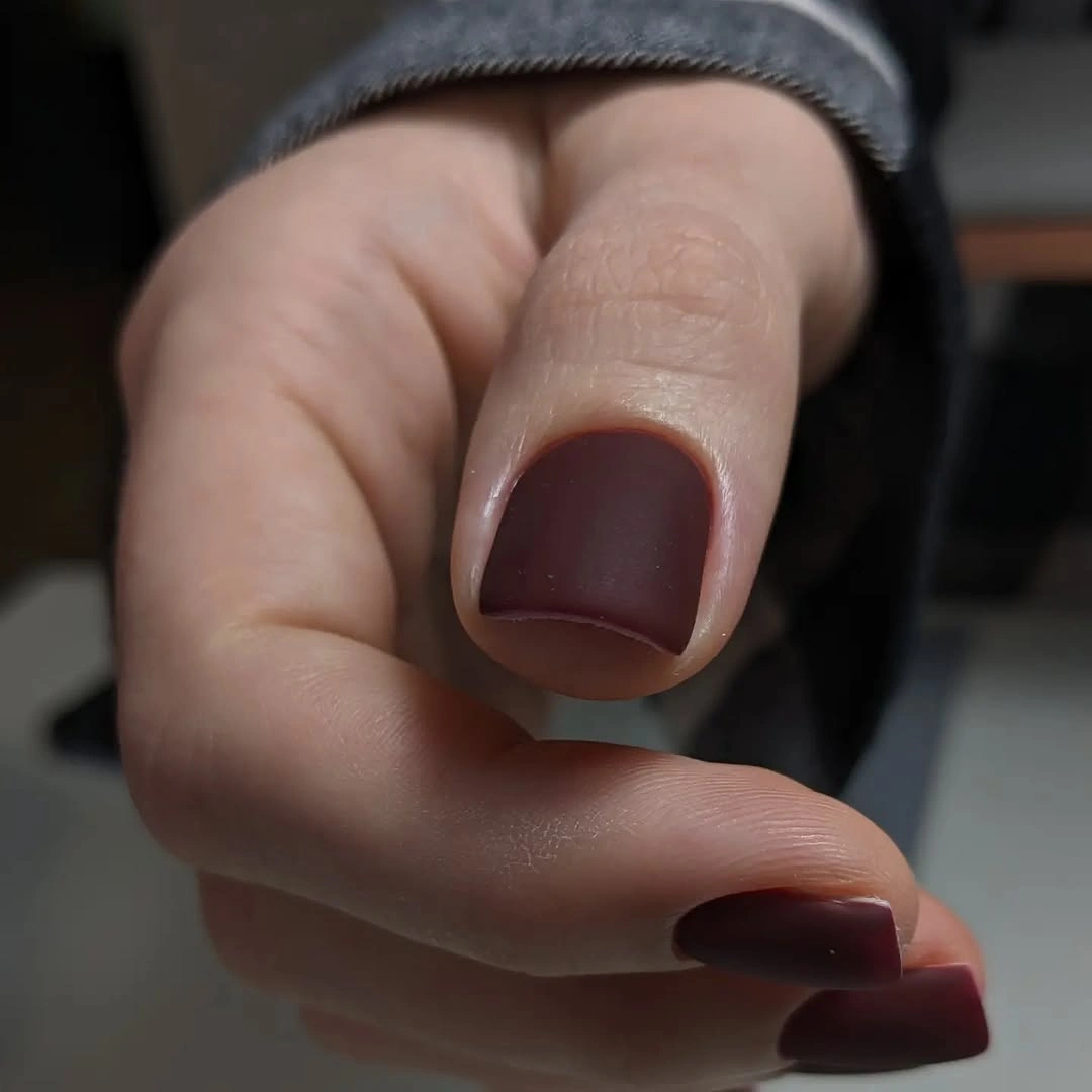
Brown becomes especially effective on a short shape when the corners stay rounded and the surface is even from cuticle to tip. This is also a flexible palette choice if burgundy has started to feel too familiar, since cocoa keeps similar depth with a warmer undertone. Adding one tiny gold line could dress it up, but the solid version already has a clear point of view.
The lack of shine means the color will show any surface scuffs sooner than a glossy finish, so a smooth top layer is worth maintaining. In exchange, the manicure looks low-key and intentional even with no accent finger at all. Its quiet richness comes from the color temperature and outline, not from an attempt to make a plain brown nail seem more elaborate.
14. Pink and Gray Alternation on Long Squares
Long square nails alternate soft pink and medium gray in a matte finish, using two calm colors to soften the strictness of their extended straight edges. The gray gives the pink a cooler counterweight, while the pink prevents the set from becoming too industrial. Because every nail is plain, the alternating sequence becomes the complete design.
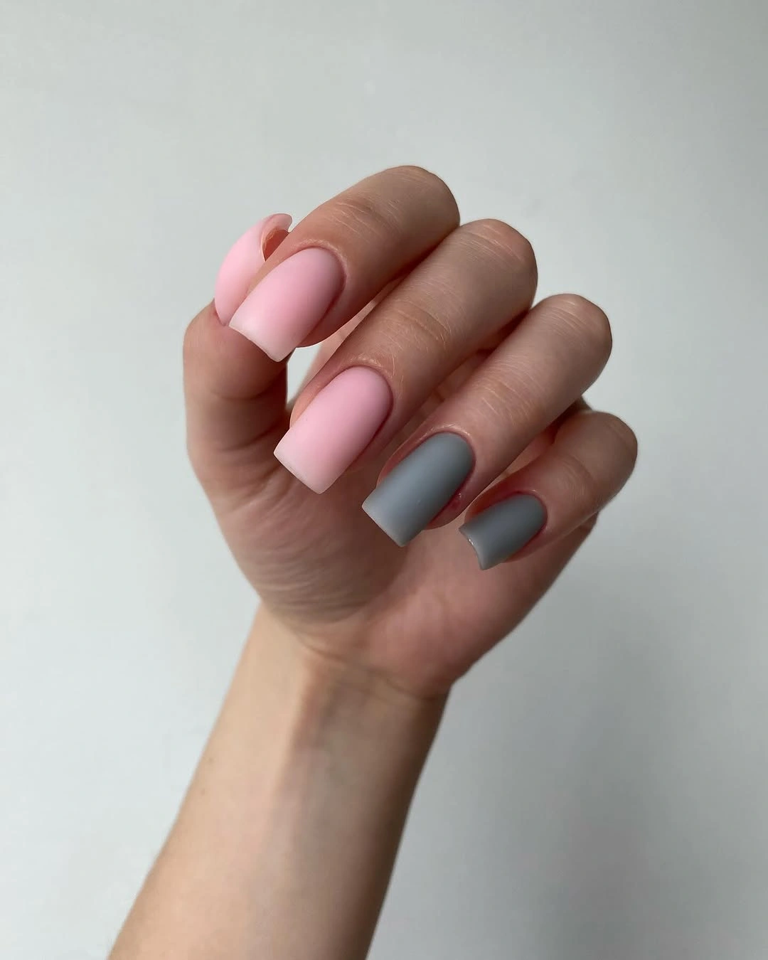
This is a useful layout when you want visible variety but do not want any painted art to manage. Keeping each color in a solid block makes the long shape look cleaner than a busy pattern might. For a more muted effect, choose a warmer mushroom gray; for a sharper contrast, shift the pink toward a dusty rose rather than a bright bubblegum tone.
Alternating solids are also easy to adjust during a future appointment because one shade can be replaced without changing the rest of the concept. The only real risk is choosing colors that are too similar in depth, which can make the sequence disappear at arm’s length. Here the gray and pink are different enough to read, but both remain soft enough for the matte surface.
15. Cool Gray-Blue Matte on Short Soft Squares
Short rounded-square nails wear a uniform cool gray-blue matte tone that looks calm against the soft knit background and keeps the focus on the compact silhouette. The blue is muted enough to act almost like a neutral, but it still gives more character than beige or pale gray. Its flat finish makes the color appear slightly clouded rather than brightly polished.
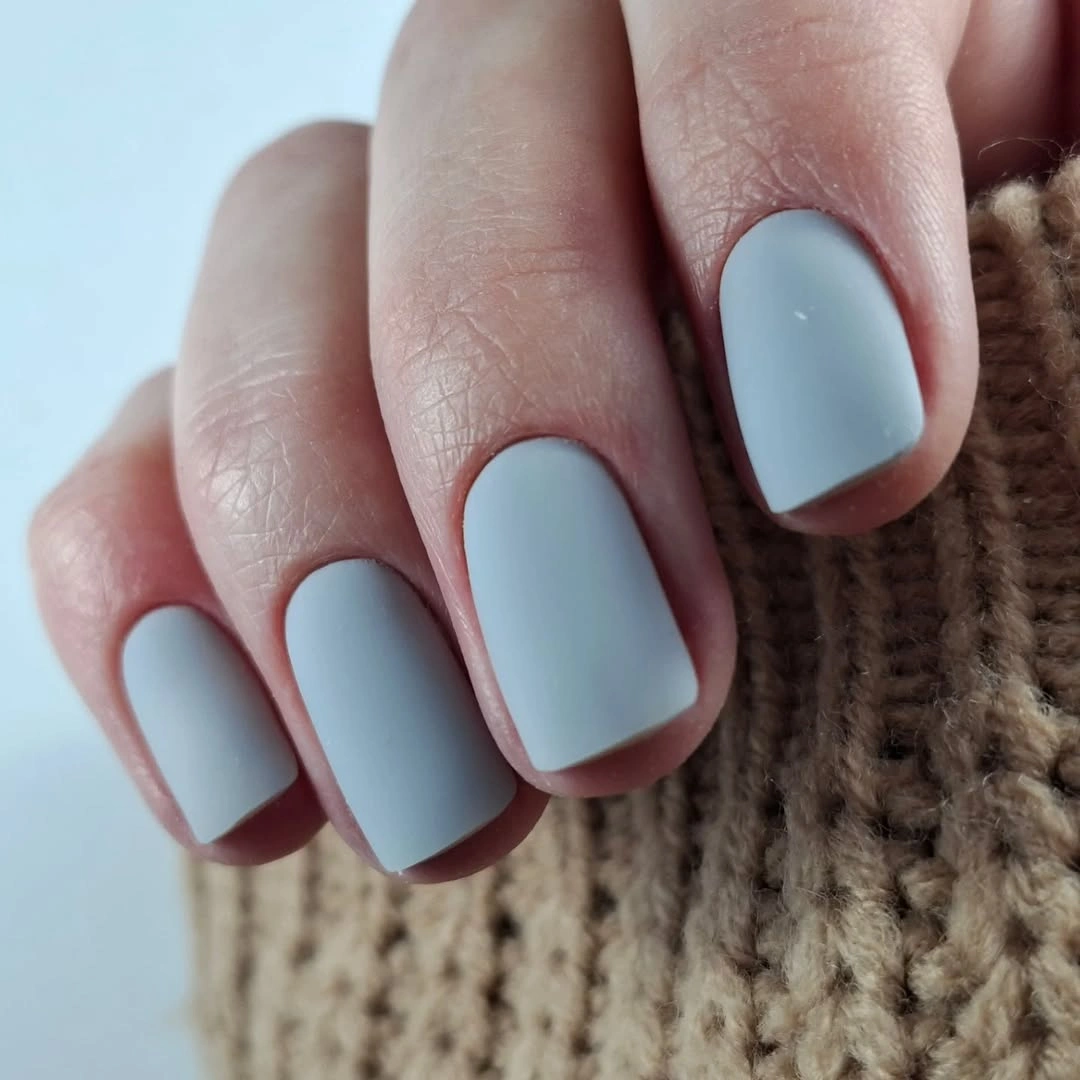
A single cool shade works best here because the short shape leaves no need to divide the surface into smaller parts. If you are drawn to matte green fall nails design ideas but prefer a less literal green, this blue-gray offers a similar subdued direction. The color would also translate well to a short oval if you want the same mood with a little less corner definition.
Cool medium-light tones can make the edge of the nail noticeable as it grows, especially when worn against warm clothing. Choosing a slightly deeper version of this shade would reduce that contrast while keeping the muted effect intact. The visual reward is a manicure that feels considered from close range, even though its structure is simply color, finish, and shape.
16. Teal Shimmer With One Botanical Accent
Shimmering teal short nails sit beside a pale accent nail marked by a dark leaf outline, combining a reflective color with a single quiet botanical cue. The deep teal shifts under light, while the pale nail creates a break that makes the shimmer feel more deliberate. The short rounded-square shape prevents the metallic surface from becoming too showy.
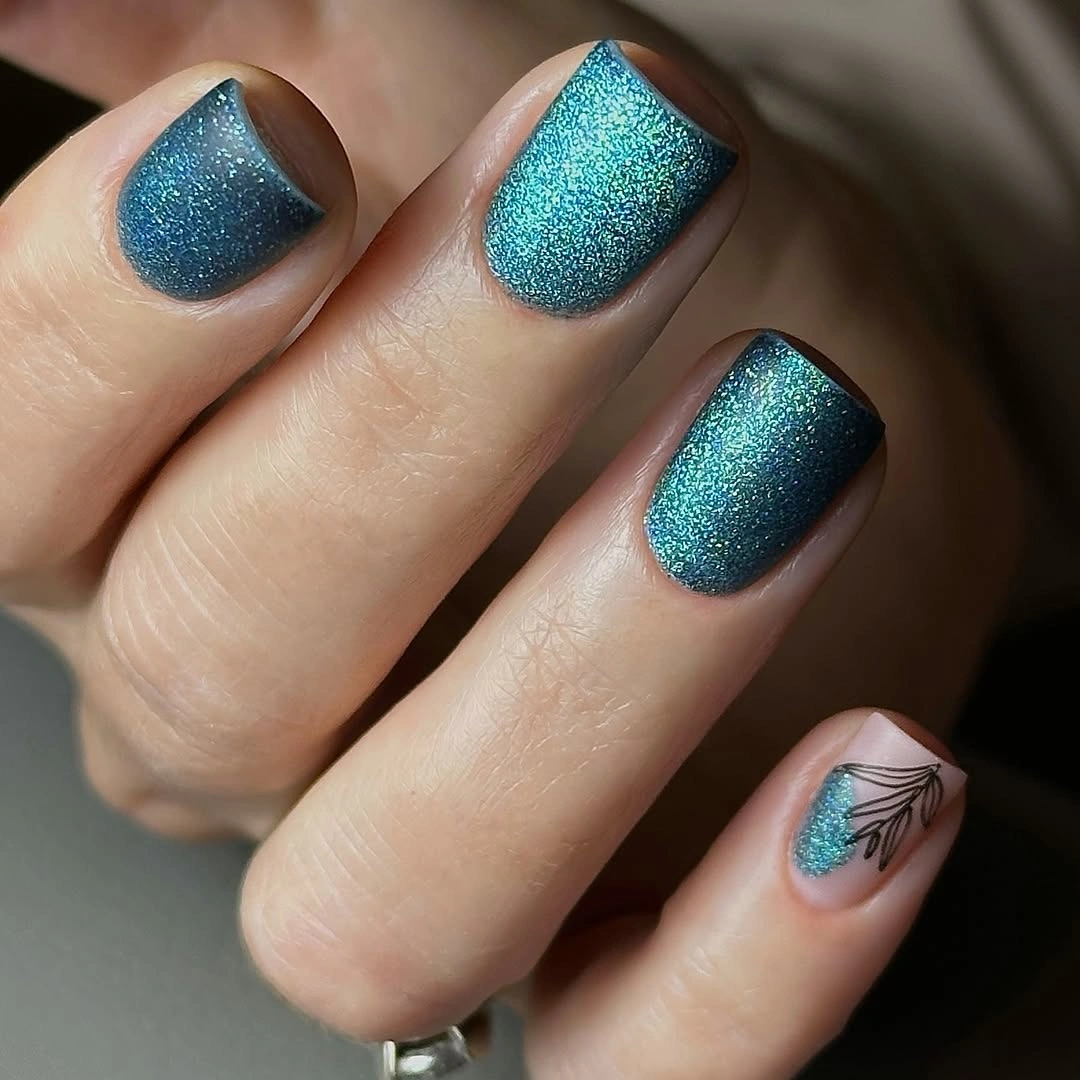
The accent works because it does not try to copy the teal texture; instead, it offers a flat pale background and a clean dark drawing. That difference creates contrast through finish and line, not just color. A person who prefers less shine could swap the teal for a muted matte green and retain the same one-accent composition.
Shimmer finishes catch attention even on short nails, which makes this an efficient choice when you want a small amount of visual energy. The leaf outline should remain simple, since more layers would compete with the shifting teal surface. There is a nice tension here between the lively color and the single calm botanical detail, and neither one needs to dominate.
17. Matte Burgundy With a Small Crystal Curve
Long matte burgundy square nails rely on their dark non-reflective surface, with one nail interrupted by a small curved cluster of light-catching stones. The jewel detail sits like punctuation rather than a full embellishment field, so the burgundy remains the dominant visual decision. Straight tips make the color feel strong, while the tiny curve adds a softer note.
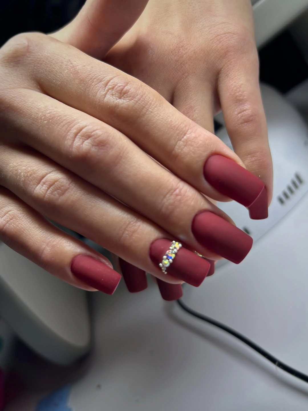
Dark matte color can look dense on a long square shape, which is why one small reflective accent has so much impact here. Keeping it on a single nail preserves the clean silhouette and avoids turning the set into a high-glitter look. If raised stones are not practical for your routine, a small painted arc in pale gold could offer a flatter alternative.
The matte surface will emphasize any interruption, so spacing around the crystal cluster is important for it to look intentional. A narrow arrangement near the lower half of the nail would be easier to see than one crowded directly at the tip. This design feels rich and controlled because the decorative element is measured against a large field of quiet burgundy.
18. Nude Almond Nails With Navy Edges
Nude almond nails have slim navy French edges and tiny light-catching studs, using a dark tip to define the shape without covering much of the neutral base. The curved navy line follows the almond outline closely, which makes the length look elegant rather than sharply graphic. Small studs add a subtle point of contrast without changing the restrained palette.
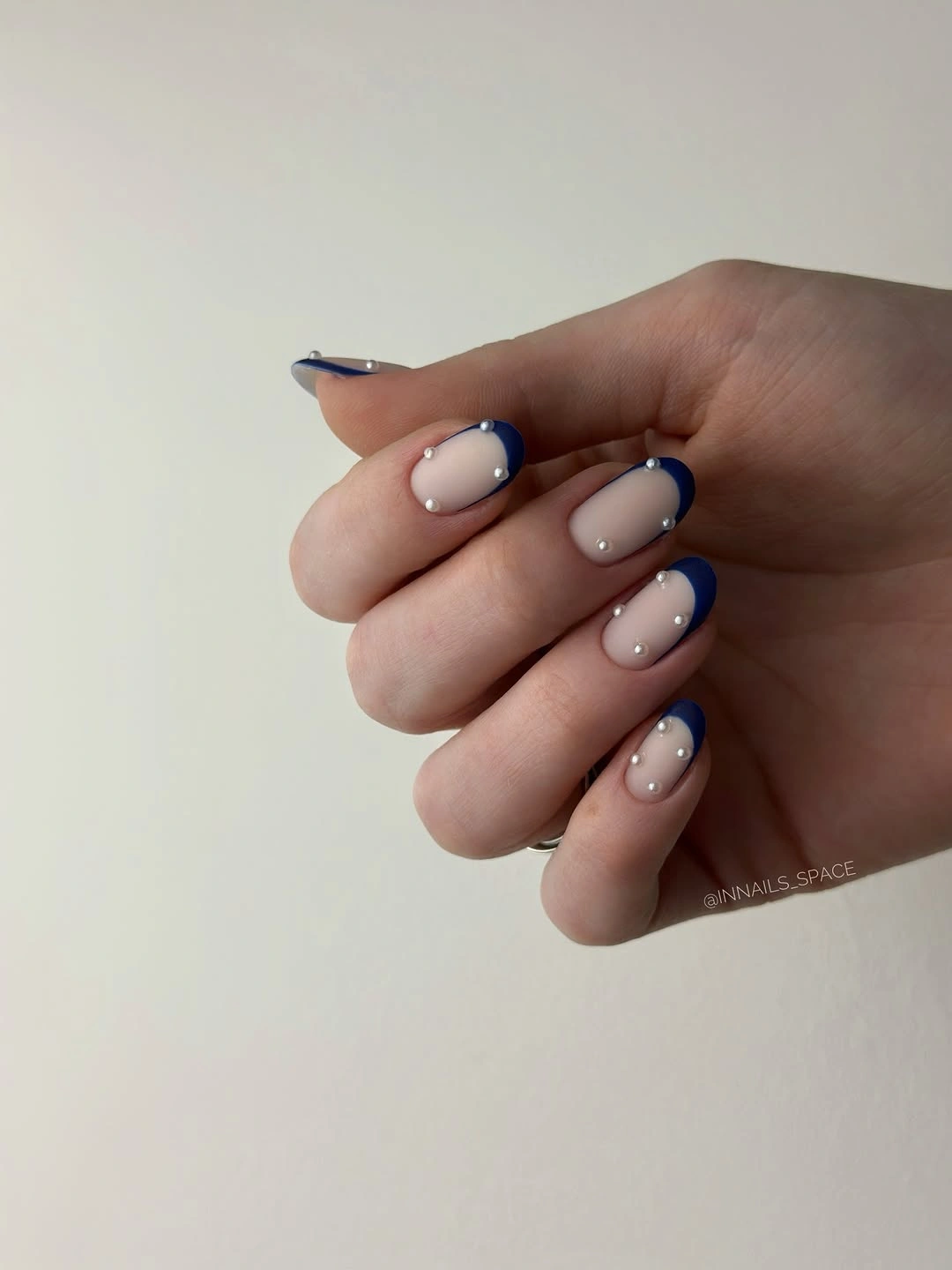
Thin French edges are an effective way to introduce a darker fall color while keeping the center of the nail visually open. Navy is especially useful when black feels too stark against a nude base, because it still creates a clear frame with a slightly softer cast. On shorter nails, reducing the stud count would keep the tips from looking overly busy.
Tip-focused color can show wear at the free edge, so this style benefits from a clean finish and careful everyday use. Its advantage is that the nude area makes regrowth less visually obvious than a full dark solid would. The design remains polished because the navy line, the almond curve, and the small studs all point toward the same refined edge detail.
19. Autumn Leaves and Plaid Across Ivory Almonds
Ivory almond nails carry yellow and red leaf drawings, while one accent introduces a small plaid pattern, creating a clear autumn reference without relying on a single repeated symbol. The light base lets the warm motifs stay visible, and the long tapered form gives each illustrated nail room to remain distinct. It is decorative, but the palette stays controlled around ivory, red, yellow, and olive.
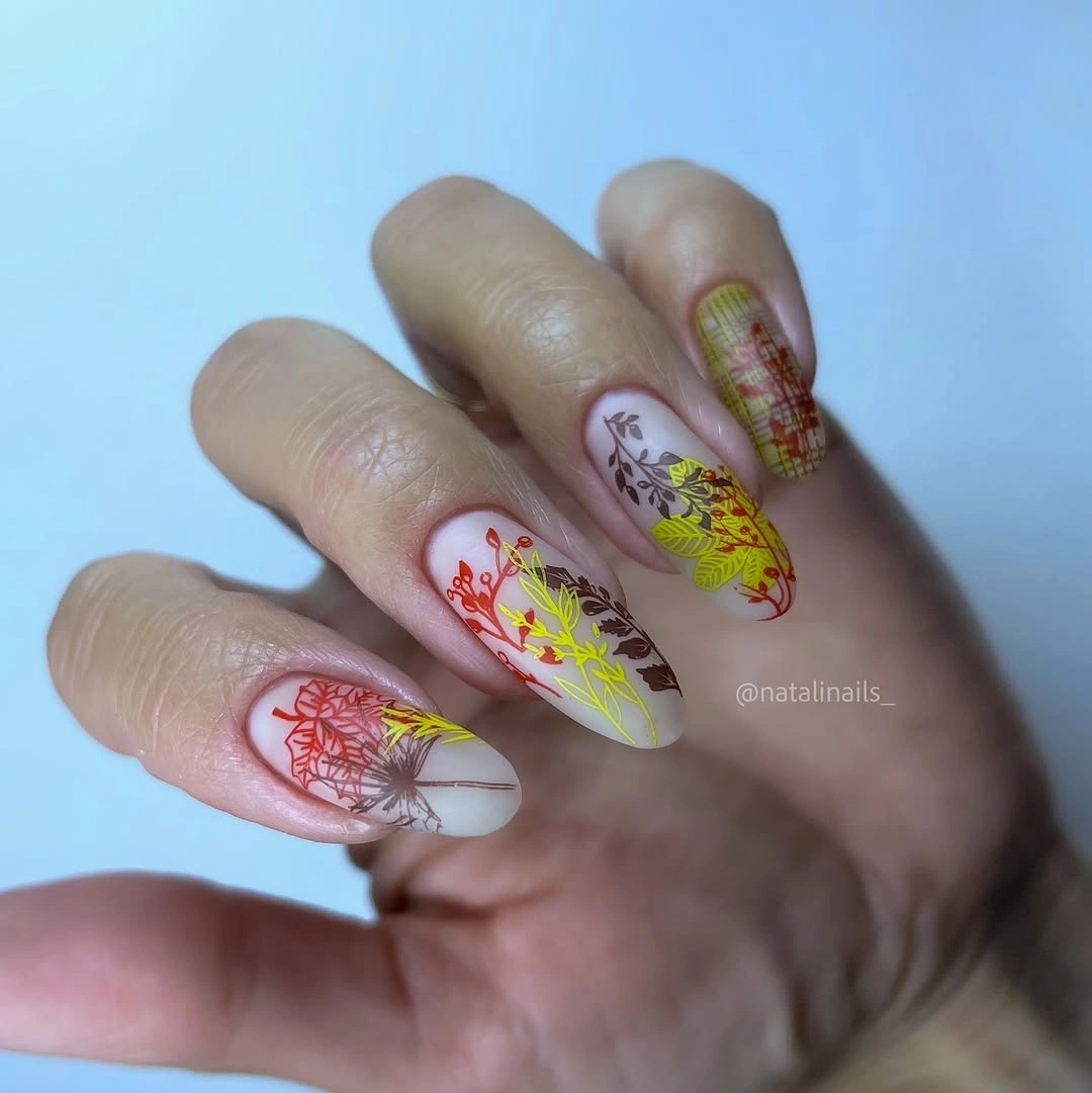
Combining leaves with plaid works because the patterns are assigned to separate nails rather than layered into one crowded area. That split gives each accent a different job: the leaves create movement, while the plaid supplies a small geometric contrast. If you want the seasonal reference to feel less literal, keep the warm colors but replace the leaf drawings with simple abstract arcs.
Detailed illustrated nails usually look best when the neighboring solids or neutral bases are left uncomplicated, as they are here. The tradeoff is that multiple motifs require more visual care than a single French edge, especially if some nails are shorter than others. Still, the ivory ground keeps the set readable, and the color choices make the patterns feel connected rather than scattered.
20. Pearl Matte Neutrals With a Gold Lattice Accent
Matte pearl-white nails surround a berry-red accent covered in a fine gold lattice, creating a compact focal point against a soft neutral field. The short rounded-square shape keeps the bright red-and-gold detail contained, while the pale nails give it room to stand out. This is a strong example of how one decorative nail can carry the entire contrast story.
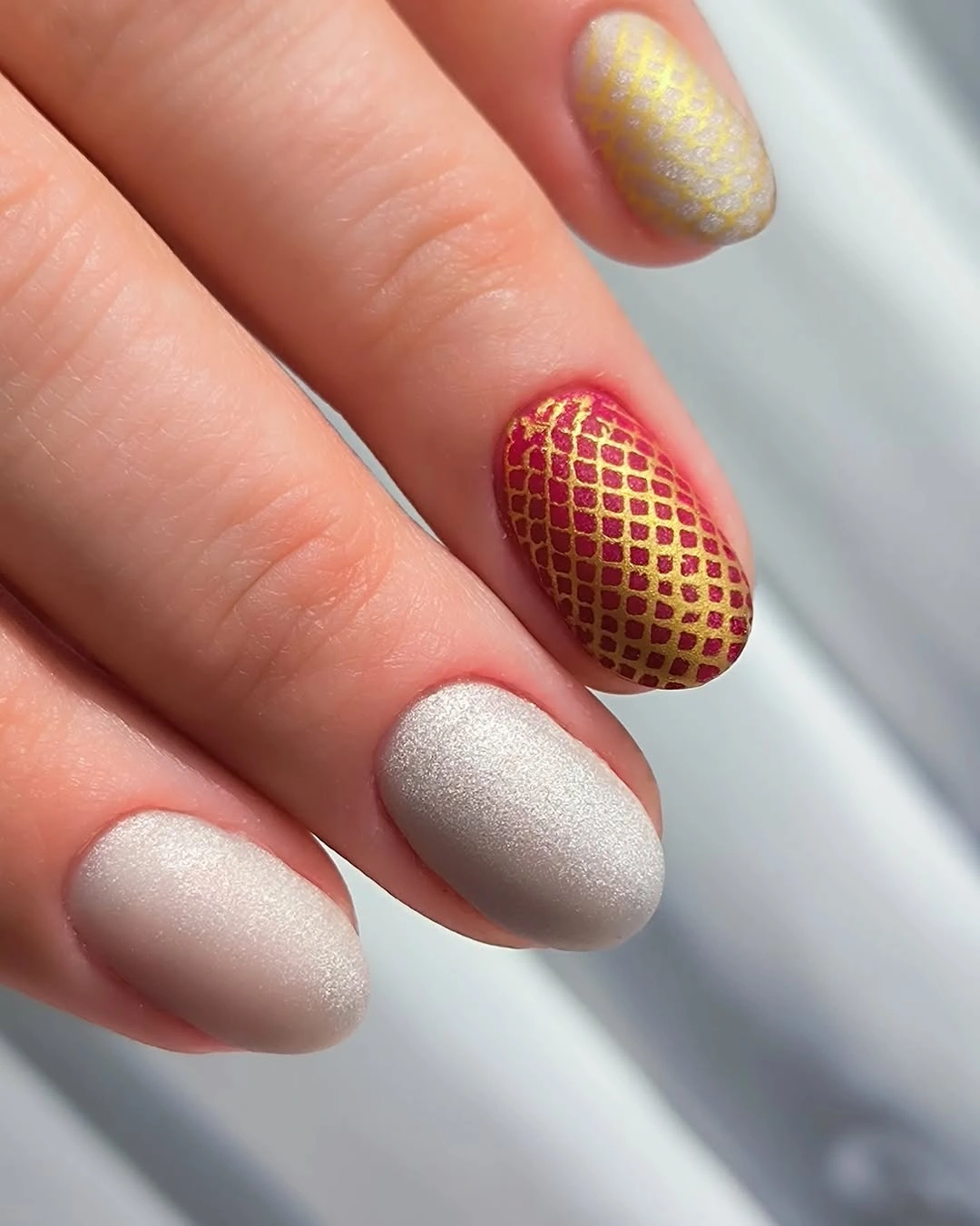
The lattice succeeds because it is limited to a single berry-red nail rather than repeated across every fingertip. Gold lines add depth without needing a large stone or heavy metallic block, and the surrounding matte white keeps the result from reading like a holiday set. A muted brick red could make the same arrangement feel more earthy and less bright.
Fine grid patterns demand clear spacing, so a smaller nail may need fewer crossings to avoid looking crowded. The neutral nails are relatively easy to live with, but the textured-looking accent will remain the point that catches the eye first. Its warmth feels measured rather than flashy because the dominant surface stays softly matte and pale.
21. Magenta Matte With Graphic and Floral Contrast
Bright magenta matte nails mix pale floral prints with one nude accent crossed by dark and magenta lines, turning a vivid color into a set with several controlled focal points. The long almond silhouette gives the printed details a graceful taper instead of a blunt end. The dark lines on nude create the strongest contrast, while the floral accents soften the overall energy.
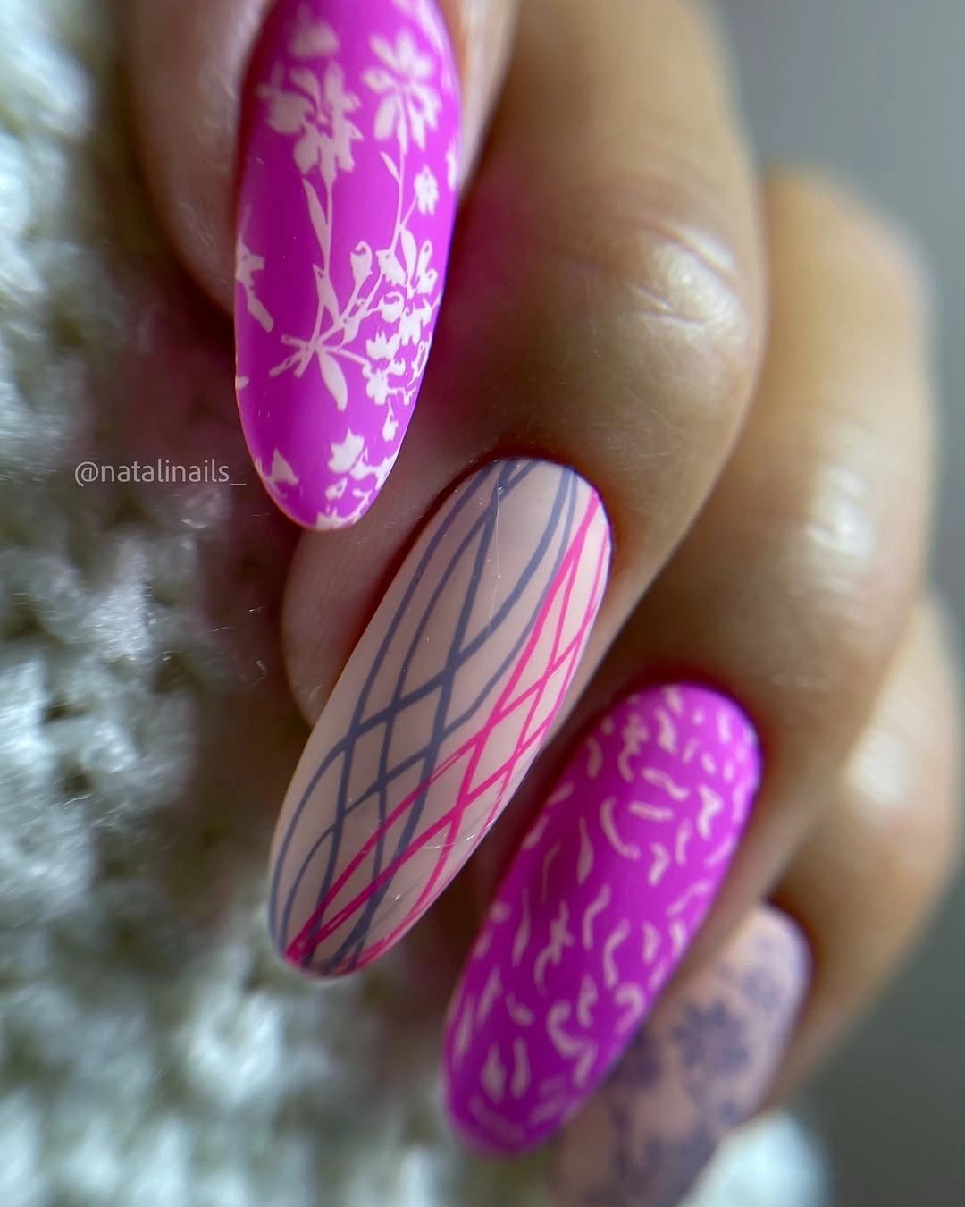
Vivid matte color is most wearable when it is balanced by a neutral break, and the nude graphic nail provides exactly that relief. The floral pattern also repeats a lighter tone, which keeps the magenta from feeling like a solid wall of color. For a less intense version, keep the neutral accent and trade bright magenta for a muted berry shade.
Because several distinct details appear in one set, the best restraint is limiting each accent to a single clear job. The printed nails need clean edges, while the matte solids need an even surface, so this choice asks for more precision than a simple two-color alternation. It ends on a confident note: rich color, soft finish, and graphic space all stay visible without blurring into one another.