Fall nails with pumpkins work best when the seasonal symbol feels like punctuation, not a costume covering every surface. A manicure can stay grounded when one warm shape gets a clear field around it, while the supporting colors echo the season without competing for attention. That balance matters on real hands because the design has to read at arm’s length and still feel considered when the details are close.
Start with the relationship between detail and empty space before choosing a pumpkin drawing. If the base, silhouette, and accent color already have a calm rhythm, you can scale the motif up or down without losing the mood; if the layout is crowded, even a charming symbol becomes visual noise. A restrained reference to fall nail art ideas can help keep the seasonal cue specific instead of turning every nail into the same announcement.
1. Tiny Pumpkin Details on a Quiet Nude Base
The long almond shape gives the small orange pumpkins a narrow vertical field, so the artwork feels placed instead of crowded. The pale peach-nude background keeps the eye moving between the pumpkins, green leaves, and tiny pale floral marks, while the deep teal setting makes the warm manicure look even brighter. Nothing needs to cover the whole nail because the empty space is carrying part of the composition.
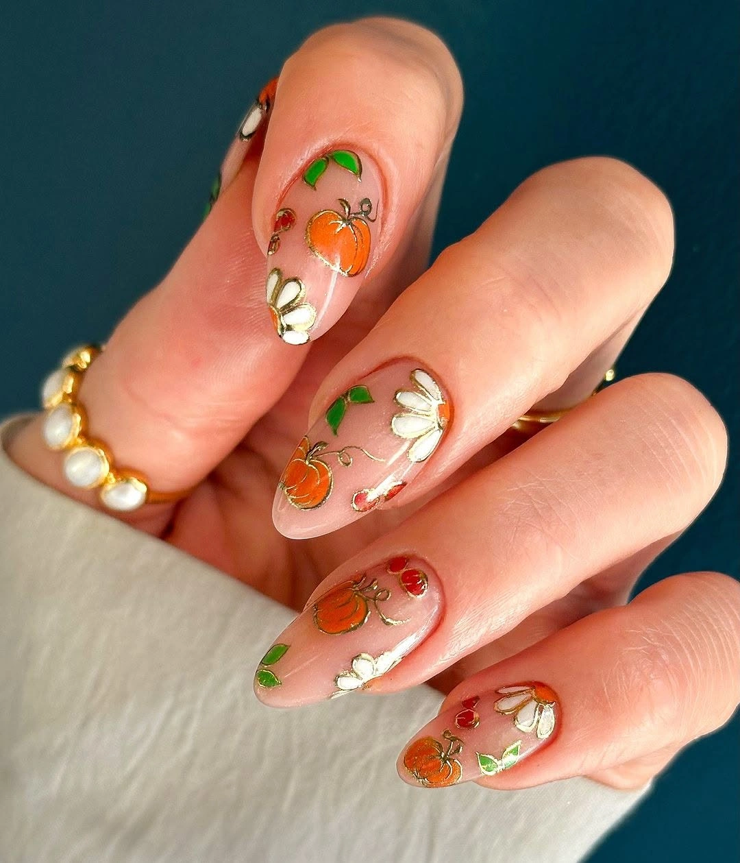
For a shorter version, keep one pumpkin on each of two accent nails and leave the remaining nails nearly bare in the same pale family. That preserves the visible rhythm without forcing a detailed motif into a small area, and it also makes the manicure easier to wear with neutral clothing. The important adjustment is not changing the symbol, but protecting the space that lets it read.
This is a good starting point when seasonal nails need to feel polished rather than theatrical. A narrow almond tip supports the delicate placement, but the same idea can move onto a short oval if the pumpkin and leaf shapes are enlarged slightly. The tradeoff is clear: more length gives the artist more room for fine lines, while less length makes the design calmer and quicker to maintain.
2. Earthy Checks Break Up Soft Fall Tones
The second design shifts attention from a single pumpkin symbol to the relationship between muted earthy colors and one crisp checkerboard panel. Taupe, brown, and green-like details keep the manicure grounded, while the black-and-white check introduces a harder edge that prevents the softer shapes from blending together. The result is autumnal because of its temperature and texture, not because every nail carries a literal icon.
If you adapt this layout to a shorter almond or square shape, use the checkerboard on one accent nail and let the remaining nails carry only the muted base. That change keeps the graphic panel legible and avoids shrinking several tiny squares into visual noise. A simplified version can still connect naturally to fall nails with autumn designs because the seasonal feeling comes from the balance of color and pattern.
The honest limitation is that mixed patterns need a quiet background to look intentional. Adding another busy motif would weaken the contrast that makes the checkerboard useful, especially on a small nail. Keep the earthy colors close in value, then allow one sharply divided panel to interrupt them; that single edge does more work than a second unrelated print would.
3. Polka-Dot Tips Keep Pumpkin Art Playful
Here, the defining decision is the dotted white tip placed over a soft pink base, with orange and red seasonal drawings saved for selected nails. The black dots create a repeated edge that ties the manicure together, while the warmer illustrations bring variation without asking every nail to carry equal detail. Because the dots are simple, the set remains readable even when the silhouette is short.
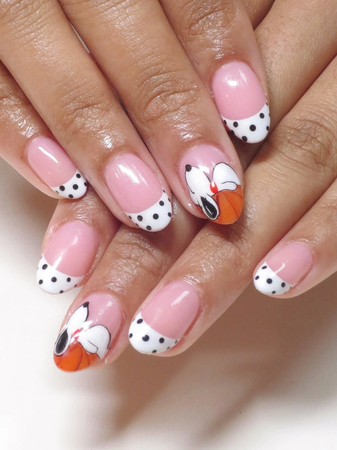
On short nails, keep the dotted edge slightly wider than the illustration so the two details do not collide near the tip. One or two accent nails can hold a pumpkin or leaf shape, while the rest repeat the pink-and-white rhythm. That adjustment makes the idea useful for someone searching for simple fall short nails without flattening the playful character seen in the original.
The design works because its repetition is stronger than its complexity. A viewer notices the dotted border first, then discovers the small warm motifs, so the manicure has an order of attention instead of a pile of competing symbols. If the dots are removed, the pumpkins may feel scattered; if too many illustrations are added, the clean tip rhythm loses the quiet structure that makes it charming.
4. Fine Botanical Lines Soften Deep Red
Deep red appears more refined when it is interrupted by pale surfaces and narrow botanical lines rather than left as one uninterrupted block. The medium almond shape supports that balance: the darker nails provide weight, while the cream and nude areas hold the fine drawings in clear view. The seasonal message stays understated because the linework suggests leaves and small warm details without turning into a full scene.
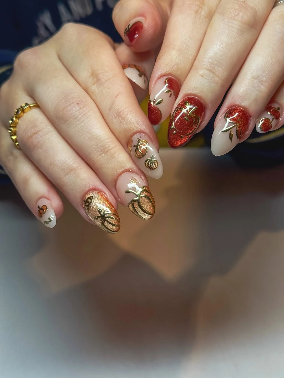
Use the palest nail for the most detailed drawing and keep the red on the simpler fingers if you want the design to remain easy to read. On a shorter shape, a single fine leaf or curved stem can replace several small marks without losing the relationship between rich color and open space. This is also a natural companion to fall burgundy nails with design when the goal is depth without visual heaviness.
Fine linework has a practical limit: it needs a clean background and enough distance between marks to remain recognizable. A dense red accent can hide those distinctions, so resist the urge to repeat every small flourish on every nail. The strongest adaptation keeps the contrast visible, letting one botanical detail clarify the color story instead of asking decoration to compete with it.
5. Cool Blue Gives Pumpkin Motifs a New Temperature
The pale blue, pink, white, and dark blue combination changes the emotional temperature of pumpkin-themed nails before the orange motifs even appear. Plaid panels add a measured graphic beat, while the cool base makes the small warm details feel brighter and more unexpected. Shape and color are working together here: medium almond tips give the varied palette enough room to stay organized.
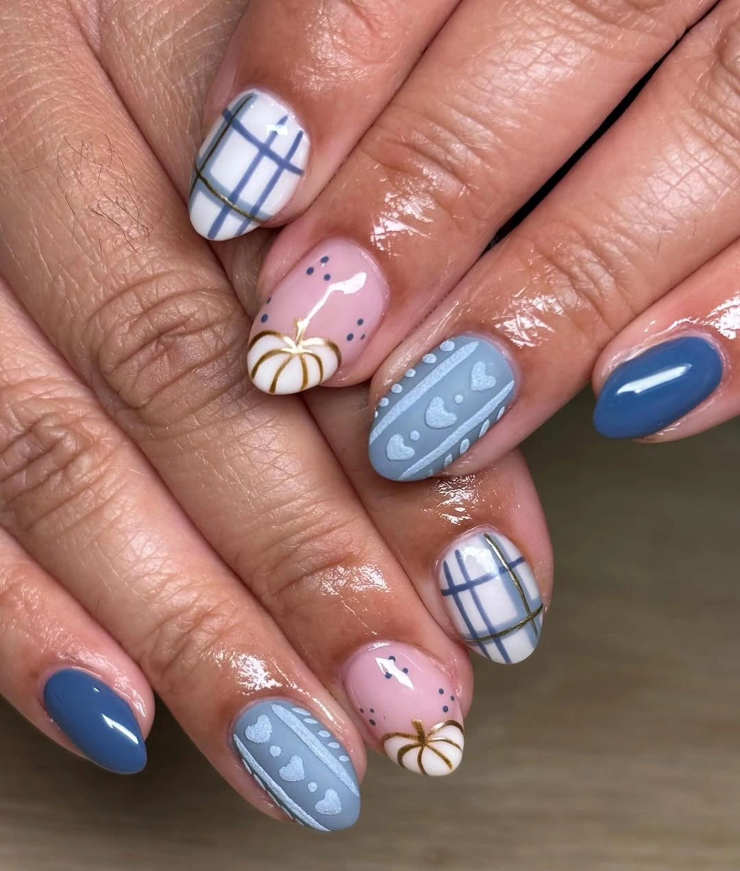
To adapt the idea, choose one cool base and one warm accent rather than carrying every visible color into a shorter manicure. A pale blue with a single orange pumpkin and one plaid nail will keep the same contrast while reducing the chance of a crowded result. Readers who already like early fall nails can use this temperature shift to move away from predictable brown without losing the season.
The blue is not decoration for its own sake; it gives the orange shapes a reason to stand forward. If the base becomes too saturated, the small drawings may lose priority, so keep the supporting blue and pink soft enough to leave a clear focal point. The most wearable version preserves the cool background and edits the number of competing accents.
6. Dark Solids Frame a Small Pumpkin Focal Point
Deep burgundy and black pointed nails create a strong frame around the few orange-red accent nails, which makes the pumpkin details feel intentional rather than scattered. The pointed silhouette adds tension, while the warm illustration gives the eye somewhere to rest inside the dark composition. This is a lesson in concentration: the seasonal symbol becomes more visible because it is not repeated everywhere.
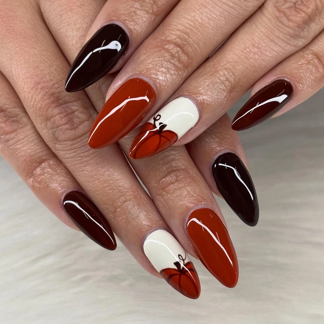
If the full pointed length feels too intense, move the same color relationship onto medium almond nails and keep only one illustrated accent. The dark solids will still provide contrast, but the shorter outline will make the design less dramatic for everyday wear. A matte variation can borrow the controlled depth of fall matte nails, provided the orange detail remains clear against the changed finish.
The main tradeoff is silhouette, not color. Long pointed nails make every dark block look sharper, so a short or rounded shape will soften the result even if the burgundy and black remain unchanged. Keep the warm motif concentrated when simplifying; moving it across too many nails would remove the focal hierarchy that gives this design its confidence.
7. Short Pink Nails Let Tiny Motifs Lead
Short rounded pink nails can carry a fall message when the pumpkins and leaves are treated as small punctuation instead of full illustrations. The pale base keeps the silhouette visually light, and the selected accents sit where the nail has enough room for their shape to remain legible. This is a useful example of proportion: the motif becomes convincing because it is scaled to the nail rather than enlarged to imitate a long design.
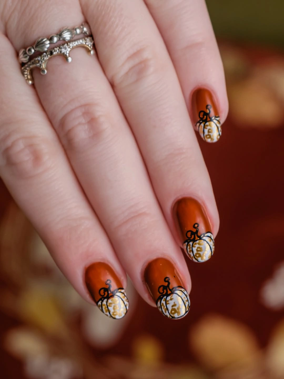
For an easy adaptation, repeat the pink base on most nails and place one orange pumpkin or leaf on two accent fingers. Keep the center of each accent open around the drawing so it does not merge with the sidewalls as the nail grows. That structure makes a gentle seasonal option without relying on heavy color, dense art, or a long extension.
The compact shape also makes maintenance visually forgiving. Small motifs can be refreshed without rebuilding an entire pattern, and a little grow-out is less disruptive when the base is pale and the art is centered. The limitation is detail scale: if the pumpkin is reduced below a readable outline, remove extra leaves and keep the simplest visible shape.
8. Long Coffin Tips Stretch Pumpkin Linework
Very long coffin nails give orange pumpkin linework room to travel vertically, so the length is contributing to the illustration rather than merely making the manicure larger. Nude and tan bases soften the strong silhouette, while orange and brown marks create a warm path from the cuticle toward the tip. The contrast between a long edge and a restrained background keeps the design from looking shapeless.
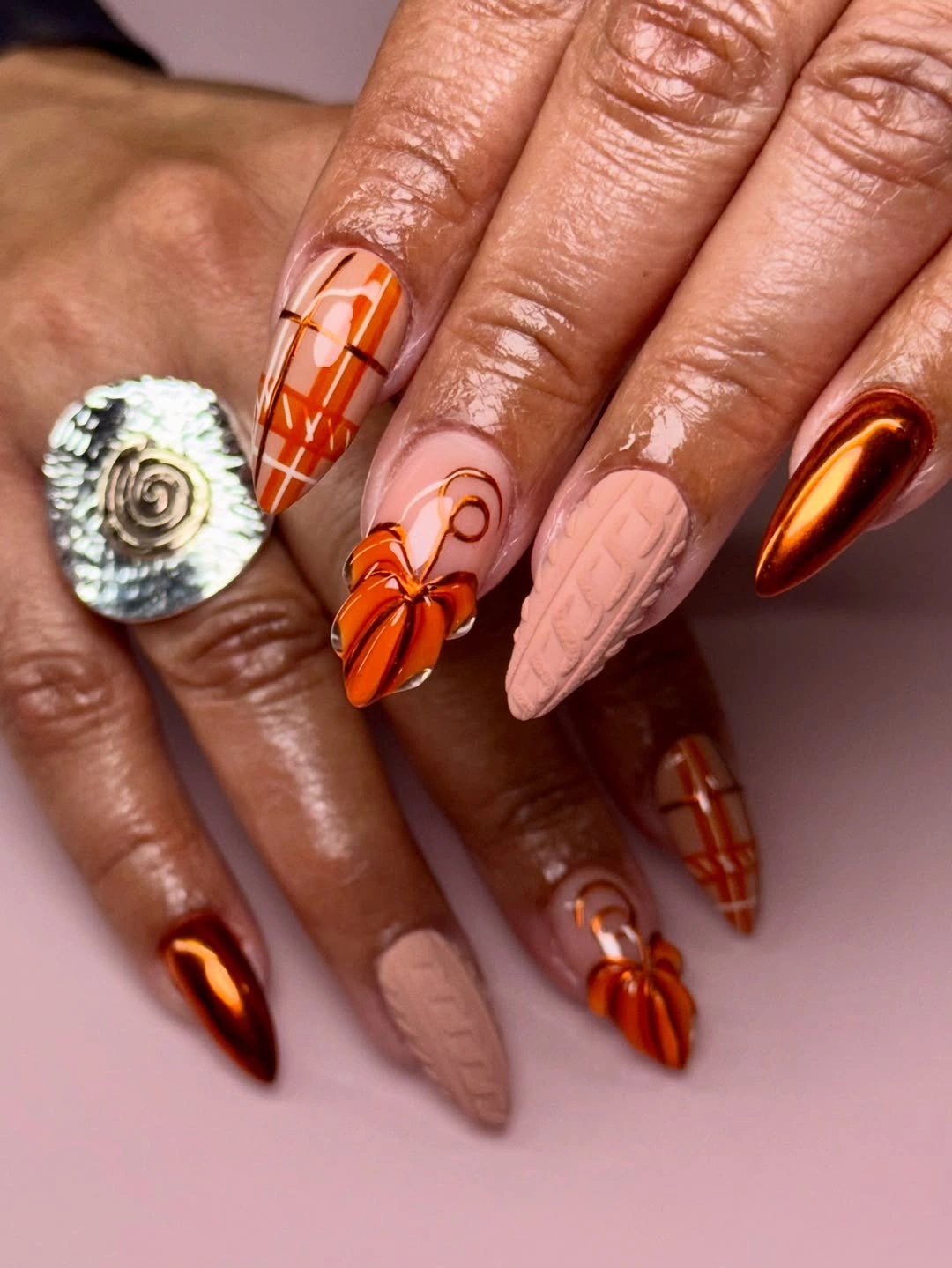
A practical shorter version would keep the vertical line direction but reduce each pumpkin to one clear outline and one accent color. Medium coffin or almond tips can preserve the elongated feeling, though the design will need fewer internal marks. The important choice is to shorten the drawing with the nail instead of compressing every detail into the same small area.
Length is the honest commitment here because fine linework placed far from the cuticle becomes more noticeable as the nail grows. If that upkeep does not fit your routine, keep one long accent nail and simplify the rest into warm neutral solids. The visual idea survives when the line direction remains, even after the number of details is reduced.
9. Pale Blue Bases Make Colorful Pumpkins Cheerful
These rounded-square nails use pale blue as an organizing background for orange, red, green, and white pumpkin illustrations. The cool base gives the warm motifs lift, and the clean spacing between illustrated nails prevents the set from becoming a dense autumn collage. The shape is short enough to feel approachable, but the color contrast keeps it from looking plain.
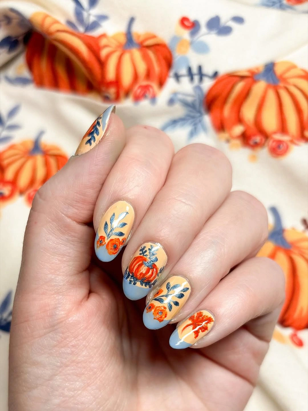
For a shorter or more neutral adaptation, keep the blue on most nails and choose either orange or red for the focal motifs, not both. A single green leaf can remain as a supporting note, while extra character details are removed first. This keeps the same cheerful temperature and makes the design easier to pair with a simple wardrobe.
The strength of this set is the separation between background and symbol. If the blue becomes too dark or the illustrations spread across every nail, the playful lightness will disappear. Preserve the pale field and let the color changes happen inside the small motifs; that is where the design gets its energy without needing a complicated finish.
10. Neutral Taupe Keeps Seasonal Line Art Quiet
Taupe-nude nails with dark line drawings prove that pumpkin art does not have to announce itself through bright orange. The medium almond silhouette is smooth and elongated, while the restrained marks give the eye small points of interest without breaking the neutral surface. The mood is seasonal because of the subject and the contrast, not because the palette is loud.
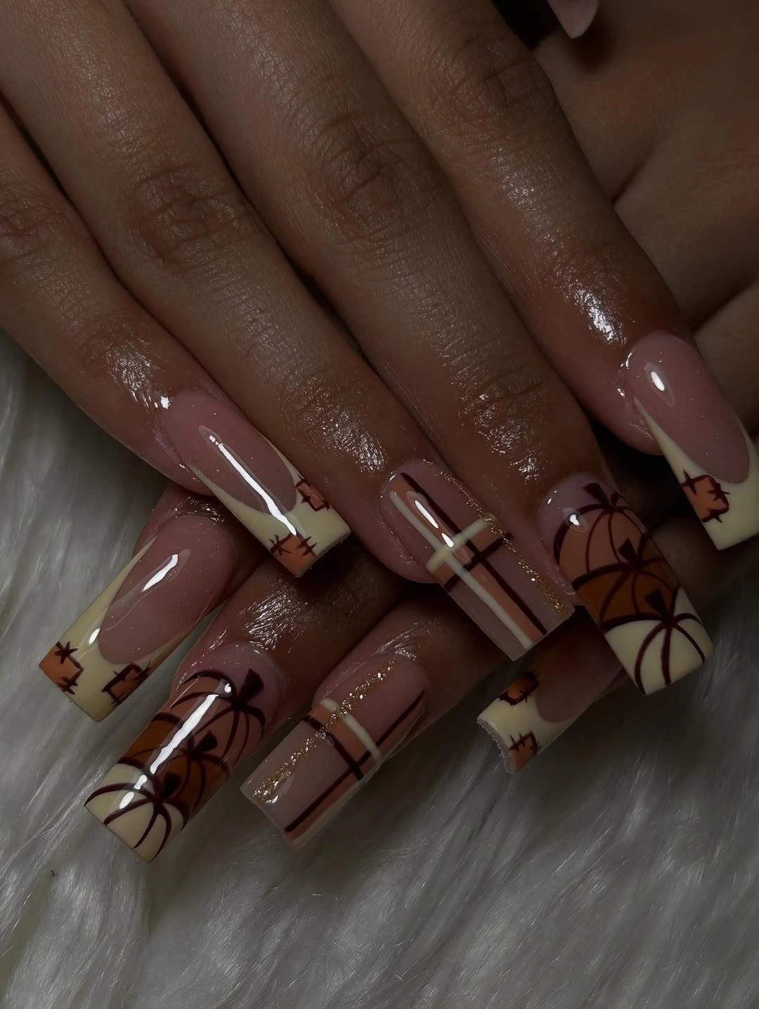
Use this approach when you want the theme to remain office-friendly or easy to combine with a neutral outfit. On a shorter nail, keep one dark drawing and one small orange mark on a pale base, then let the remaining fingers repeat taupe. The result stays close to the visual logic of dark fall nails while avoiding an all-over dark finish.
The limitation is visibility: subtle line art depends on enough value contrast to keep the drawing from disappearing. If the taupe is very close to the skin tone, make the outline slightly darker or move the motif onto the palest accent nail. Do not compensate by adding more symbols; improve the separation so one precise detail can do its job.
11. Checkerboard Tips Give Pumpkins a Clear Edge
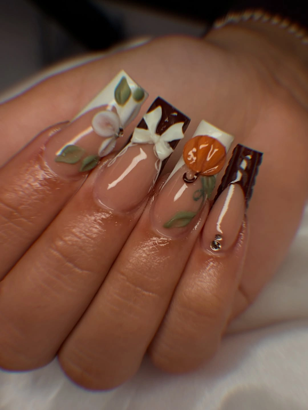
Long coffin nails with brown-and-cream checkerboard tips use the edge as the main structural device. The tiny orange pumpkins sit above that repeated pattern, so each accent has a graphic base instead of floating in empty space. Pale nude areas keep the manicure open, while the checked tips make the shape feel finished and deliberate.
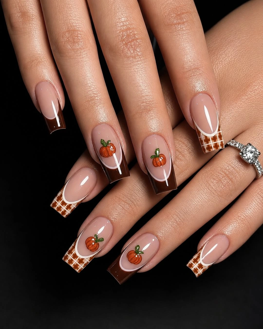
If you shorten the silhouette, reduce the checkerboard to one accent nail or make the squares larger and fewer. The pumpkin details can stay small because the tip already provides a strong repeated rhythm. That is a more useful edit than trying to preserve every square, and it keeps the connection to fall nails with an accent nail focused on placement rather than density.
The pattern also creates a maintenance consideration: uneven growth can make a narrow checked edge look less regular than a plain tip. Keep the rest of the nails quiet if the checkerboard is the main feature, and resist adding a second busy border. The manicure works when the tip frames the pumpkin instead of competing with it.
12. Curved White Tips Soften a Pointed Silhouette
Long pointed pink nails look less severe because the white tips curve softly across the nail instead of following a hard straight edge. Green and brown botanical marks then sit inside that gentle movement, with small warm details adding the seasonal cue. The eye reads the curved tip first, so the sharp silhouette feels balanced rather than purely dramatic.
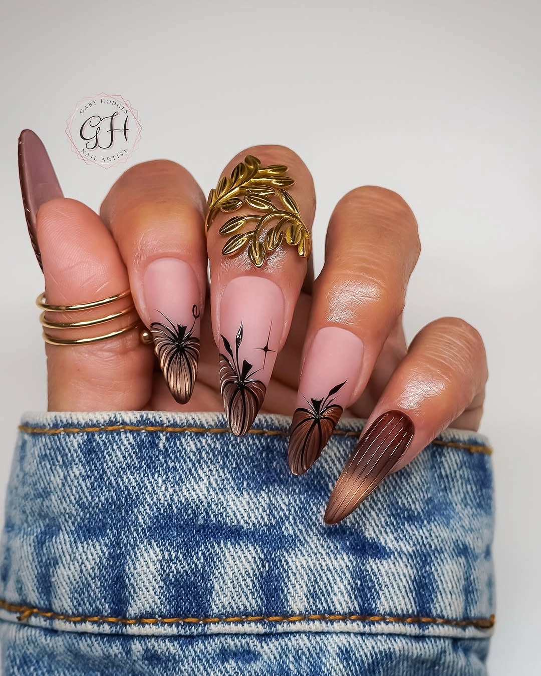
To make the idea more wearable, keep the curved white edge on a medium almond shape and use only one green or brown leaf on each accent nail. The rounded outline will preserve the softness even after the length is reduced. A pale pink base can stay, but the curve should remain the clearest line so the design does not lose its organizing feature.
The tradeoff is that pointed nails amplify every curve and every gap. If the white tip is uneven, the whole manicure can feel less controlled, whereas a shorter almond hides small differences more easily. Keep the palette quiet and the line spacing generous; the design needs that visual calm to support the decorative details.
13. Orange Tips and White Bows Share the Spotlight
Long coffin nails with orange tips use the edge as a repeated warm signal, while white bow details create a softer counterpoint on the nude-pink base. Pumpkin forms sit near the tips, so the seasonal motif and the color border reinforce each other rather than competing for attention. The result is decorative, but its repetition gives the ornament a clear order.
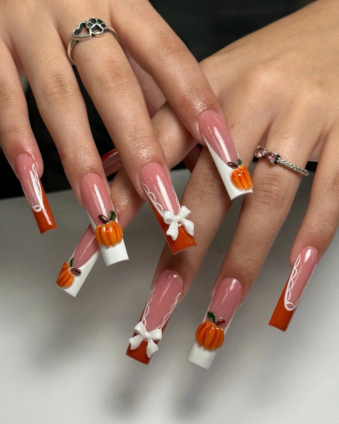
For a shorter version, keep the orange tip on two nails and replace the raised-looking bows with small flat white loops. That change preserves the relationship between warm edge and pale accent while reducing the amount of detail that can catch on the shorter silhouette. The visual idea remains coordinated because the same two accent shapes keep returning.
The main limitation is detail density near the tip. When the pumpkin, bow, and orange edge all occupy the same small area, the design can become difficult to read as the nail shortens. Give the orange border priority, then keep the bow and pumpkin smaller; a clear hierarchy will make the manicure feel more polished than equal emphasis everywhere.
14. Amber and Brown Create a Compact Warm Palette
Brown, amber, and gold-toned accents make this medium almond manicure feel rich without needing a long list of colors. The reflective-looking surfaces catch light, while small pumpkin and leaf forms provide a recognizable seasonal direction. Because the palette stays close in temperature, the design reads as layered rather than fragmented, and the almond shape gives each warm panel a neat outline.
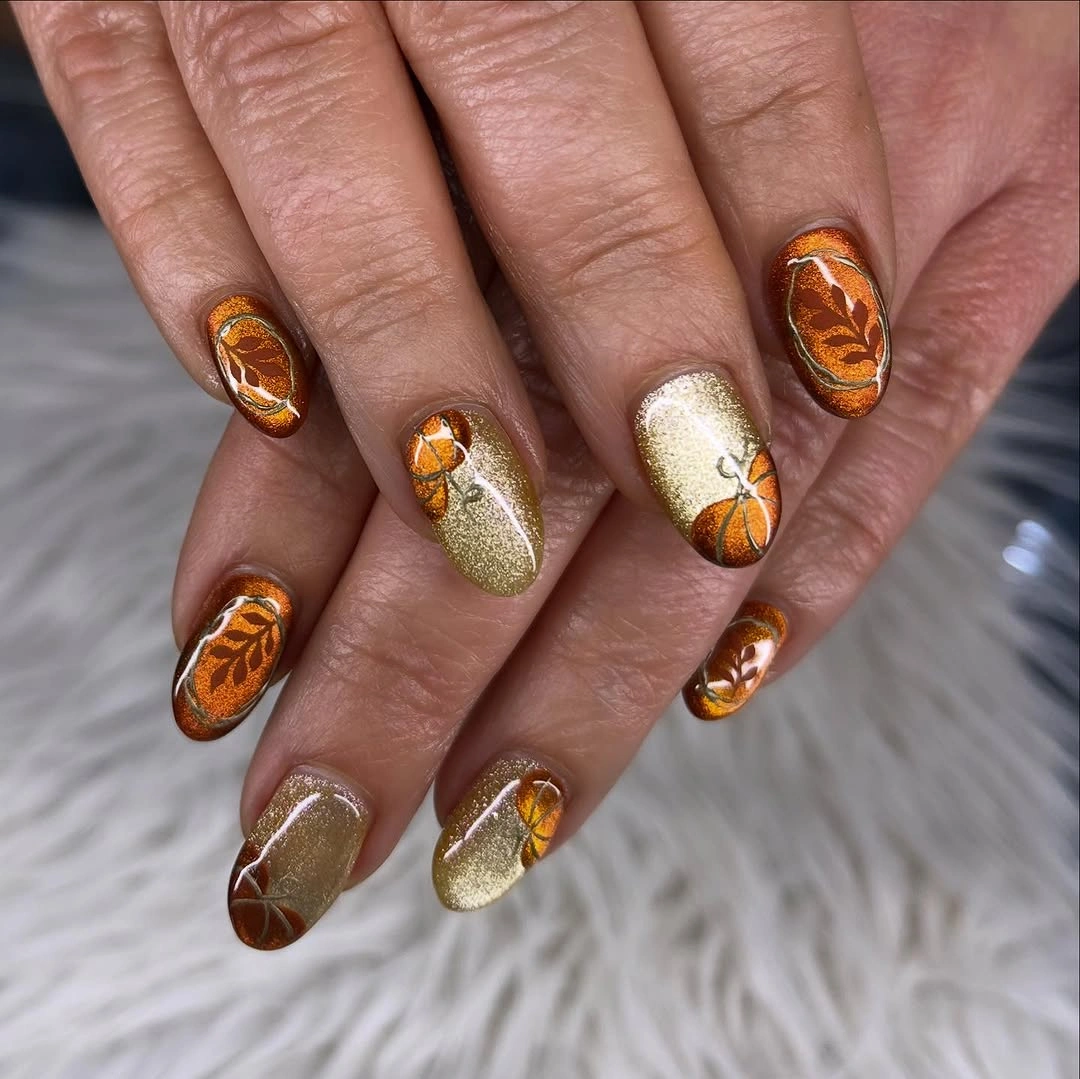
Keep the warm palette narrow if you adapt it to shorter nails: one brown base, one amber highlight, and one pale accent are enough. If every nail receives a different metallic-looking detail, the surface may lose the calm rhythm that makes the original feel mature. The useful change is concentration, not adding a brighter color to compensate for less length.
Reflective accents also bring an honest upkeep issue because small tip wear can show quickly against a shiny surface. A simpler brown base with one amber accent is easier to refresh and still supports the same seasonal mood. Let the warm relationship do the work; the manicure does not need extra symbols once the color contrast is clear.
15. Simple Pumpkin Lines Suit Short Rounded Nails
Short rounded nails in white, yellow, orange, and brown use simple pumpkin outlines and circular swirls rather than dense scenes. The repeated line language gives the manicure continuity, while the light bases keep the small drawings separate. This is a detail-first design in the most literal sense: the motif is uncomplicated, but its spacing and repetition make the set feel finished.
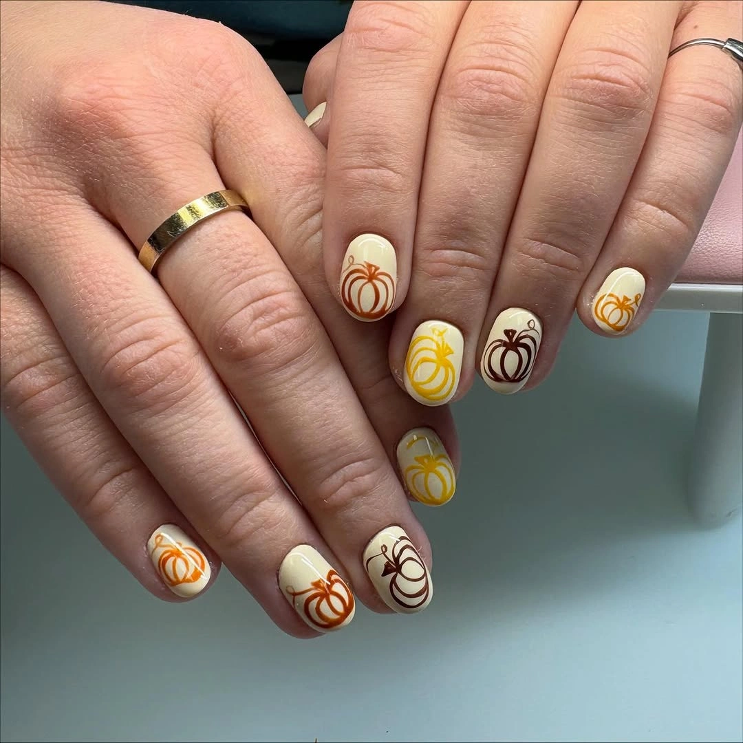
To keep the idea easy, choose one outline color and repeat it on two or three accent nails instead of mixing every visible warm shade. The short shape already supplies restraint, so a clean white or cream base can carry the drawing without additional texture. A tiny swirl can remain as the supporting feature because it echoes the pumpkin curves.
The design has a narrow margin for clutter. If the lines become too close, the pumpkins may turn into unrecognizable circles, so remove the smallest interior marks first. The strongest short version preserves the repeated outline and the open base; those two decisions are more important than matching every color in the original arrangement.
16. Orange-Red Solids Make Patterned Accents Pop
Orange-red solid nails give this set an immediate seasonal pulse, while pale accent nails carry checkered details and small pumpkin drawings. The eye moves from the confident blocks of color to the quieter pattern, so the manicure feels bold without requiring every nail to be illustrated. The shorter rounded shape keeps the strong palette approachable and prevents the design from becoming overly formal.
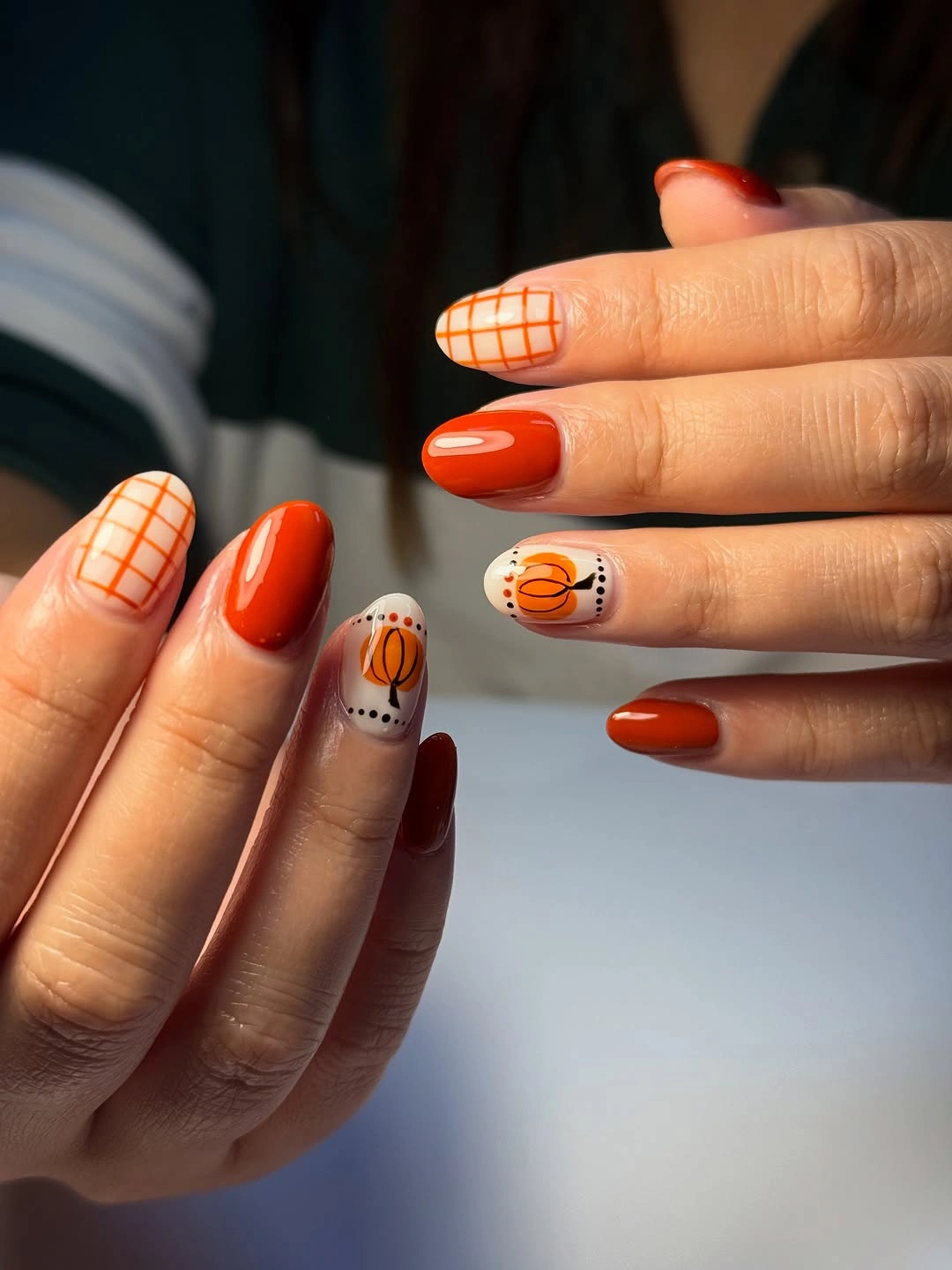
If you want a softer result, replace one orange-red solid with a sheer neutral and keep the checked pumpkin accent on the opposite hand. That edit lowers the saturation while preserving the key contrast between a clean color block and a detailed panel. It also makes the set easier to coordinate with the richer shades already used in autumn nail wardrobes.
Solid nails are doing practical work here because they give the eye relief between patterns. Removing them would make the checked accents compete with each other, especially on a short shape. Keep at least half of the manicure visually simple, then let the accent nails carry the seasonal story; the balance matters more than the number of motifs.
17. Burgundy Edges Frame a Sheer Mauve Base
The long square silhouette is defined by deep burgundy French edges over a sheer mauve base, with narrow pale or metallic-looking lines adding a small interruption. That dark edge gives the shape a strong boundary without covering the full nail, while the translucent center keeps the composition light enough for tiny autumn accents. The result is structured, not heavy.
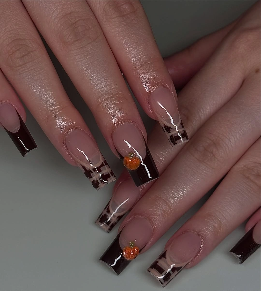
On a shorter square nail, widen the burgundy edge only slightly and remove the extra interior line if it begins to crowd the tip. The important relationship is between the pale center and the dark frame, so every supporting detail should protect it. This makes the idea a neat companion to fall matte nails even if the final version stays glossy.
French edges require consistent spacing because the eye follows the border across the whole hand. If the length changes, keep the curve or angle simple rather than trying to preserve a complex outline. The manicure will look more intentional with one clean burgundy boundary than with several small decorations competing against an uneven tip.
18. Burgundy Solids Anchor Pale Botanical Accents
Glossy burgundy nails act as solid anchors beside blush-pink and white nails carrying black botanical marks and small checked accents. The deep color keeps the pale details from feeling overly delicate, while the lighter nails provide enough space for the drawings to remain visible. Contrast is coming from both value and density: simple solids sit next to more observed surfaces.
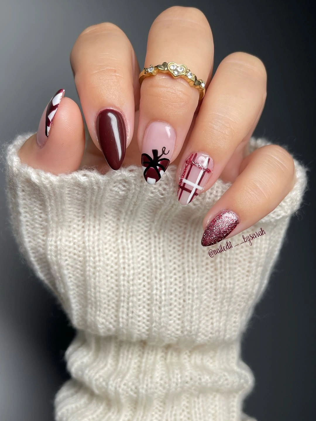
For a shorter version, keep the burgundy on two nails and use one pale accent with a single botanical mark rather than several small patterns. The set will still have the same dark-to-light rhythm, and the simpler panel will be easier to maintain. Readers comparing fall burgundy nails with design can borrow this anchor-and-accent structure without copying the exact motifs.
The key limitation is visual weight. Too much burgundy can make the pale details disappear, while too many pale patterns can make the solid nails look disconnected. Keep the dark blocks clean and let the lighter accents hold the information; that division of labor is what gives the medium almond set its balance.
19. Pale Pink Gives Pumpkins and Bows Breathing Room
Pale pink and nude surfaces create an open field for orange pumpkin shapes, white bows, and green leaves, so several seasonal symbols can coexist without becoming a crowded collage. The motifs are small and separated, which makes their relationship feel coordinated rather than random. The manicure is decorative because of placement and spacing, not because every nail is filled.
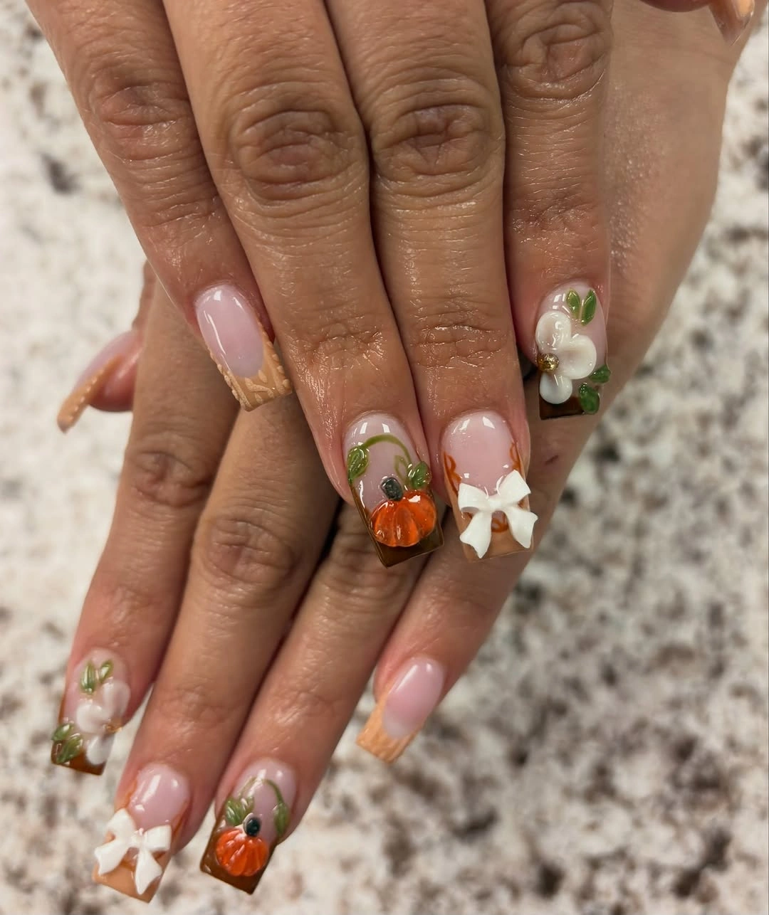
To adapt the design, keep the pale pink base and choose two symbol families, such as pumpkins with leaves or pumpkins with bows. Simplifying the set this way protects the open space and makes it easier to reproduce on medium or short almond nails. If you want a little more contrast, deepen only the orange accent instead of darkening every outline.
The airy arrangement is also its practical advantage. Small changes in length will not immediately destroy the composition because the motifs are centered and separated. The limit appears when extra stickers or marks are added to fill empty areas; resist that impulse, since the breathing room is exactly what makes the soft palette feel deliberate.
20. One Orange Accent Can Carry a Pale Set
Long almond pale nails with black botanical marks use orange only as a selective accent, which gives the manicure a quiet seasonal signal. The dark lines provide structure across the hand, while the brighter pumpkin detail becomes a visual stop rather than one more repeated object. This is a precise example of emphasis through omission: what is absent makes the focal color stronger.
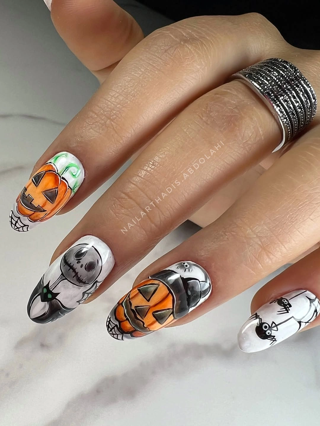
For shorter nails, keep the pale base on most fingers and place the warmest orange on one accent nail, with a small dark line on a neighboring nail for connection. That creates a clear path for the eye without forcing a tiny drawing onto every tip. The approach suits someone who likes fall nails with an accent nail but wants the accent to stay restrained.
The main tradeoff is that selective color needs enough contrast to remain visible. If the orange is too close to the base, the focal point disappears; if it is repeated too often, the quiet logic weakens. Keep the supporting marks dark and sparse, then allow the single warm detail to remain the consequence of all that restraint.
21. Large Pumpkin Artwork Makes Length the Feature
The final design places large orange-brown pumpkin artwork over long pointed nude nails, with glossy highlights and gold-toned details drawing attention to the concentrated focal area. Here the motif is not a tiny seasonal note; it is the dominant surface decision, and the length gives it enough room to look intentional. The rest of the manicure stays comparatively quiet so the artwork can lead.
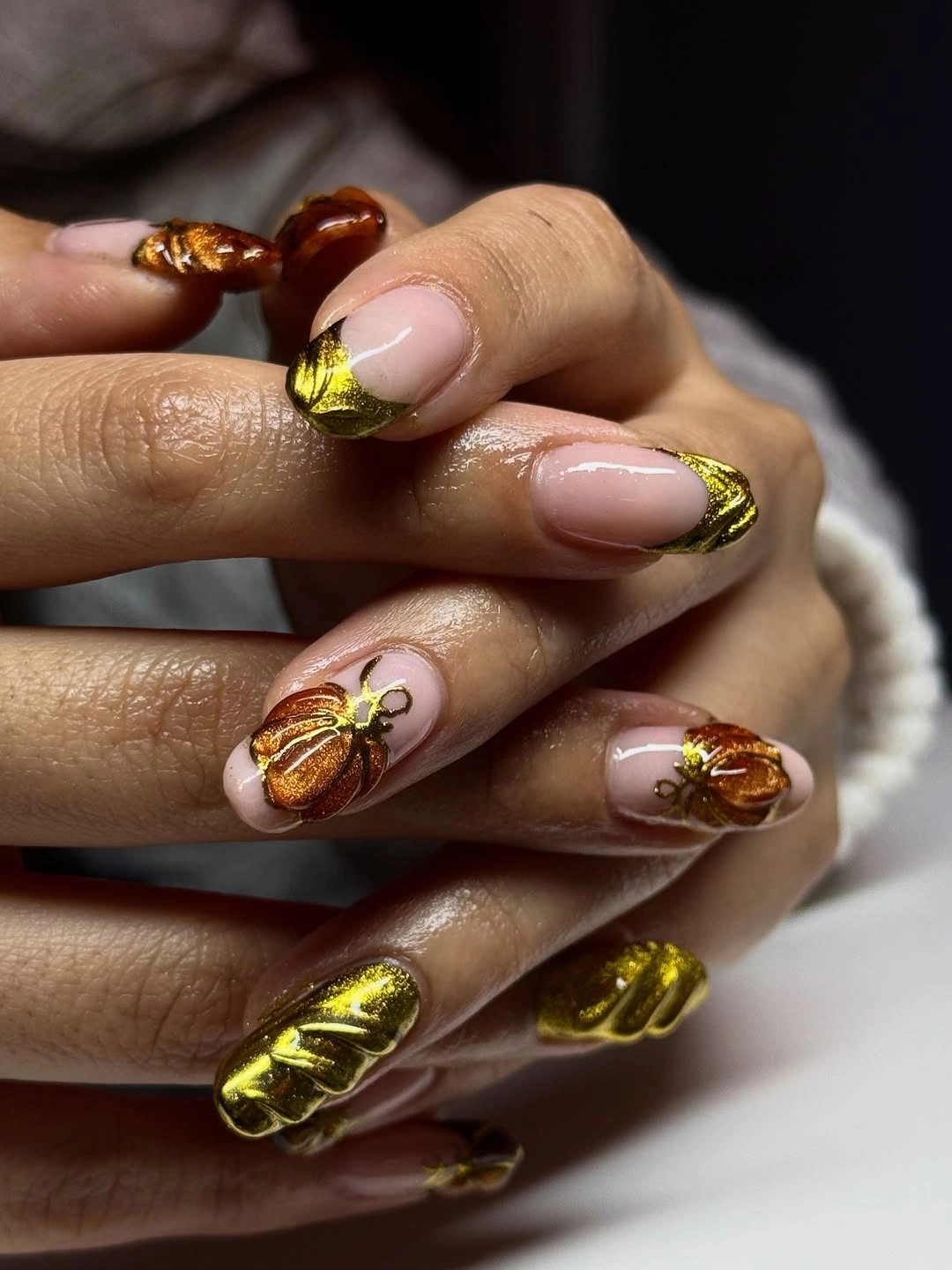
If you want the statement without the full commitment, keep the largest pumpkin on one accent nail and reduce the remaining nails to nude with a small brown line. That preserves the relationship between open space and concentrated detail while making the manicure easier to wear. The shorter adaptation should simplify the internal highlights first, because the silhouette and warm focal color are doing more work.
Length and dense decoration are the honest tradeoff, especially when the design grows out or catches attention from every angle. A medium almond can hold a smaller version, but it will not carry the same theatrical scale, and that is not a flaw. The useful choice is deciding whether the pumpkin should be a quiet seasonal signature or the feature that defines the whole manicure.